Torrens-Hudson Group: River Monogram & Identity System
Portfolio project

Verified paid work
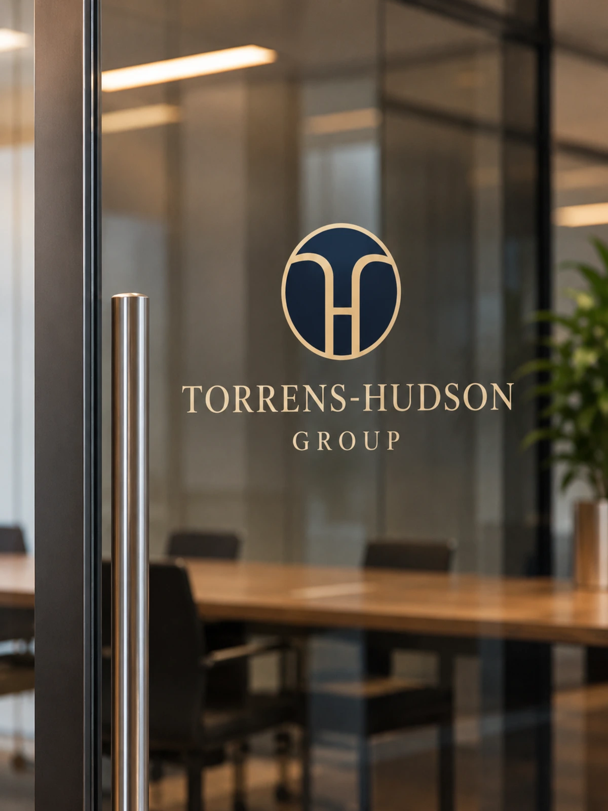
Glass door (top): “Reversed mark on glass, conference room entrance”
A monogram where two rivers form an H and the space between them forms a T.
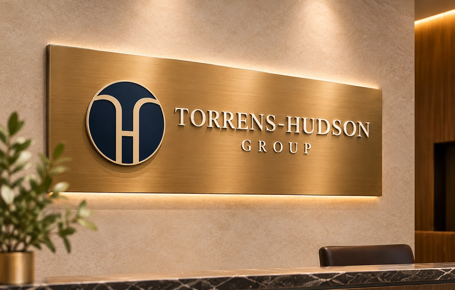
Plaque: “Reception signage in brushed bronze”
The challenge
Torrens-Hudson Group is named after two rivers: the Torrens in Adelaide and the Hudson in New York. The firm needed a monogram to sit beside its serif wordmark. It had to tell the story of two rivers becoming one, spell TH, and stay legible down to a 16 px favicon.
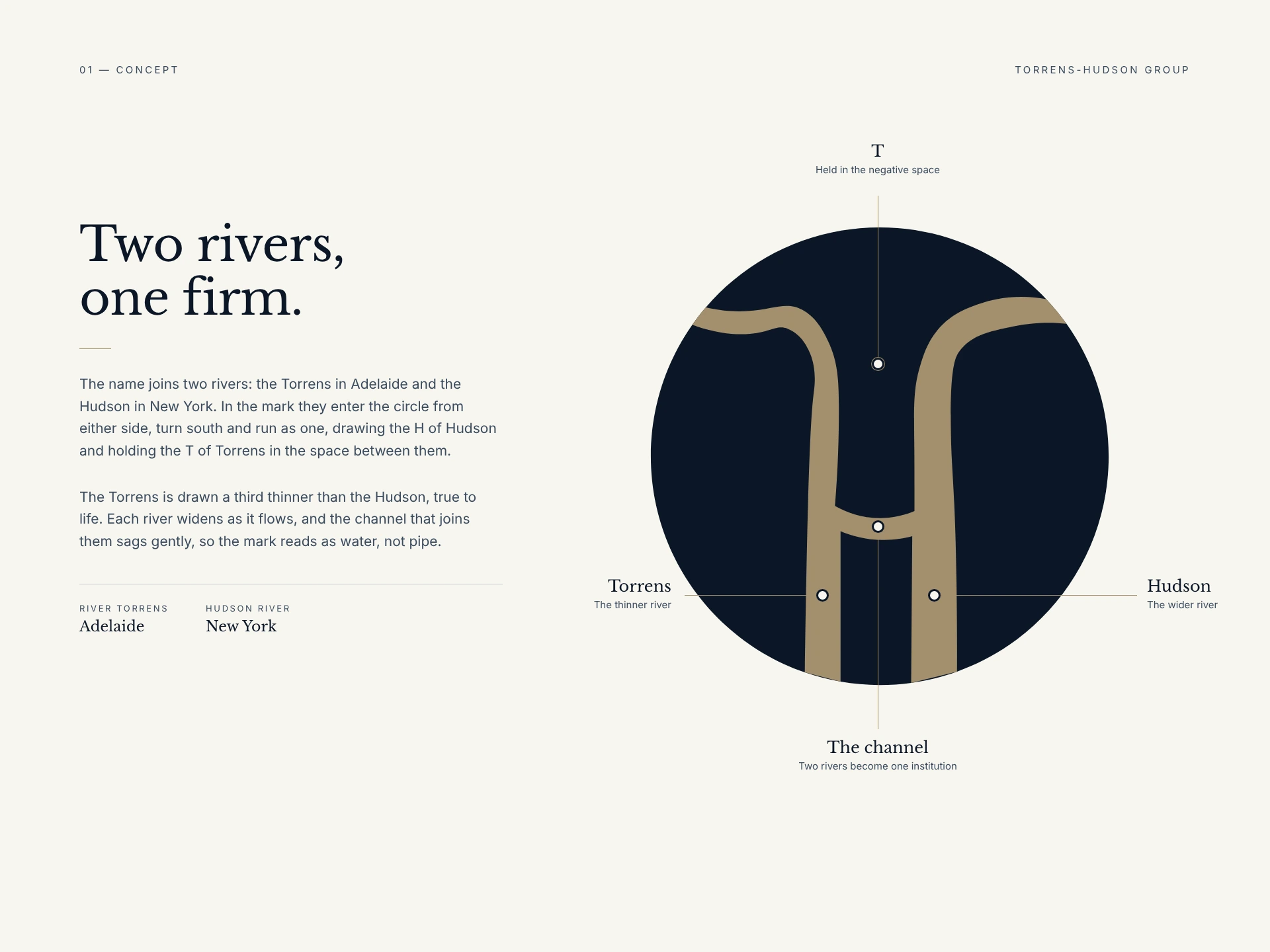
Two rivers board: “The Torrens and the Hudson meet to form the H, with the T in the space between”
The solution
My first concept had the right story and palette. In review, though, the shape read as a funnel narrowing rather than two rivers meeting. After several rounds, the final mark brings two rivers into the circle from either side, bends them south, and joins them with a channel that forms the H. The navy space above forms the T. Each river widens as it flows, the arms wave before they bend, and the joining channel sags slightly, so the mark reads as water rather than pipe. The Torrens is drawn a third thinner than the Hudson, as it is in real life.
The system
I rebuilt the mark as clean curves on a 200-unit grid, with a lighter-weight version for 16 to 48 px. I also refined the wordmark with a true raised hyphen, wider spacing on the capitals, and a smaller, widely spaced GROUP. The palette is Deep Maritime Navy, Brushed Bronze used sparingly, Archival Cream and Hudson Slate. The type is Libre Baskerville over Inter.
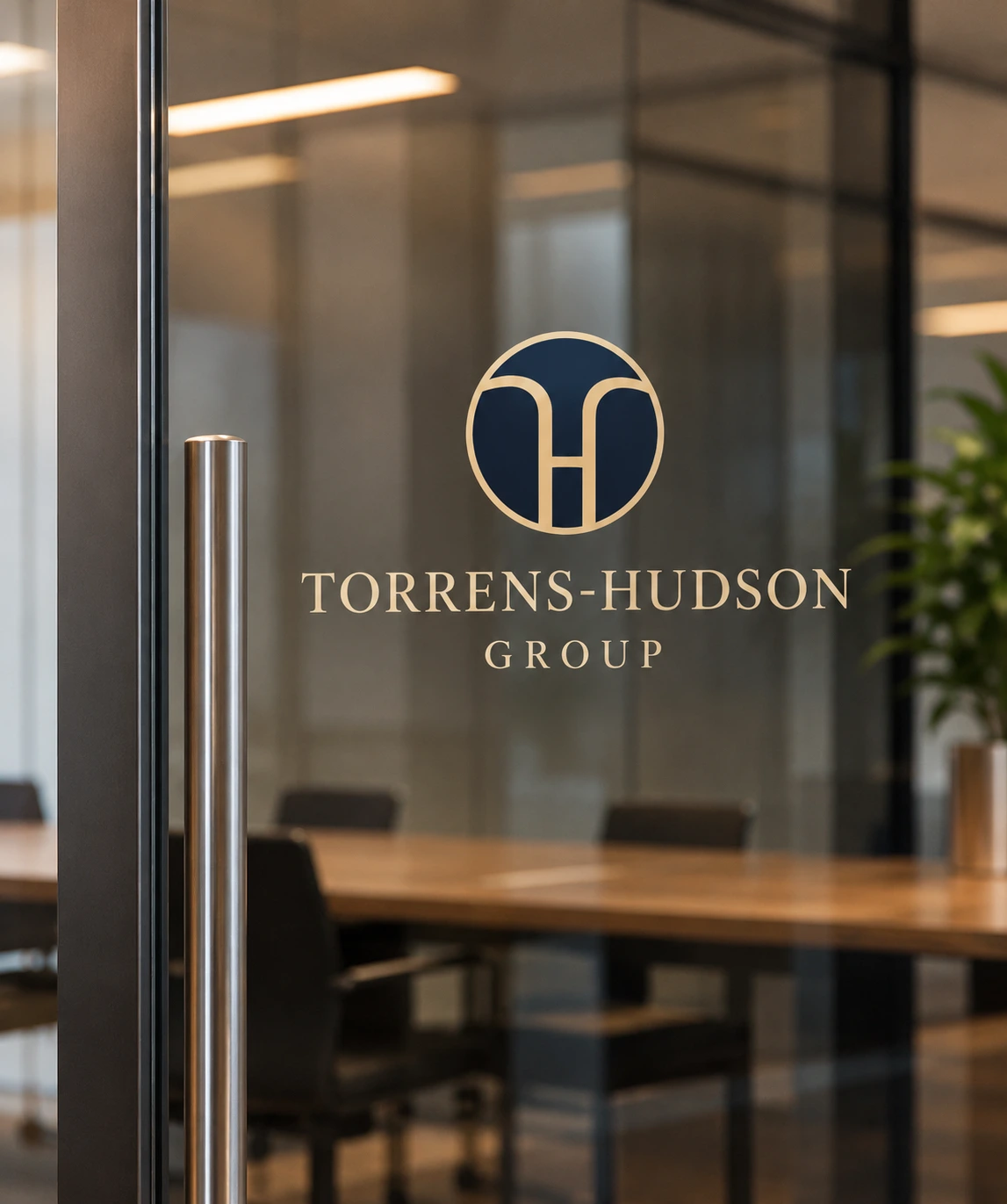
Glass door (top): “Reversed mark on glass, conference room entrance”
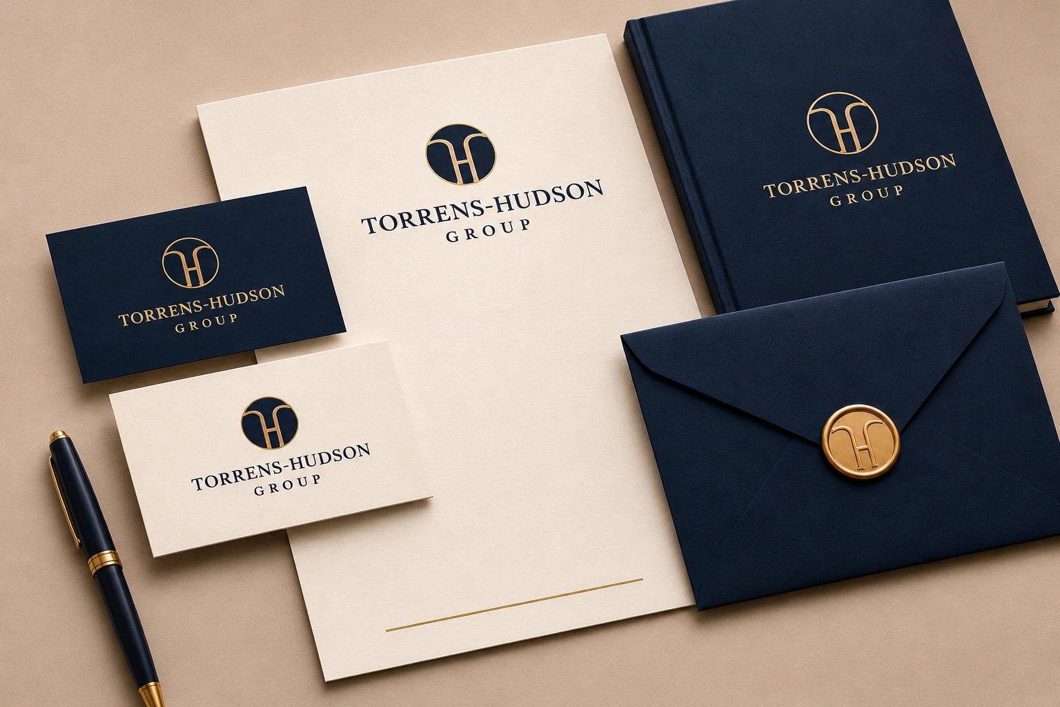
Stationery: “Letterhead, business cards and envelope seal”
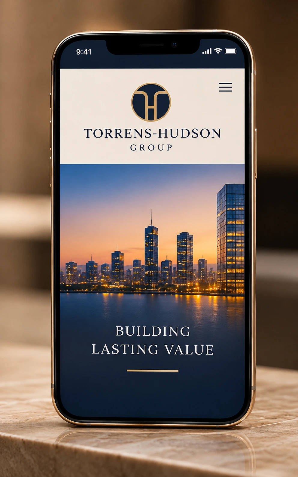
Phone: “Mobile homepage header”
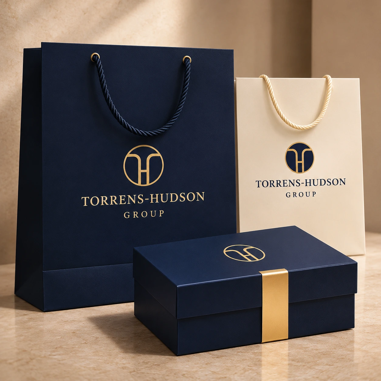
Packaging: “Corporate gift box”
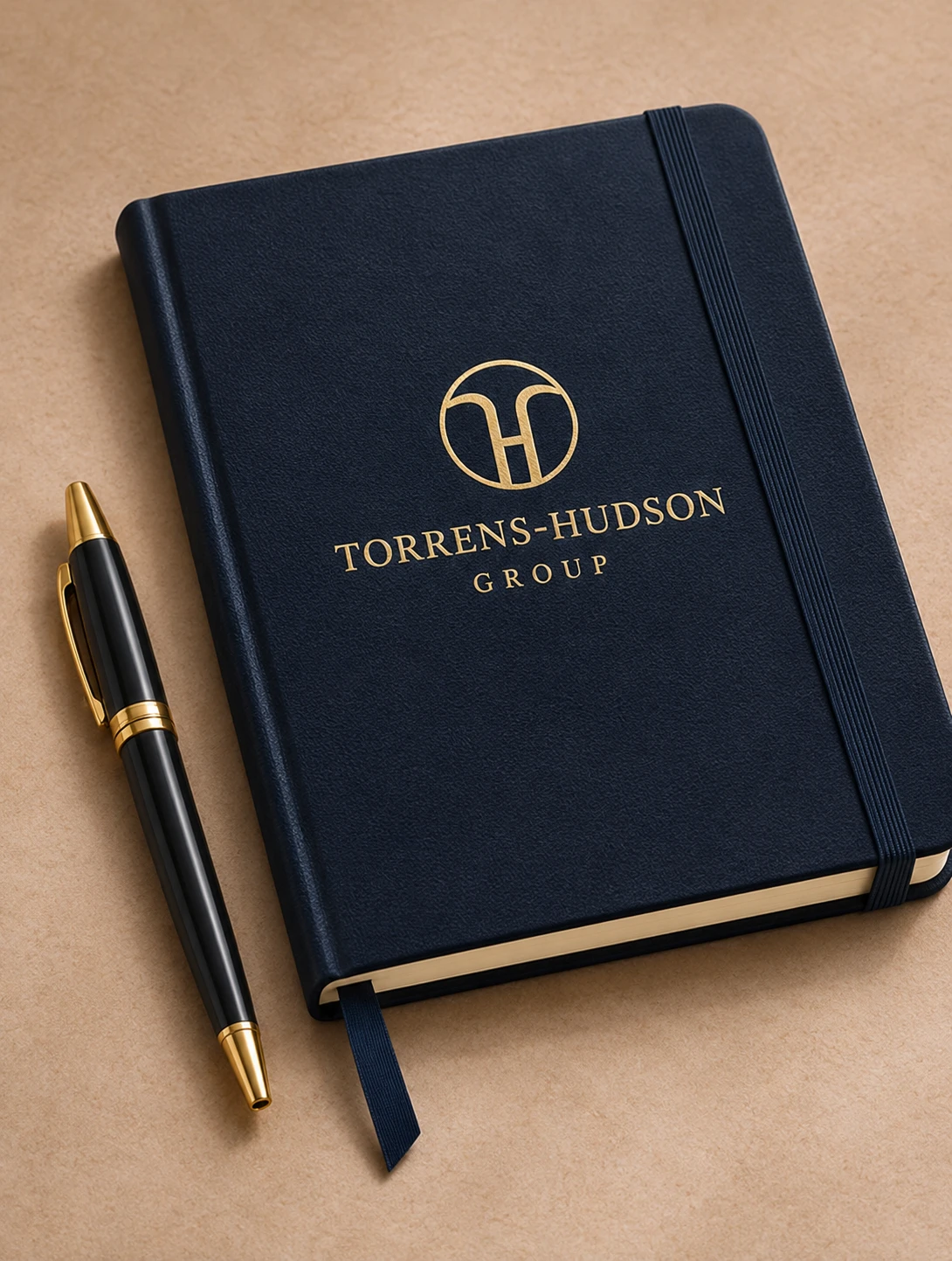
Notebook: “Embossed executive notebook”
Deliverables
Master mark, small size mark, horizontal and stacked lockups, mark only versions, full color, reversed and one color versions, clear space and minimum size rules, and a one page usage sheet.
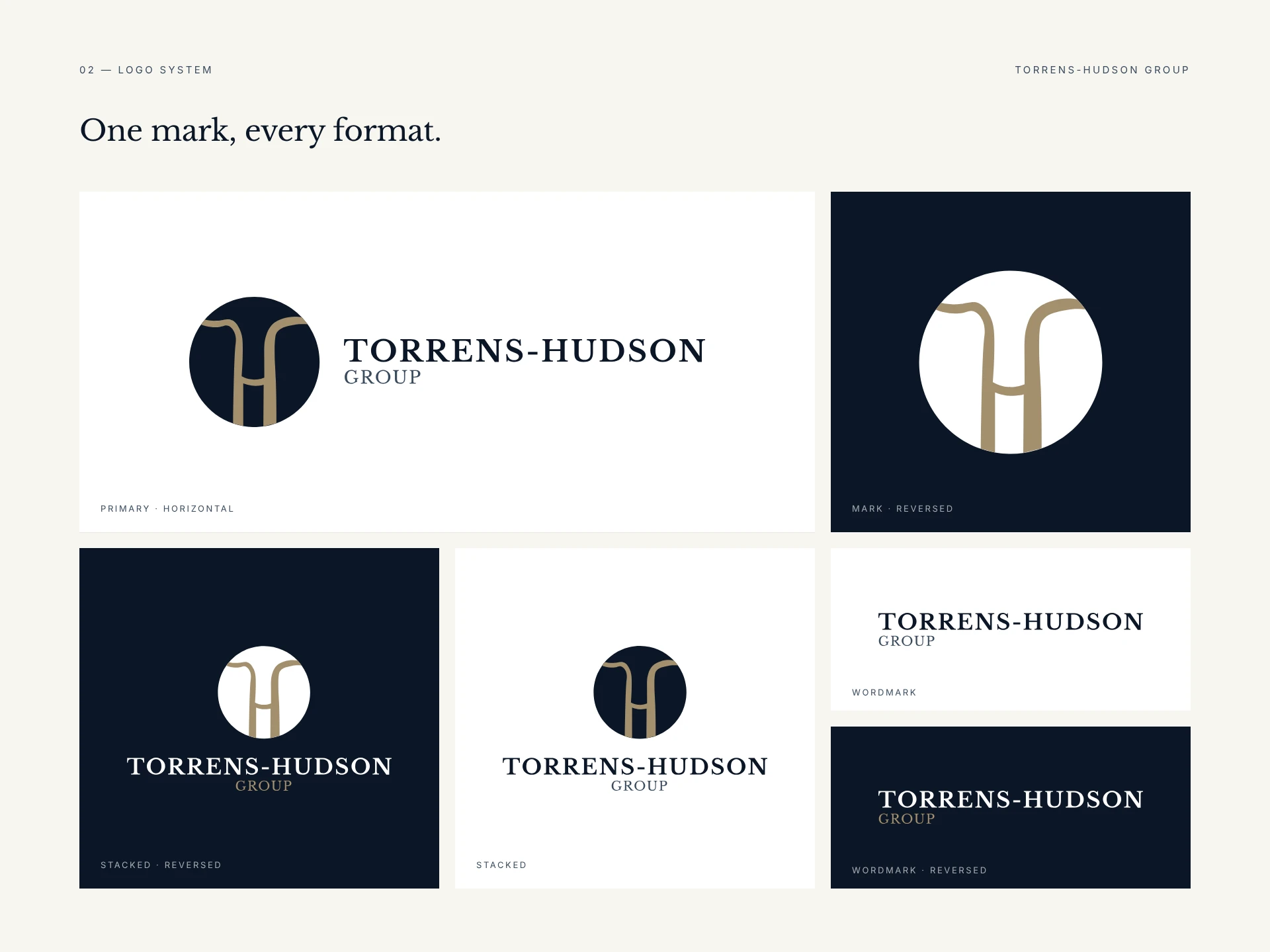
Lockups board: “Horizontal, stacked and reversed lockups, and the favicon”
1 like · 1 view · Nov 18, 2026
A river monogram and identity system for Torrens-Hudson Group, a firm named after the Torrens and Hudson rivers. I designed the mark so two rivers form an H and

