How We Made UserBook’s Hero Clear, Engaging, and Trustworthy
Minhaz Ratul
For UserBook, the core idea was already strong — a tool that helps teams create product documentation without writing a single word.
But the first impression? Not doing it justice.
This is where the HeroMaxx Roast came in.
🔥 The HeroMaxx Roast Process
Every redesign I do follows a battle-tested process:
Understand the product’s personality
Break down the current landing page
Use the product to get real insights
Analyze competitors
Define the audience, use cases, and USPs
Roast it
Redesign it ✨
It’s not just about making things look pretty — it’s about clarity, positioning, and building trust where it matters most: above the fold.
🧠 Understanding UserBook
To design something that works, I first had to define what this product is, who it’s for, and why it matters.
Audience: Product teams, Developers, Documentation teams
Use case: AI-generated product and user documentation
Competitors: HelpDocs, GitBook AI, Scribe
Problems solved:
Saves hours of manual doc writing
Automatically generates docs from user activity
Clear onboarding for users without lifting a finger
Helps users help themselves (reducing support tickets)
Zero setup, low effort, high output
Easy to embed, share, and update
Tone of Writing: Friendly, Clear, Empowering
Style of Design: Light, Minimal, Soft gradients, Clean UI
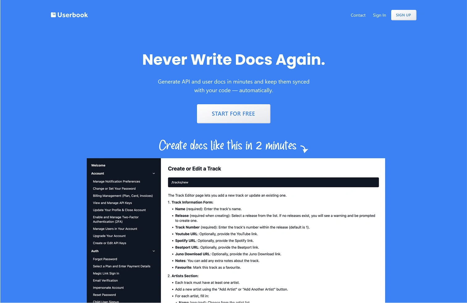
🧾 The Original Version
The original design had a good start — minimal, clean, and focused.
But it missed out on key fundamentals:
◆ Headline was vague: “Never write docs again” sounds catchy, but tells us nothing
◆ No context: Who is this for? What kind of docs? Why should I care?
◆ Flat visuals: No depth, no contrast, no visual entry point
◆ Wall of text: No clear flow or visual hooks
◆ No trust signals: No testimonials, logos, or users shown
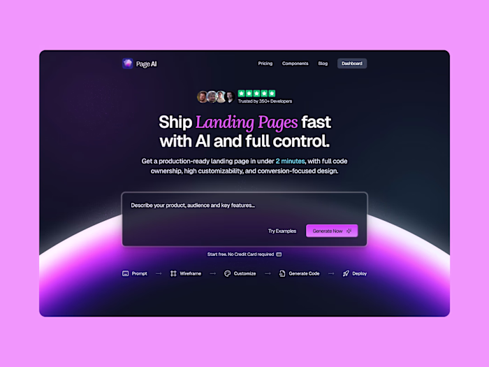
✍️ Clear, Targeted Messaging
Great design without good copy is like a racecar with no engine.
I rewrote the hero copy to clearly communicate what the product does, why it matters, and who it helps — in plain English.
🎨 Using Color With Intention
I actually liked the color palette they used — but the application didn’t follow UX best practices.
I kept the core palette, but improved how it was used:
Better contrast
Clearer focus
More warmth + hierarchy
🤝 Adding Social Proof
People trust people.
I added user avatars and real metrics to immediately show that people are using and benefiting from the product.
🔄 Explaining the Product Journey
The original had a product demo — good!
But there was no explanation. No clarity on how the docs were generated or what the process looked like.
So I added a simple stepper visual to show the journey from input to doc generation.
🚀 Call-to-action
Closer look at the CTA.
✏️ Small Copy, Big Clarity
Sometimes, one sentence can change how a product is perceived.
I added a short line to clarify the product and it instantly improved comprehension. No guessing needed.
🌌 Visual Polish & Final Touches
Then came the polish.
Gradients, soft shadows, refined spacing, better alignment, cleaner hierarchy. Everything working together to make the user experience feel seamless and thoughtful.
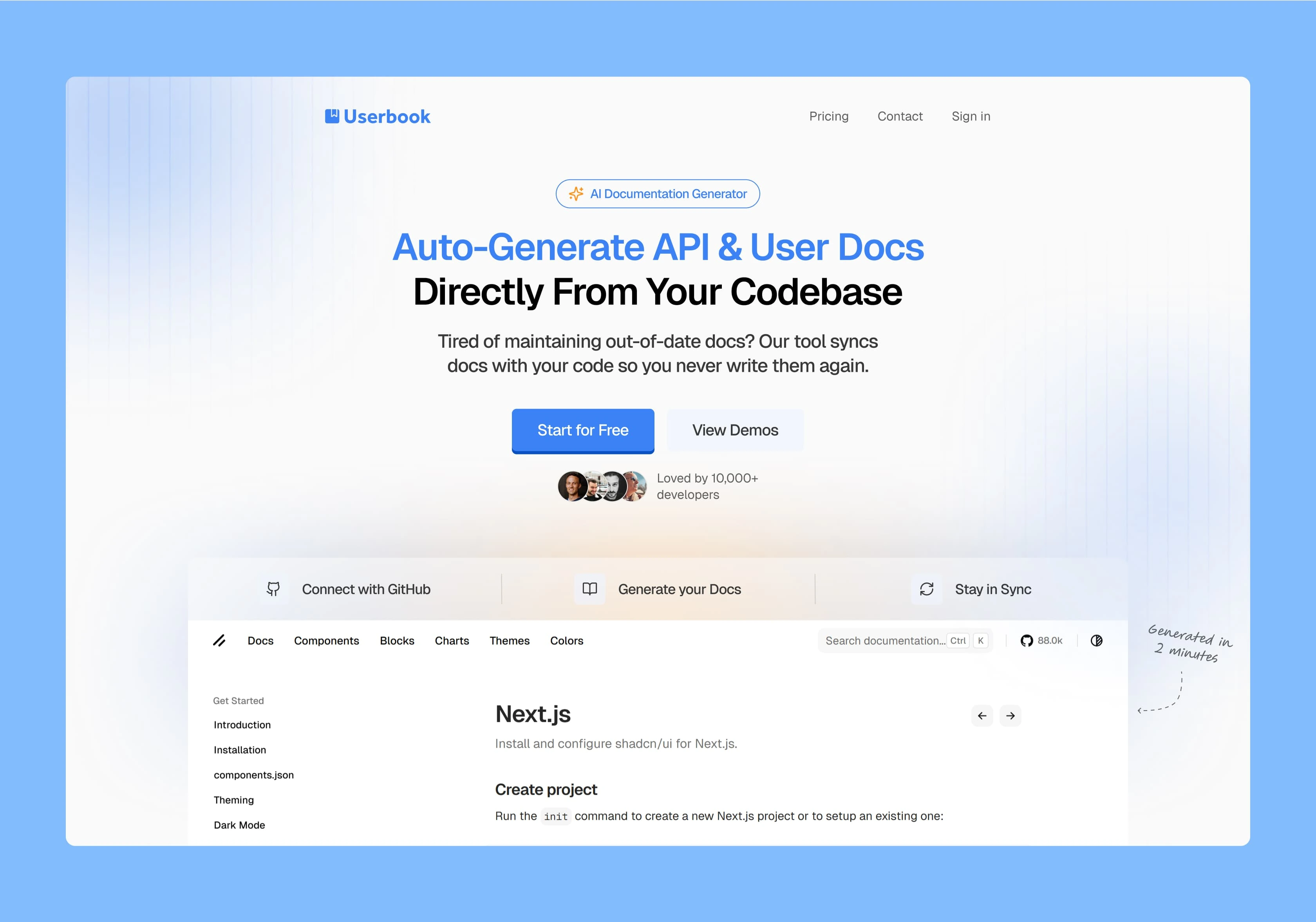
Here’s the final result:
🚀 Final Thoughts
UserBook already had a solid idea — it just needed the right story, the right visuals, and the right structure to connect with people instantly.
It’s not about adding more. It’s about adding meaning.
Like this project
Posted Jun 16, 2025
Redesigned UserBook's landing page for clarity, positioning, and trust.
Likes
1
Views
9
Timeline
Jun 4, 2025 - Jun 6, 2025