Landing Page Redesign for PageAI
Minhaz Ratul
Roasted PageAI Pro (A SaaS AI software for creating landing pages)
Sometimes the best way to explain your product is just to show it. Real screens over vague diagrams. Let the product speak for itself. This is what I prioritized in this transformation. Here's a full breakdown:
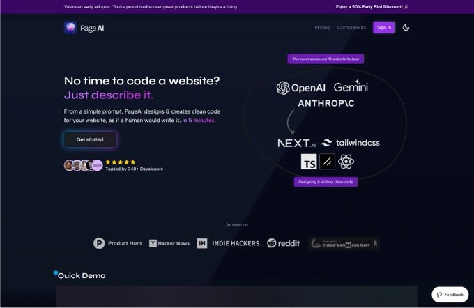
This was the original version. Clean and to the point, which I really like. That said, the product is solid and deserves a landing page that does it justice.
Here's what could be better:
◆ Remove vague diagrams — they add no real value
◆ Let users try the product upfront — it's a strong hook
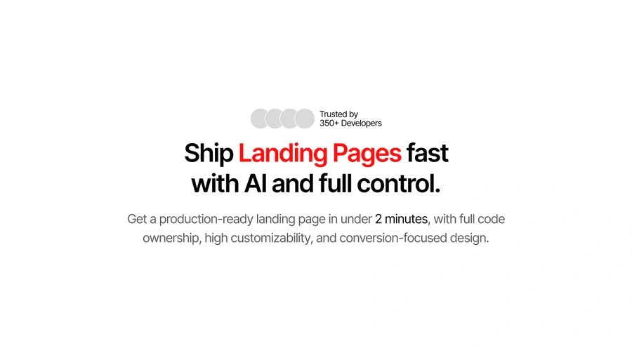
◆ The copy feels generic and doesn't speak to users
◆ CTA is too neutral — lacks contrast
◆ Hero feels flat — needs more depth and life
Time to improve it!
Remember, you have 5 seconds to show your product’s value. It must:
◆ Explain what the product is
◆ Show why it matters
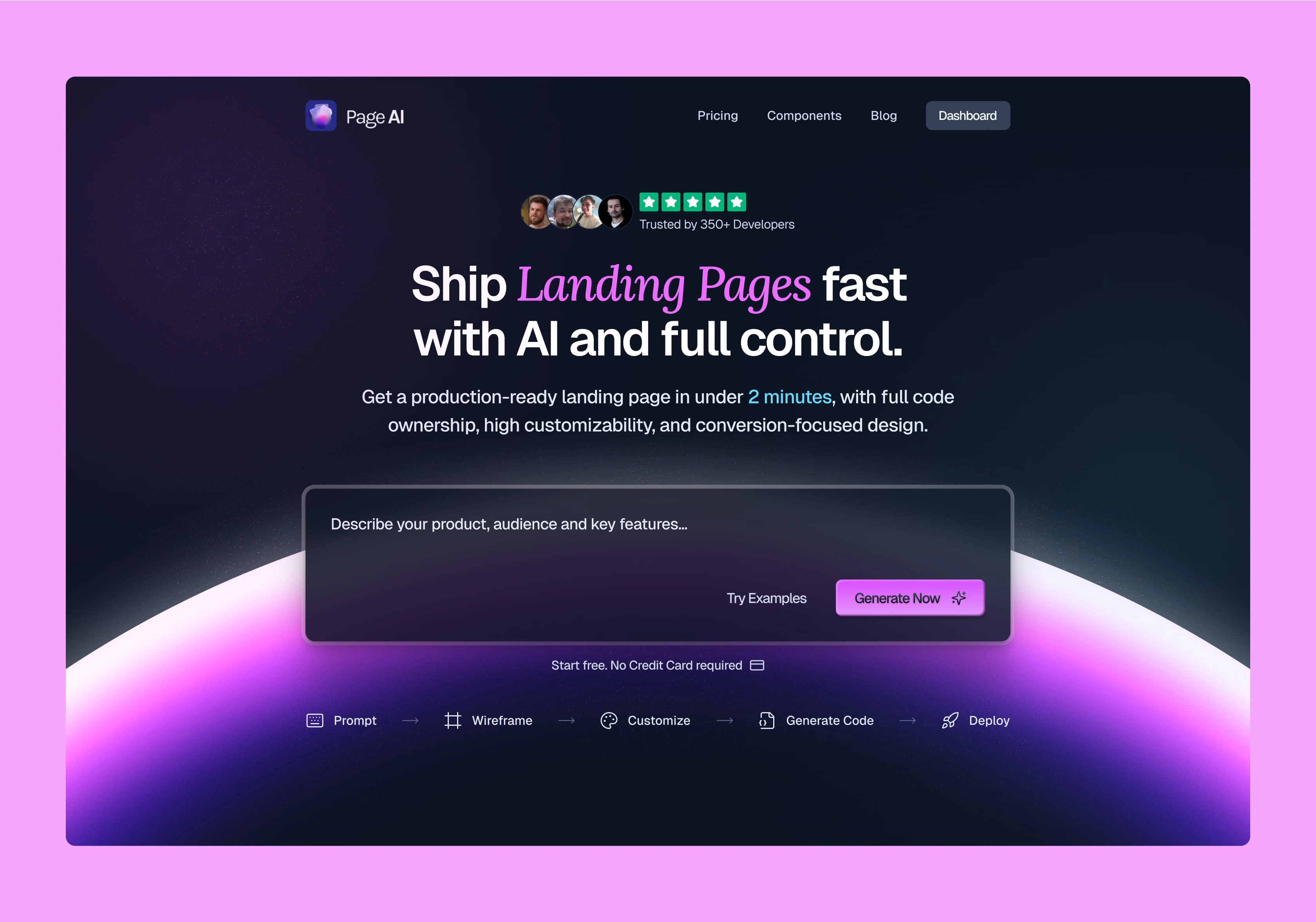
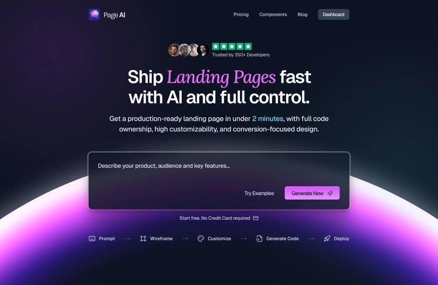
Here, it’s a landing page builder for busy developers — delivered super fast. The unique part? Full control over the codebase.
Next, I chose the typeface. Geist felt like the perfect fit — clean, versatile, and modern. I paired it with Lora for a nice balance of clarity and personality.
I also pulled in elements from the product itself. Since the product should do most of the talking, I built a small AI chatbox where users can try it out by entering a prompt. It’s a simple way to show value upfront and guide them toward signing up.
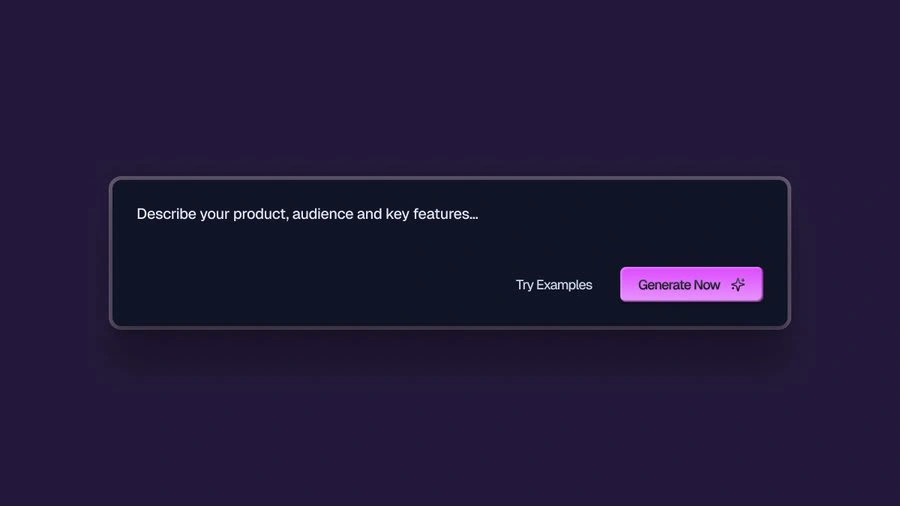
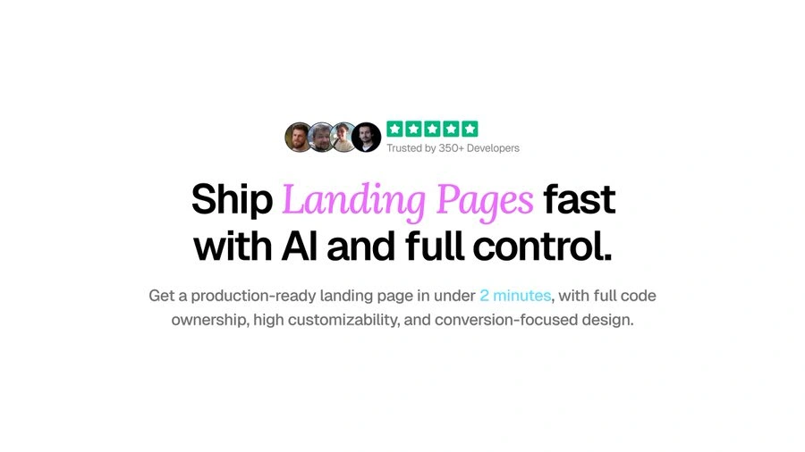
I stuck with their existing color palette — it already fits the brand well. Just added a few more hues and used them more intentionally based on solid UX principles.
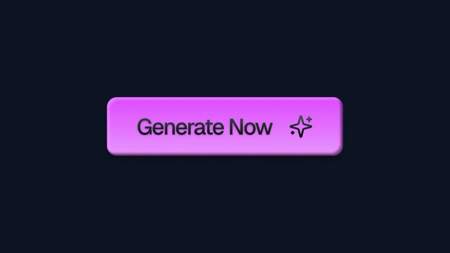
Closer look at the CTA 👀
Users often don’t know what to expect when trying a product. That’s why it’s key to show the journey upfront. I created a simple stepper to guide them and set clear expectations. Giving users certainty makes them more eager to take action.
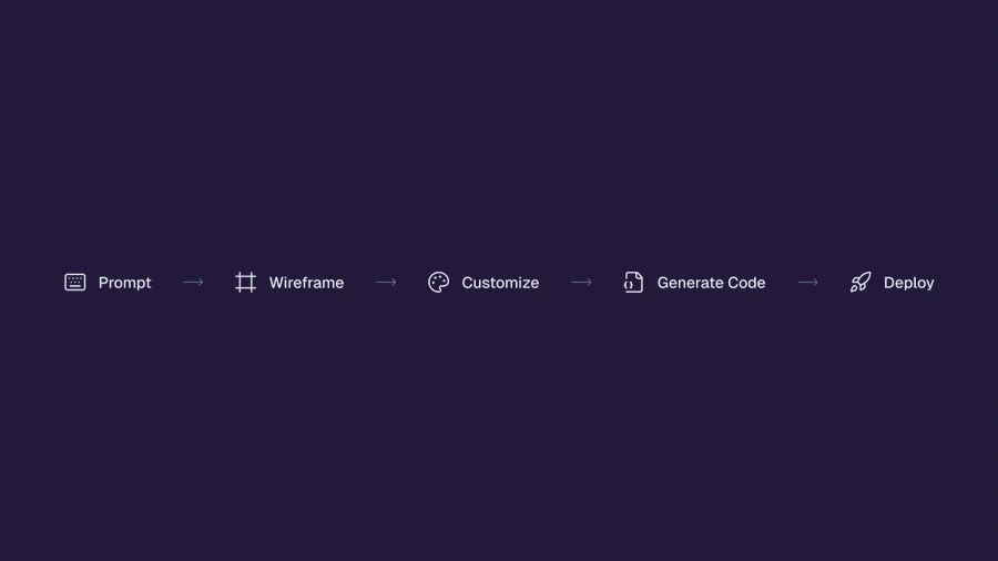
We want users to feel like they’re missing out if they don’t try it. So we add hooks like “Free to get started. No credit card required” to remove any barriers and encourage action.
Then I brought everything together and polished the design. The result is a new hero section that’s clearer, more engaging, and focused on driving action.
Like this project
Posted Jun 13, 2025
Designed an engaging landing page for PageAI, focusing on user interaction and clear value presentation.
Likes
1
Views
11
Timeline
Jun 11, 2025 - Jun 13, 2025