Identity Design for Lost City Naturals
LOST CITY NATURALS
Skincare Brand Identity
Lost City Naturals sought a refined visual identity; one that could distill its ethos with clarity and allure, drawing in discerning, health-conscious individuals as its presence expanded.
The new identity needed to exude quiet luxury while underscoring a deeper commitment: the preservation of fragile oceanic ecosystems.
Through a tapestry of richly textured imagery, steeped in place and sensation, we invite the viewer into an environment both serene and elemental.
LCN does not merely craft products; it curates an experience - one that lingers, evocative and immersive. The brand visuals had to do the same.
Our new identity gives us the confidence to approach the market in a way that feels like Lost City was intended. I feel like we're now able to communicate what makes us valuable and unique more confidently and clearly.
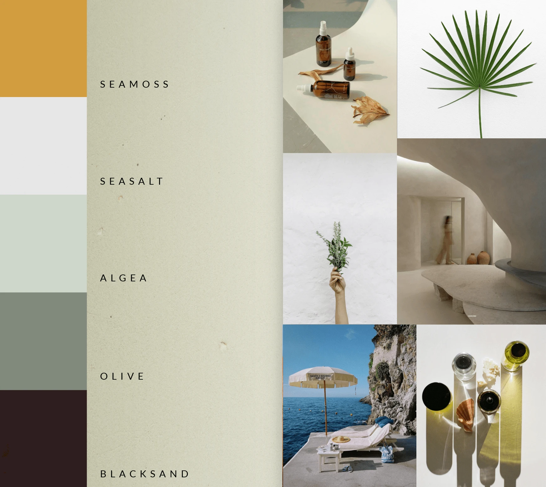
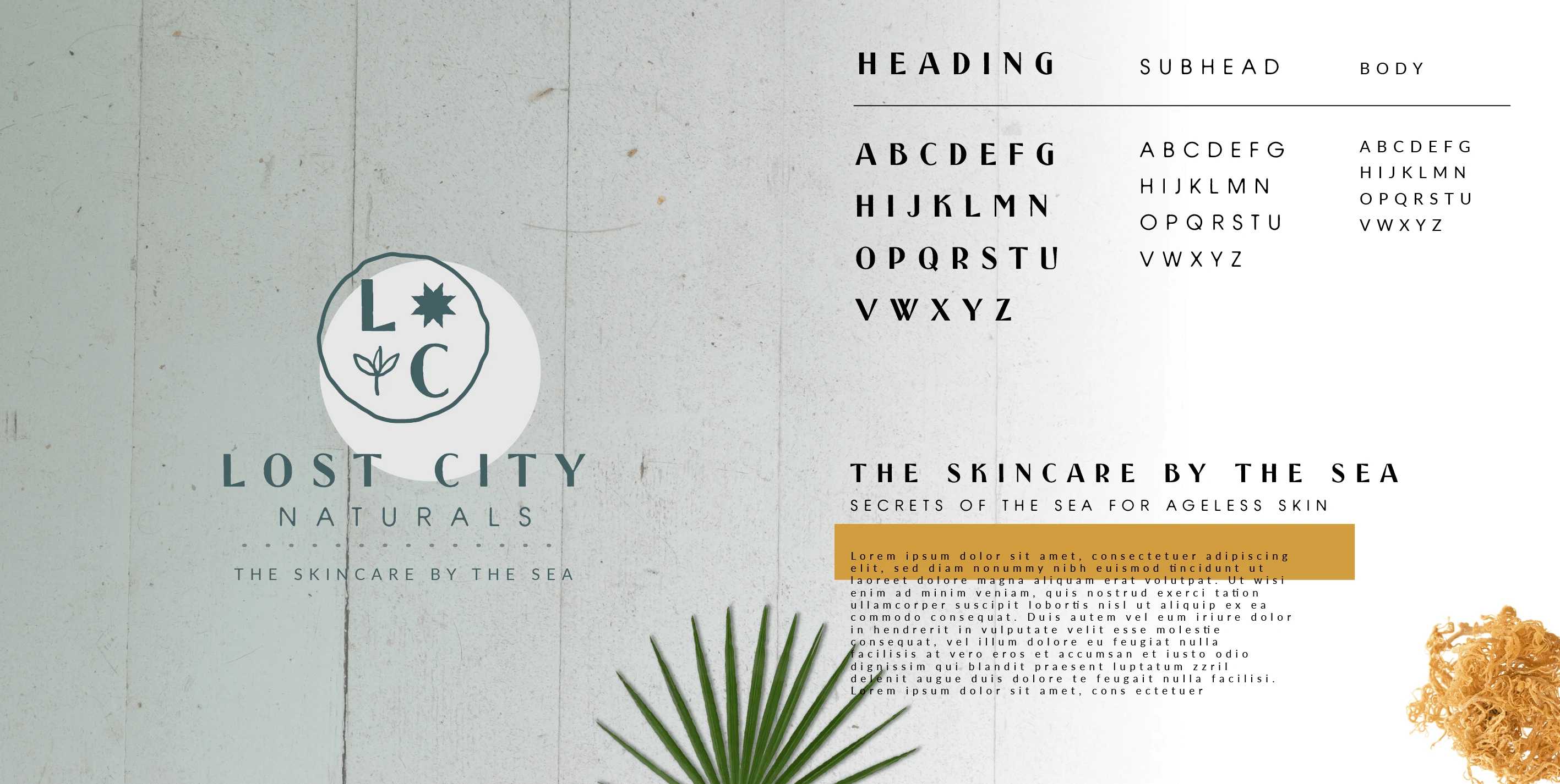
A curated color palette and imagery style were crafted to evoke a sense of calm. An homage to the organic rhythms of ocean life, where fluidity and serenity coexist.
With a considered logo system, a nuanced palette, an elegant typographic language, and a distinctive approach to imagery, Lost City Naturals steps forward with a refined identity - one designed to resonate with its growing community of eco-conscious and health-minded individuals.
The brand strikes a careful balance: bold yet restrained, enduring yet fluid. Crafted with intention, its visual language is both grounded and expansive, adaptable across every touchpoint while remaining unmistakably its own.
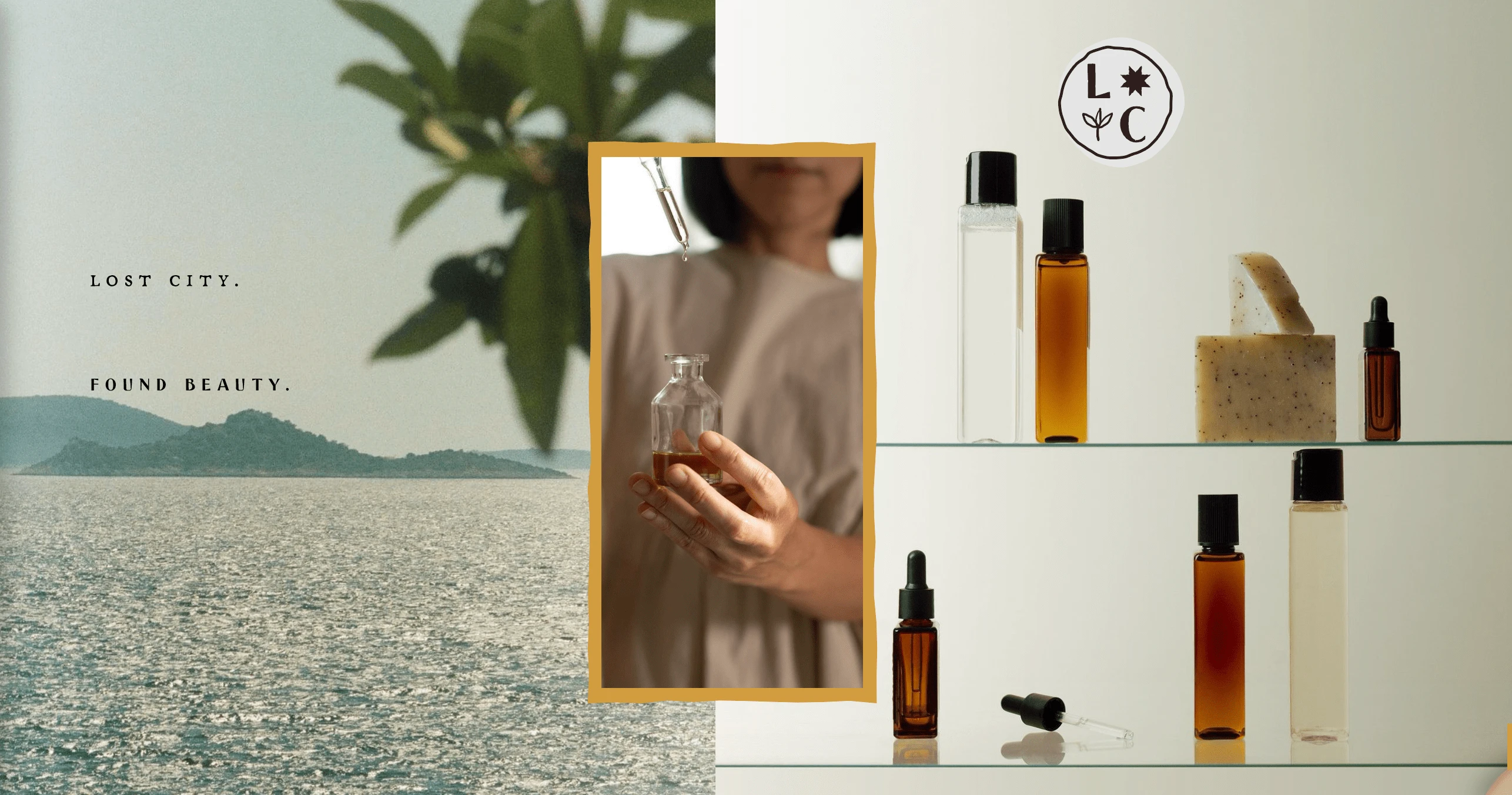
Simple. Natural. Beautiful.
Like this project
Posted Feb 27, 2025
A considered logo system, nuanced palette, an elegant typographic language, and a distinctive approach to imagery - explore Lost City Naturals' refined identity

