Starbuck Reusables Swag
Creative Brief
Starbuck's Sustainability team Is looking for help with a new shirt and tumbler design for their partners in Napa, CA. Napa will be the first store to test a reusable only mandate where single use cups will not be allowed anymore.
Customers will need to bring in their own reusable cups, borrow a cup from Starbucks (bring it back afterwards to reuse), or sit and stay (finish your drink at the store to enjoy their beverages. This test pilot is a part of Starbucks effort to find more plant positive alternatives.
They would like to see few ideas for language that feels inspirational, young, and partner-oriented, and to pull in some kind of language or graphic treatment that speaks to their location (California, N. California). The demographic and recipients of the swag will be a younger demographic. The design must be able to work on both a t-shirt and tumbler.Process
Results
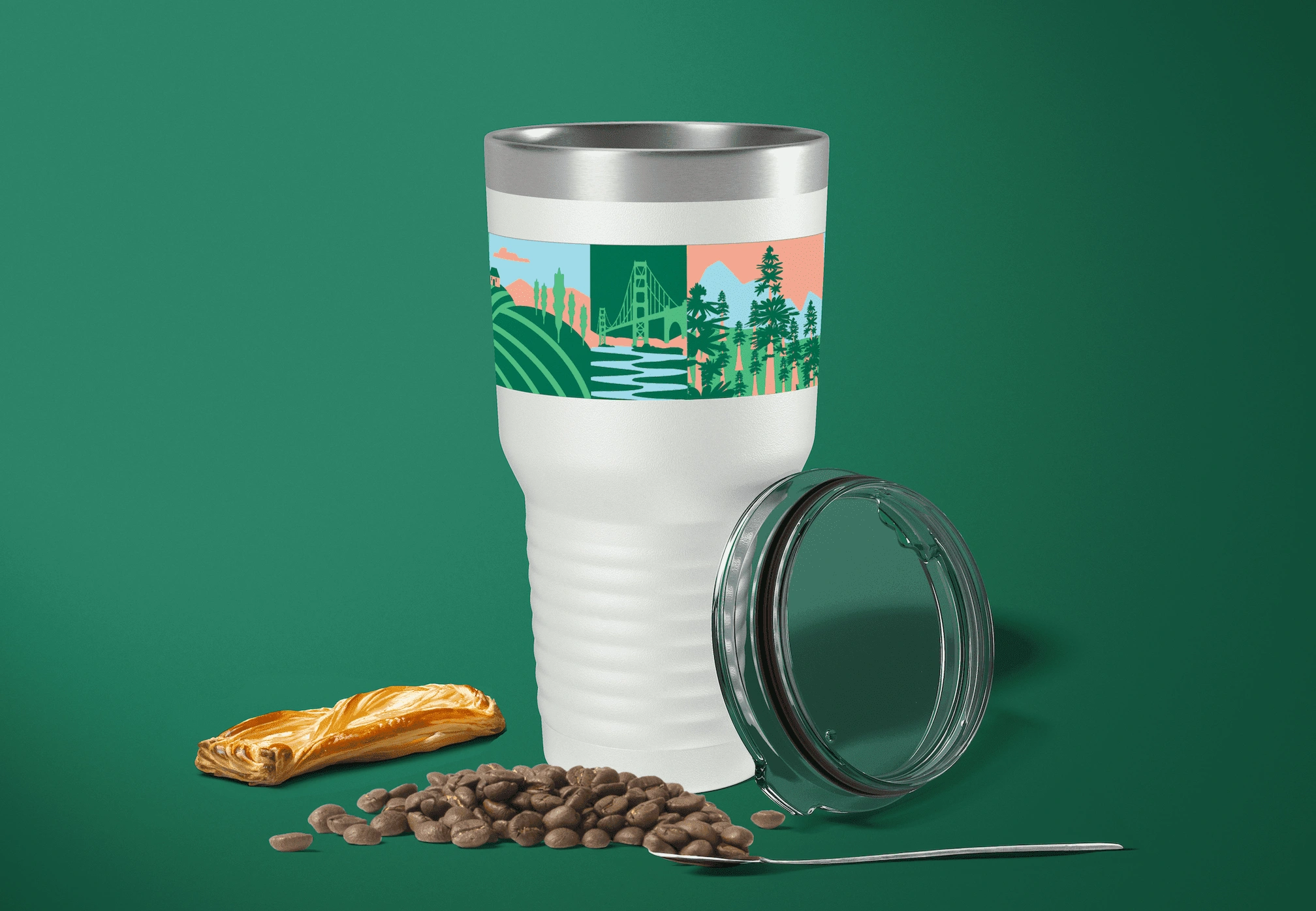
We created custom tumbler and t-shirt designs for the employees and partners at the Napa location. The graphic toolkit includes icons from Northern California, such as the Golden Gate Bridge and Napa Valley, intended for merchandise design. The phrase "Reuse for a Better Tomorrow" emphasizes the importance of eco-friendly reusable cups for a sustainable future.
Mood board
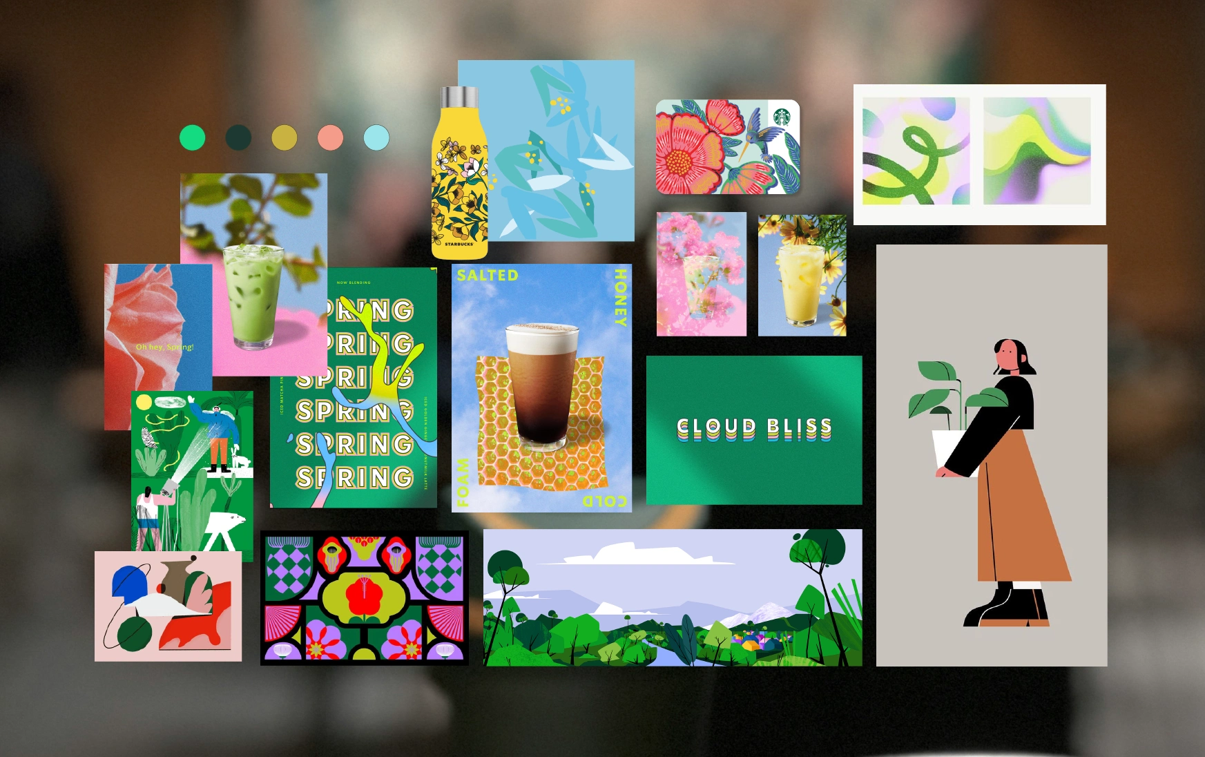
Art Direction: 2D flat illustration with organic and abstract shapes
Tone: Playful, youthful, organic, and eco-friendly
Color Palette: Draws inspiration from Starbucks' seasonal spring campaign, which are known for their fresh and vibrant imagery. This serves as a reminder of the importance of preserving the environment.
Napa Graphic Tool Kit
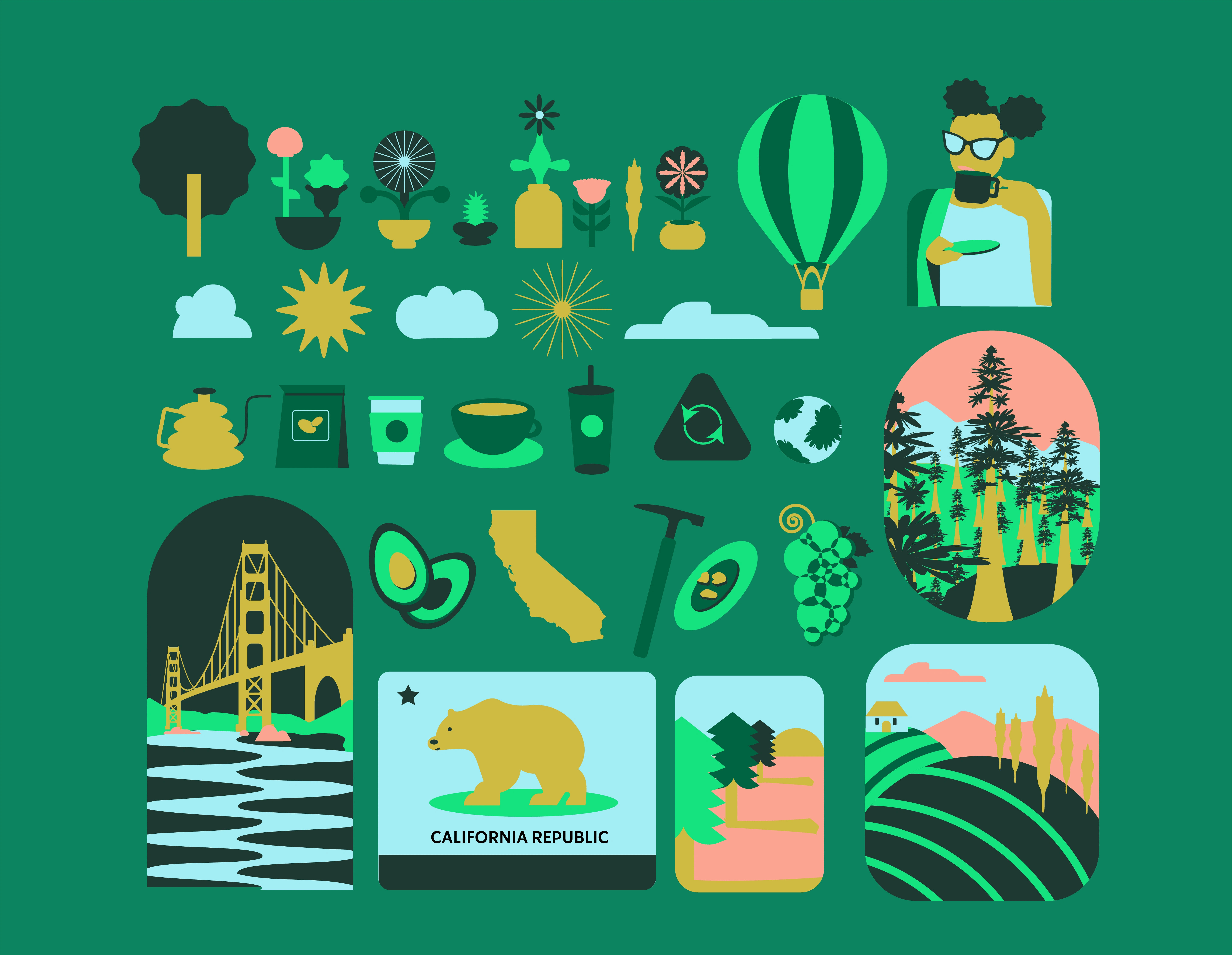
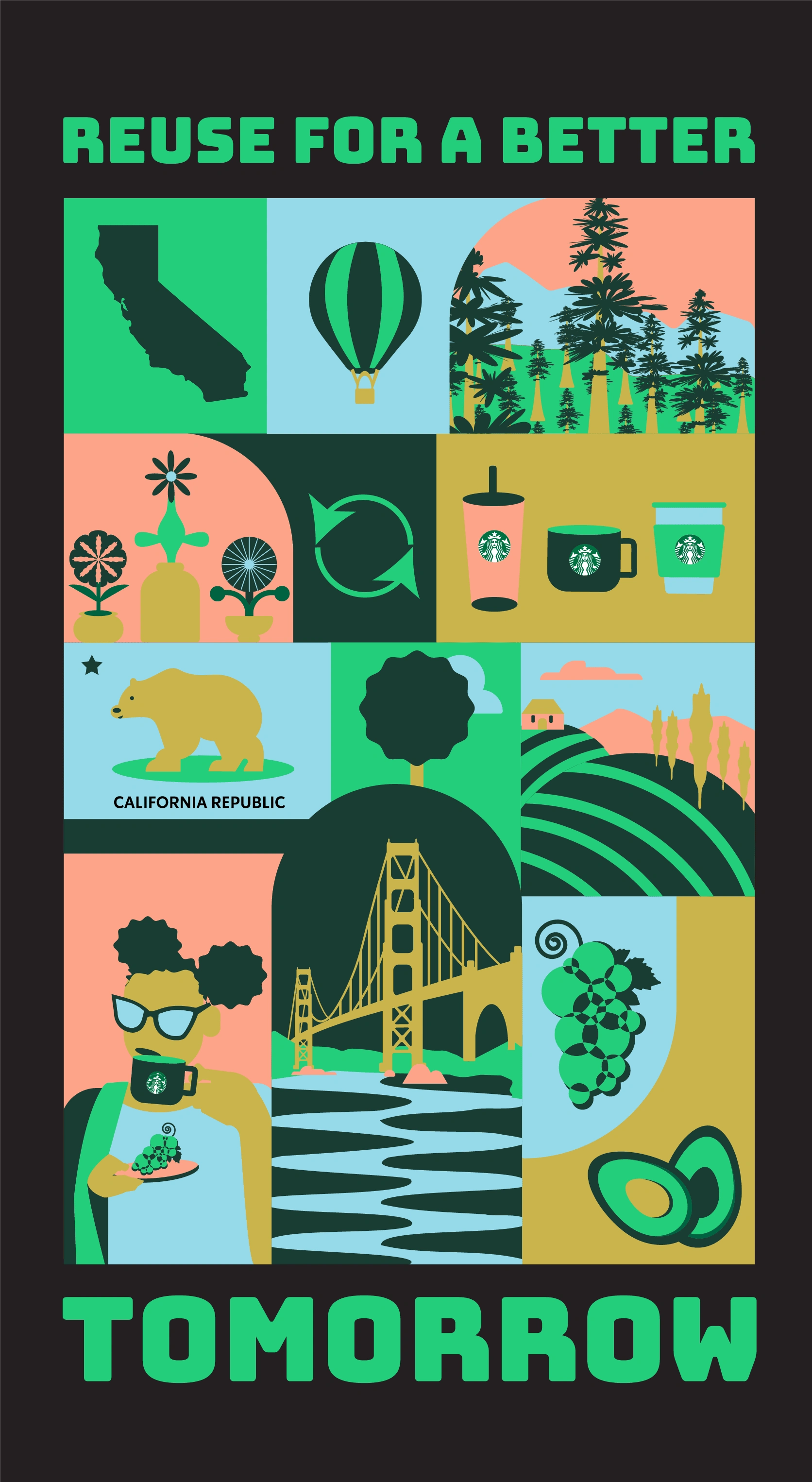
I had an idea to develop a toolkit comprised of various graphic icons, useful for setting parameters during merchandise design.It includes landmarks like the Golden Gate Bridge, Napa Valley, hot air balloons, and the California flag. It also features elements from California's history, nature, ecosystems, and coffee culture.
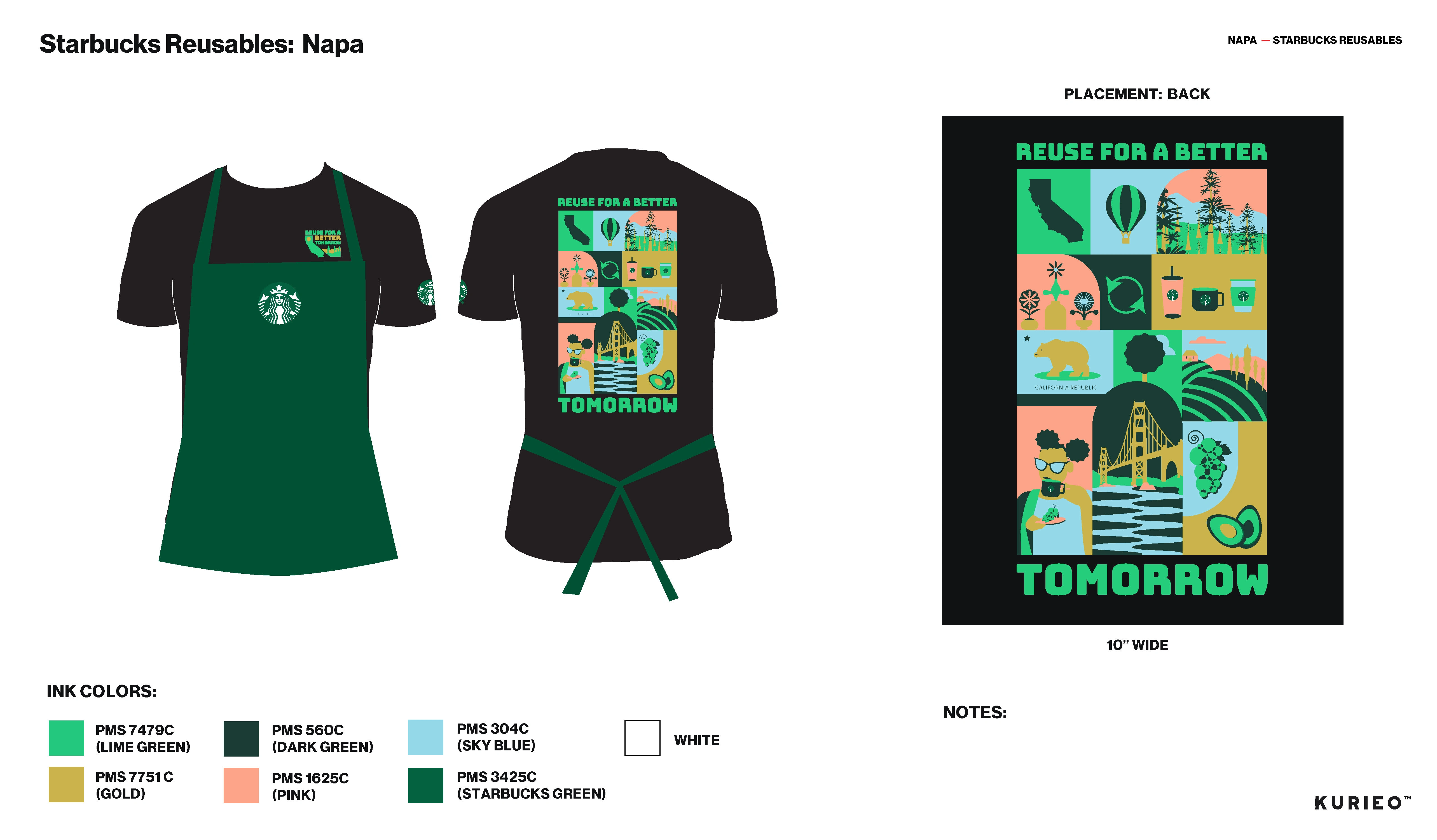
Napa Proof Sheet (T-Shirt Back)
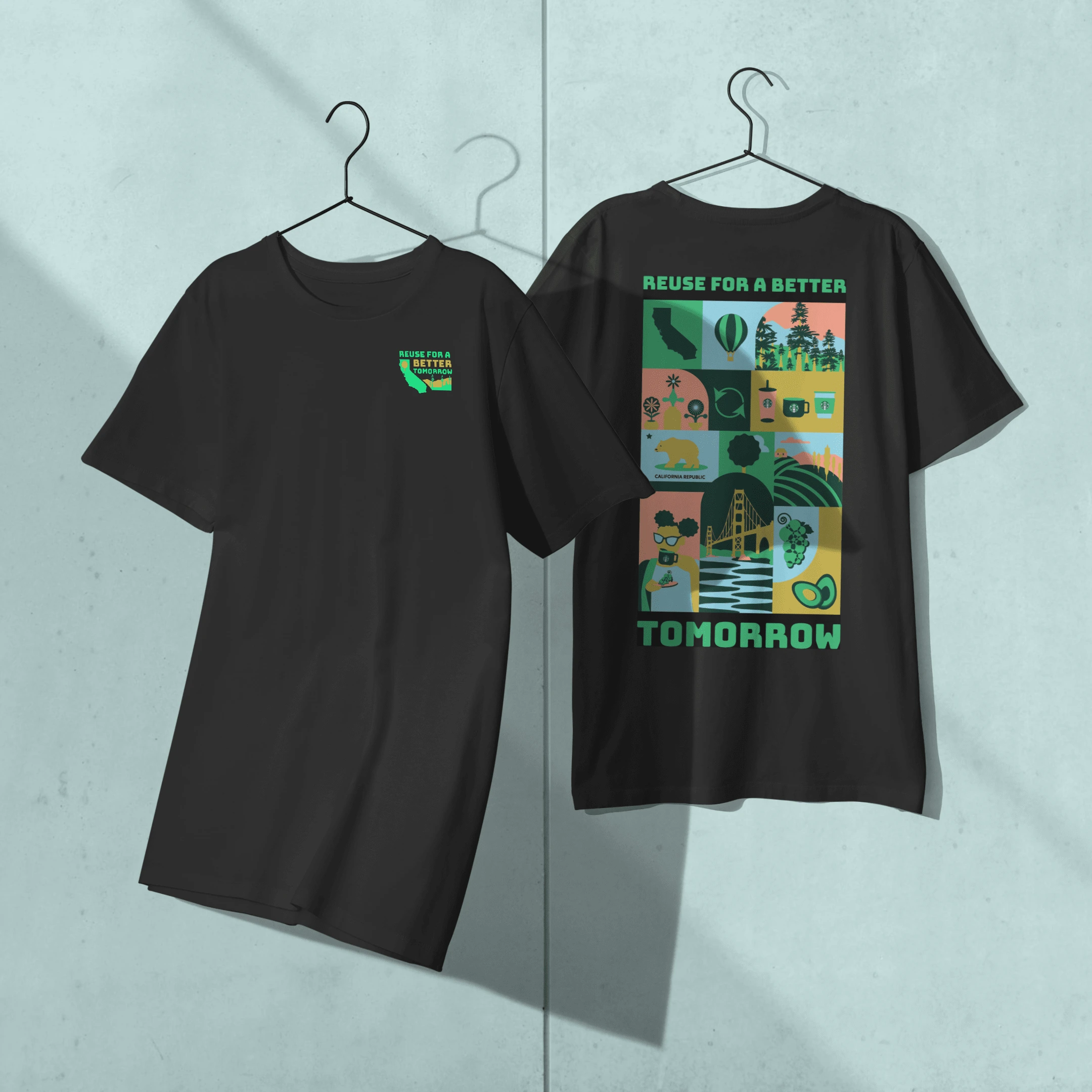
The front of the shirt features the tagline "Reuse for a better Tomorrow", as well as the outline of the state of California and a landscape to tie into the location and demographic. This design choice serves as a reminder of the natural beauty and rich history of Northern California. The back of the shirt is similar to a collage poster, using the graphic icons from the toolkit.

Napa Tumbler Artwork
Napa T-Shirt Back
Mockups
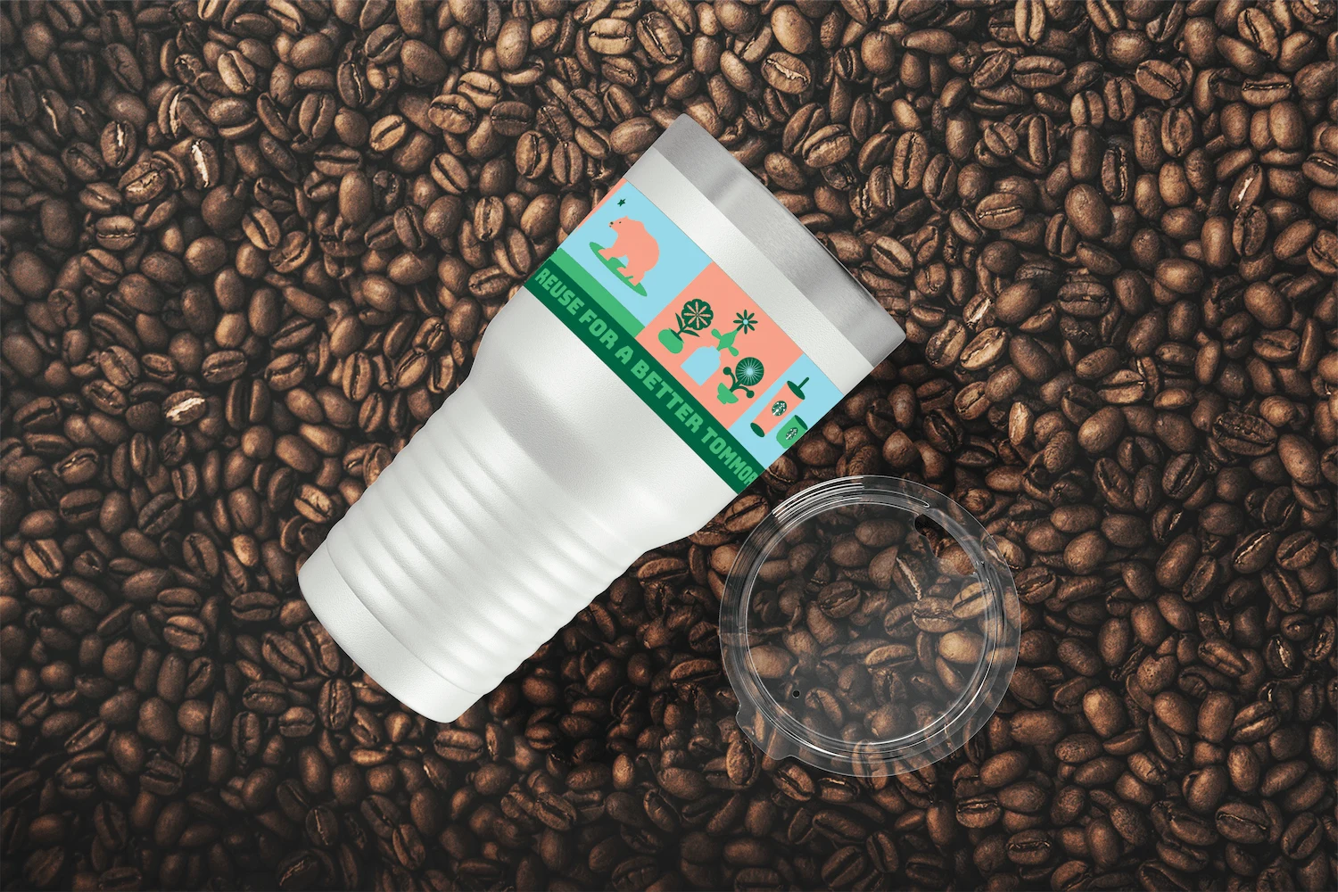
Arizona for Starbucks Reusables
After completing the designs for the Napa pilot, I learned that Starbucks wanted to test this in one of their Arizona locations. This gave me another opportunity to create new designs for Arizona, following the same process as I did for Napa. Following the success of the Napa test pilot I was able to apply the same strategy to create an extensive toolkit and designs for merchandise for the Arizona location.
Arizona Graphic Tool Kit
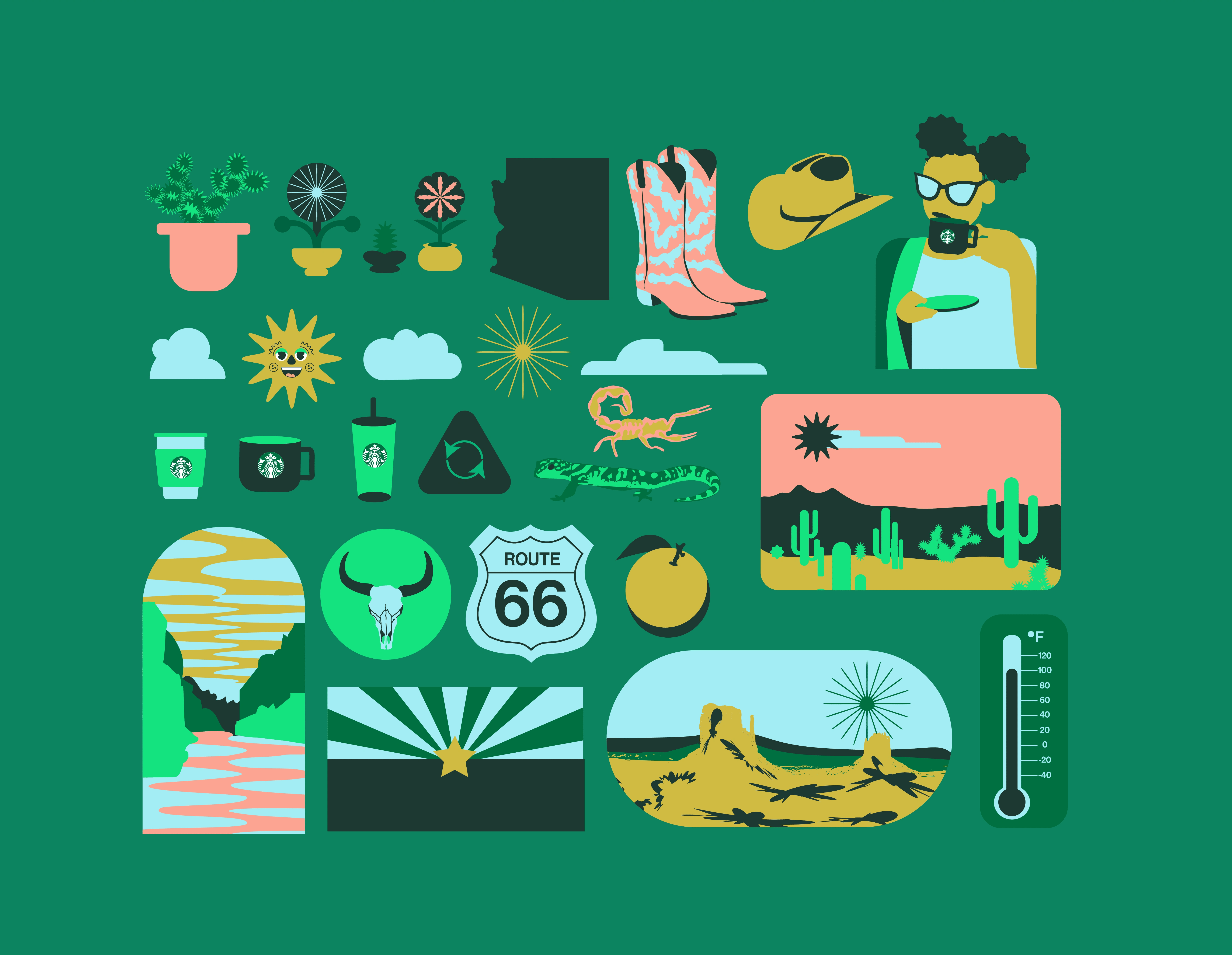
In order to capture the essence of Arizona, I included several graphics suchSedona red rocks, Rote 66, etc. The cacti symbolizes the states arid climate, while the grand Canyon represents one the states most iconic natural landmarks.
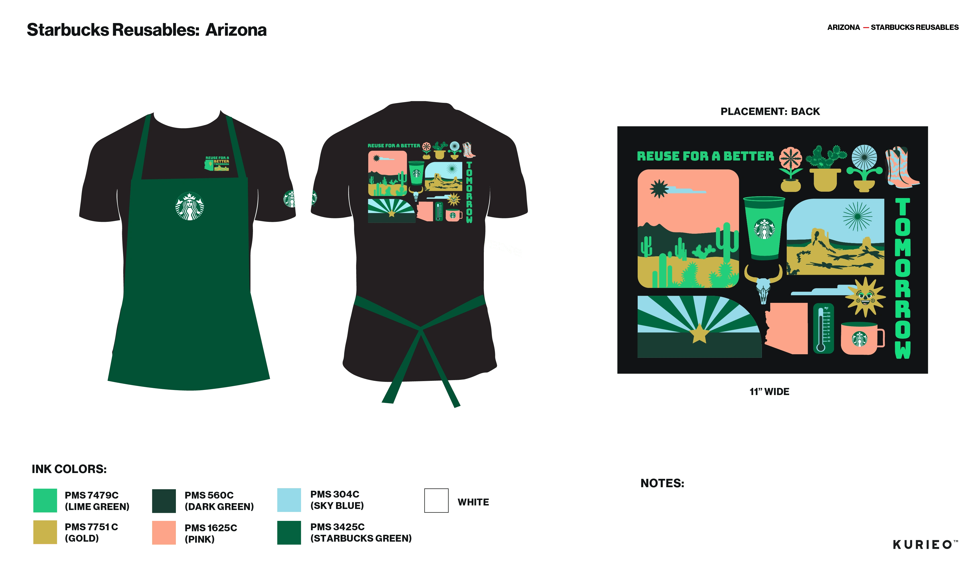
Arizona Proff Sheet (T-Shirt Back)
The design is a unique and innovative approach to showcasing the beauty of Arizona. The design's combination of bordered environmental illustrations and free-flowing icons work together seamlessly to form a cohesive and visually stunning final product.

Arizona Tumbler Artwork
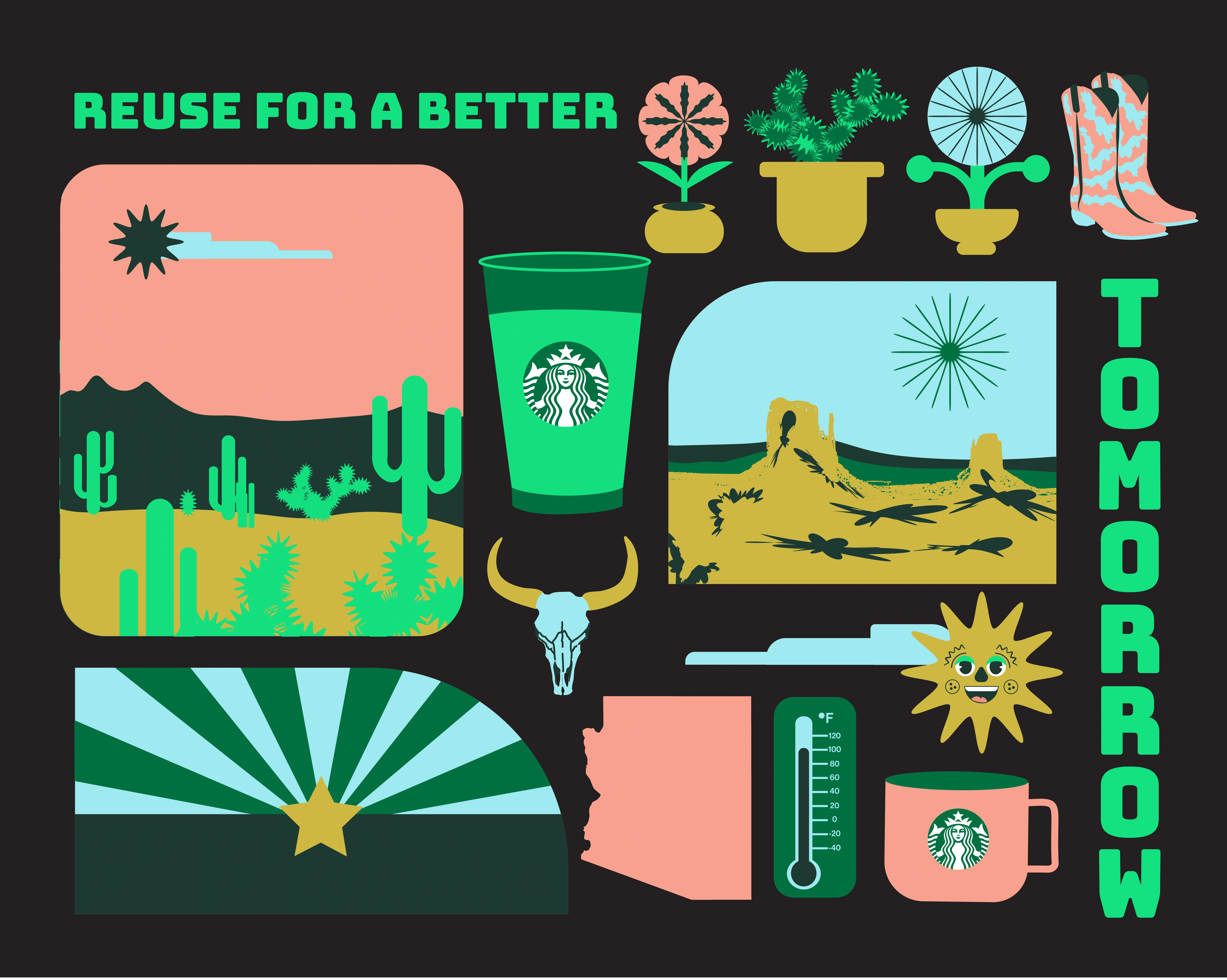
Arizona T-Shirt Artwork Back
Like this project
Posted Jan 19, 2024
This project is an initiative aimed at promoting eco-friendly practices through visually engaging merchandise.
