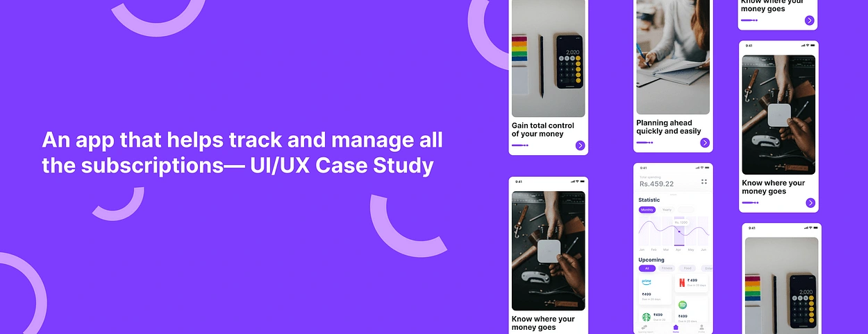
An app that helps track and manage all the subscriptions— UI/UX
In this case study, I will explain and take you through my process of designing the SubTrack app, which enables users to track and manage all their subscription.
Project Summary
Project type: Mobile App
This problem strongly resonates with me, as I still remember. It was a Monday morning, usual coffee in hand, when my phone buzzed with a notification, Rs. 599 charged for Amazon Prime. Panic surged through me. I hadn’t used Amazon in months! I scrambled through my bank statements, a familiar feeling washing over me — subscription overwhelm. Spotify I haven’t touched, kuku FM service I forgot to cancel, and now, Amazon — became a source of nagging anxiety.
This personal experience fueled my passion to make a difference in the lives of people who struggle with tracking and managing their subscriptions.
The Challenge
Today, we are all subscribed to many products/services like Netflix, Amazon Prime, Spotify etc. These platforms deduct money on a monthly/annual basis based on their users’ preferences.
Some users feel overwhelmed by the constant money getting debited out of their accounts without clearly being able to understand or acknowledge the transaction. Sometimes they don’t even require the service anymore
How might we help salaried individuals easily track and manage these subscriptions?
About the User 👥The user base for this project consists of salaried individuals, between the ages of 25 to 50 years old.With this version of the app, I want to give the users a really simple interface to easily track and keep a clear record of their subscription.
Empathy😇 & Problem 😖:
Like me, many salaried individuals, aged 25–50, juggle multiple subscriptions for entertainment, fitness, and convenience. But managing them is a chore. Lack of visibility, forgetfulness, and hidden costs lead to unwanted charges, financial strain, and frustration.
Interested to know how I approached the design of this app? Scroll down to learn more!
Research 🔍
While it would’ve been nice(and fun!) to get straight into Figma and start designing, I wanted to find some answers surrounding spendings and what people’s opinions of it were. Thus I started my research.

1. How common is the problem of uncontrolled subscription spending among salaried individuals in India?
India’s internet penetration has skyrocketed, with over 800 million users as of 2023
This translates to a larger pool of individuals susceptible to subscription services. India’s subscription market is expected to reach $100 billion by 2025, reflecting a significant increase in subscription adoption.
News articles and personal anecdotes highlight the growing issue of uncontrolled subscription spending, indicating a rise in its prevalence.
A 2023 report by Razorpay suggests that Indians have an average of 3.4 active subscriptions, with 20% of respondents admitting to forgetting about some.
Several articles in Indian publications like The Economic Times and Moneycontrol discuss the growing problem of subscription fatigue and hidden costs.
2. What are the most significant pain points users face while managing their subscriptions?
Based on research and user feedback, some of the most significant pain points people face while managing subscriptions include:
Users often forget about inactive subscriptions, leading to unintended charges.
Hidden fees and automatic renewals: Surprises like tax, additional charges, and automatic renewals can lead to budget overruns.
Confusing interfaces and hidden cancellation options create frustration and prevent users from easily unsubscribing.
Juggling different billing cycles, interfaces, and logins across multiple service providers can be overwhelming.
3. What types of subscriptions do users commonly struggle with (e.g., entertainment, fitness, financial services)?
Streaming platforms, music streaming, Netflix, Gym memberships, workout apps, fitness trackers, food delivery subscriptions, grocery delivery memberships, Spotify, e-books, etc. Users often oversubscribe due to free trials and forget to cancel, leading to unnecessary spending.
Source (the data has been taken from many resources, I have just mentioned one over here to support my research)
Competitor analysis 🥷🏻
Track.in: Offers subscription tracking, budgeting tools, and bill reminders. Focuses on a clean interface and data visualization.
Strengths: Clean design, data visualization, good user reviews.
Weaknesses: Lack of advanced features, limited budgeting tools, no focuse upon subscriptions.
Moneyfront: Similar features to Track.in, with additional expense categorization and spending insights not much focusing upon subscriptions. Targets young professionals.
Strengths: Advanced features, spending insights, targeted audience.
Weaknesses: May be overwhelming for non-tech-savvy users, premium pricing.
RupeeTrack: More basic features, focused on subscription tracking and cancellation. Caters to a budget-conscious audience.
Strengths: Simple interface, affordable, cancellation focus.
Weaknesses: Limited features, lack of financial insights.
CRED: Gaining traction by offering subscription management alongside bill payments and credit card rewards. Leverages existing user base.
Strengths: Existing user base, loyalty program integration, brand recognition.
Weaknesses: Subscription management still in beta, focus on credit cards might overshadow other features.
Research Insights 🧠
To sum up my research, here’s all the important information that would benefit the rest of the design.
We need a simple and intuitive interface to address forgetfulness and complexity.
Juggling multiple providers and logins is time-consuming and confusing.
Difficult navigation and cancellation processes discourage users from unsubscribing.
Existing apps like Track.in and Moneyfront offer budget tracking and data visualization, but lack focus on subscriptions.
User Base 👥
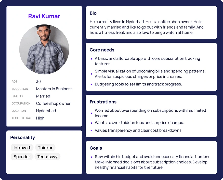
On the basis of my understanding, primarily through secondary research, I built my personas around 2 different kinds of people.

Information Architecture 📐
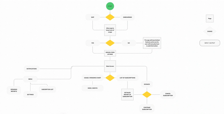
Since my goal was to create an MVP version of the app, I wanted the app to be as simple and intuitive as possible. Here’s a visual representation of the IA that I came up with:
Wireframing ✏️
After information architecture came wireframing. After going through a lot of iterations, I finally came up with something that was satisfactory.
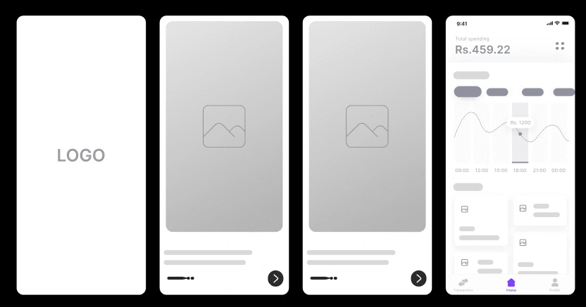
While I did end up doing a lot if iterations during this stage, it was done fairly quickly because I had the structure of the information decided upon with my IA.
Visual Design 📱
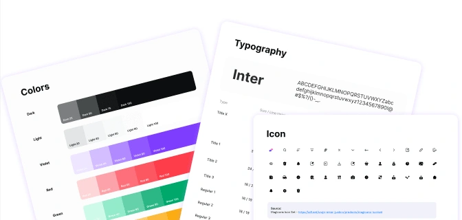
1. Onboarding
The onboarding process of SubTrack aims to provide a seamless and engaging experience for new users. It effectively introduces them to the app’s features and highlights the importance of tracking and managing these subscriptions.
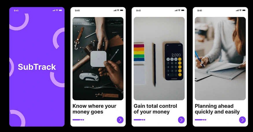
Design thinking around Onboarding
Don’t do information overload.
Use of classic three — swipe onboarding screens.
Scanning your phone
When you use Subtrack for the first time, it will automatically scan your phone and gather a list of applications and media that you are currently subscribed to. You can simply just add whatever else you are subscribed to as well.
Homescreen at a glance
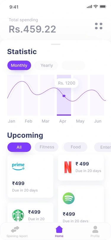
The SubTrack app’s homepage prioritizes simplicity and clarity, addressing user pain points identified in research. Inspired by research showing forgetfulness and a desire for easy cancellation, the home screen features a prominent “Active Subscriptions” list and a spending graph, showcasing key details like logos, prices, and renewal dates. This readily available information empowers users to quickly gauge their spending and identify potential cancellations.
To address the pain point of juggling multiple providers, the homepage offers quick access to popular categories like entertainment, fitness, and food delivery. This categorization helps users navigate their subscriptions efficiently and avoid the overwhelming feeling of managing diverse services.
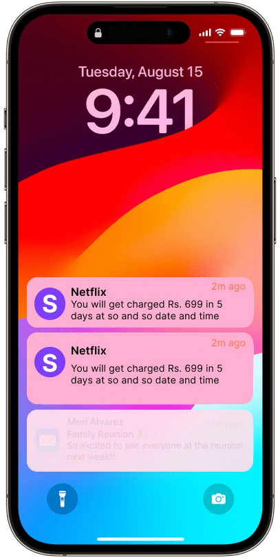
Remind Me.
You don’t have to be afraid of forgetting your payment dates. Rely on us to remind you about your repayment date in advance.
Overall, the SubTrack reflects a data-driven design approach informed by user research. It prioritizes transparency, accessibility, and efficiency, aiming to empower users to take control of their subscriptions and reduce financial strain.
I understand the iterative nature of the UX process that is always room for improvement. Even the most successful designs can be refined and made even better through user testing and feedback. The UX design process is never truly finished. It’s an iterative cycle of research, design, testing, and refinement. Even the best designs can benefit from improvements, and there are always other approaches to consider.
Learnings and insights👀
Broadening your research scope allows for more flexibility in narrowing down potential solutions during the design process.
The design process is not always linear and typically involves iterative cycles between different stages.
It’s crucial to always be mindful of project deadlines when making design decisions.
Aaannd That’s A Wrap🙌
Thank you for taking the time to read this through. I am still learning in design, so I know that there is a lot of room for improvement. Feedbacks are much welcome!
Like this project
Posted Feb 7, 2024
In this case study, I will explain and take you through my process of designing the SubTrack app, which enables users to track and manage all their subscription
Likes
0
Views
20


