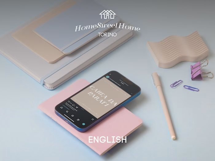
HomeSweetHome Torino Remake (ENG)
Melania Carta
Logo
After talking with Barbara, co-owner of HomeSweetHome Torino, I began redesigning the logo for the Interior Design & Home Staging studio. I chose to retain the original colors (#2ca2ae and #ffffff) that have been integral to the brand identity from the beginning. The logotype follows the curvature of the typical round profile picture on Instagram, and the font I selected aligns with the shabby-chic style of interior design that the studio commonly offers.

Logo
Feed
For the Instagram layout, I curated a collection of pictures that conveyed a more "modern" style of interior design. I alternated between showcasing interior spaces and sharing inspirational quotes, while also striving to create a cohesive color scheme throughout the feed. Additionally, I revamped the logos for the Highlights section and simplified the bio to draw attention to the website.
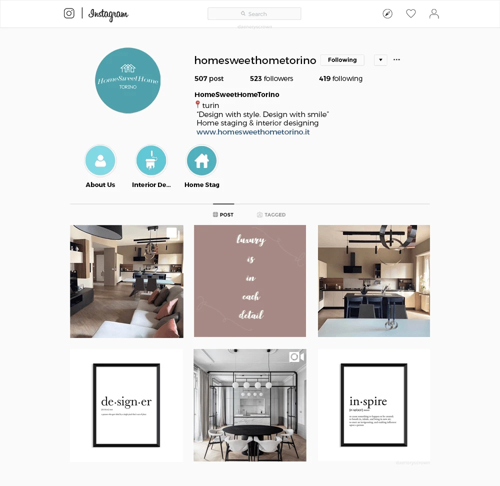
Instagram feed
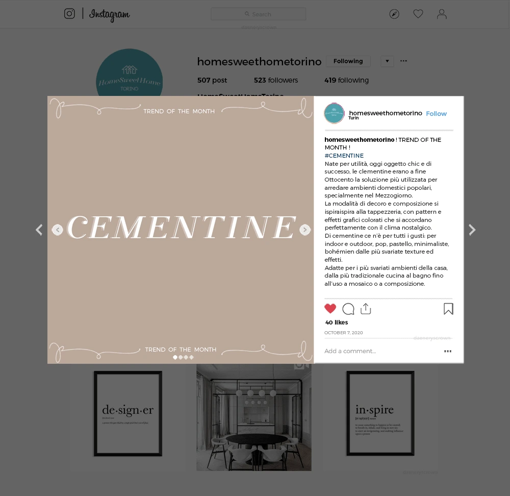
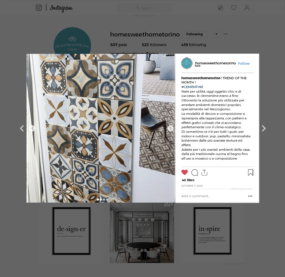
Trend of the month
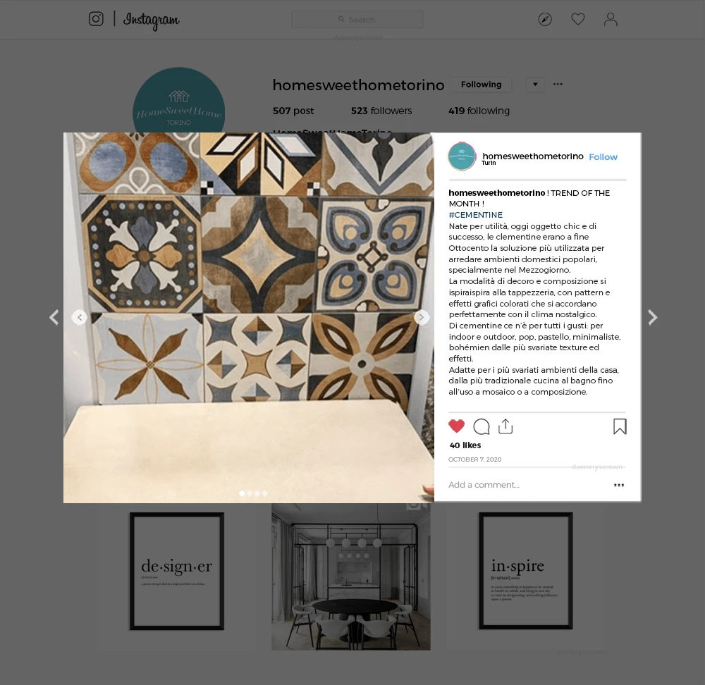
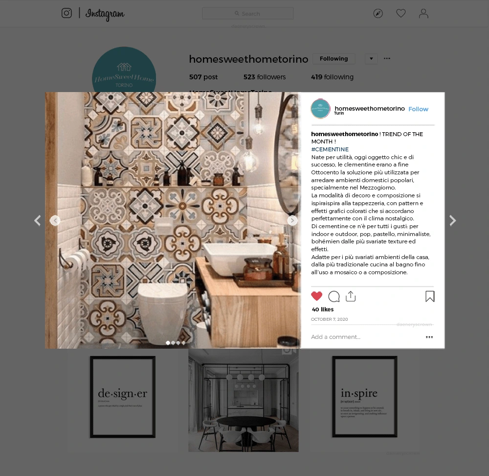
To engage our followers, I proposed a monthly posting strategy that focuses on sharing informative content about various home design techniques and transformations. One of the topics I suggested is the use of "cementine," a type of decorative tile that HomeSweetHome has successfully utilized in numerous bathroom and kitchen renovations. By highlighting this specific element and showcasing its versatility, we can provide valuable insights and inspire our audience to explore creative possibilities for their own homes.
#1
#2
#3
#4
After presenting this modest yet focused mock-up, the studio was impressed by my ideas and execution, and they offered me the opportunity to undertake my curricular internship with them. We collaborated for four months, and the results were excellent from both perspectives.
Like this project
Posted May 20, 2023
Mock-up Instagram remake for an Interior Design & Home Staging studio