Bookspace - Book Organization App
Robyn Fiorda
Overview
Problem
Avid readers need an easy way to track everything they own, books they have read, what they will read next, and also everything they have loved so far. Bookspace wants to give a more user-centric approach to their app, adding features and flows that make it delightful for people to use.
Objectives
Design Bookspace’s mobile application.
Design the Bookspace brand.
Competitive Analysis
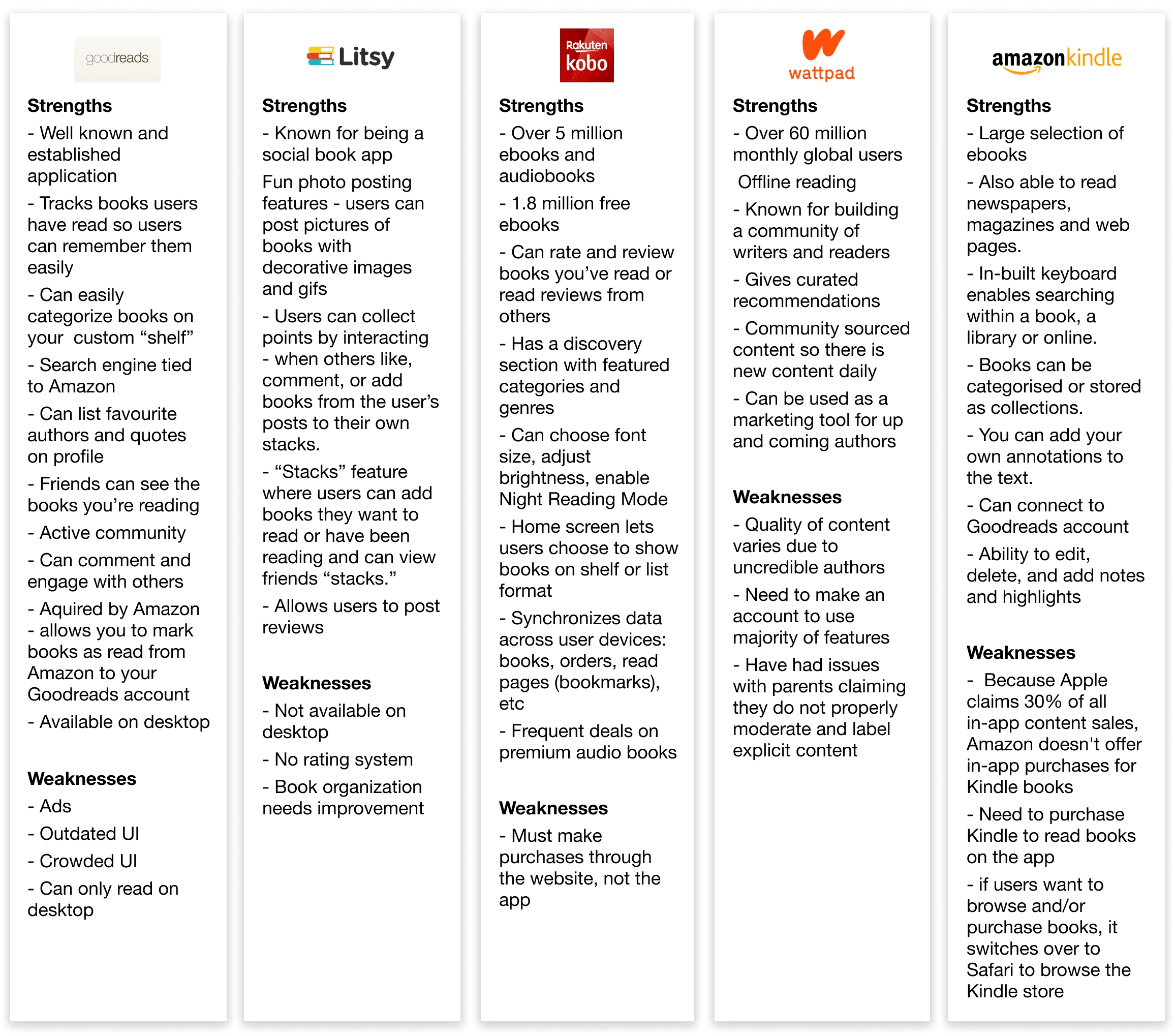
Conducting a competitive analysis allowed me to see what was working in the market, and where there’s areas for improvement. While some features were similar, I could see how each competitor differentiated itself from the next. Litsy is known for their social features, and Kobo is primarily an ereader. Indirect competitors like Wattpad focus on community contributed content, and Amazon Kindle offers a wide variety of content through their ereading services. While direct competitor Goodreads is an established cataloguing app for books, the UI is outdated and lacks the user centric focus Bookspace aims to have.
Empathy Map
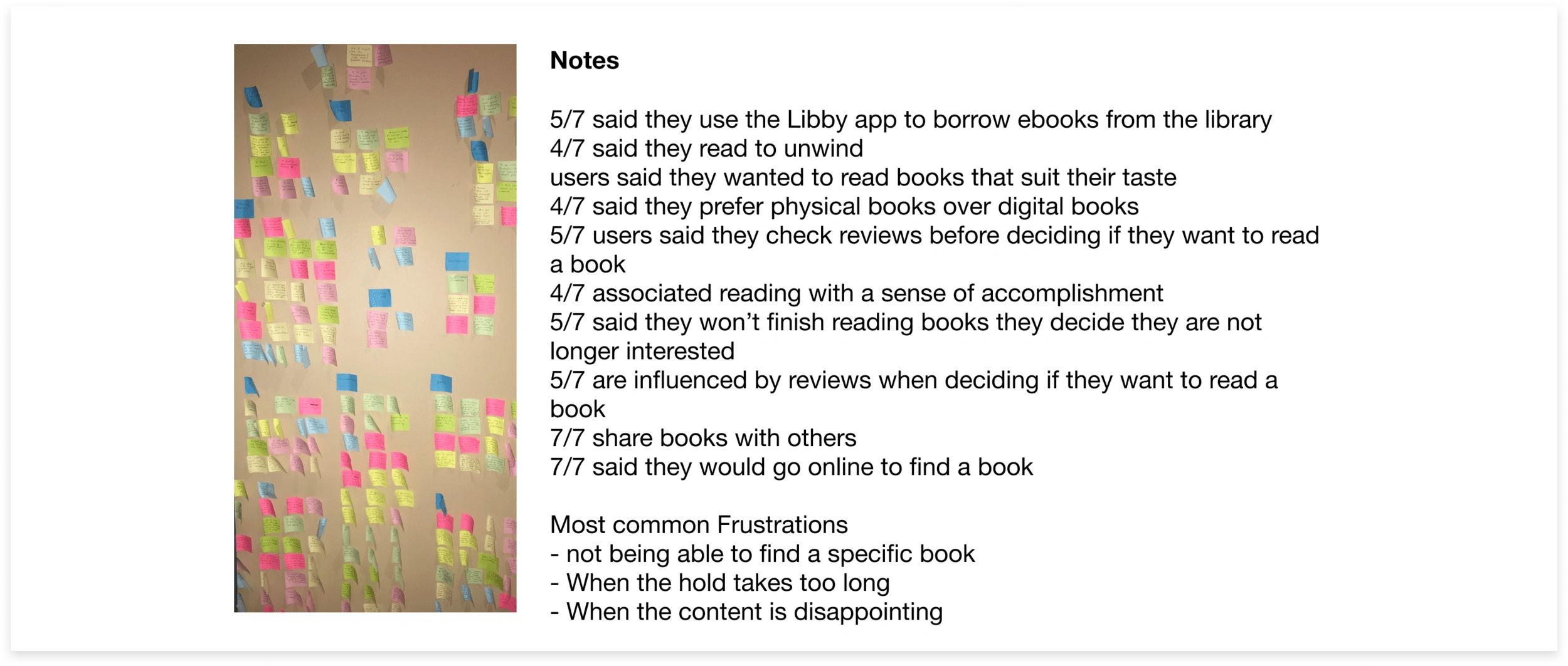
From my empathy map clusterings, these 1-1 insights and needs were uncovered:
Insights
Users want to discuss the books they are reading.
Users rely on other people’s opinions to find books to read.
Users want to find books that suit their interests.
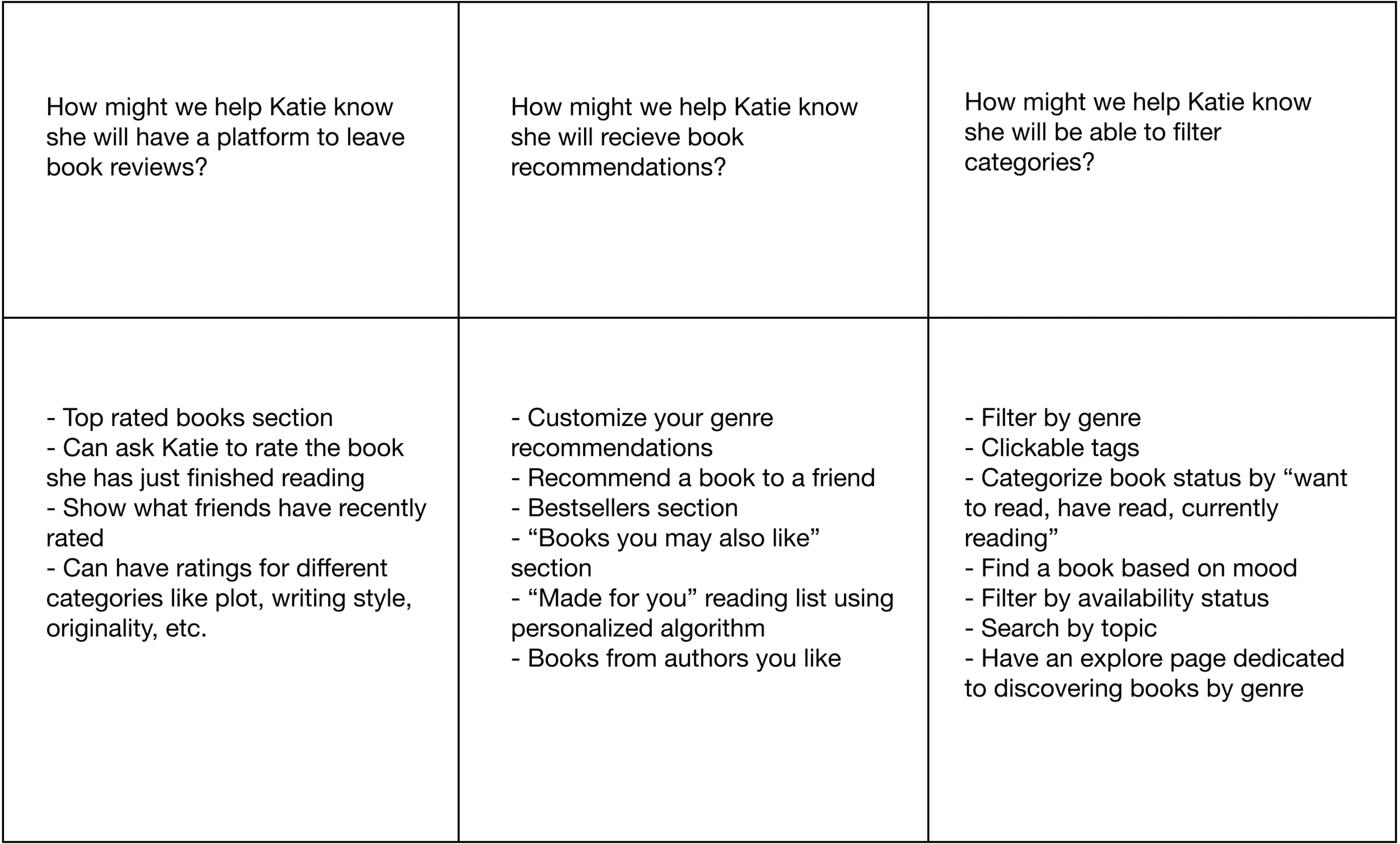
Needs
Users need to know they will have a platform to leave book reviews.
Users need to know they will recieve book recommendations that align with their tastes.
Users need to know they will be able to filter categories to find what they are looking for.
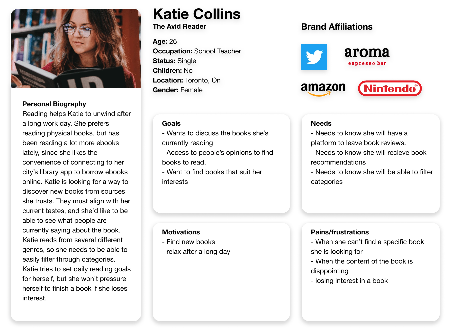
User Persona
After learning what motivated, frustrated and delighted readers through user interviews, I used my qualitative research as well as market research to create “Katie.” Katie is a persona who represents the majority of users. She is female, between the target demographic ages of 18-35, has frustrations that were expressed by the majority of users during user interviews, and has the goals and needs uncovered from synthesizing the empathy map. Humanizing the data and compiling it into one persona was helpful to remind me who I was designing for.
Individual Brainstorm
I wanted to get my own ideas out, so I sat down and had an individual brainstorming session. originally done using a mind-mapping technique, I focused on getting out as many ideas as possible. I then identified some of the more feasible ideas. I kept these potential solutions in mind, and brought some of them to life during the define stages of the design process.
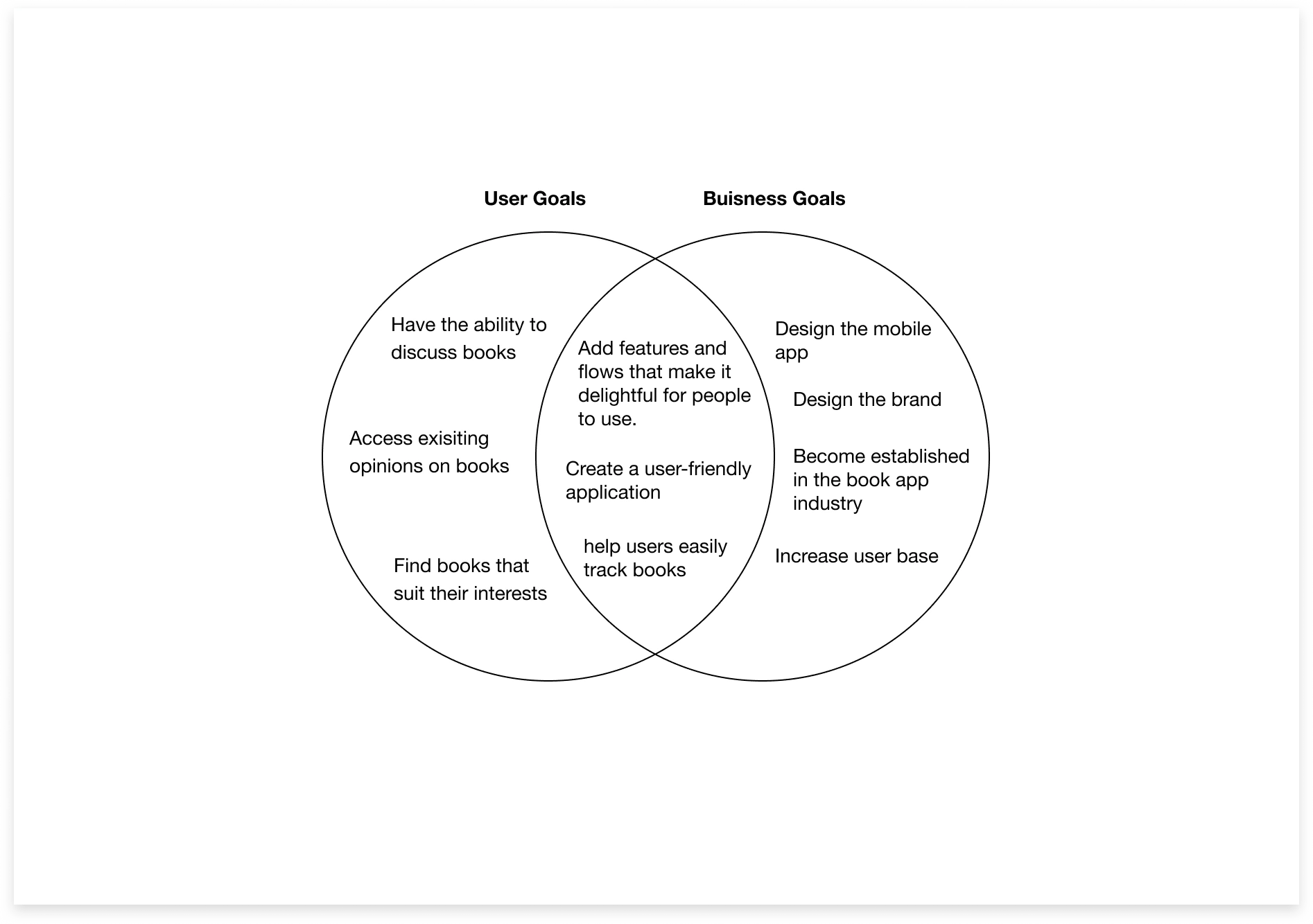
Project Goals
After brainstorming, I had generated possible solutions for Katie, but needed to assess which solutions aligned with the the right goals. In order to design features that were in the interest of both the user and the business, I defined the user goals based on the goals from my persona Katie, business goals from the project brief, and took into account technical considerations. I could then focus my project on the goals that overlapped with all parties.
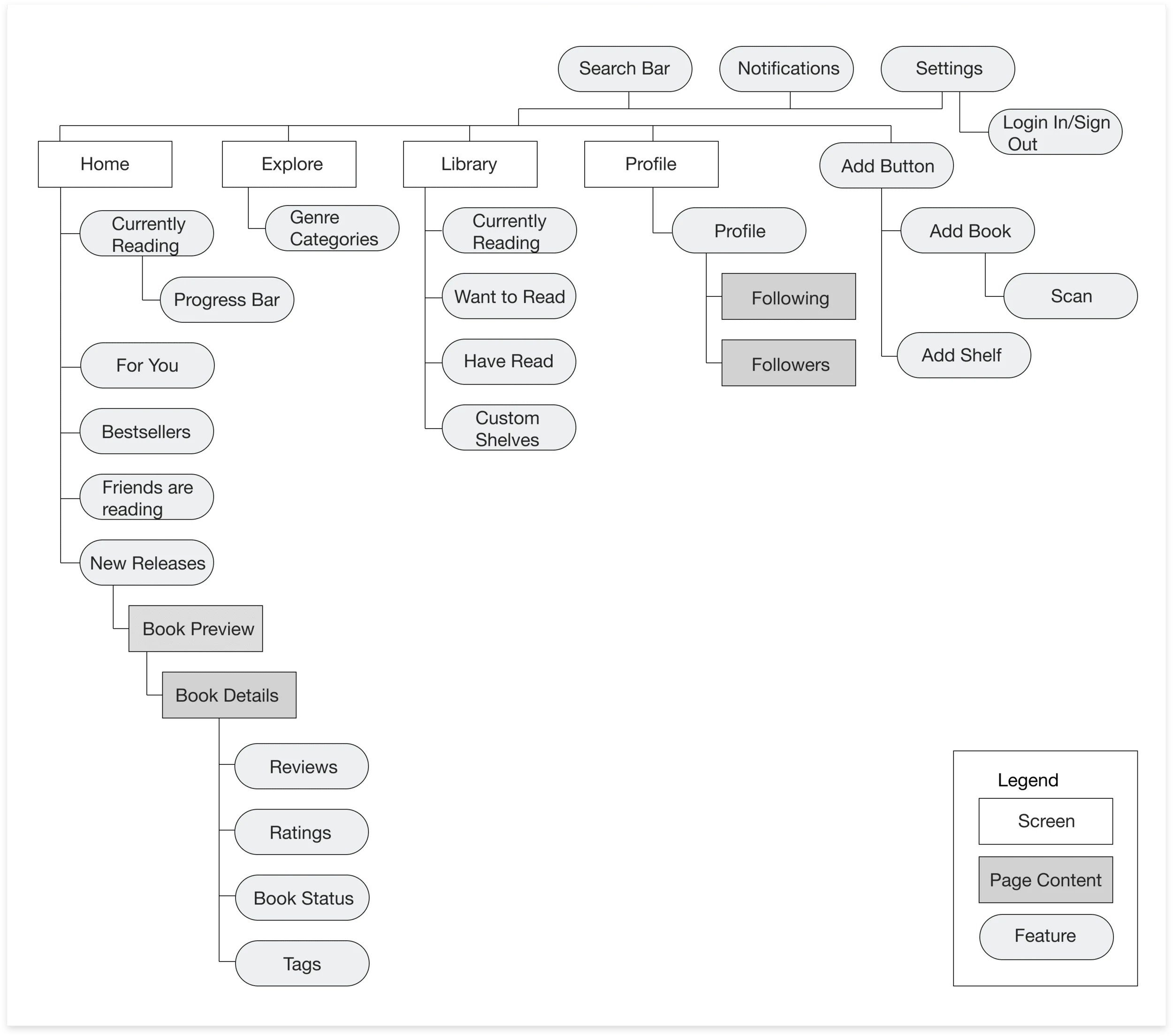
Site Map
I created this site map after referencing how information is organized from competitors, and thinking about what place would make logical sense for Katie to find the features she needed to use. I decided on four main screens in the navigation - home, search/explore, library, and profile. To add books and shelves, I would create an add button, referencing a design pattern I had found. A main feature of the app, this would be a global feature that Katie could easily access from whichever screen she happened to be on.
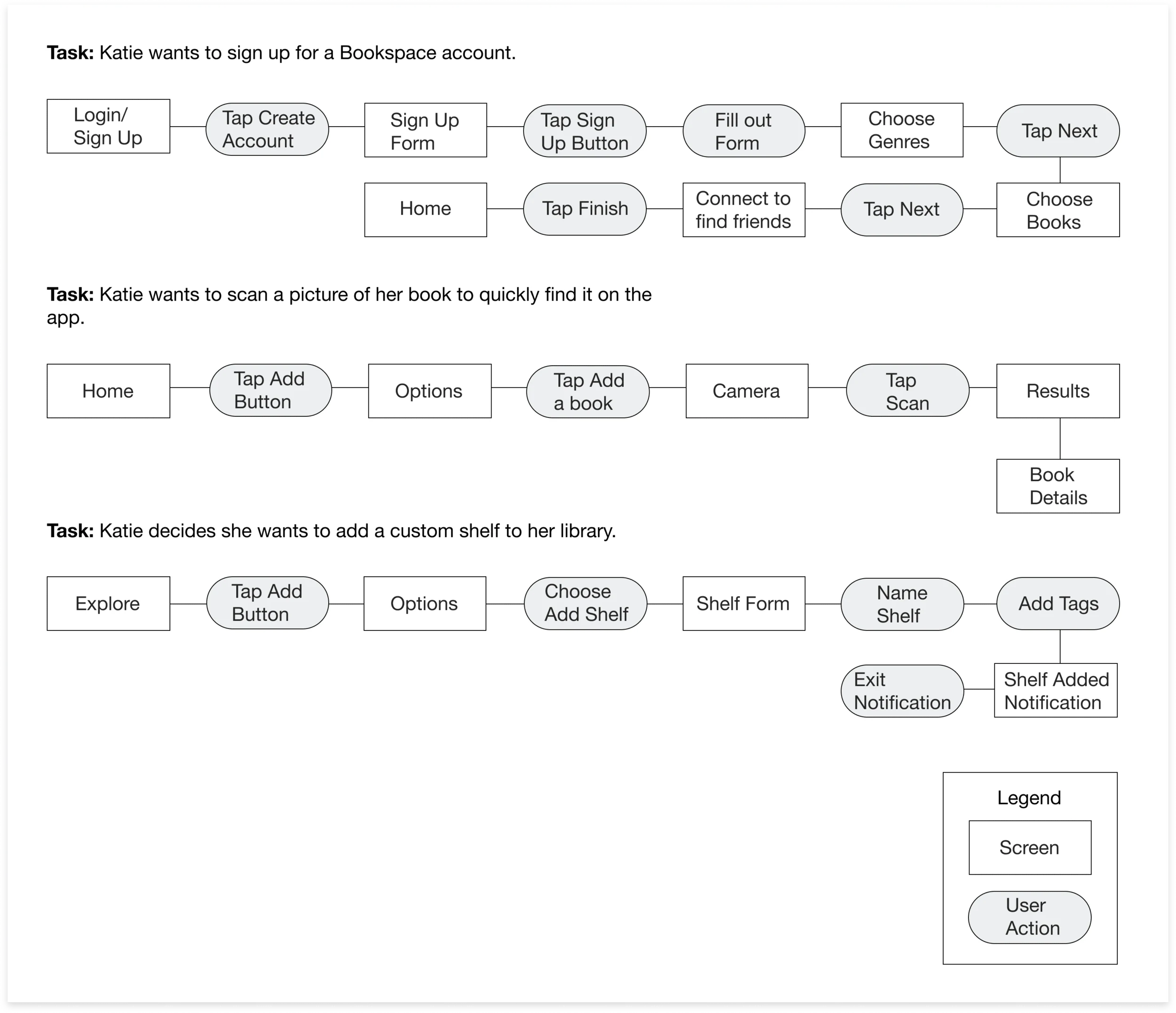
Task Flows
I created task flows to identify the path Katie would take to complete tasks while on the application. I gave her common tasks from different starting points so I could think through the screens and steps required to complete them.
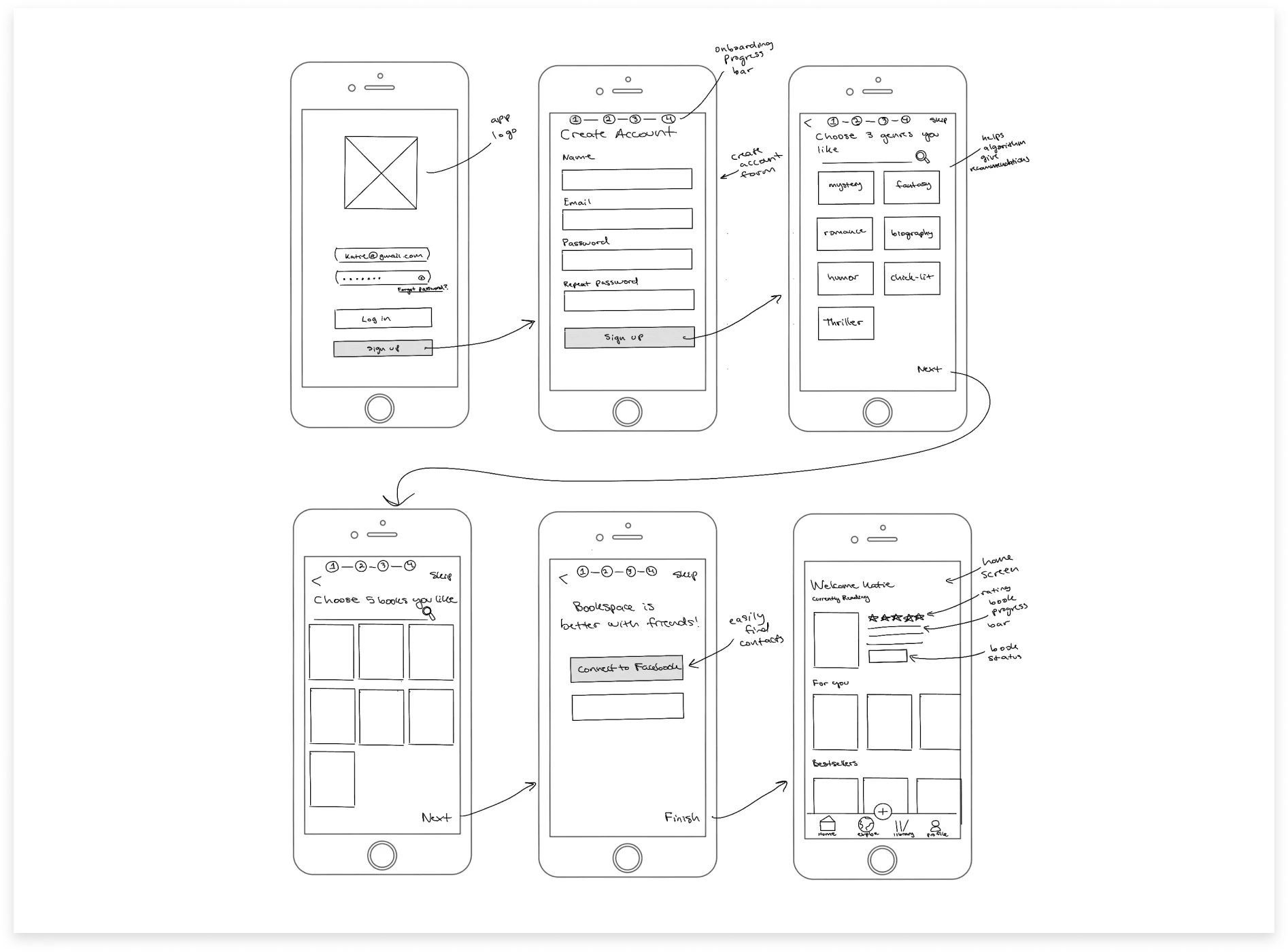
Sketches
I began sketching my low fidelity screens to create a visual aid for where elements would be laid out on the screens. In this stage, I referenced design patterns and design websites for inspiration. I also needed to make sure each screen had the elements needed for the functionality to complete the flows I had previously defined.
Visual Design
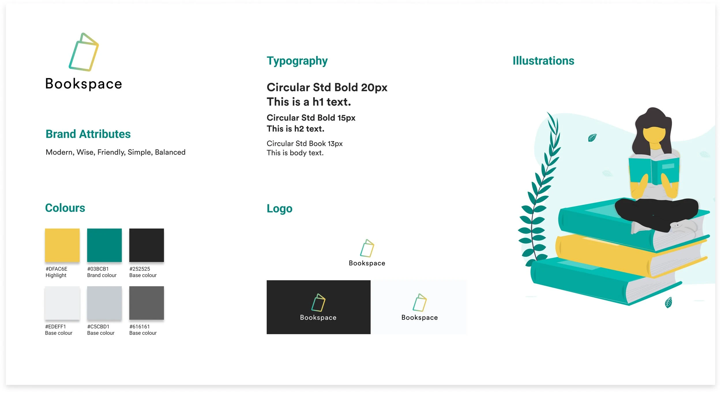
Mood Board
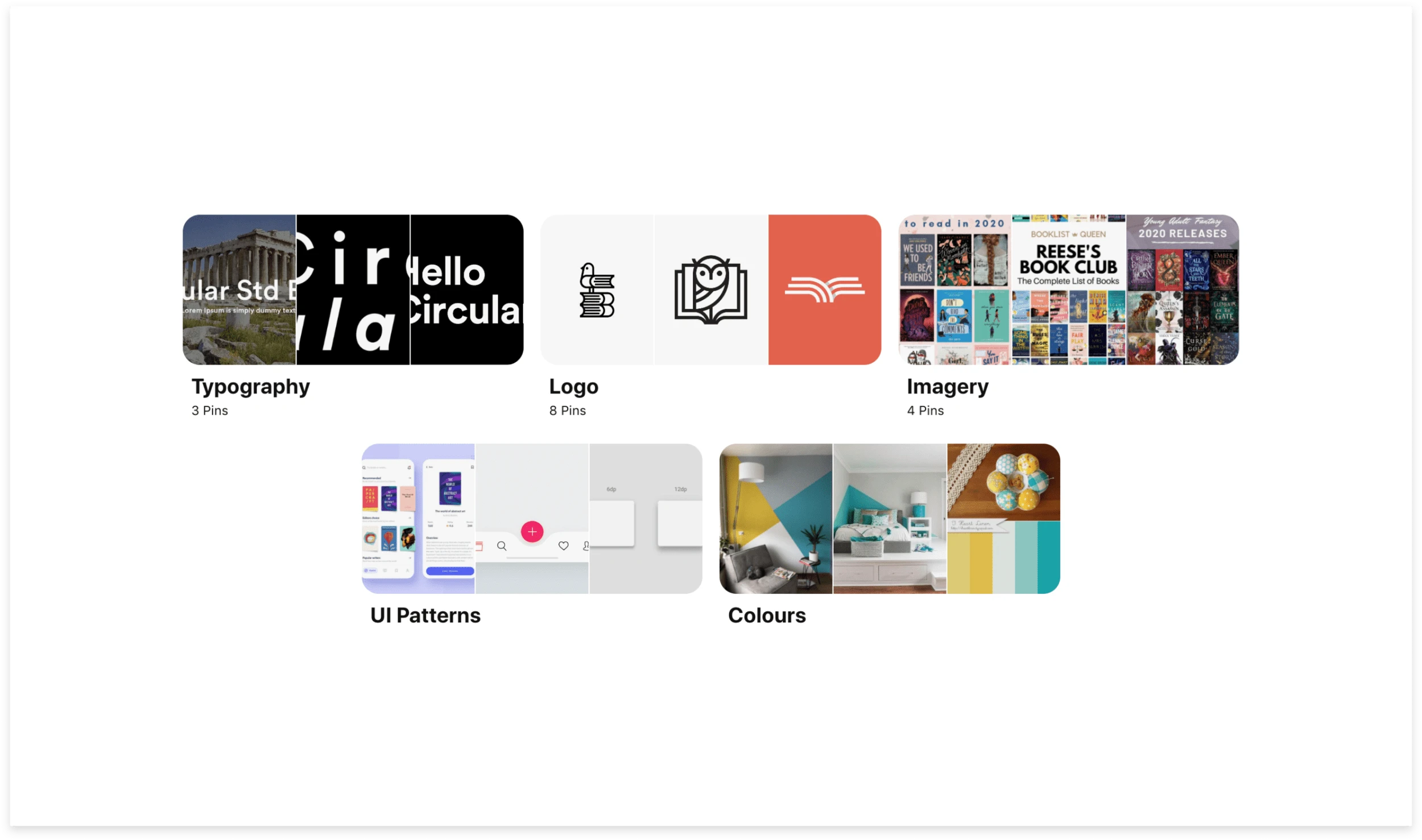
Since Bookspace was a new app and business, I needed to define its brand. I first define the brand attributes - modern, friendly, wise, simple, balanced. I used Pinterest to source logo, typography, colours, and UI inspiration that aligned with the attributes.
Style Tile
After sketching and vectorizing ideas, I came up with a final logo. I compiled the final elements and created a style tile I could refer back to when implementing the visual design.
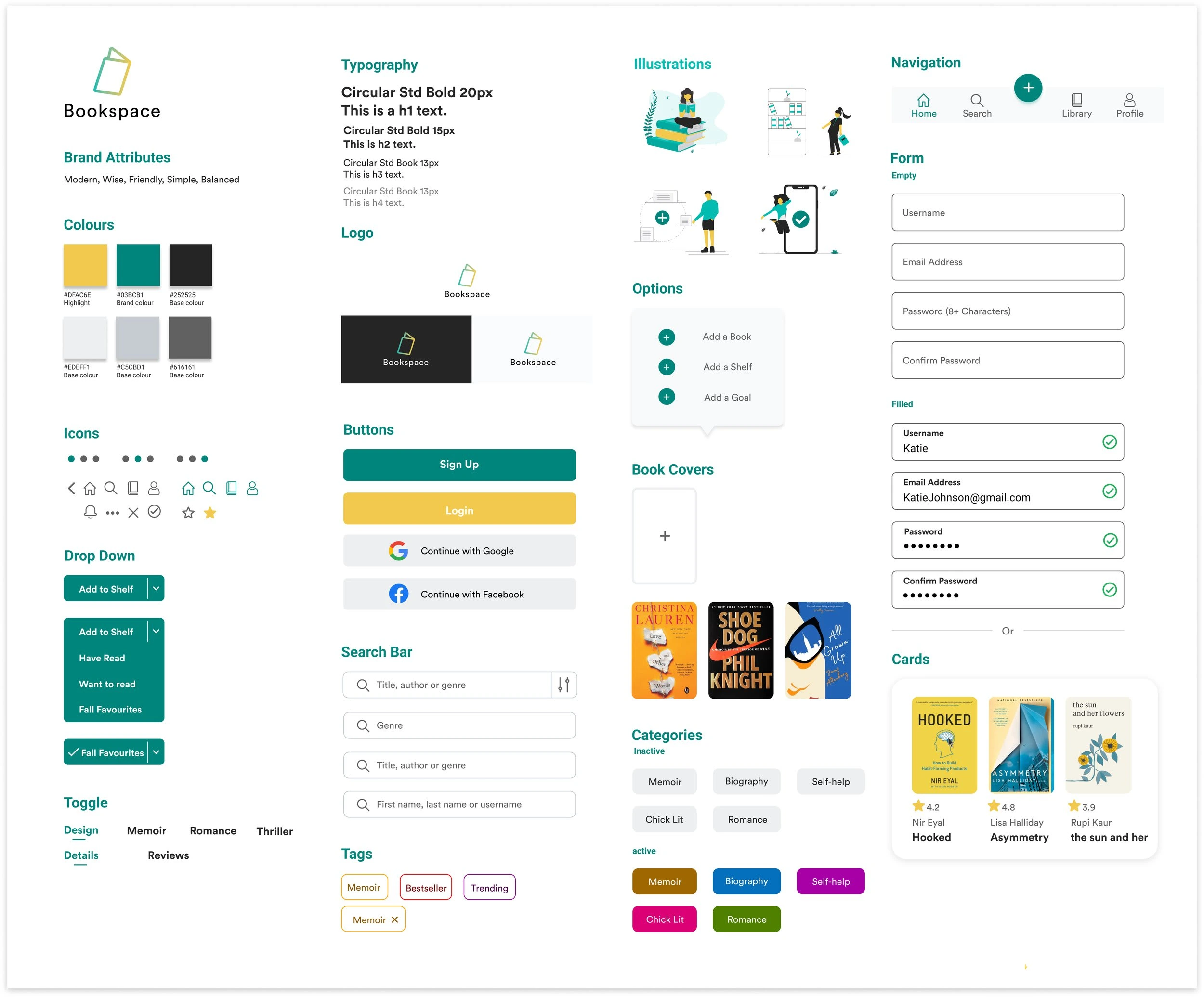
UI Kit
The UI Kit was updated throughout the project as UI elements and components were created and used in the design. Elements like icons, buttons and cards were created using Figma or sourced from material design.
Mid Fidelity Wireframes
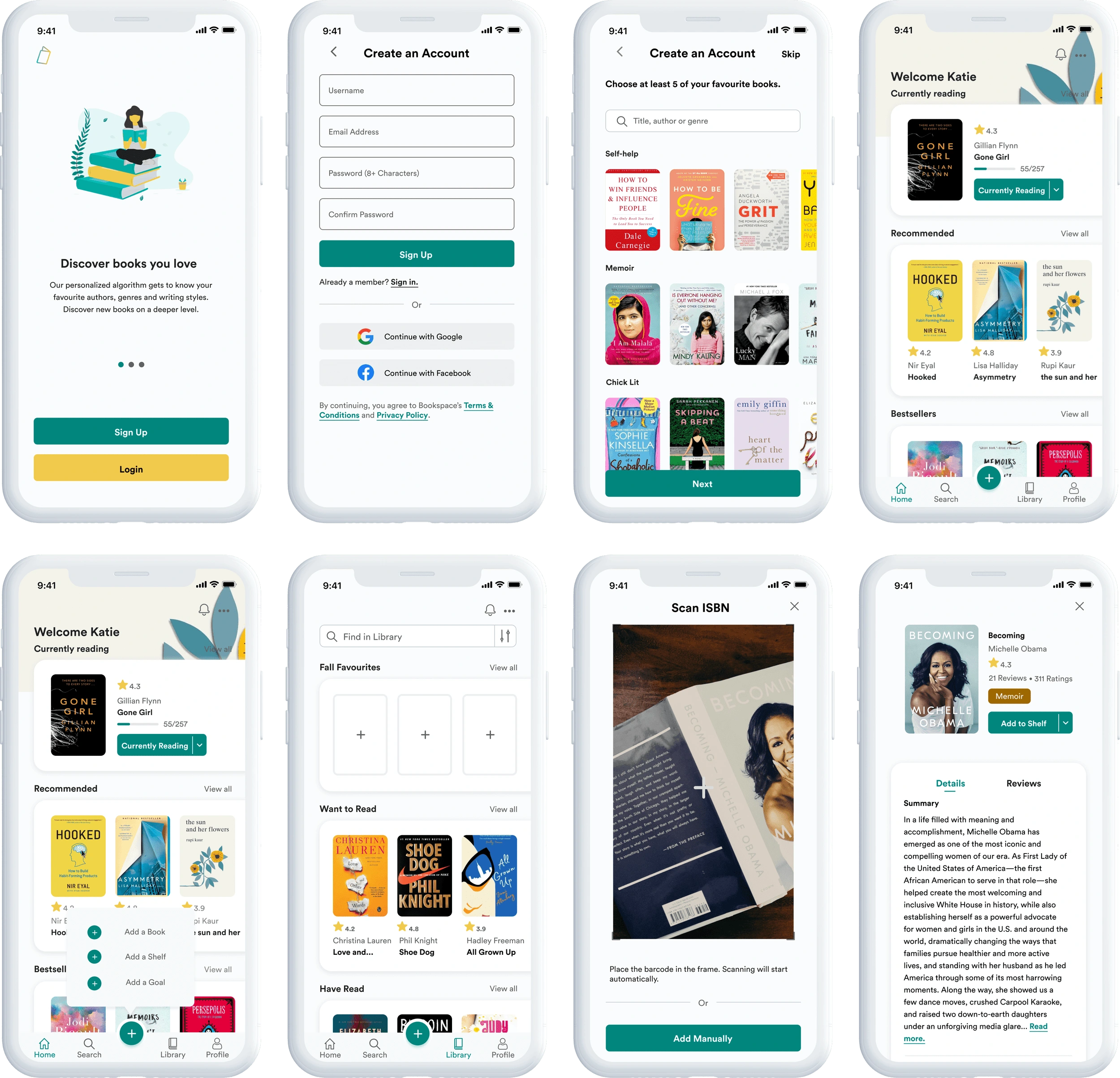
Referring back to my low fidelity sketches and my user flows, I created mid fidelity wireframes of application. I created these wireframes and the prototype using Figma so I could test the design with users.
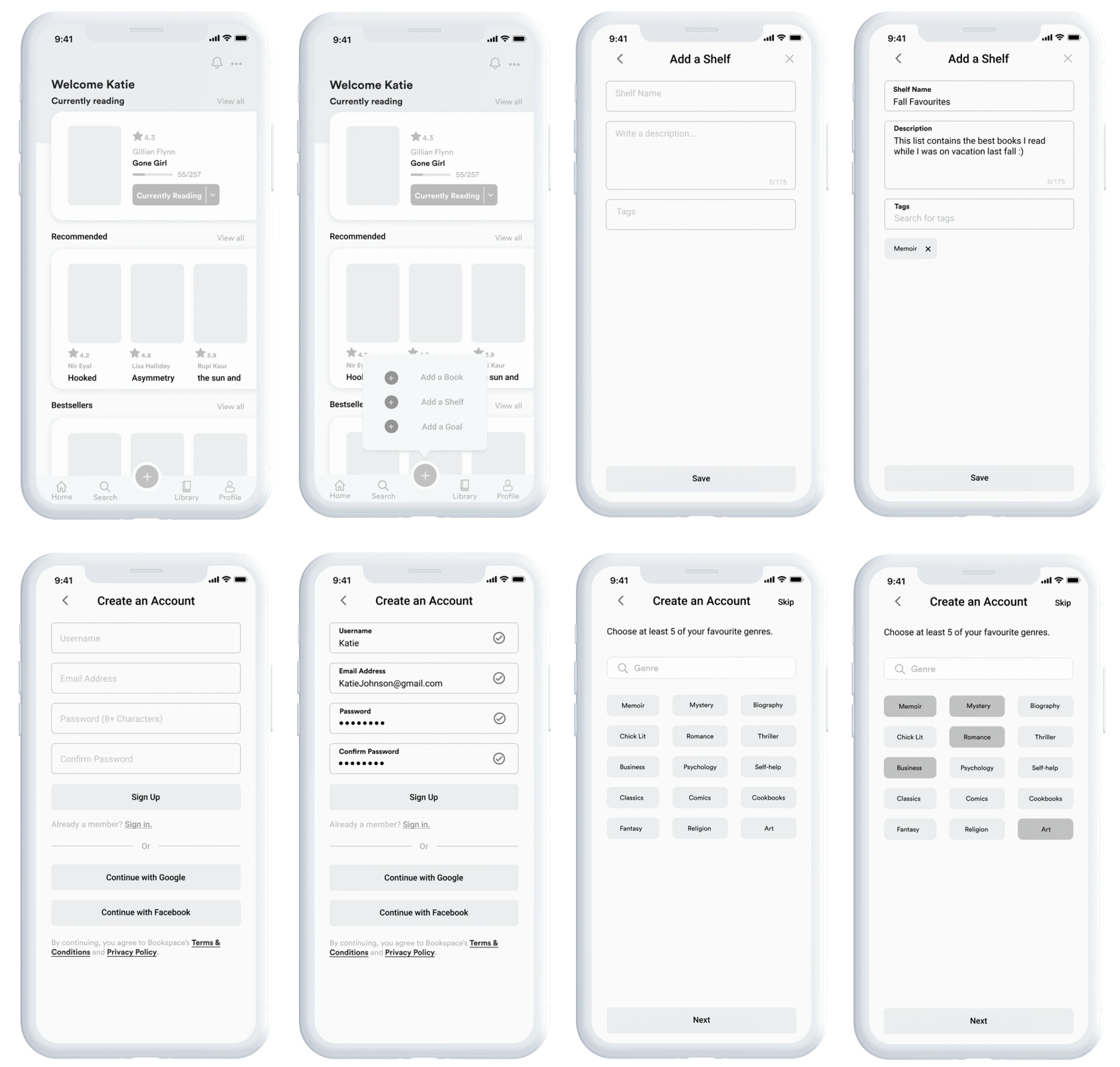
Prototype
I tested the mid-fidelity prototype with 5 participants so I could identify areas for improvement. I observed how easily participants could complete the tasks, how efficiently they could find what they were looking for, and any areas of confusion or hesitation while completing these tasks:
Task 1: Sign up for a Bookspace account.
Task 2: Create a new shelf called “Fall Favourites.”
Task 3: Add a book.
Task 4: Add the book to the “Fall Favourites” shelf.
Usability Test Findings
After interviewing, I created an affinity map to synthesize my research and find patterns in how users interacted with the prototype.
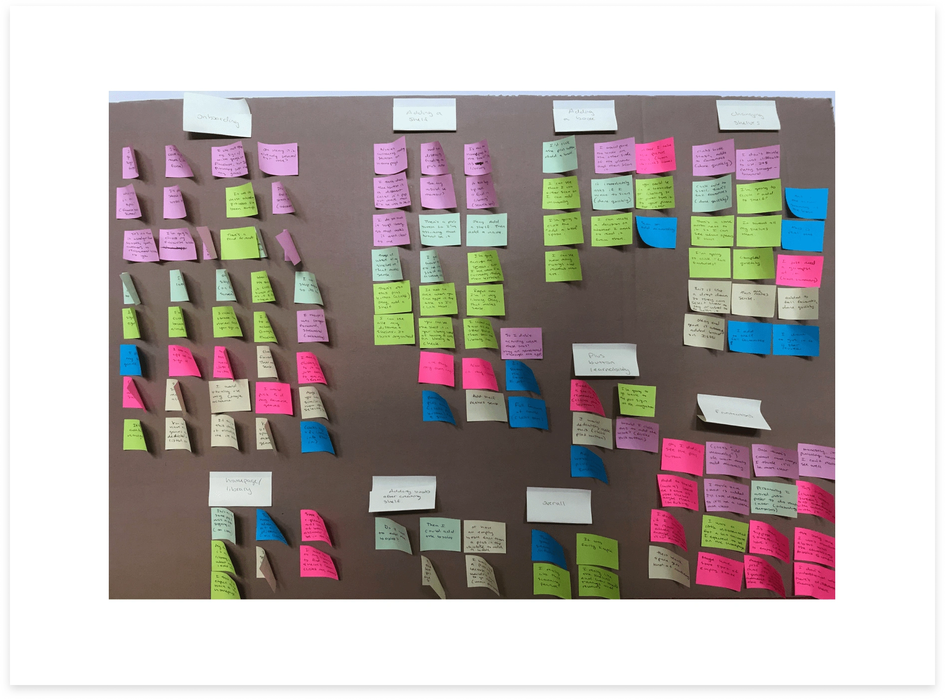
Successes:
6/6 found the app easy to navigate overall.
6/6 Participants remembered the plus button had a “add a book” option when given the third task.
3/6 expressed that the prototype lacking colour and images contributed to the difficulty of completing tasks.
Insights:
3/6 needed clarification on the empty space on the “add 5 favourite books” screen.
3/6 thought they would have to navigate to their library first to create a shelf.
4/6 participants thought they were on the homepage when they were taken to the “my library” screen at the end of task 2.
5/6 participants asked questions related to how the app worked throughout the test.
Recommendations:
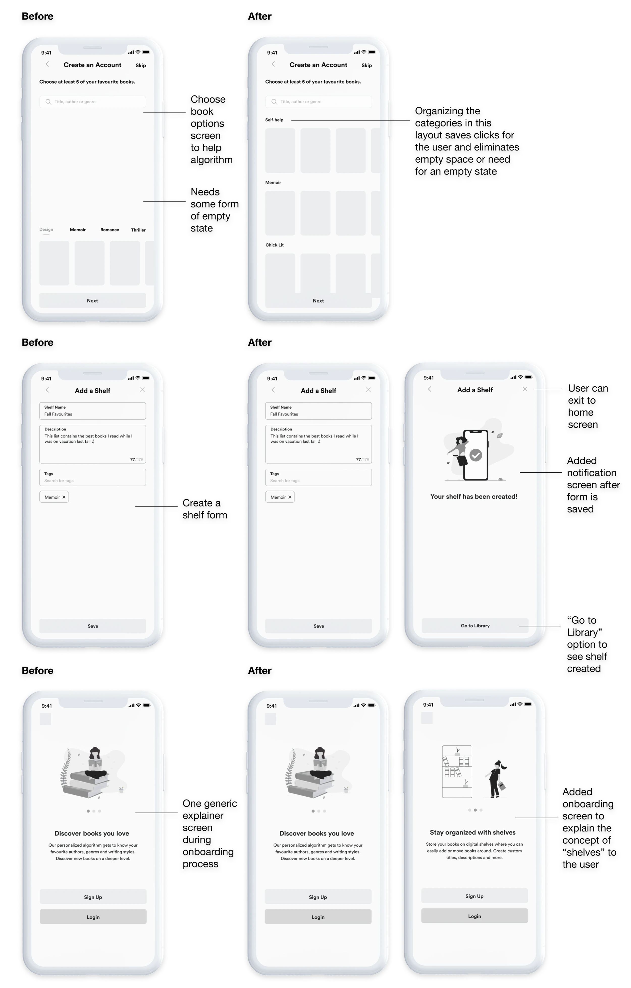
Create an empty state to help users understand what will appear on screen after selecting books (effort level: low, necessary UI fix).
Move “add a shelf” option to the “My Library” screen (Effort level: high. Requires getting rid of existing plus button, moving other options under plus button elsewhere. Also, half of users completed the task with the existing flow).
Add a screen or option to go to either finish and exit to homepage or view shelf in library. (Effort level: low. Requires adding new option or screen at the end of task 2).
Add information on how to use app in on-boarding screens. (Effort level: low. Will be completed when created high fidelity wireframes).
Revised Wireframes & Prototype
After prioritizing revisions from the affinity map, I made the necessary revisions. I took into account the number of users that had problems, time and effort level to prioritize which elements needed to be revised. Based on this, I decided I needed to create an empty state for unselected books, add a “go to library” option after users have created custom shelves, and add a brief explainer on the on-boarding screens to explain the concept of “shelves” and give the user a quick run down on how they worked in the app before the user makes an account.
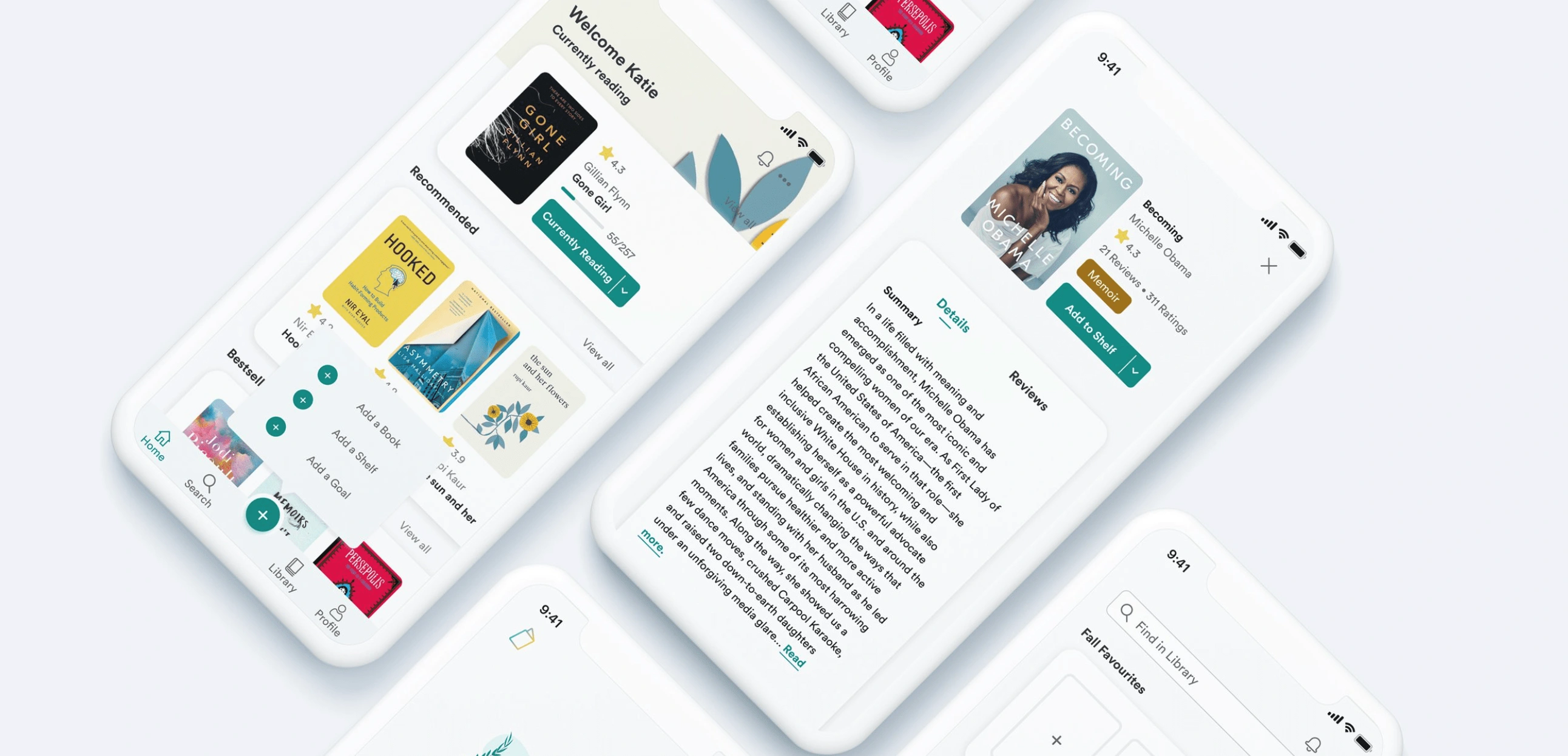
High Fidelity Wireframes & Prototype
Making revisions allowed me to ensure I created a usable and intuitive design. I then used the visual design elements I created to arrive at the final high fidelity wireframes and prototype.
Next Steps
I think there are a lot of opportunities to expand on this application. If I had more time, I would have loved to add more nice to have features such as a library integration, since it was revealed in user testing that 5/7 participants use the libby app to borrow ebooks from the Library.
While Bookspace is primarily concerned with attracting new users, there are also opportunities in this industry to generate revenue from ad space so I would have loved to explore ways to optimize this in the UI. I think this could have been done in a non-intrusive way with such a minimal UI.
Like this project
Posted Sep 29, 2024
Created the UX and UI design for a book organization application.
Likes
0
Views
45