Mad Monkey Hostel Website Redesign

Haikal Nurkalam

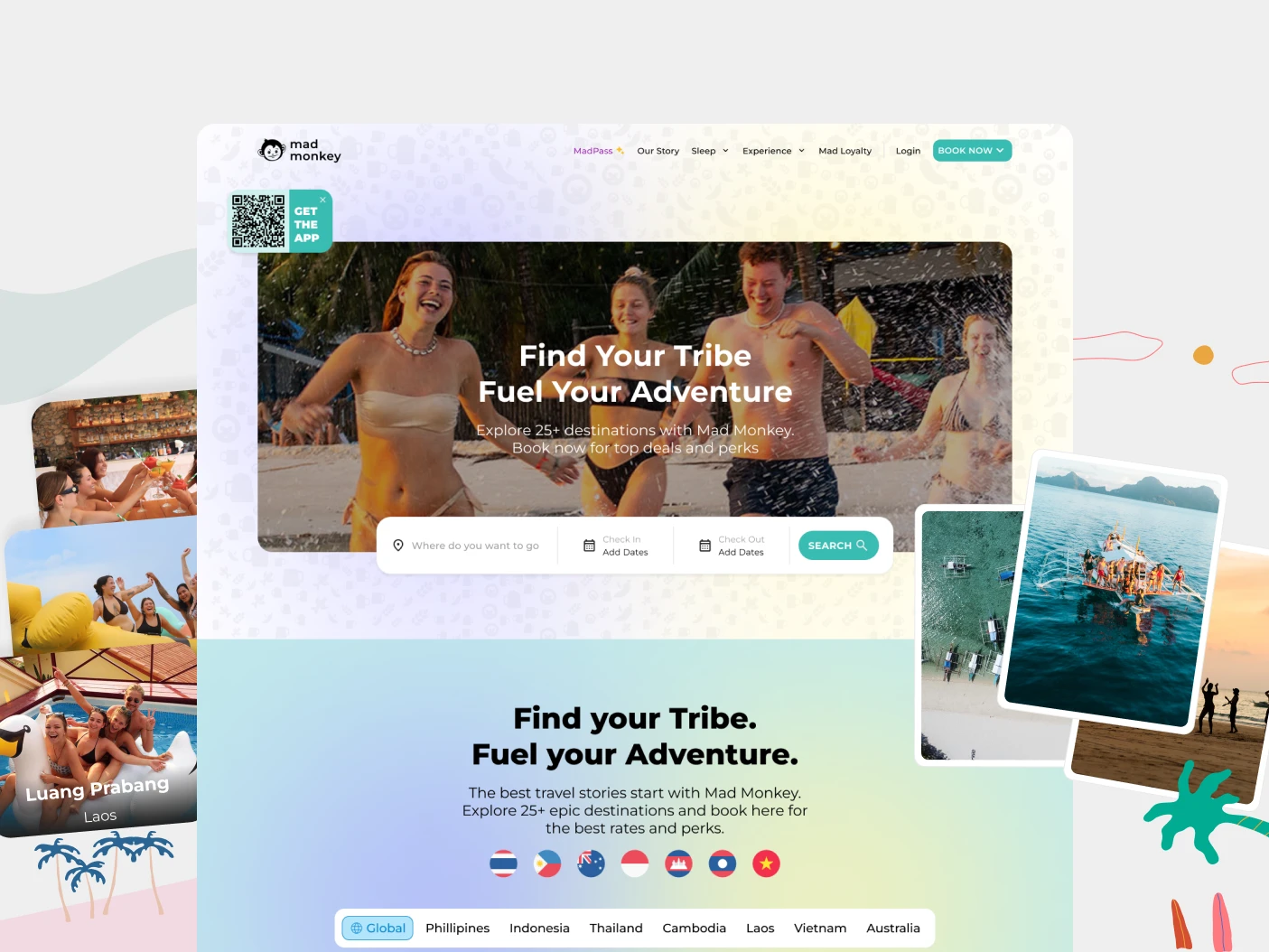
Overview
Website redesign for a Mad Monkey hostel, aimed at two things at once: converting more direct bookings, and showing the personality guests only met after they had already arrived. The old site was a placeholder that handed bookings to third-party platforms instead of selling the rooms itself. The new site replaced that channel and became the hostel's primary revenue source.
Challenge
- No clear call-to-action on the landing page, so visitors had nowhere obvious to go.
- Booking flow required too many steps with unclear progress.
- Mobile experience was not built for travellers booking on the move.
- Brand personality never reached the screen, so the site read like a generic hostel.
Approach
Competitive analysis of five hostel brands surfaced the same three priorities across all of them: social vibe, location clarity, and a booking flow that stays fast on a phone. That told me the problem was not aesthetics, so I ran a design sprint with stakeholders, explored three visual directions, and pushed for the photography-led one, the hostel's atmosphere was its actual differentiator and none of it was on the site. Then I rebuilt the booking flow with visible progress and fewer steps, and moved it fully on-site instead of handing the transaction to a third party.
Result
- Booking conversion up 32%.
- Average session duration up 45%.
- Mobile bounce rate down 28%.
- Bookings moved off third-party platforms. The site is now the primary revenue channel.
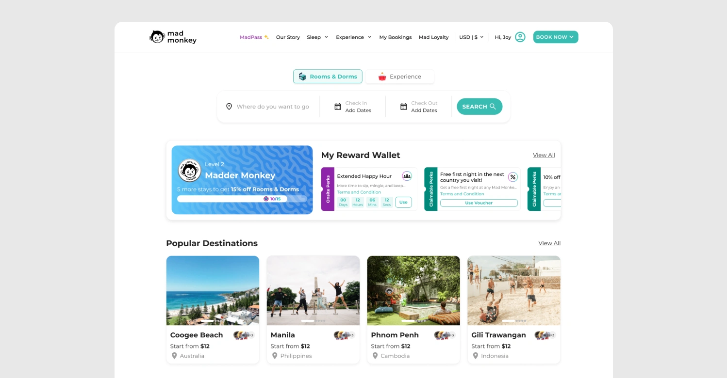
Homepage
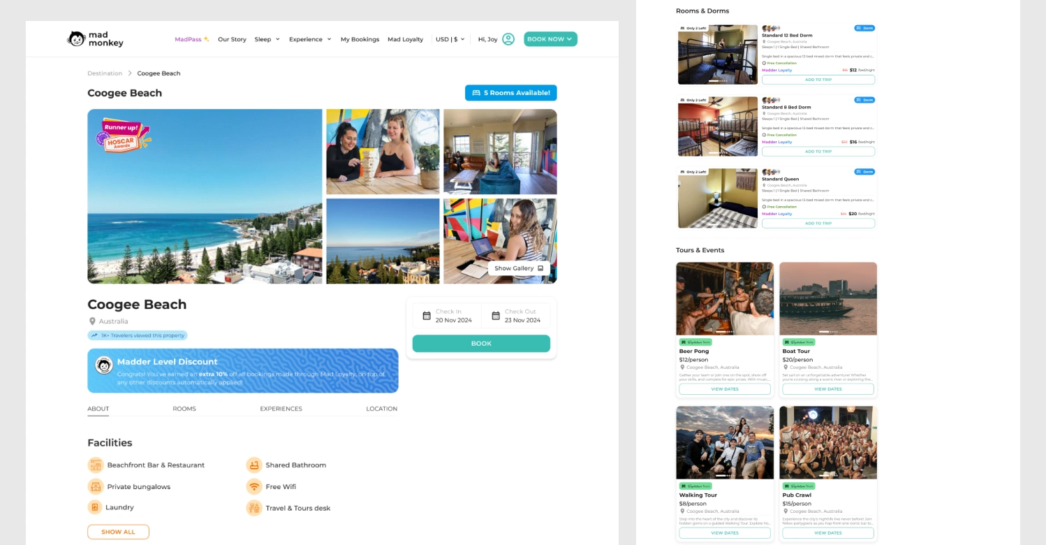
Hostel Details
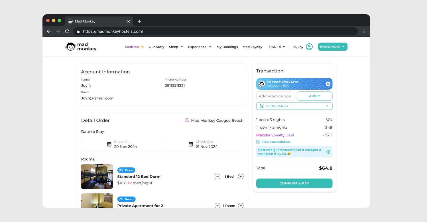
Checkout Bed
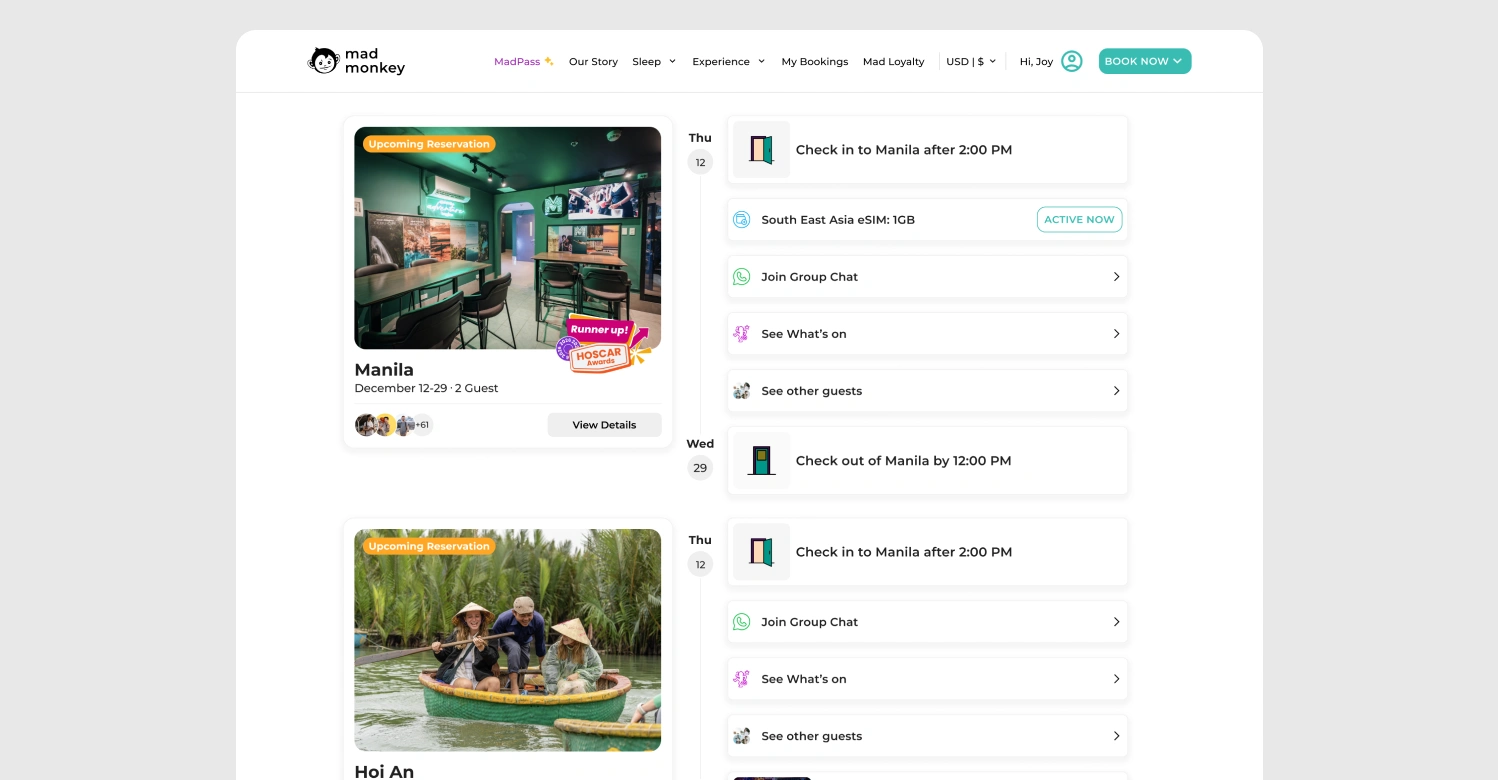
My Bookings
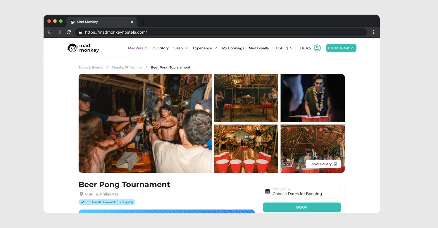
Event Details
Like this project
Posted Oct 30, 2026
Redesigned website for Mad Monkey Hostel to boost direct bookings and showcase personality.
Likes
0
Views
0
Timeline
Sep 1, 2024 - Sep 1, 2025