Before & After - Transformation of Complex content

Hany Guirguis


🟨 Before & After: Transforming Health Content for Clarity, Readability & Patient Understanding
A real example of improving structure, clarity, and readability in patient-facing medical content.
About This Project
Clear communication saves time, reduces confusion, and improves patient outcomes.
This project demonstrates how I transform dense, unclear, or poorly structured health information into clean, readable, patient-friendly content.
As a Clinical Pharmacist and Health Communication Consultant, I focus on turning complex or overwhelming content into material patients can understand, trust, and act on.
This BEFORE & AFTER example shows my full approach.
NHS- & NICE-Aligned Medical Copywriting & Design
Healthcare content often becomes overwhelming — long sentences, dense paragraphs, and mixed hierarchy that make it hard for patients to understand and act safely.
In this project, I show how I turn complex medical information into clear, structured, and patient-friendly communication, blending my background as a Clinical Pharmacist with evidence-based writing and accessible design.
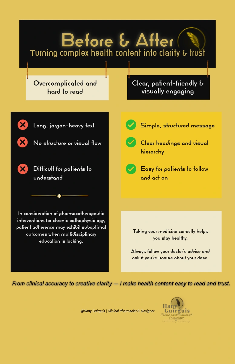
The Challenge (Before)
The original content had strong medical accuracy but suffered from typical issues found in healthcare communication:
❌ Dense blocks of text
❌ Jargon-heavy sentences
❌ Low visual hierarchy
❌ No clear “what to do next”
❌ Confusing flow
❌ Difficult for patients with low health literacy
Patients seeing this type of content may feel overwhelmed, disengaged, or unsure how to follow instructions.
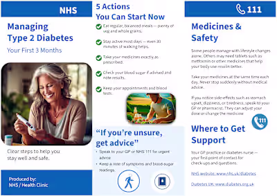
The Solution (After)
I redesigned and rewrote the content using plain-English principles, NHS health-literacy guidelines, and visual hierarchy techniques.
✔ What I improved:
Shorter, clearer sentences
A structured layout with headings and subheadings
High-contrast sections to guide the eye
Simple, actionable steps
More supportive tone
Space for the content to breathe
Everything is designed to reduce cognitive load and make the information immediately usable.
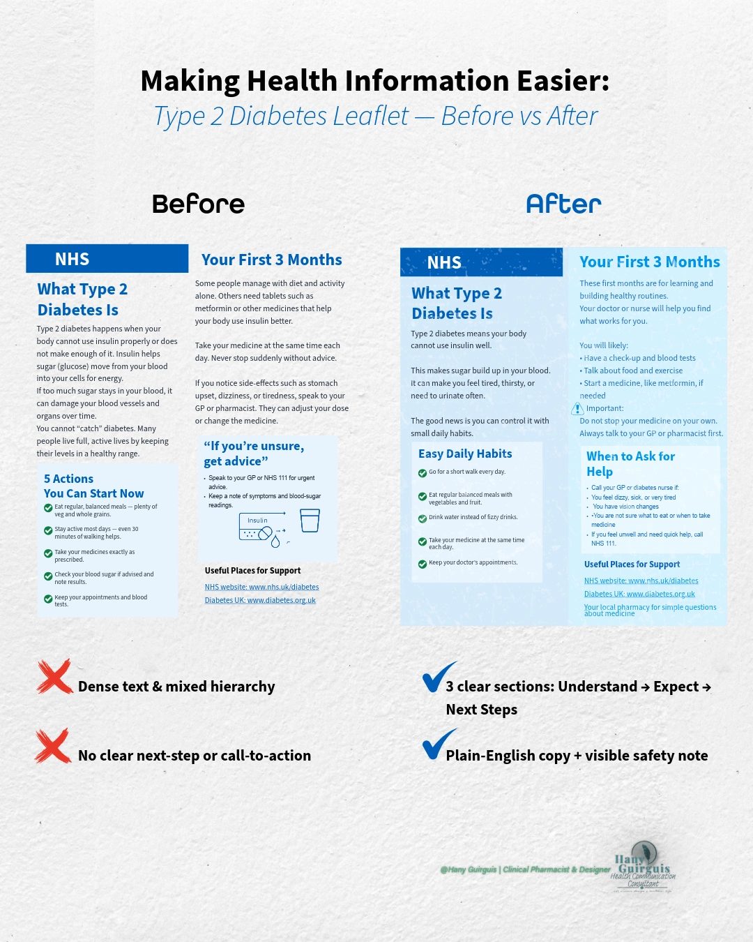
Before & After — Key Changes Explained
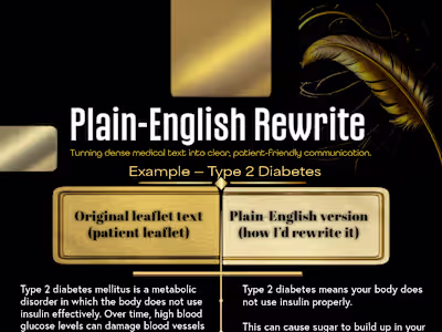
🔶 1. Language Simplification
Complex clinical wording becomes plain English without losing accuracy.
🔶 2. New Information Hierarchy
Readers can now scan and understand the content quickly.
🔶 3. Behaviour-Based Writing
The after-version teaches the reader what to do, not just what to know.
🔶 4. Consistent Visual Design
Brand colours, clear icons, balanced spacing, and clean typography make the message stronger.
Impact of the Redesign
✔ Patients understand the message more easily
✔ Clinicians spend less time re-explaining unclear materials
✔ The content becomes safer, clearer, and more engaging
✔ Aligns with NICE, NHS Health Literacy, and Plain-English standards
✔ Builds trust between healthcare providers and patients
This redesign method can be applied to leaflets, carousels, brochures, onboarding documents, and digital health content.
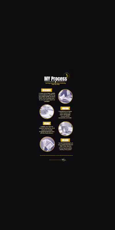
My Role
Medical content review
Plain-English rewriting
Visual redesign & layout
Behaviour-change communication
Accessibility optimisation
Tools Used
Adobe Express
Readability & plain-English frameworks
NHS/NICE guidelines
Like this project
Posted Dec 6, 2025
These transformations help: ✓ Improve patient understanding ✓ Reduce confusion and misinformation ✓ Enhance NHS-aligned communication standards