Chomper Labs Brand Rebranding Project
Said Brjanov

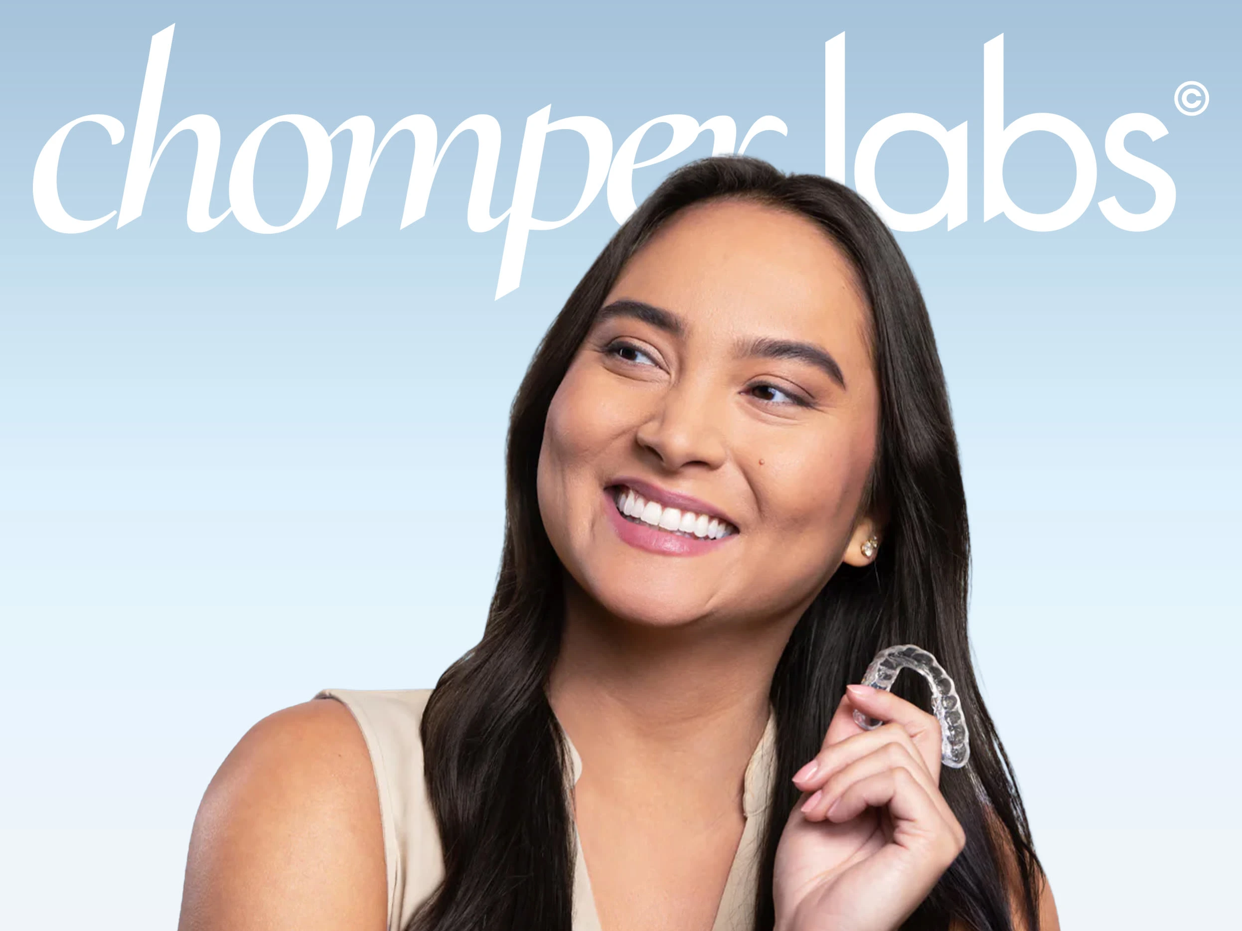
ChomperLabs
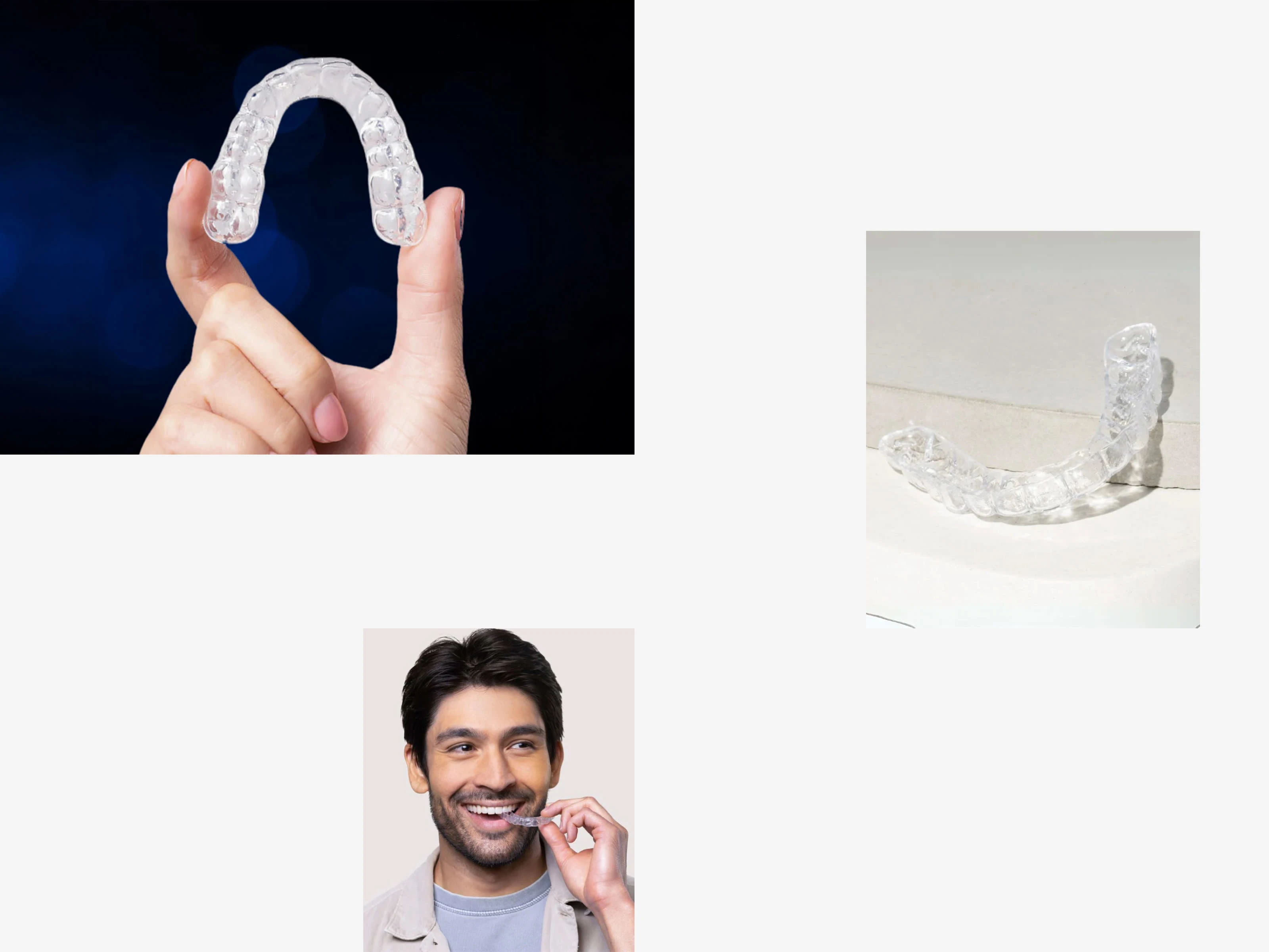
Chomper Labs is a dental brand specializing in custom night guards. From the beginning, I approached this project not just as a dental solution, but as a brand that protects people during their most vulnerable hours — while they sleep.
Creation Date: 2025
Tools Used: Adobe Illustrator, Photoshop, After Effects, Figma
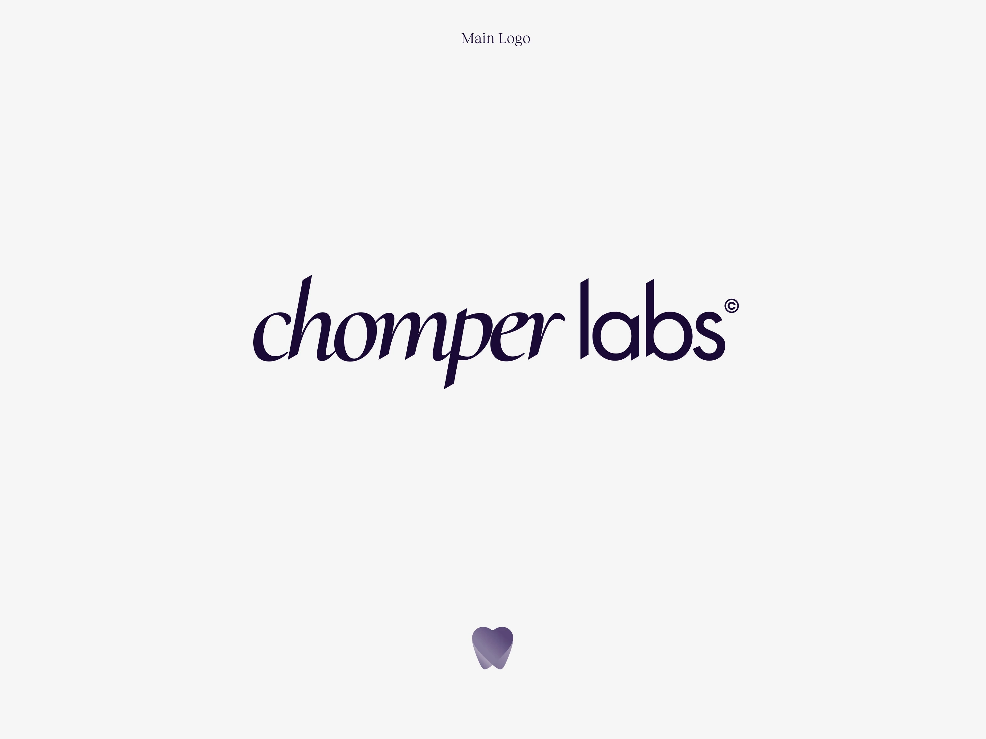
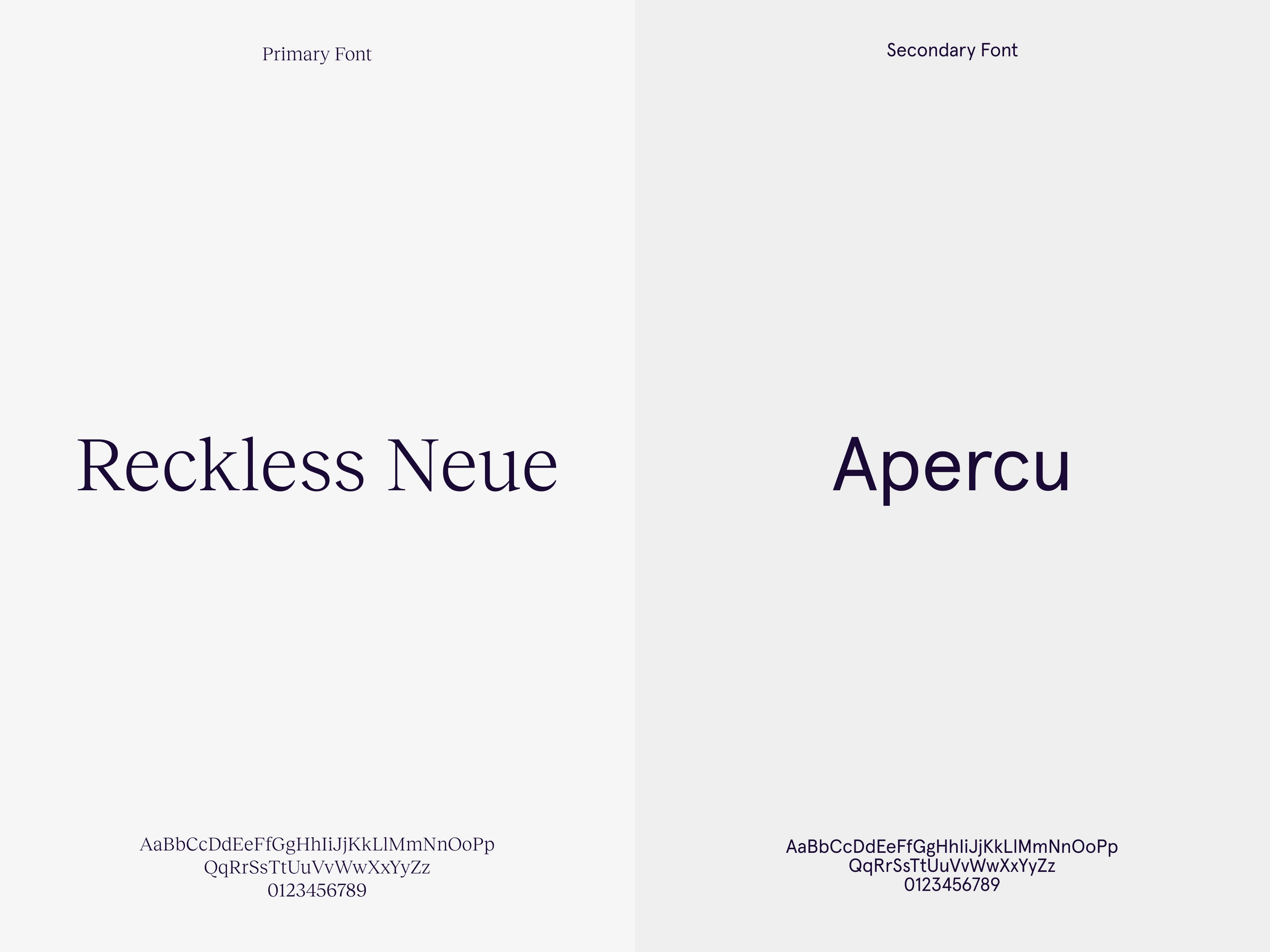
The primary logo is a custom lowercase wordmark built from a refined sans serif structure. I intentionally differentiated the typographic rhythm:
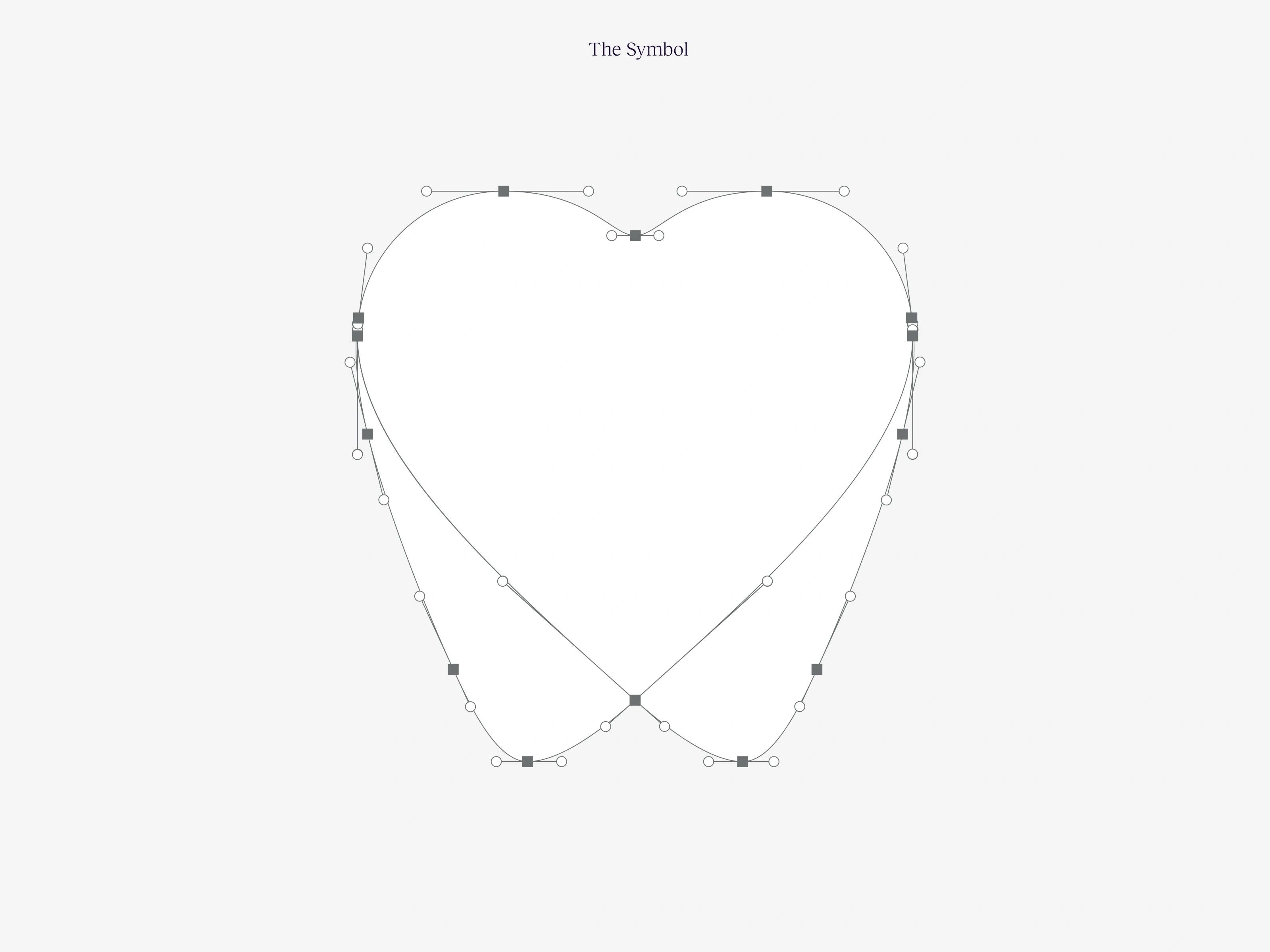
“chomper” carries a subtle italic flow, almost cursive in movement — giving it softness and personality. In contrast, “labs” remains upright and grounded, reinforcing precision and scientific credibility. The interplay between motion and stability visually mirrors the relationship between comfort and protection.Beyond the wordmark, I developed a brand symbol inspired by abstract geometric teeth. The mark is constructed from two overlapping translucent organic shapes. Where they intersect, a subtle heart form is revealed at the center — symbolizing care hidden within structure. It’s both clinical and compassionate, abstract yet emotionally resonant.
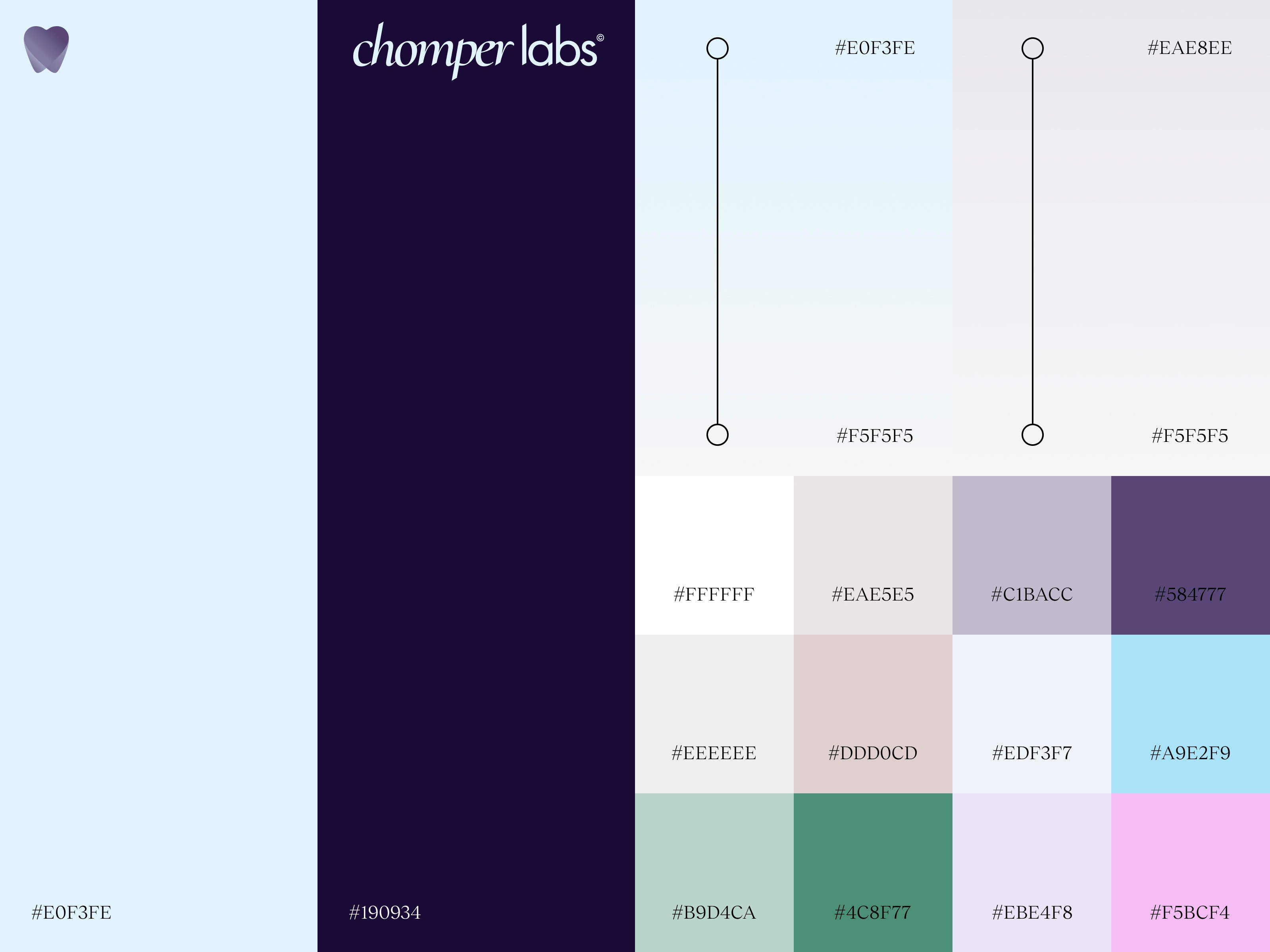
The primary brand colors — dark purple and light sky blue — were chosen to challenge conventional dental aesthetics. Instead of sterile blues and medical whites, the deep purple introduces sophistication and calm authority, while sky blue adds clarity and lightness. A range of secondary UI colors was developed to create flexibility across web and digital applications, ensuring a scalable and modern design system.
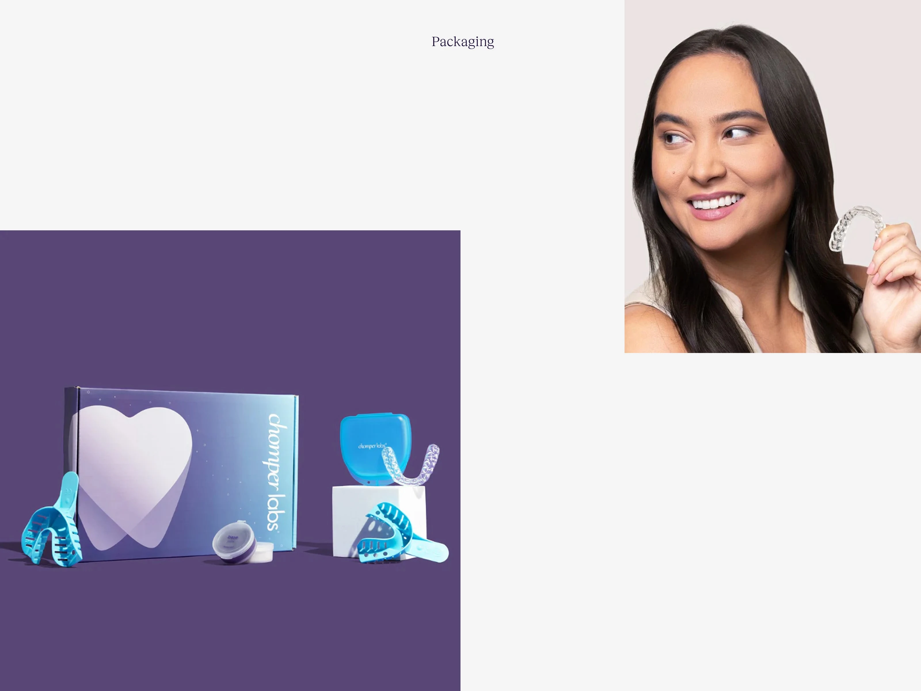
I also designed the packaging system, focusing on clarity, structure, and a sense of reassurance. The layout uses intentional spacing and controlled typography hierarchy to reduce visual noise. The goal was to make the unboxing experience feel calm and considered — not clinical.
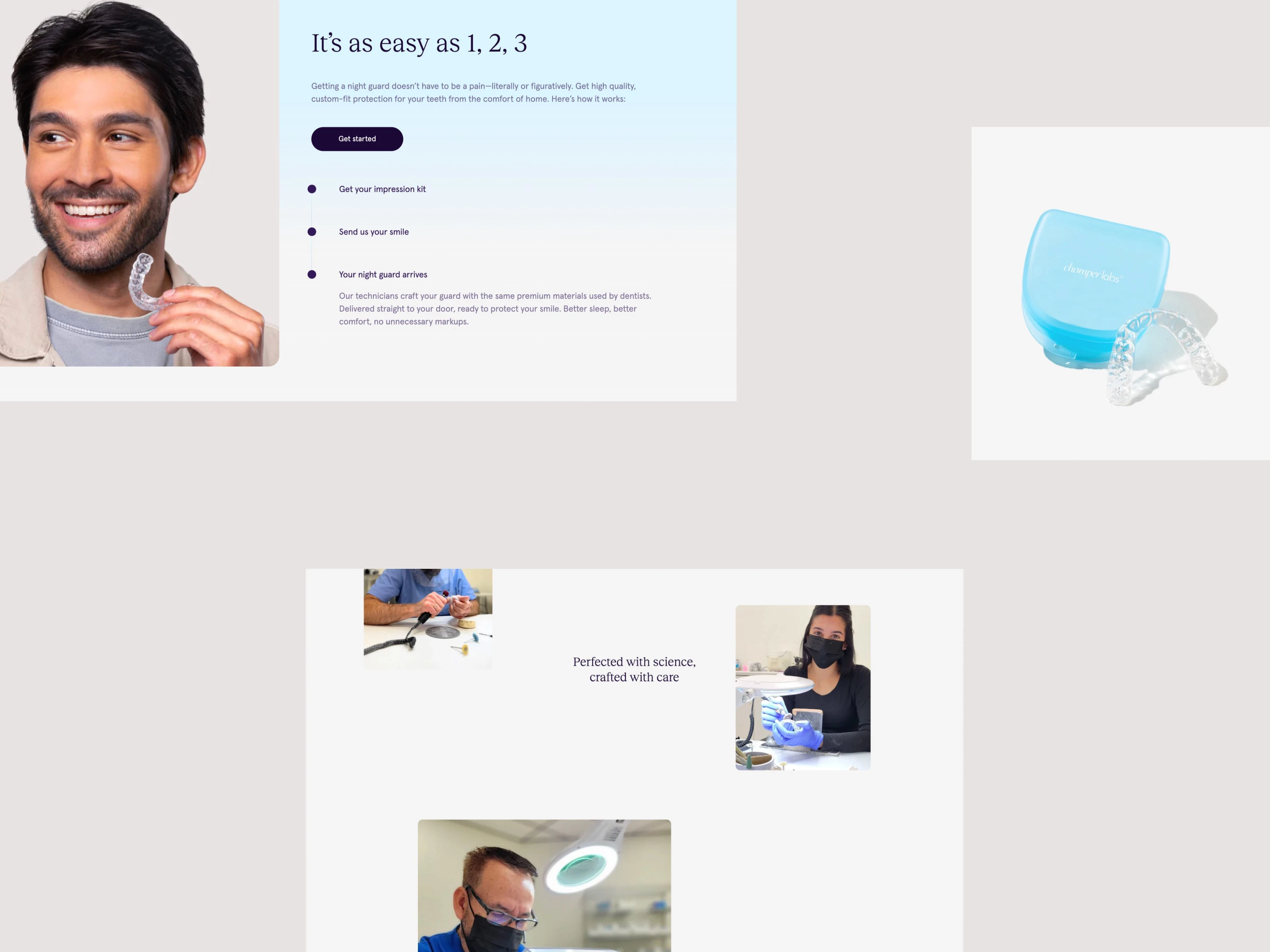
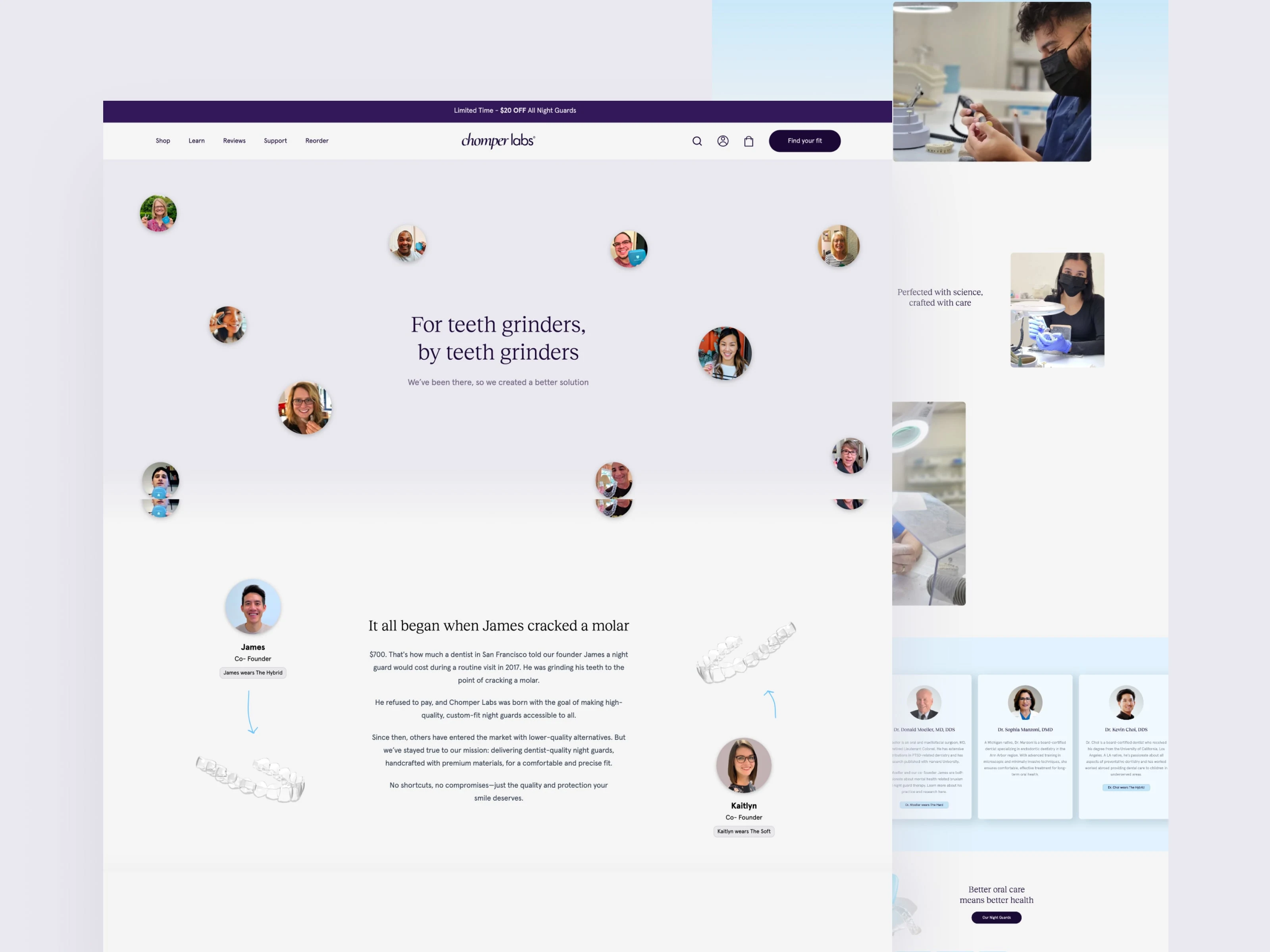
The website design extended this identity through structured grids, layered information architecture, and subtle motion design to reinforce brand tone. Every touchpoint was built to feel cohesive, thoughtful, and quietly protective.

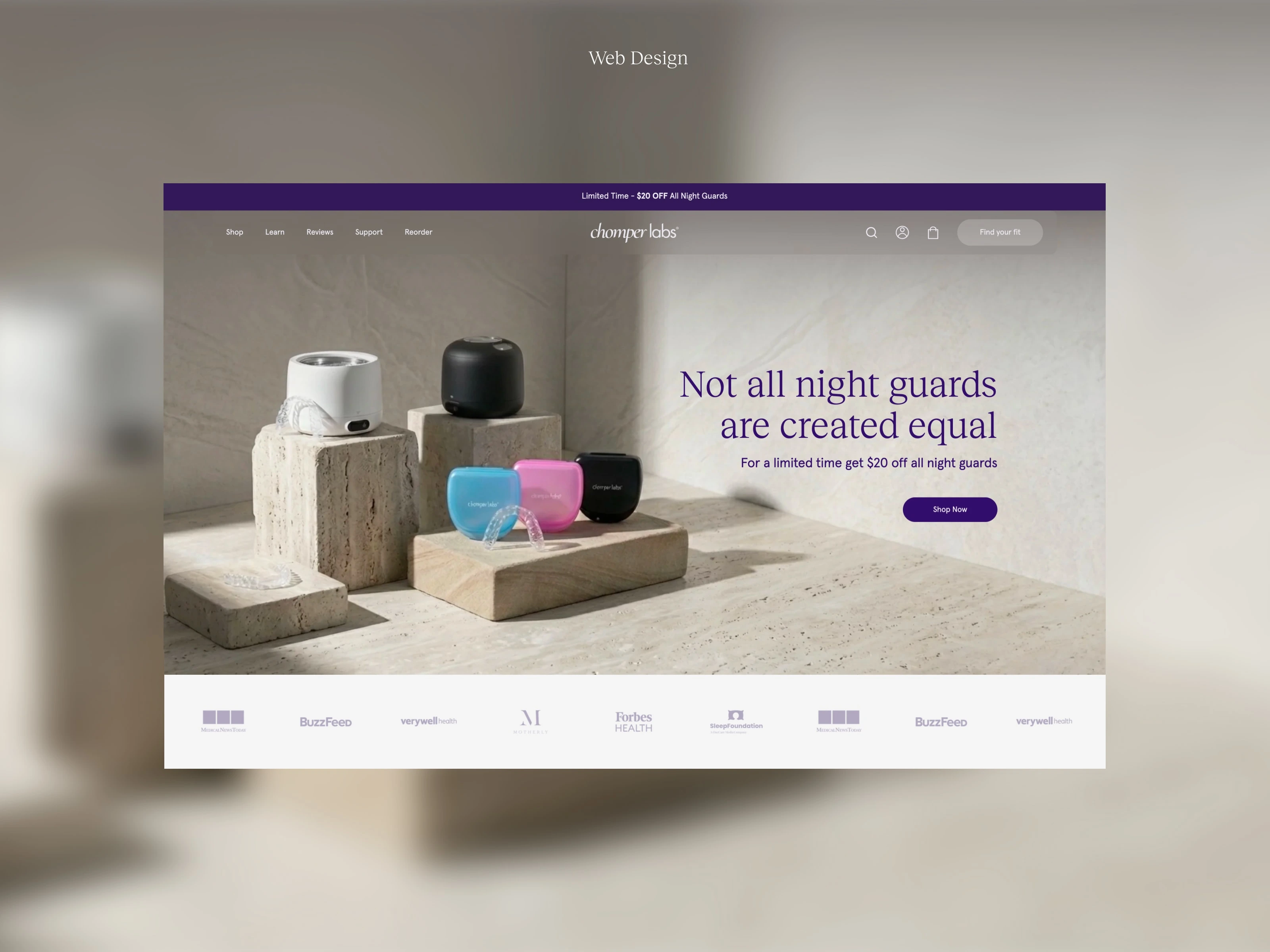
Beyond visual identity, I designed the full website experience.
The goal was to create a digital environment that feels reassuring, intuitive, and modern. I structured the layout using clean grids and generous negative space to reduce cognitive load. Information architecture was carefully layered to guide users naturally through product education, customization steps, and purchase flow.
Micro-interactions and subtle motion elements (developed through After Effects prototypes) were integrated to create rhythm without distraction. The animations were intentionally restrained — reinforcing the brand’s calm and supportive tone rather than overwhelming users with tech-driven effects.
The UI system leverages the brand’s secondary color palette to differentiate sections and improve usability, while maintaining visual consistency. Every element — from button curvature to spacing scale — was aligned with the brand’s protective yet approachable personality.
Challenges & Solutions:
The main challenge was redefining dental aesthetics without compromising credibility.
Too clinical, and the brand feels cold.
Too lifestyle-driven, and trust erodes.
The solution was systematic balance:
Structured sans serif foundation for authority
Italicized motion for human warmth
Abstract symbol for relevance with emotional nuance
Dark purple for maturity, sky blue for clarity
Modular UI system for scalability By building a consistent visual language across logo, packaging, and web, I ensured Chomper Labs operates as a unified brand system rather than disconnected assets. This project reinforced something I value deeply: Design is not about decoration — it is about creating environments where people feel supported. Because sometimes, what we’re truly designing isn’t protection for teeth — it’s protection for peace of mind.
Like this project
Posted Mar 6, 2026
Rebranded Chomper Labs with new logo, packaging, website, and visual identity.
Likes
0
Views
12
Clients
Chomper Labs