Brand Identity for SmakenVan

Artur Mikhov


SmakenVan is a Dutch culinary brand connecting people with authentic gastronomy, regional stories, and carefully selected restaurants.
The challenge was to create a brand identity that could communicate the quality of Dutch cuisine while feeling contemporary, editorial, and culturally refined.
The result is a sophisticated visual identity and logo design built around the idea of culinary discovery — where restaurants, recipes, places, and stories become part of one experience.
Brand strategy. Logo design. Branding. Visual identity. Art direction. Typography. Graphic design. Culinary branding. Hospitality branding.
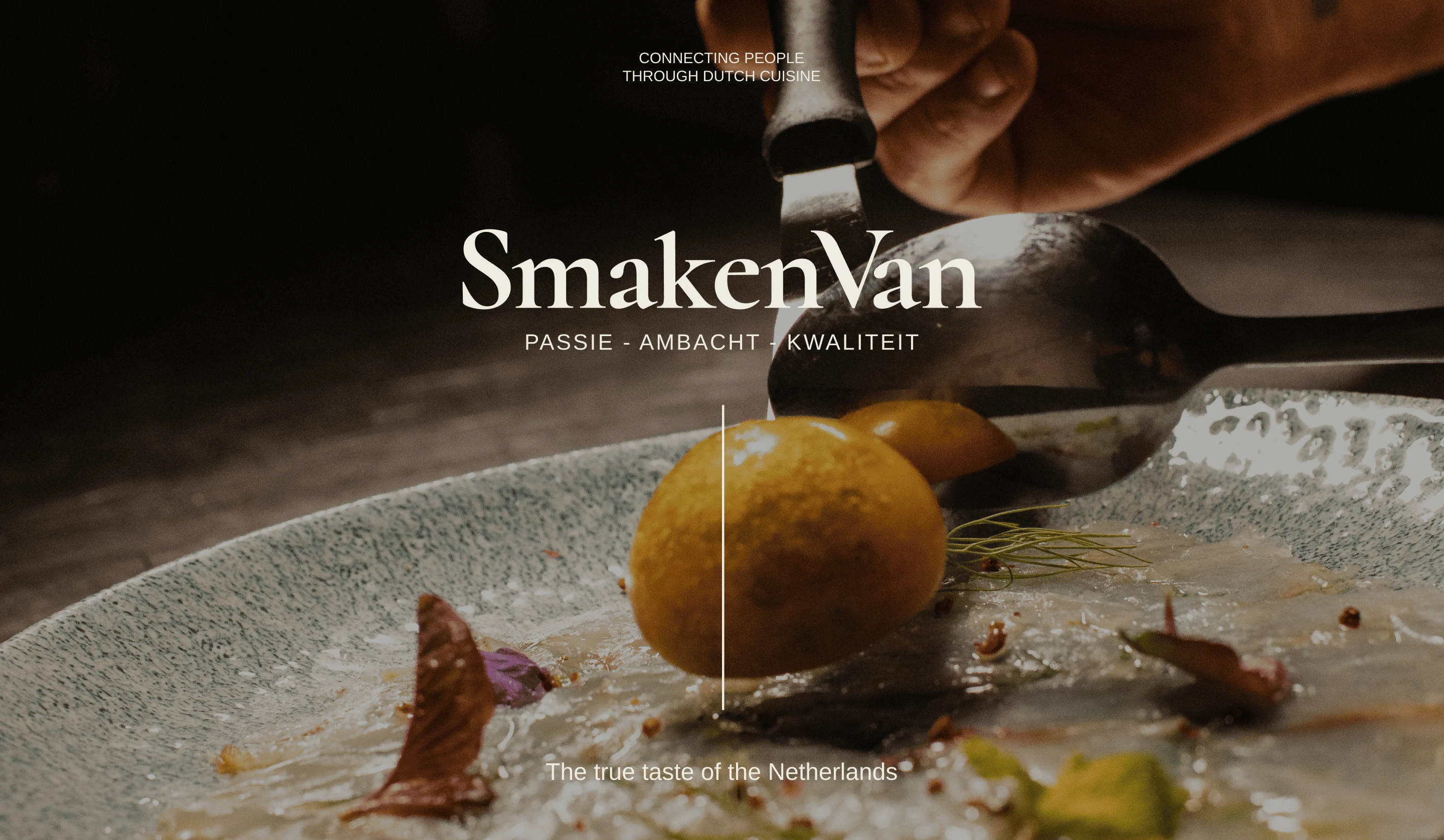
The Tension
Food discovery is rarely just about the food.
It's about where you eat, who makes it, the story behind the ingredients, and the culture surrounding the table.
SmakenVan needed to occupy that space between gastronomy, culture, and discovery.
The identity couldn't feel like a traditional restaurant brand. It needed to represent a broader culinary platform — sophisticated enough for curated restaurants, but approachable enough for people simply looking for their next place to eat.
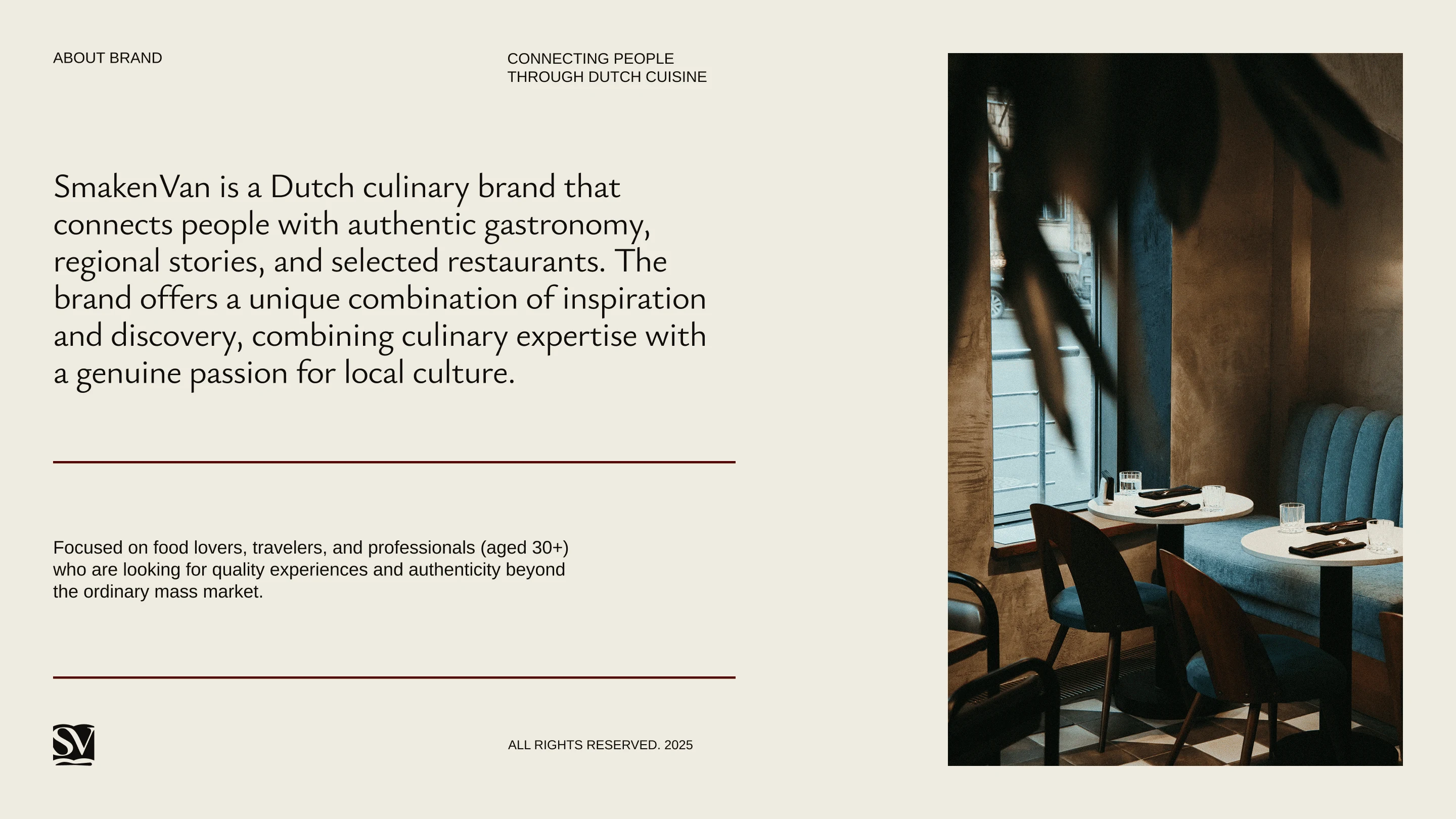
The Decision
The concept started with the name and its connection to storytelling.
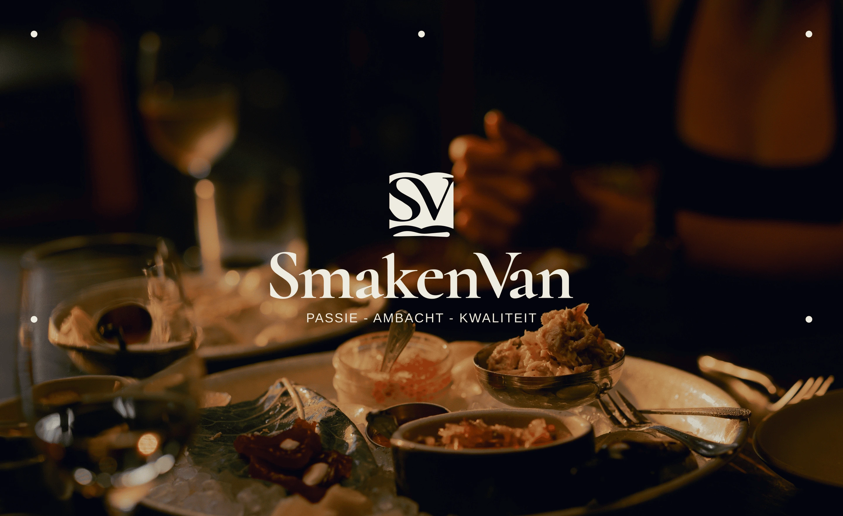
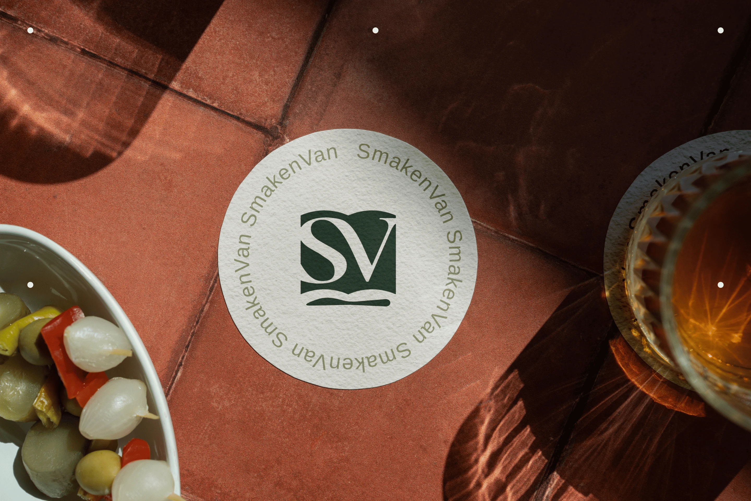
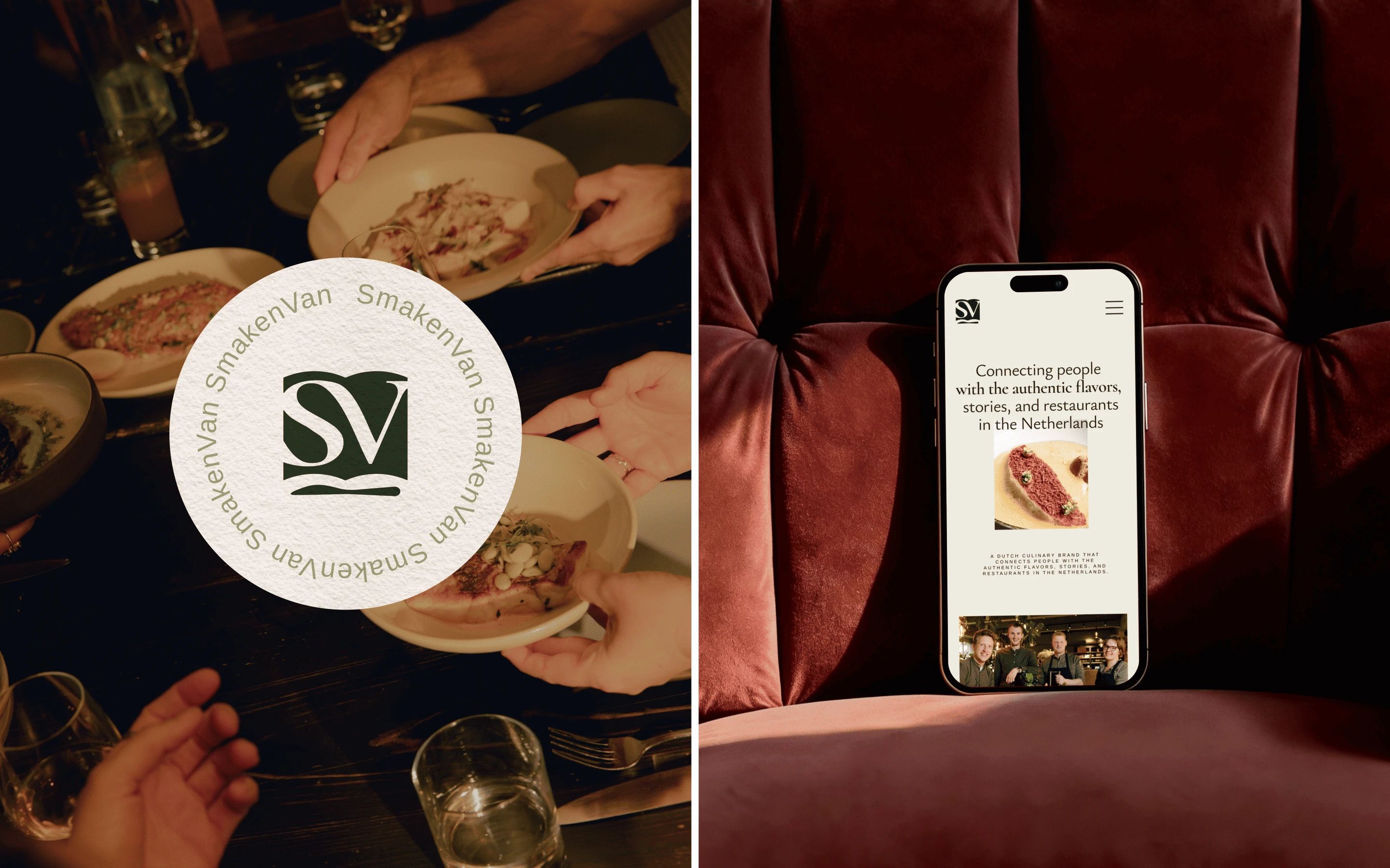
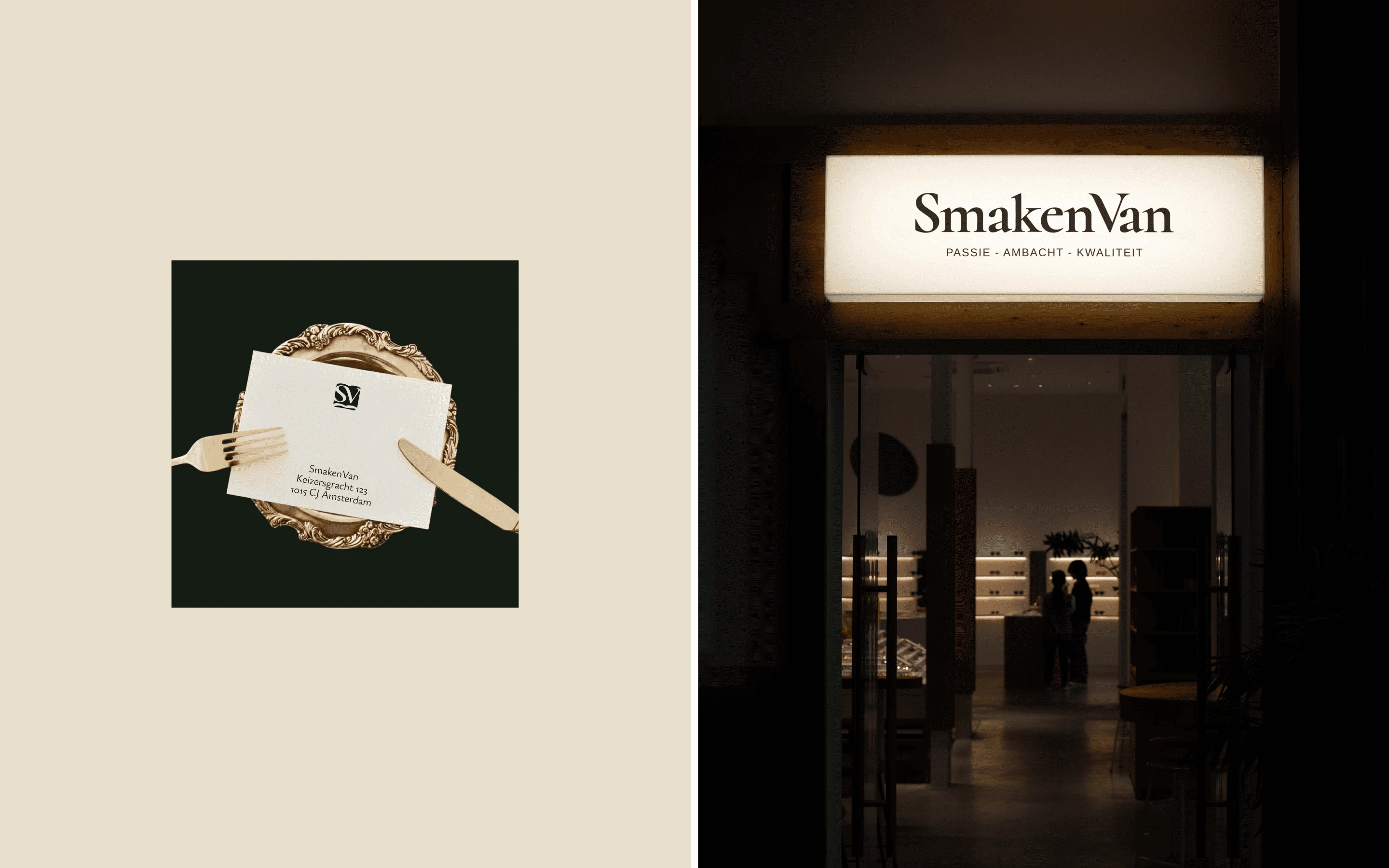
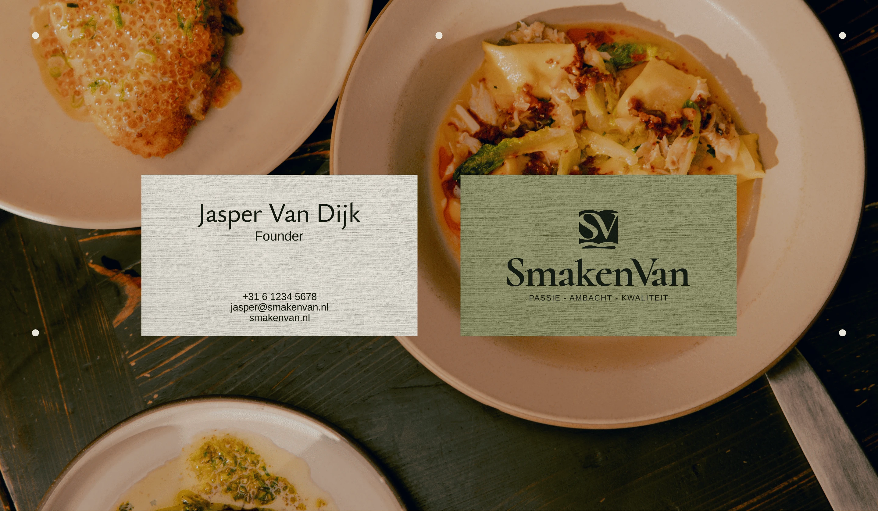
The logo integrates the initials into a symbol inspired by an open book.
It references two things at once: the cookbook and the reservation book.
One represents culinary knowledge and tradition. The other represents discovery and the act of choosing where the next story will happen.
This dual meaning became the foundation of the SmakenVan brand identity.
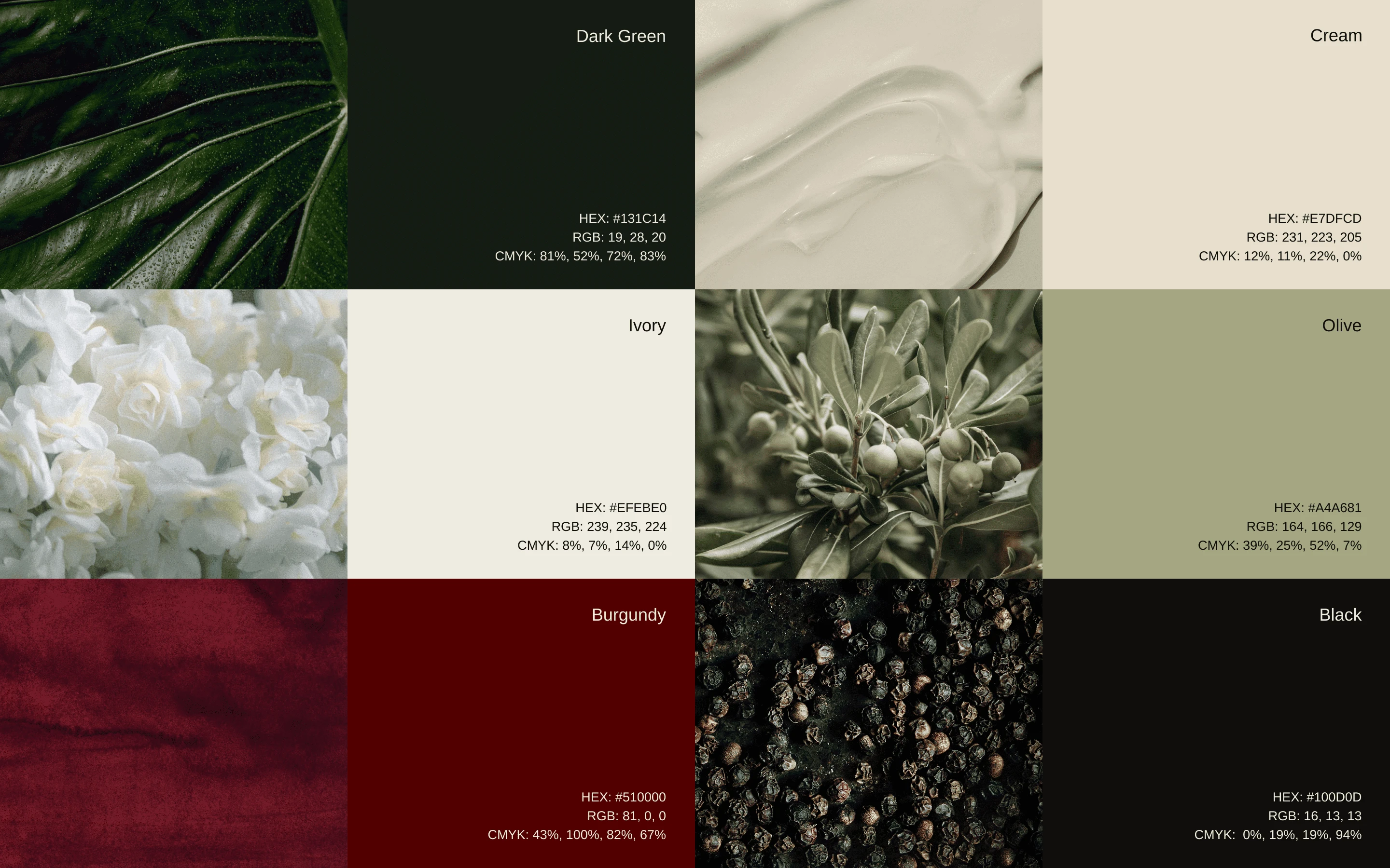
The System
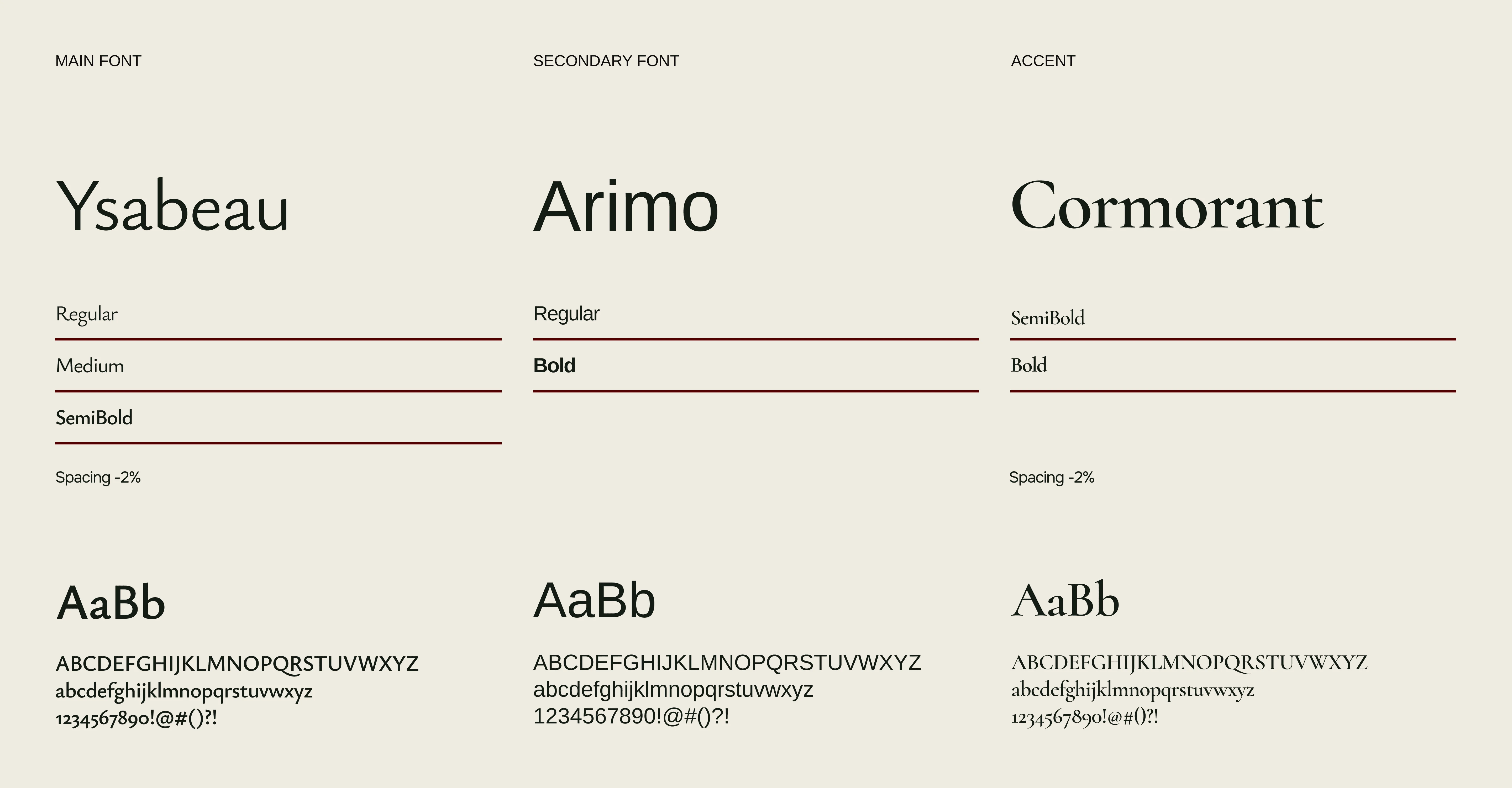
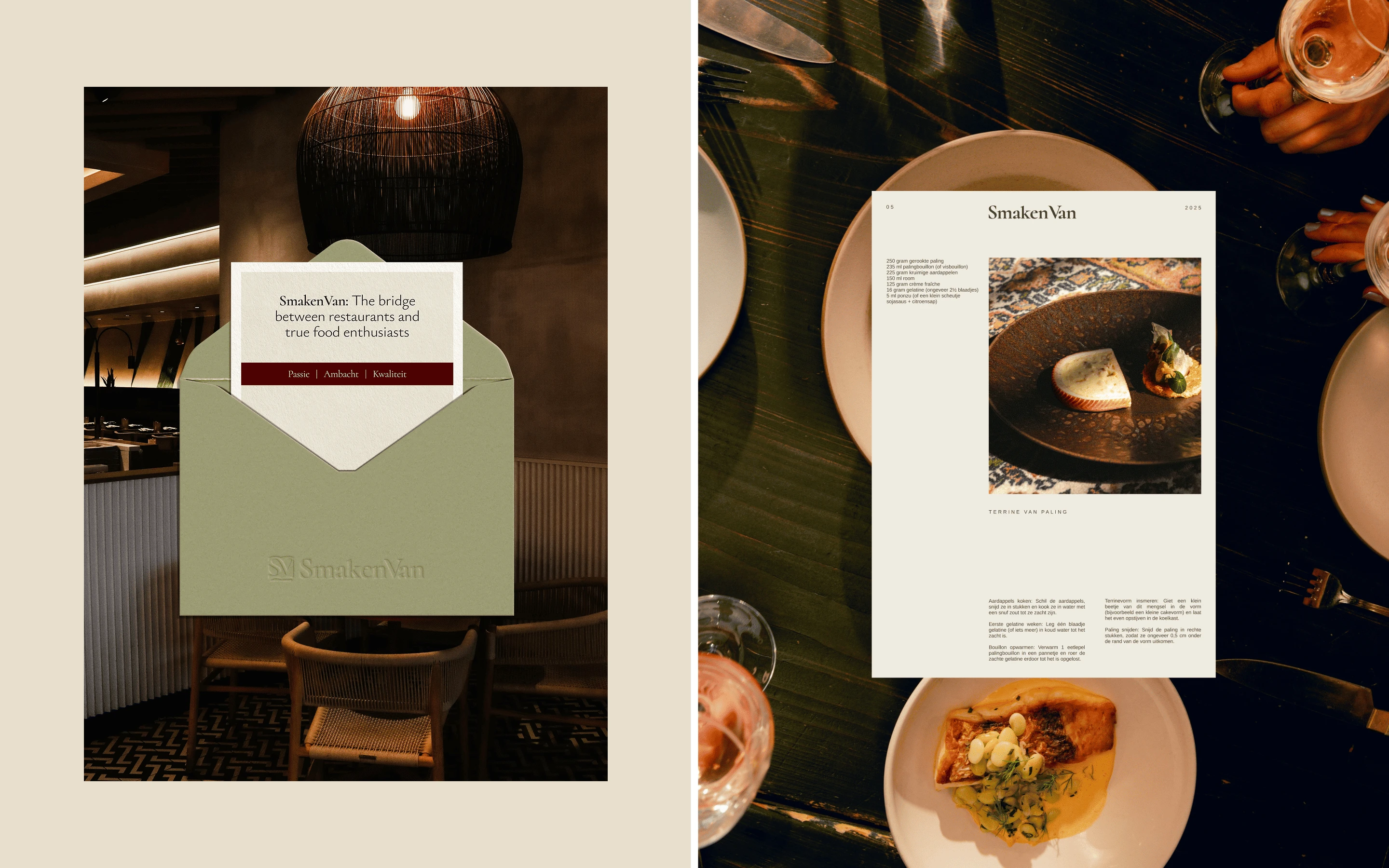
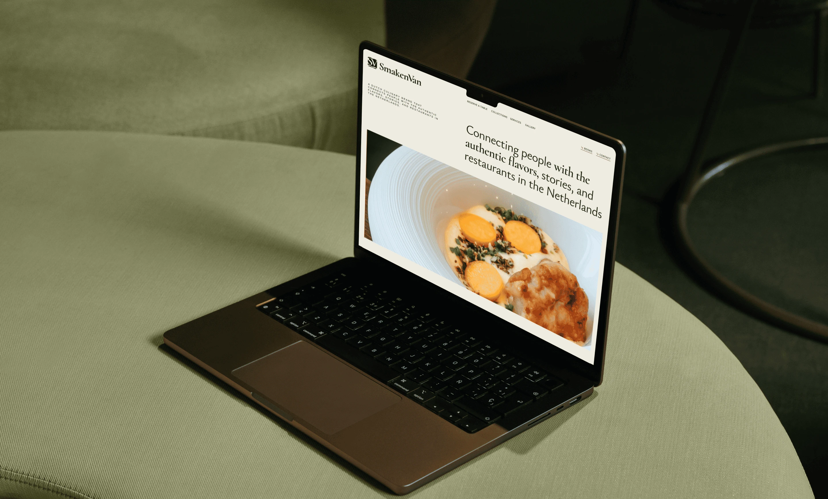
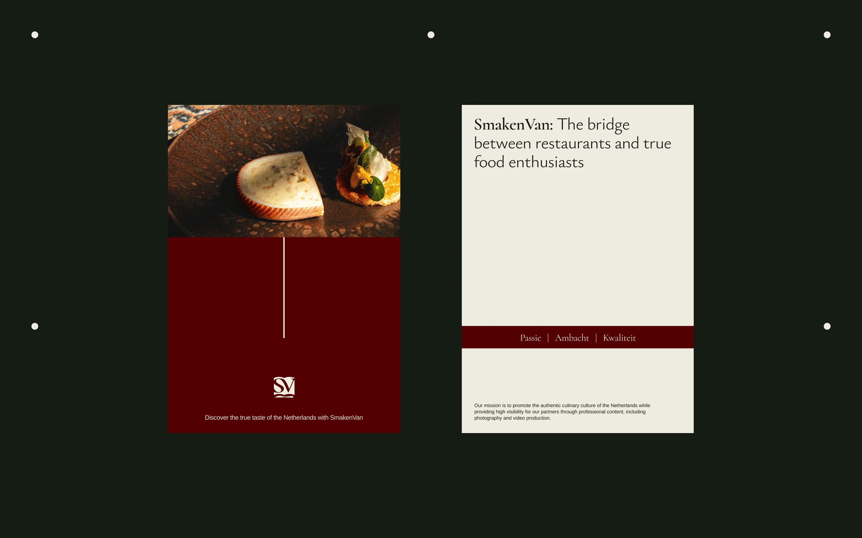
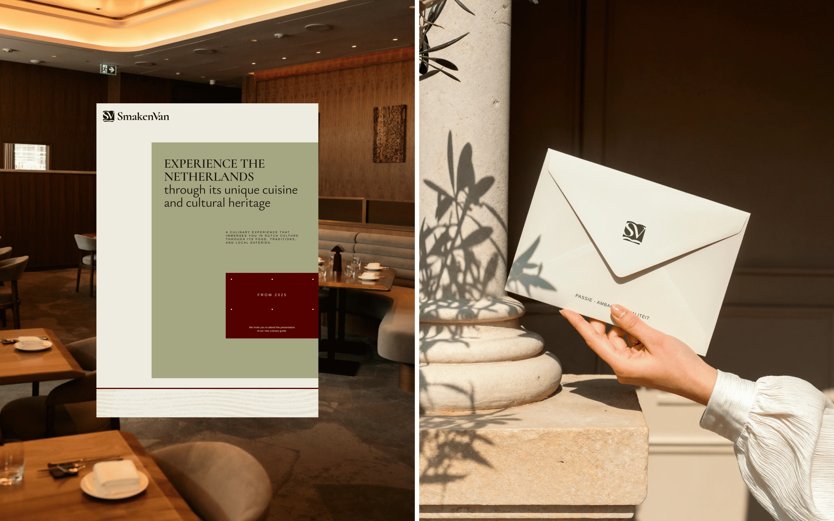
The visual identity combines elegant typography with a refined color palette inspired by natural ingredients and traditional Dutch cuisine.
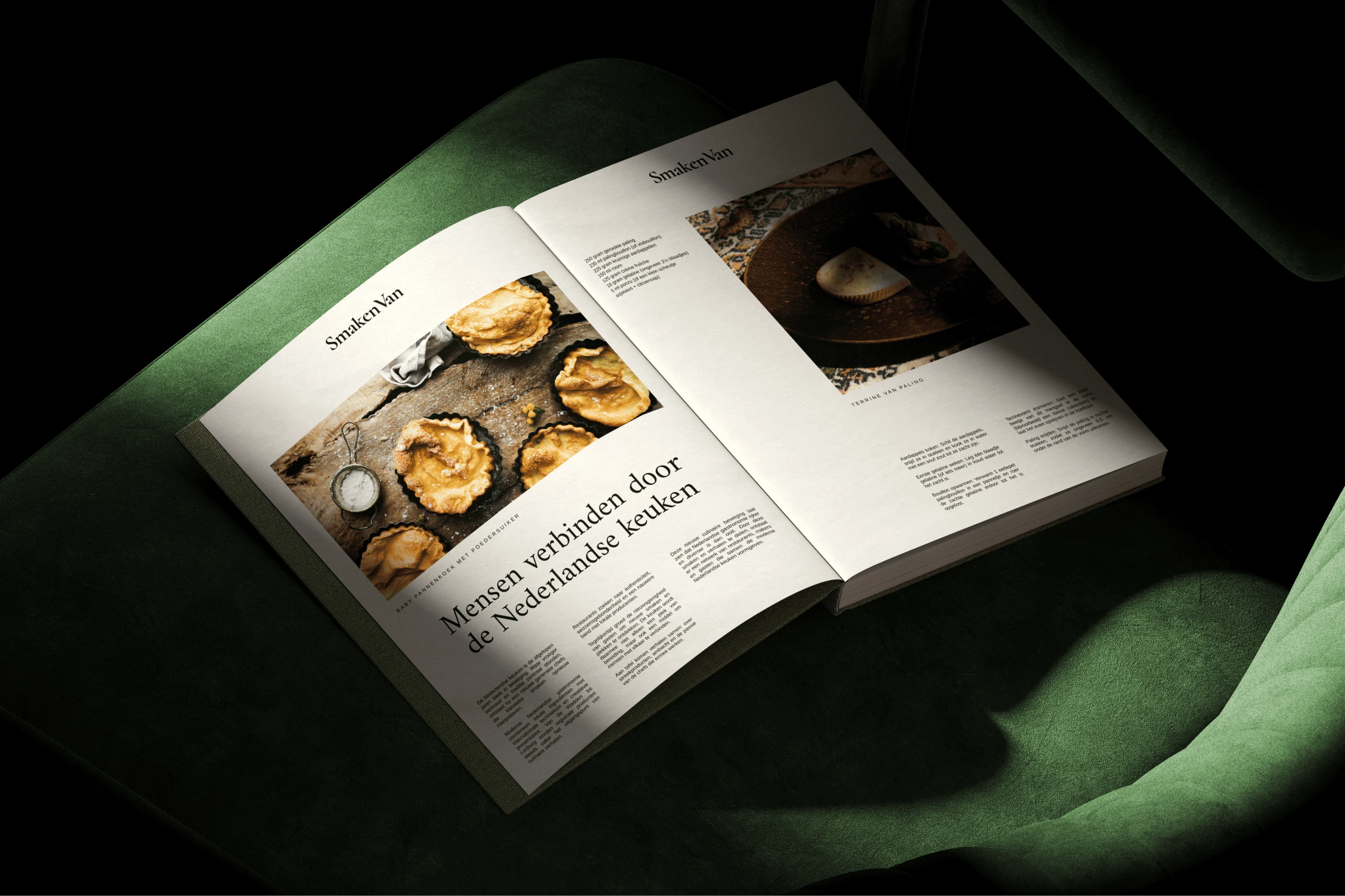
The typography gives the brand an editorial and premium character, while the restrained color system keeps the identity warm and connected to food.
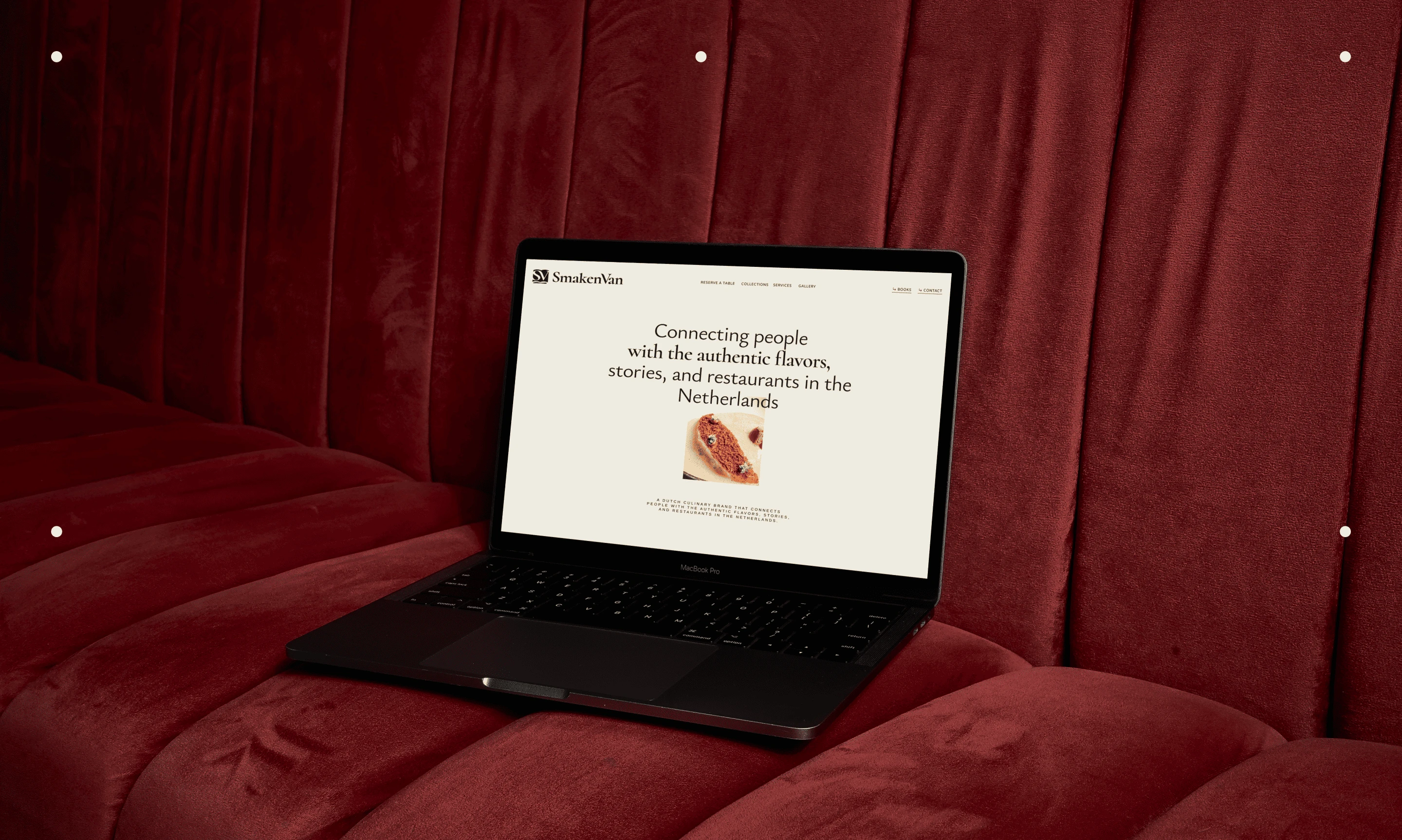
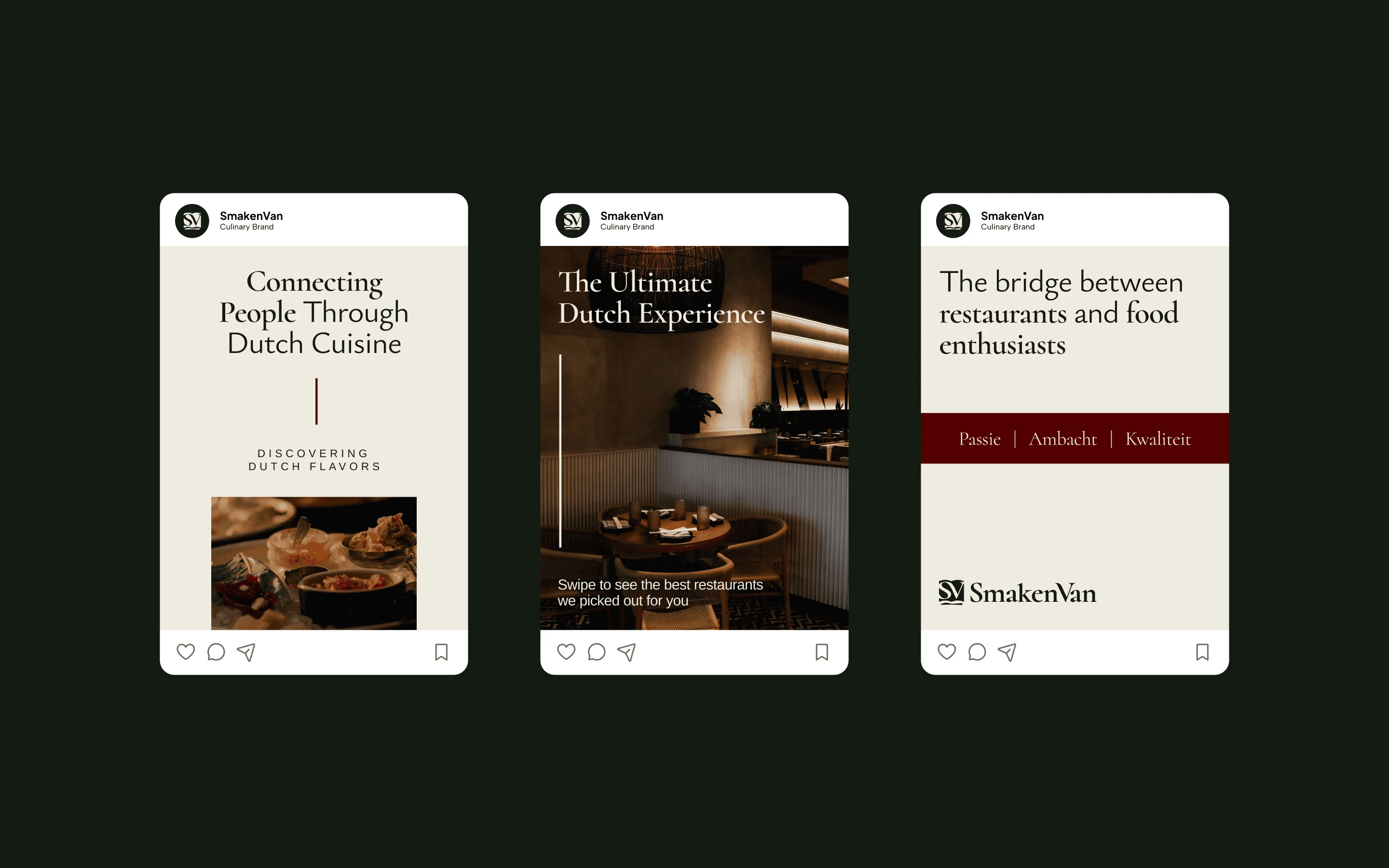
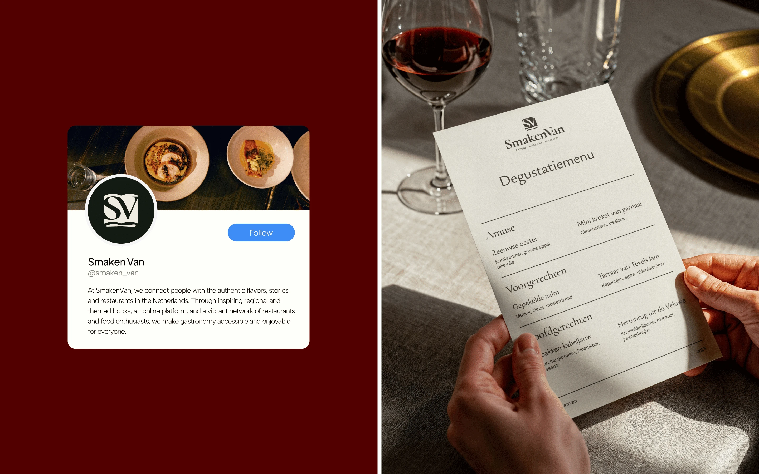
The open-book symbol acts as the central logo mark, creating a recognizable visual asset that can work across digital platforms, restaurant features, editorial content, social media, and marketing materials.
The system is intentionally understated.
Instead of competing with the food, the branding creates a frame for it.
Culinary Storytelling
SmakenVan isn't simply about restaurant recommendations.
It's about culinary storytelling.
The identity was therefore designed to support content around restaurants, regional cuisine, local traditions, ingredients, and the people behind the food.
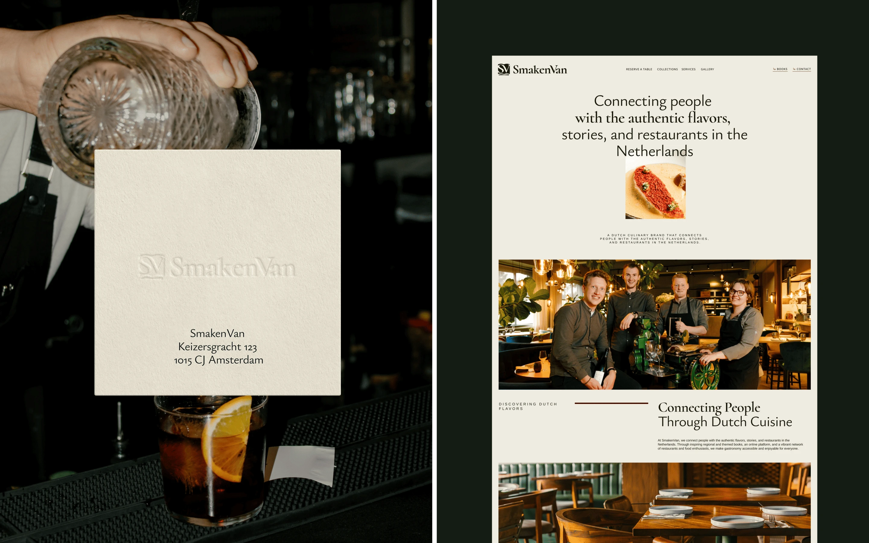
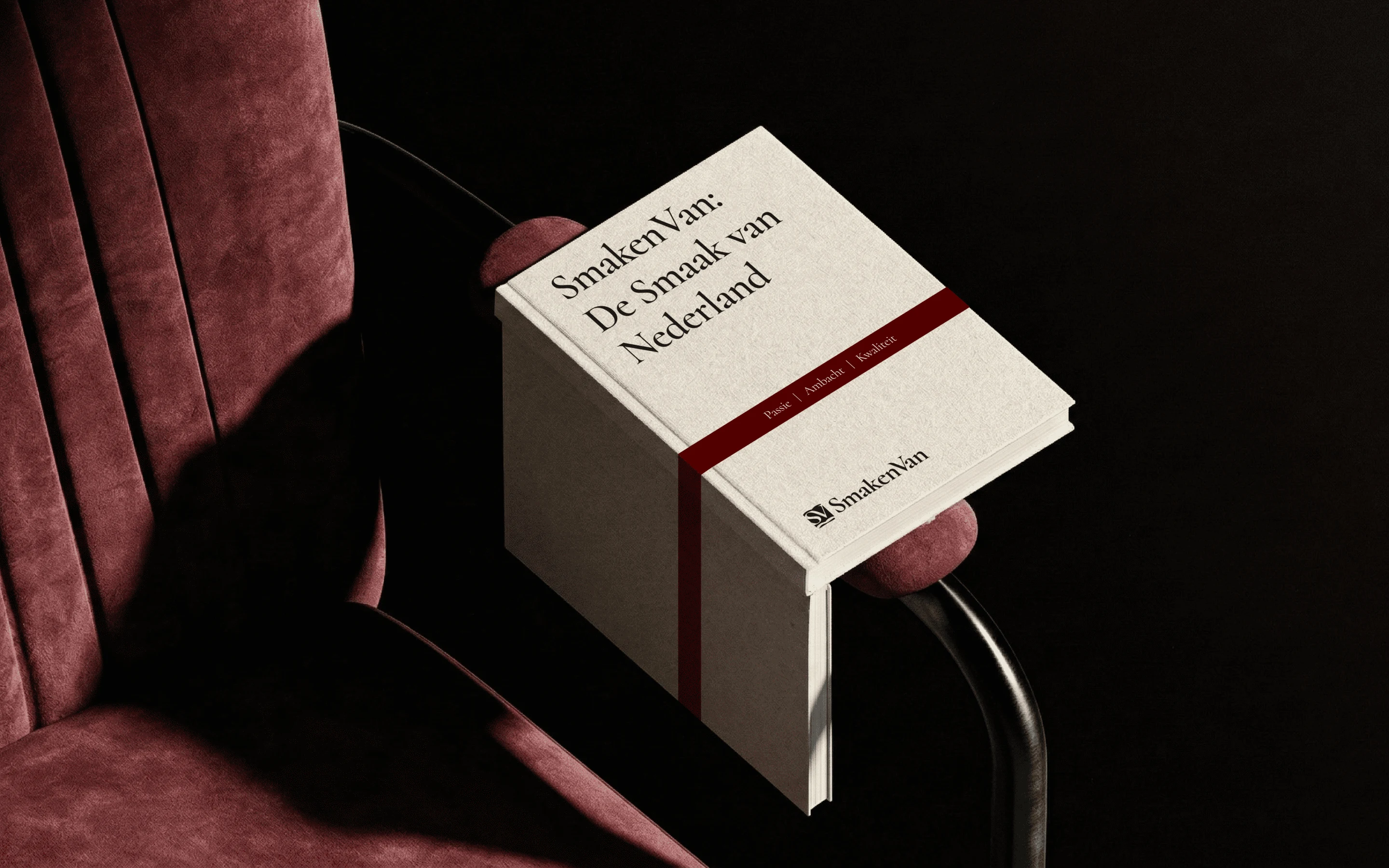
The book metaphor gives the brand a natural editorial language — every restaurant can become a chapter, every region a story, and every meal another discovery.
This makes the identity flexible enough to grow beyond a restaurant directory into a broader culinary discovery platform.
The Impact
SmakenVan has a distinctive culinary brand identity that connects Dutch gastronomy with contemporary editorial design.
The project combines branding, logo design, visual identity, typography, art direction, and graphic design into a system built around discovery, culture, and authentic food experiences.
A brand designed not just to help people find somewhere to eat — but to make them curious about the story behind the table.
The Takeaway.
Every great meal has a story. SmakenVan gives people a reason to open it.
Like this project
Posted Aug 12, 2026
Brand identity and logo design for a Dutch culinary platform connecting gastronomy, restaurants, regional stories, food culture, and culinary discovery.