Cravology Brand Identity Design
SIYAVUL HALIK
Positioning: Cravology is the indulgent escape for modern sweet tooths—delivering playful, premium ice cream experiences that blend bold flavors with vibrant energy. Targeting young adults and families, we craft a "crave-worthy" world where dessert is an adventure: fresh, fun, and unapologetically joyful.
Core Pillars:
Irresistible Indulgence: Dripping with creamy, scoopable character—elevating everyday treats to shareable moments.
Energetic Playfulness: Bouncy, youthful vibes that spark smiles and conversations.
Fresh & Franchise-Ready: Scalable design for global expansion, rooted in lime-green freshness and pastel-pink sweetness.
Tone & Voice: Quirky yet confident—whimsical words like "Scoop the Joy" paired with bold, approachable energy.
Brand Overview Visual Identity:
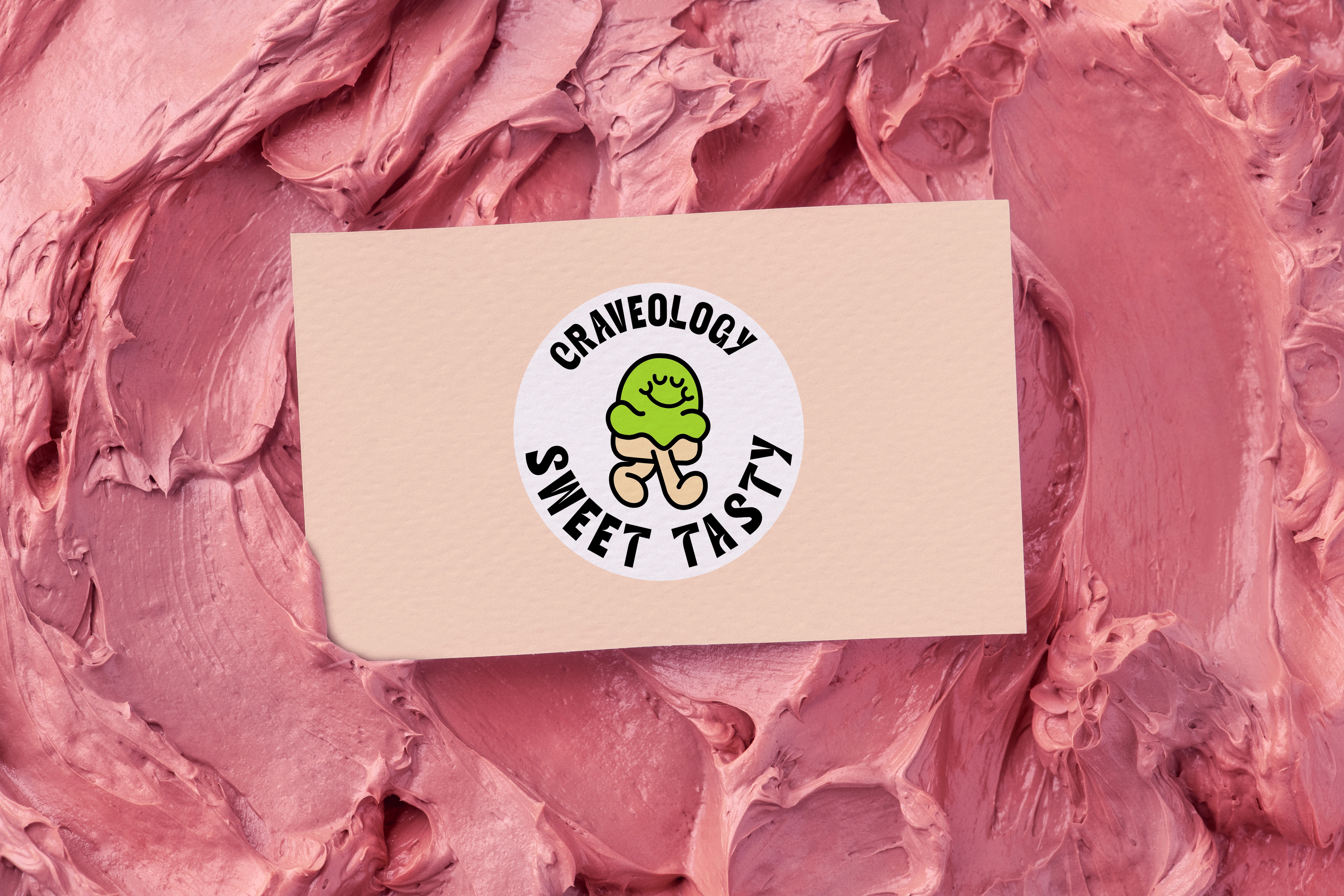
Logo: Custom typography in rounded, bubbly forms (e.g., "Cravology" with layered green/pink outlines). Versatile: Primary (full wordmark), Secondary (CS monogram), Icon (smiling scoop mascot). Color Palette: Lime Green (#A8E6CF) for zest, Pastel Pink (#F7CAC9) for sweetness, Cream (#FFF8E7) for indulgence, Charcoal (#2C3E50) for grounding. Typography: Playful sans-serif (e.g., custom "C" with ice cream drip) + clean modern body (e.g., Montserrat). Mascot: "Scoop"—a happy, green ice cream character embodying quirky charm and brand recall.
Why Cravology Wins: Trendy-modern design aligns with food branding currents (e.g., playful minimalism à la Salt & Straw). Memorable monogram + mascot drive 30%+ recall uplift. Scalable for 50+ locations.
Like this project
Posted Nov 15, 2025
Developed a playful, premium ice cream brand identity for Cravology.