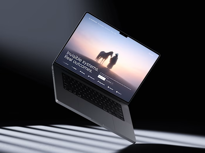
ARO · Identity for a home appliance brand

Shivansh Tomar


Overview
Appliances live in a home for years, so the ARO brand had to feel the same: quiet, precise and built to last. The whole system comes from one arch, taken from the A.
Our role: identity, construction rules, graphic language and applications.

ARO brand guidelines.
The idea: Better everyday living
Calm over loud. Warm neutrals, one deep green and a single shape that can stand on its own: the arch.
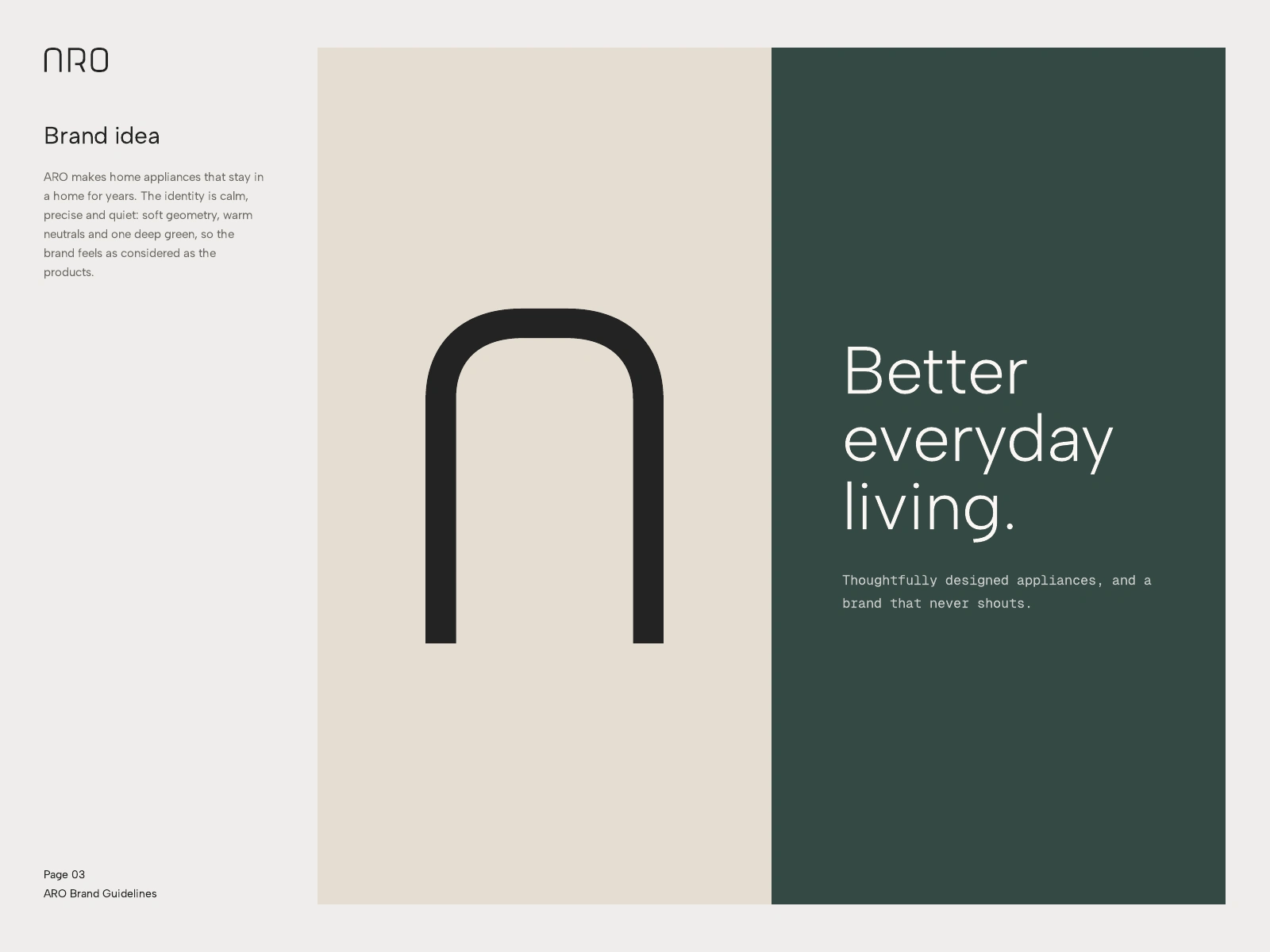
The brand idea.
Logo system
Every measurement in the wordmark comes from the stroke width. Corner radii are 3x, the gap after the A is 3x, after the R 2.5x, and the letters stand 11x tall. The mark can be rebuilt from rules, never by eye. The arch logomark is the A on its own.
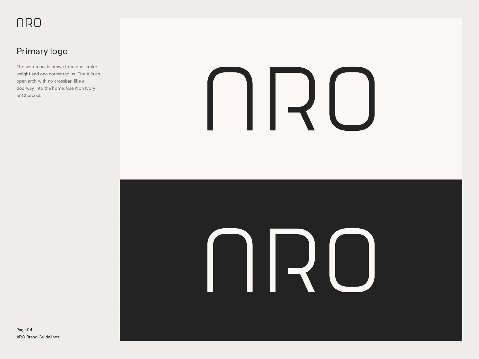
Primary wordmark on Ivory and Charcoal.
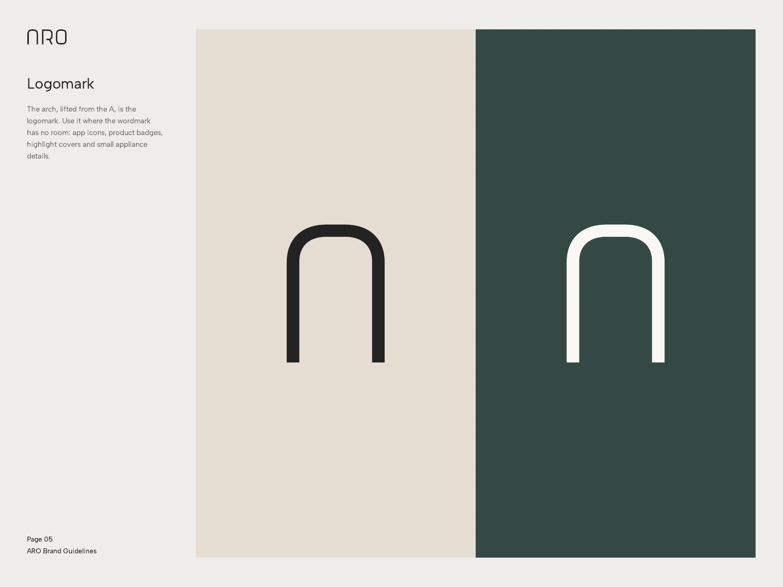
The arch logomark.
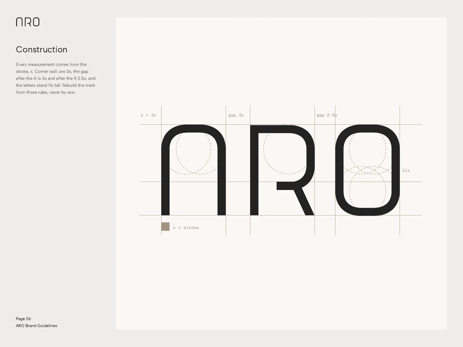
Construction, every value a multiple of the stroke.
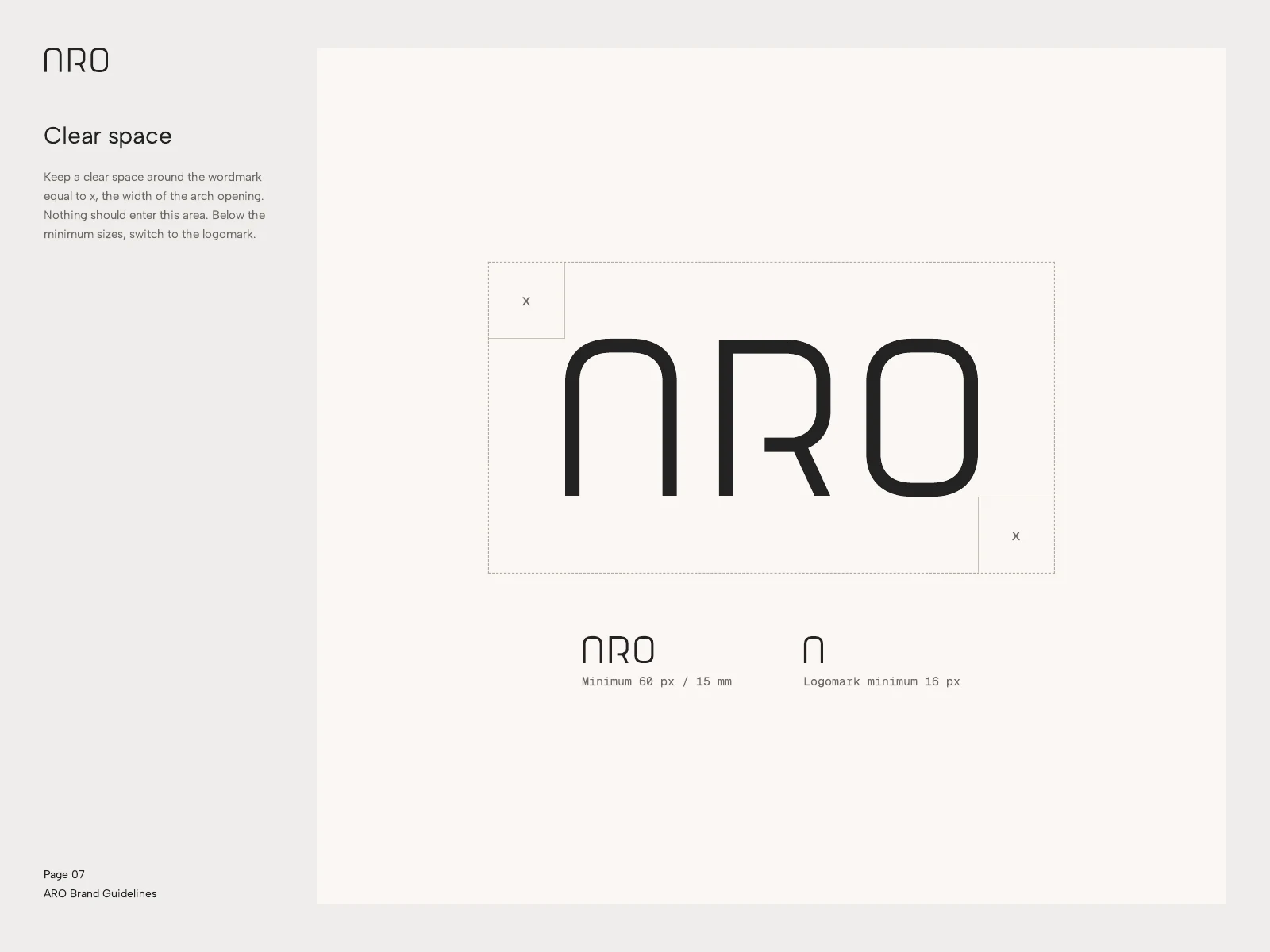
Clear space and minimum sizes.
Colour and type
Ivory, Sand and Taupe as the warm base, Pine as the accent and Charcoal for the product. Albert Sans for headlines and copy, Geist Mono for specifications and labels.
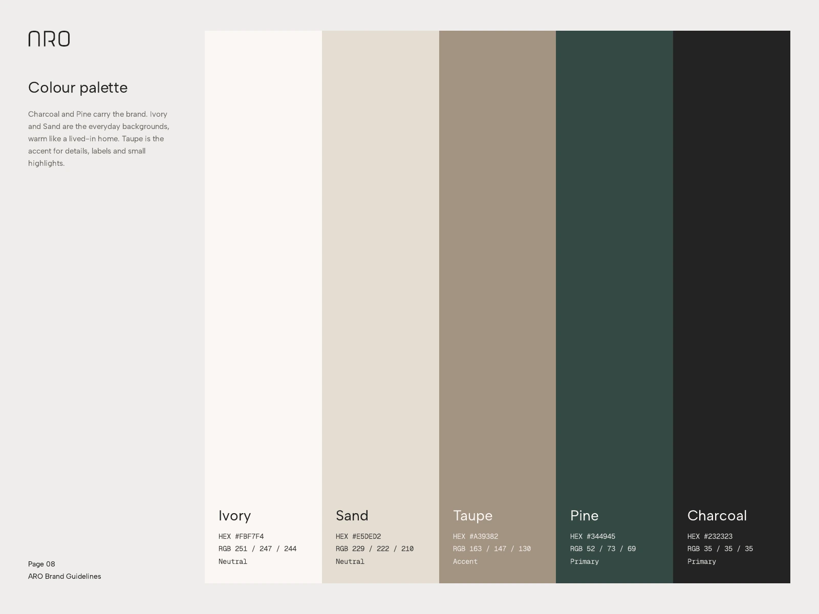
Five-colour palette with values.
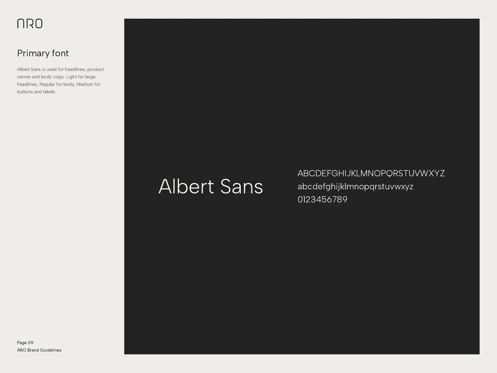
Albert Sans, the primary face.
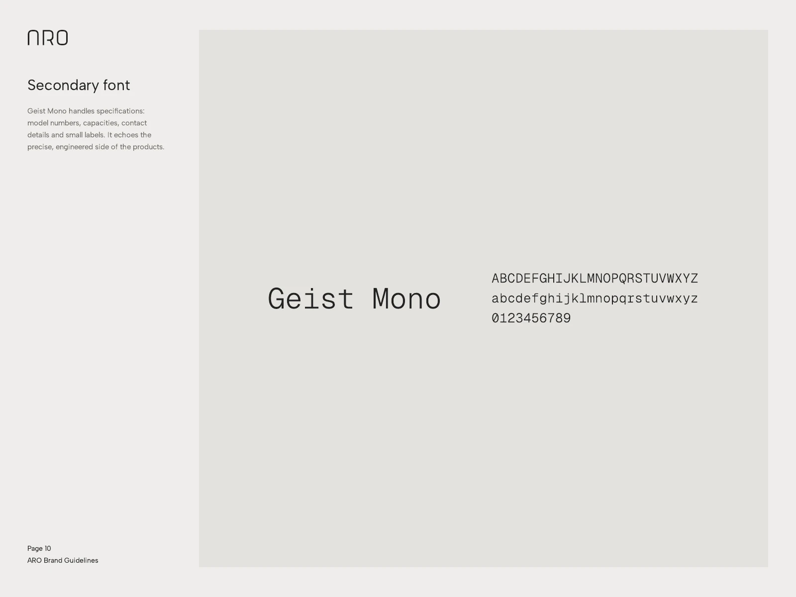
Geist Mono for specifications.
Graphic language
Two patterns from the logo: fine diagonal strokes and a repeating arch. They fill surfaces without adding a second idea.
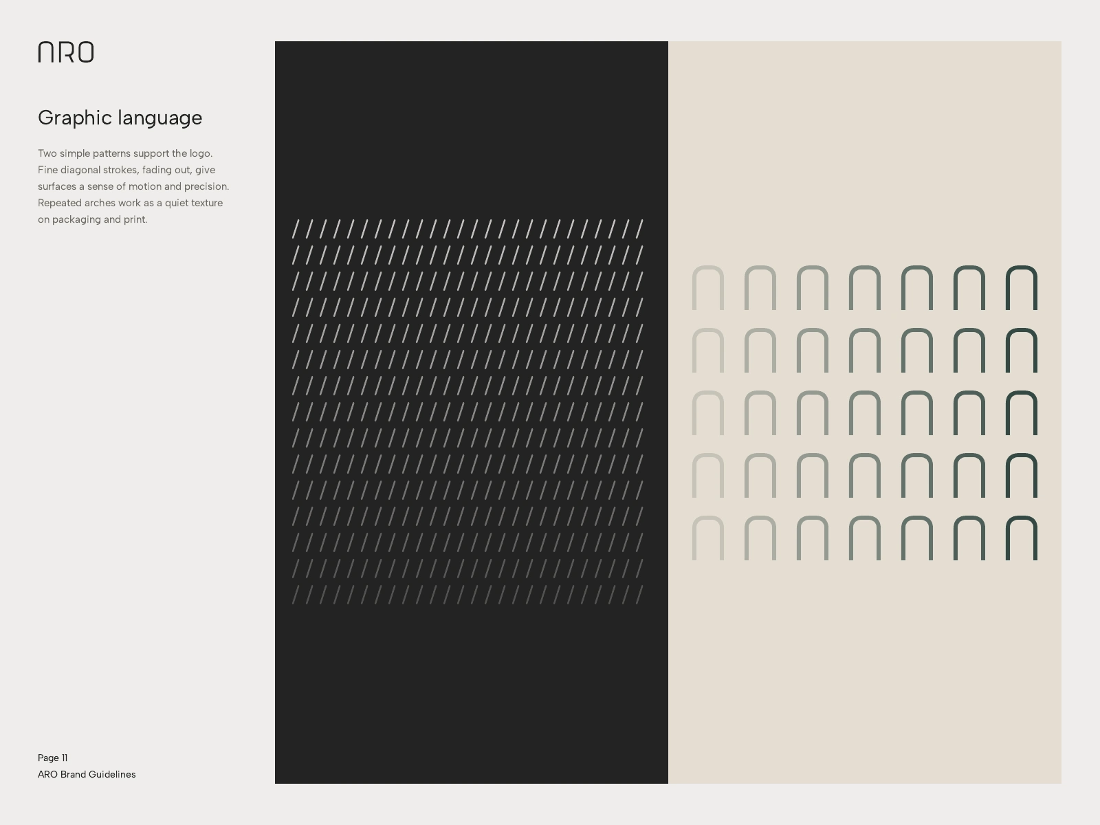
Stroke and arch patterns.

The wordmark in motion blur, a key visual.
Applications
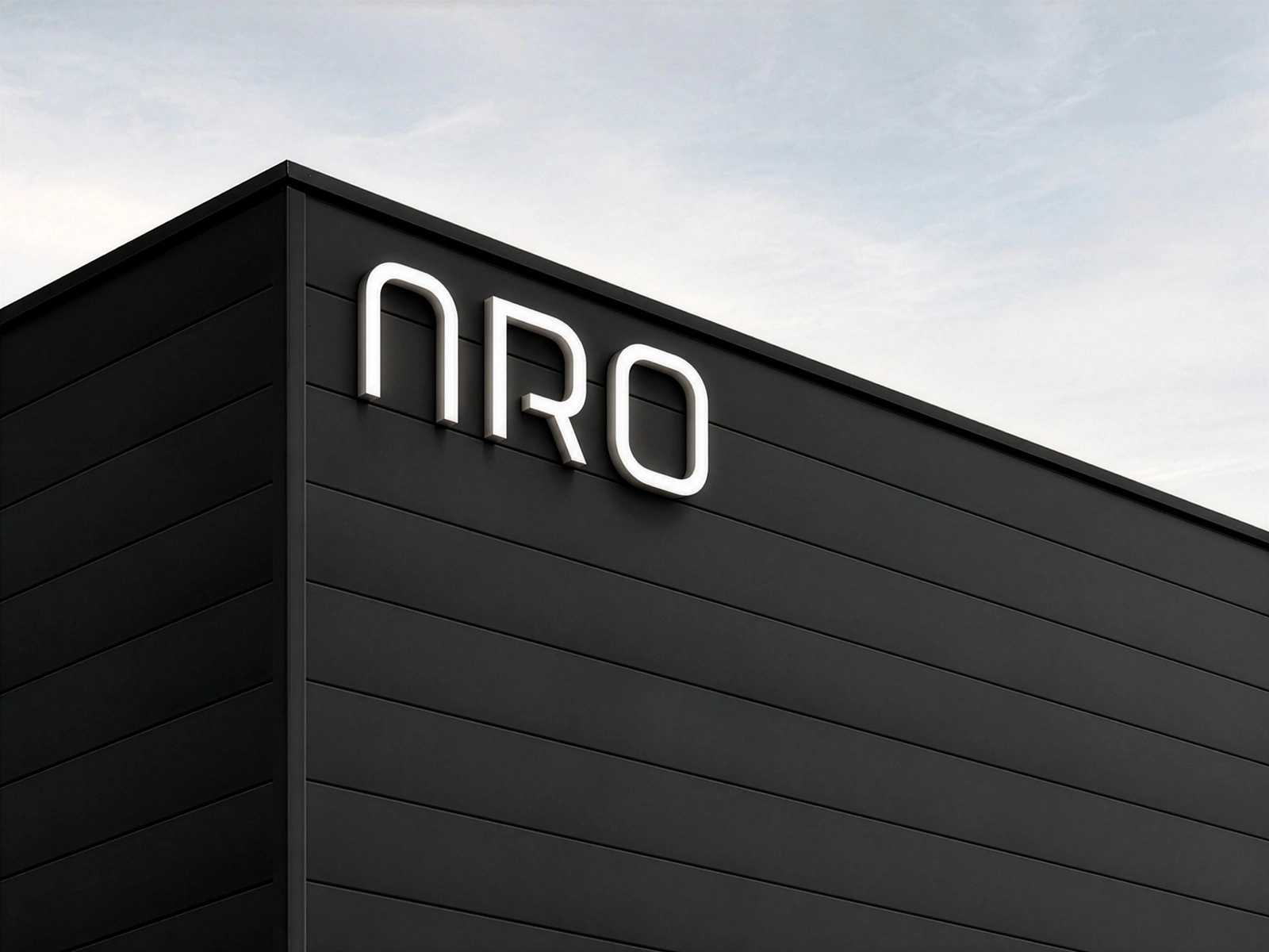
Signage, fleet, tags and stationery, all Charcoal with the wordmark in white and the stroke pattern as texture.
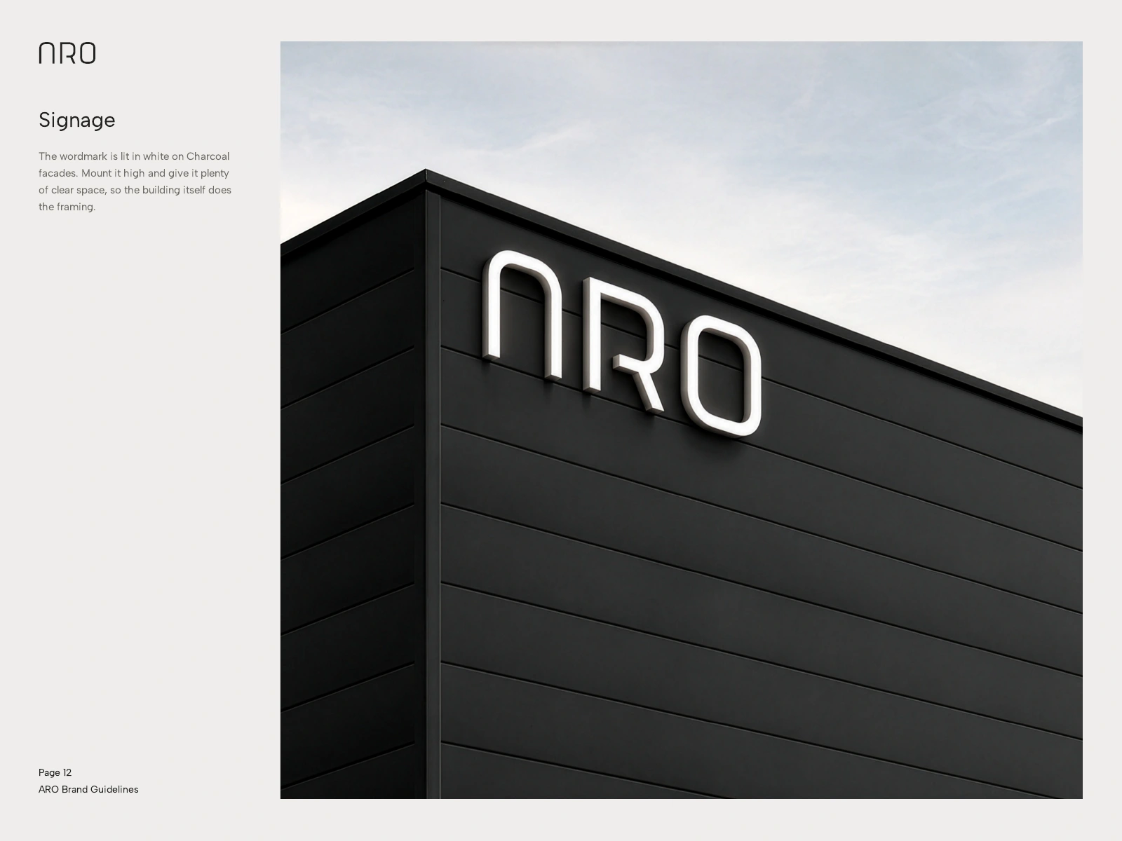
Facade signage.
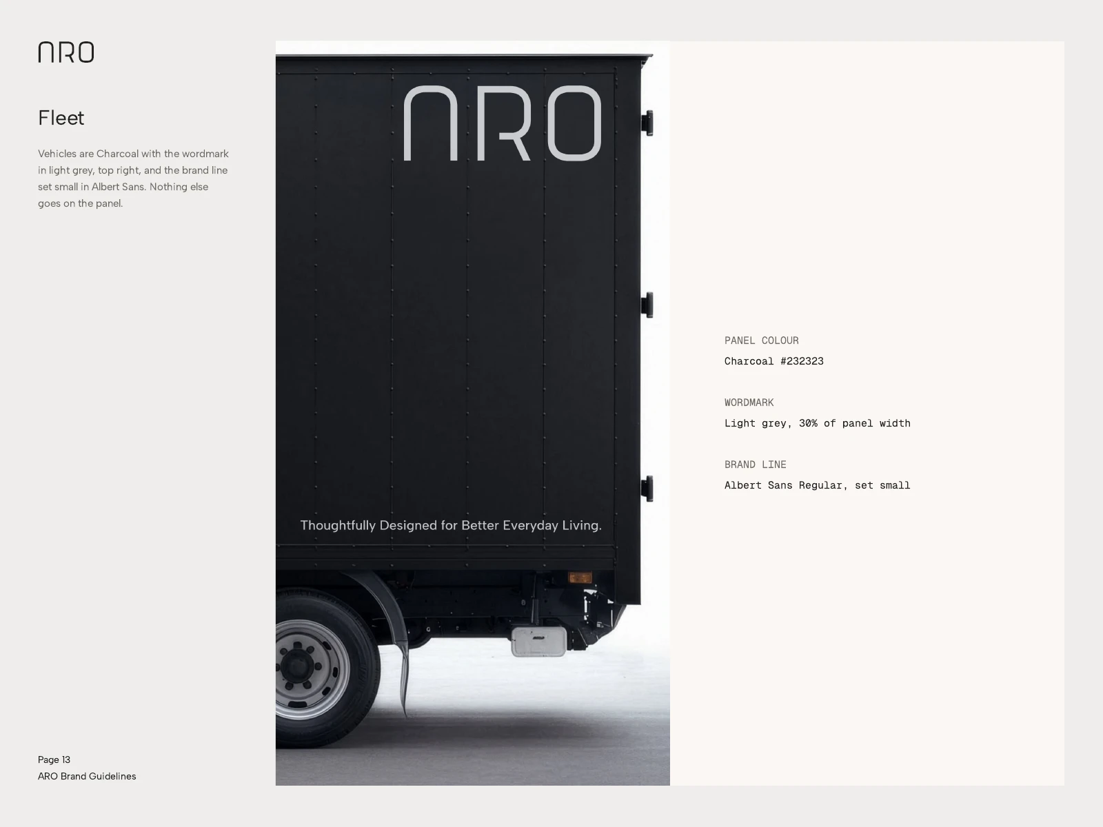
Fleet livery.
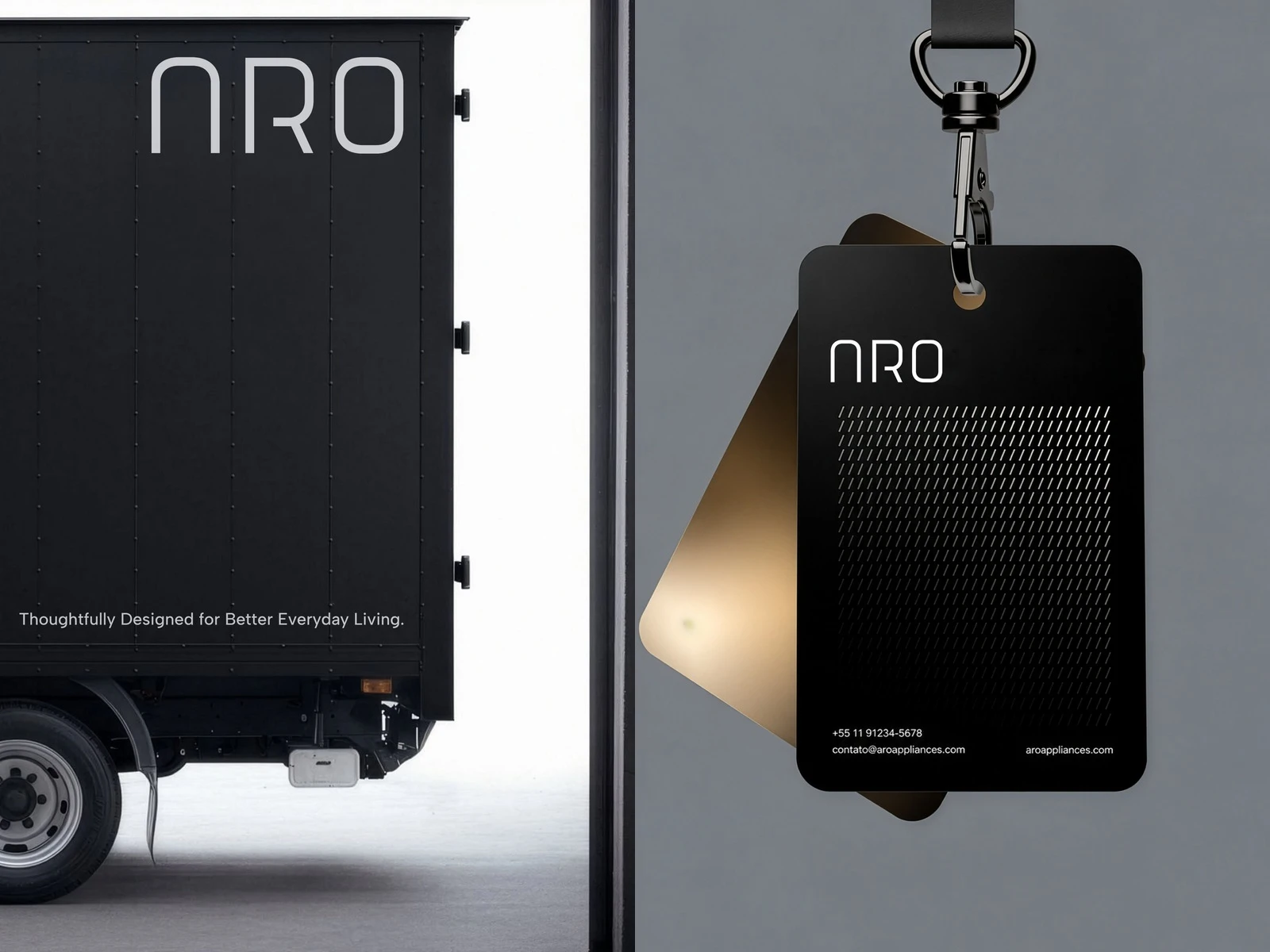
Fleet and product tag.
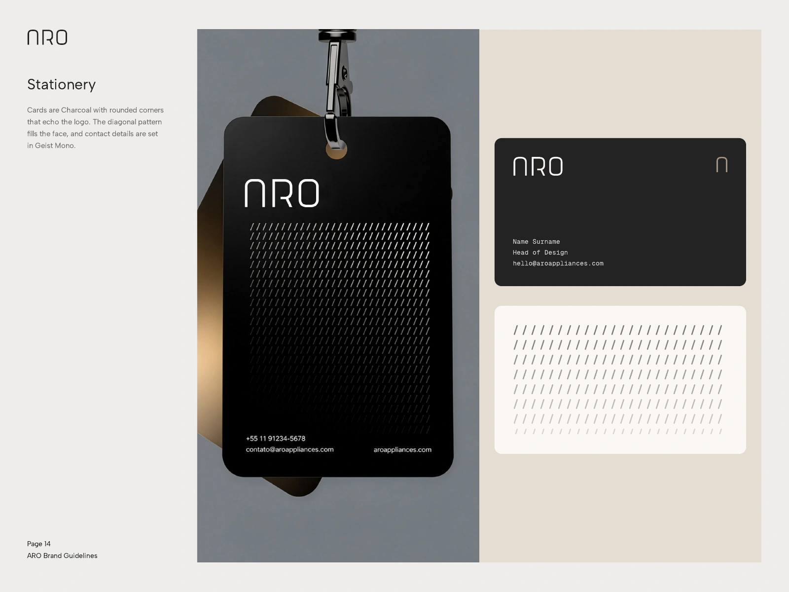
Tags and business cards.
Social
An Instagram profile and post system that alternates product, pattern and type.
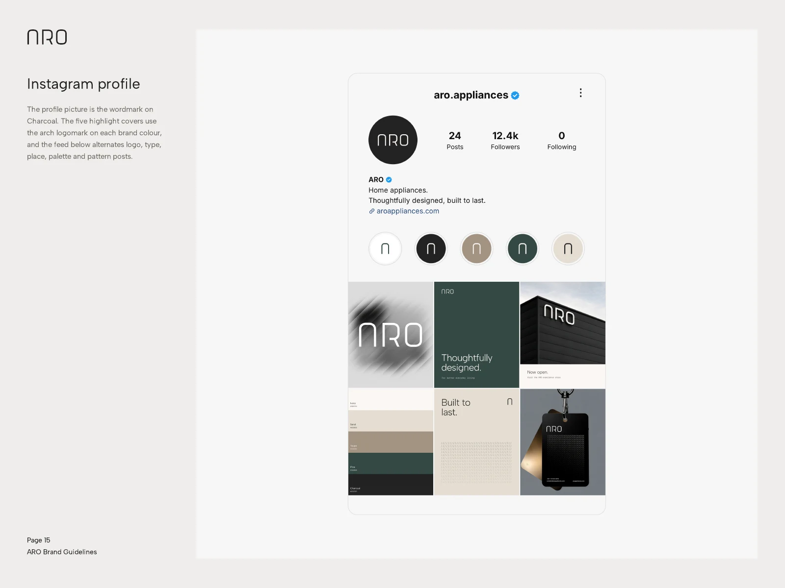
Instagram profile.
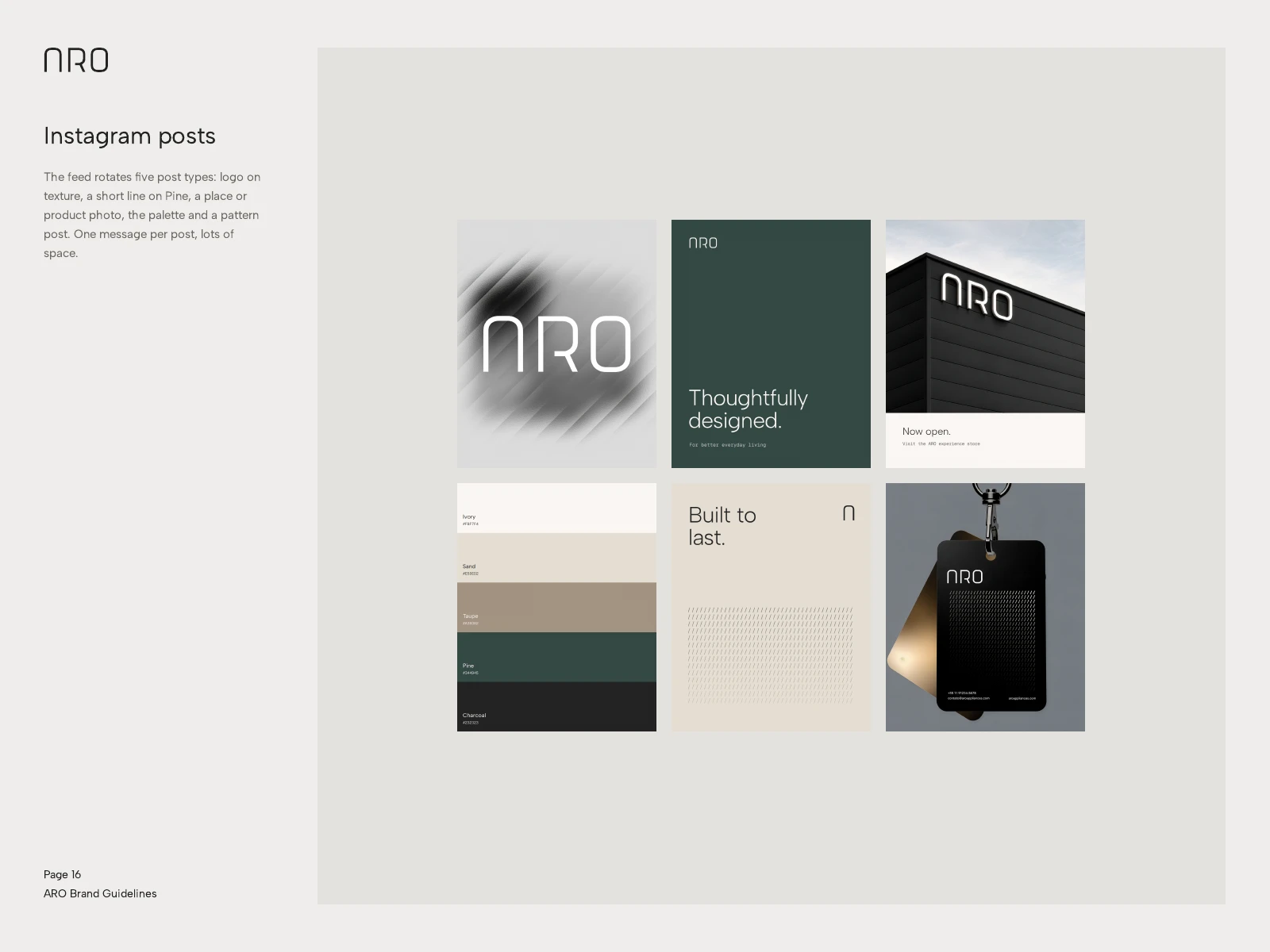
Post system.
What we delivered
Wordmark and arch logomark with construction rules
Colour palette and type system
Graphic language
Signage, fleet, stationery and Instagram system
Brand guidelines
Need an identity built on rules your team can follow? Message us here on Contra.
Like this project
Posted Nov 3, 2026
A quiet, precise identity for home appliances, built from one arch and rules taken from the stroke width.
Likes
0
Views
1
Clients
ARO