Forto Brand Revamp Project
alem sacak

In 2022, Forto initiated a comprehensive brand refresh, with the majority of implementation occurring in 2023. This project encompassed a complete overhaul of the brand's visual identity, including a new color palette, typography system, custom icons, and illustrations. Crucially, it also involved developing adaptable supporting visuals designed for seamless integration across both print and digital platforms, with the overarching goal of enhancing brand recognition and cohesiveness through a distinct and impactful visual language.
Supporting Visuals
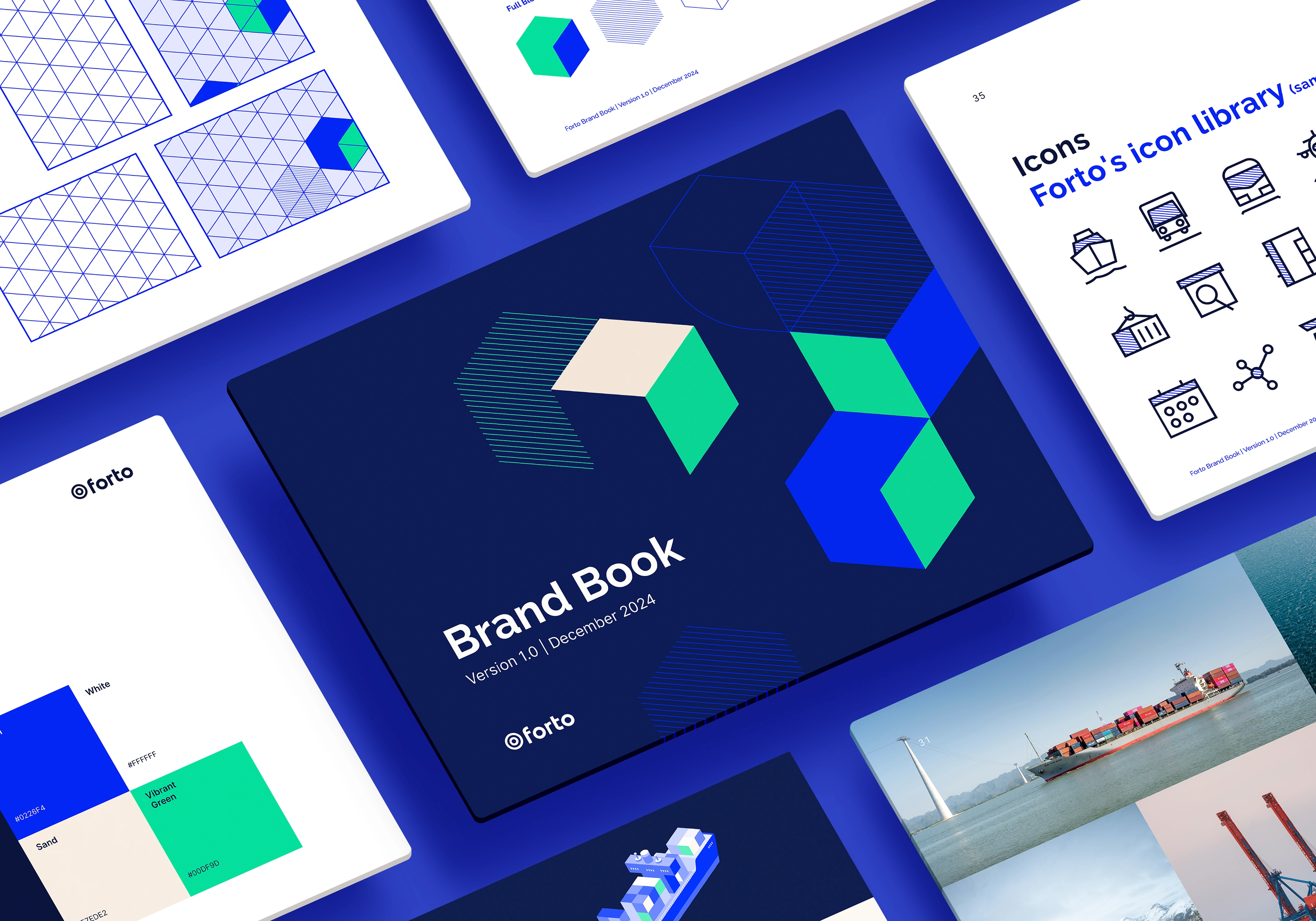
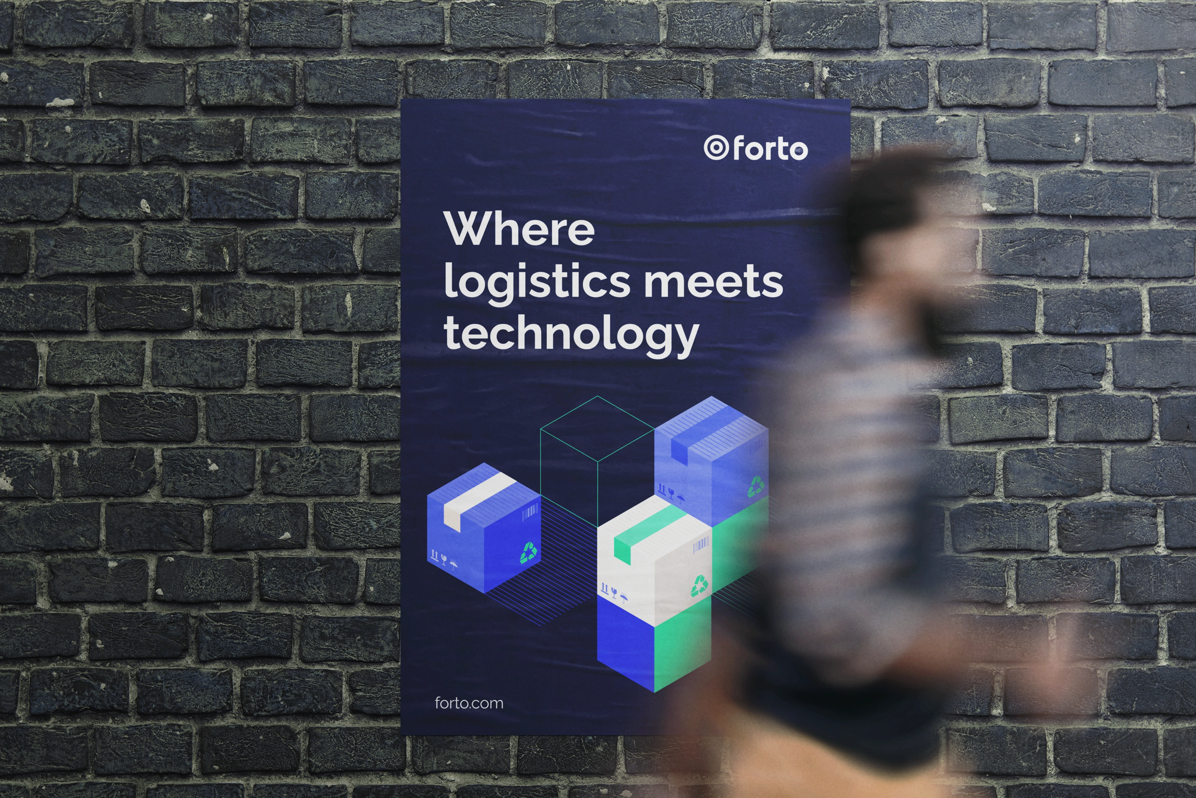
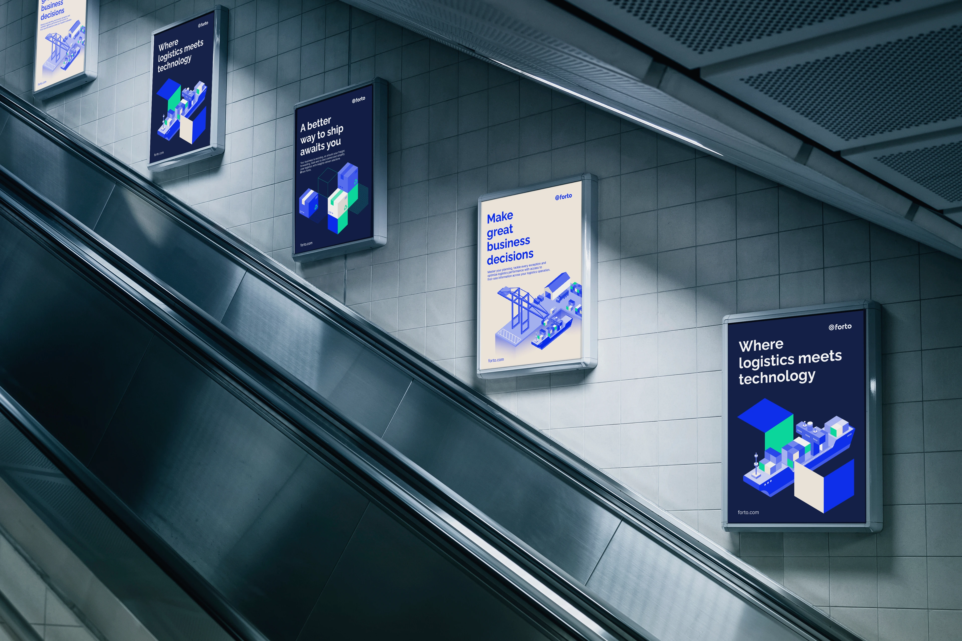
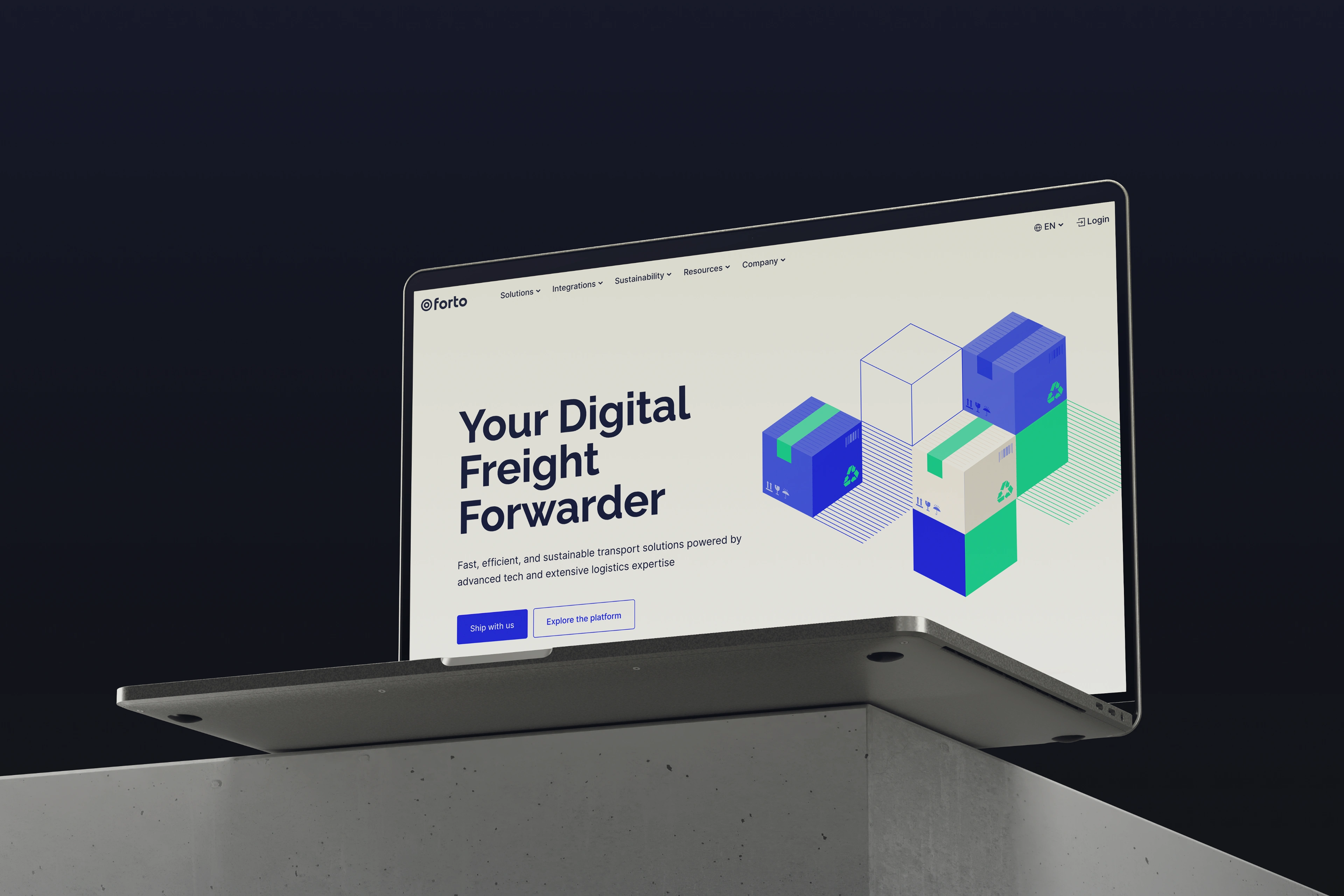
Forto Blocks
The core objective for the supporting visuals was to create a design that was both minimalistic and meaningfully impactful. Through research and experimentation, an isometric block system, dubbed "Forto Blocks," was developed to construct a comprehensive visual narrative. This approach allowed for a clean, modern aesthetic while effectively communicating Forto’s core themes of movement, connectivity, and innovation.

The design concept centers around three key brand elements: containers and goods, movement, and data. The use of isometric shapes with rounded corners provides a distinctive character. These rounded edges not only reflect Forto’s creative and innovative spirit but also subtly allude to various modes of transportation, such as the bow of a ship or a vehicle's wheel, further reinforcing the themes of movement and logistics.

Technically, the system utilizes three distinct block types: full blocks represent containers or goods; line patterns depict the movement of goods; and line blocks symbolize data points. These elements combine to form a cohesive visual language that strengthens Forto’s brand narrative and identity.

Brand Illustrations
Isometric Style
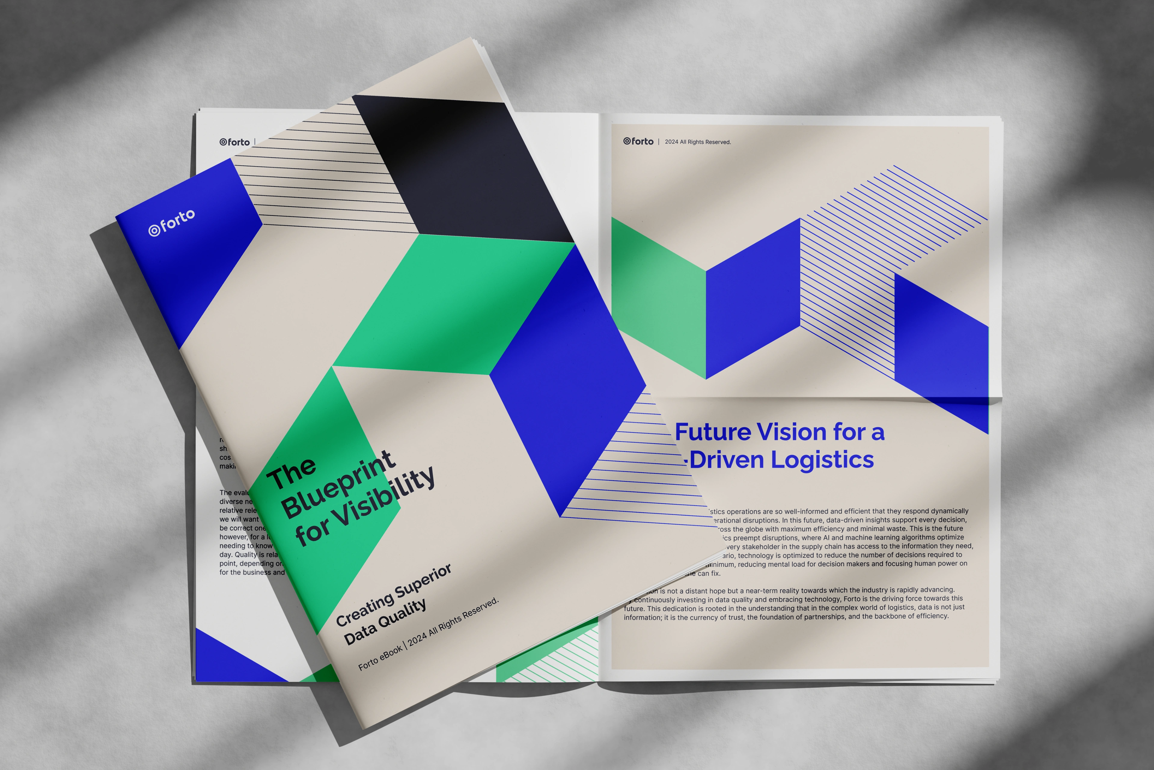
The new illustrations adopt a clean, minimalist, and playful style, enhancing Forto’s modern and approachable image. Primarily isometric in design, they achieve depth and three-dimensionality through parallel lines and evenly spaced elements.
A cohesive and striking visual palette is achieved through the use of three primary colors—Vibrant Green, Sand, and Ocean Blue—along with their respective shades. The isometric nature of the illustrations allows them to combine seamlessly, much like building blocks, ensuring visual harmony across all applications.


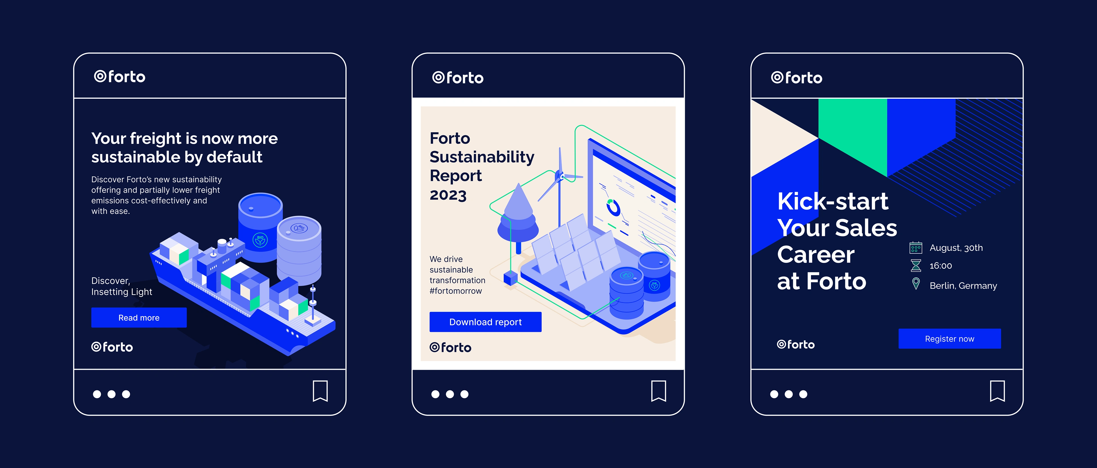
Versatile Applications
Striking and Adaptable Designs
The true impact of the supporting visuals and illustrations is realized in their application across various mediums. From posters and t-shirts to notebooks and digital platforms, these designs adapt effortlessly to both print and digital formats. Their striking presence commands attention while maintaining a balance between stability and innovation. The deep navy blue tones convey trust and reliability, while the vibrant green accents introduce a fresh, digital, and forward-thinking edge. This harmonious blend ensures that the visuals not only align with Forto’s brand identity but also leave a lasting impression at every touchpoint.
Like this project
Posted Feb 9, 2025
Branding, Graphic Design, Illustration, Adobe Illustrator, Adobe Photoshop, Figma
Likes
0
Views
7
Clients
Forto