BetterWorks
Marie Krueger
HR Software tool that simplifies performance management, aligns goals, and engages employees with feedback and recognition
OKR Creation Redesign
My Role:
Usability Testing
Persona Development and Research
User Interviews
Contribute to Visual Redesign & Layout
Quality Assistant Redesign
Accessibility & QA
Specing visual guides and repository for engineering
Duration: 7 months
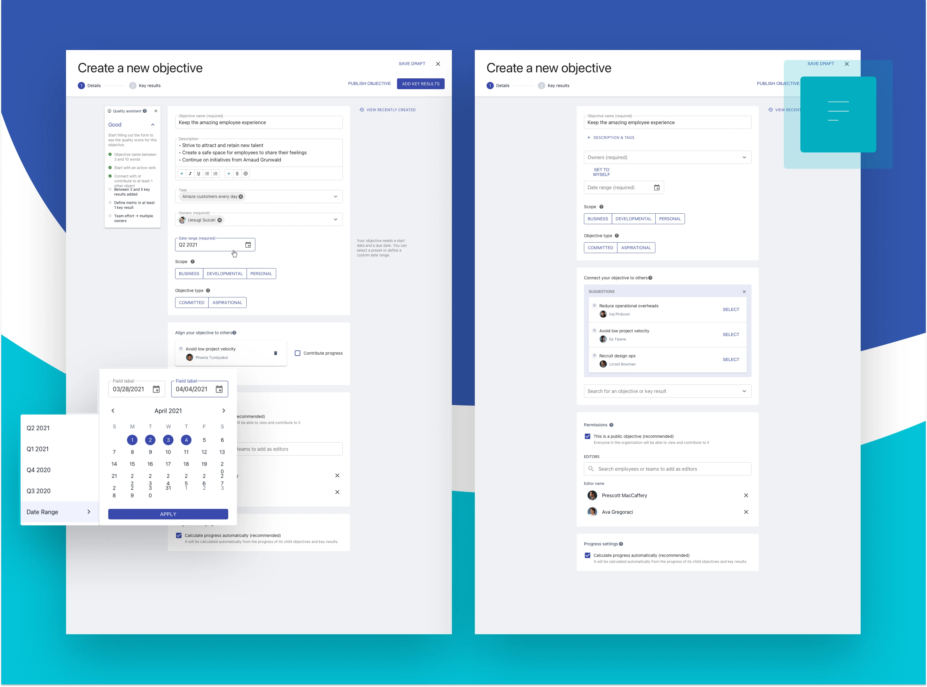
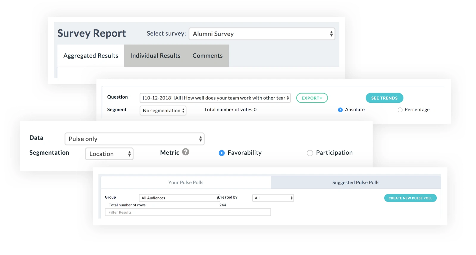
OKR Creation
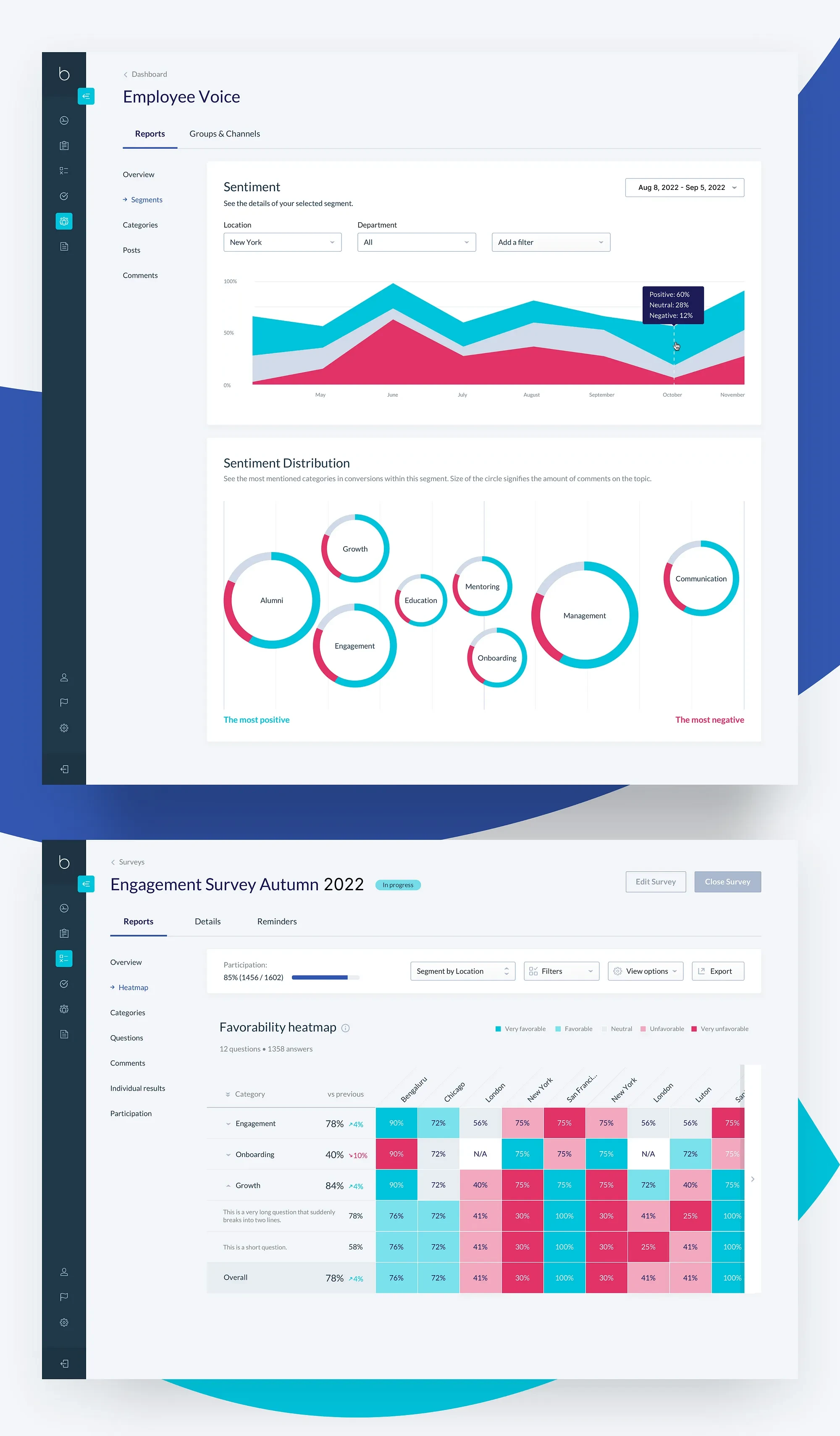
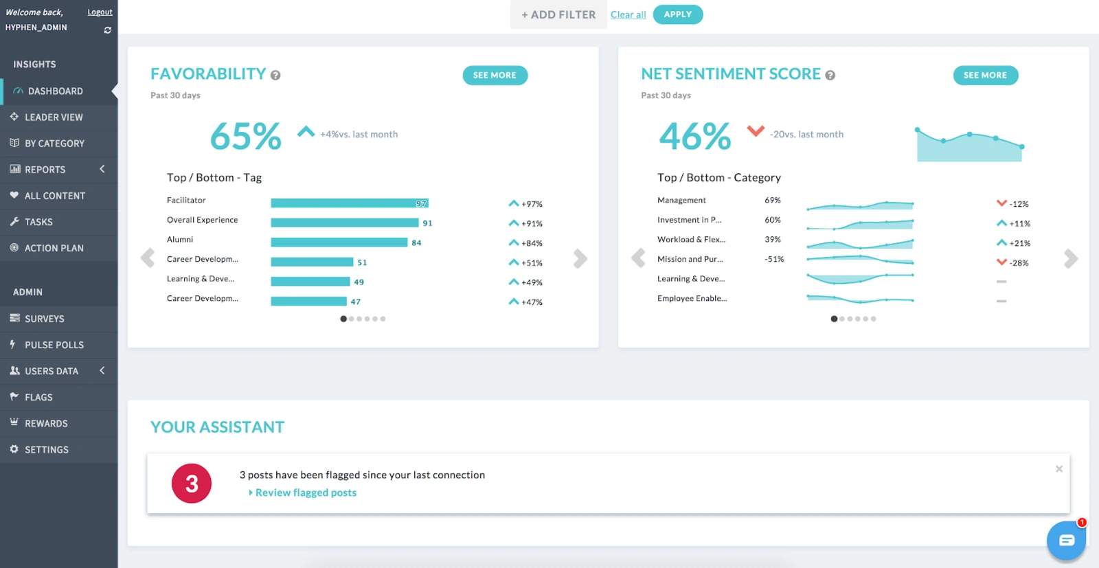
Metrics
Sentiment tracking and measuring employee engagement is easier than ever and compiled together meaningfully in one place
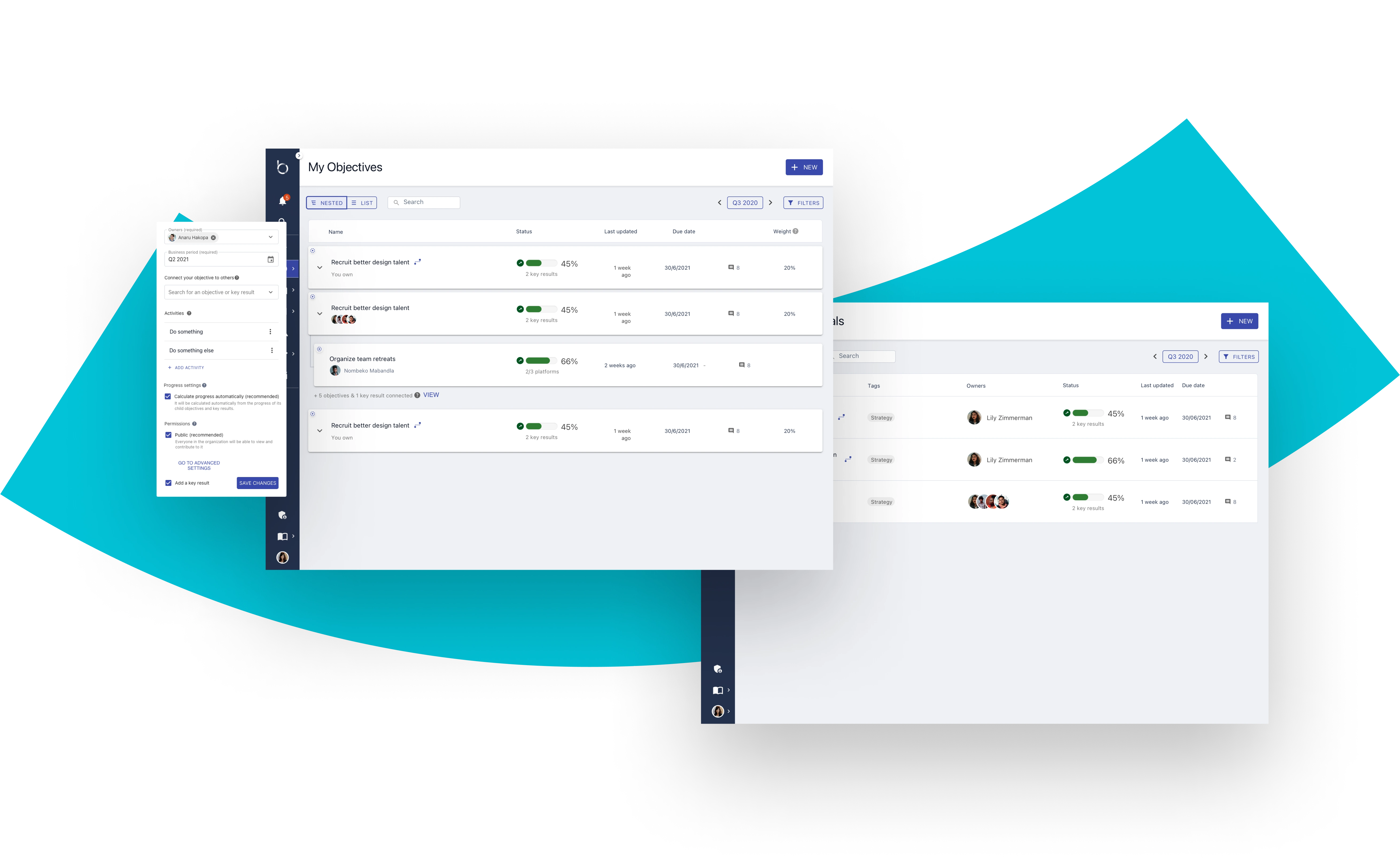
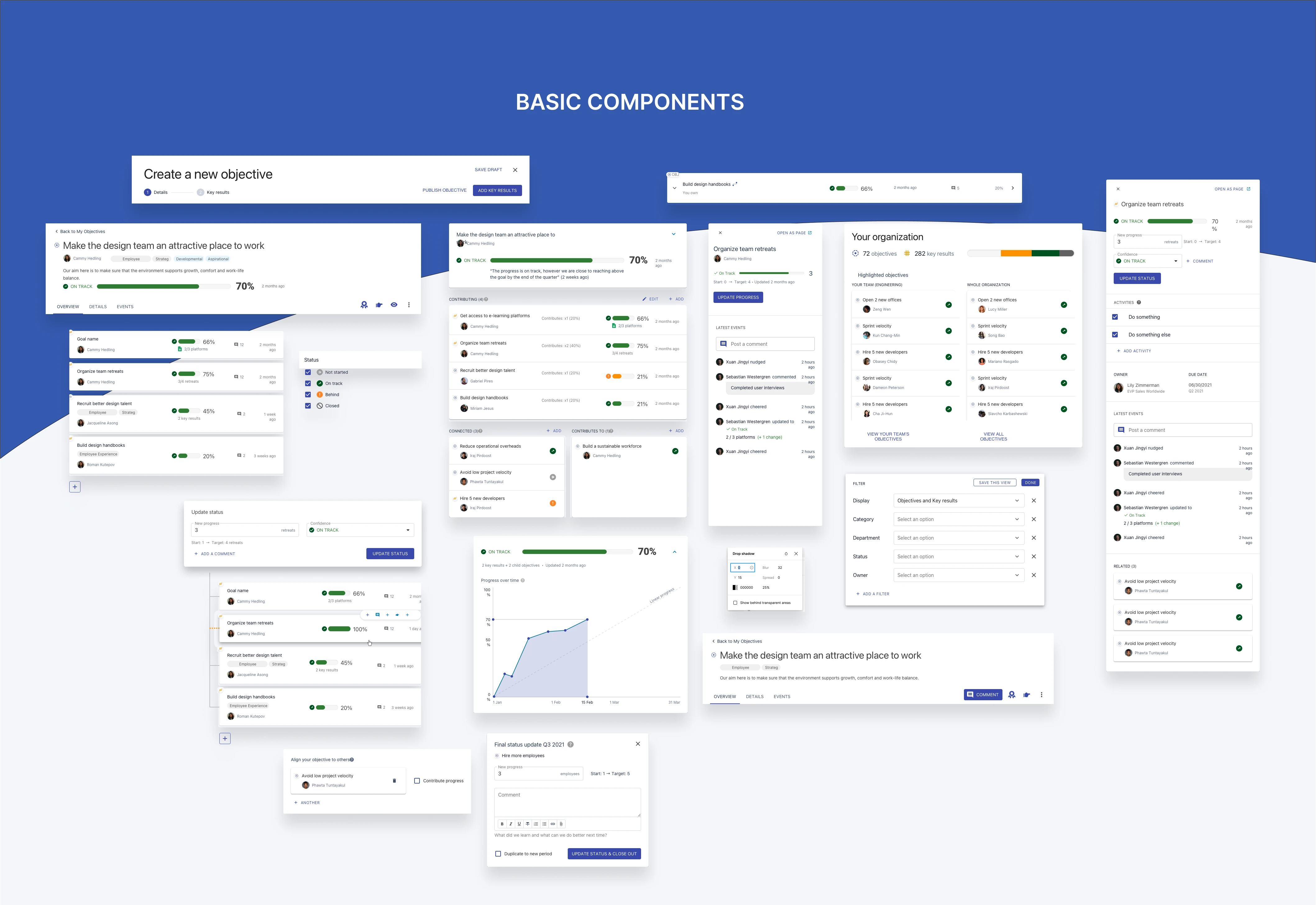
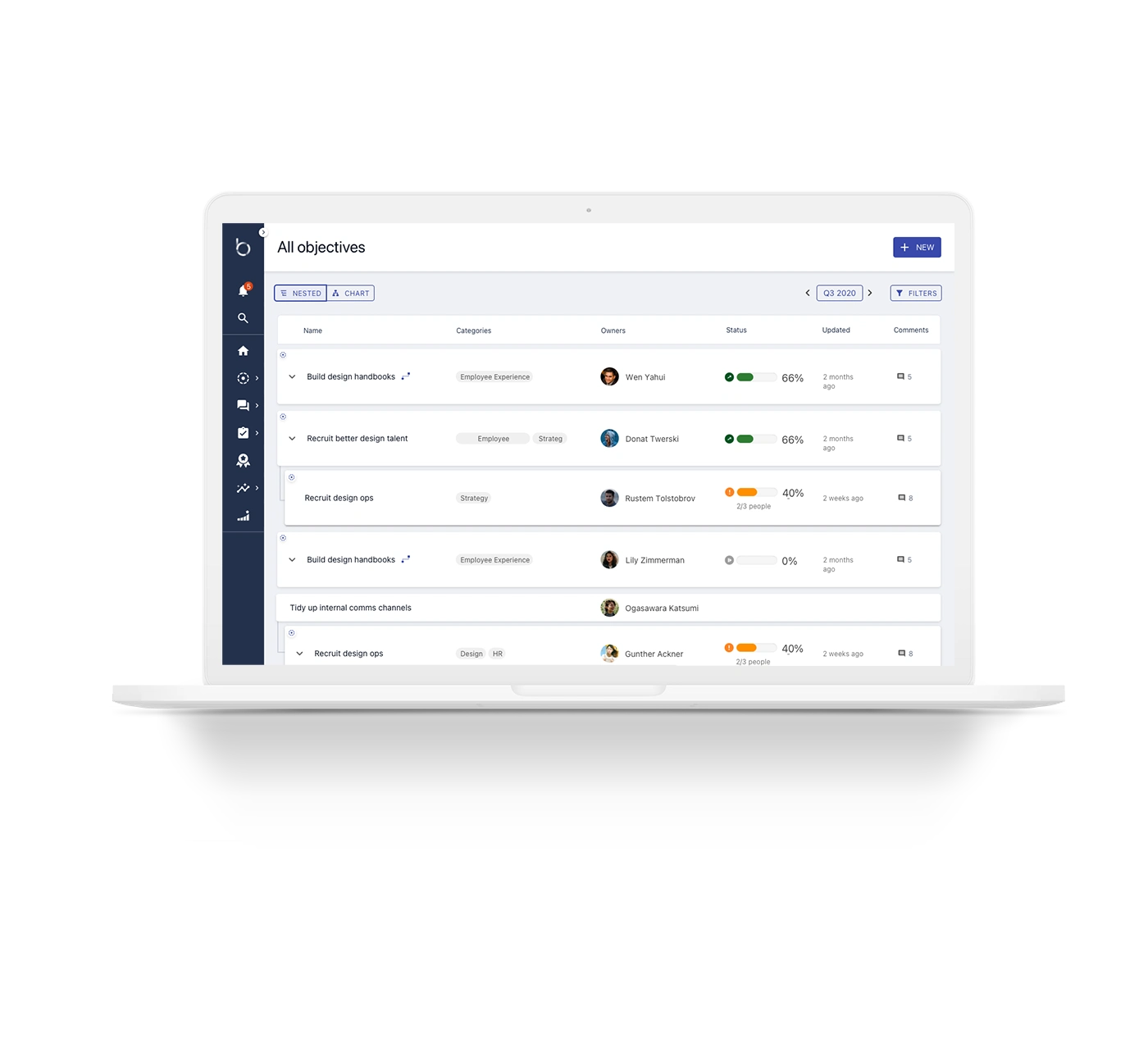
Objectives List & Nested View
Results
Increased engagement from individual contributors
Improved visibility for Objectives across all teams
Improved clarity and understanding around what makes a "great" (or best achievable level) OKR
Streamlined flow that made sense for all users
Features surfaced and organized, making them easier to find and use
Betterworks
Intelligent Performance Management Platform
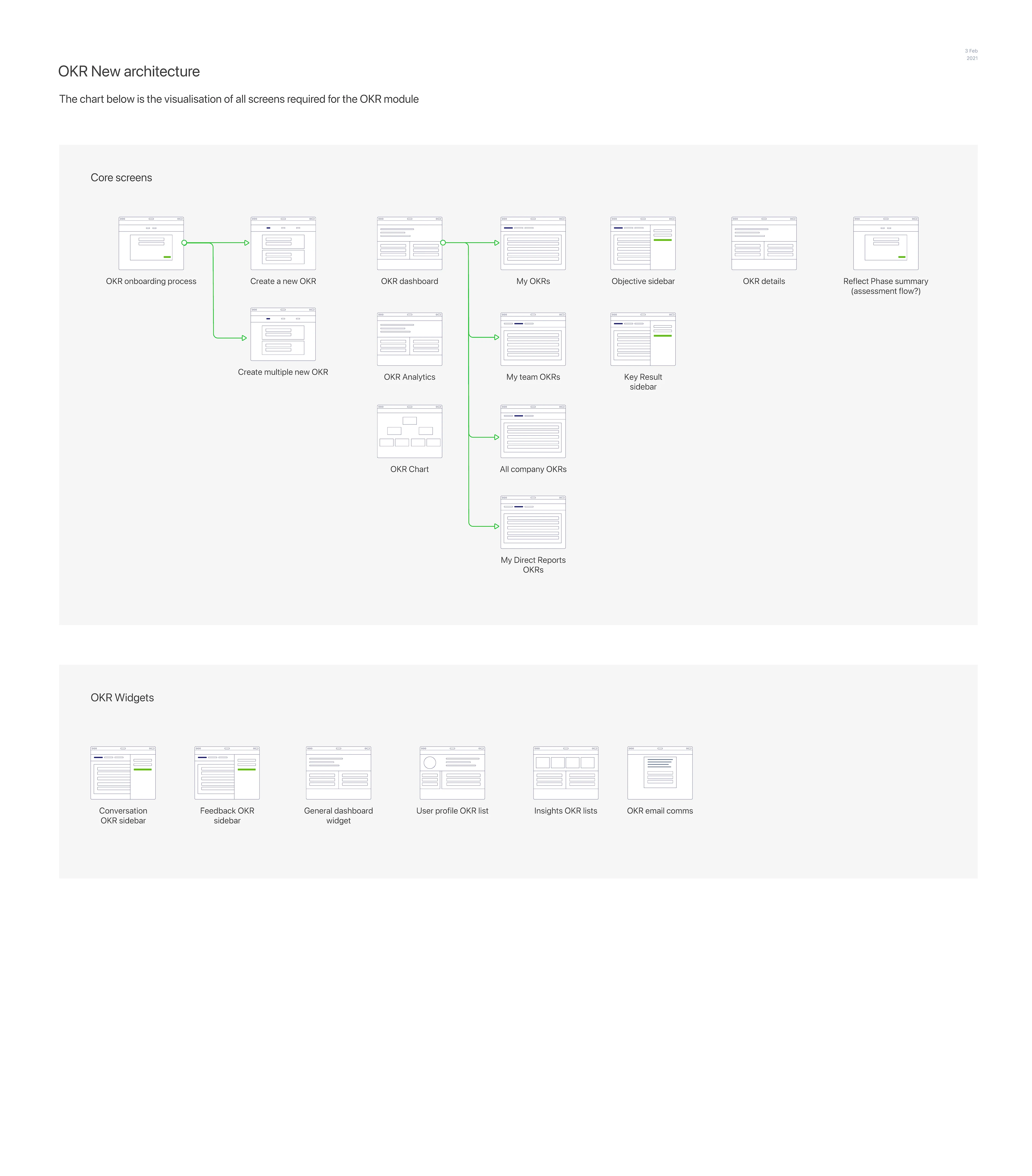
OKRs
OKRs or Objectives and Key Results are the DNA embedded into the fabric of Betterworks' approach to performance management. This had to be taken into consideration for the planning and foundation of the rewrite
There's a whole book about it:
Measure What Matters
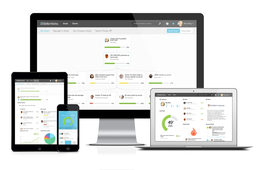
Before Version
Dashboard and Navigation did not support the core user flows
Users had to use workarounds since many useful features were buried. Adding to the confusion were redundant features and multiple ways to accomplish the same things, often even on the same screen. There were a glut of over 100 screens to navigate to find the desired area of the platform, including 50 multi-level report screens and a number of creator and settings screens.
Strategy
I collected feedback from HR specialists, Managers, Admins, and other user types
User Experience Audit
Usability testing with different user types
Stakeholder interviews
Analysis of customer service logs
Review of behavioral analytics
What we uncovered
Navigation and architecture was a jumble of disparate features cobbled together through gradual development. Features had to be squeezed in to areas they did not necessarily belong to avoid the entire structure from falling apart.
Screens were not grouped together in a way that supported the way users actually needed to use the application and their flows.
Features were strewn across multiple screens instead of compiled in a single page to enable completing tasks quickly and efficiently
Elements were inconsistent, so the cognitive load to learn the interface was high. Different teams built the same functions and ended up looking and behaving differently
Similar features look different across the platform. Users have a hard time using the application.
OKR Creation needed to be streamlined and organized to produce the best possible user experience for all user types from management to employees
UX Architecture
We needed to provide a clear navigation path and show the hierarchy of different modules. Similar elements were grouped into a single page where possible so users would not get lost. The navigation menus were used to go between screens, but also to show an overview of the application's structure. The user path was designed with ease of use and organization in mind, as well as providing a high level overview of important metrics.
We tested the designs and gathered feedback
We learned a lot and implemented the feedback into the final designs:
Painpoints for each user type
Executive / CEO
No way to track developmental OKR’s. Executive Assistants often don't have permissions to access admin areas of the app.
Line of Business Leader
Employee turnover, improving sentiment, unable to measure engagement
HR Admin
Need easier reporting. Inadequate and inconsistent permissions to have visibility for reporting and Calibration that requires chasing down other people to help them do their job.
Program Team Super Admin
Not having ability to impersonate and see all settings
Manager
Need way to track team progress and know quickly where to focus. Need more flexibility in program team design. Redundancy and inefficiency in quarterly and year end reviews.
Individual Contributor
Tool requires high effort and input but offers low value to IC’s. Employees are already managing heavy workloads and trying to complete all of their tasks and then need to add another list of tasks to it.
Goals for each user type
Executive / CEO
Setting performance goals and developmental metrics, giving feedback, delegating to Executive Assistants, talent promotion, leadership. Reporting, analytics, feedback
Line of Business Leader
Targeted to OKR’s, team metrics, contributors of feedback from teams, trends for cross functional collaboration.
HR Admin
Wants to improve experience, surveys, sentiment, employees and organizations are HR customers, they want to improve, you can create a OKR and assign to everyone, can see over time how it improves, we should have engage as part of the package an not an add on
Program Team Super Admin
Managing employee program, needs to be able to test scenarios without them occurring, responsible for data and analytics, determines who should have API keys, pull reports
Manager
Wants to help retain and develop employees, are here to check on goals, roadblocks, if direct reports need anything, alignment for direct reports, support and encouragement, need to push compliance and completion rates, feedback etc, coaching to develop.
Individual Contributor
Balance workload with OKR’s, meet goals, update progress, know team’s status, improve performance
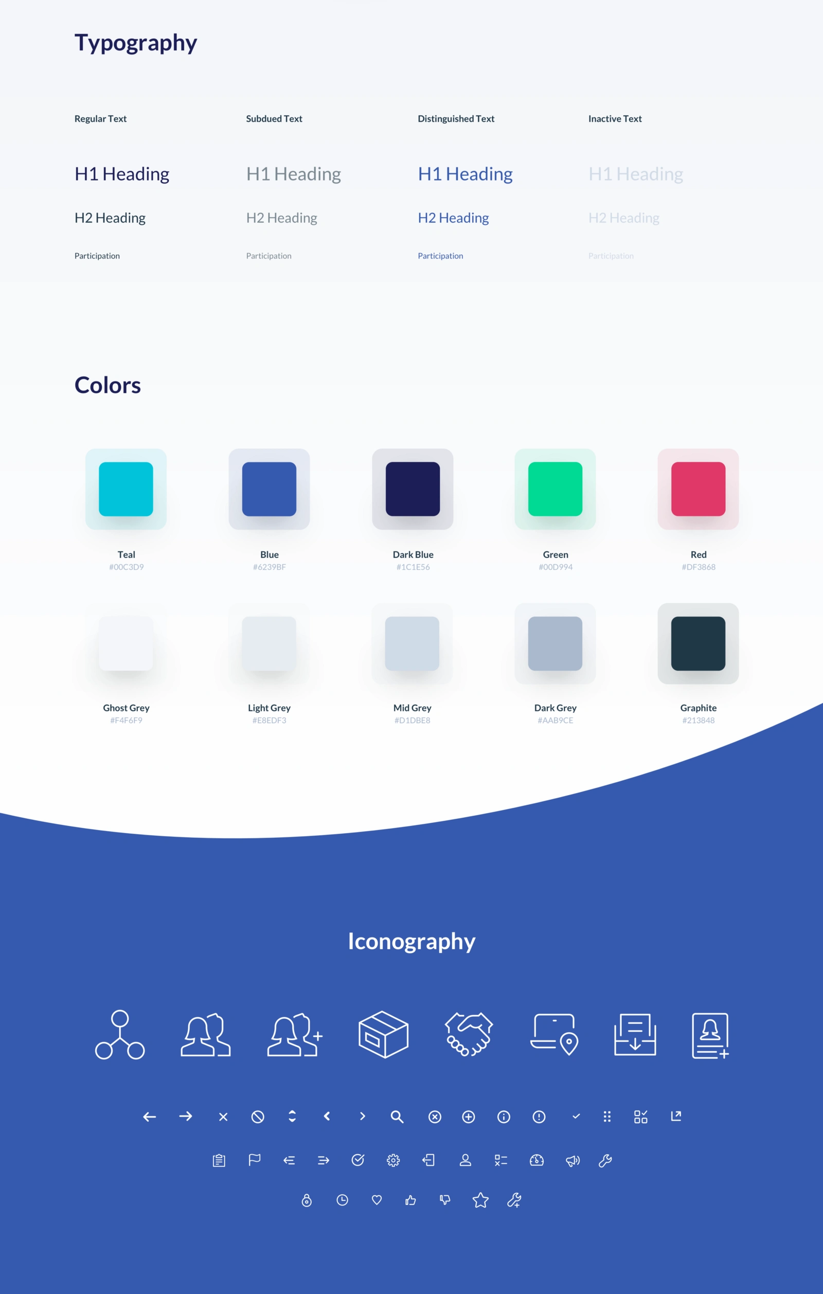
Style Guide
Using refreshed colors with a reduced and more meaningful color palette and iconography, the platform was revamped and important features were easier to find
Updated UI
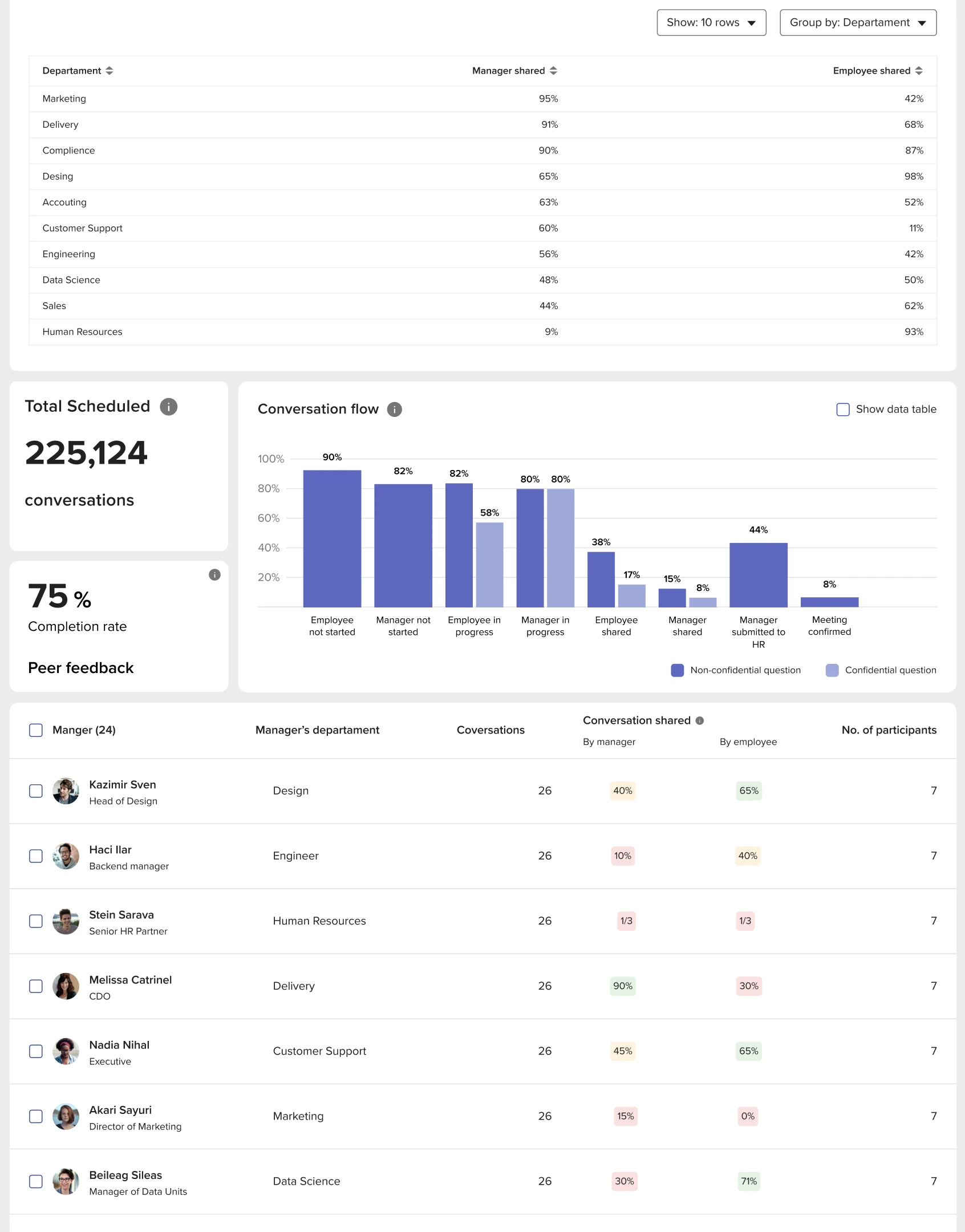
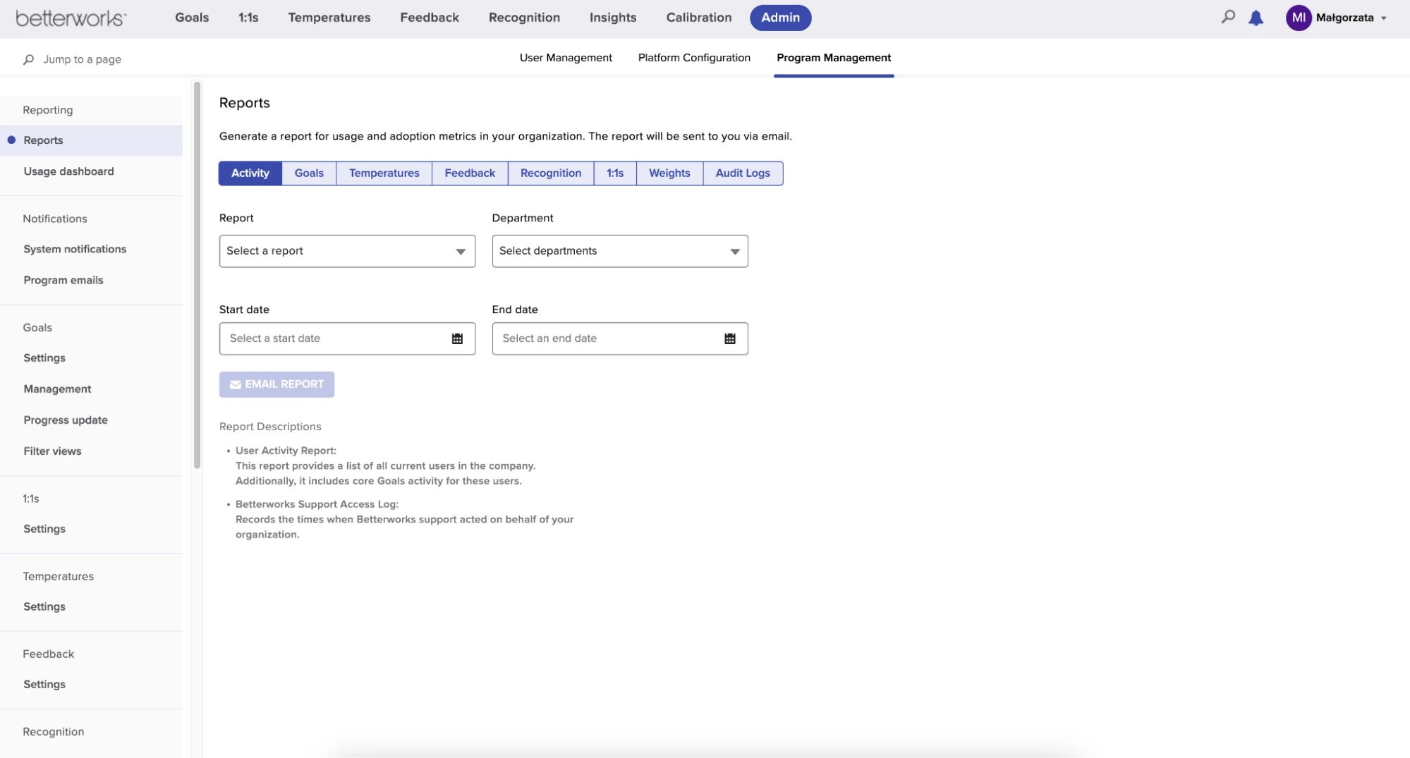
Reports Page test environment
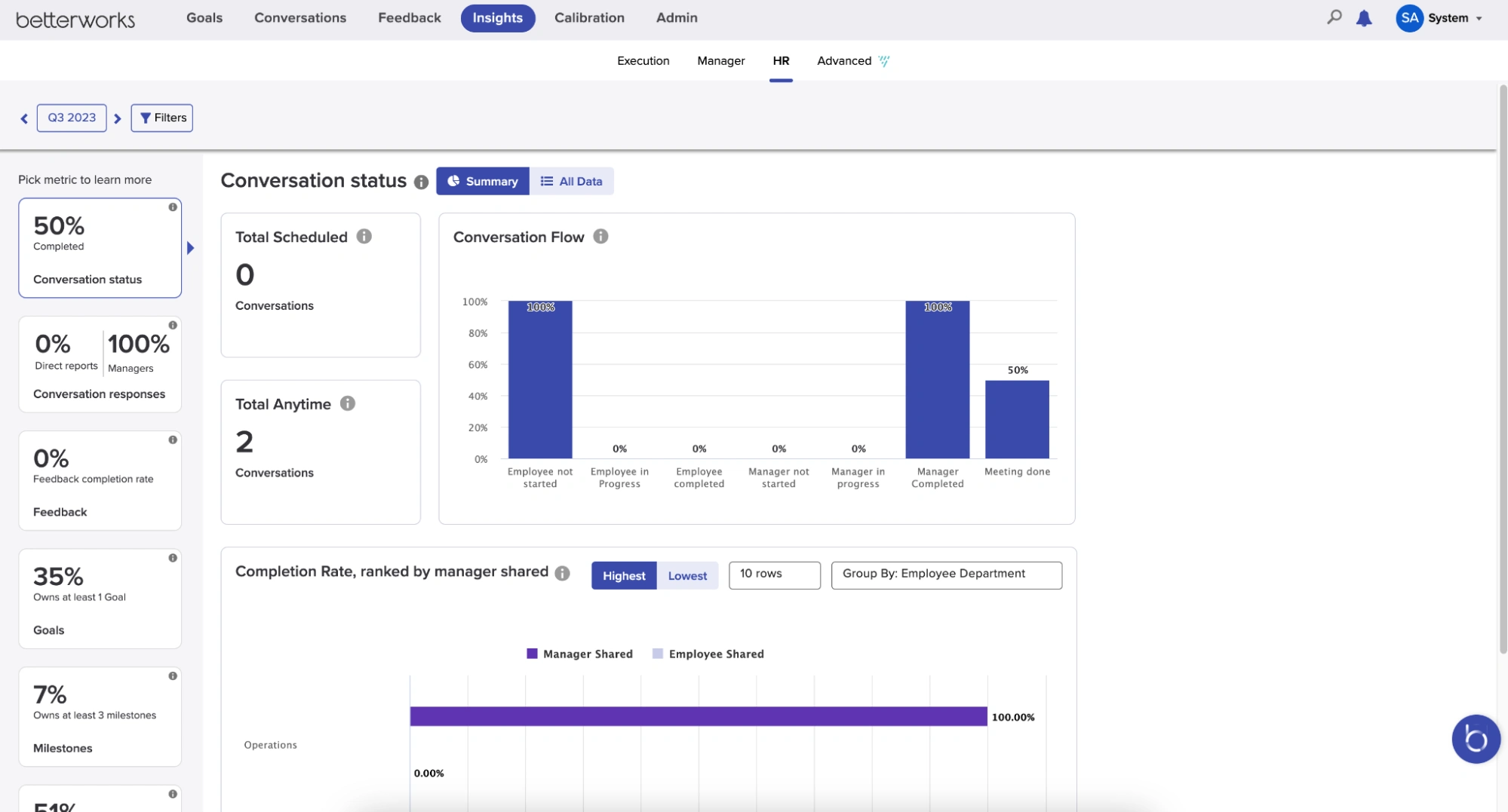
Insights Page, HR tab test environment
Mobile App
The mobile app allows users to access many of the same functions and features as the web application.
Results
We surfaced and reorganized the features needed by all user types and revised OKR entry, streamlining the process. Objectives are now easier to find and update, and can be shared among teams. Tracking progress is quick and easy and gives both managers and individual contributors increased visibility and transparency, while fostering trust & enabling communication and support.
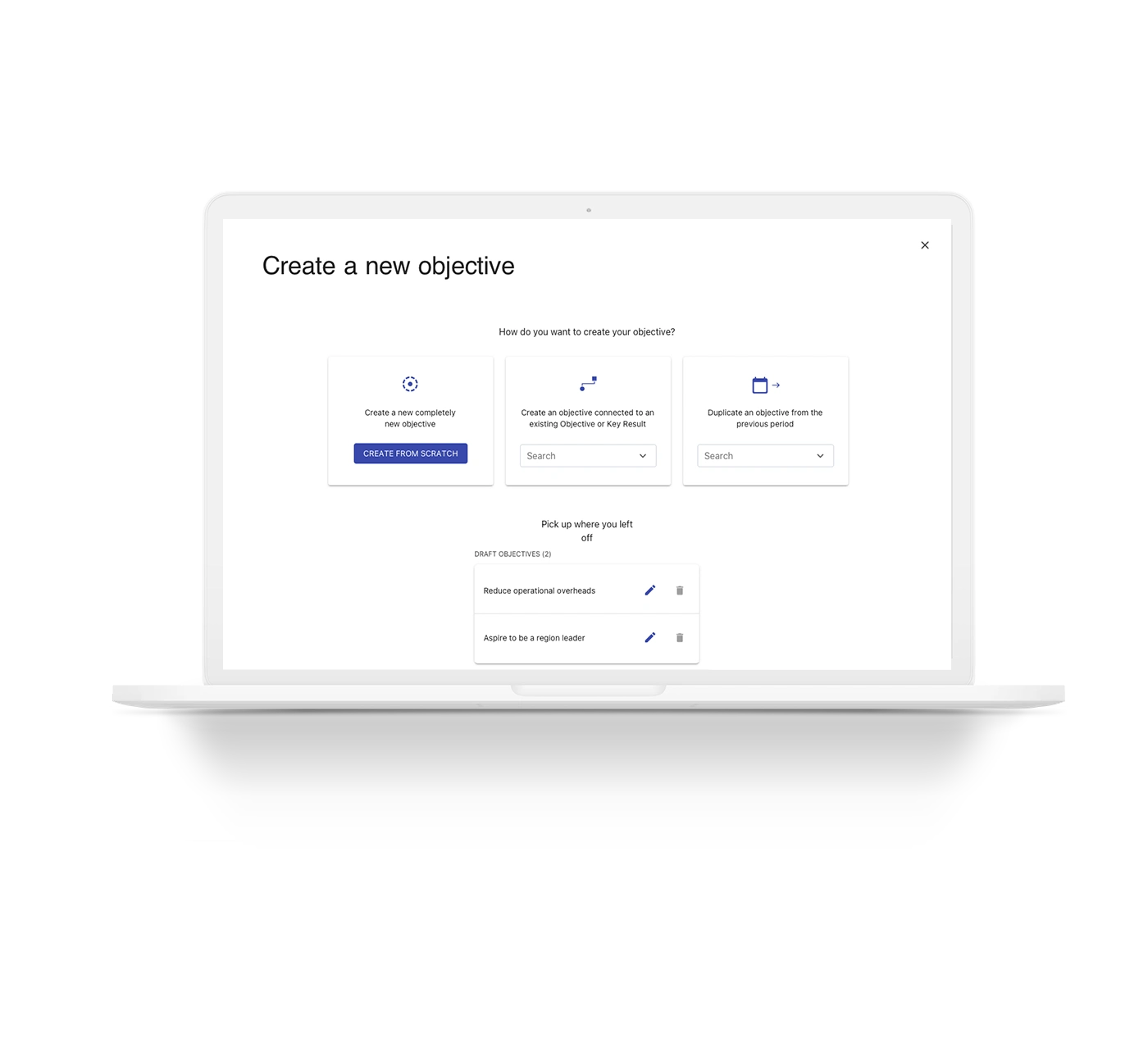
Enhanced OKR Settings
Now users can create a new OKR from scratch or tag into a team OKR and see updates from all owners
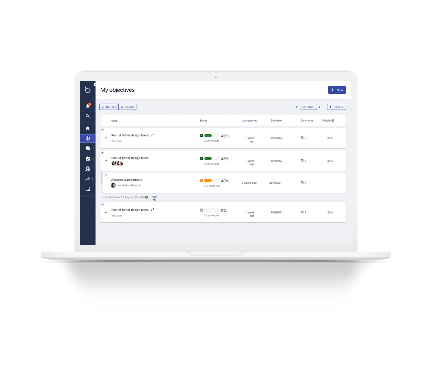
Nested Objectives
Expanding objective card shows nested objectives that contribute to a larger overall objective. Enhanced card shows owners, progress, and timeline
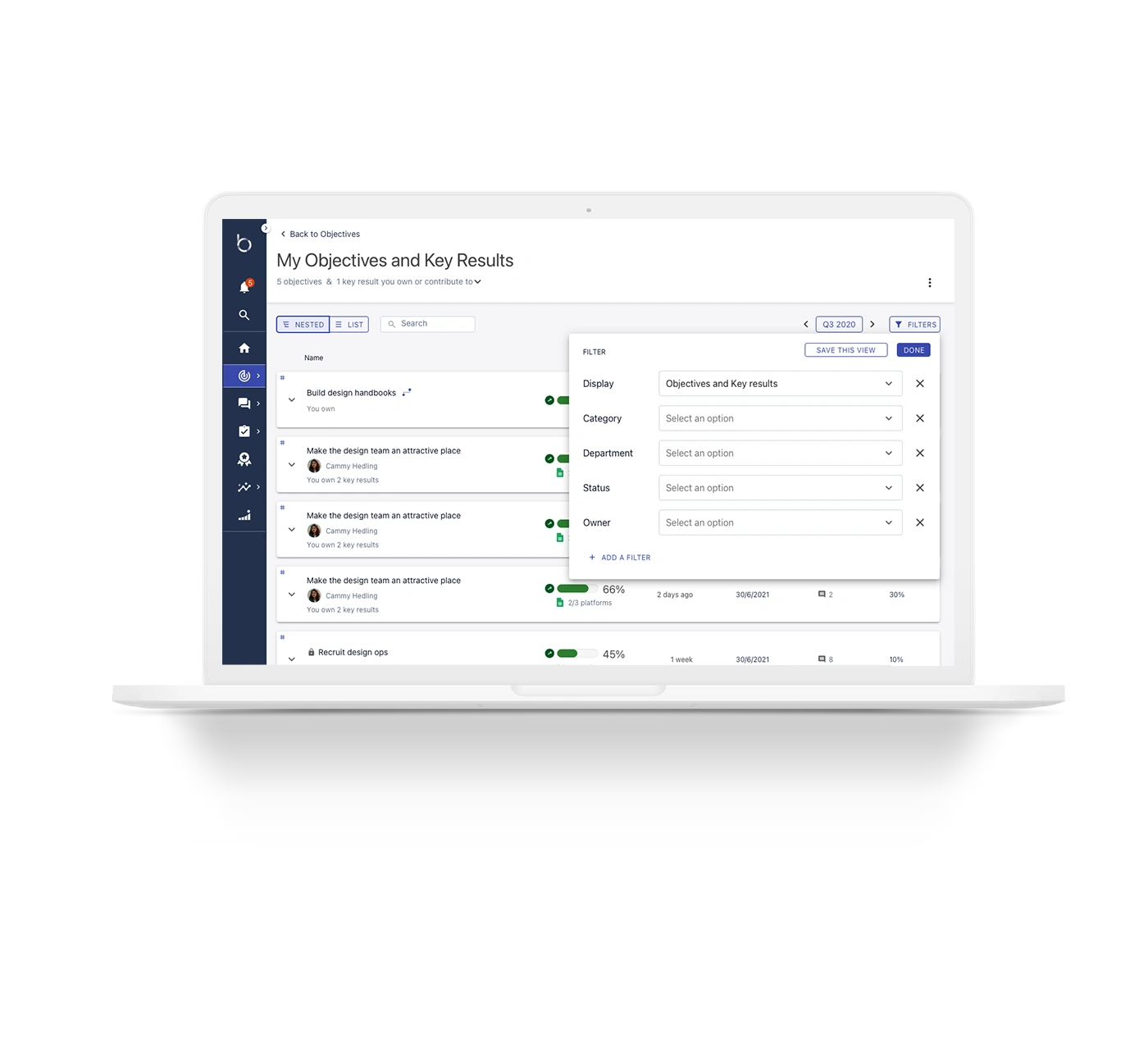
Filters
Filter panel makes searching by objective, team member, owners, or status possible, and enables saving a custom view
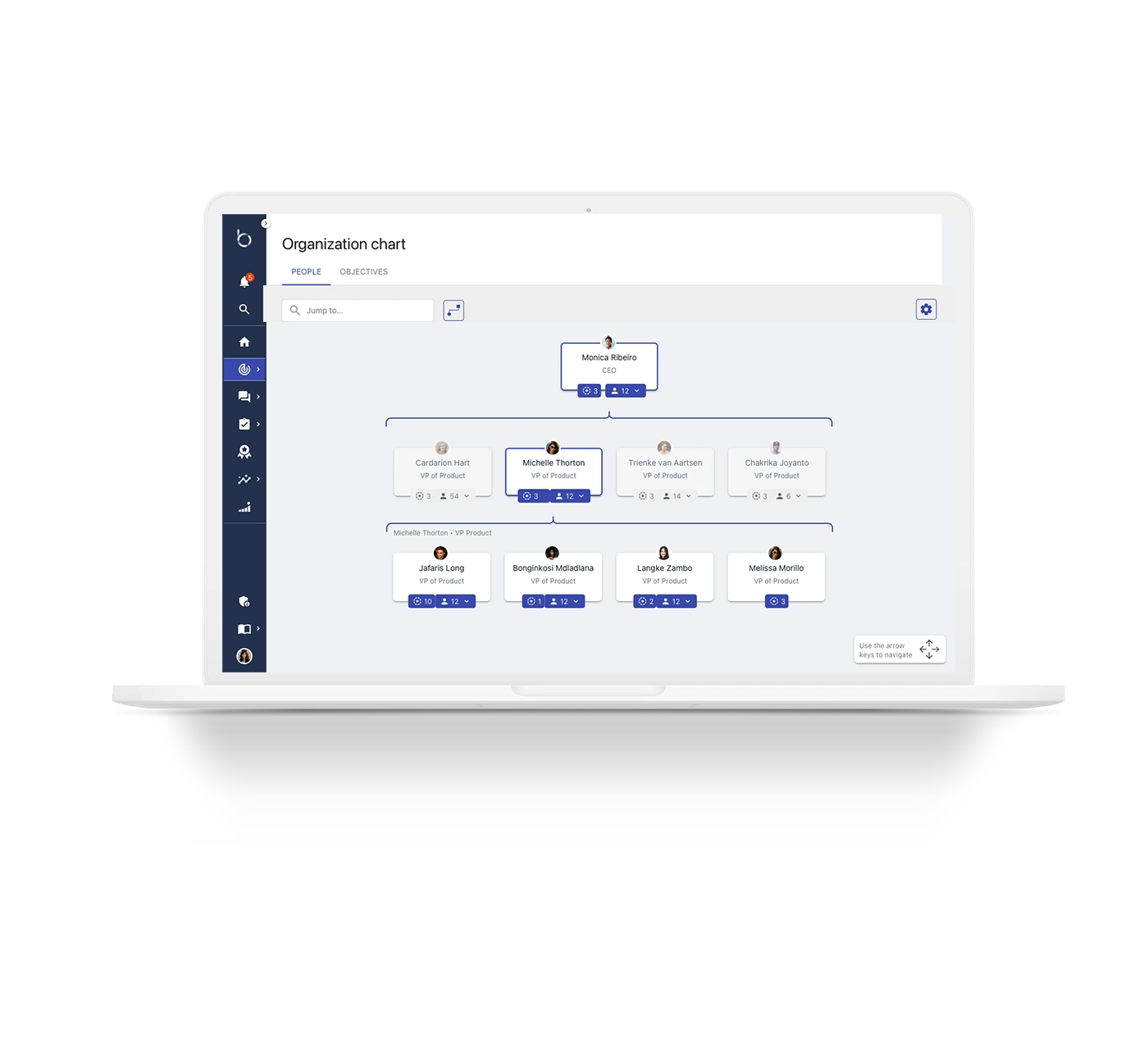
Org Chart - People
Organization charts are easier than ever and show a quick overview of team structure
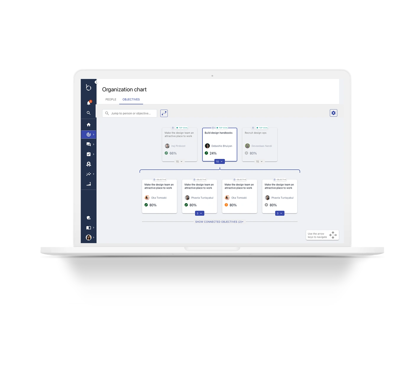
Org Chart - Objectives
Each card includes a summary of OKRs and progress for each team member
Progress Indicators
Progress indicators show which objectives need attention and allow users to nudge a team member for updates
Outcomes
The new flow improved visibility and communication for all user types and provided clarity and insight into collaboration and goals. Features were implemented incrementally and are available for use now
Read more of my case studies
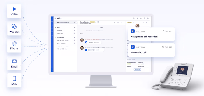
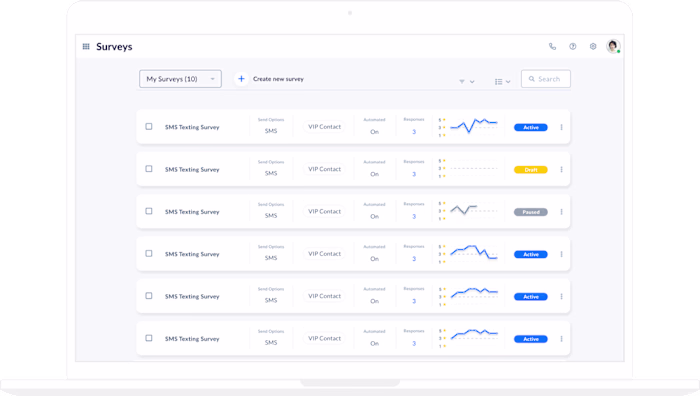
Nextiva Survey Builder
NextOS Voicemail
Get in touch
mariekrueger@gmail.com
Like this project
Posted Feb 11, 2024
I’m a UX designer. I’m passionate about creating usable digital products. I have worked with incredibly talented people across different companies.
Likes
0
Views
6