Anderson Craft Ales
Anderson Craft Ales
Anderson Craft Ales approached me to design and establish the branding for their family owned & operated craft brewery based out of London, Ontario. They had the experience to create amazing beer (their award winning Brewmaster also has a Ph.D. in Microbiology!), but needed a look that is very approachable and will stand out from the many craft breweries in Ontario alone.
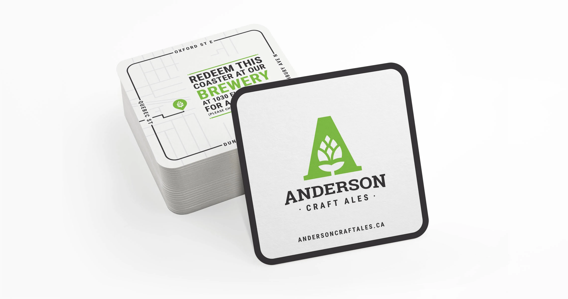
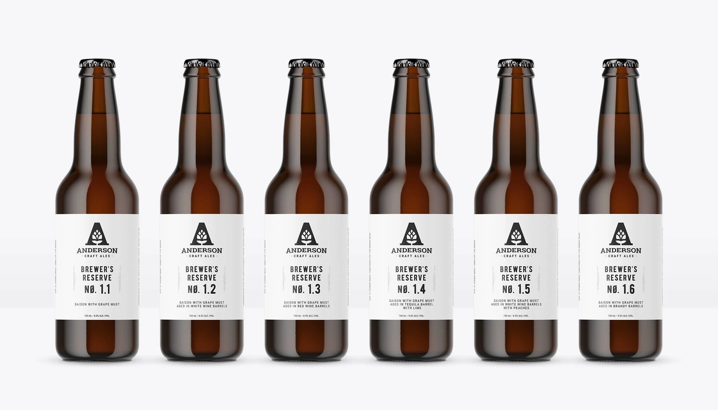
Design trends run wild when it comes to craft beer, but Anderson Craft Ales is a brand created with longevity in mind and is perfectly balanced between professional, modern, and approachable. The identity cleverly features a hop in the negative space of the 'A' to pay homage to their hop-focused ales while the brand direction follows a minimalist, approachable direction.
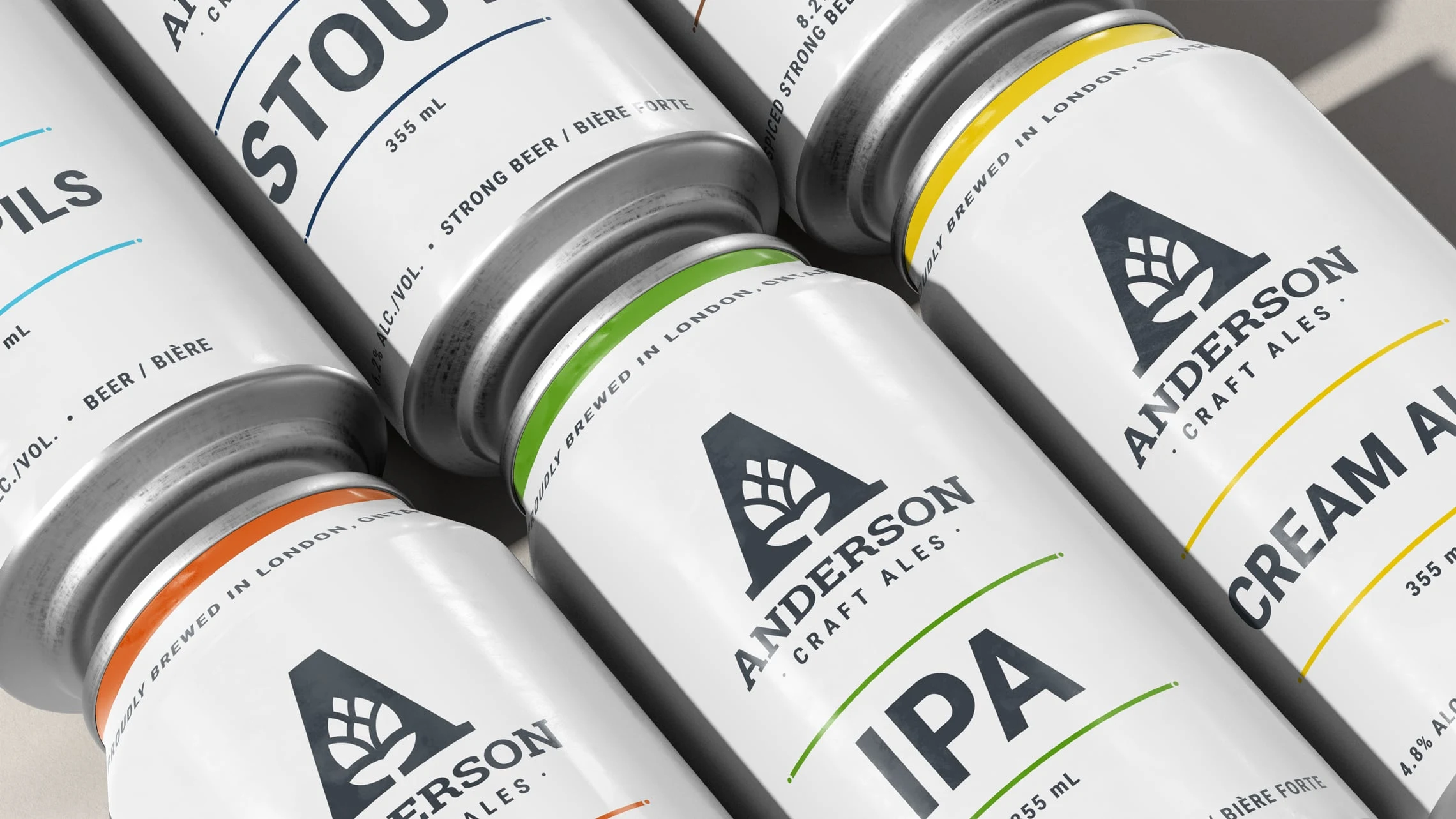
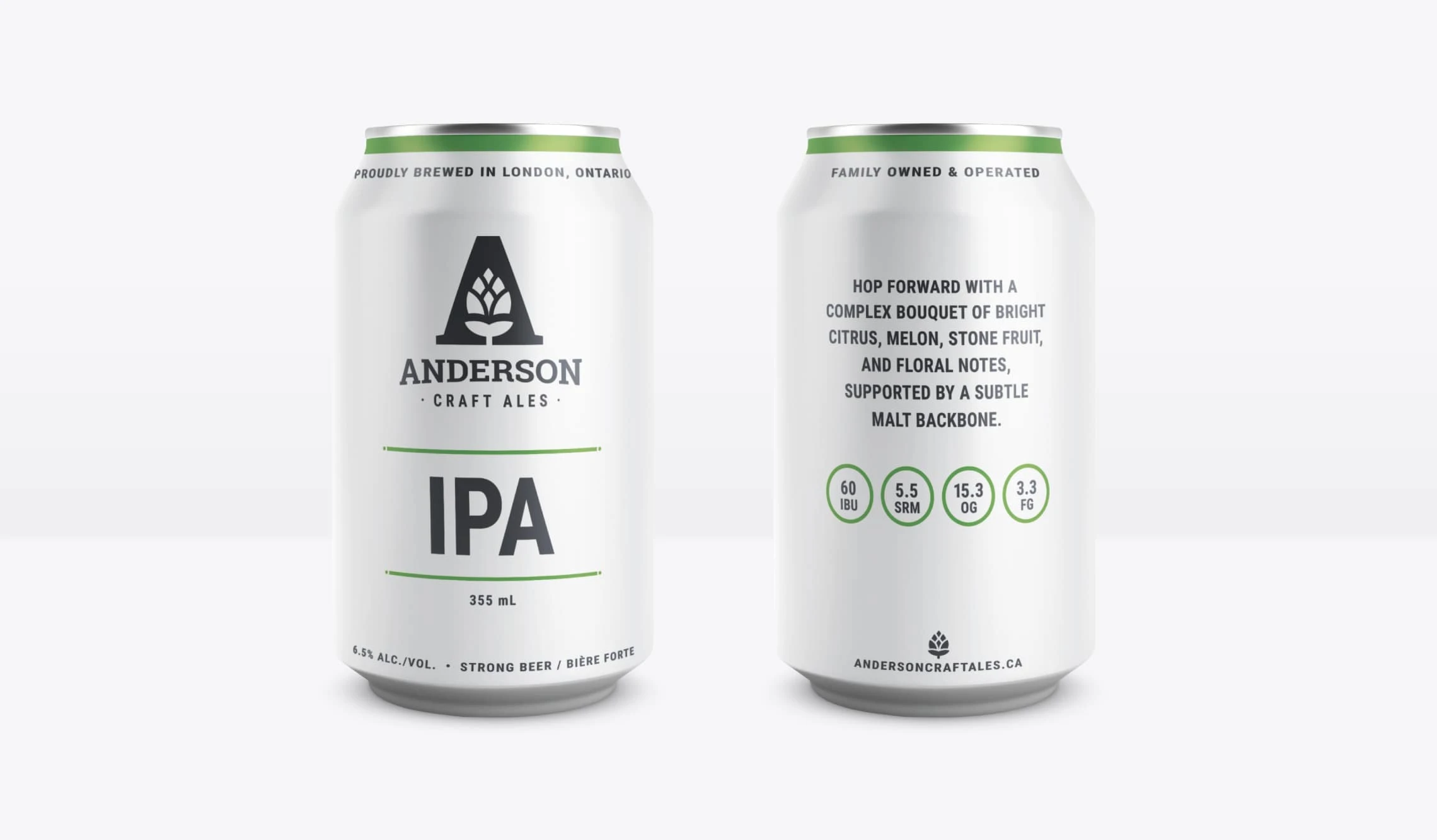
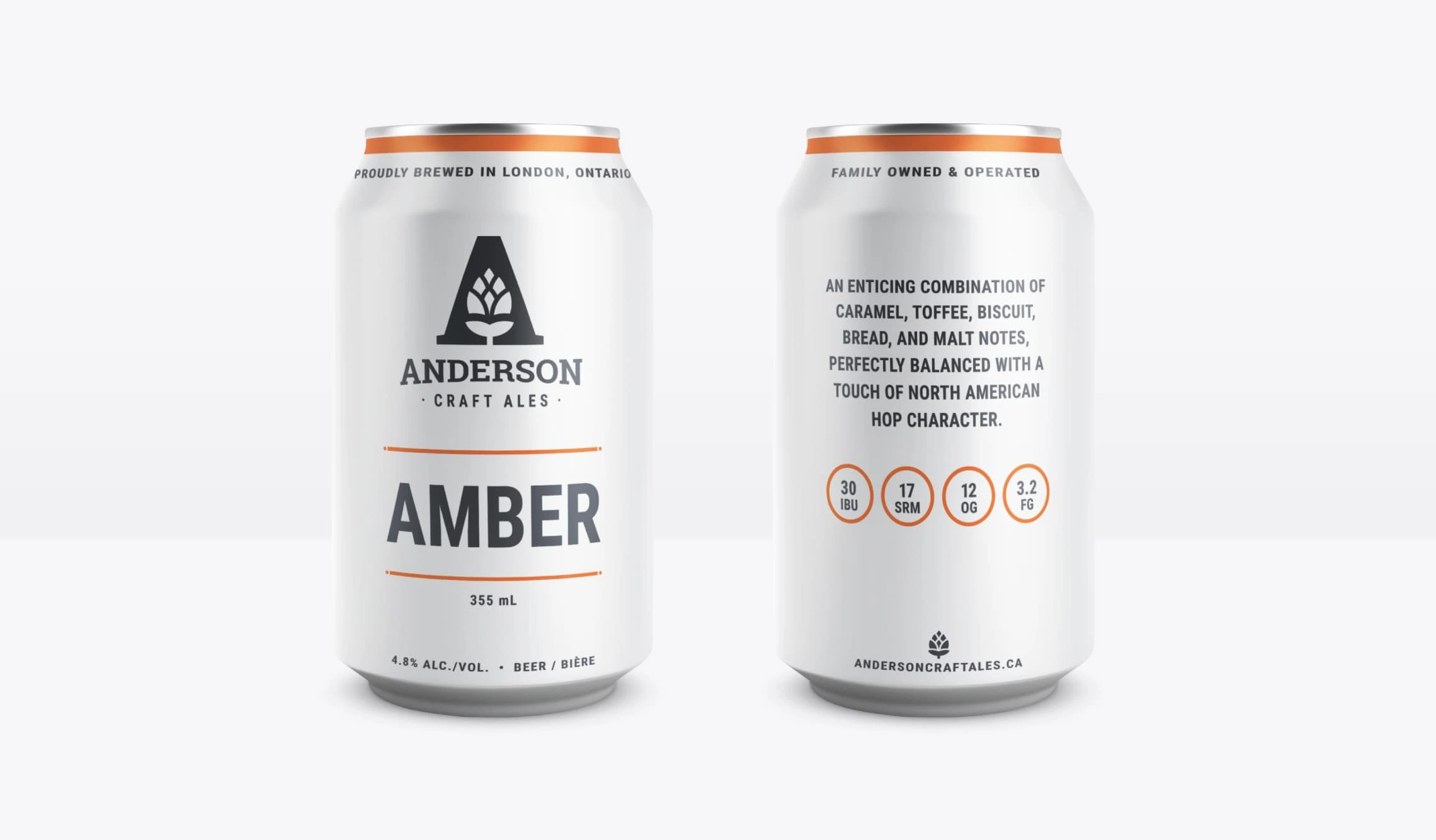
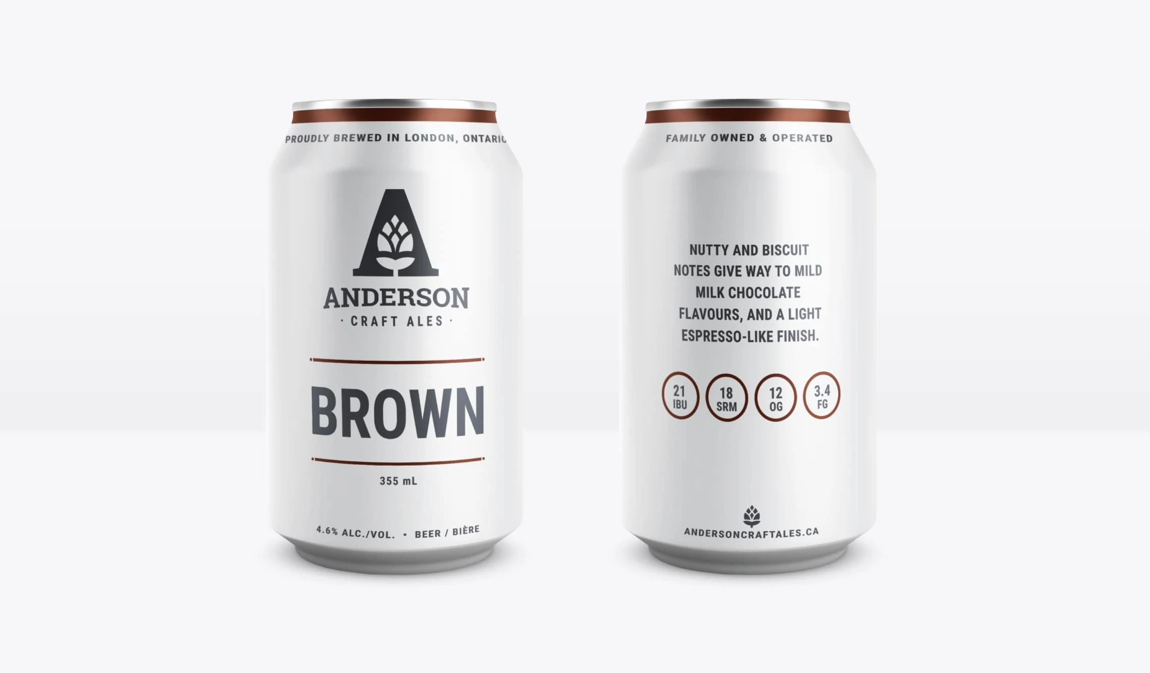
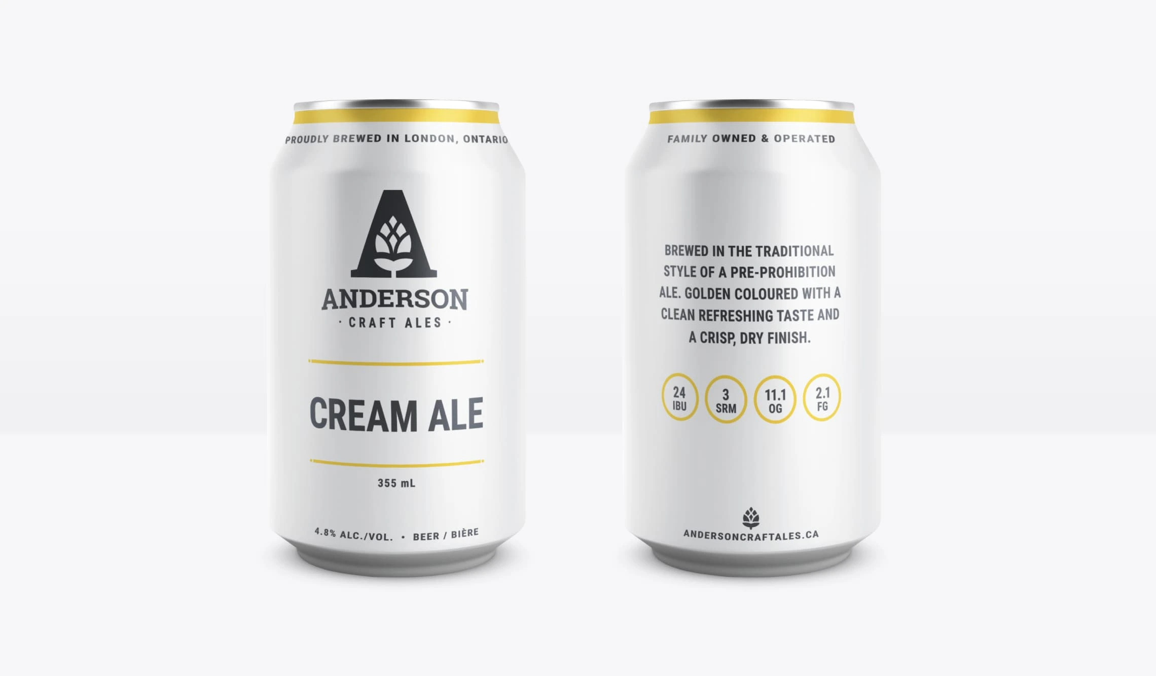
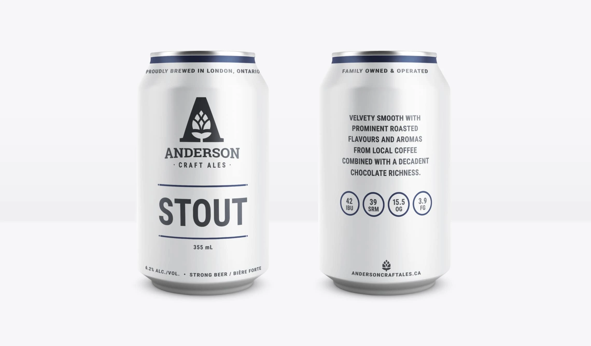
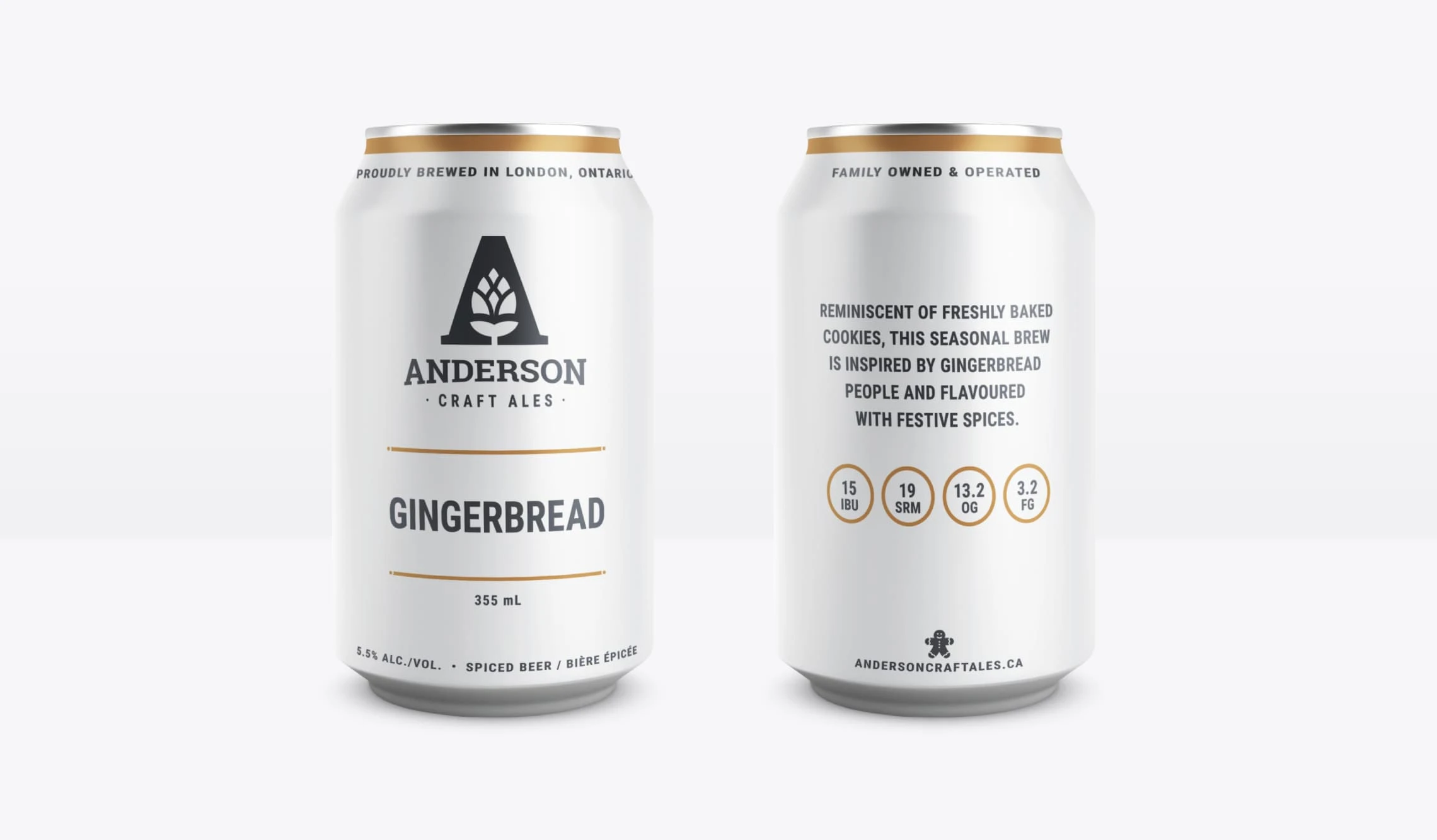
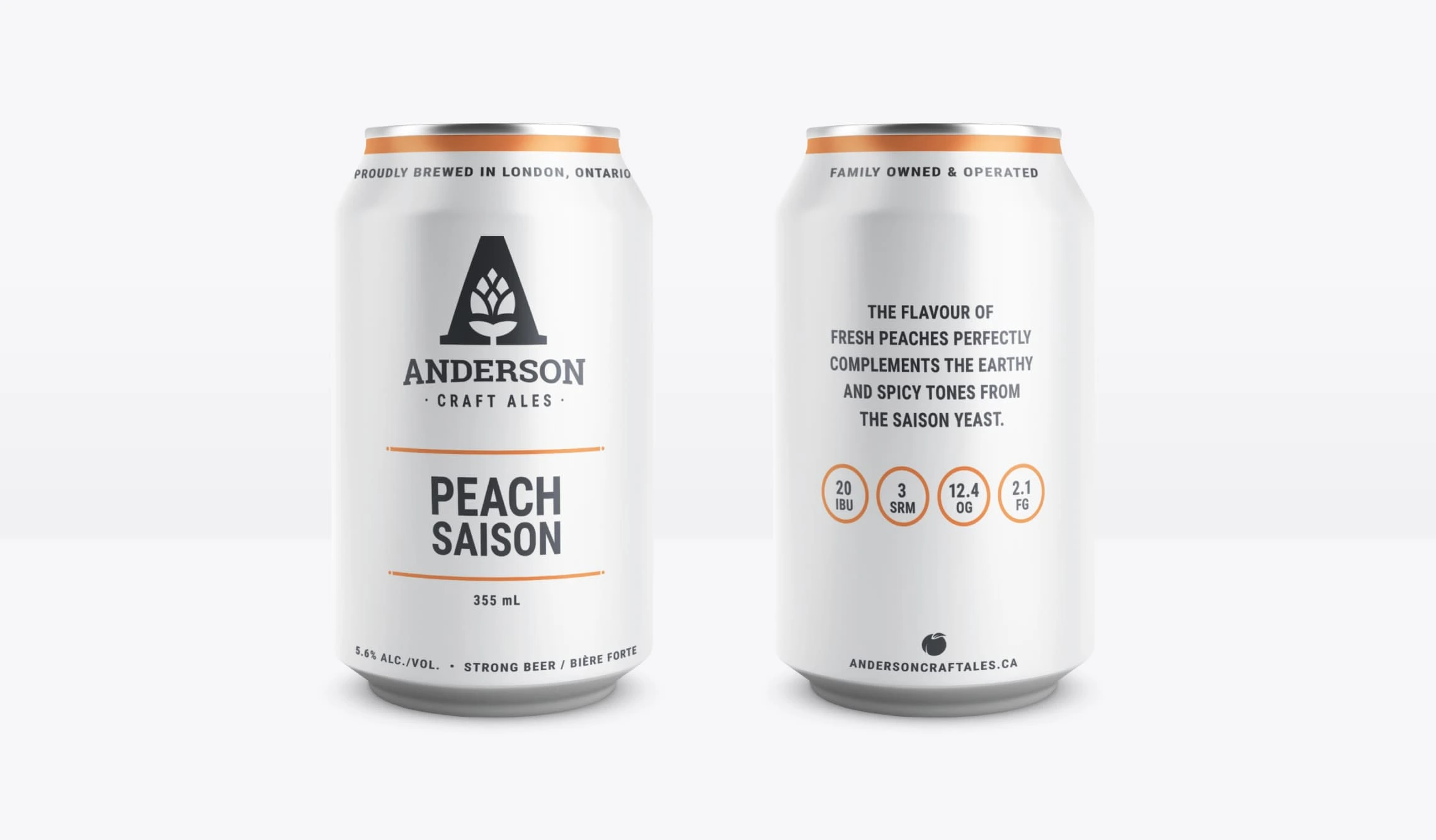
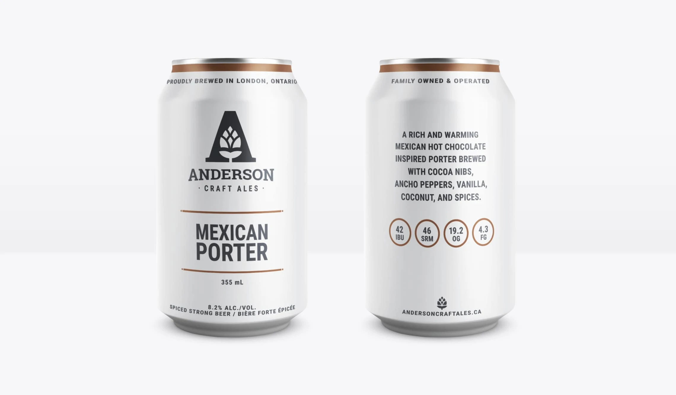
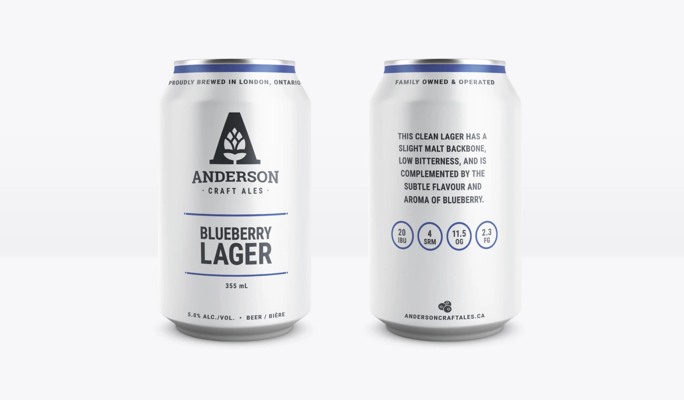
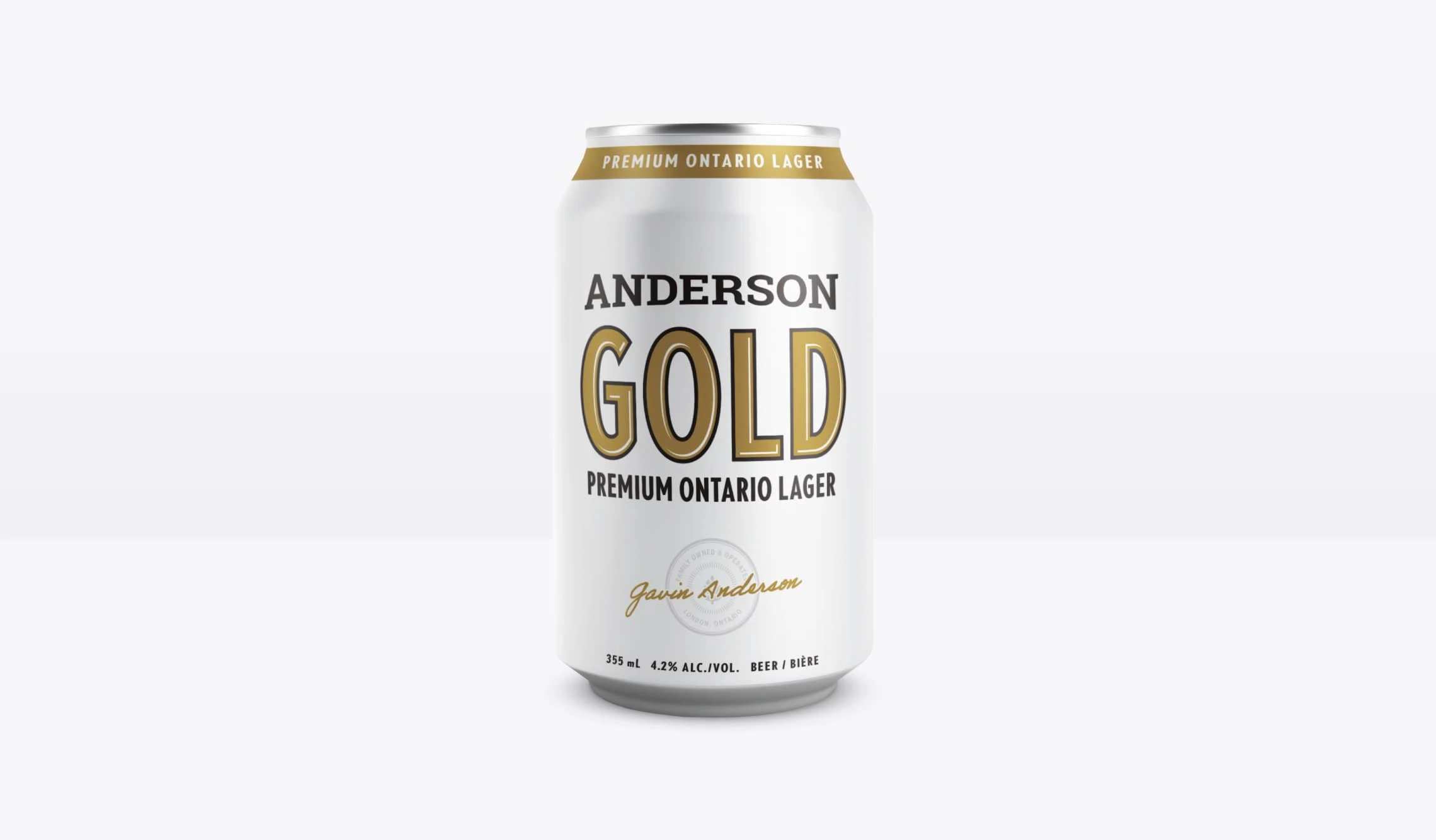
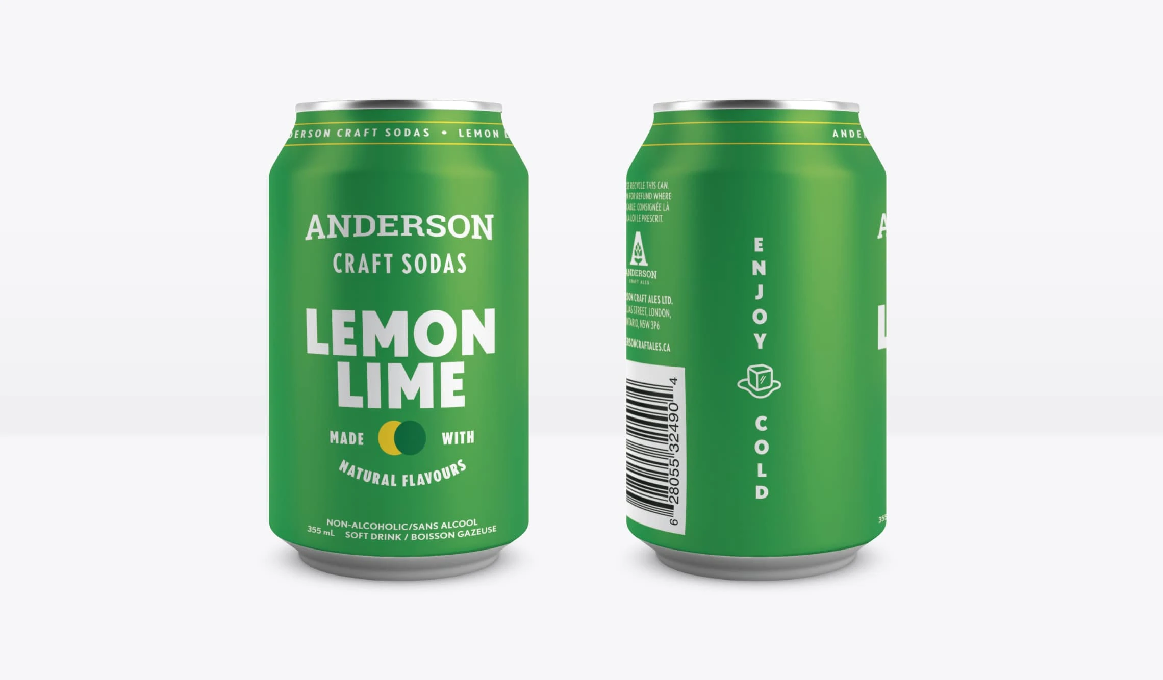
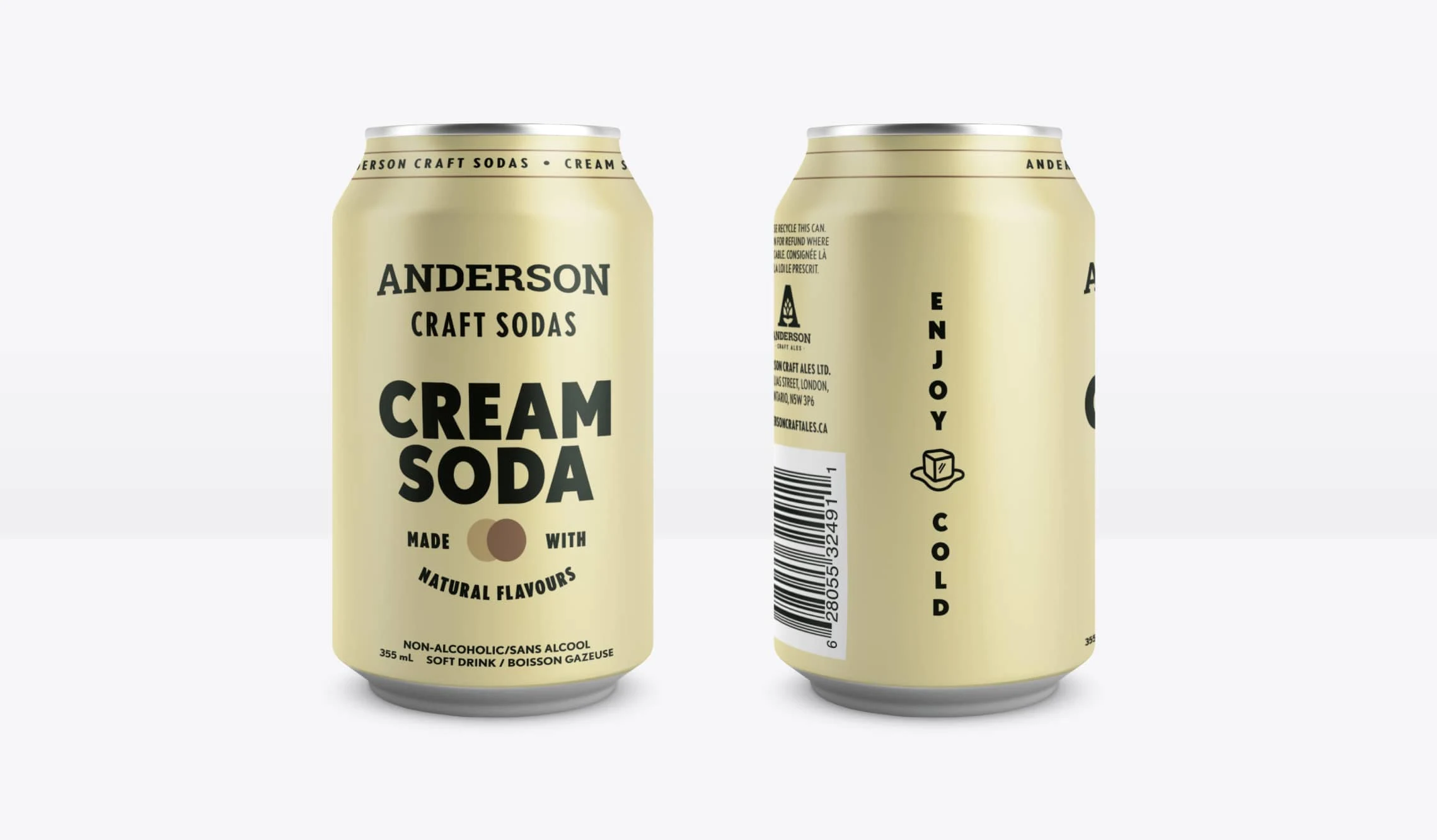
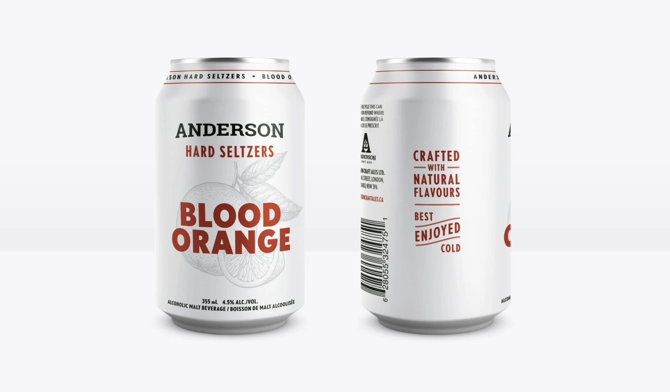
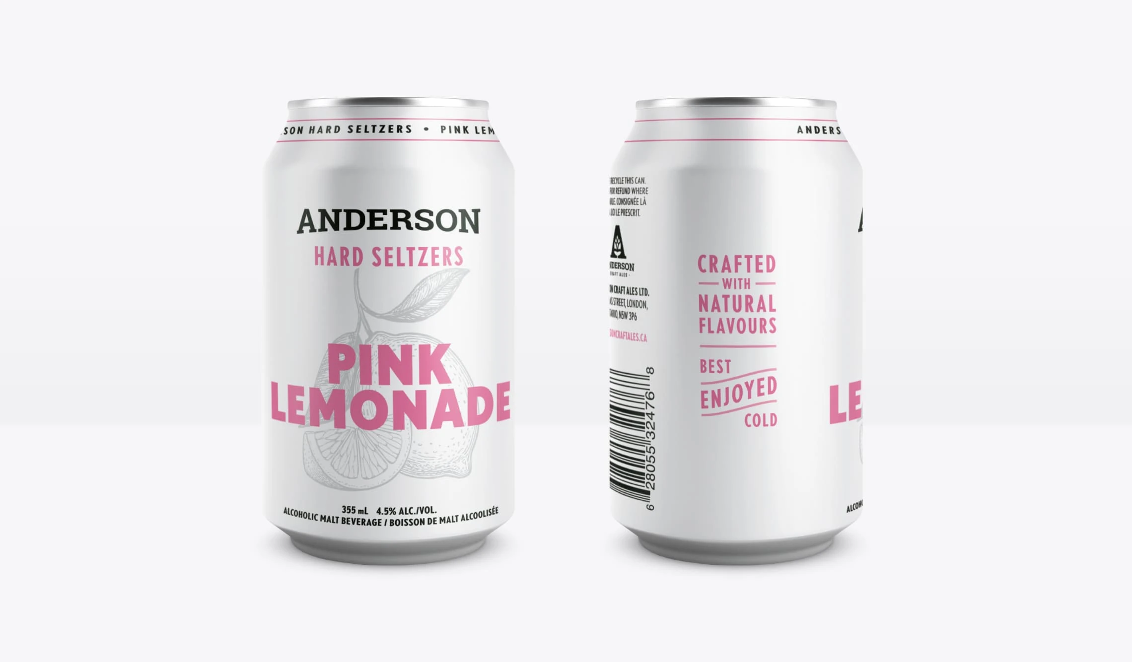
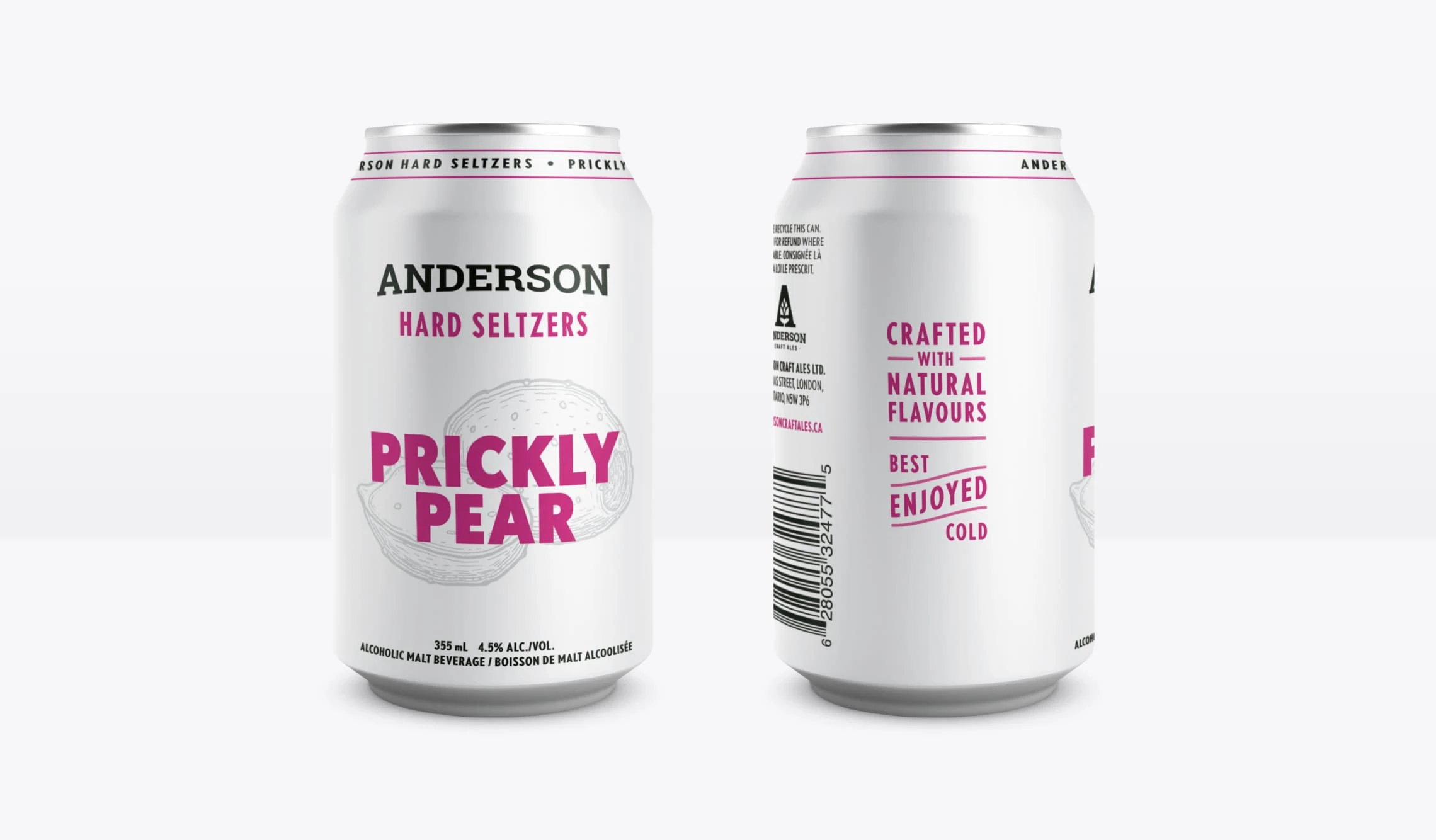
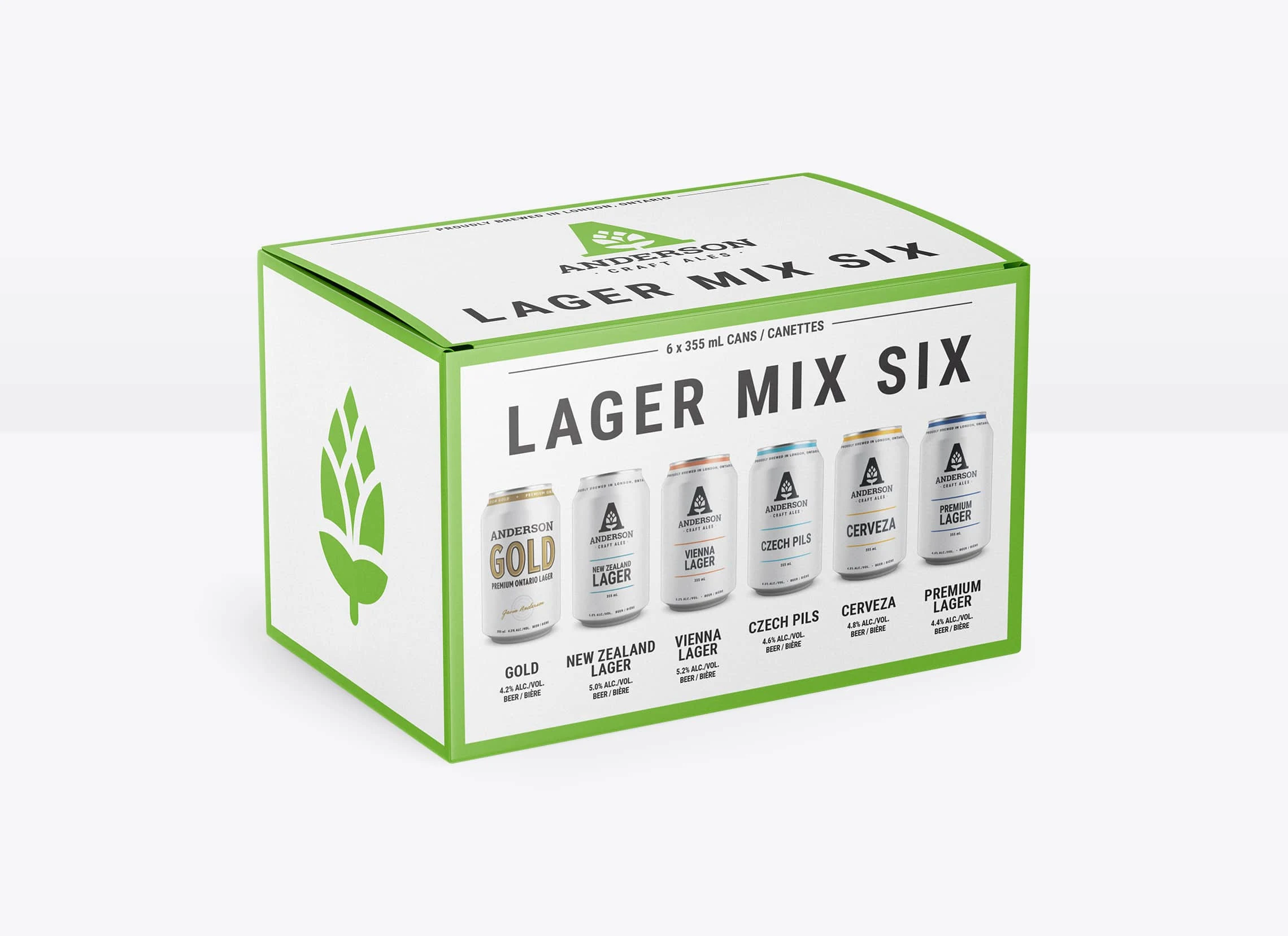
This minimalist approach continues with the beer cans and is where the branding really evolves and a strong design system is set in place. Using solid white cans allows the hits of bold colour to draw your focus to the beer's name and help the product line stand out on the shelves by creating a billboard effect. The back of the cans feature tasting notes and vital information for anyone looking to understand the beer's profile better. On the side of the can, the ideal serving temperature and glassware icon is set for people looking to get the full experience.
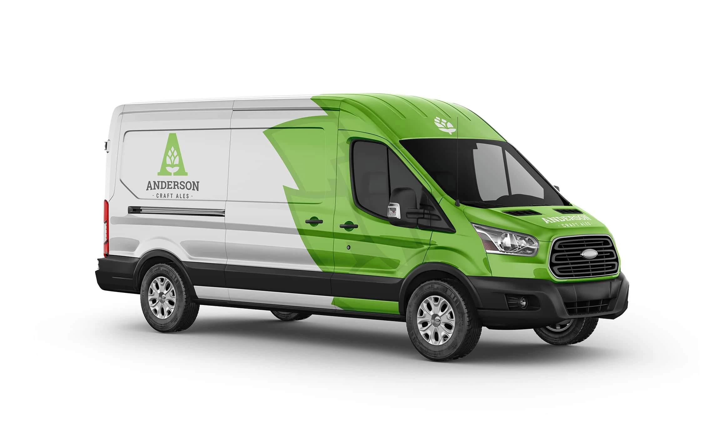
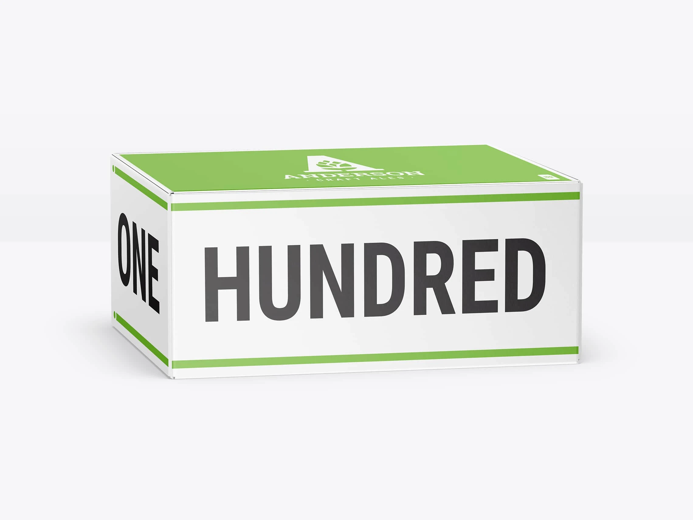
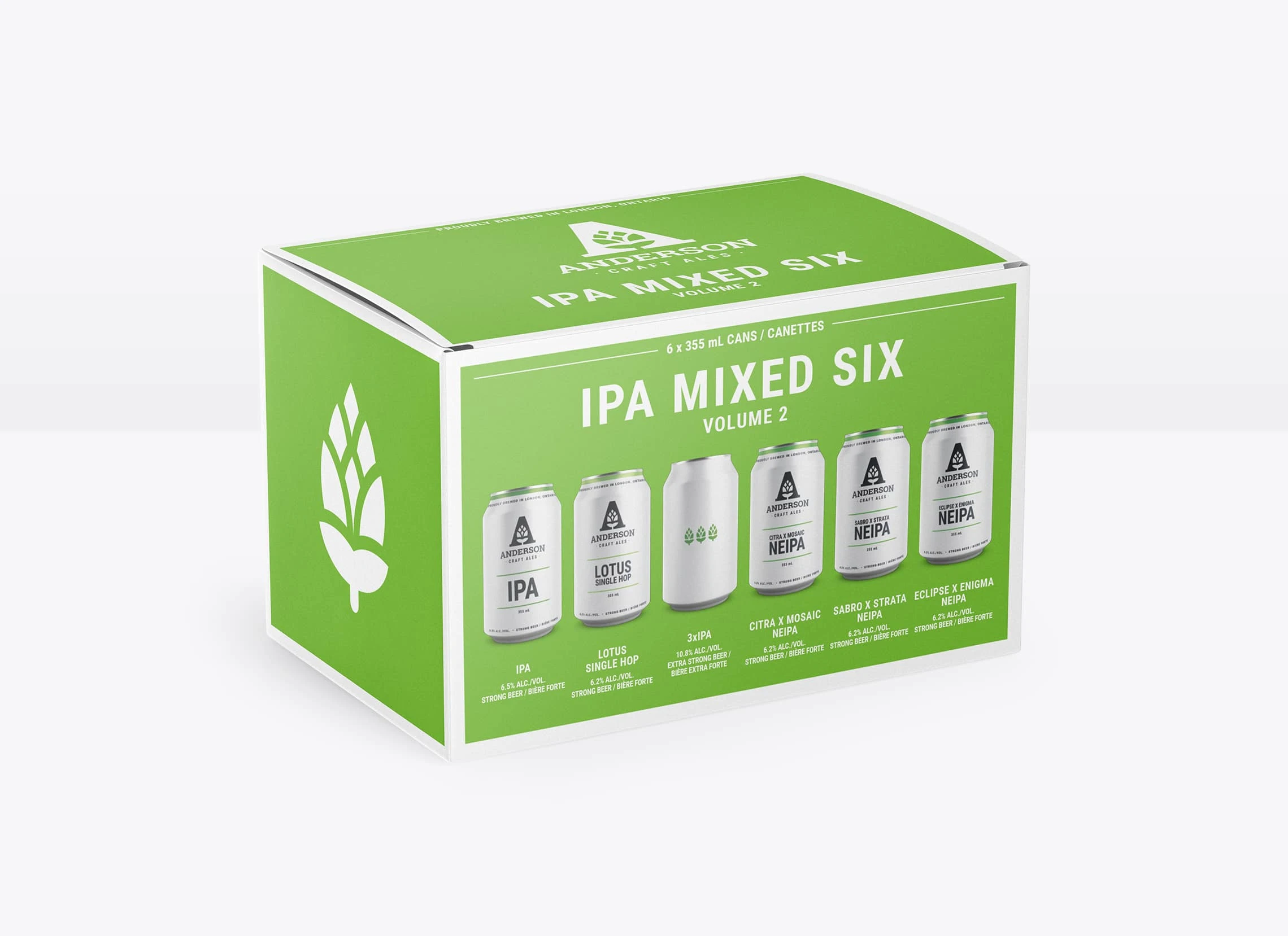
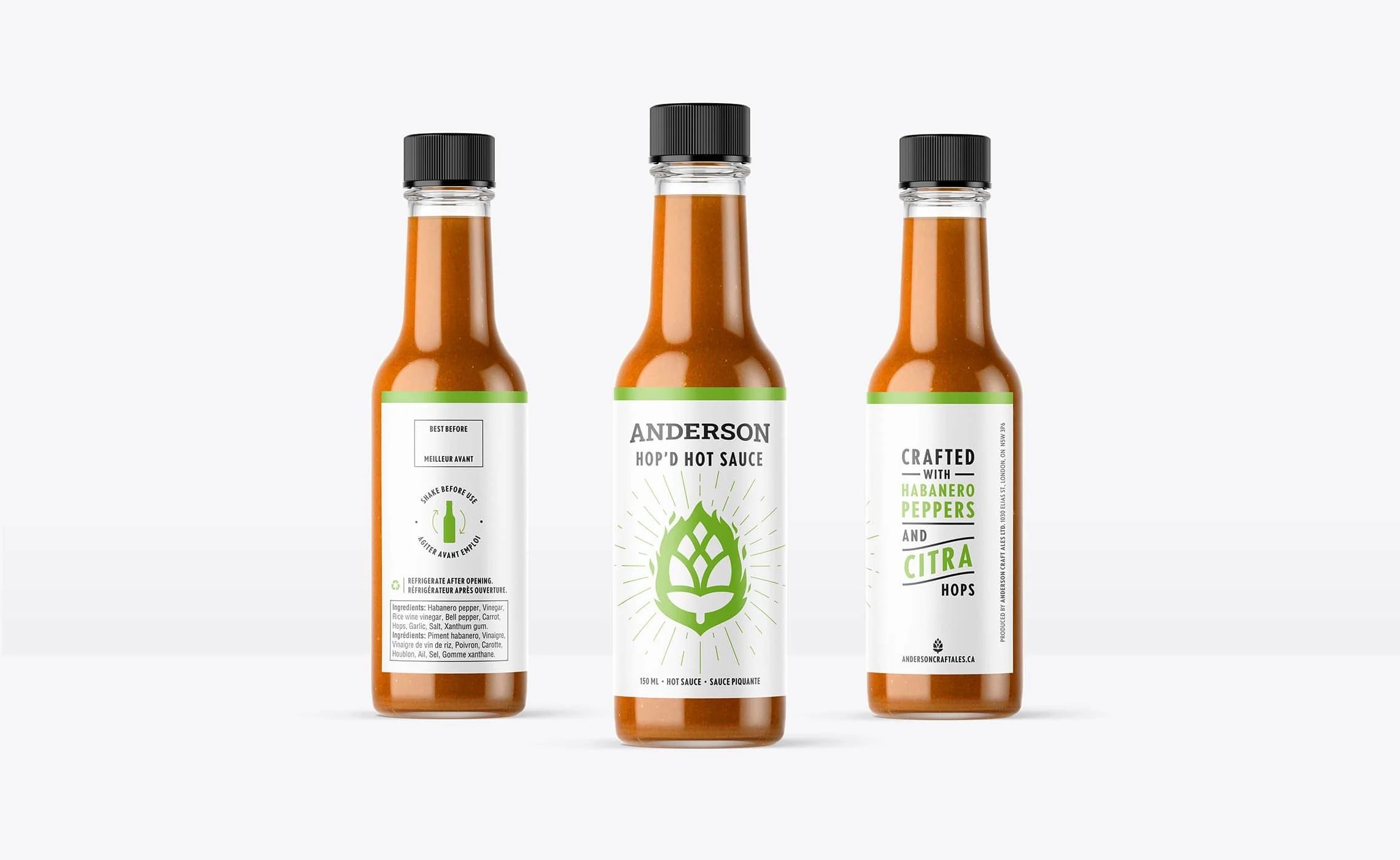
The brand aesthetic created for Anderson Craft Ales balances a clean, premium look while still being approachable for someone who is just getting into the craft beer scene, and has extended the brand lineup from a variety of beer to variety packs, seltzers, sodas, and even a hot sauce.




Logos. Branding. Packaging.
www.brettlair.ca | hello@brettlair.ca
Like this project
Posted Apr 13, 2023
Branding and packaging for a Canadian craft brewery who is putting the focus on the beer and setting aside the gimmicks.

