Officeworks - Santa's Last Stop
Hugo Jackson
OFFICEWORKS - SANTA'S LAST STOP
Turning Retail into Art.
THE CHALLENGE
Redefining the Holiday Aisle.
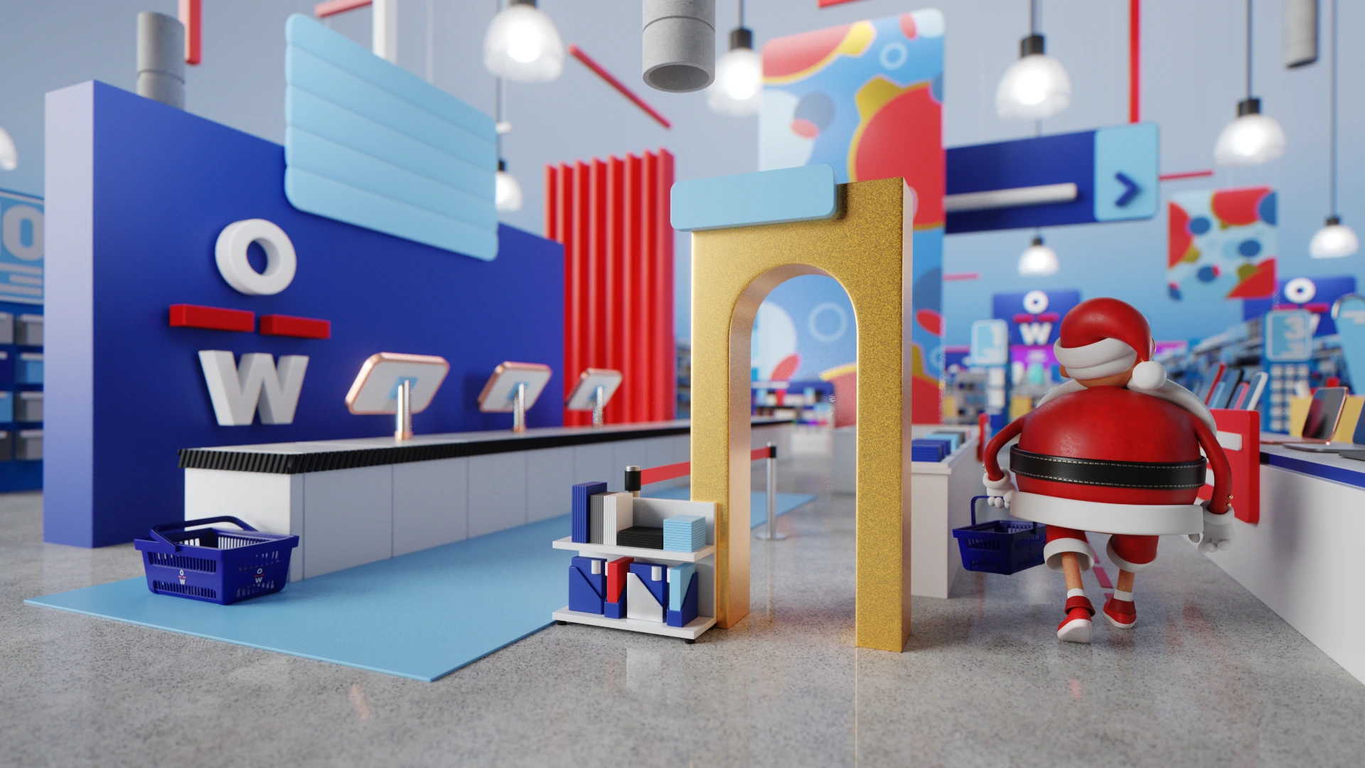
Officeworks is typically associated with utility and supplies. The brief was to break that perception for the holiday season. They wanted a campaign that felt magical, trendy, and premium, moving away from the standard "catalogue" look of retail advertising.
As Director, my goal was to create a world that felt like a high-end toy store for adults. I wanted to balance product recognition with a highly stylized, almost abstract art direction inspired by the motion graphics work of artists like Peter Tarka.
THE CONCEPT
The "Soft-Touch" Universe.
Instead of photorealism, I opted for a "C4D Motion Graphics" aesthetic. This meant simplifying shapes, exaggerating proportions, and focusing entirely on material contrast. The world is built from soft plastics, matte paper, and polished gold. It feels satisfying to look at.
I directed the team toward a visual language based on "Tactile Minimalism". This meant simplifying shapes, exaggerating proportions, and focusing entirely on material contrast.
I worked closely with a concept artist to establish the composition and flow of the store layout. The design team produced loose line drawings and vibrant color concepts which served as the blueprint for the production. My job was to translate these 2D illustrations into a believable 3D space without losing their graphic charm.
THE CHARACTERS
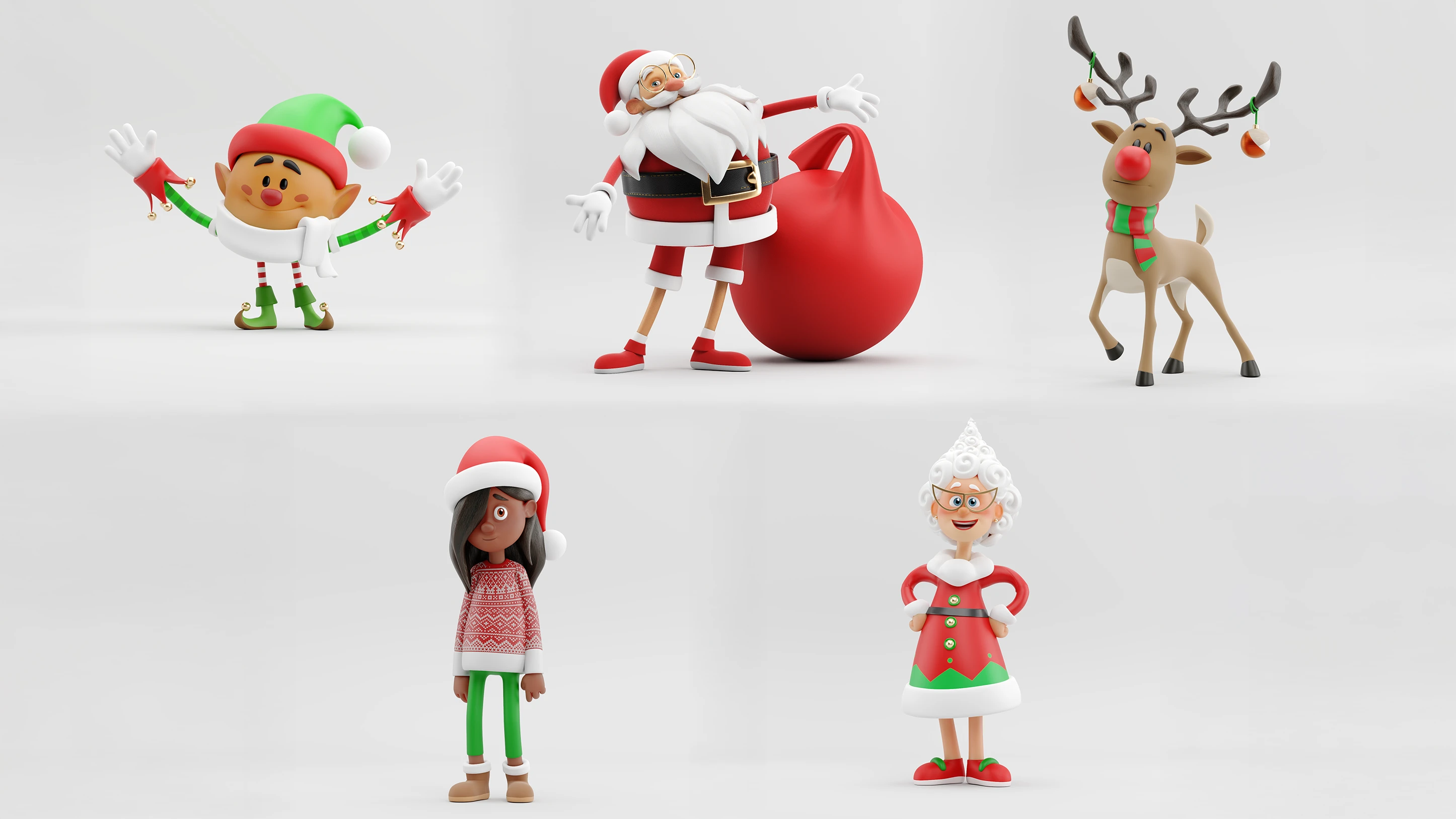
High-End Vinyl. To inhabit this stylized world, we couldn't use standard realistic humans. I directed the character team to develop a cast that felt like high-end vinyl toys.
Shape Language: We focused on simple geometric forms. Spheres for heads and cylinders for limbs. This ensured they read clearly even at small scales in the wide store shots.
Materiality: As the Look Development lead, I treated their skin and clothing not as biological tissue, but as soft-touch plastic and fabric. Santa’s beard is a sculpted cloud, and the reindeer has a smooth, matte finish. This ensured they caught the studio lighting perfectly and integrated seamlessly with the "motion graphics" environment.
THE VISUAL PIPELINE
From Sketch to Shader.
I managed the visual evolution of the shots, ensuring the 3D execution stayed true to the design intent.
Environment Modeling: I handled a significant portion of the environment modeling. I followed a strict rule: no sharp edges. Every desk, shelf, and prop was given a soft bevel to catch the light. You can see in the clay renders how the geometry is chunky and playful, removing the coldness of a typical office setting.
Character Direction: I directed the character creation process to match this "toy" aesthetic. The characters needed to be shape-based and expressive to fit the stylized environment.
LIGHTING & LOOKDEV
Painting with Light.
This was the core of my hands-on contribution. To achieve that trendy "C4D Motion Graphics" look, the lighting had to be impeccable.
The Studio Setup: I avoided realistic sun-sky systems. Instead, I lit the scenes like a miniature set in a photography studio. I used large area lights to create broad, soft reflections on the floor and the products.
Material Definition: I spent considerable time on the shaders to elevate the flat color concepts into rich 3D surfaces. The floor isn't just concrete; it is a slightly rough, specular surface that grounds the objects. The gold arches have a distinct roughness map to break up the reflection, making them feel like anodized metal rather than cheap foil.
THE RESULT
A Cohesive Campaign.
The final output was a series of rich, satisfying visuals that worked across video and print. By stripping away the noise of the real world and focusing on pure shape and color, we elevated everyday office supplies into desirable gifts. The transition from the 2D concept to the final 3D render demonstrates the fidelity I maintained from the initial art direction through to the final image.

Like this project
Posted Jan 4, 2026
Reimagining the retail experience. A director-led 3D campaign transforming office supplies into a playful, high-end world of tactile shapes and motion graphics.