Built with Framer
Horizon Reality Brand Identity Development

Tsion Tamirat


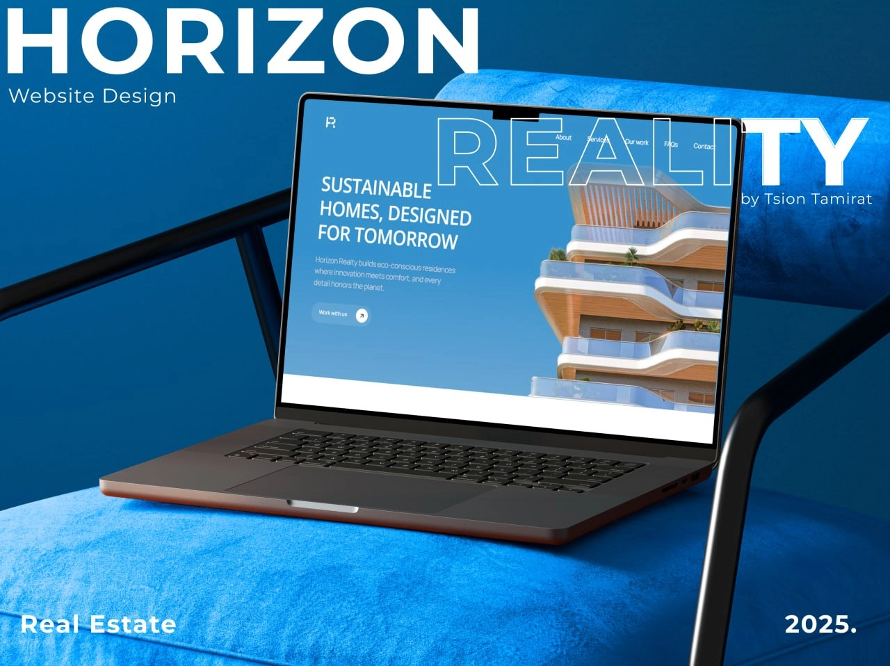
The challenge
Horizon Reality needed a brand that could speak to two very different audiences at once: property investors who wanted credibility and data backed confidence, and everyday buyers who needed the platform to feel approachable, not intimidating. Most real estate tech brands default to either sterile fintech aesthetics or generic warm and friendly real estate visuals. Neither would work here.
The Strategic Challenge: Horizon Reality needed to shift from a transactional real estate firm to a visionary investment partner. Their existing visual presence lacked the architectural weight and structural clarity required to build trust with institutional investors.
The Execution & Architecture: Built a 'Clarity First' visual system centred on architectural grid structures, refined typography, and high contrast layouts. Stripped away generic real estate tropes (like abstract house outlines) in favor of a modern, institutional brand identity.
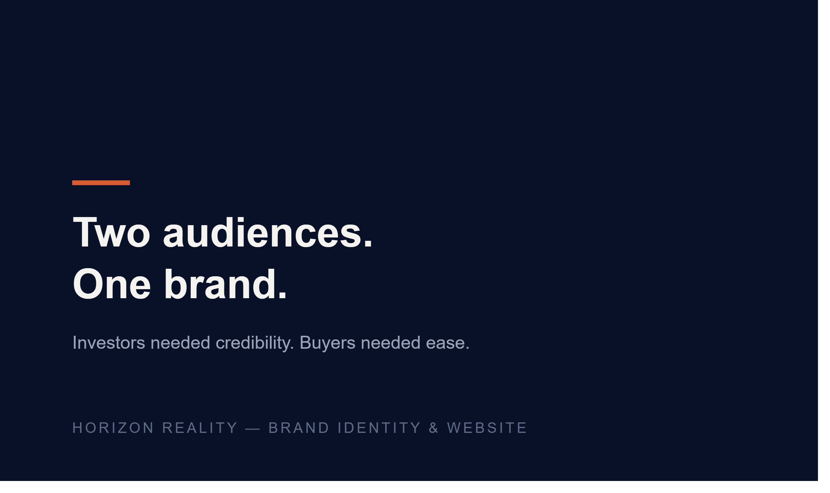
Defining the core tension before designing the solution.
The approach
Coming from an architecture and urban planning background, the starting point wasn't a mood board, it was the platform's actual structure: how listings, data, and user decisions moved through the product. The brand system was built to mirror that logic, clean grid based layouts, a restrained color system, and typography that could hold dense data without feeling cluttered.
What was delivered
Full brand identity: logo system, color palette, typography, and visual guidelines
A Framer website built to translate the brand system into a live, responsive product
A component based design approach so the visual language could scale across future product pages without needing a redesign each time
Technical Deliverables: List the precise scope: Logo System & Usage Rules, Typography Hierarchy, Color Palette System, Digital & Print Collateral, Web Component Guidelines.
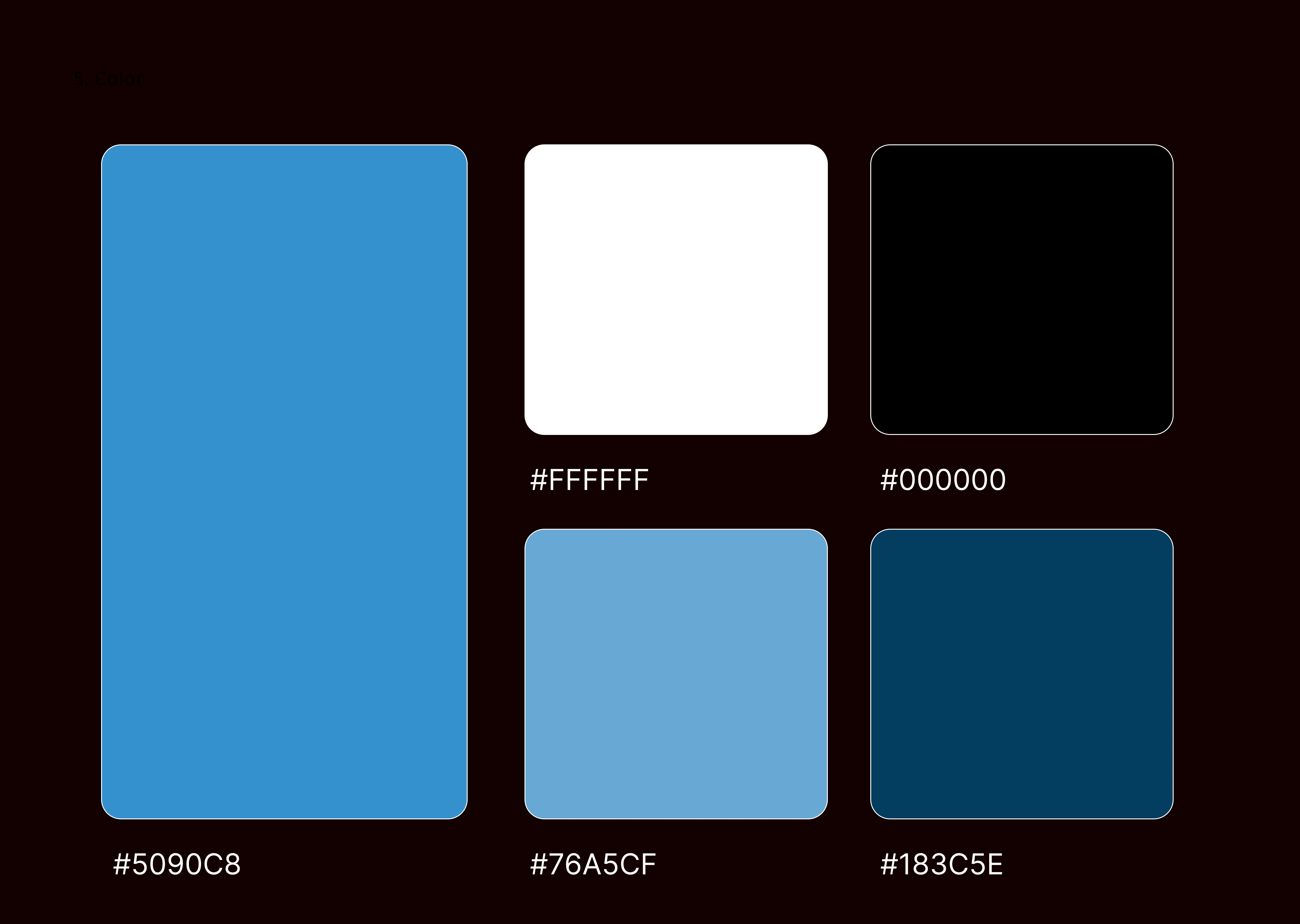
Color
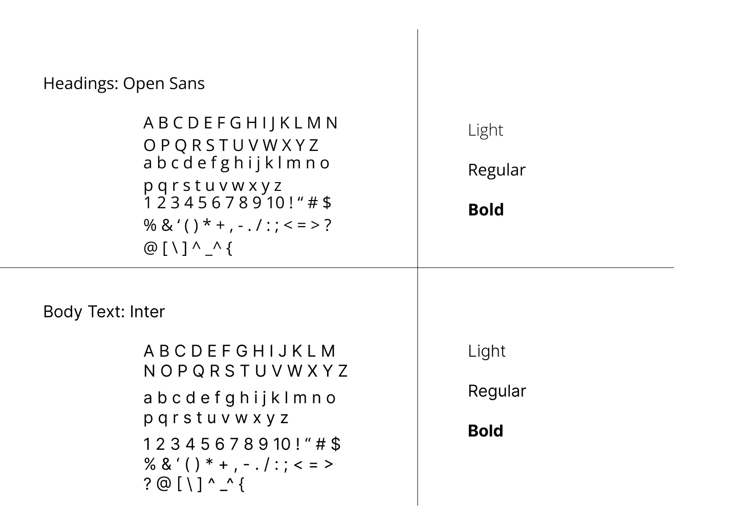
Typography
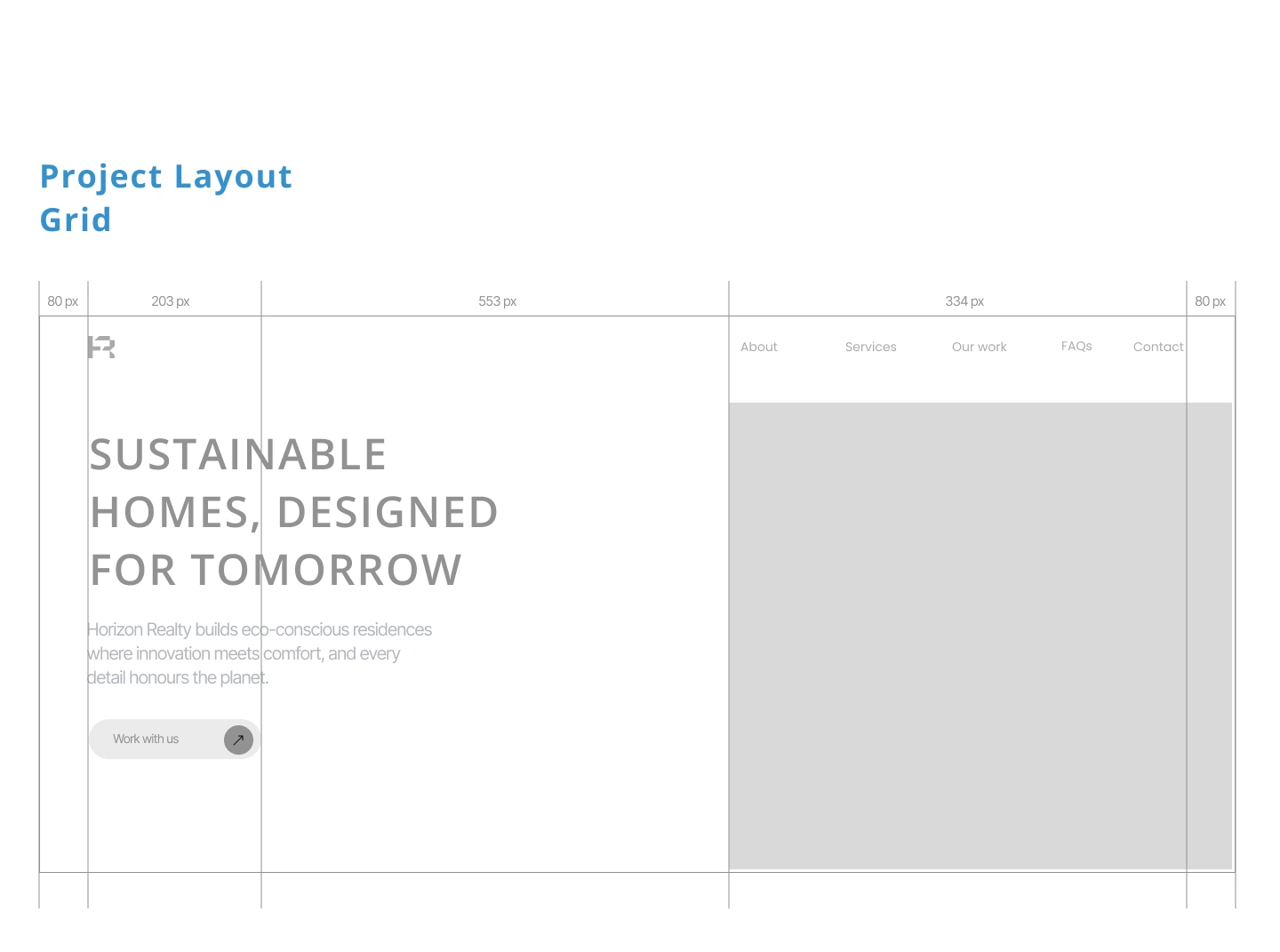
Hero Layout Grid
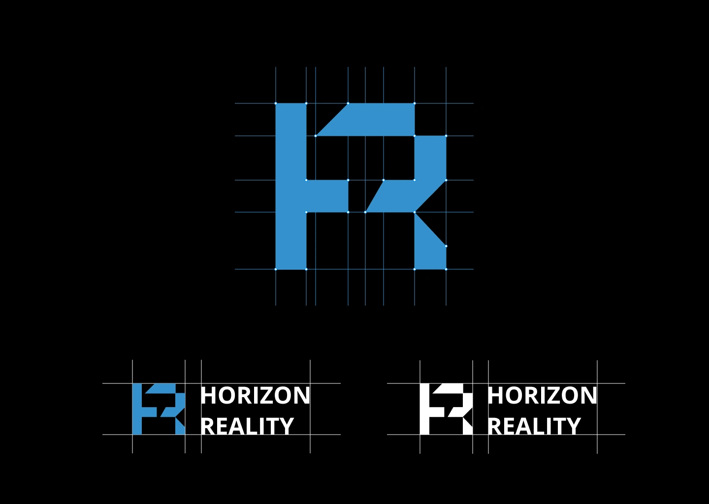
Logo Approach
The outcome
The result is a brand that reads as trustworthy to investors and usable to first time buyers, without compromising either. It's a good example of building identity from structure outward, rather than decorating a product after the fact.
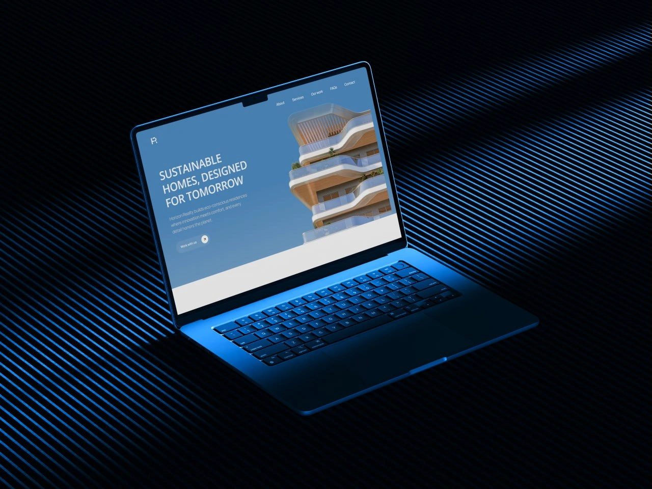
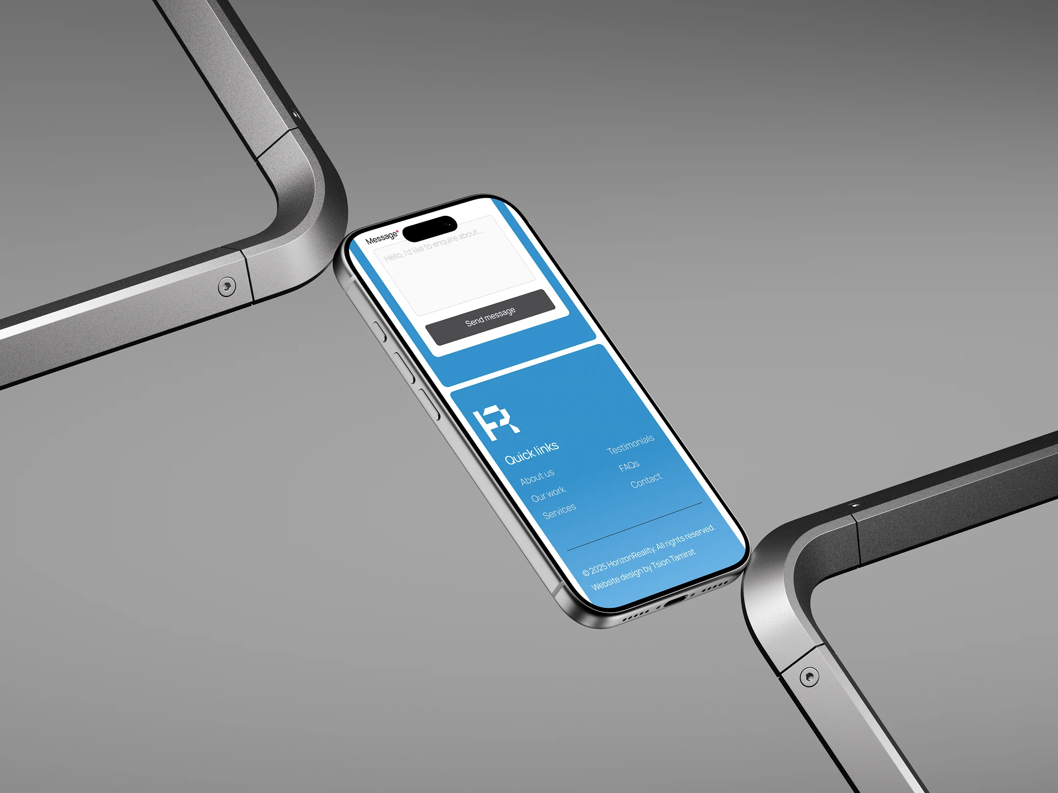
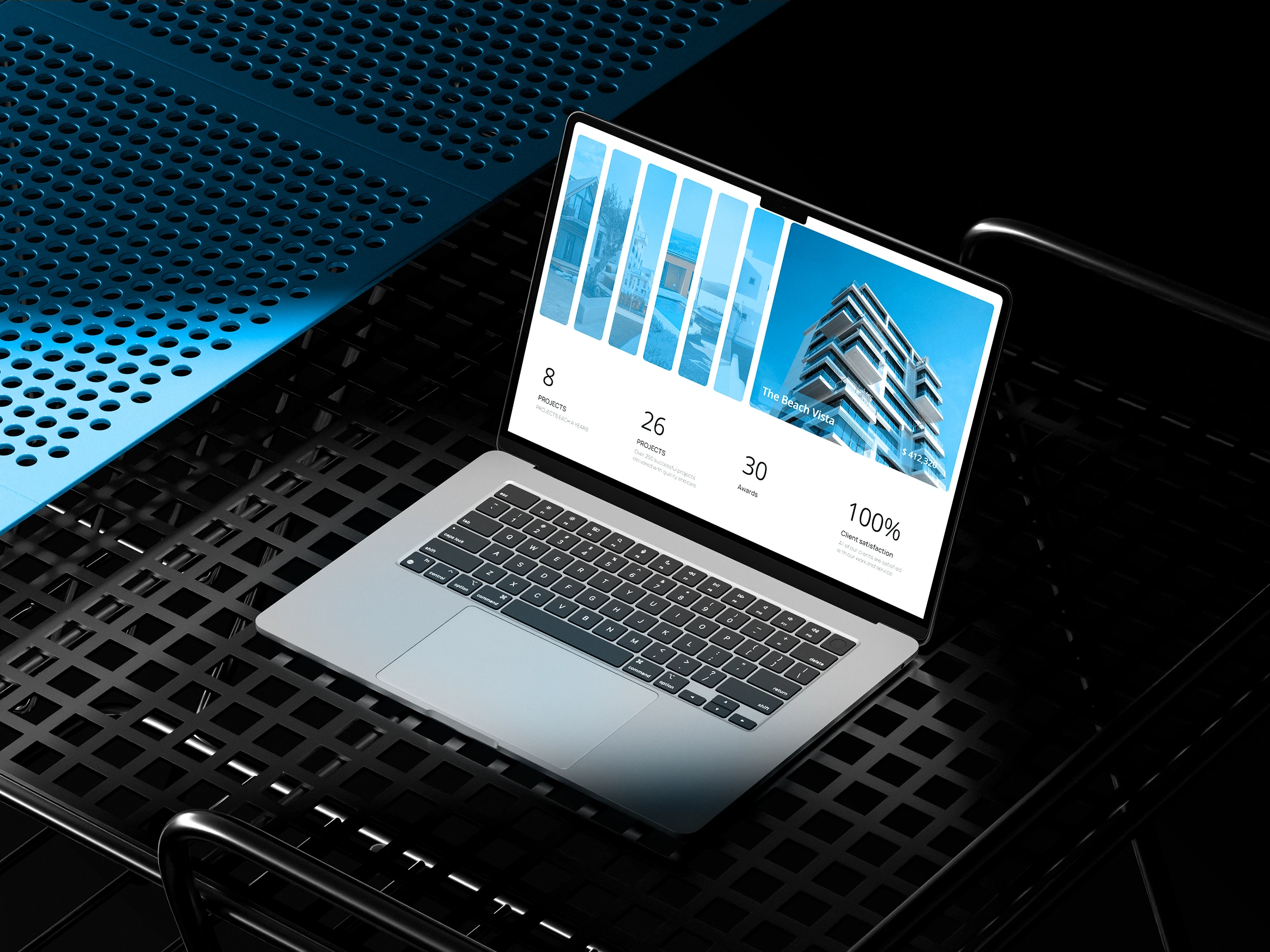
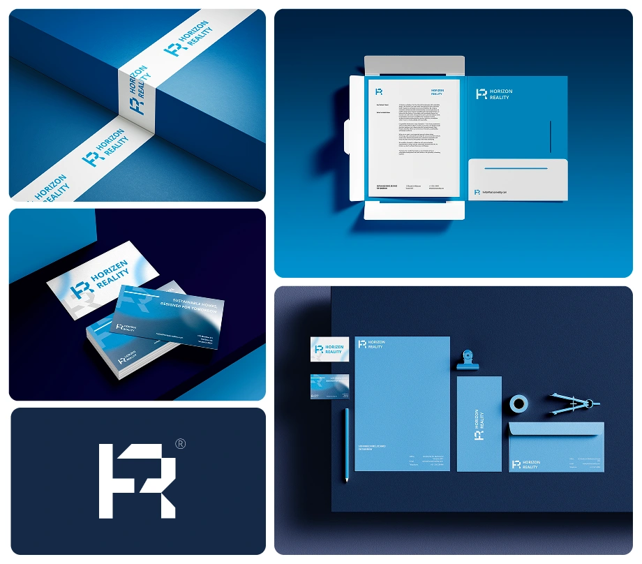
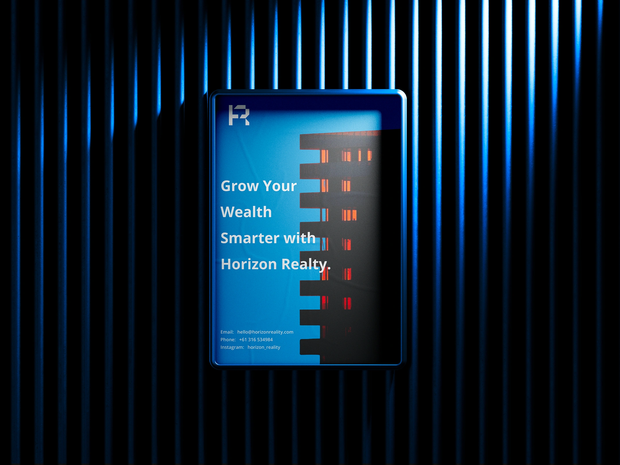
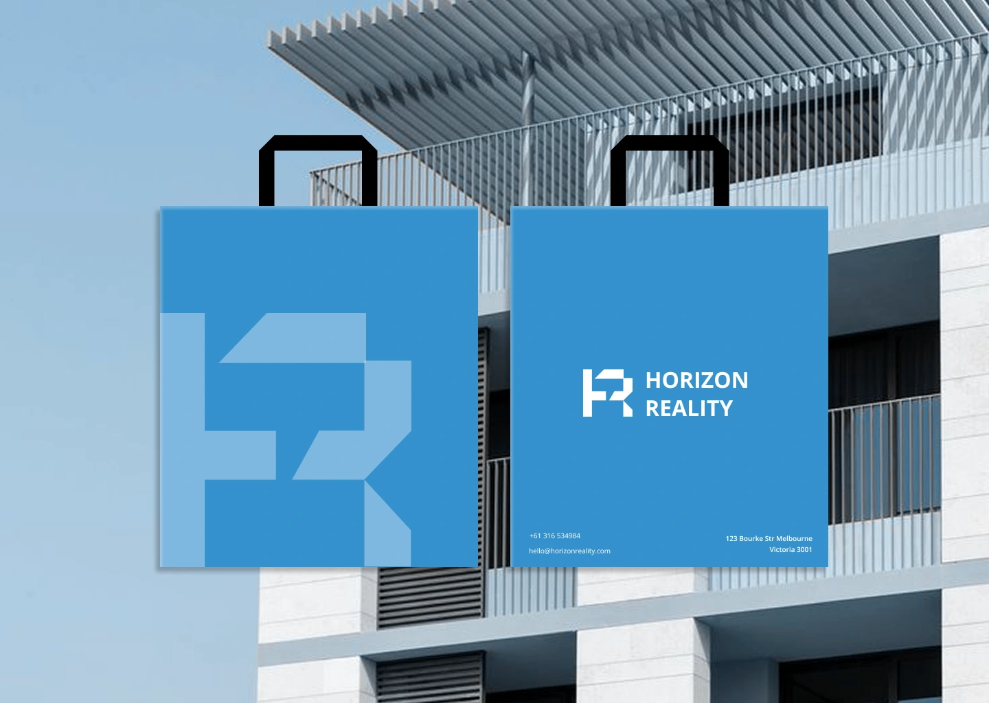
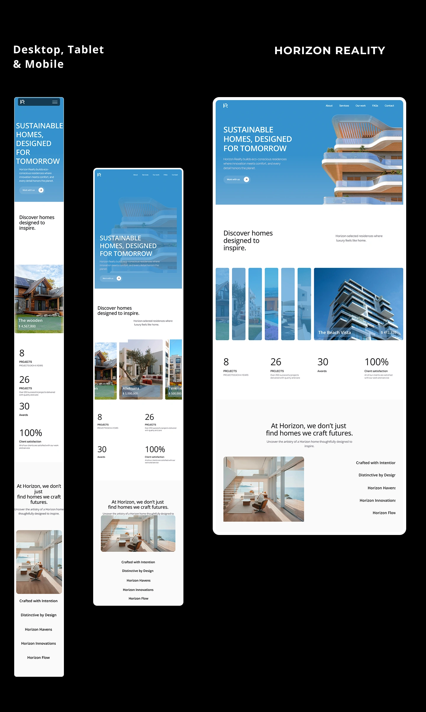
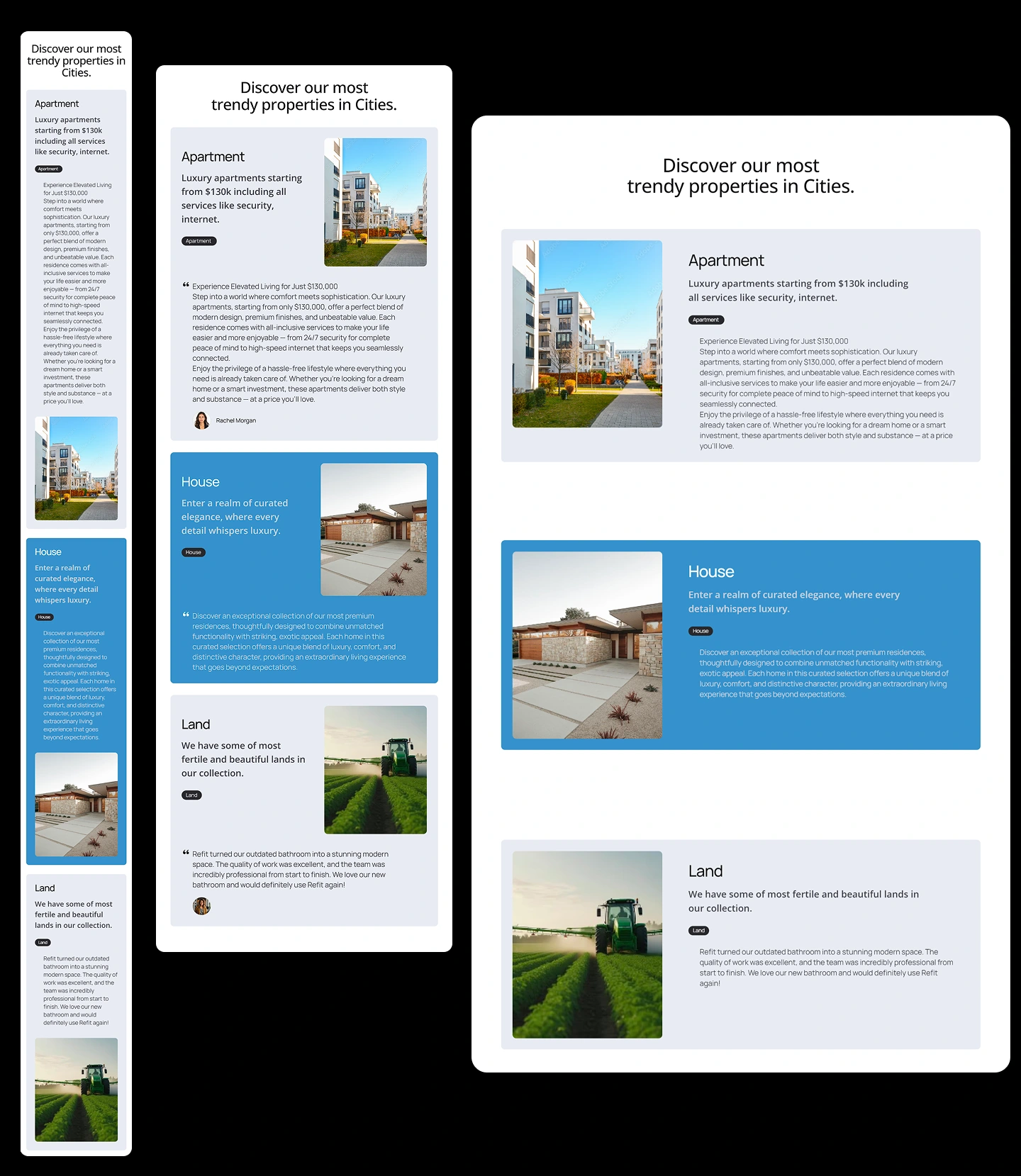
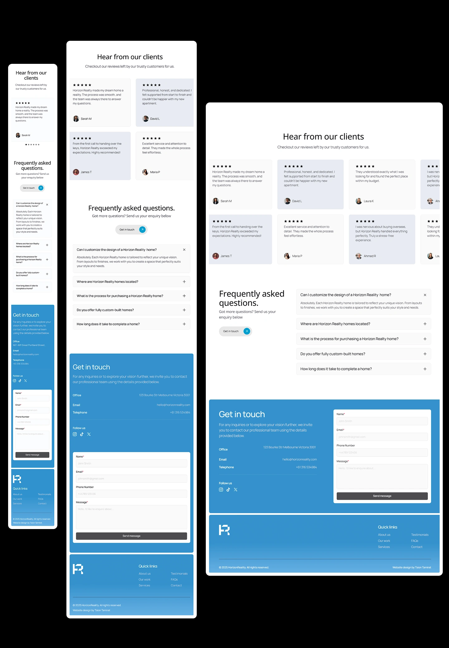
The Market Impact: Transformed their brand presentation into a scalable asset system, enabling the team to pitch confidently to high net worth investors and differentiate in a crowded market.
Scaling a real estate or investment firm?
I partner with founders and developers to build high precision brand systems that signal authority and command trust. If you need a brand identity that translates across digital and physical touchpoints, let's build your visual architecture.
Like this project
Posted Aug 10, 2026
Developed a dual audience brand identity for Horizon Reality.
Likes
0
Views
6
Timeline
Nov 15, 2025 - Dec 12, 2025