Luxury & Premium Brand IdentityTsion Tamirat
Luxury is not about being expensive. Luxury is about making people feel something before they even know the price.
The most successful premium brands in the world understand that restraint precision and intention communicate quality louder than anything else.
I create brand identities for luxury and premium products that make people lean in not look away.
WHO THIS IS FOR:
→ Fashion and apparel brands positioning at the premium end of their category
→ Beauty and skincare brands that use premium ingredients and need packaging and branding that reflects that quality
→ Luxury real estate developers and property brands selling to high net worth individuals
→ Fine dining and premium hospitality businesses where the brand experience starts before guests arrive
→ Jewelry watches and accessories brands where presentation is part of the product value
→ Premium wellness and lifestyle brands in spa retreat and high end fitness categories
→ Any brand that sells to people for whom quality matters more than price
MY APPROACH TO LUXURY BRANDING:
Luxury brands are built on three foundations that I never compromise:
RESTRAINT
Less is always more. Every element earns its place. Nothing is added for decoration. White space is used intentionally as an element of sophistication not emptiness.
PRECISION
The difference between premium and generic is in the details most people never consciously notice but always feel. Letter spacing line height proportions and margins matter enormously.
TIMELESSNESS
Luxury brands don't chase trends. I create identities that will still feel appropriate and elevated in 10 years not just next season.
WHAT I DELIVER:
REFINED LOGO SYSTEM:
✓ Wordmark logotype Carefully crafted typography often customized letterforms
✓ Monogram or crest For stamp emboss and premium applications
✓ Full application suite All formats and variations for every use case
SOPHISTICATED COLOR PALETTE:
✓ Primary palette Often anchored in neutrals with one signature accent
✓ Material and finish notes Gold silver matte glossy recommendations
✓ Color psychology rationale Why these colors communicate luxury for your specific brand
EDITORIAL TYPOGRAPHY:
✓ Display typeface selection Often serif or refined geometric for that timeless quality
✓ Body typeface Highly readable elegant
✓ Full typographic hierarchy
PACKAGING CONCEPTS:
✓ Primary packaging direction
✓ Secondary packaging ideas
✓ Label or tag design
✓ Tissue paper pattern
✓ Ribbon and seal concepts
BRAND WORLD DOCUMENT:
✓ Comprehensive brand guidelines
✓ Photography and art direction
✓ Lifestyle imagery direction
✓ Retailer and partner guidelines
MY EXPERIENCE WITH LUXURY:
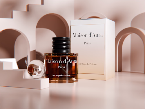
I developed the brand identity for Maison d'Aura a luxury fragrance house that required communicating exclusivity craft and sensory elegance through every visual decision.
That project shaped my understanding of how luxury brands must balance
aspiration with accessibility making people want something they feel slightly unworthy of while still inviting them in.
Timeline: 14 days
Revisions: 2 rounds included
FAQs
Example work
Tsion's other services

Starting at$1,200
Duration2 weeks
Tags
Adobe Suite
Figma
Brand Designer
Brand Strategist
Graphics designer
Service provided by
Tsion Tamirat Addis Ababa, Ethiopia
- 8
- Followers
Luxury & Premium Brand IdentityTsion Tamirat
Starting at$1,200
Duration2 weeks
Tags
Adobe Suite
Figma
Brand Designer
Brand Strategist
Graphics designer
Luxury is not about being expensive. Luxury is about making people feel something before they even know the price.
The most successful premium brands in the world understand that restraint precision and intention communicate quality louder than anything else.
I create brand identities for luxury and premium products that make people lean in not look away.
WHO THIS IS FOR:
→ Fashion and apparel brands positioning at the premium end of their category
→ Beauty and skincare brands that use premium ingredients and need packaging and branding that reflects that quality
→ Luxury real estate developers and property brands selling to high net worth individuals
→ Fine dining and premium hospitality businesses where the brand experience starts before guests arrive
→ Jewelry watches and accessories brands where presentation is part of the product value
→ Premium wellness and lifestyle brands in spa retreat and high end fitness categories
→ Any brand that sells to people for whom quality matters more than price
MY APPROACH TO LUXURY BRANDING:
Luxury brands are built on three foundations that I never compromise:
RESTRAINT
Less is always more. Every element earns its place. Nothing is added for decoration. White space is used intentionally as an element of sophistication not emptiness.
PRECISION
The difference between premium and generic is in the details most people never consciously notice but always feel. Letter spacing line height proportions and margins matter enormously.
TIMELESSNESS
Luxury brands don't chase trends. I create identities that will still feel appropriate and elevated in 10 years not just next season.
WHAT I DELIVER:
REFINED LOGO SYSTEM:
✓ Wordmark logotype Carefully crafted typography often customized letterforms
✓ Monogram or crest For stamp emboss and premium applications
✓ Full application suite All formats and variations for every use case
SOPHISTICATED COLOR PALETTE:
✓ Primary palette Often anchored in neutrals with one signature accent
✓ Material and finish notes Gold silver matte glossy recommendations
✓ Color psychology rationale Why these colors communicate luxury for your specific brand
EDITORIAL TYPOGRAPHY:
✓ Display typeface selection Often serif or refined geometric for that timeless quality
✓ Body typeface Highly readable elegant
✓ Full typographic hierarchy
PACKAGING CONCEPTS:
✓ Primary packaging direction
✓ Secondary packaging ideas
✓ Label or tag design
✓ Tissue paper pattern
✓ Ribbon and seal concepts
BRAND WORLD DOCUMENT:
✓ Comprehensive brand guidelines
✓ Photography and art direction
✓ Lifestyle imagery direction
✓ Retailer and partner guidelines
MY EXPERIENCE WITH LUXURY:
I developed the brand identity for Maison d'Aura a luxury fragrance house that required communicating exclusivity craft and sensory elegance through every visual decision.
That project shaped my understanding of how luxury brands must balance
aspiration with accessibility making people want something they feel slightly unworthy of while still inviting them in.
Timeline: 14 days
Revisions: 2 rounds included
FAQs
Example work
Tsion's other services
$1,200