Case Study: Modernising & Simplifying a legacy recruiting app
Dan Spratling
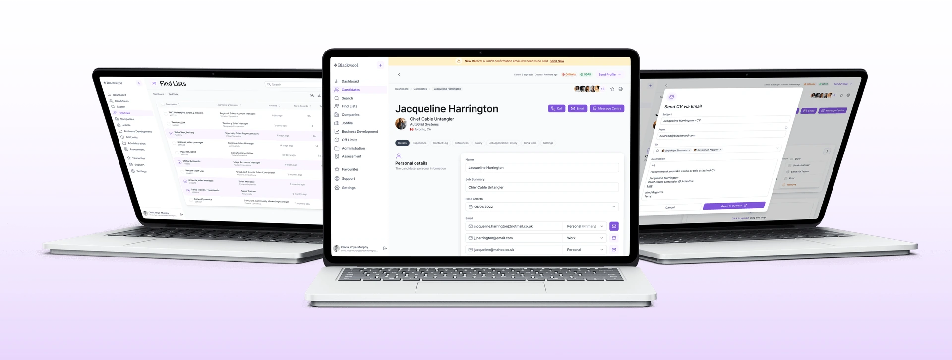
Blackwood are staffing specialists for enterprise level corporations. They created an internal application designed to help their specific needs when managing communication with candidates and companies. But over years the application became very dated, and with new features continuously being added it slowly grew harder for team members to use or maintain.
We were commissioned to create a brand-new User Experience for this application, with a primary goal of streamlining the team's experience and making the application as easy to start working with as possible.
Finding Pain Points with UX Research
To make sure we understood exactly where the current CRM application was going wrong, we conducted some user research studies so we could get a better idea of how the current app was used and where it was causing frustrations.
In order to get a good understanding of how most of the team felt about the application, we sent around a questionnaire with generalised questions covering the entire app experience, and specific questions about certain areas. This showed us that, overall, most of the staff learned to use the application and after lots of training they mostly felt comfortable using it, but it could take years to get there. Comparatively, new employees struggled to use the application on their own requiring months of training and regular support.
With this information in mind, we took the time to visit the team and review how some longer term and some newer employees used the platform which confirmed that newer employees greatly struggled to use the application effectively. There was lots of room for improvement.
Creating the new design
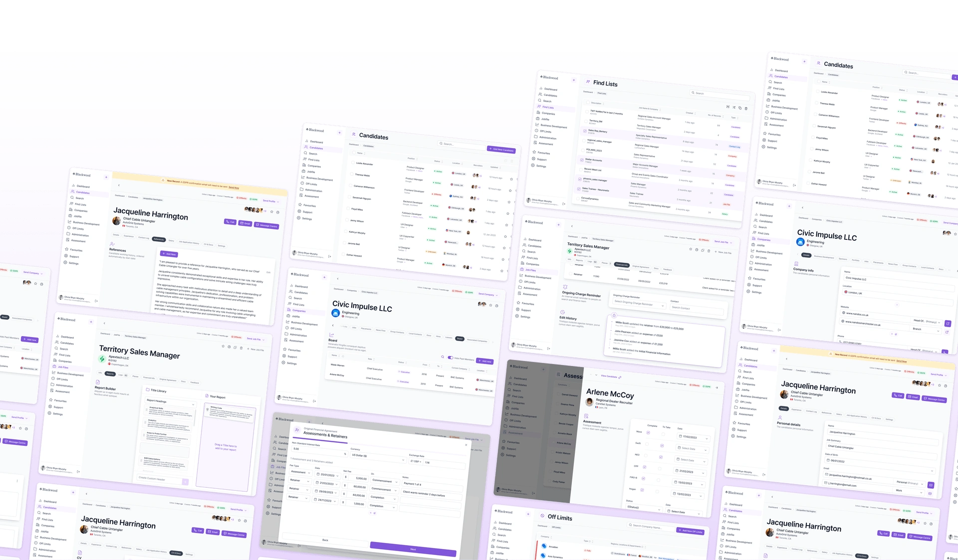
Using our research, we collaborated with the project owner to begin revising the application bit by bit. Usability came above all else for this project, as it was likely only to be seen by internal stakeholders but for them, the project had to be incredibly simple to use.
Each section of the redesign began on the iPad in the Concepts app. We imported the current app screenshots and notes from the Blackwood team before stripping everything down to its bare essentials. Doing this in a lo-fi format with an apple pencil lead to more rapid iteration. These wireframes were then brought into Figma for feedback from the Skyward team before a high-resolution version was designed to present to the client.
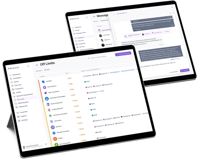
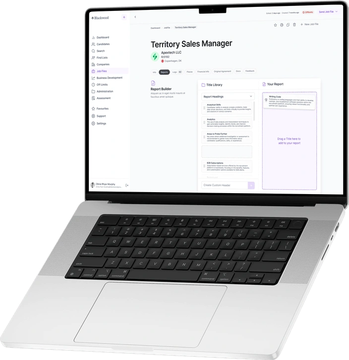
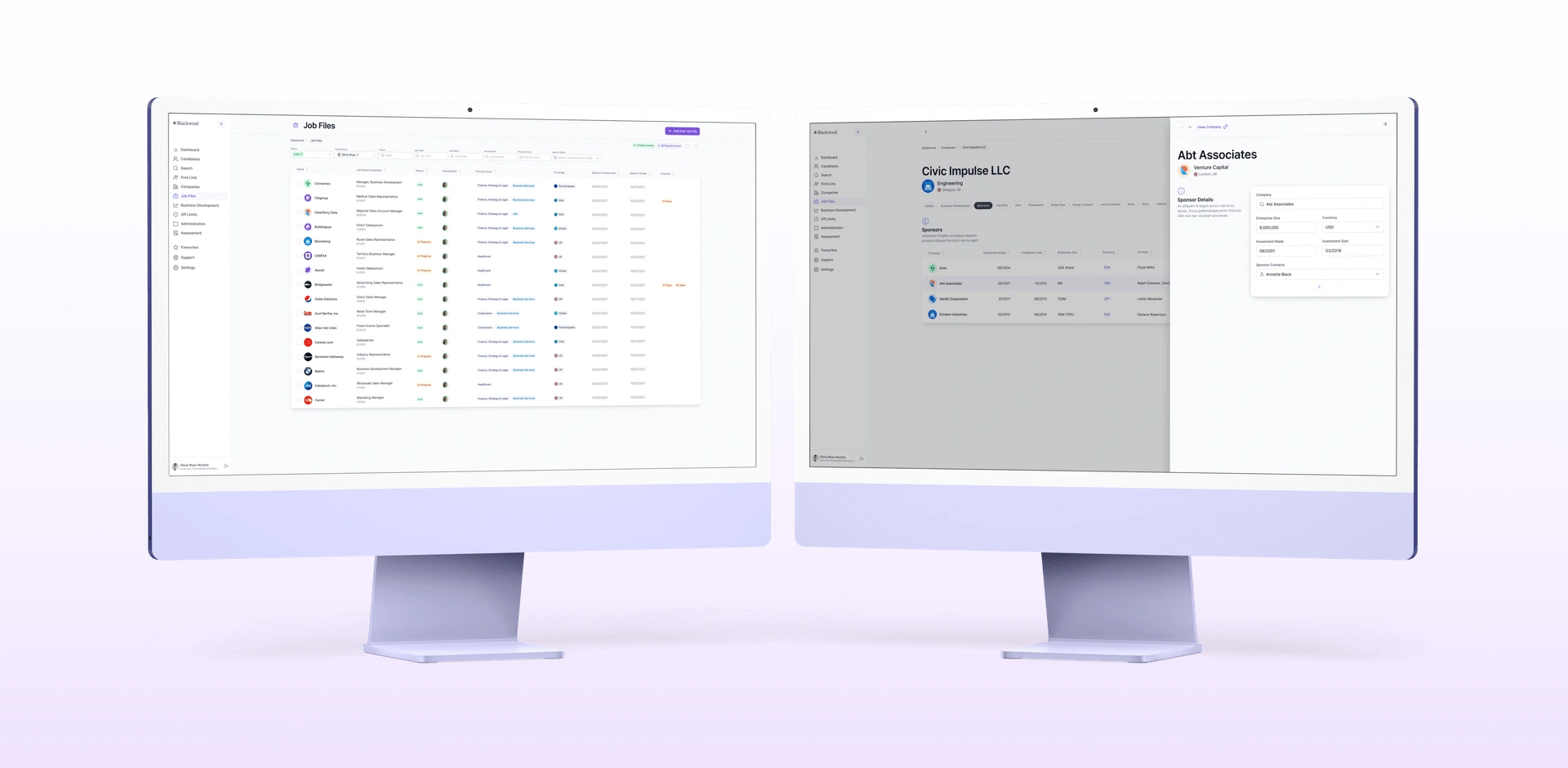
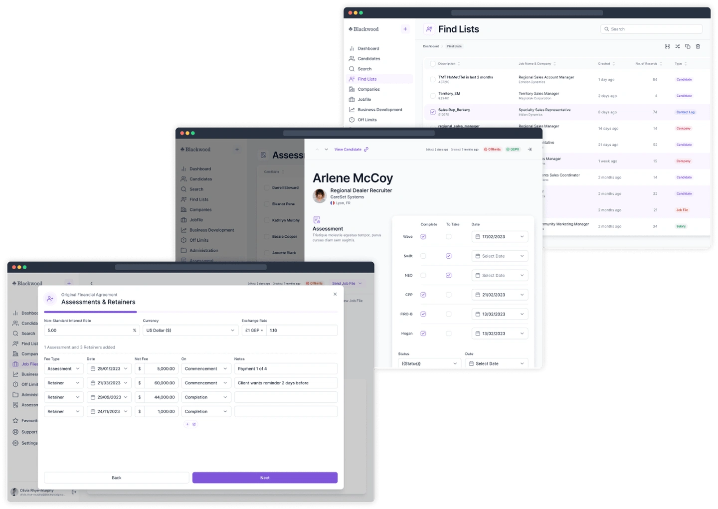
A well-structured content hierarchy was key. The original app lacked consistency as the user moved through the many sections and sub-sections. We wanted users to feel comfortable in every part of the app. To achieve this we introduced a sidebar navigation so users would never feel lost in the app. This consistency was re-enforced with headers and breadcrumbs, which provided an interface users could rely on regardless of which part of the app they were viewing. We also added consistency through the placement of primary and secondary actions, along information for tags, collaborators, and edit history.
Reusable components within Figma were essential for keeping the pages consistent as we deep dove into the various sections of the app. Many of the key components were grouped based on their placement on the screen as opposed to their placement in the app. This enabled us to efficiently ensure sections were remaining consistent.
With such a large project, we took special care to revisit designs from previously completed sections and ensure that any new changes were implemented. Keeping the designs up-to-date and in sync was critical for both implementation and maintaining designs for the future. This was additionally challenging due to the size of the application designs, which needed to span multiple files and therefore required extra thought when making sure the designs easy to understand and translate into dev.
Integrating the frontend
While we had not originally planned to assist with the frontend development of the website, when we were asked to help the team develop the application to integrate our designs, we were happy to assist. We had been working on the designs for over a year, so we already had a great understanding of the project and its complexities.
When we started working on Blackwood’s new codebase, it was enormous. Despite being built from the ground up as a new project, the complexity of the necessary features and the sheer volume of data moving through the app made finding the perfect implementation tricky. This was even harder when considering the team originally didn’t have any frontend developers assisting with the build, which led to code which could be put together in a more understandable, maintainable way.
We started by working with the team, breaking down the designs and projects into stories that everyone could understand. Small, digestible chunks of work that we could actively track and make sure they were completed fully and to a high standard before moving on.
Next, we used these stories to guide us through the project, working step by step, improving and standardising the design system within the project and suggesting improvements on components where they could be made more reusable.
We used Storybook to help implement improvements which gave us a great foundation to ensure our styles were created in an isolated way that we could test and document for future implementation.
This process started off slow, as we were implementing a reusable design system that worked across the entire project, but as we started getting the building blocks in place, it made implementing the UI significantly easier for everyone and provided a platform that was less confusing to work with for everyone on the team.
Despite this being a .NET project which was out of our comfort zone, we managed to implement some creature comforts to help improve teamwork across the project, including lint & formatting checks to help ensure styles are consistent across different team members' changes.
Like this project
Posted Sep 27, 2023
We worked with Blackwood to redesign their complex internal recruiting app, modernising it and making it significantly easier and faster for their team to use
Featured on