Product Page Redesign for B2B SaaS

Luiza Medeiros

Project: Product Page Redesign — Conversation Automation Builder
Role: Web Design, Product Page Strategy (in-house design team)
Type: Real client work — company name withheld for confidentiality
This project was created as part of my in-house design work for a B2B SaaS company (name withheld under confidentiality). It's shown here to demonstrate real product page design and information architecture, not as a self-initiated concept.
The Brief
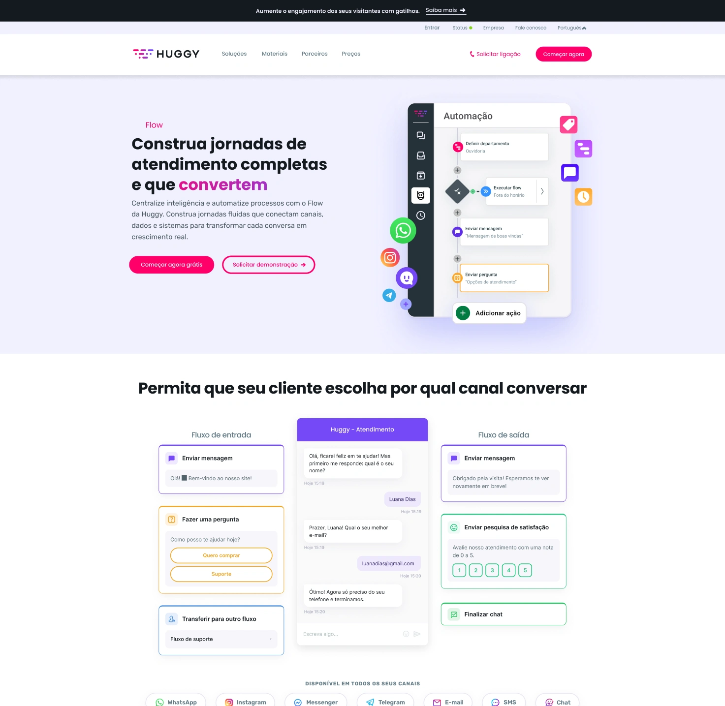
Redesign the product page for the platform's no-code automation builder — the tool customers use to design conversational flows across WhatsApp, Instagram, and web chat.
The existing page was outdated and visually disconnected from the company's newly refreshed homepage identity, and it explained the product mostly in feature-list terms rather than showing what the builder actually does or why it mattered for the buyer's day-to-day operation.
The Problem
Automation builders are hard to sell on a page: the product's real value only becomes obvious once you've used it, but a first-time visitor needs to understand it in seconds, from static screenshots. The previous page leaned on generic phrases like "automate your conversations" without showing what building a flow actually looks like, and it treated every feature as equally important — burying the two capabilities (smart routing and native WhatsApp forms) that most differentiated the product from cheaper competitors.
The Approach
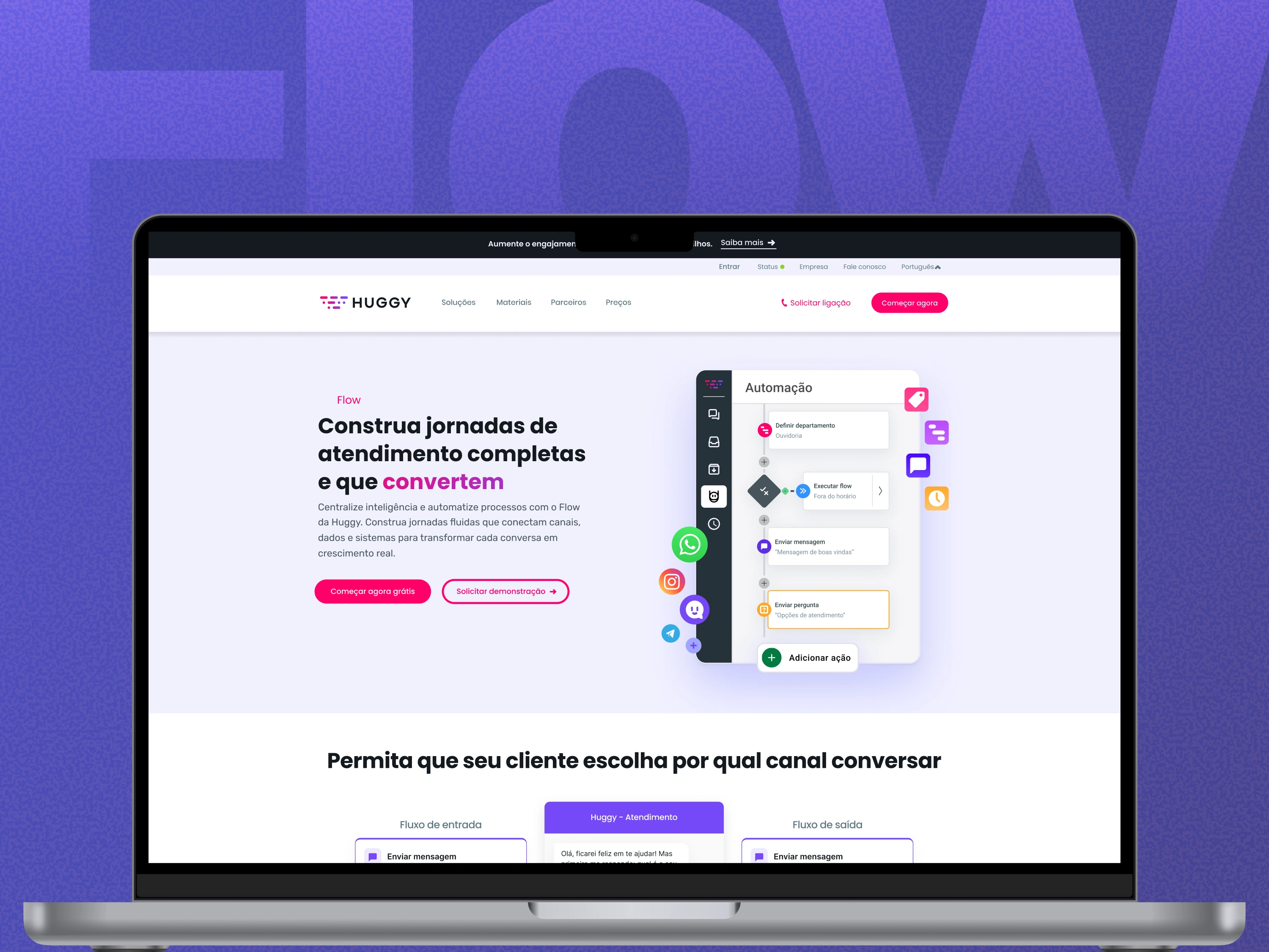
Led with the builder itself, not a feature list. The hero shows the visual, drag-and-drop flow canvas directly, with a headline focused on the outcome ("build complete service journeys that convert") rather than the mechanism, so a non-technical buyer immediately understands this doesn't require code.
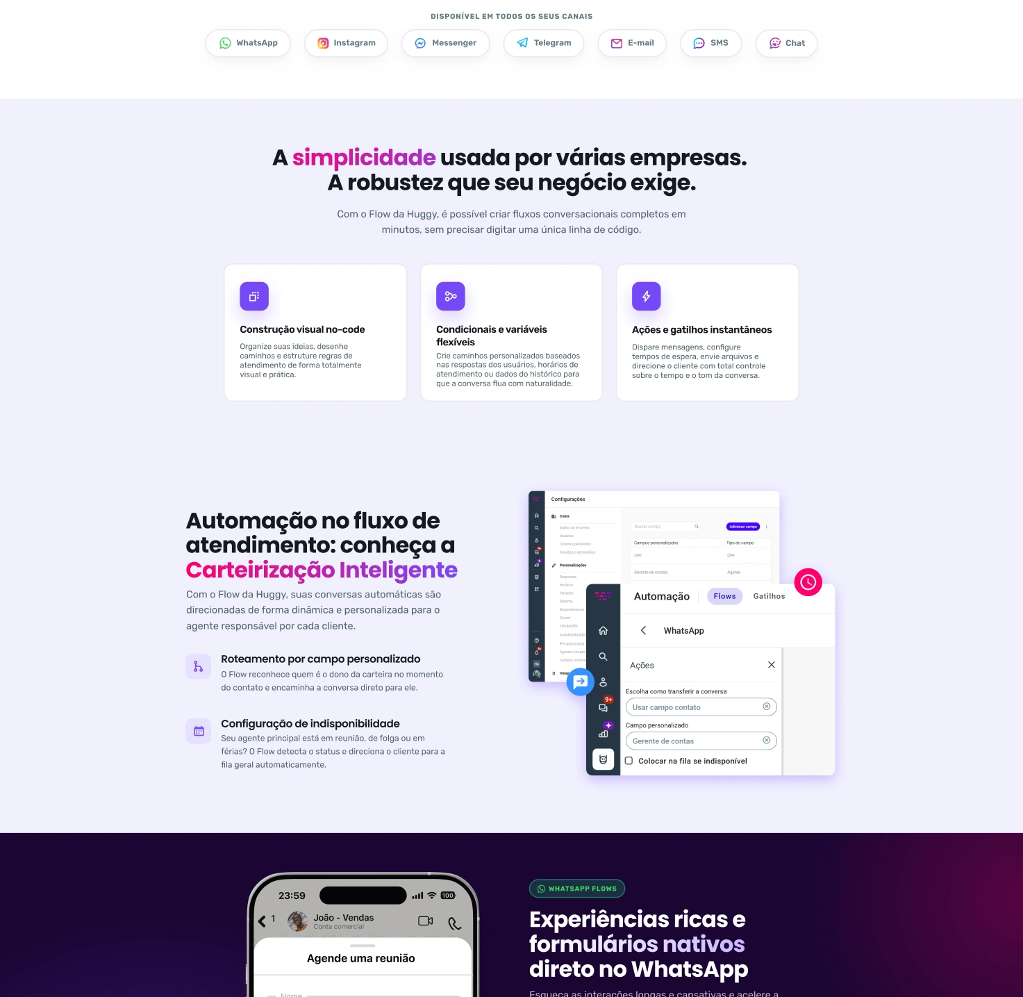
Structured around three product moments, not a flat feature grid. Instead of one
long list, the page walks through three distinct capabilities in sequence — general
flow-building (visual builder, conditionals, triggers), an "intelligent routing" section explaining how the tool assigns conversations to the right agent automatically, and a WhatsApp Flows section showing native in-chat forms — each with its own visual proof rather than an icon and a sentence.
Used a dense action-icon grid near the end ("send message," "set department,"
"conditional," "run flow," etc.) styled as colorful rounded app-icon tiles, to communicate depth and flexibility at a glance — signaling "this handles complex logic" without requiring the visitor to read every capability.
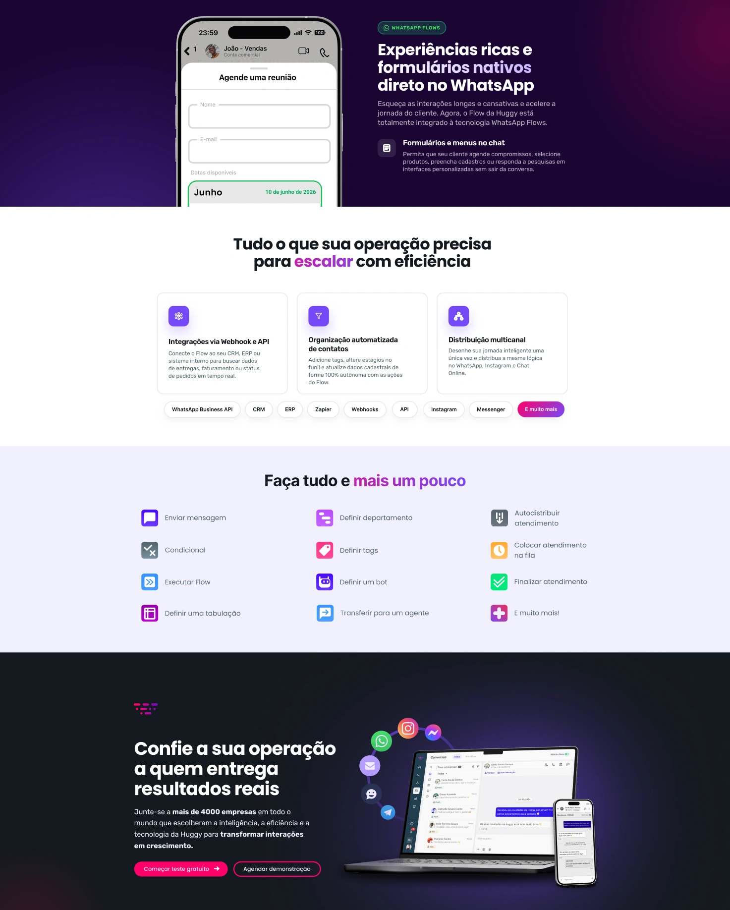
Closed on scale and trust, not just a generic CTA — social proof framed around
company volume rather than testimonial quotes, reinforcing that this is enterprise-ready infrastructure, not a beta feature.
Process
Audited the existing page against the new homepage design system to identify every point of visual inconsistency (spacing, iconography, color usage)
Interviewed product/sales stakeholders to identify which two capabilities actually won deals against competitors, and restructured the page hierarchy around those
Produced detailed wireframes, then high-fidelity screens, iterating directly against the updated brand system rather than the legacy page
Designed the colorful icon-tile grid as a flexible, reusable component now used across other product pages in the same family
Result
A product page that leads with what the tool does rather than what it's called —
reorganized around the two differentiating capabilities that matter most in sales
conversations, with a reusable icon-grid component that extended into the rest of the product page family.
Need a product page that explains what your tool actually does?
I design pages that translate complex, technical products into something a
non-technical buyer understands in seconds.
Like this project
Posted Aug 18, 2026
Redesigned a product page for a B2B SaaS company's automation platform, highlighting key differentiators.
Likes
0
Views
0