Surge Marketing Website

Luiza Medeiros


Surge — Website Case Study
Project: Surge — Marketing Website
Role: Web Design, Brand System, Copywriting
Timeline: 3 weeks
Tools: Figma, Framer
The Problem
Most personal finance apps default to one of two visual languages: sterile corporate blue (safe, forgettable) or gamified confetti (fun, not credible past age 25). My first pass at Surge tried to split the difference and ended up feeling like neither — it read as "just another budgeting app," despite the product concept's genuinely different mechanic: momentum-based goal tracking instead of guilt-based budgeting.
The content had the same problem. An early draft leaned on generic single-line copy over placeholder boxes — no real numbers, no specific features, no answers to the objections a first-time visitor actually has (Is this a bank? Is my money safe? What does it cost?). It read like a template, not a company.

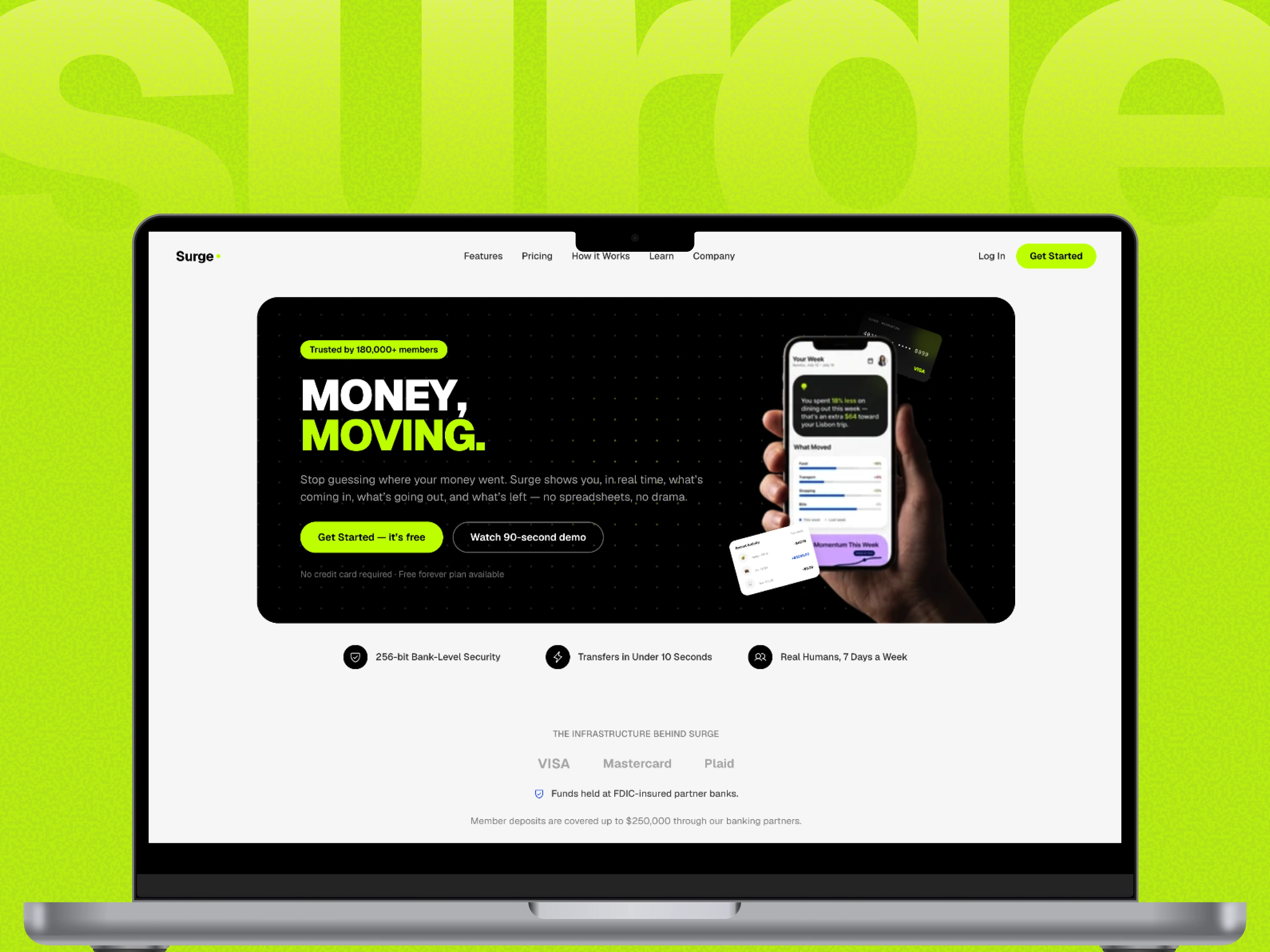
Img. 1 - Surge Website
The Approach
Visual identity. I moved away from the safe fintech palette and built a system around Bitter Lime (#C2FF01) as the primary accent, with Blue and Mauve as secondary accents, black reserved for a single contained hero card and typography, and Pearl White carrying most of the page. Geist gave the type system range — bold, condensed headlines and clean body text from one typeface. A recurring black-line "starburst" motif and rounded icon badges tie the smaller UI moments together.
Content depth. Rather than one CTA-driven scroll, the site is structured like a real fintech company's site: trust bar with specific numbers, a 4-tier feature breakdown, a detailed pricing table with real dollar amounts, a direct comparison against "checking your bank app," an FAQ answering the questions people actually have before signing up, a press mention row, and a blog/resources teaser. Every stat, feature, and testimonial carries a specific number or outcome instead of a vague claim.
UI density. To match that content depth visually, I paired every section with a concrete piece of interface — a spending donut chart, a momentum progress ring, a weekly recap card, a comparison table with check/x icons — rather than decorative placeholder boxes. The goal was a site that reads as a real product's home, not a brochure.
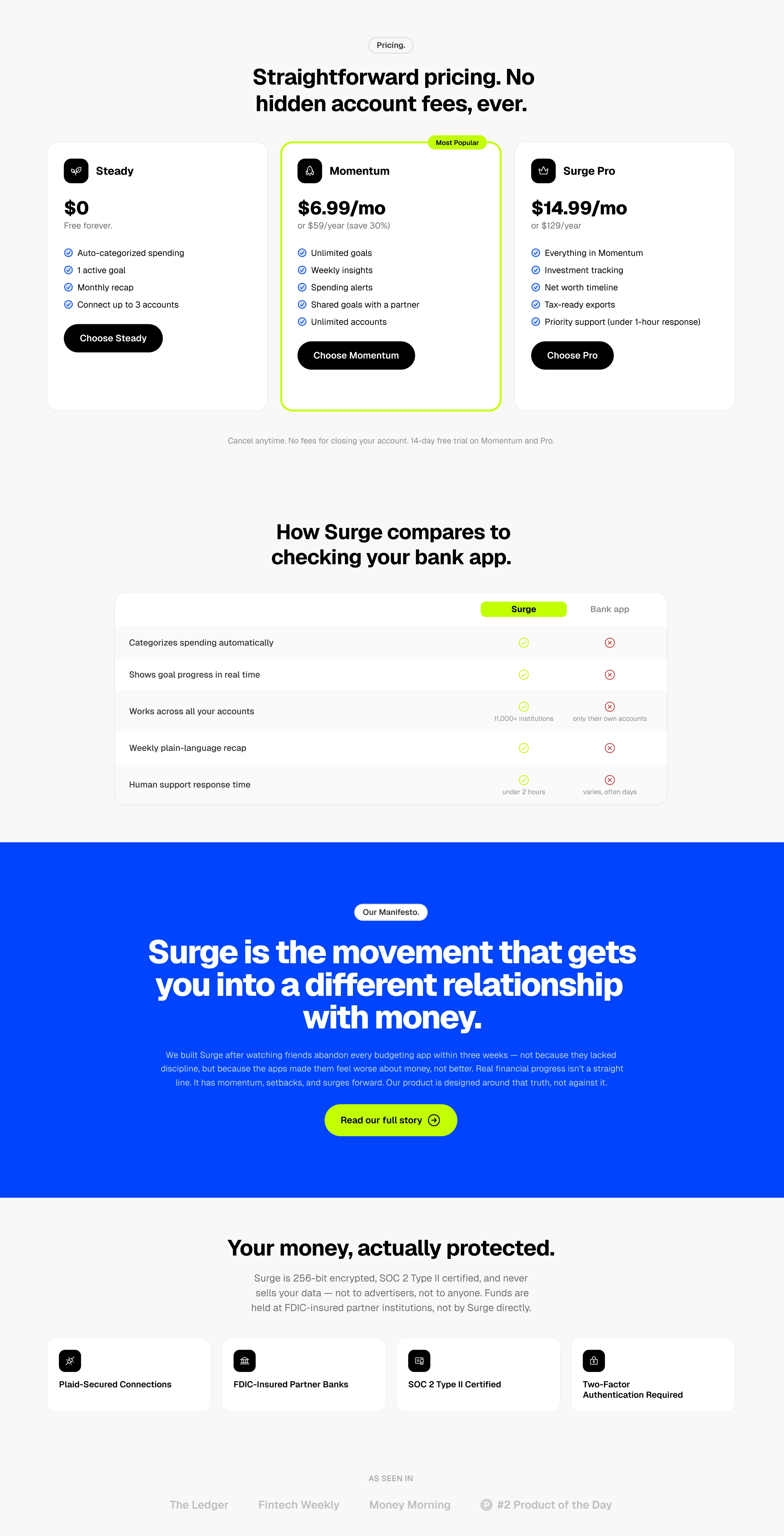
Img 3. Website
You can check the website here
Like this project
Posted Jul 25, 2026
Website design for Surge, focusing on a clear visual identity and content depth.
Likes
0
Views
2
Timeline
Jul 20, 2026 - Jul 25, 2026
Clients
Surge