Wisp: Mood-Focused Productivity App Design

Luiza Medeiros

Wisp - Finding Calm in a Noisy Digital World
Role: Product & Visual Design
Tools: Figma, FigMotion
Timeline: Two weeks
Type: Case study conceitual
The Challenge
Most productivity apps are built for output, not for people. They track tasks, streaks, and hours — but rarely ask how you're actually feeling while you get things done. Wisp set out to close that gap: a wellbeing-first productivity app where mood isn't an afterthought, it's the interface itself.
Vid.1 - Dashboard with the mascot
The Concept
At the center of Wisp is a soft, rounded dome-shaped mascot, a quiet companion rather than a cartoon character. Around that mascot, the entire visual language shifts with the user's mood, from calm blues and lavenders on low-energy days to warmer corals and yellows on high-energy ones.
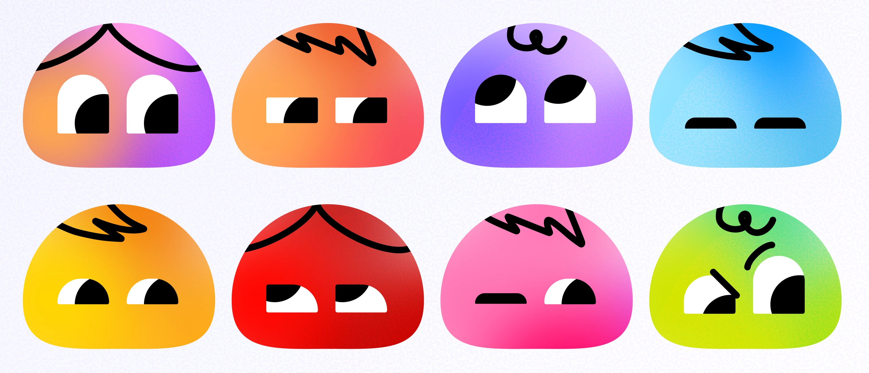
Fig.1 - Wisp's Mascot
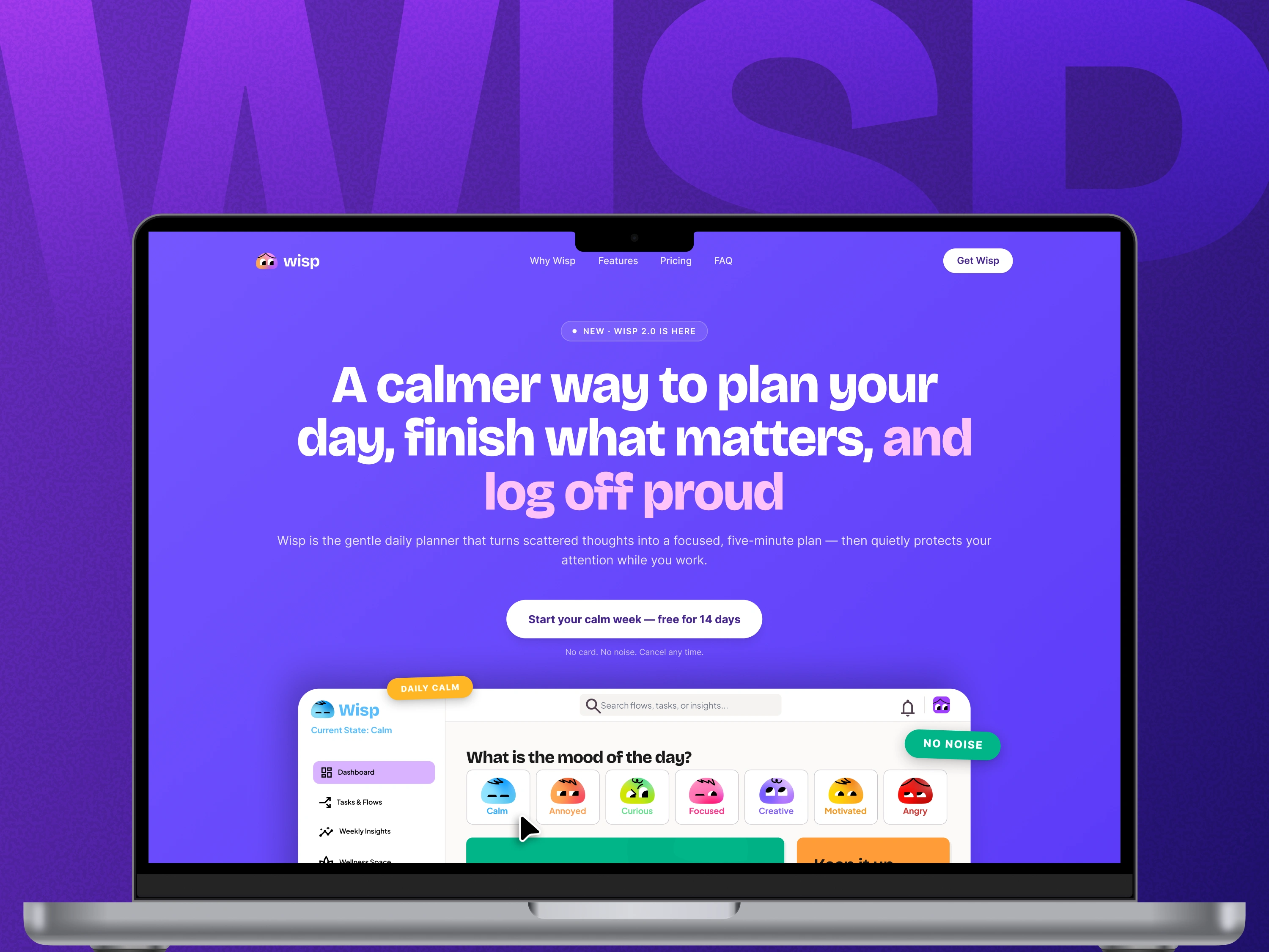
Wisp became the most fully realized project in my portfolio exploration: a complete case study spanning mascot design, an adaptive color system, and full UI screens, all working together to answer one question: what if productivity tools cared about how you feel, not just what you finish? It's a demonstration of how emotional design and functional UI don't have to compete, they can be the same system.

Fig.2 - Wisp's website
Interested in working together?
Reach out!
Like this project
Posted Jul 14, 2026
Wisp is a wellbeing-focused productivity app case study — mood-based UI, adaptive color system, and mascot design in Figma.