
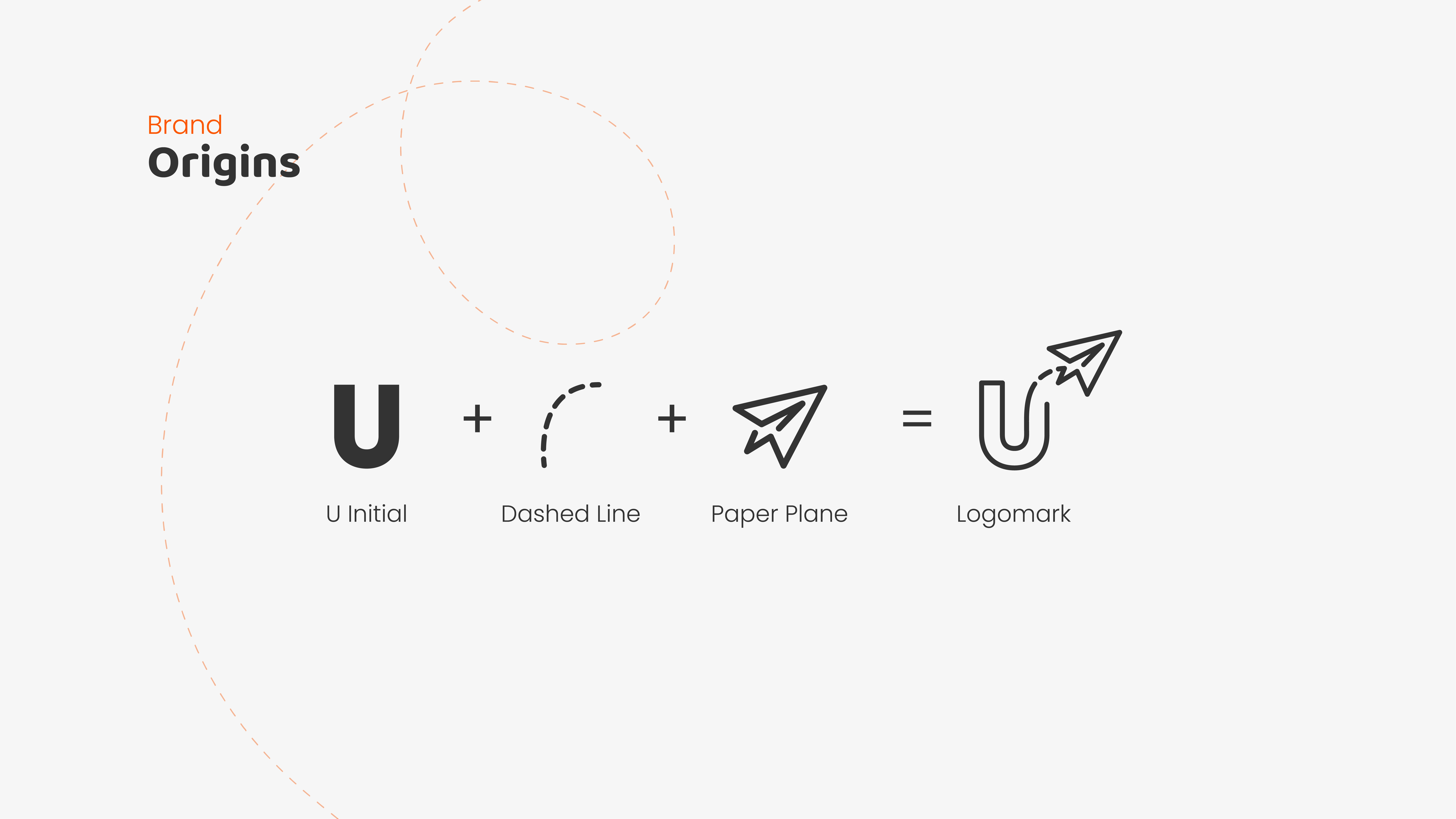
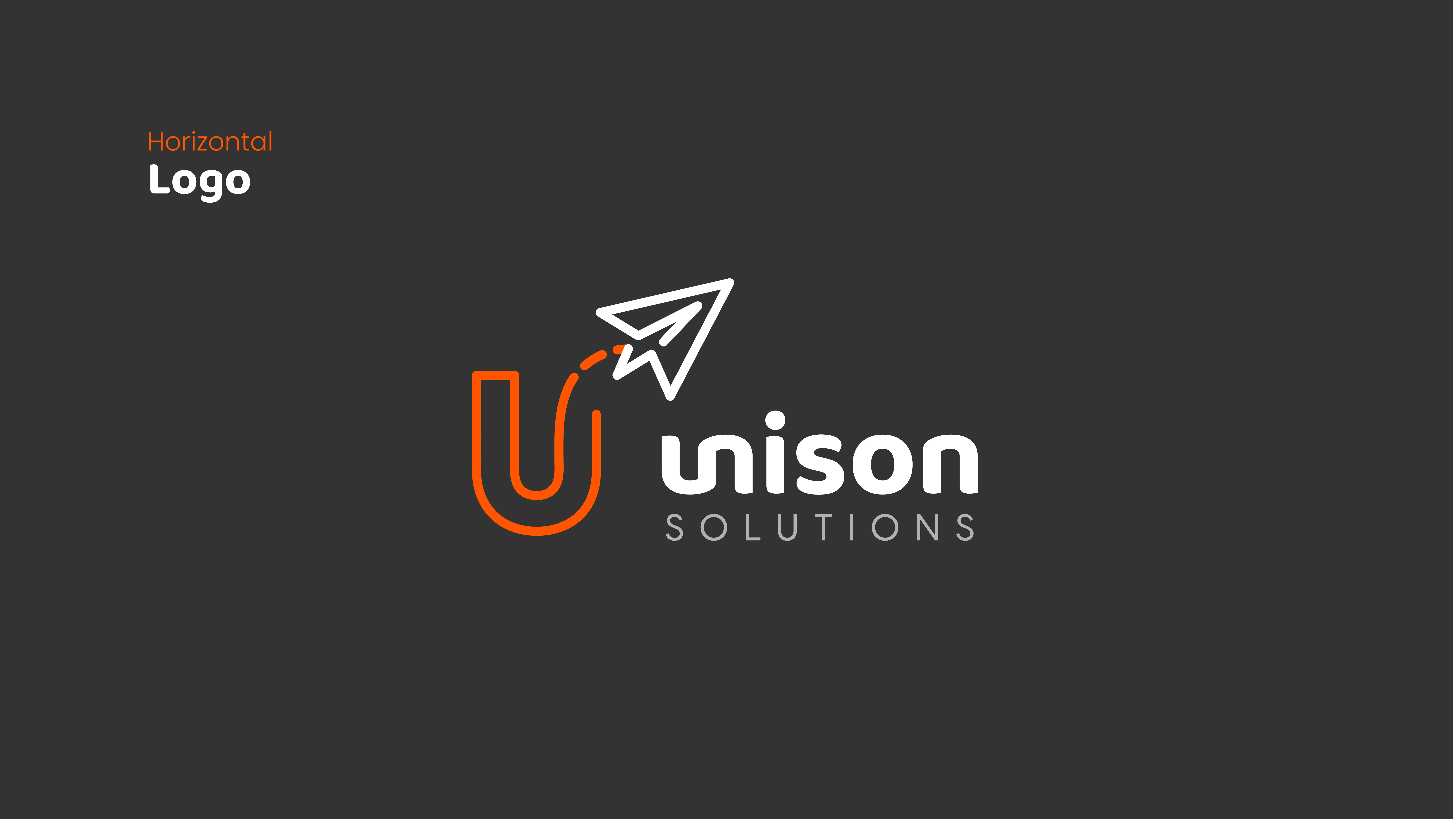
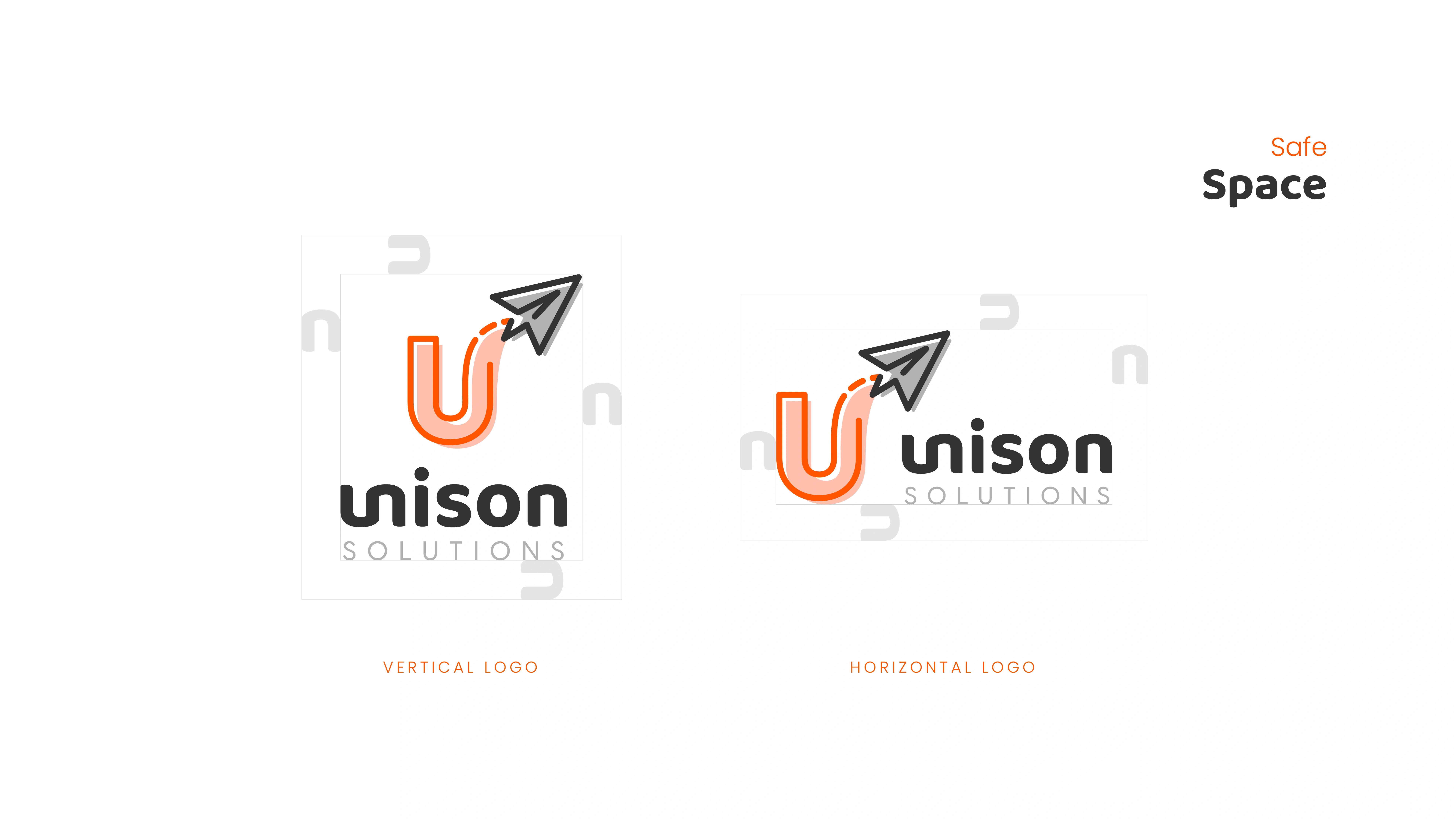
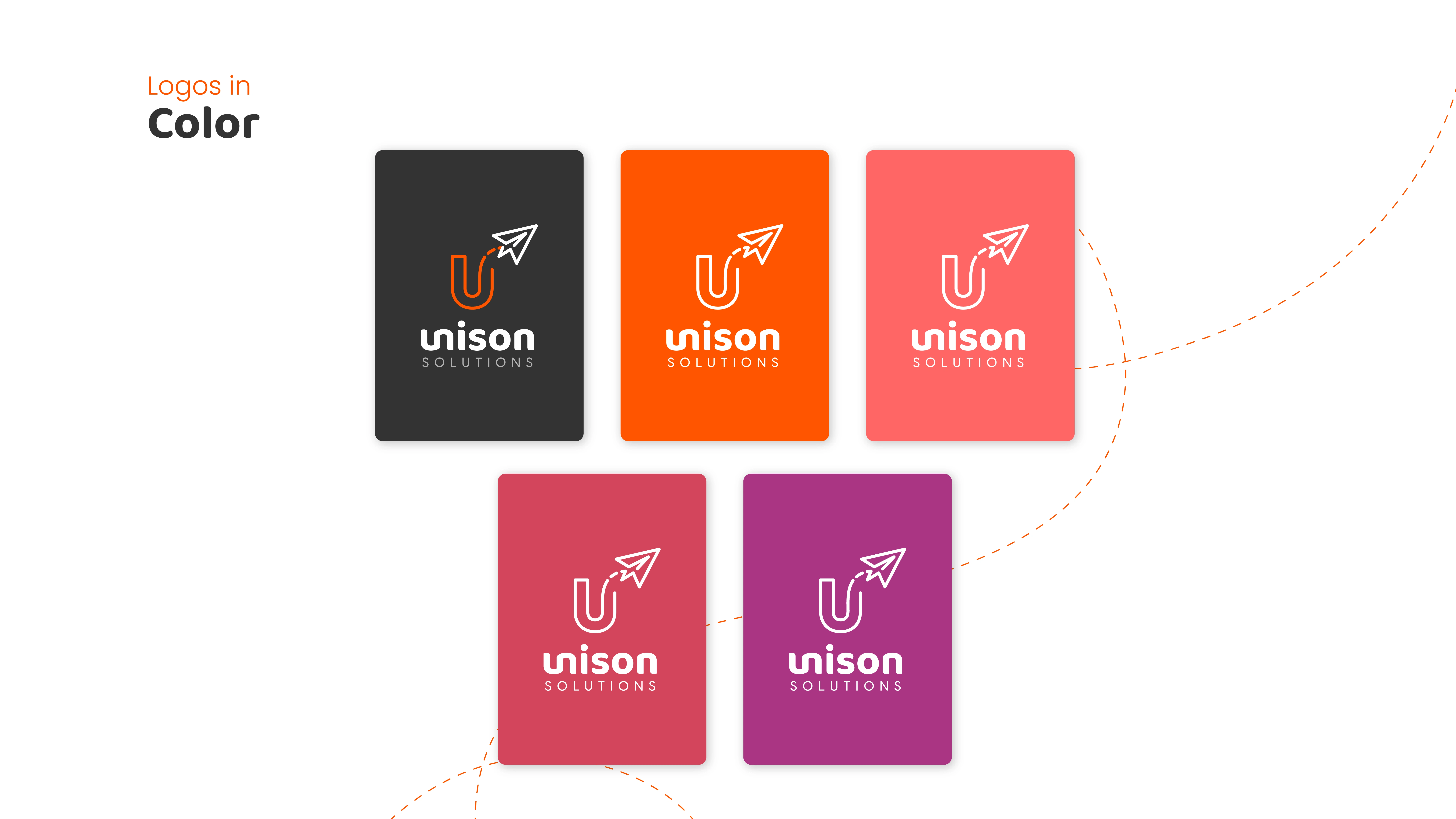
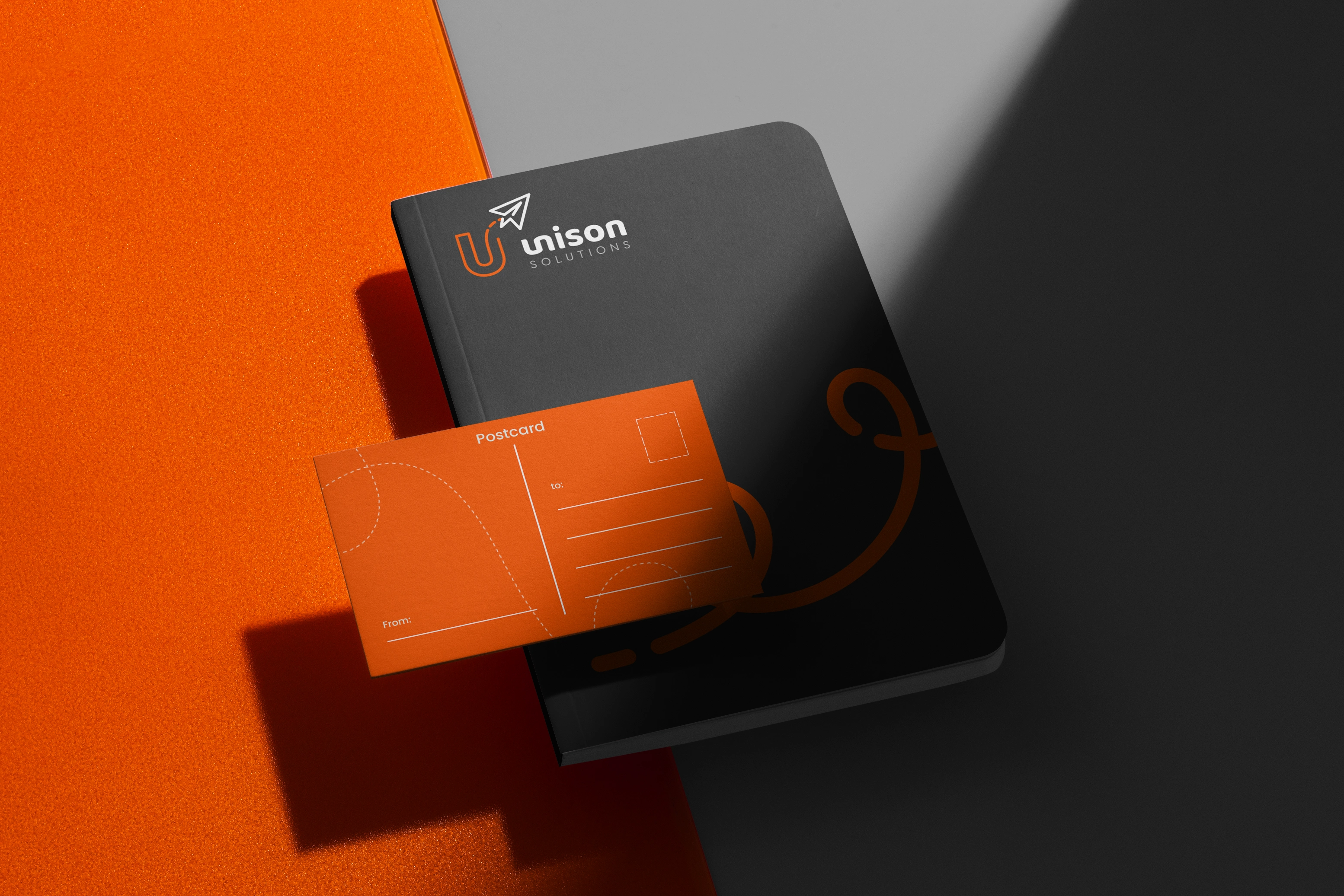
The logo is meant to feel professional, authentic, and handcrafted, just like the services Unison offers to their clients. Each piece of our logo helps the team and clients connect with who they are. The dotted line represents the path they take to guide clients down; the paper airplane represents the personalized companies their clients seek to build; and the connected ‘u’ and ‘n’ represent the work they do in tandem with their clients to bring the company to life.
Client Unison
Year 2021
Branding Manager
Karina Blanco
Graphic Designers
Karina Blanco & Fernando Curtis
0 likes · 1 view · Sep 17, 2026
The logo is meant to feel professional, authentic, and handcrafted, just like the services Unison offers to their clients. Each piece of our logo helps the team and clients connect with who they are. The dotted line represents the path they take to guide …

