Mixtape, a Design System Built for SoundCloud's DNA
Rohan Boda
Building SoundCloud's Missing Design System from Scratch
A lack of a design system made SoundCloud's experience inconsistent, Inaccessible, and barely optimized
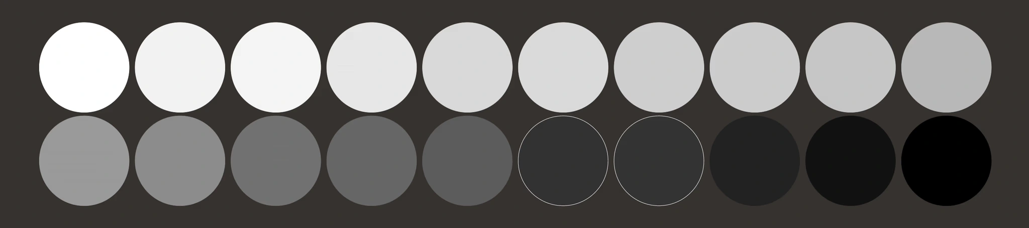
14 redundant shades of grey
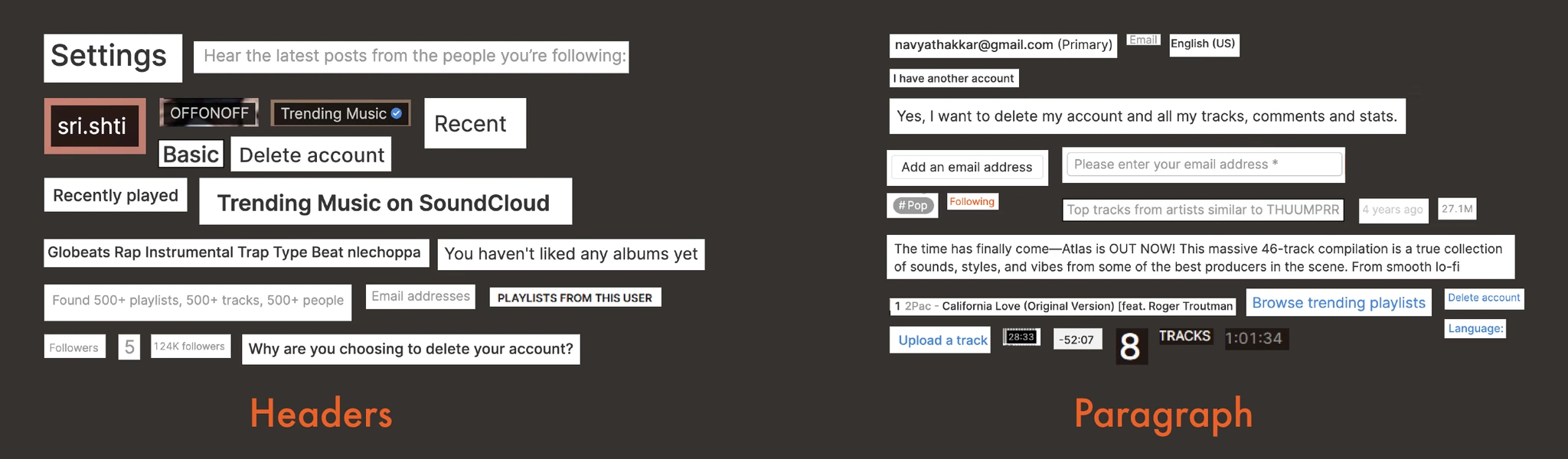
Far too many styles of text
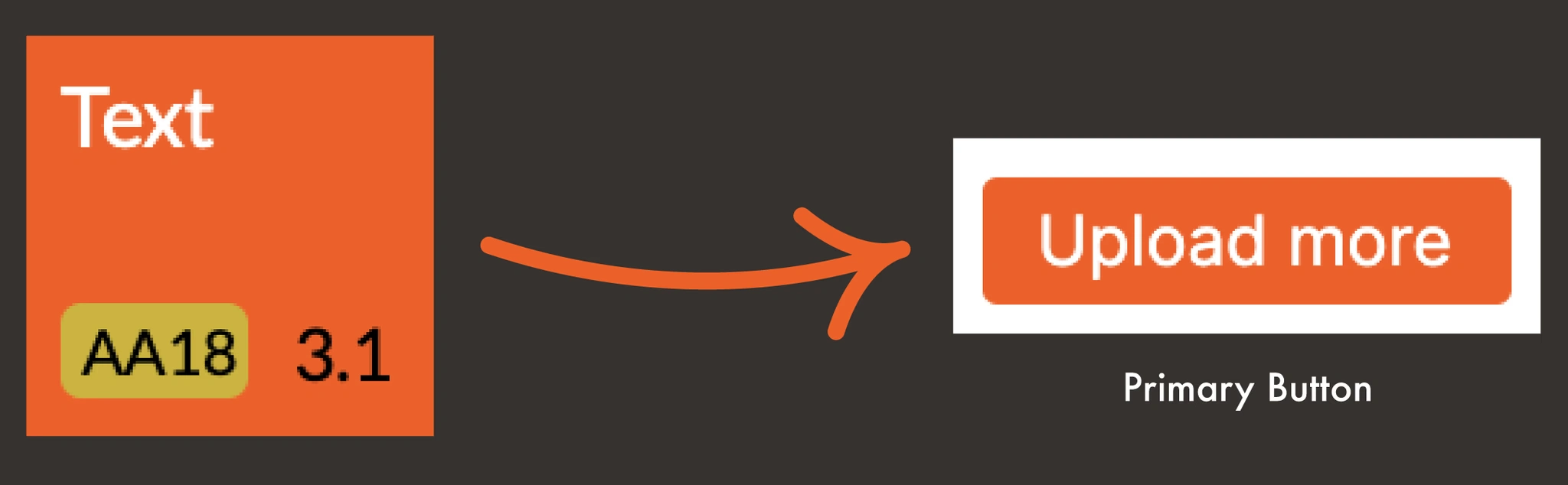
Inaccessible color combinations according to WCAG Accessibility guidelines
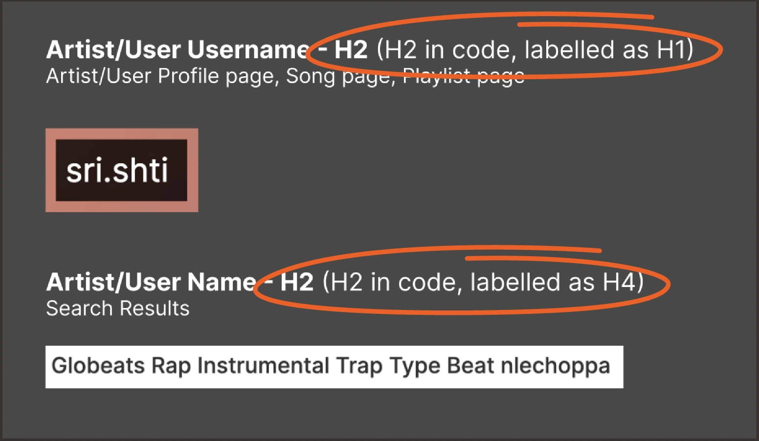
Inaccessible typography labelling
I redesigned SoundCloud with an external design system (Twilio's Paste design system). While it resolves all the issues, it also stripped the experience of SoundCloud's unique identity).
This is when we realized that SoundCloud needs its own design system for scalability, accessibility, and branding.
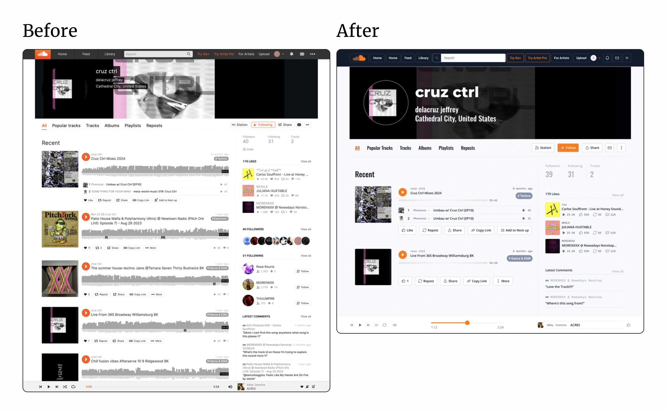
SoundCloud before and after implementing Twilio's Paste design system. Great for accessibility, but forgettable for brand identity.
Three Guiding Principles That Made Every Decision Easier
Rather than designing components first, we set rules first to guide us.
Clear & Consistent
Accessible
Bold & Beautiful
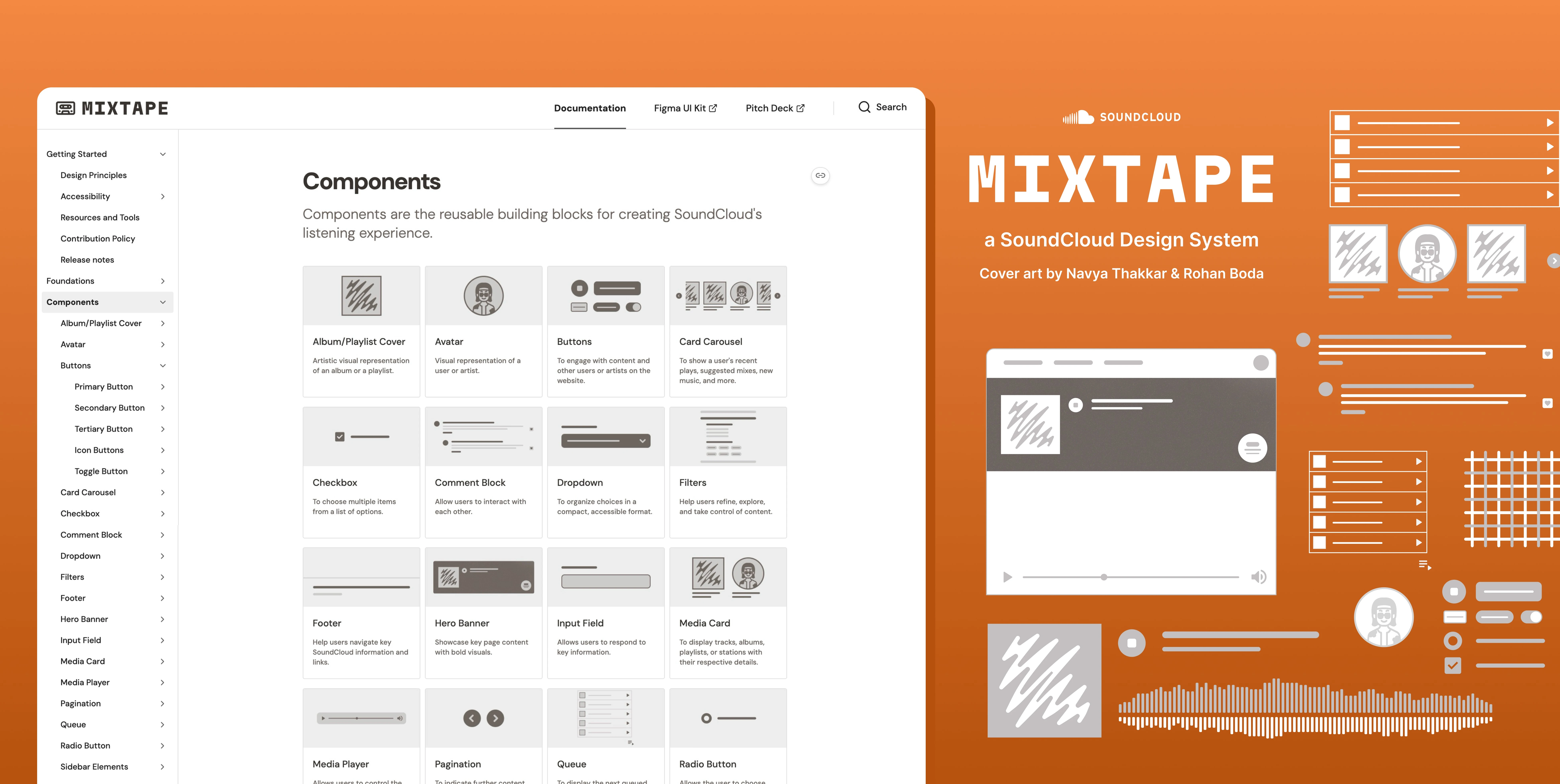
Introducing Mixtape - a SoundCloud Design System
SoundCloud's Next UI Update Went in the Same Direction
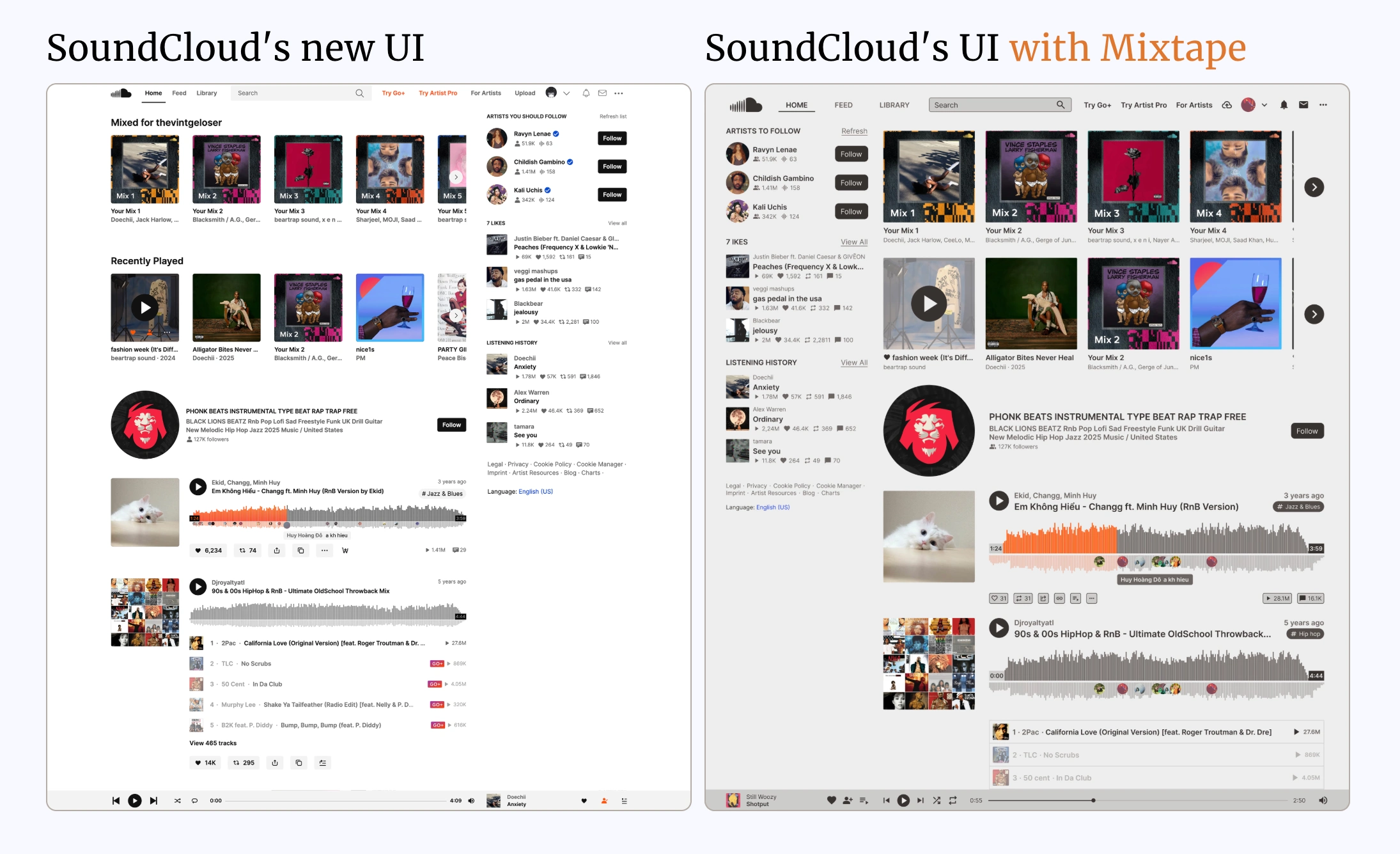
SoundCloud's updated UI (left) points to a new design system. And the design decisions validate our decisions (right).
Project Context
Course project · 4-week timeline · Group project (3 design students) · Figma + ZeroHeight
Check out the full case study
Like this project
Posted Mar 30, 2026
A from-scratch design system for SoundCloud, later validated when SoundCloud's own redesign moved in the same direction.
Likes
1
Views
2
Timeline
Jan 20, 2025 - May 16, 2025
Clients
SoundCloud