Logo Brand Identity
Scott DS Young
Brand Identity
Logo Direction:
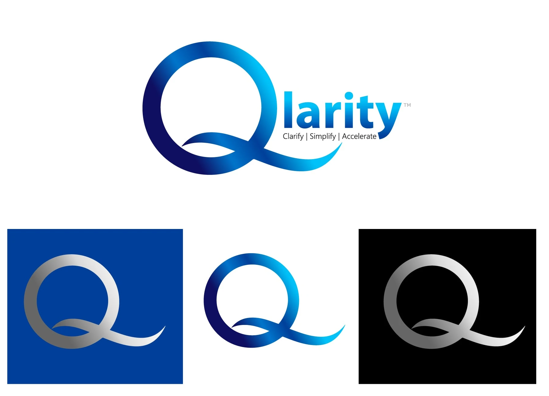
At its core, Qlarity stands for focus and forward motion — making sense of data, simplifying complexity, and accelerating performance. The logo captures this essence through a bold, looping “Q” that flows effortlessly into the name — a symbol of momentum and intelligence in motion.
The color gradient moves from deep midnight blue to luminous cyan, representing the journey from complexity to clarity. Clean, lowercase typography emphasizes approachability while retaining the technical sophistication of the brand’s AI-powered platform.

Before and After
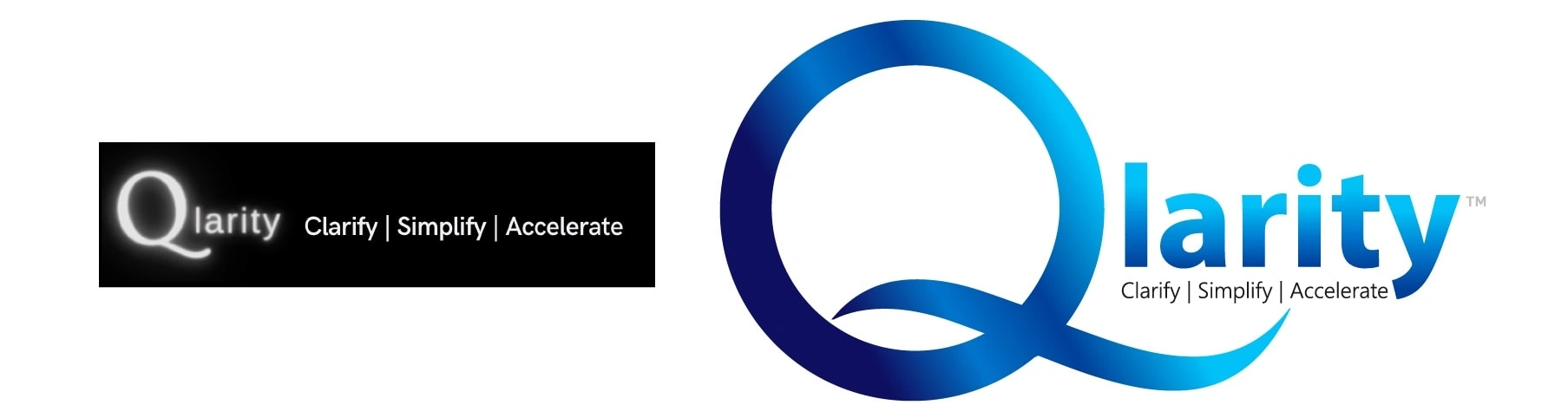
Color Palette:
A refined spectrum of blue tones was selected to evoke clarity, confidence, and connection — qualities that define Qlarity’s role as a trusted SaaS partner worldwide.

Like this project
Posted Nov 13, 2025
The Qlarity logo blends fluid geometry and modern minimalism, symbolizing adaptive intelligence, clarity, and innovation through sleek gradients of blue.
Likes
0
Views
9
Timeline
Oct 1, 2025 - Oct 4, 2025