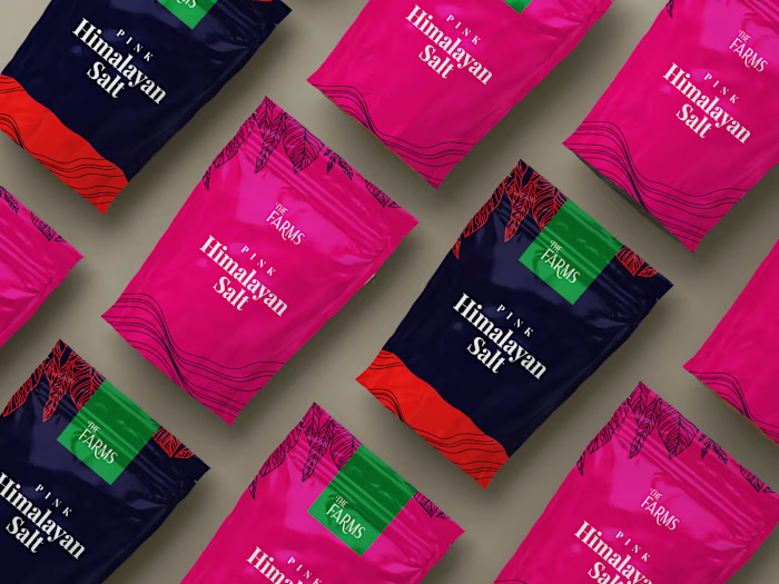
Branding for an Agri-Tech Startup

Primary Logo
Peepu, an agri-tech startup, aims to bridge the gap between farmers and markets through its mobile app.
With a target audience primarily consisting of smallholder farmers, comprising 65% female and 35% male, the challenge was to design an identity that resonated with a technology-limited audience while exuding a friendly and approachable vibe to encourage adoption.
The key focus of the identity design was to align the wordmark with the brand's values. To achieve this, I opted for a simple, memorable, and friendly approach by utilizing lowercase letters with curved forms. This choice aims to evoke a sense of familiarity and ease of use for the target audience.

For the color palette, I drew inspiration from the agricultural domain, selecting hues that would evoke a connection and relatability for the farmers when encountering the brand's various visual elements.
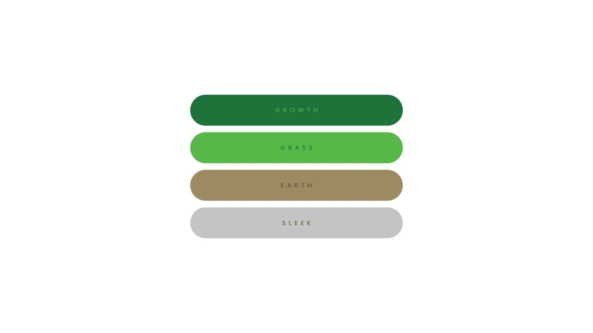
Color Palette
By combining these design elements, the Peepu identity aims to establish a strong visual presence that appeals to the target audience's sensibilities, facilitating their willingness to explore and engage with the app's offerings.

Patterns

App Icon

Laptop Stickers

Social Media Posts
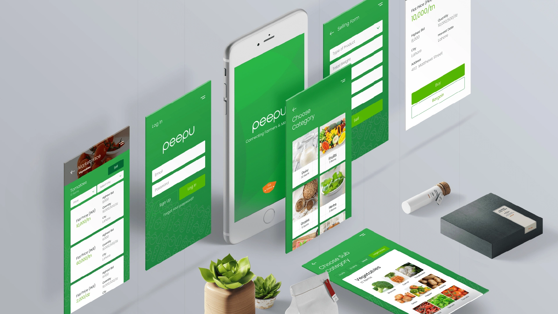
Mobile App Design
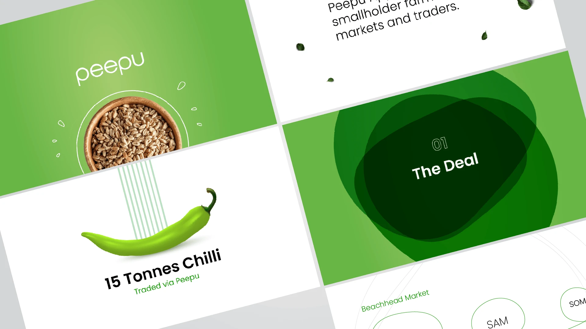
Pitch Deck for Investors
Like this project
Posted Jul 23, 2023
Logo, brand identity design, and mobile app design for an agri-tech startup.
Likes
0
Views
17
Clients
Peepu-agritech

