Branding and Packaging for Organic Food Startup
Raza Khan
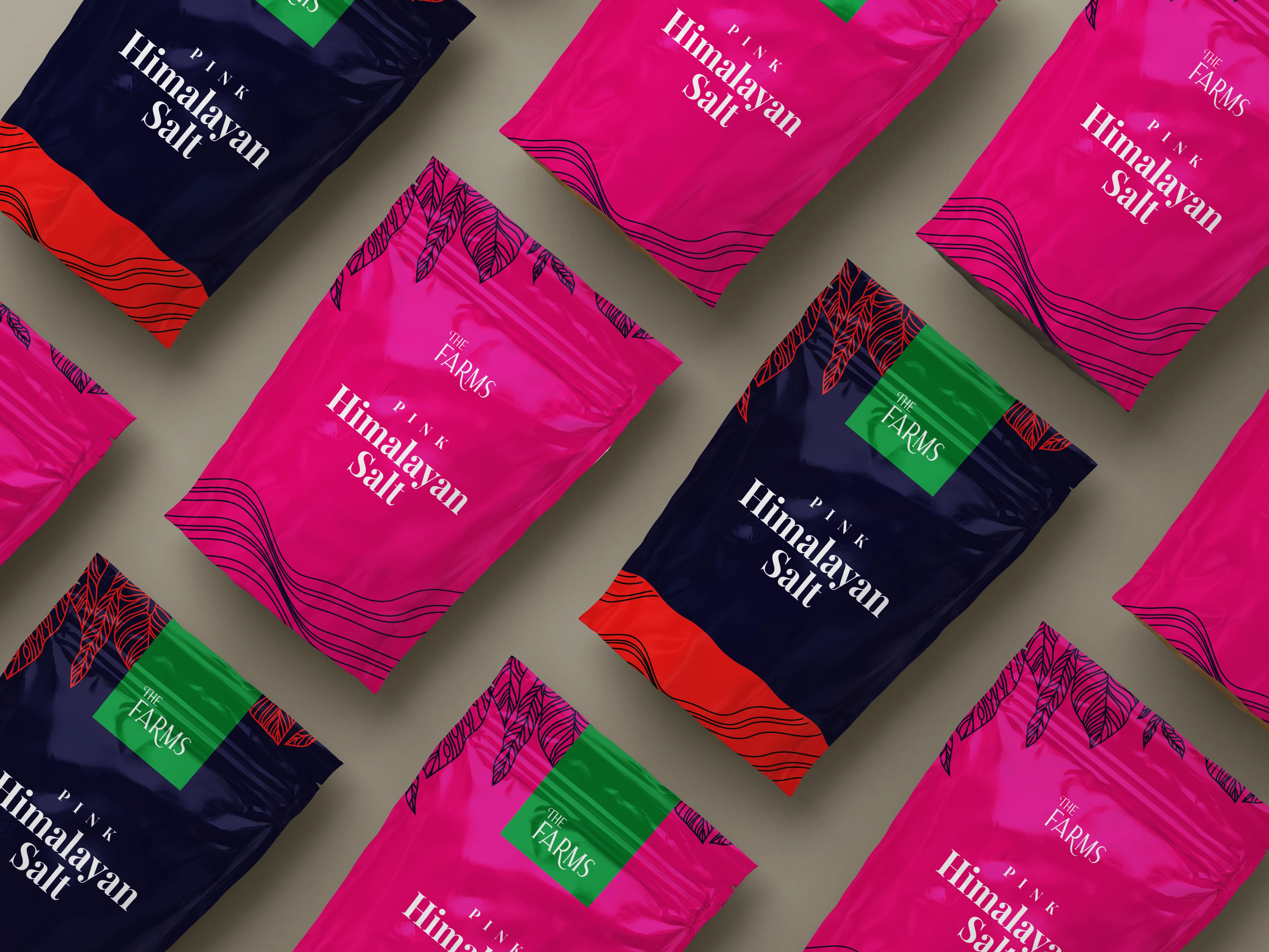
Salt packaging
The Farms, a brand known for its natural, fresh, and certified USA and EU organic food products, faced a challenge due to its outdated branding, which did not accurately reflect its brand personality.
This lack of cohesiveness was negatively impacting the brand's sales. To address this issue, a new brand identity was created that aligns with The Farms' core values of providing fresh, natural, organic, and premium products.
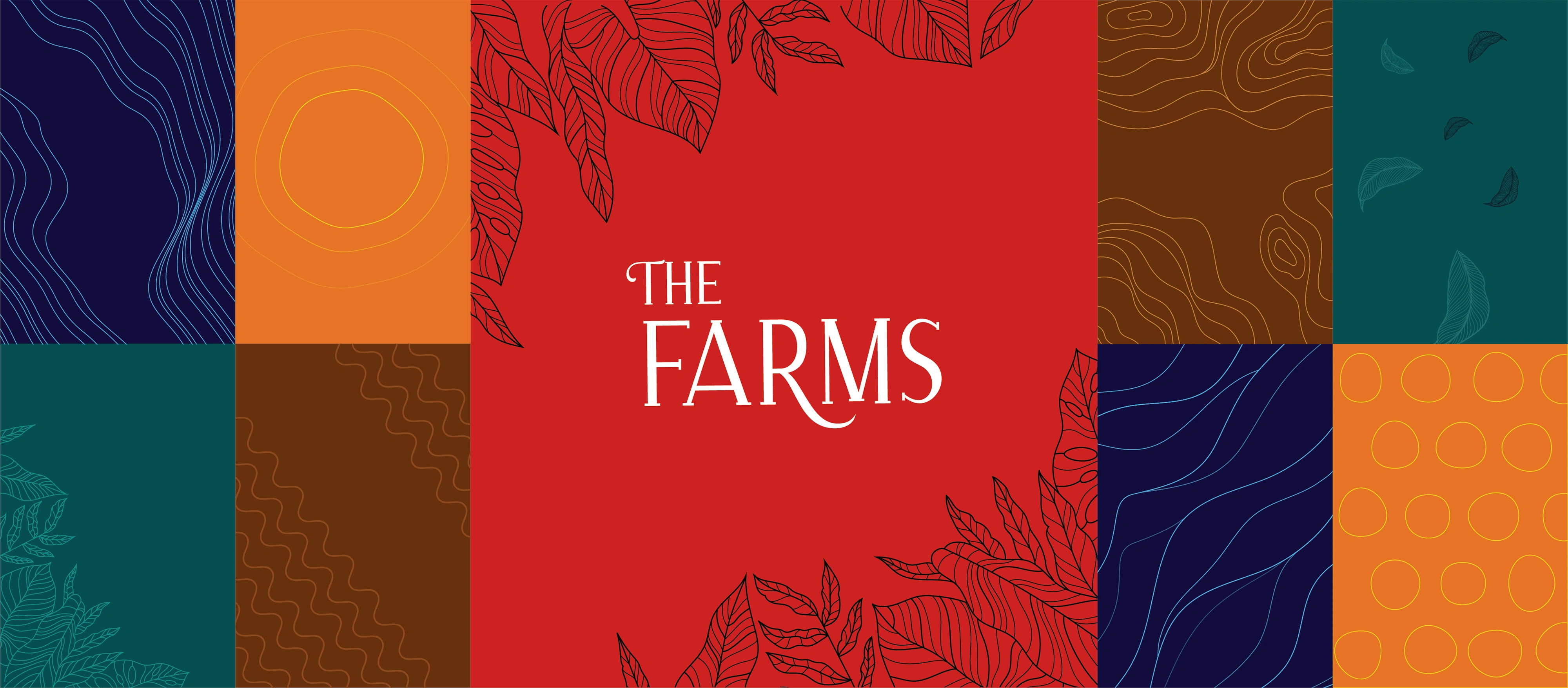
The new logo design incorporates serif and all-caps letterforms, which convey a sense of sophistication and modernity. The letter "T" in the word "The" features a curved arm resembling a plant, while the letter "F" extends its leg, further emphasizing the natural and organic aspects of the brand.
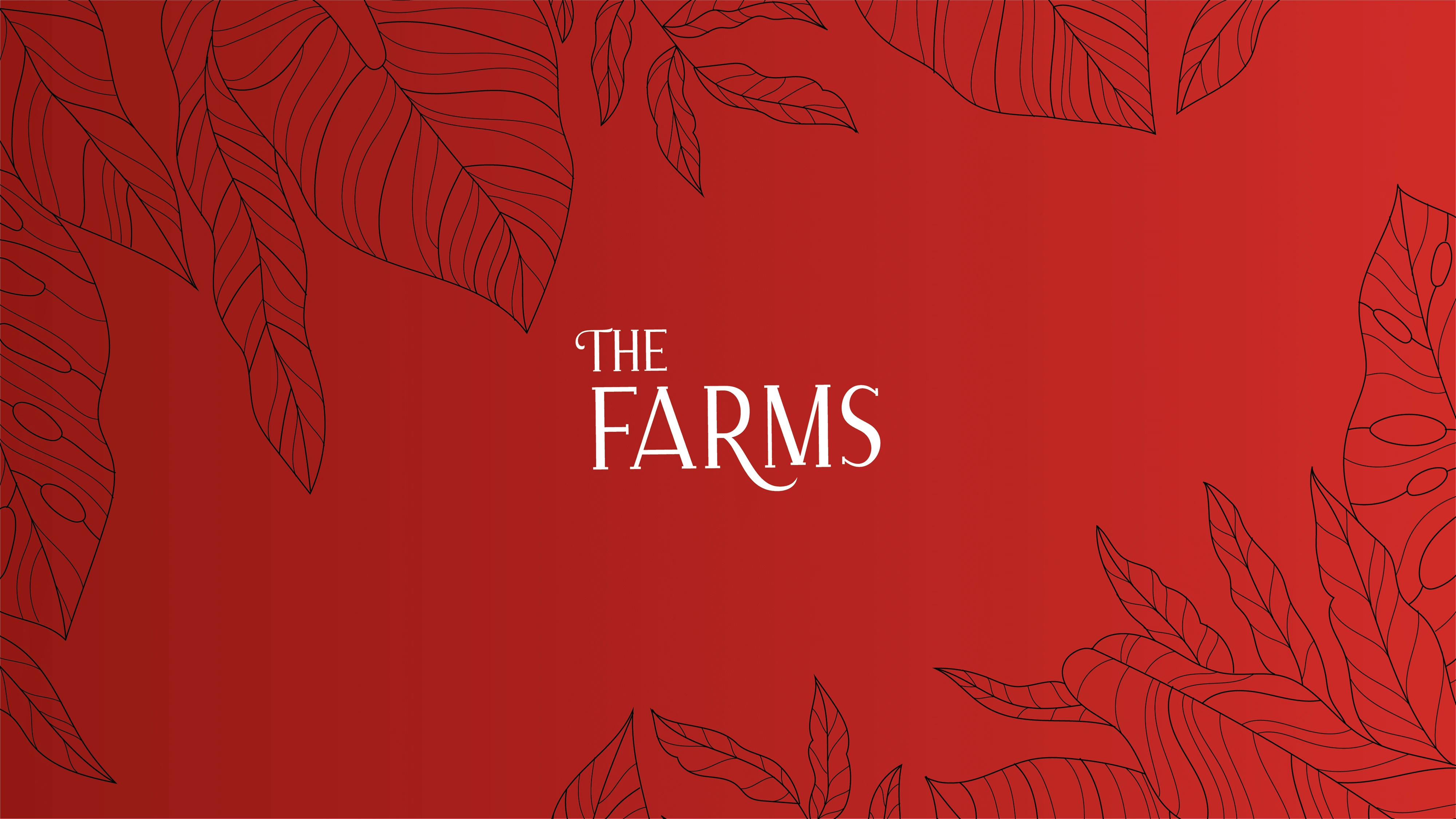
These subtle design elements contribute to a wordmark that is both scalable and visually striking while maintaining an overall sense of elegance.
Like this project
Posted Jul 22, 2023
Logo, brand identity design, and packaging design for an agri business.
Likes
0
Views
12