300$ Landing Page Pack
I present the 300$ LANDING PAGE PACK
The First View which crosses your vision
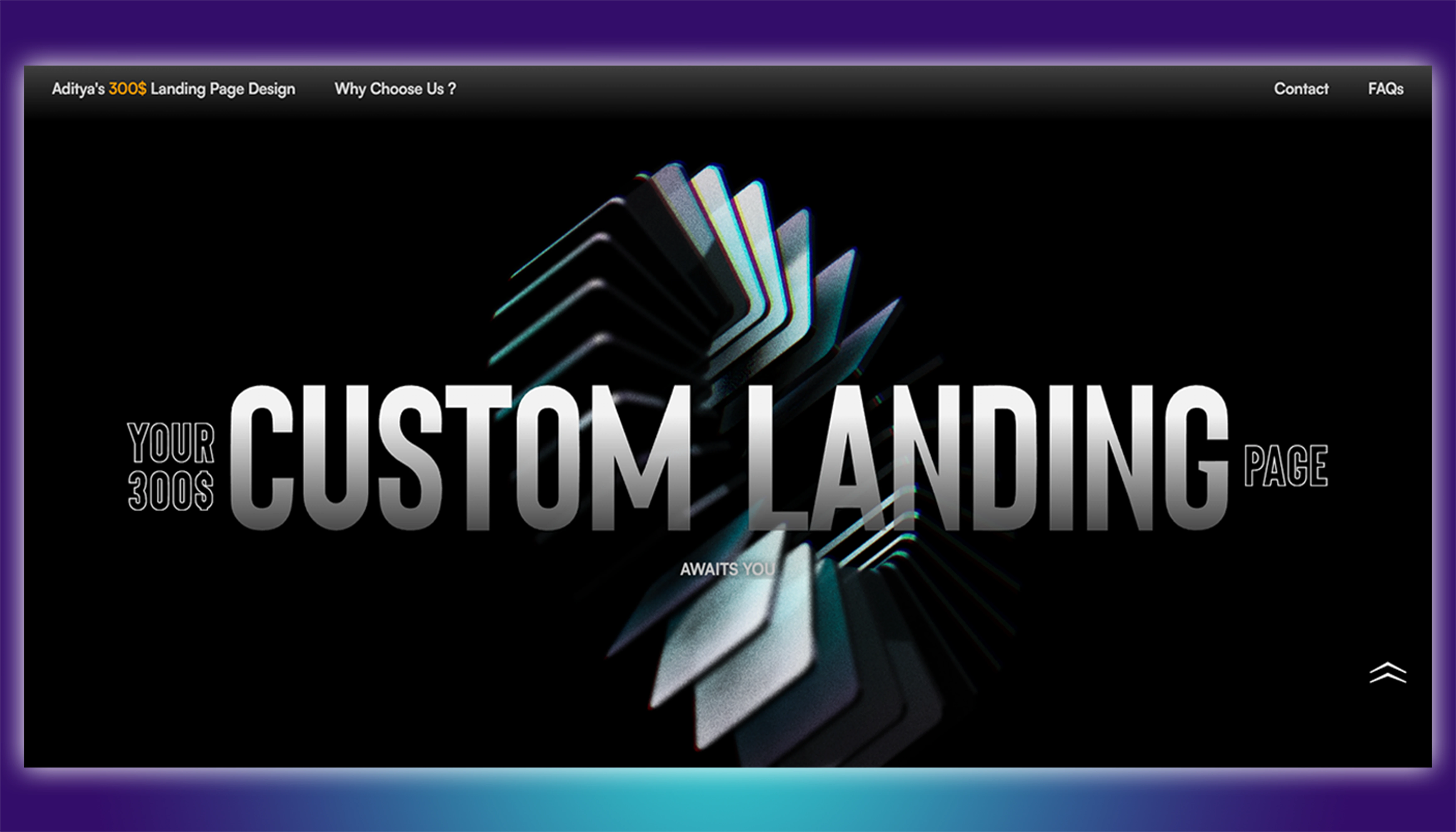
300landingpage.framer.website
This is the first view which you get when opening the website at first. We made sure to use bold fonts and 3d elements in the background which really enlightens the look. It has a blurry header which really isn't cluttered and is quite minimal. It contains the basic details upfront. Let's look at the other pages.
The Use of Colours
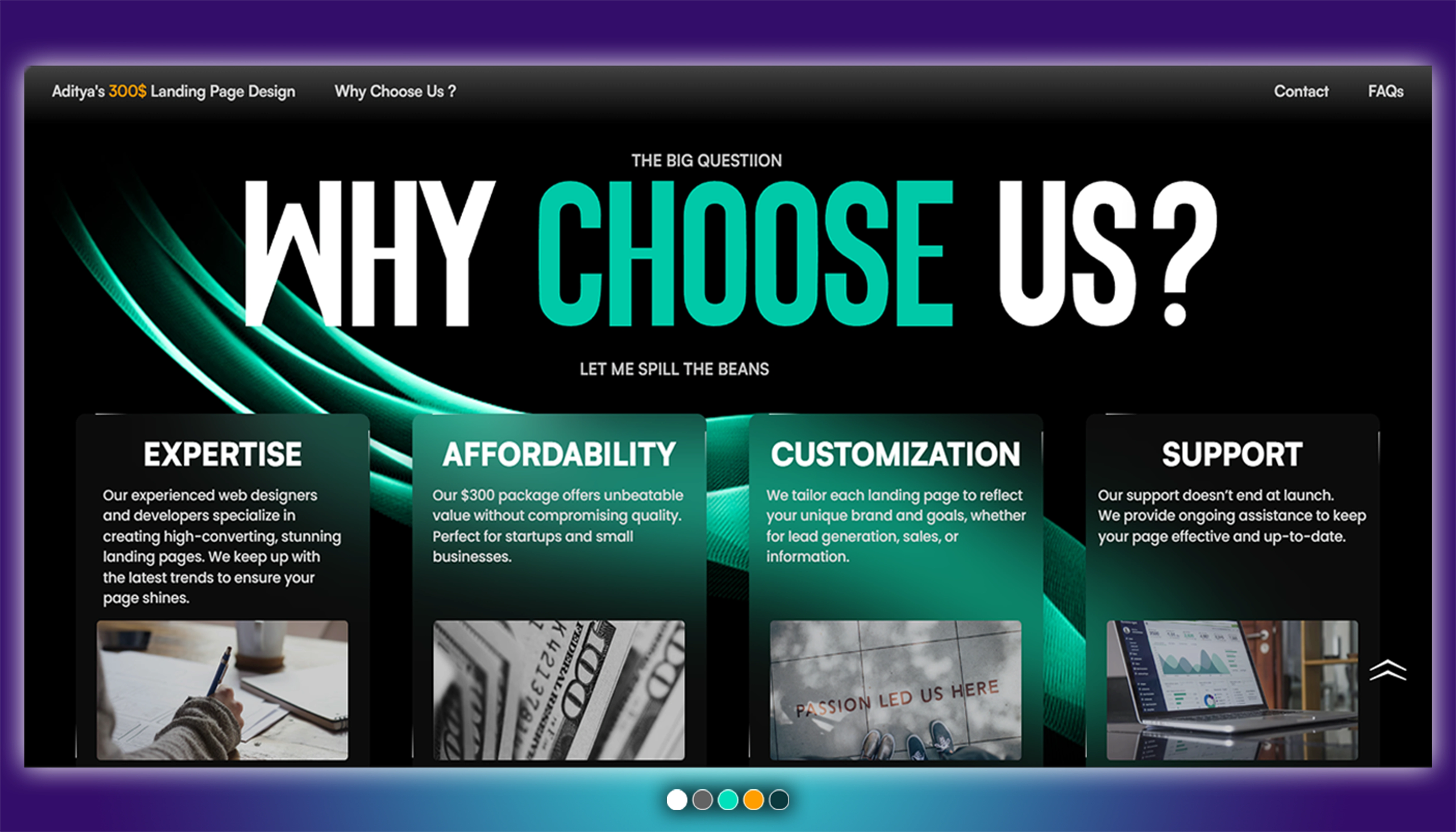
The use of colours really play a major role here as the more bright and eye catching colour, the more people tend to like it and it really looks smooth and optimised. Using Bright Colours with a darker shade really brings up the contrast and makes it more appealing.
Adding Reactive & Other elements
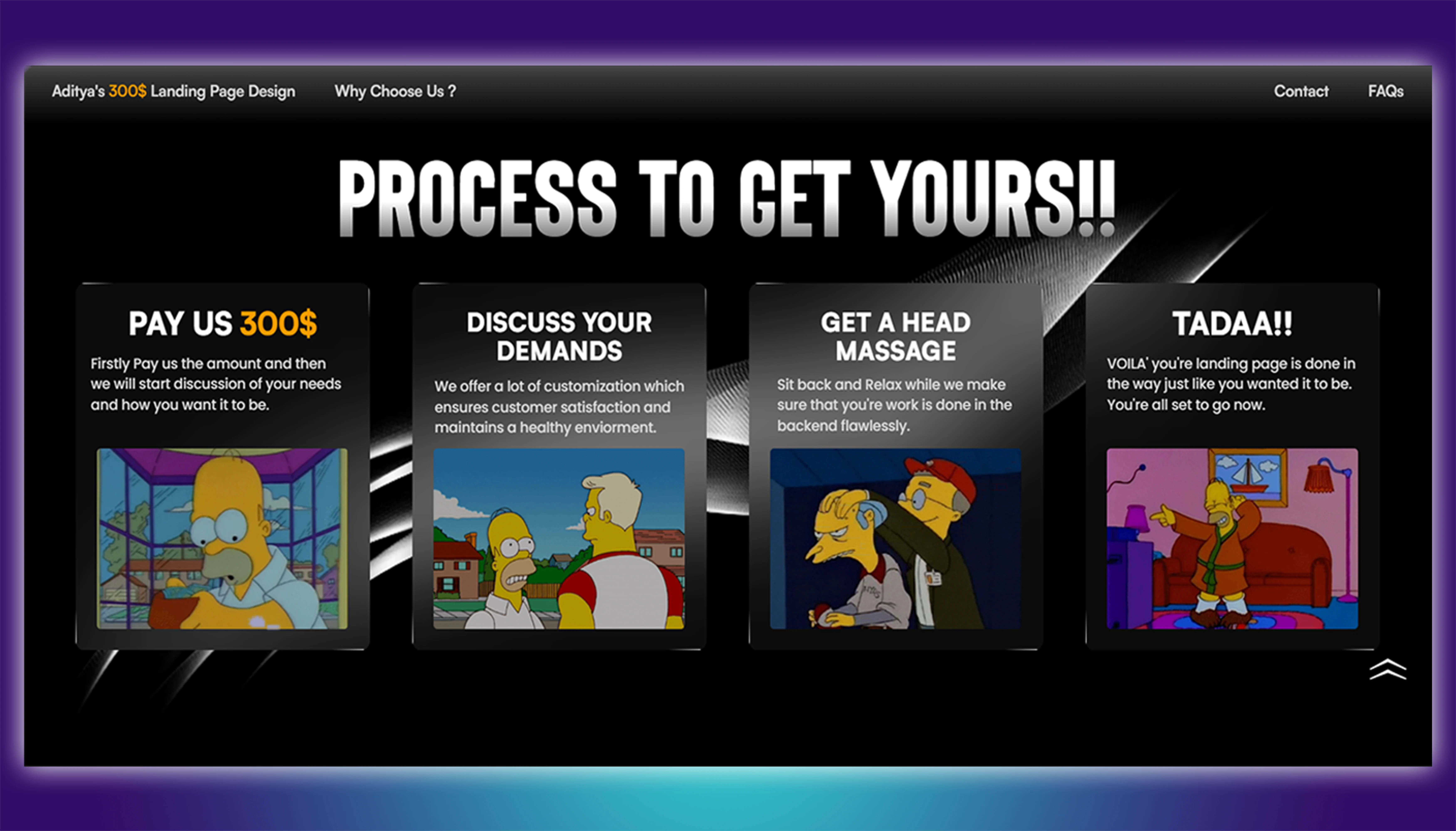
Adding information blocks really help in summarizing the content and making it easy for the visitor to grab the information very easily and efficiently. The transitions and how the elements move is also a game changer cause who likes still things? Everybody likes Motion ifykyk :) anyways, for instance using here the Simpsons GIPHs really connects with the visitor in a fun and dramatic way.
Adding FAQs
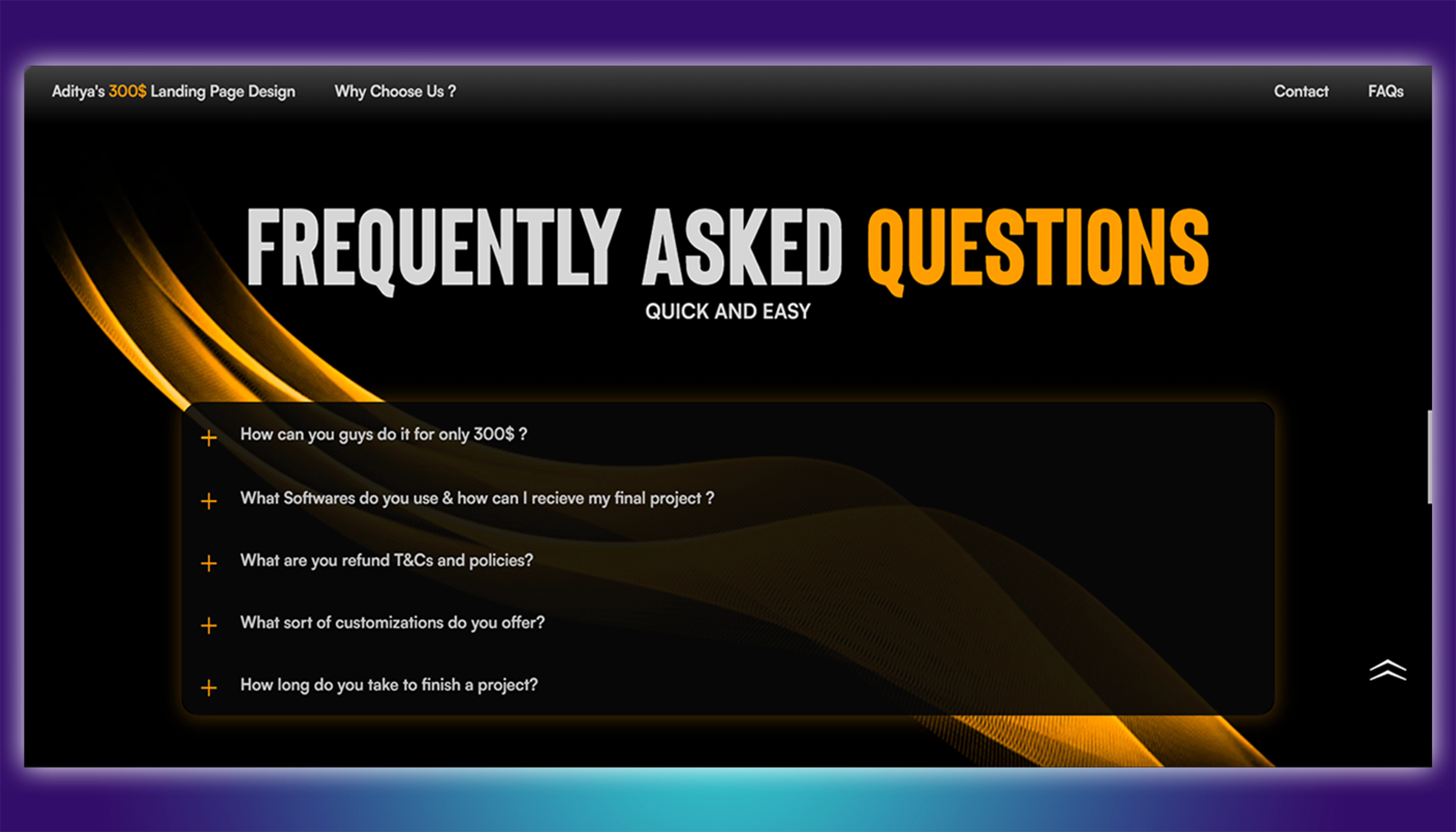
FAQs Help a lot as the visitor can get their most of the doubts cleared itself as they don not have to wait for a response from the website owner instead, they can get access to questions which are already answered and are commonly asked by everyone.
At last these were the details in a NUTSHELL
for more info you can visit the website from the link given at the top.
Like this project
Posted Jul 27, 2024
This is the preview of how a landing page worth 300$ would actually look, more or less the look really depends on the client's needs and requirements. Thank You
Likes
0
Views
4

