500px - Design System
Context
When I joined 500px, the design team was inheriting a cross-platform product with designs progressively added over the course of five years. It was time for a redo.
Design systems were still in their infancy, and we knew that 500px needed one for a few key reasons:
Designer and developer efficiency. Design systems (despite the name, they also include developer UI kits) are crucial in a modern product development approach to ensure that we're not duplicating effort and we can move quickly to build new products and features.
UI consistency. When a product has many different styles and components for similar purposes, it's difficult for users to quickly understand the UI and easily predict its behavior. By doing a design audit and standardizing styles and components, we can ensure a beautiful, seamless user experience on every page and in every app.
Reduce onboarding time for new hires. By thoroughly documenting usage guidelines for each style and component, we made it easier for new designers and developers to quickly get up-to-speed and make their own UI decisions without consulting longer-tenured team members. We used Zeroheight for our documentation hub.
The Design System
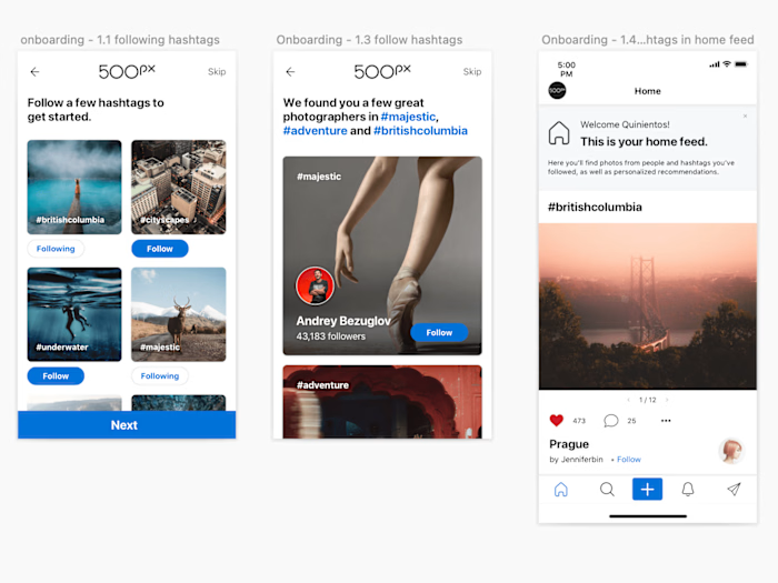
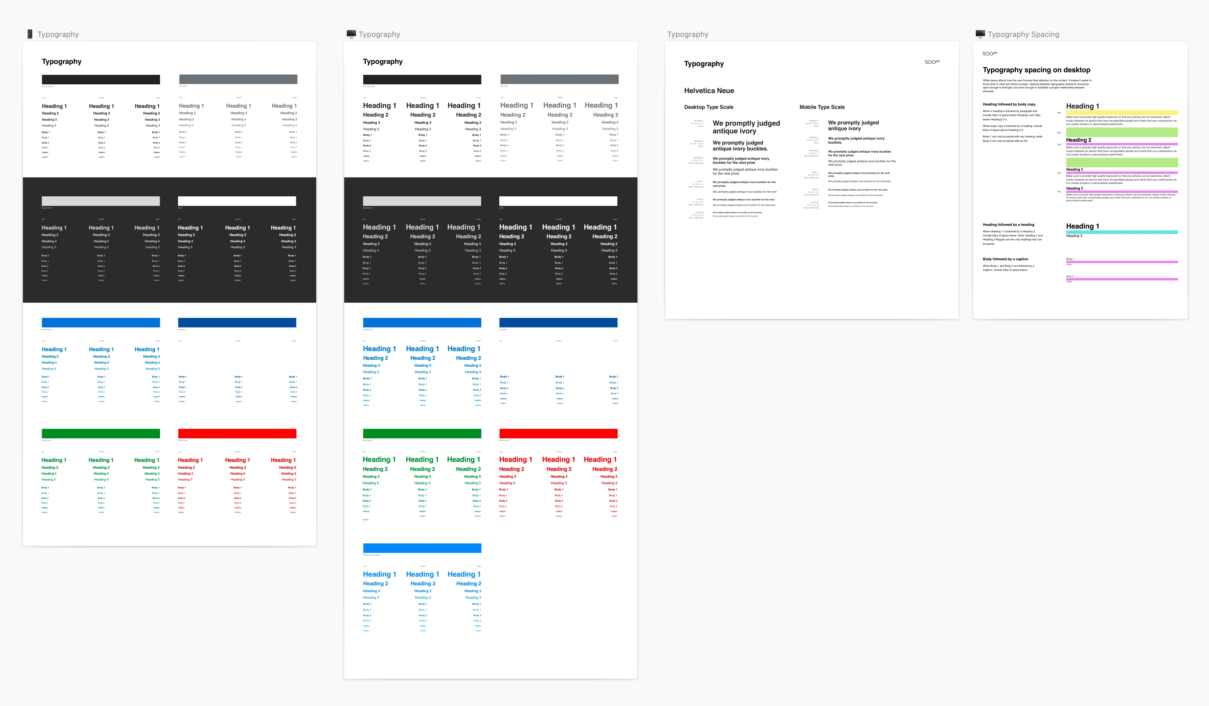
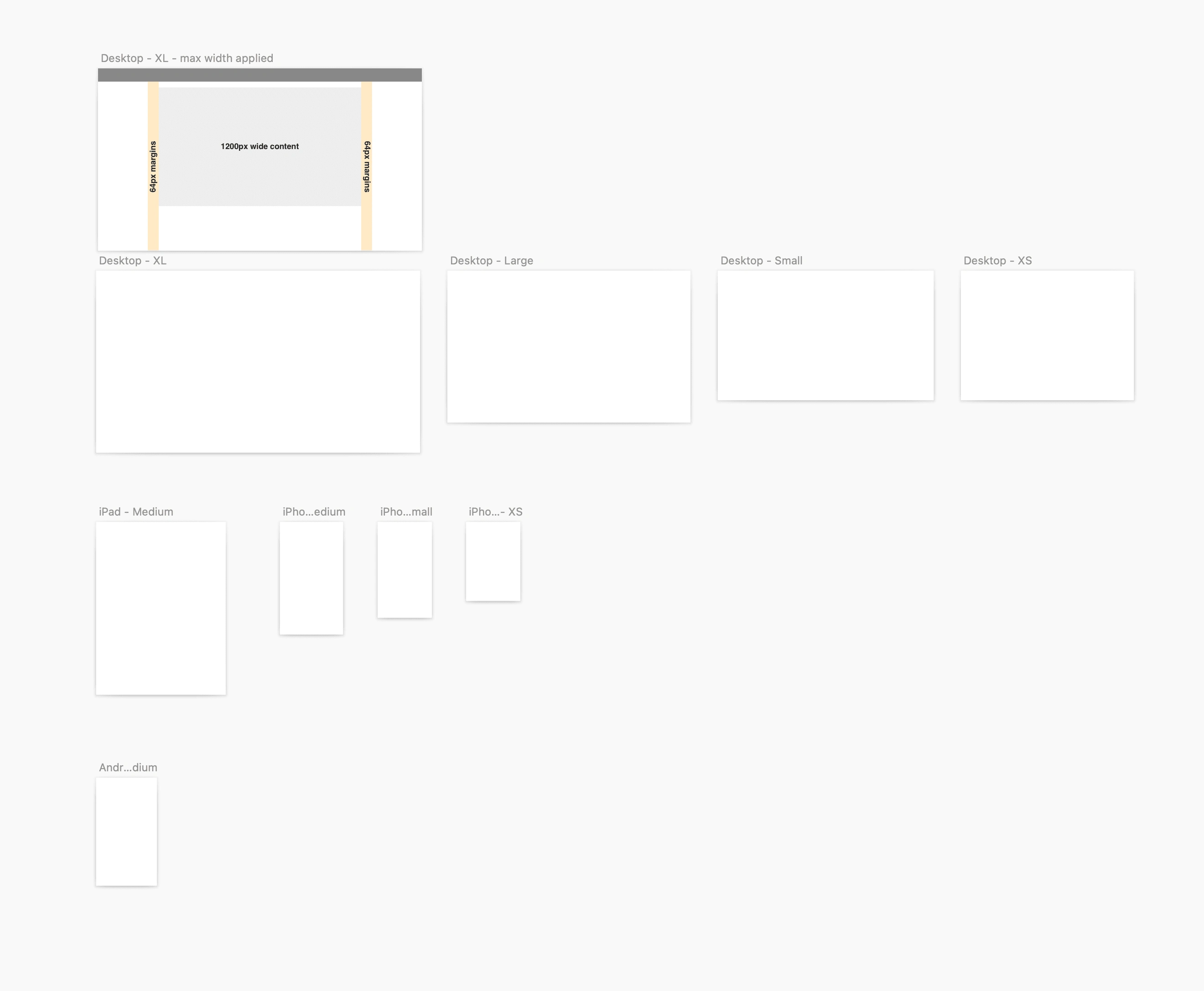
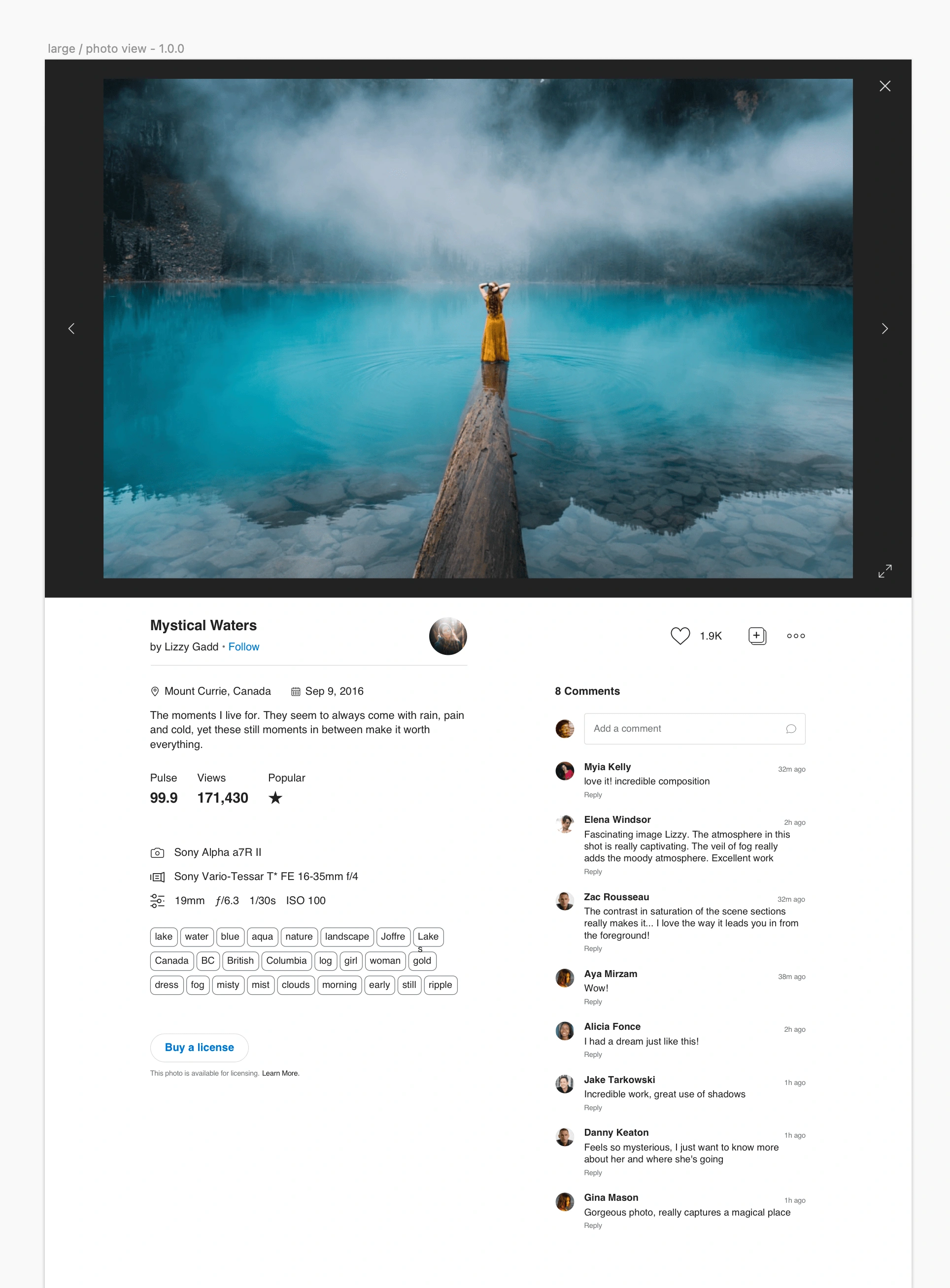
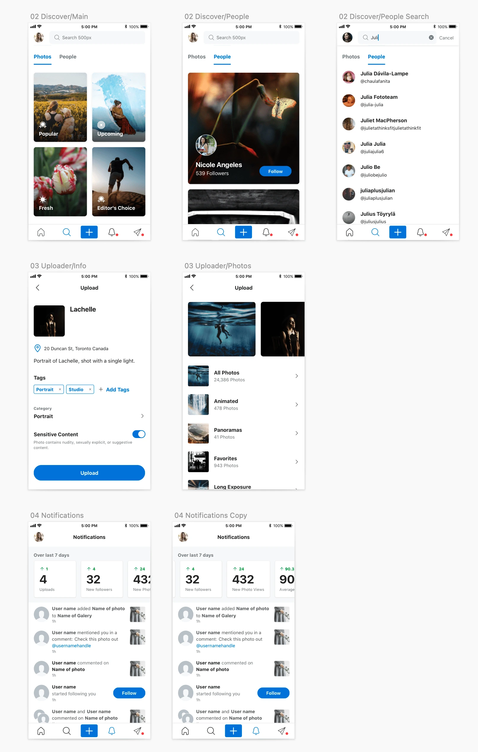
We started with a new style guide for the 500px platform, including a new color palette, typography, spacing, shapes, iconography, image filters, and more.
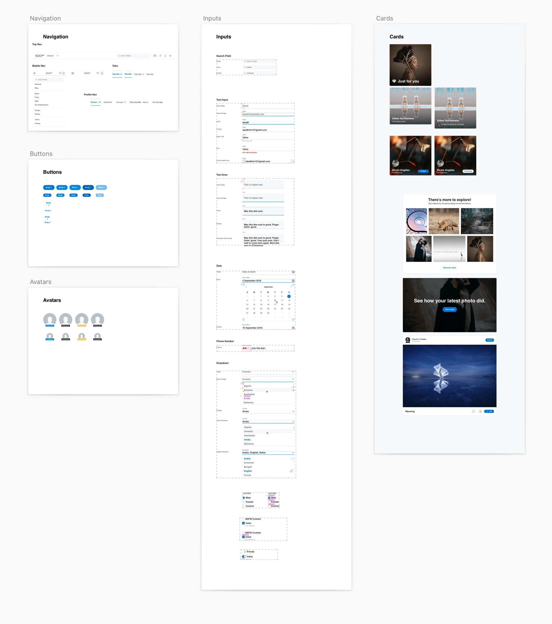
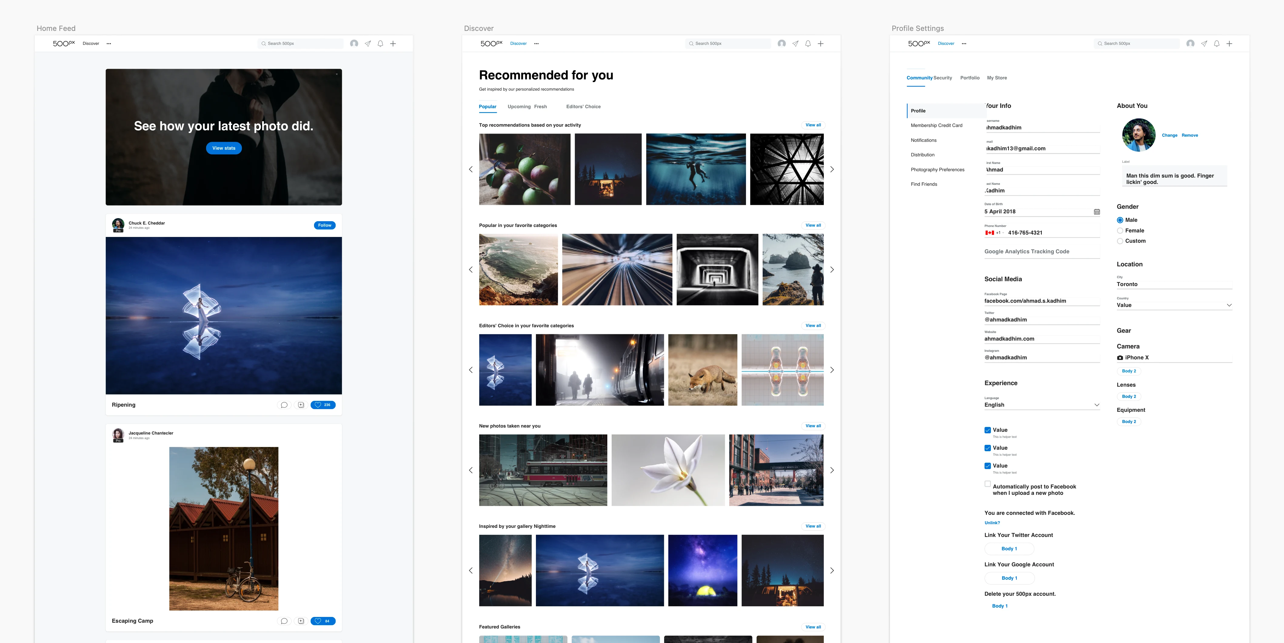
We then applied it across the platform, dramatically simplifying and beautifying the 500px UI.
Like this project
Posted Aug 2, 2022
I led the creation of a design system from scratch to make our design and development process more efficient while revamping an inconsistent outdated UI.

