Analyzing User Renewal Journey Ratios: From Baseline to Success
Problem Statement
When a user's plan expires and they attempt to renew it through their mobile device, they may encounter a problem. Traditionally, they are redirected to a web page where they must create a new order and start over. This procedure can be quite cumbersome due to the long path and many obstacles. As a result, the user drop-off rate is relatively high.
To address this issue, we have developed a concept that streamlines the process and reduces the number of clicks and obstacles. Our minimal journey approach has received overwhelmingly positive feedback from our users. With this approach, renewing a plan on a mobile device has become much simpler and more convenient.
Insights from mix panel
Research
To gain insights into how other platforms handle similar situations, quantitative research by gathering relevant images from various sources and consolidating them in one place. By analyzing and comparing the strategies and techniques used by other platforms, they identified common trends and patterns that could inform their approach.
The research provided a useful foundation for developing a strategy that aligned with industry best practices and their unique needs and goals.
UI Design
After setting up everything, I crafted multiple design variations to provide a range of options for our final selection, ensuring we choose the most suitable design. Overall, Figma has been an excellent tool, enabling me to create top-notch designs with speed and efficiency. The availability of multiple design variations grants us flexibility, allowing for adjustments as needed before moving forward with implementation.
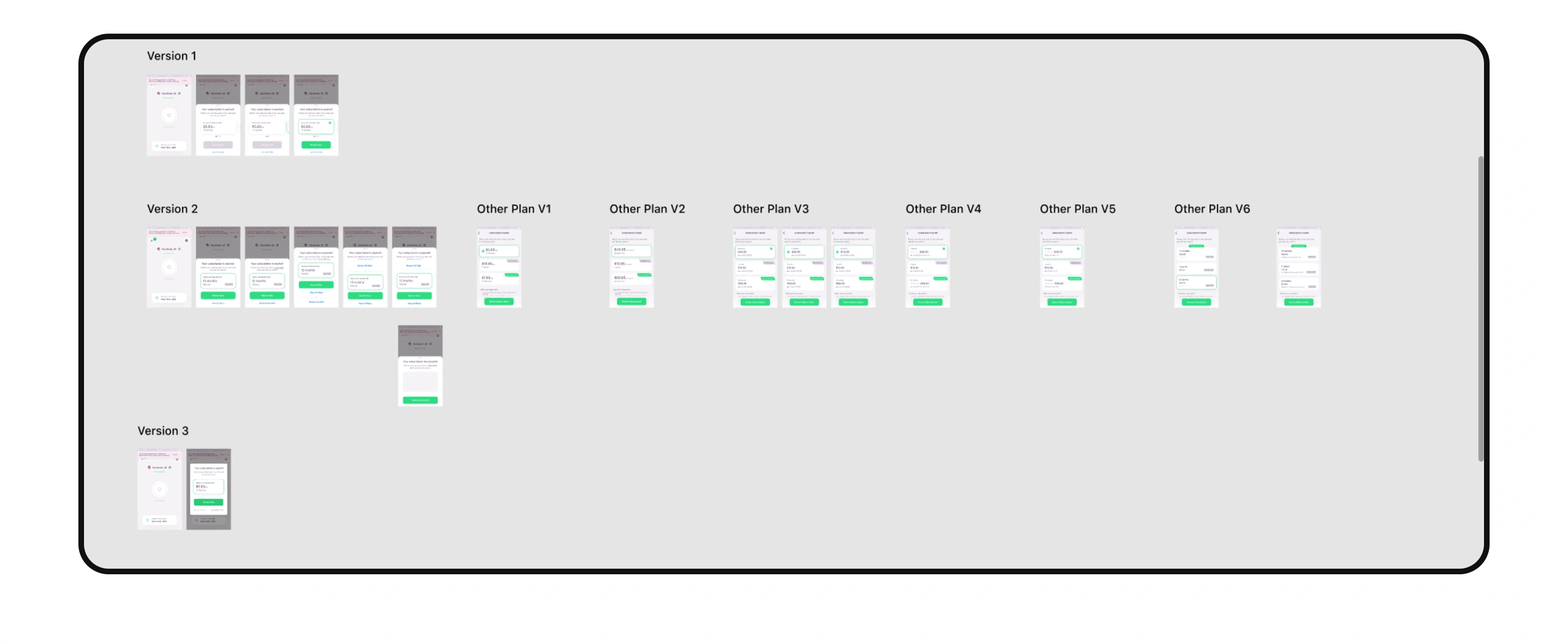
Design Variations
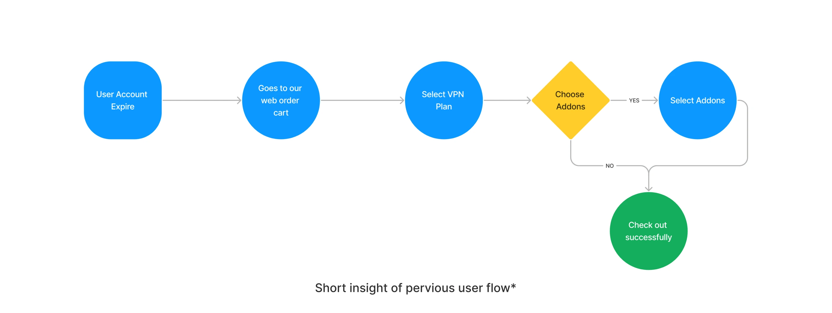
Previous User Flow
Previously, when a user's plan expired and they wanted to renew it, they were directed to our web order page, which started the entire process from scratch. The same was true for customers who purchased plans through the Apple Store or Google Play Store, leading to a high rate of users abandoning the process.
This issue arose because the process was overly time-consuming and complicated, involving too many steps for a simple task.
As a result, we recognized the importance of simplifying the user flow and enhancing the overall experience to minimize drop-off rates and enhance customer satisfaction.

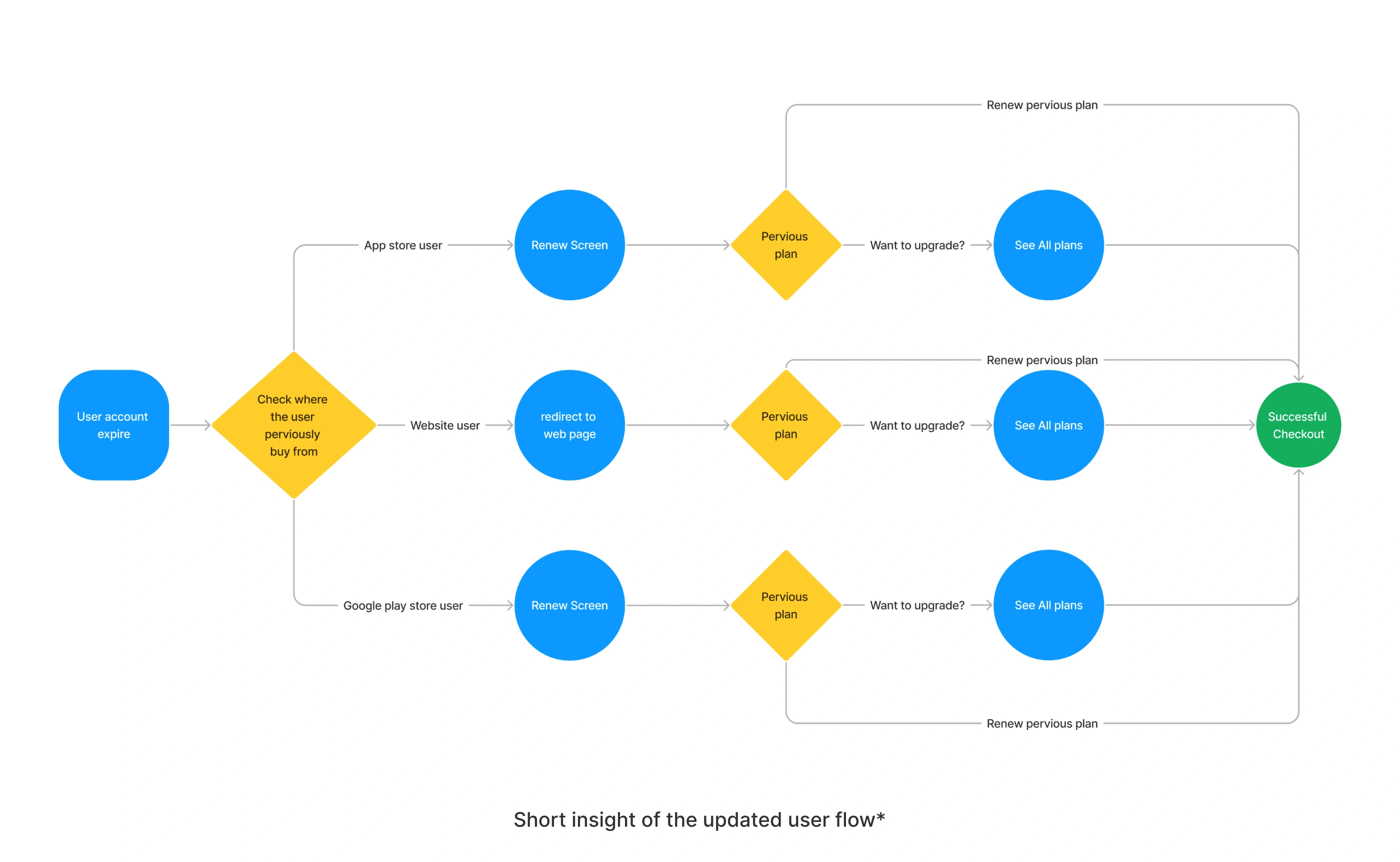
Updated User Flow
To enhance the user experience and reduce drop-off rates, we have implemented the following strategies:
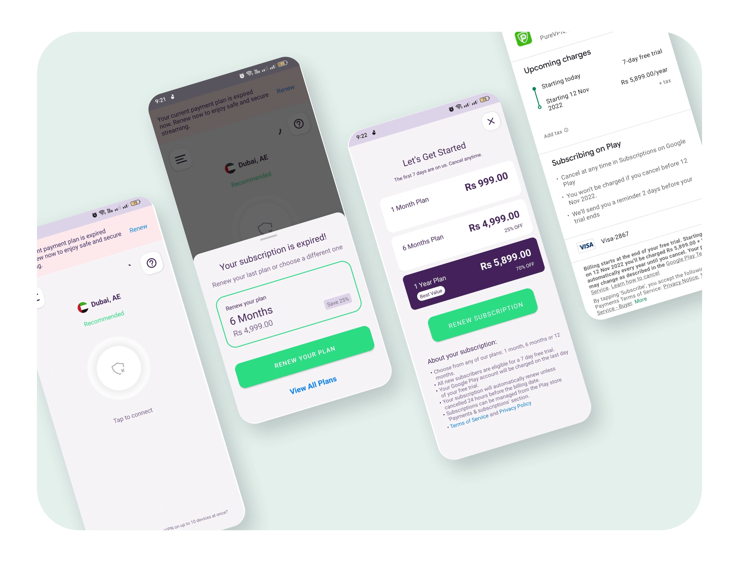
Created unique user interfaces designed to cater to the specific needs of users who purchase our VPN services through the Apple Store, Google Play Store, or our website order page.
Identified the source of the user's purchase (Apple Store, Google Play Store, or website) to provide tailored interfaces optimized for each platform.
Developed dedicated user flows specifically for Apple Store users, Google Play Store users, and website order page users.
By customizing the user interfaces and flows based on the purchasing platform, we aim to provide a seamless and intuitive experience that aligns with users' expectations and preferences, ultimately improving user satisfaction and reducing the likelihood of drop-offs.
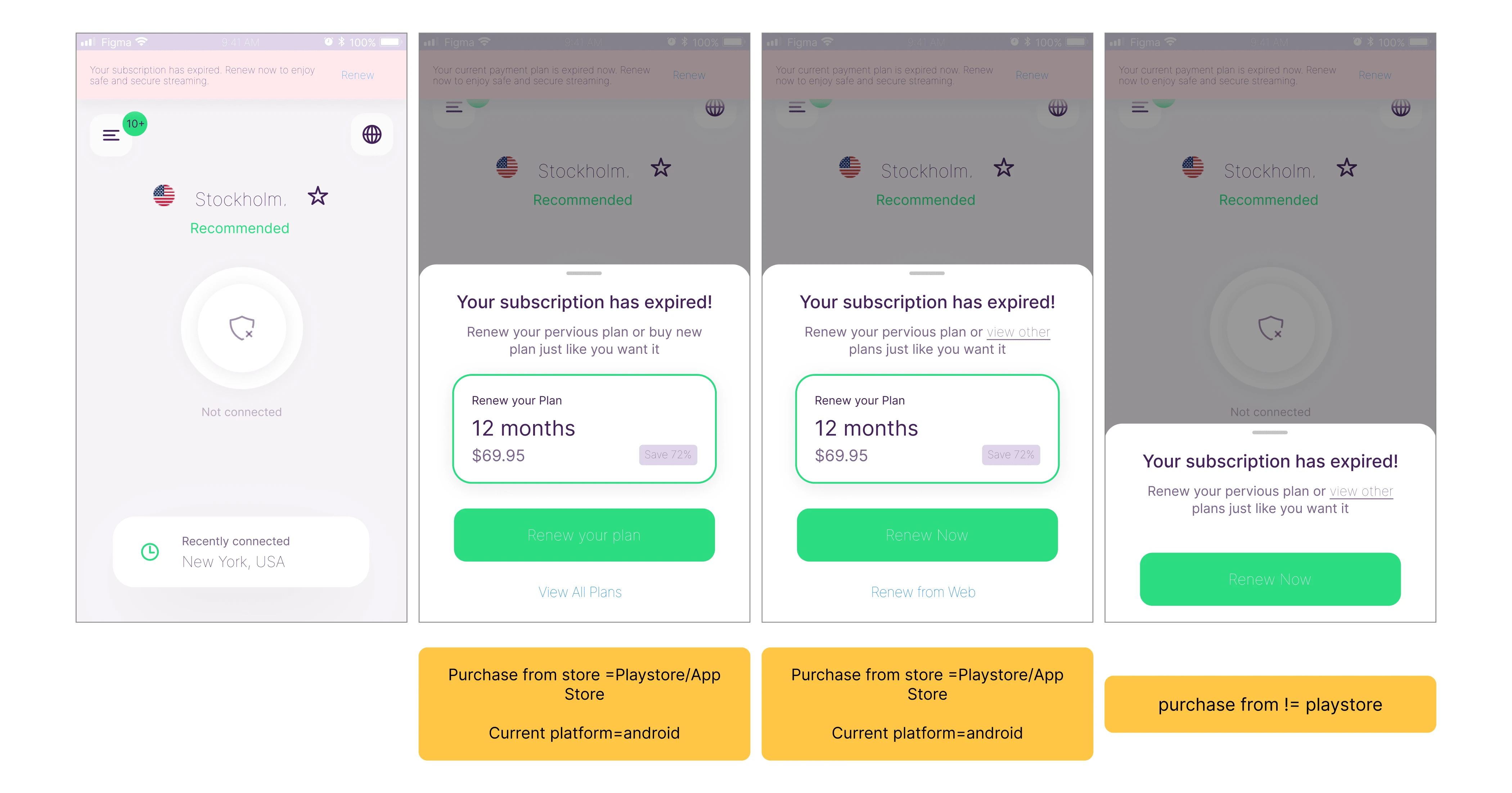
Final UI Design
We have created separate interfaces for users who purchase our VPN services through the Apple Store, Google Play Store, and our website order page. Now, we are excited to introduce a consolidated user interface that delivers a seamless and efficient experience for all users, regardless of their purchasing platform. This unified interface ensures consistency and a user-friendly journey, maximizing satisfaction across the board.
Result
After rolling out this feature to 100% of our users, we were thrilled to see a significant increase in activation rates.
Our latest quarter showed an impressive 53.2% activation rate, which is more than half of our user base. This demonstrates the effectiveness of our approach in improving user experience and retaining customers.

Conclusion
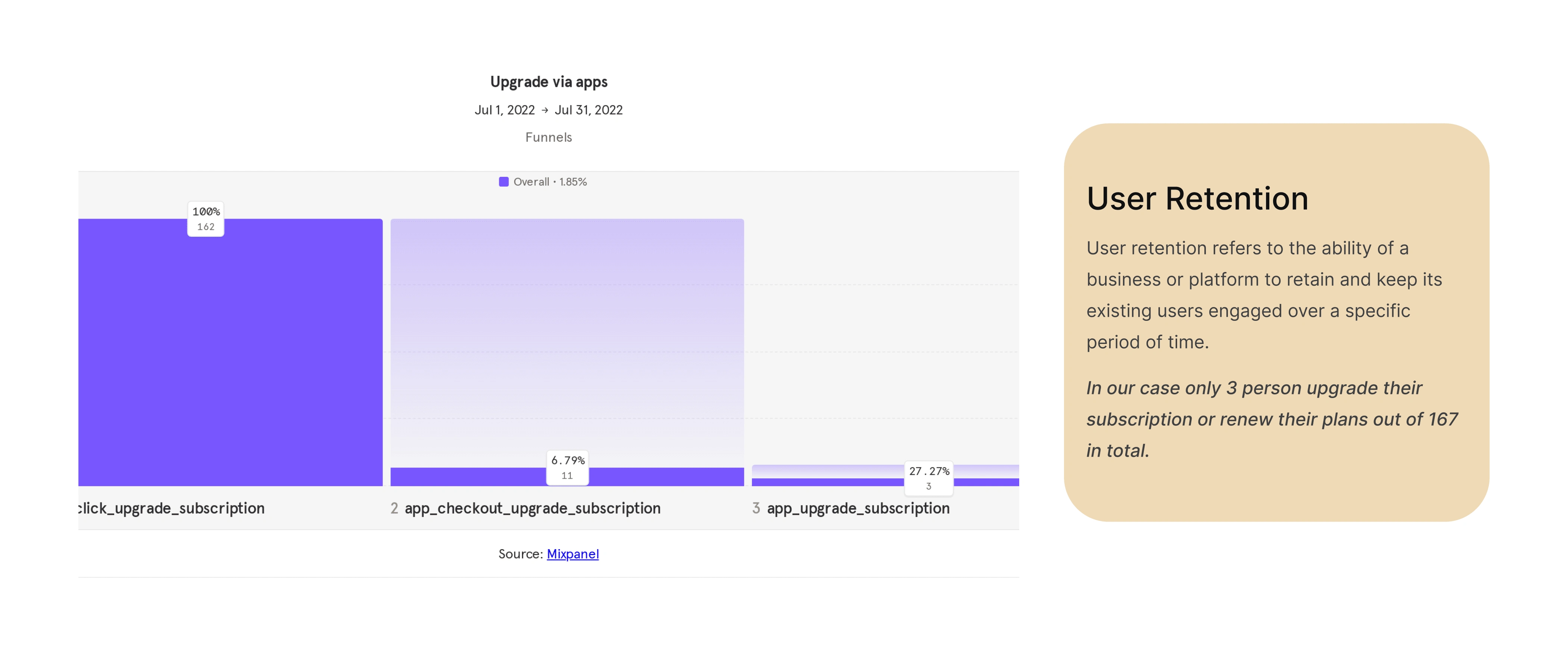
The conclusion we arrived at is that we were missing out on a significant portion of users who were experiencing issues when their accounts expired.
To address this, we utilized the design thinking approach to identify the problem and develop a solution that minimized the user's journey and reduced drop-off rates.
As a result, we were able to improve our activation rate to 53.2% after rolling out the feature to all users.
By solving this problem we also find out so many things that users can’t complain or tell us that they were facing these issues.
Like this project
Posted Jul 24, 2023
There is a slight problem in when upgrade/renew their account from mobile app and that’s the reason user are dropping off. Let’s find out
Likes
0
Views
60

