Built with Framer
Website Design for Noise: AI Assistant for Executive Assistants

Harsh Shah
Verified


Website Design for Noise: AI Assistant for Executive Assistants
Client: Noise (US AI productivity startup)
Role: Lead Designer: positioning, UX, visual direction and Framer development
Tools: Figma, Framer, custom code components, HTML animations
Timeline: Part of a 3-month contract with the founder
Scope: Messaging, information architecture, visual direction, website design and development
🧠 Overview
Noise is an AI assistant built for executive and virtual assistants: the people who manage calendars, inboxes and priorities for several executives at once. I worked directly with the founder for three months on go-to-market and v1 product design. The website was the first place that thinking had to become concrete.
The challenge: the AI productivity space is crowded with similar-looking tools, like Superhuman, Fyxer, Missive and Shortwave. Noise needed a site that spoke to a specific, overlooked user, and looked nothing like the rest.
🧩 The problem
The audience was specific, but most AI tools talk to everyone. Assistants juggle multiple executives, and generic "save time with AI" messaging doesn't speak to that.
The site had to serve two readers. Assistants use the product, but executives often approve the purchase.
The category's visual clichés (purple gradients, glowing AI orbs, dashboard screenshots) would make Noise forgettable.
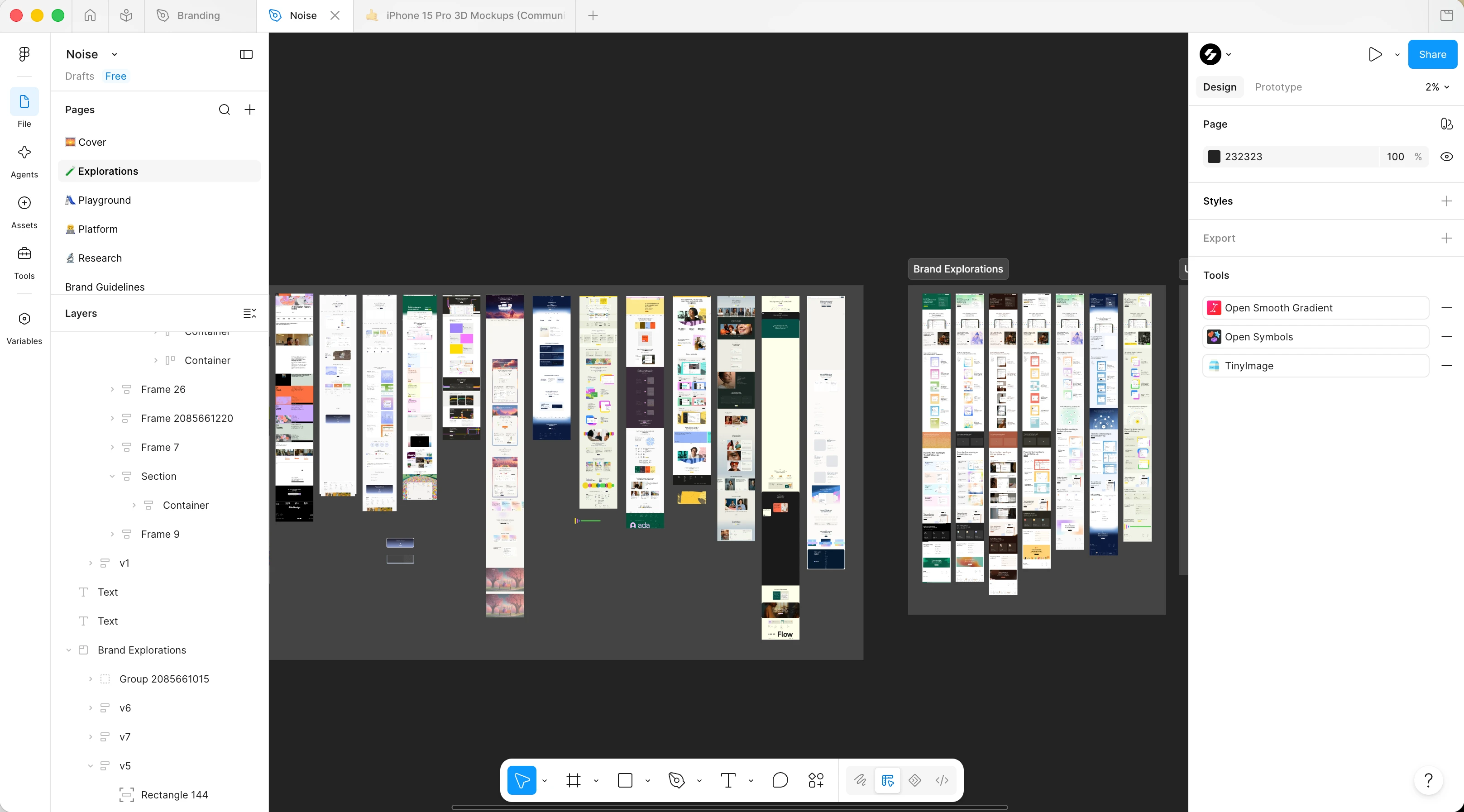
Brand Explorations
🎯 My approach
1. Positioning before pixels
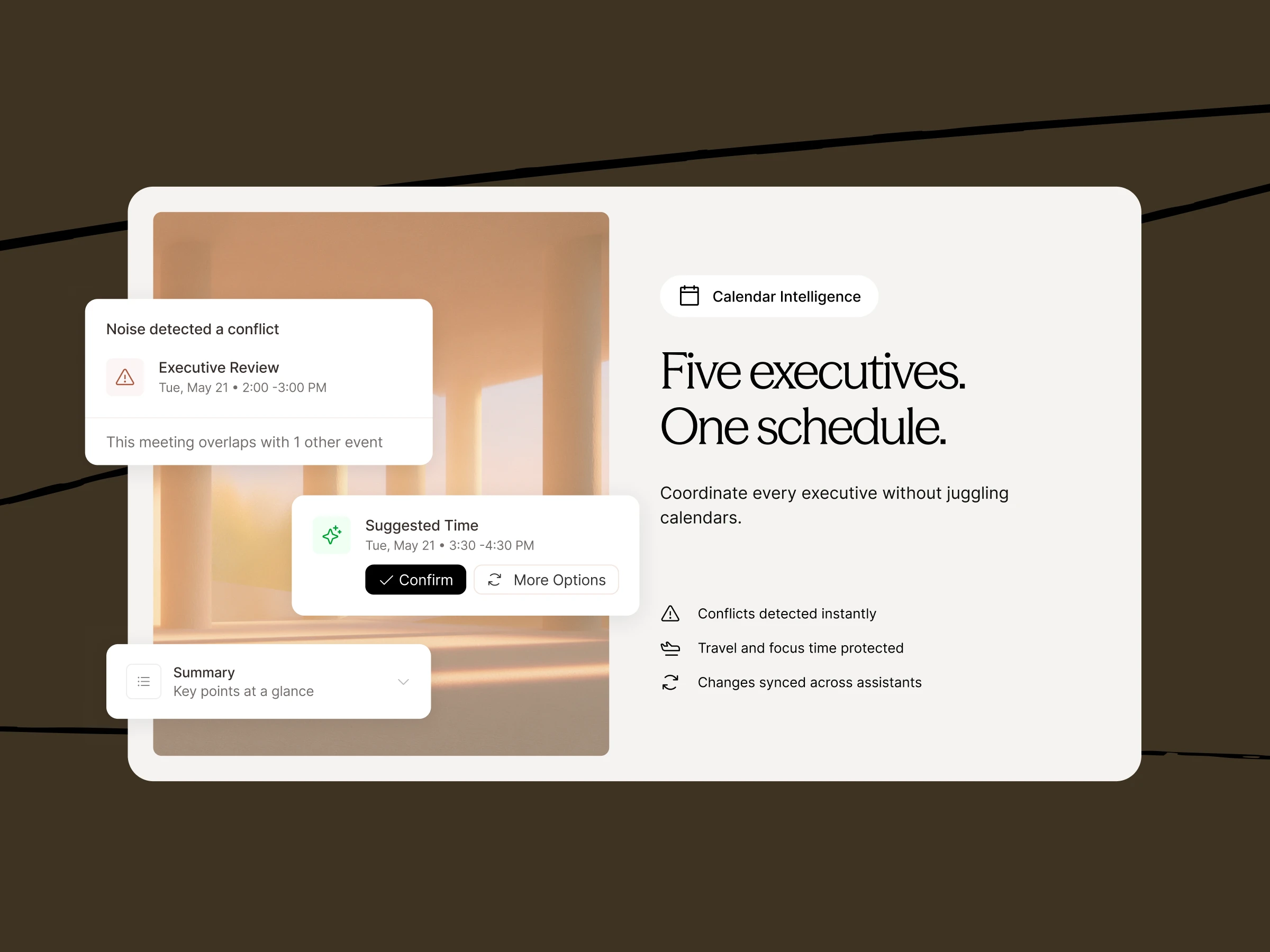
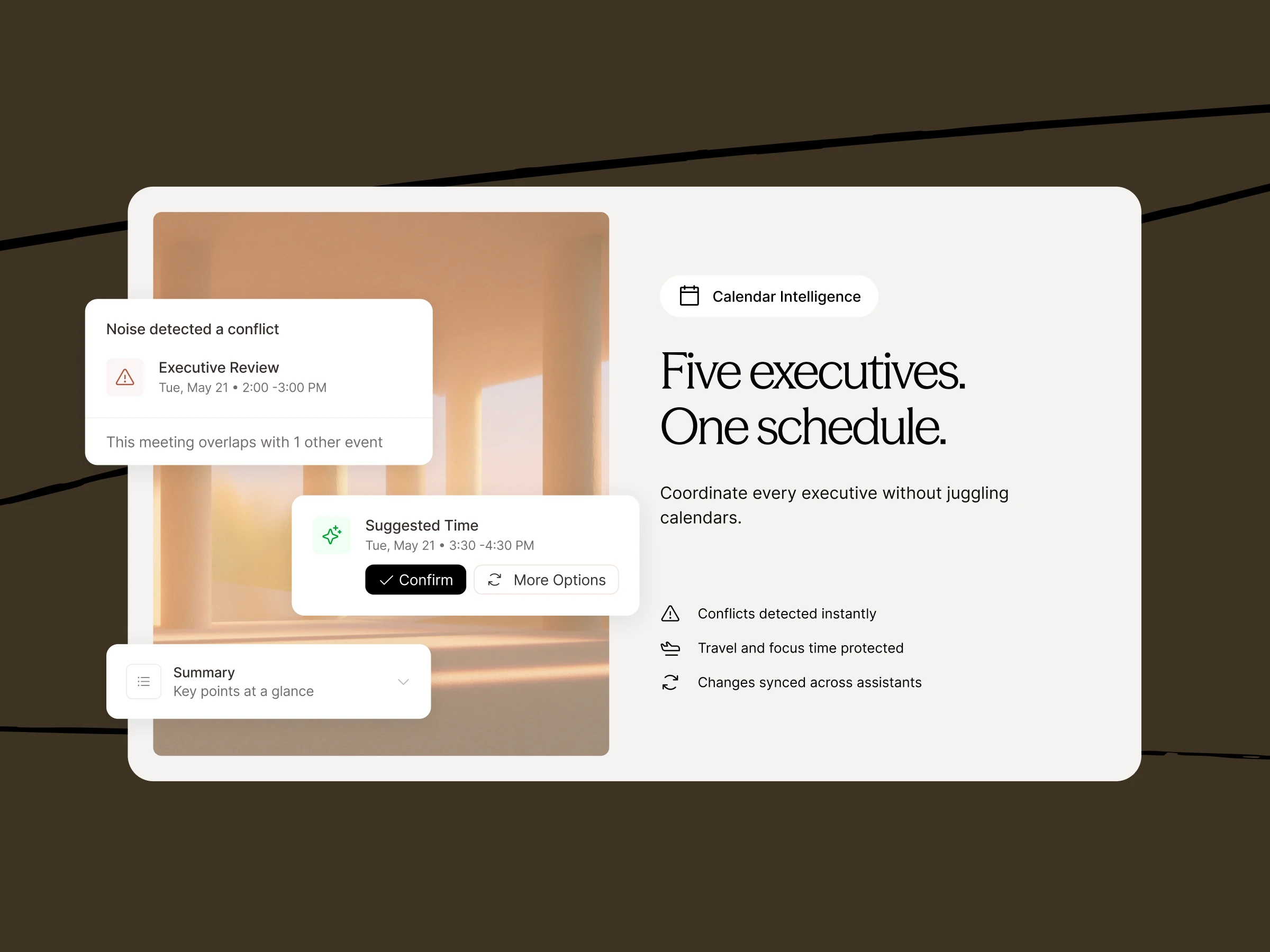
I started with messaging, not layout. The core idea: assistants carry an enormous amount of invisible work in their heads. That became the headline direction, "Stop carrying work in your head," and feature-level lines like "Five executives. One schedule." Each line names the real pain of coordinating multiple people, not a generic AI benefit.
2. Structure for two audiences
I designed a Features Timeline with a role toggle, For Assistants / For Executives. The same product story is told twice: day-to-day relief for assistants, and visibility and reliability for executives. One page, two buyers, no duplicated site sections.
3. Editorial visual direction
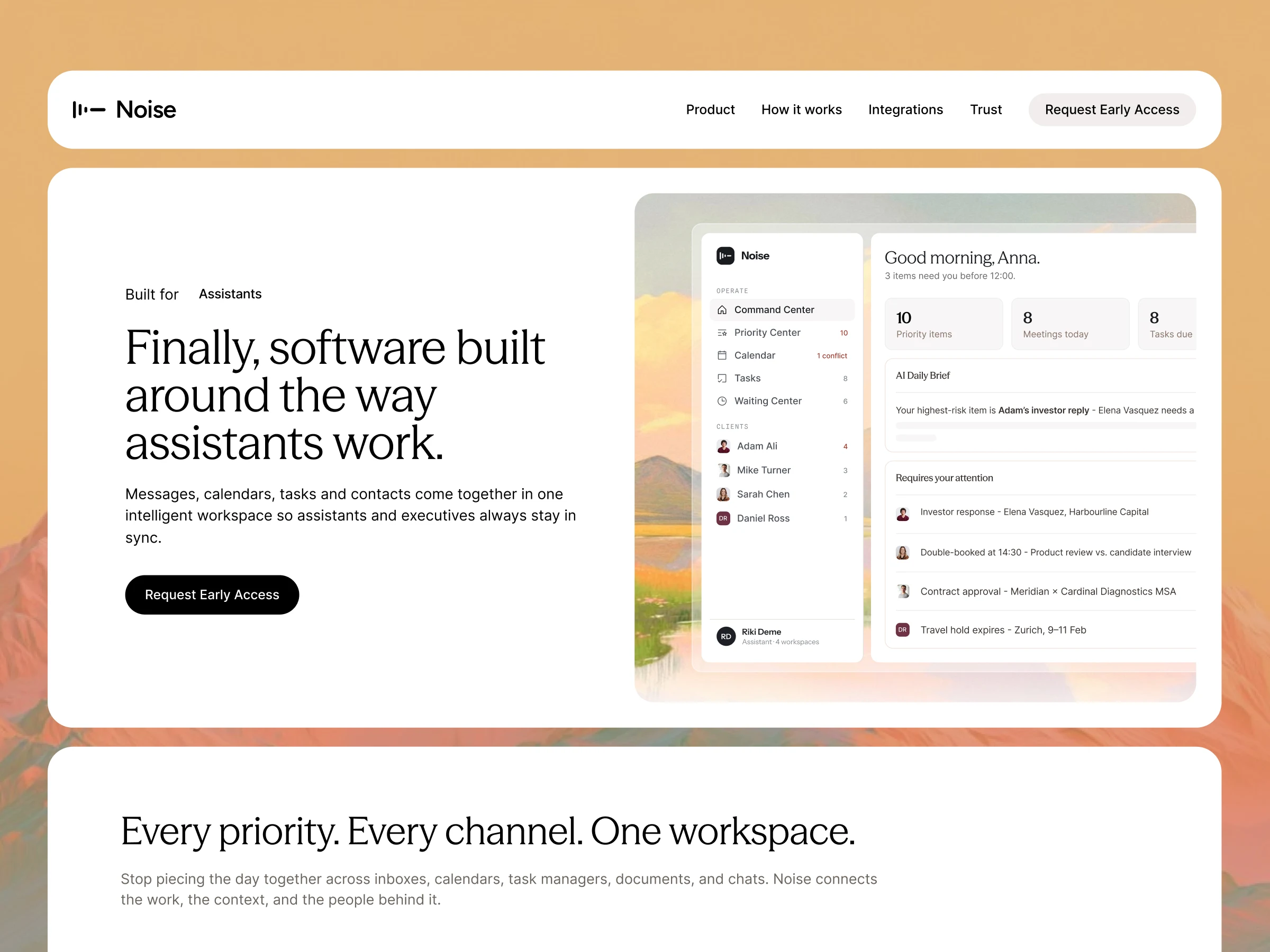
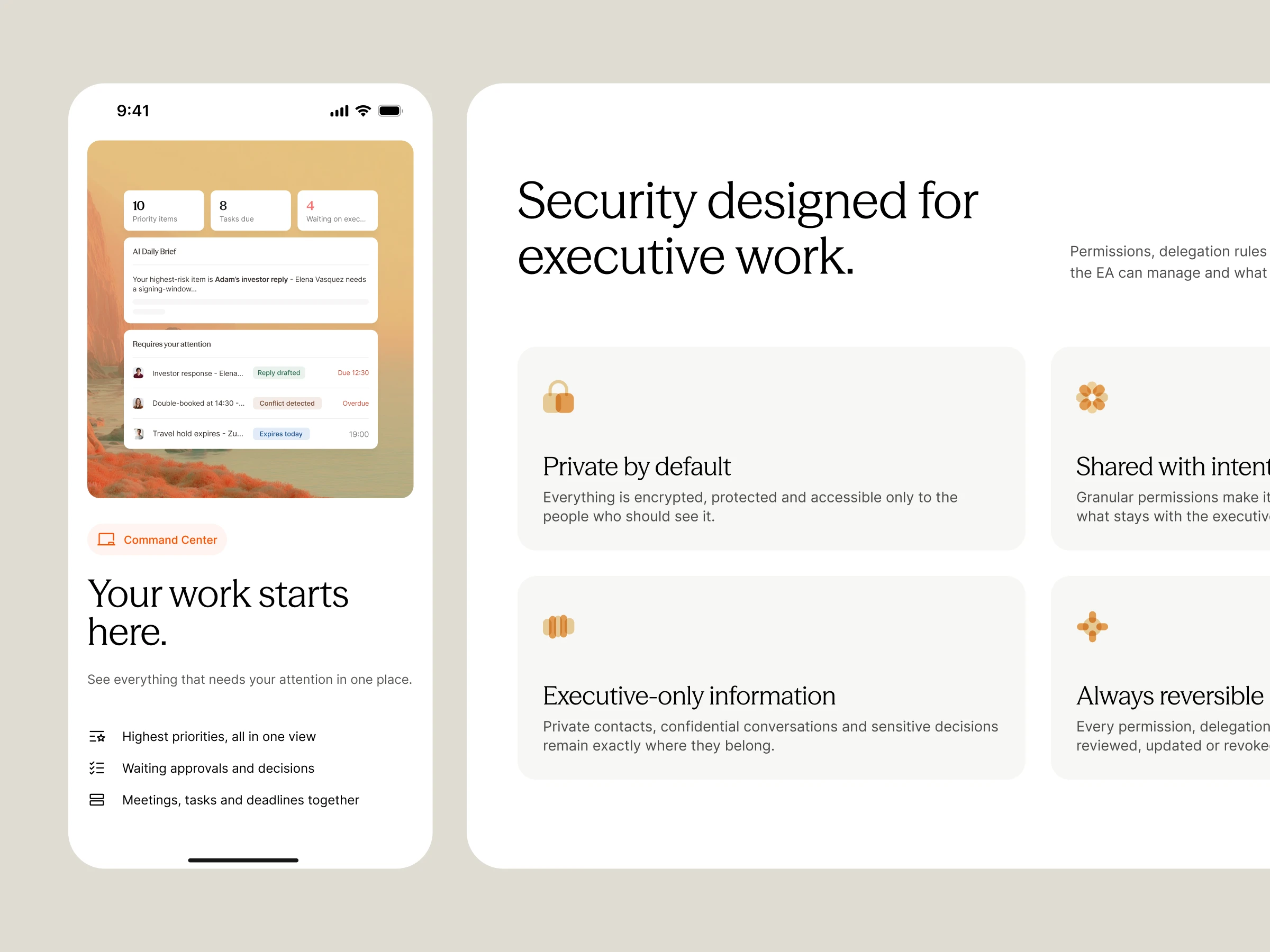
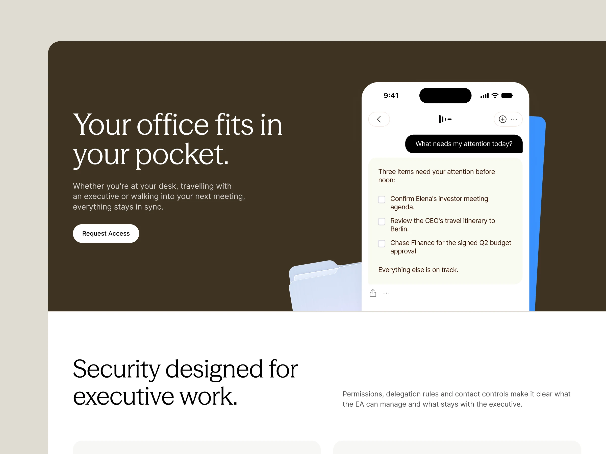
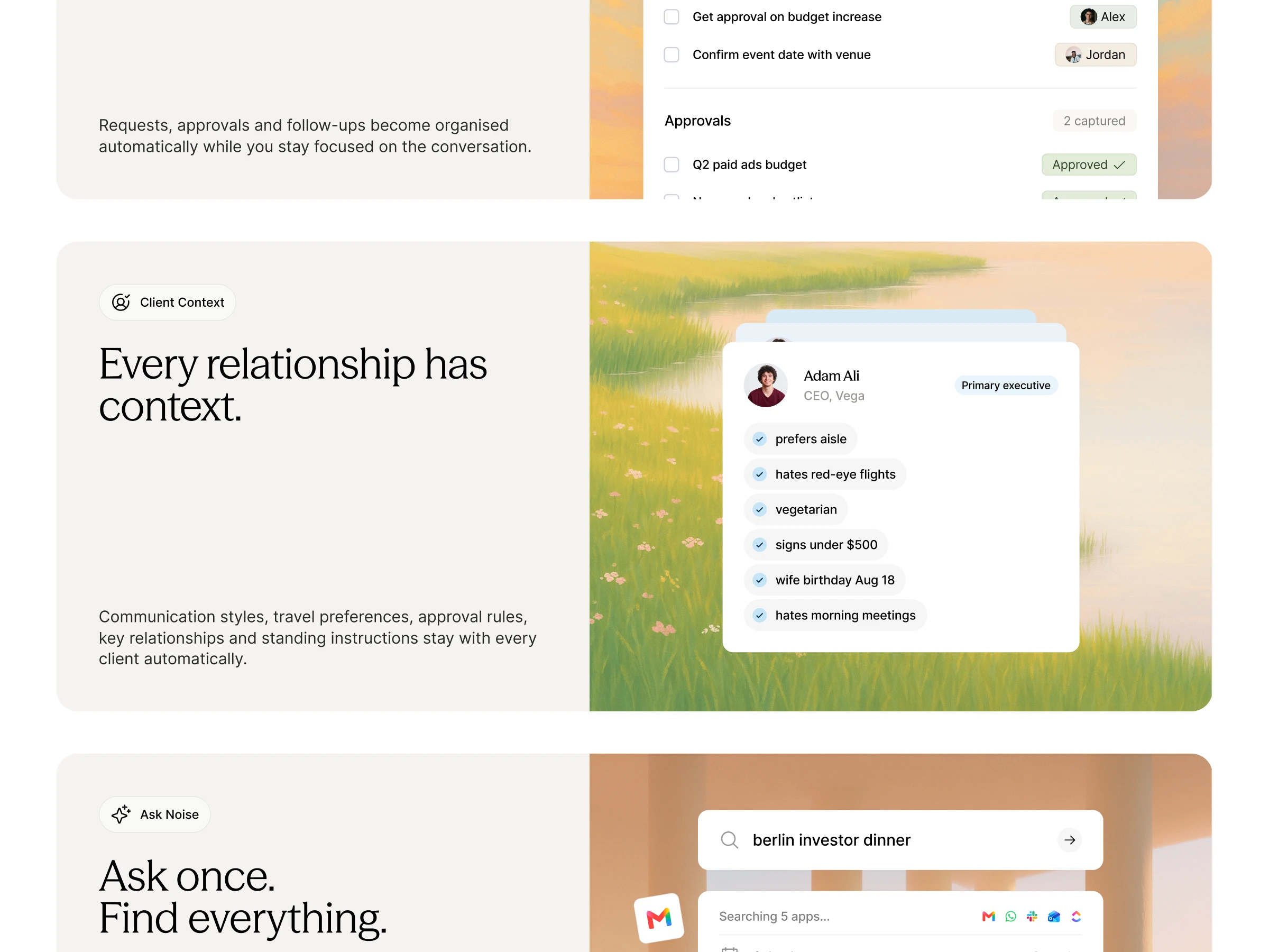
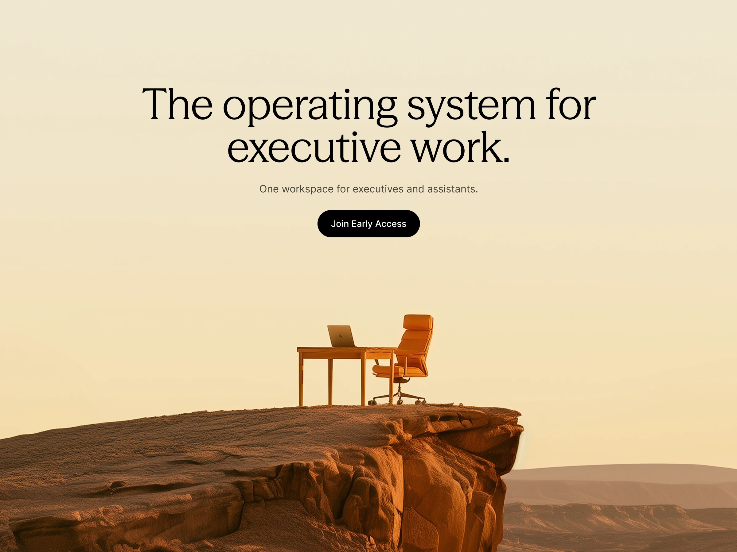
References came from outside SaaS: Apple, Kinfolk, Mercury and Linear. The result is a calm, premium look: warm light-filled imagery, serif display type, generous spacing, and product UI shown as small, focused moments like conflict detection and suggested times, not full dashboard screenshots. The product removes chaos, so the site had to feel calm.
4. Product moments, not screenshots
Each feature section shows a single interaction as an animated card: a conflict detected, a time suggested, a summary generated. Visitors understand what Noise does in seconds, without having to read a UI.
✏️ Key design choices
Serif-led editorial typography paired with a restrained sans for UI
Warm, architectural imagery instead of stock photos or AI clichés
Custom HTML animations embedded in Framer for lightweight, high-fidelity product moments
A code-driven role toggle in Framer (custom overrides with shared state), so one section serves both audiences
A fully responsive build in Framer, ready for the founder to iterate on
✅ Outcome
A clear positioning and messaging framework the founder could use beyond the website, in decks, outreach and onboarding
A distinctive brand presence in a category full of look-alike AI tools
A production-ready Framer site, designed and built end to end by me
Building an AI product that needs to stand out in a crowded category?
Book a Free Call
Like this project
Posted Sep 29, 2026
Positioned and built the website for Noise, an AI assistant for executive assistants: an editorial, calm site for a product that removes chaos.
Likes
0
Views
23
Timeline
Jul 27, 2026 - Ongoing
Clients
Noise