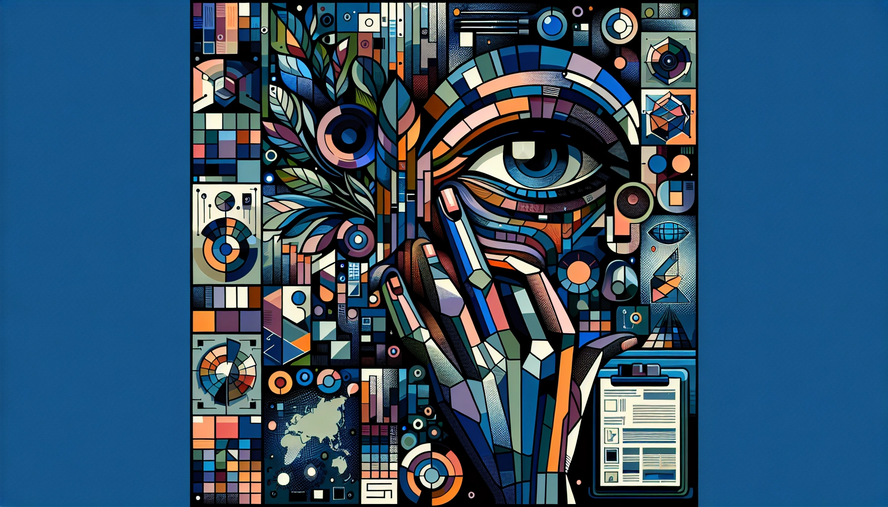
Brand Designer Portfolios: What to Look for Beyond Pretty Pictures
Rebecca Person
Brand Designer Portfolios: What to Look for Beyond Pretty PicturesWhat Is a Brand Designer Portfolio?7 Key Elements to Explore in a Brand Designer Portfolio1. Comprehensive Style Consistency2. Audience Alignment3. Story-Focused Layout4. Cross-Channel Adaptability5. Data-Driven Results6. Thorough Brand Guidelines7. Proof of CollaborationHow to Assess Strategy Over StyleWhy Metrics and Process Are ImportantCollaborating With a Brand Designer on Contra – FreelancerFAQs about Brand Designer PortfoliosWhat criteria should I prioritize in a brand portfolio?How do I know if the designer’s work is original?Can one portfolio showcase multiple industries effectively?Key Takeaways for Your Brand Journey
Brand Designer Portfolios: What to Look for Beyond Pretty Pictures
I’ve looked at hundreds—maybe thousands—of brand design portfolios. Some are stunning. Some are strategic. A few are both. But more often than not, I see portfolios that look beautiful at first glance but don’t say much once you dig in.
When I first started freelancing, I thought a great portfolio was just a clean layout with a grid of logos. That changed the moment I had to explain how a color system helped a client connect with Gen Z without alienating their Gen X investors. That’s when I realized: pretty doesn’t always mean purposeful.
“Design without context is decoration. And decoration isn’t strategy.”
Now, when I’m reviewing or building a portfolio—for myself or another designer—I’m looking for more than just visuals. I’m looking for how those visuals were built, why they exist, and who they’re meant for.
What Is a Brand Designer Portfolio?
A brand designer portfolio is a collection of work that shows how a designer builds, evolves, or supports a brand’s identity. It includes visuals like logos, typography, color palettes, and packaging—but also goes deeper into strategy, systems, and audience alignment.
Unlike general graphic design, brand design focuses on consistency across different platforms and touchpoints. It’s not just about how something looks, but how it feels, sounds, and behaves in the world.
You’ll often see examples of brand voice, tone guidelines, and user personas. These aren’t add-ons—they’re central to how the design functions in real life.
At its core, a brand design portfolio connects creative decisions to a brand’s goals. That includes things like target audience research, competitive positioning, and internal use cases like brand manuals or onboarding kits.
It’s not just “here’s a logo I made.” It’s “here’s how this logo fits into a bigger system that supports the brand’s story, values, and long-term growth.”
7 Key Elements to Explore in a Brand Designer Portfolio
A brand designer portfolio is more than a visual gallery. These seven elements provide a clearer picture of how a designer thinks, works, and solves problems within a brand context.
1. Comprehensive Style Consistency
Style consistency shows up in repeated use of colors, typefaces, spacing, and layout choices. This consistency reflects how well the designer understands and maintains a brand’s personality across all assets.
“If the logo wears jeans on the homepage and a tuxedo on Instagram, something’s off.”
In portfolios, this can include examples like identical typographic hierarchies across web, print, and social, or logo lockups used with the same proportions and spacing across formats.
2. Audience Alignment
Look for signs that the designer considered who the brand is speaking to. This can appear as moodboards based on research, or visuals tailored to specific demographics, like friendly, rounded fonts for early education brands or minimalist grays for fintech.
Some portfolios include user personas, survey data, or direct visual comparisons between audience segments to show how design decisions align with user expectations.
3. Story-Focused Layout
The layout of each case study should follow a clear narrative. This includes the challenge, the approach, and the result.
Some designers add context with short copy blocks that explain the problem they were solving. Others use visual storytelling—like showing a moodboard next to sketches, then the final output—to walk viewers through the evolution.
4. Cross-Channel Adaptability
A strong portfolio shows how a brand identity holds up across different applications. This includes packaging, mobile interfaces, trade show booths, email templates, or motion graphics.
It’s not about how many channels are shown, but whether the brand feels the same across all of them. For example, a logo that works just as well on a billboard as it does inside a favicon.
5. Data-Driven Results
Some designers include metrics such as engagement increases, higher conversion rates, or improved brand recall post-launch. Others show A/B test outcomes or UX improvements tied to new branding.
These metrics help connect the visuals to tangible results—even simple ones like “reduced bounce rate by 12% after new homepage design.”
6. Thorough Brand Guidelines
Portfolios that include brand guidelines show that the designer considered long-term usage. These might be full manuals or snapshots of brand books with logo rules, color usage, and typographic systems.
Some even include design tokens, accessibility specs, or usage violations to help teams avoid misuse.
7. Proof of Collaboration
Look for signs that the designer worked with others. This might include rough sketches, annotated screenshots, or client feedback notes.
Client testimonials, Slack snapshots, or even photos of brand workshops offer glimpses into the real process—where ideas were challenged, refined, and implemented together.
Collaboration isn’t always pretty, but good portfolios don’t hide the mess. They explain it.
How to Assess Strategy Over Style
Style can be subjective. Strategy is not. In brand designer portfolios, the presence of strategy shows up in how well the work reflects a brand’s purpose, audience, and long-term positioning—not just how polished it looks.
Start by reviewing how the designer introduces each project. Portfolios that include a brief or project scope provide context for what the brand was trying to solve. These can be as simple as one sentence outlining the challenge or as detailed as a full brand mission statement.
Concept development is usually visible through moodboards, early sketches, or rationale for visual decisions. If a designer includes multiple logo options with explanations for why one was chosen, this helps connect the dots between exploration and outcome.
Alignment with brand values is often shown through messaging work. Look for taglines, tone-of-voice examples, or content guidelines. These elements indicate whether the designer contributed to or understood the brand’s verbal identity, not just its visual one.
Some portfolios include strategic frameworks like brand pyramids, positioning maps, or competitive audits. These aren’t always labeled as such. They may appear as charts, personas, or diagrams that show how the brand differentiates itself in a specific market.
“If a portfolio skips the ‘why,’ then the ‘what’ doesn’t matter.”
Long-term thinking is harder to spot, but possible. Rebrands that document phased rollouts, sub-brand architecture, or global adaptation plans suggest that the designer considered how the identity scales over time. This is especially relevant when a brand has multiple product lines or audiences.
Strategic depth often appears in the small details: a note explaining how a color palette was chosen to reflect cultural context, or how a layout system was built for accessibility compliance. These choices show that the designer is thinking beyond the screen.
Some projects include before-and-after snapshots or legacy brand analysis. These provide insight into how the new design solves what the old one couldn’t. 📊
In some cases, portfolios include links to real-world use—like a landing page, social campaign, or published brand guide. These external references help verify that the system was not only designed but also implemented.
Why Metrics and Process Are Important
As of April 16, 2025, most brand design portfolios that stand out don’t just show final visuals—they document how those visuals performed and how they got there. Metrics and process are now baseline expectations, not bonus points.
Objective data helps evaluate whether the design actually worked. That might include conversions, engagement rates, bounce rate reductions, or brand recognition lift. For example, a case study might mention that a logo redesign contributed to a 23% increase in brand recall within five months of launch.
This kind of data doesn’t need to be complex. A simple before-and-after showing click-through rate improvements on branded landing pages or a heatmap illustrating improved visual hierarchy can be enough. Without those numbers, it’s not clear if the solution solved anything.
The process section of a portfolio is where the design thinking becomes visible. This includes early sketches, brand audits, UX feedback loops, and A/B testing results. It also includes the decisions that didn’t make it into the final product—like two rejected logo concepts with annotated client comments explaining why they were cut.
“A clean grid is nice. A clean grid with the reason it exists is better.”
Iterative design is often shown through versioning. Some designers include timeline-based slides showing how a logo evolved over multiple rounds, backed by stakeholder input, research insights, or usability testing. These timelines give context to the final outcome and demonstrate adaptability.
Research methods are becoming more detailed. Portfolios sometimes include user personas, competitive audits, or even screenshots of customer survey results. In one example, a brand identity for a nutrition startup was shaped by ethnographic interviews with athletes and dietitians. The final product included packaging that reflected those findings—modular, accessible, and color coded for meal types.
Some designers go one step further and document what didn’t work. These “failed” directions are backed up by data—like drop-off stats, user confusion, or internal pushback. Including these shows that the designer knows how to course-correct in response to real-world friction.
“Not every idea is a good one. The good portfolios show the bad ones too.”
Metrics and process also surface in rollout planning. A brand redesign might be launched in phases, and the designer explains how each stage was tracked and adjusted. One portfolio broke this down into a Gantt chart, noting performance benchmarks along the way.
In short, metrics show impact. Process shows thinking. Together, they tell a complete story.
Collaborating With a Brand Designer on Contra – Freelancer
On Contra, freelancers and clients work without commission fees, which removes a common source of friction in creative partnerships. The absence of platform cuts means that pricing discussions happen directly between both parties, making budgets, expectations, and deliverables easier to align.
This kind of setup supports clearer communication. There’s no third-party overhead shaping how feedback is shared or how timelines are managed. Designers can present their process, research, and rationale without needing to pad their work to offset platform costs. Clients can ask for revisions or strategy shifts without worrying about additional hidden fees.
Brand designers on Contra typically include a range of project types in their profiles: rebrands, early-stage identity systems, modular design kits, and cross-platform adaptations. Many also upload full case studies showing how they’ve aligned visual systems with business goals—like complete brand manuals, concept iterations, and audience-specific adaptations.
Because Contra’s tools are designed for independent professionals, it’s easier to evaluate a designer’s process in context. Portfolios often include embedded visuals, collaborative notes, and links to live brand assets. This allows clients to view how a designer has handled similar challenges across industries, formats, or user segments.
“The real collaboration isn’t in the final logo—it’s in the annotated Figma files, the shared Notion links, and the one-liners pulled from stakeholder interviews.”
Brand experts on Contra offer flexible engagement options. Some work on fixed-scope identity packages, while others partner on long-term brand evolution. Multiple freelancers list experience managing sub-brands or helping clients scale identity systems across international markets.
The platform’s structure makes it easier to build a team around a brand—sometimes including a strategist, a copywriter, and a designer working together on one project thread. Because everything stays within the same workspace, files, decisions, and feedback remain accessible as the project evolves.
“No cut, no middleman, no weird delays. Just design, feedback, and files that make sense.”
Fairness is built into the workflow. Without commissions, both sides retain more control over how they collaborate, iterate, and evaluate results. There’s no incentive to rush, skip steps, or avoid necessary brand documentation just to protect margins.
FAQs about Brand Designer Portfolios
What criteria should I prioritize in a brand portfolio?
Start with how well the work reflects the brand’s core values and long-term goals. Look for portfolios that connect design decisions to business context—such as audience segmentation, competitive analysis, or positioning strategy. The presence of concept development, messaging frameworks, and strategic rationale provides a clearer view than visuals alone.
If every project feels generic, the designer may be solving visual problems, not brand problems.
How do I know if the designer’s work is original?
Portfolios that include early-stage sketches, moodboards, or brand research artifacts are more likely to represent original thinking. Repeated use of identical layouts, recycled templates, or trends without context usually signals a lack of customization. Unique iconography, contextual typography choices, and visual differentiation across sectors are also indicators of original work.
Can one portfolio showcase multiple industries effectively?
Yes, if the designer adjusts their process and outcomes to fit each market. A portfolio can span industries like healthcare, fintech, and food service if each project shows unique research inputs, distinct audience alignment, and tailored brand systems. The key is not visual diversity alone but whether the design approach changes based on industry-specific needs.
One tone doesn’t fit all—unless the brand is yelling into the void 🎤🔊
Key Takeaways for Your Brand Journey
As of April 16, 2025, brand designer portfolios are being evaluated less for their visual polish and more for their strategic clarity. The most effective portfolios show how design decisions connect to business objectives, audience data, and measurable outcomes. This includes references to brand architecture, phased rollout plans, and system adaptability across formats and markets.
Designers are documenting their process with more transparency. Early drafts, user research artifacts, stakeholder notes, and even abandoned concepts are being included. These materials help explain how decisions evolved over time and how feedback loops shaped the final outcome.
Quantitative tracking tools—like A/B test results, brand recall scores, and conversion metrics—are now common in high-performing portfolios. These insights are often paired with visual documentation of the process, such as heatmaps, UX flows, or annotated wireframes.
Portfolios that include collaboration evidence—like workshop notes, co-creation session recaps, or client testimonials—tend to give a more complete view of how designers work within multi-stakeholder environments. Storytelling is often used to explain not just the result, but the rationale and tradeoffs behind each decision.
Designers working on Contra often include these elements in their profiles and case studies. Because profiles are commission-free and managed directly by the freelancer, it’s easier to see unfiltered, complete project documentation. Some include links to live brand systems, internal handoff materials, or even implementation roadmaps.
“The strongest portfolios aren’t galleries. They’re timelines.”
Portfolios that show how the brand scales over time, adapts across geographies, or evolves with product growth are increasingly valuable. These often include modular design systems, localization frameworks, and implementation guides built for non-design teams.
Visuals still matter, but they now function as supporting evidence rather than the main focus. The core of a strong portfolio lies in its ability to show how design supports long-term brand goals.
Freelancers on Contra who specialize in brand design often work across industries but show how their process adjusts with each client. Their profiles are structured to highlight both creative output and strategic input, with embedded case studies, annotated visuals, and project context.
🧠 Look for portfolios that explain how the work was done, who it was for, and what changed because of it.
Like this project
Posted Apr 17, 2025
Brand designer portfolios should show strategy, audience alignment, and results—not just visuals. Learn what to look for beyond pretty pictures.