Wanderloom Travel-Library Website Design

Project Overview
Wanderloom is a travel-library concept built around one promise: every place in it has been visited at least twice, in different seasons, and written up with the timing, the cost, and the walk you'll actually need. It's an independent, reader-funded resource for people who would rather take the detour than the top-ten list, and the site had to feel like that: unhurried, specific, and honest.
What I worked on:
Full multi-section site design and build
Filterable destination grid with category tabs
Stories (journal) layout with featured and list articles
FAQ accordion and newsletter signup
Responsive layout across breakpoints
The challenge:
Travel websites usually pick one of two looks:
A booking-engine grid crowded with prices and urgency badges, or an endless listicle blog. Neither signals what Wanderloom is actually selling, which is trust. A reader deciding whether to plan nine days around one site's notes needs to feel its independence immediately: no sponsored listings, no crowd-chasing, real field experience.
The second challenge was scale. A library of over a thousand places can't be a hand-built page per destination. The structure had to be a content system first, with a design calm enough that adding place number 1,241 never makes the page feel busier.
The approach:
Make it read like a printed journal:
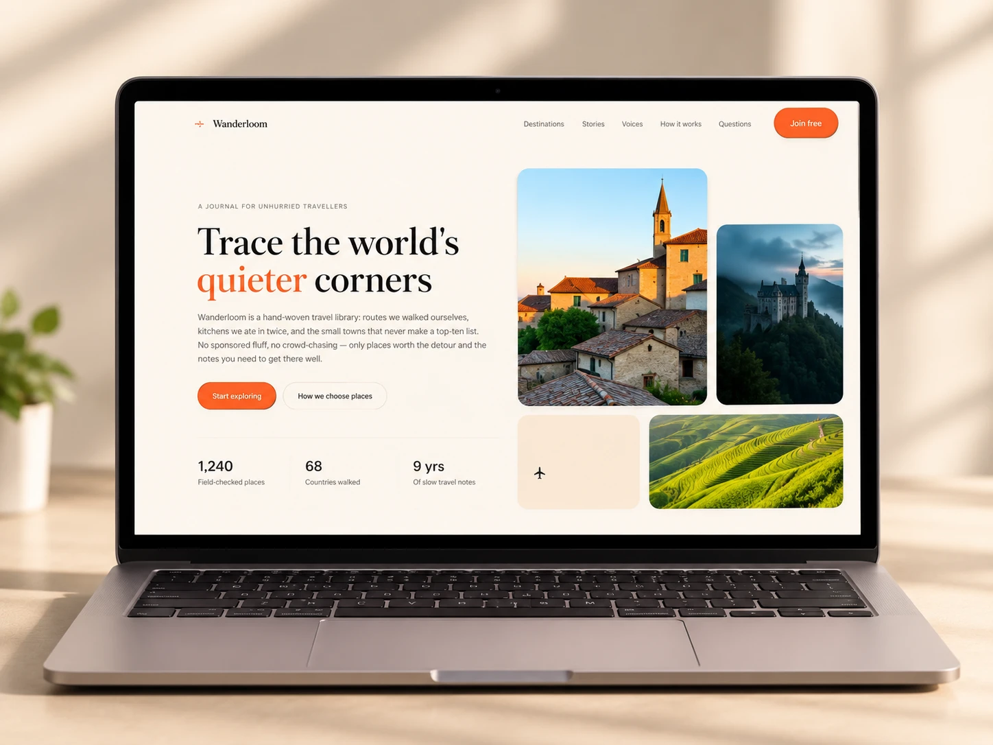
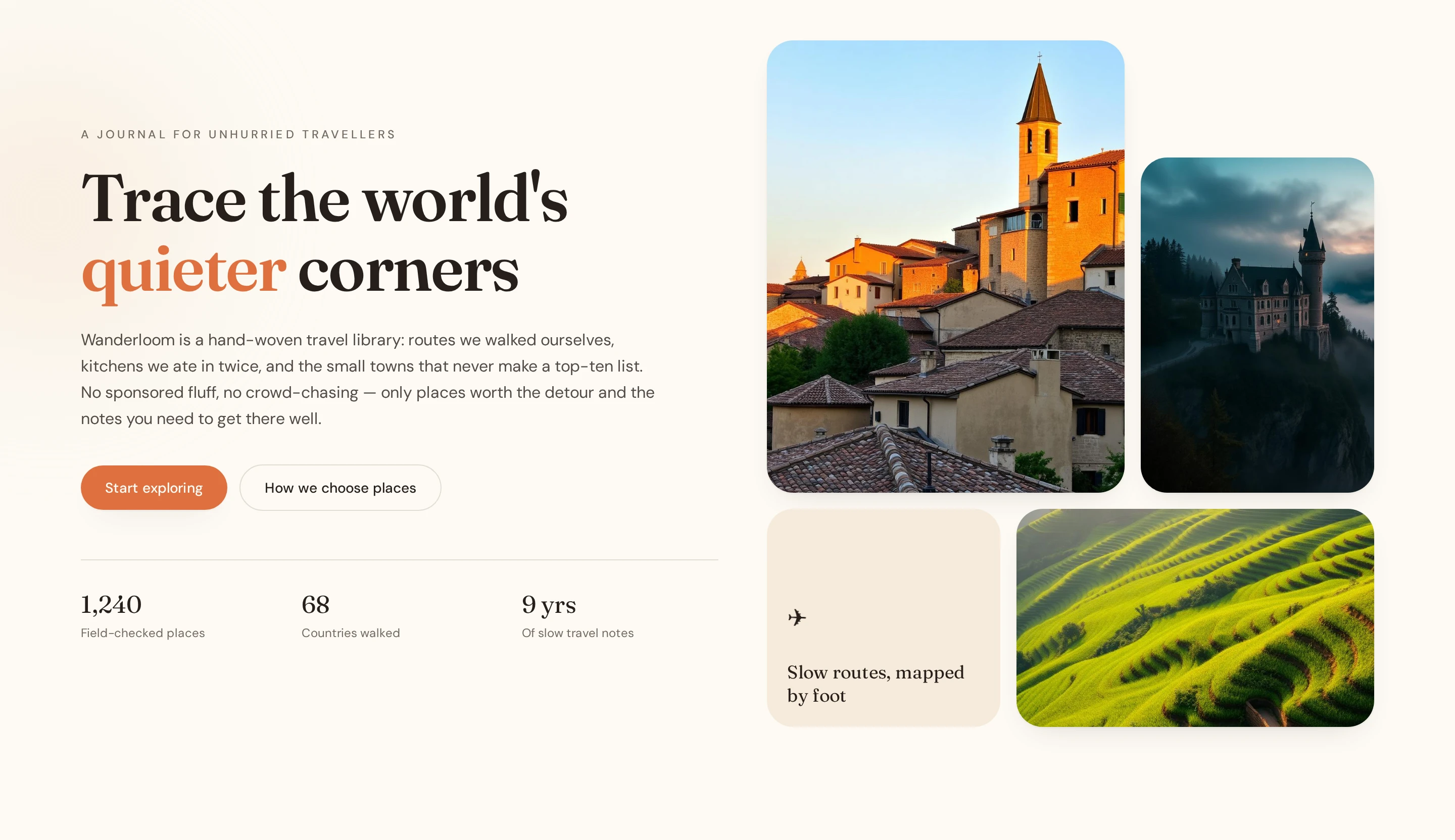
A warm cream palette, a high-contrast serif for headlines, a quiet sans for body copy, and a single terracotta accent. In the hero, one word ("quieter") picks up the accent color, so the page states its tone before the copy explains it. The terracotta shows up only on actions and key words, so it never competes with the photography.
Put the proof right under the promise:
Three plain numbers (1,240 field-checked places, 68 countries walked, 9 years of slow travel notes) sit beneath the hero, followed by a slow-moving ticker of the editorial rules: no sponsored listings, local kitchens first, off-season timing, public transit notes. The ticker reads as a manifesto and keeps the page feeling alive without a hero video.
Let readers filter without leaving the page:
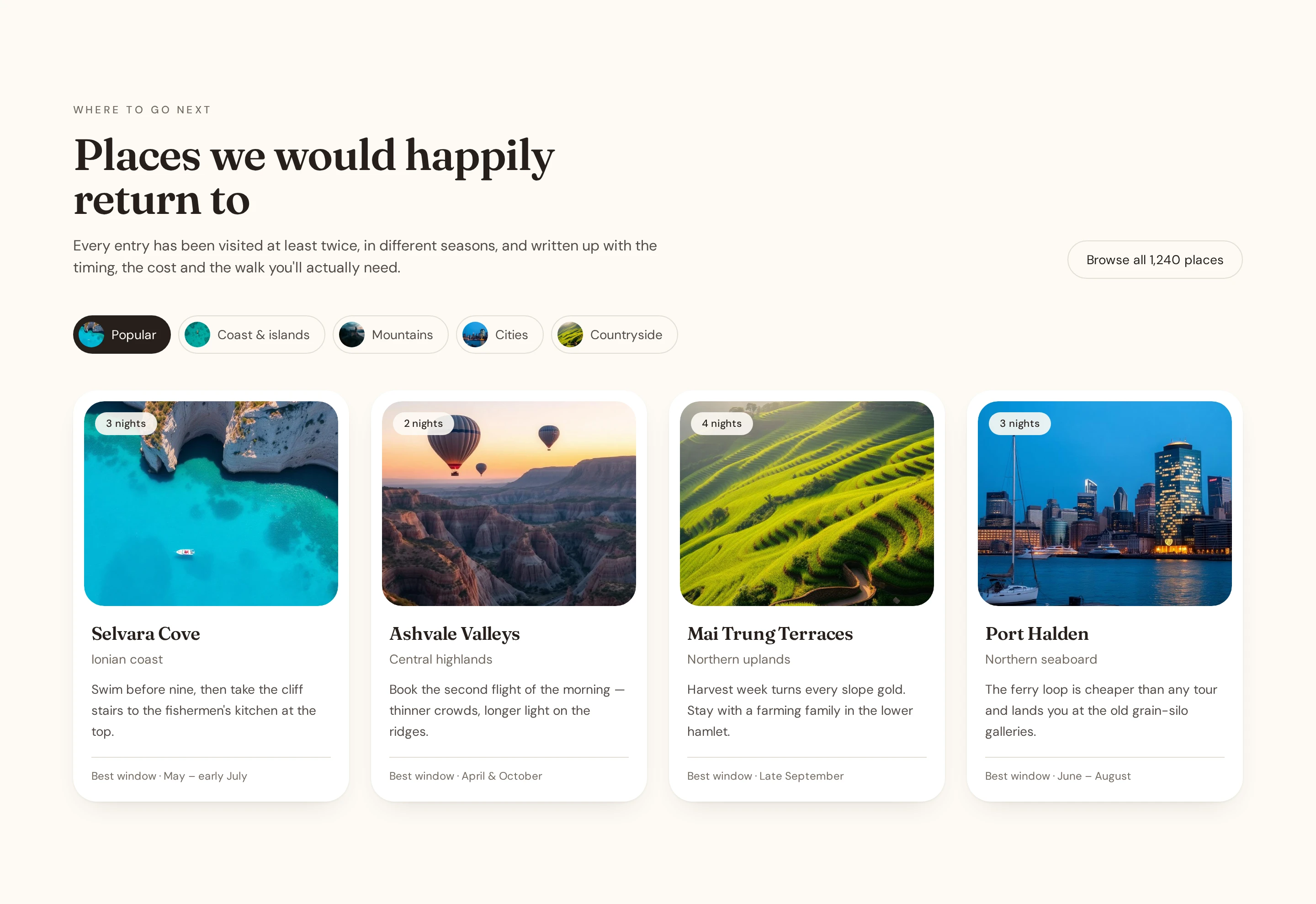
"Places we would happily return to" uses category chips (Popular, Coast & islands, Mountains, Cities, Countryside) that swap the visible destination cards in place. Each card carries the same compact anatomy: a nights tag, the place name and region, a two-line field note, and a "best window" footer. Consistent cards make a long library scannable, and the data behind each one is exactly what a CMS collection is good at holding.
Give stories their own rhythm:
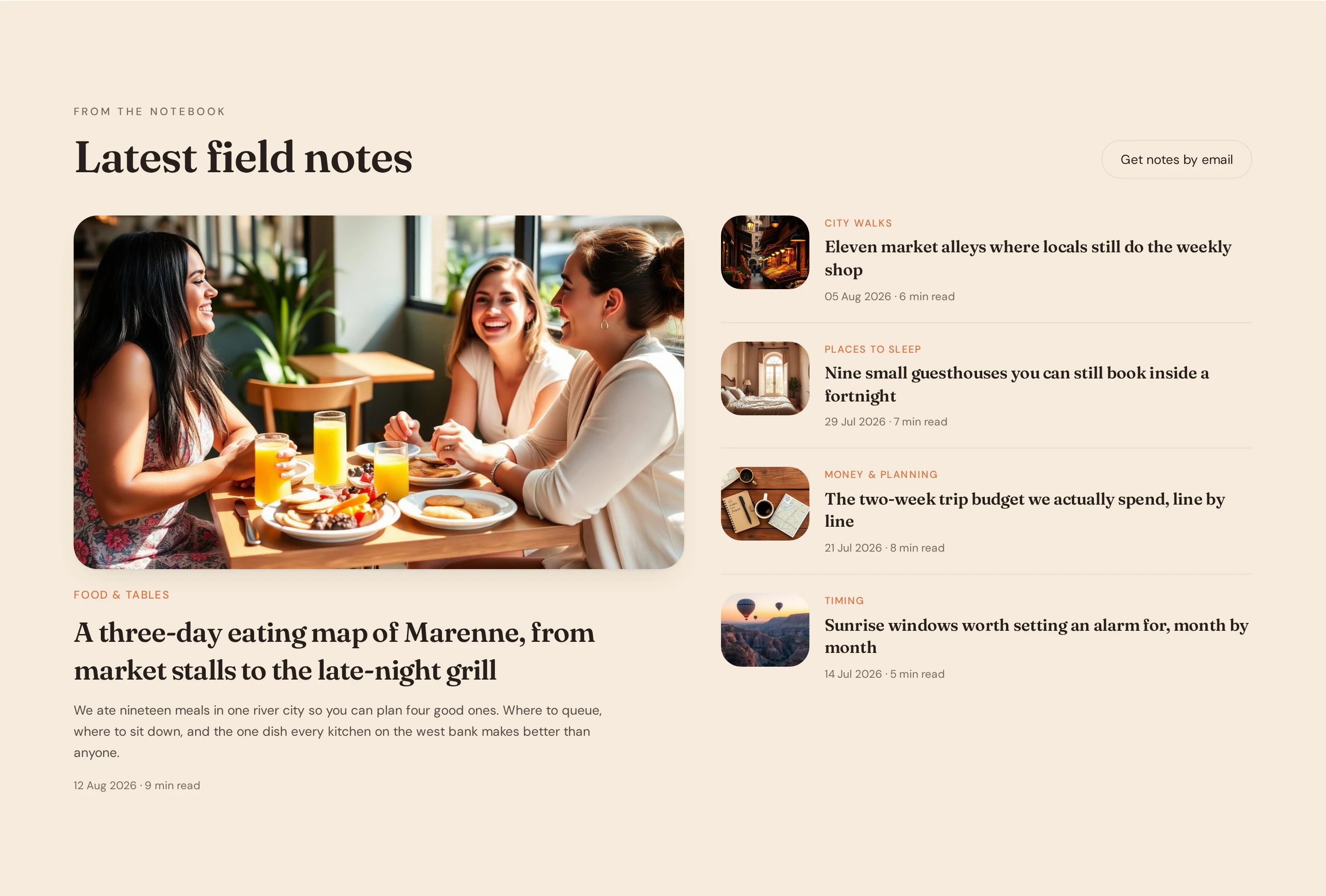
The journal section pairs one large featured article (a three-day eating map, with a category tag and a short standfirst) against a stacked list of smaller pieces with date and read-time metadata. Varying the scale this way gives the page a magazine cadence and keeps the stories section from looking like another card grid.
Turn the editorial method into a design element:
"We go, twice. We check the boring parts. We ask people who live there. We revisit and retire." These four principles get numbered cards on a tinted band. It's the section where a skeptical reader finds out why they should believe the rest, and it's laid out to be read in ten seconds.
Use one voice, not a testimonial wall:
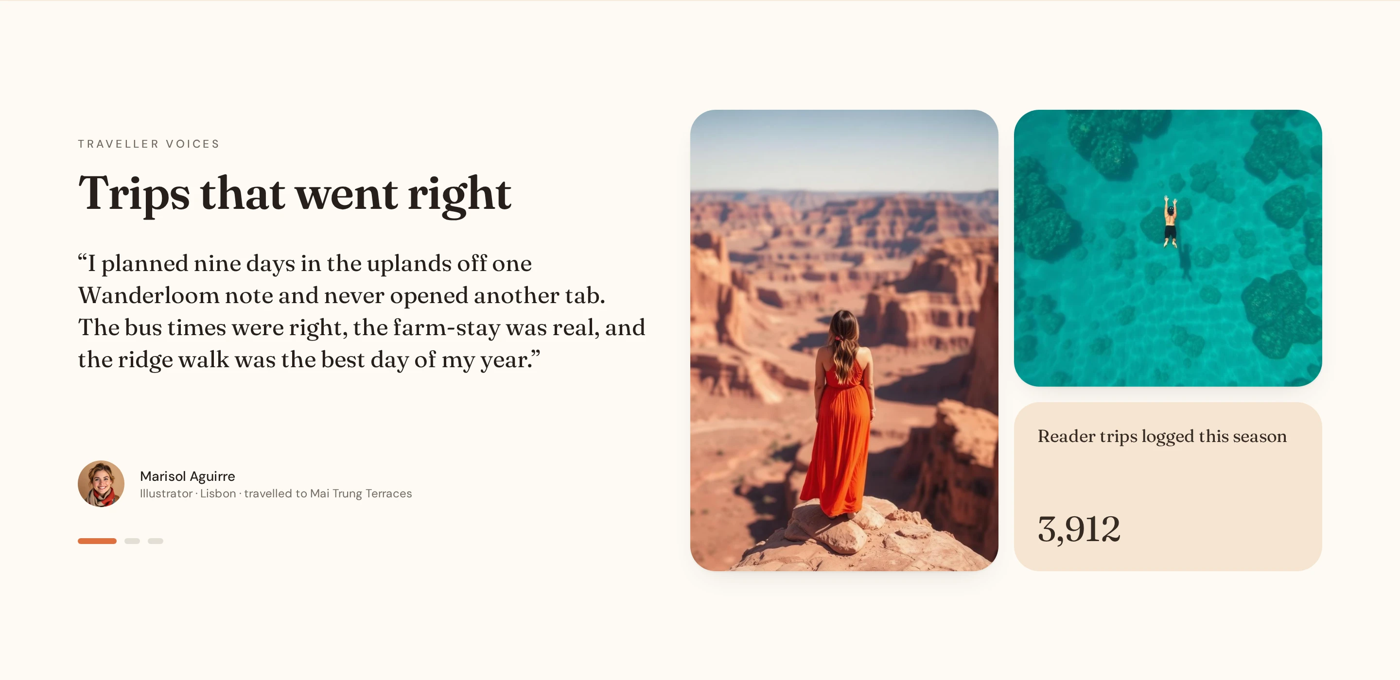
Instead of a carousel of quotes, "Trips that went right" features a single traveller quote beside photography and a live-feeling stat (3,912 reader trips logged this season). One specific story, with a name and a place, is more believable than six generic ones.
Close with a quiet ask:
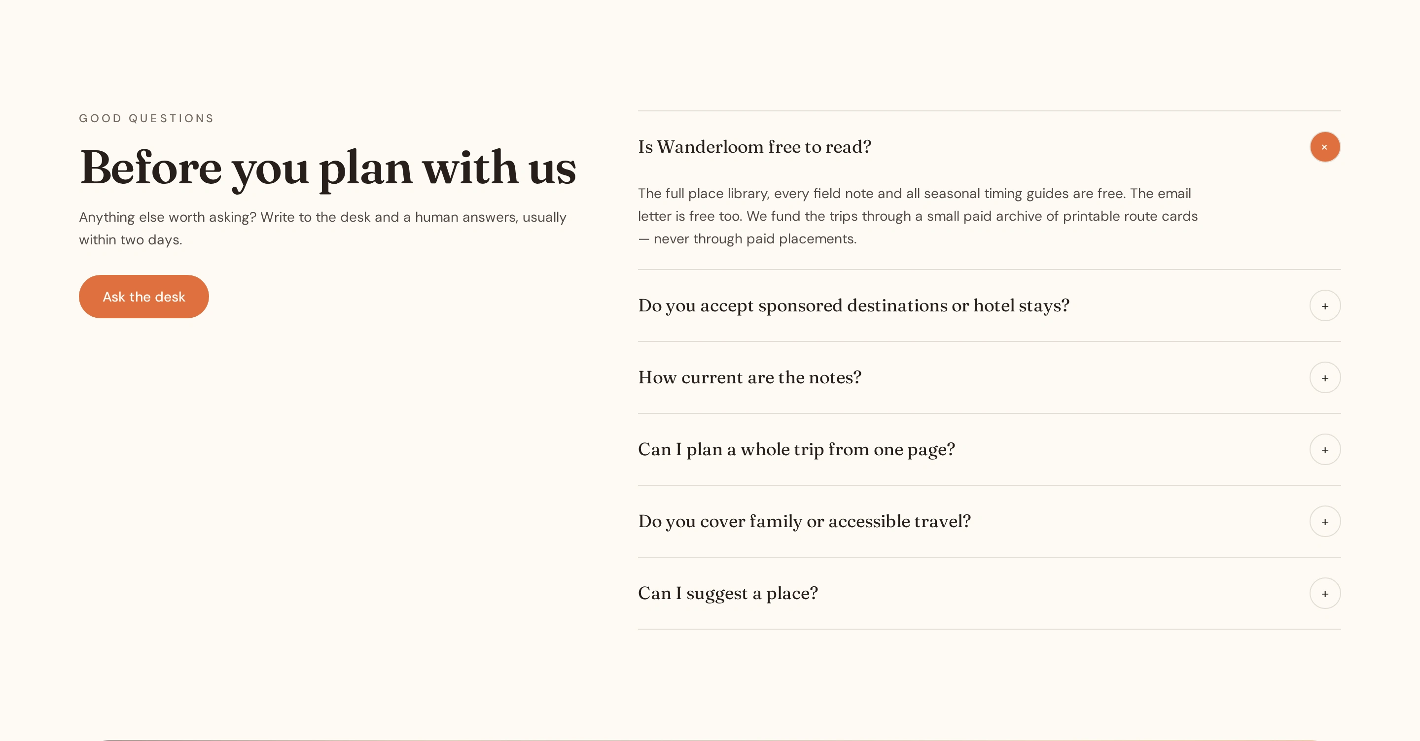
A short FAQ accordion handles the practical questions (how current the notes are, whether you can plan a whole trip from one page, family and accessible travel), then the page ends on "One quiet place, one honest note, every Sunday," a newsletter signup over a full-width landscape with the line "We write once a week. That's the whole deal." The footer is grouped by what a reader wants to do (Explore, Read, About, Practical) rather than by internal site structure.
0 likes · 1 view · Nov 5, 2026
A Webflow slow-travel guide featuring filterable destinations, editorial stories, and trusted recommendations with no ads or sponsored listings.