Meterly: AI agent billing and metering platform

Amina Hussain



Project Overview
Meterly is a monetization-infrastructure platform for companies selling AI agents - instrumenting usage, pricing any unit of agent work, and settling revenue without an engineering team hand-rolling a billing system. The audience is technical (founders and product leads shipping agent products) but the sell is fundamentally about trust: can this platform price fairly, bill accurately, and prove the value being delivered?
What I worked on:
Full landing page design and build
Claymation-style hero illustration integration
Invoice and dashboard UI mockups
Interactive pricing toggle (monthly/annual)
Dark-mode security and stats sections
Responsive layout across breakpoints
The challenge
Billing and metering products default to dry, spreadsheet-flavored design - tables, gray dashboards, generic fintech blues. That look actively undersells Meterly's real differentiator: it doesn't just count usage, it turns billing into proof of value for the customer's own renewal conversations. The challenge was finding a visual language warm and editorial enough to stand out in a crowded infra category, without losing the precision and credibility a finance buyer needs to see in the actual product screens.
The other challenge was conceptual: "usage-based billing for AI agents" is abstract. The page had to make an invisible thing - metered agent actions turning into an invoice - feel concrete and inspectable.
The Approach
Lead with tactile illustration instead of a dashboard screenshot:
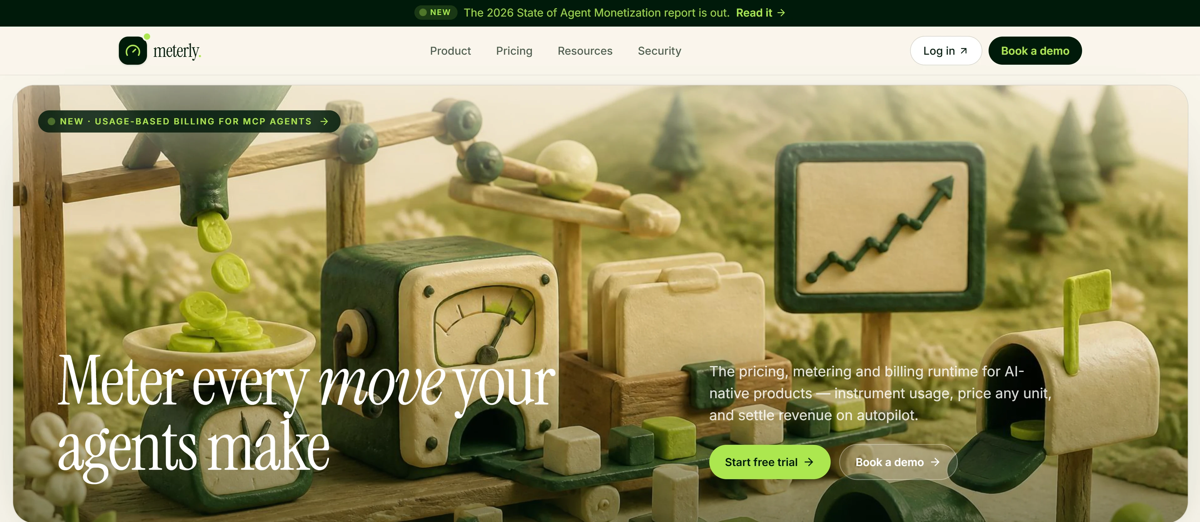
The hero uses a warm, claymation-style illustration - a miniature diorama of funnels, gauges, and ledgers - rather than the default "app screenshot in a browser frame." Paired with serif italic type ("Meter every move your agents make"), it gives an infrastructure product a handmade, considered feel before a single dashboard is shown.
Sell the invoice as a trust document, not a bill:
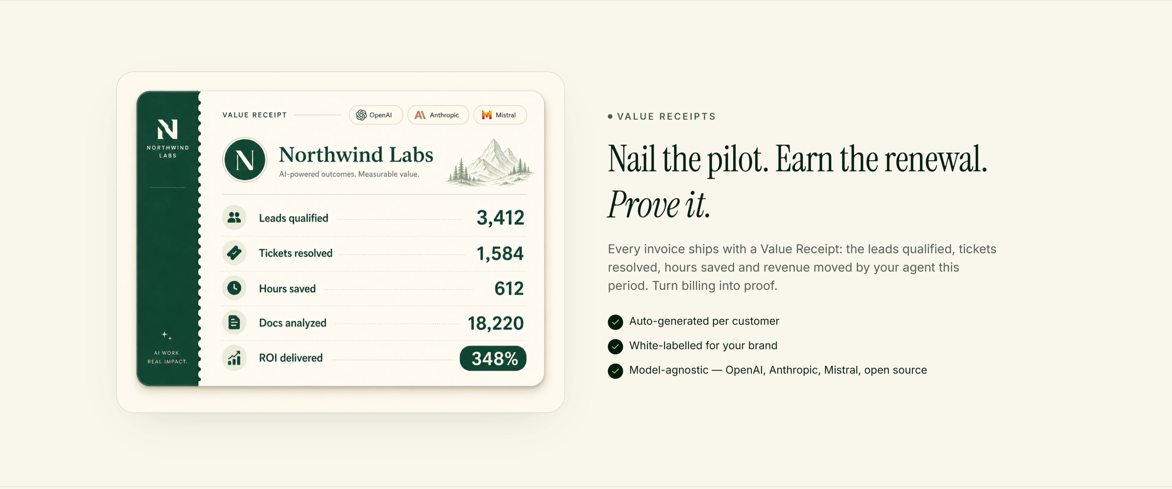
The "Value Receipt" concept reframes an invoice line item as proof: leads qualified, tickets resolved, hours saved, ROI delivered, sitting right next to the charges. This is the page's central idea, and it's introduced visually before it's explained in words - the receipt mockup does the persuading.
Show the operator's actual view, not an abstraction:
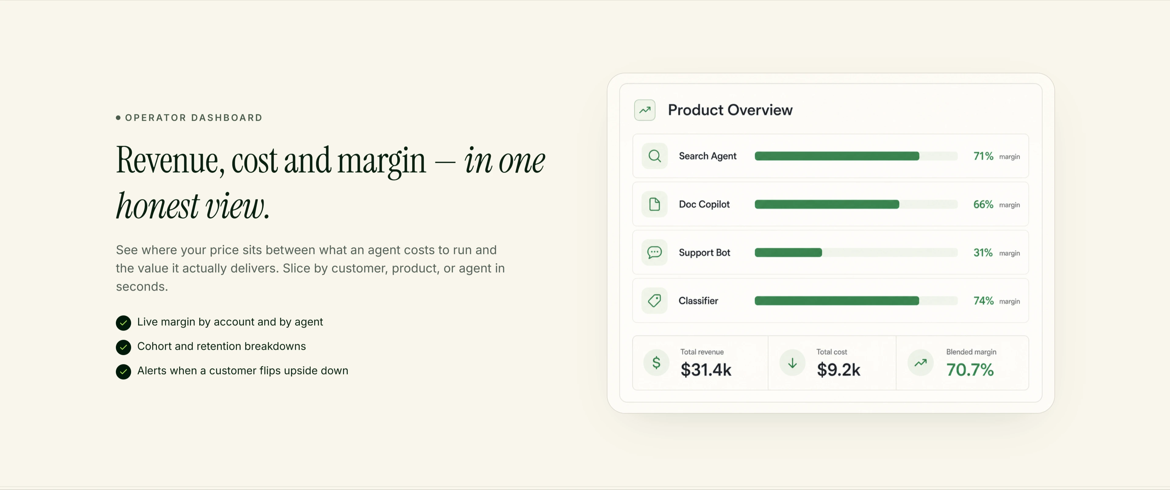
"Revenue, cost and margin -in one honest view" pairs editorial copy with a real-looking product dashboard: per-agent margin bars, blended margin, total revenue and cost. Anyone evaluating this as infrastructure needs to see the actual screen they'd live in, and the mockup is detailed enough to function as a real product tour.
Make the invisible metering layer visible:
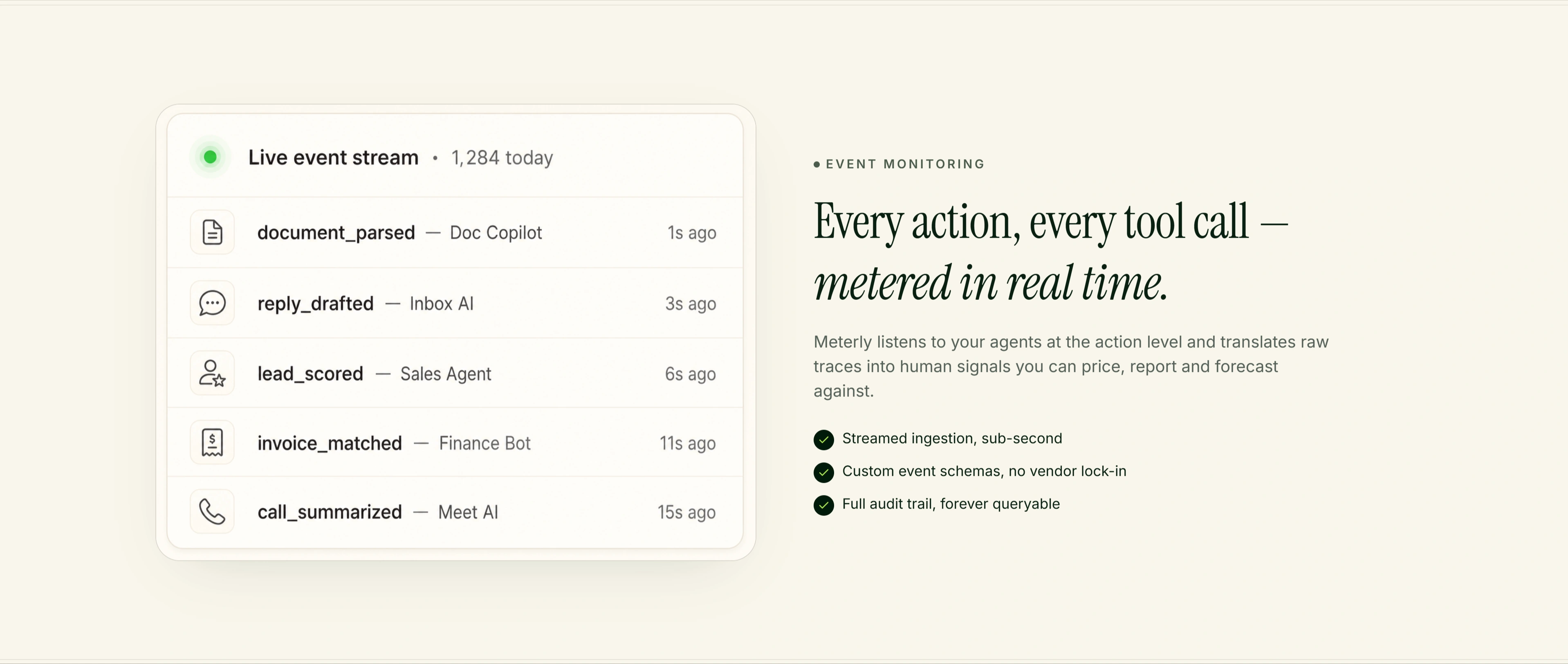
A live event-stream mockup -document_parsed, reply_drafted, lead_scored, ticked off with timestamps - turns "we meter every action" from a claim into something the visitor can watch happen. It's the same move as the reward-bundle cards in past projects: don't describe the mechanism, show it firing.
Pair the billing engine with an actual invoice:
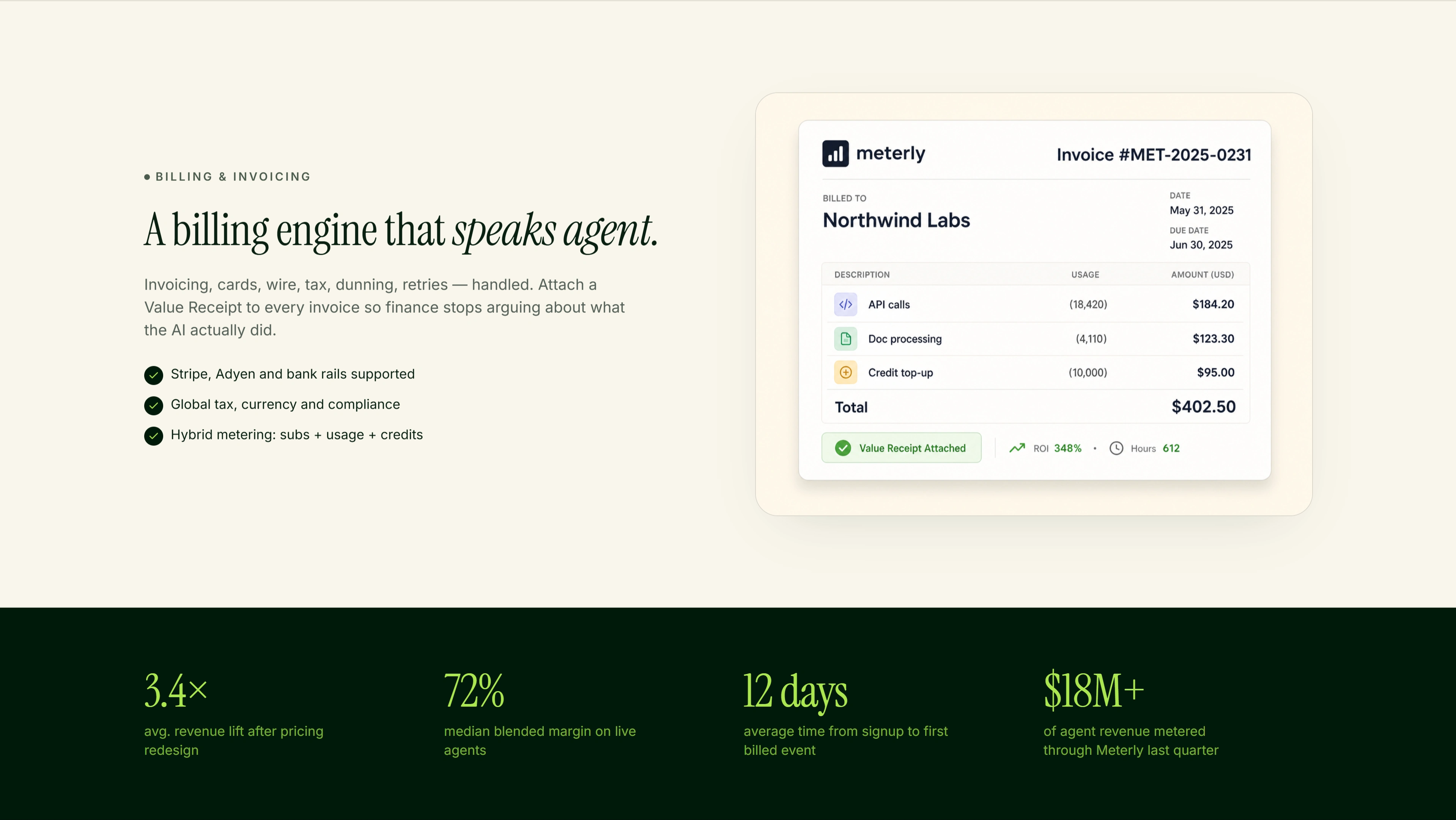
The billing section sits next to a fully rendered invoice - line items for API calls, doc processing, credit top-ups, a Value Receipt badge, and the resulting ROI stat - so a skeptical finance lead can see exactly what their customer would receive, not just a feature description.
Switch to dark mode for the numbers that need weight:
Revenue-lift stats (3.4x, 72% margin, $18M+ metered) sit on a near-black green background directly beneath the billing section - a deliberate contrast shift that signals "here's the serious proof" the same way a pull-quote in a magazine breaks up body copy.
Price with the same honesty the copy promises:
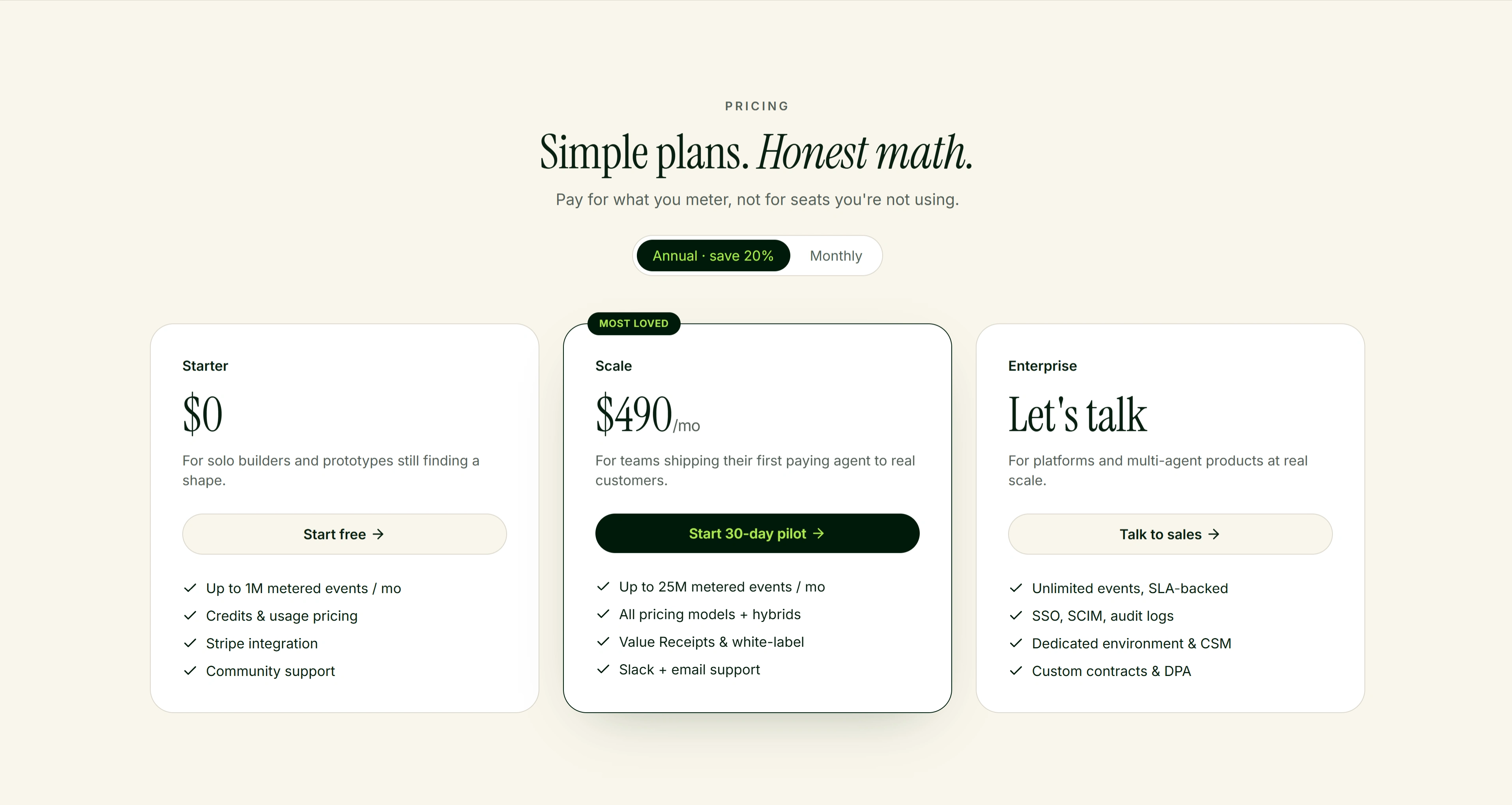
"Simple plans. Honest math." backs up its own claim with three legible tiers (Starter, Scale, Enterprise), an annual/monthly toggle defaulting to the discounted option, and a "Most Loved" tag on the plan most visitors should pick - pricing UI that doesn't hide behind a "contact us" wall until the enterprise tier.

Close security with the same visual weight as the hero:
Rather than a throwaway badge row, "Enterprise-ready. Independently audited." gets its own full dark section with SOC 2, GDPR, ISO 27001, and HIPAA marks rendered as etched shield icons - treating compliance as a design moment instead of an afterthought bolted to the footer.

Like this project
Posted Aug 28, 2026
A landing page for an AI agent billing and metering platform, designed and built in Webflow with a Claymation-illustrations.