Pulsekit: the retention loop behind mobile games

Amina Hussain


Project Overview
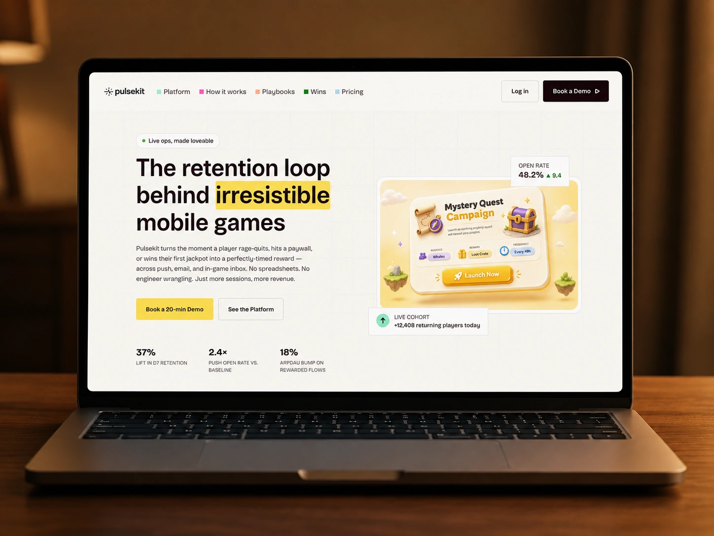
Pulsekit is a CRM concept built specifically for live-ops teams at mobile game studios - tracking sessions, in-game currencies, and churn risk instead of the deals-and-contacts model every generic CRM defaults to. The pitch is narrow on purpose: a tool that speaks fluent "whale," "D7 retention," and "reward drop" instead of forcing a game studio to translate their world into sales-tool language.
What I worked on:
Full landing page design and build
Color-coded navigation and section system
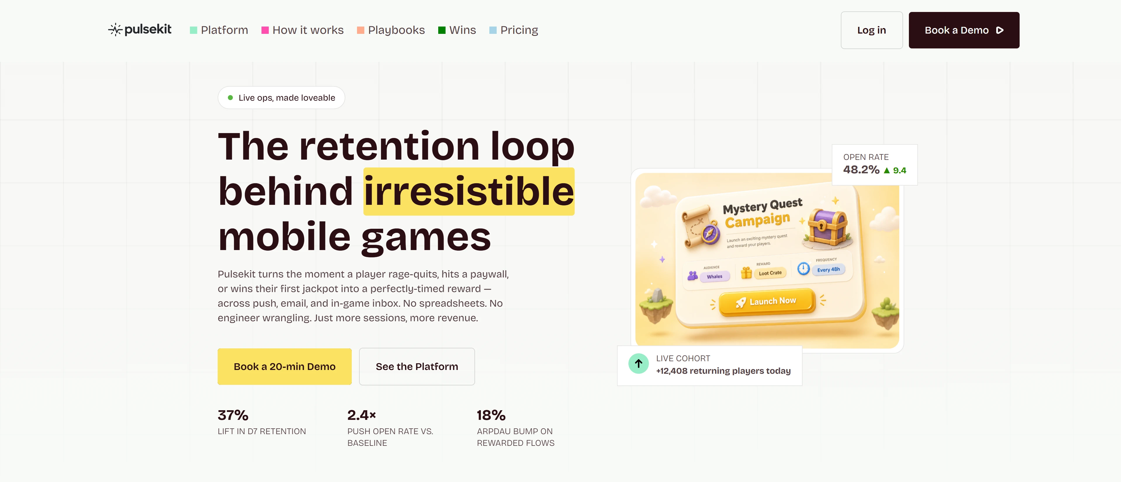
Illustrated hero mockup with live stat overlays
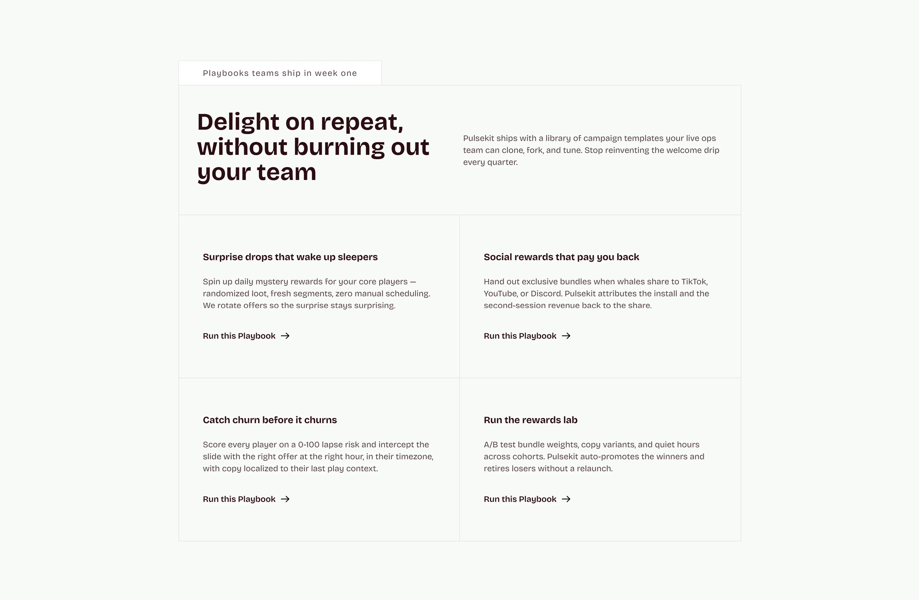
Playbooks template library section
Usage-based pricing table
Responsive layout across breakpoints
The challenge:
Most retention/CRM tools are built around ecommerce or B2B sales funnels, then awkwardly retrofitted for other industries. That mismatch shows up immediately to a live-ops manager - generic segment names, currency fields that don't fit in-game economies, dashboards built around leads instead of players. The challenge was making Pulsekit feel purpose-built from the first scroll: real gaming vocabulary, real in-game reward mechanics, and metrics (ARPDAU, D7 lift, push open rate) that a live-ops team already tracks, not ones borrowed from sales.
The secondary challenge was pacing a page with a lot of product depth - rewards engine, triggers, segments, playbooks, pricing - without it reading as a dense feature dump.
The Approach
Color-code the page from the nav down:
Each nav item (Platform, How it works, Playbooks, Wins, Pricing) carries its own small colored square, and that same color language reappears as section tags throughout the page (Rewards Engine in yellow, Real-Time Triggers in green, Segments in blue). It gives visitors a visual map of the page before they've read a word, and makes a long scroll feel organized rather than endless.
Prove the product with a mockup, not a mission statement:
The hero pairs the headline with an illustrated "Mystery Quest Campaign" card mid-launch, plus two floating live-stat overlays (open rate, live cohort count). It's a small piece of interactive-feeling UI rather than a static screenshot, which sells the product's personality - playful, game-flavored - before any copy explains it.
Give every capability its own concrete artifact:
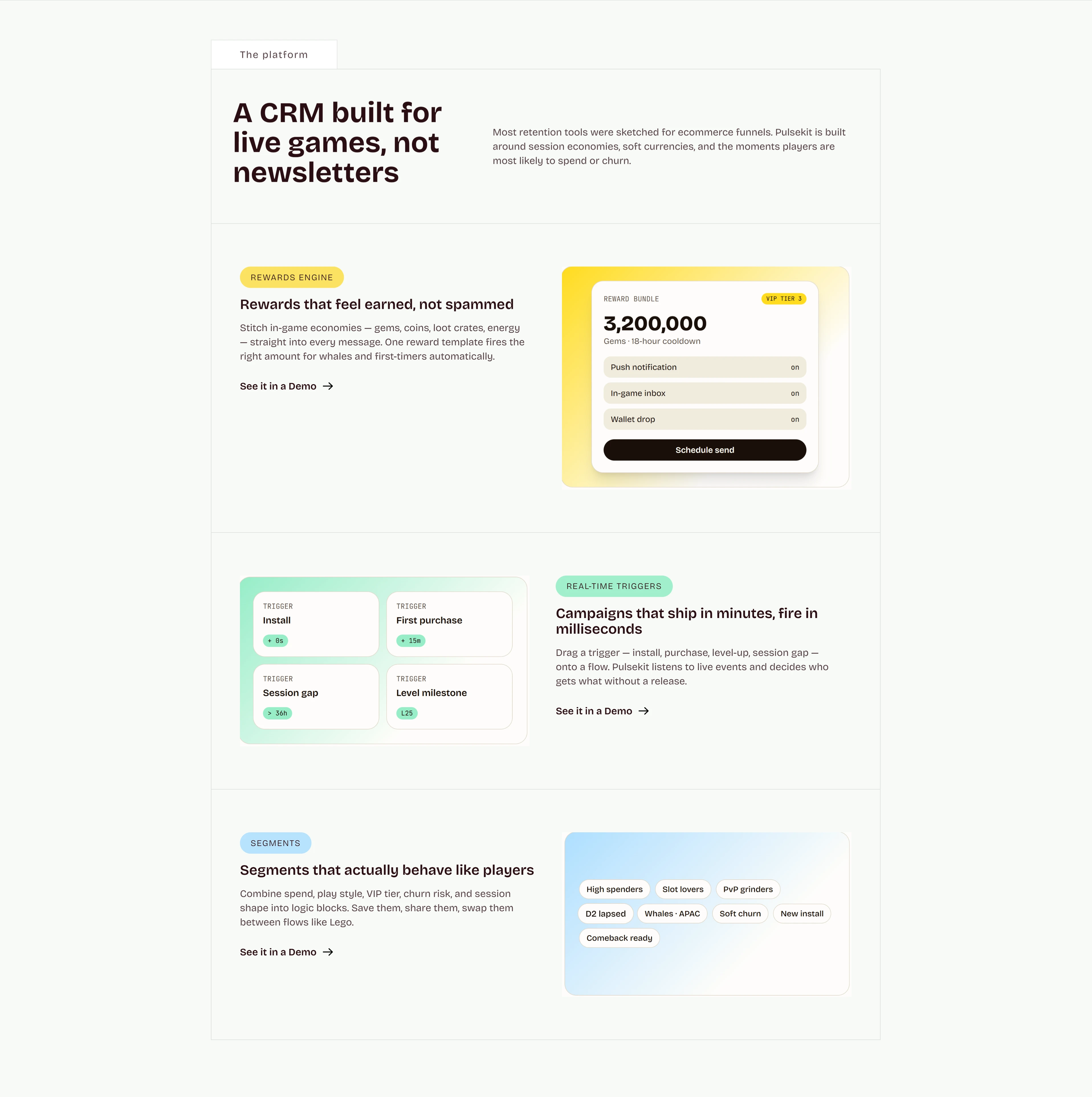
Rewards Engine, Real-Time Triggers, and Segments each pair a plain-English pitch with an actual mini-interface: a reward bundle card showing "3,200,000 Gems · 18-hour cooldown," a grid of real trigger types (Install, First purchase, Session gap, Level milestone), and a tag cloud of segment names like "Whales · APAC" and "Comeback ready." Nothing here is illustrated abstractly - every claim has a visible, specific example sitting next to it.
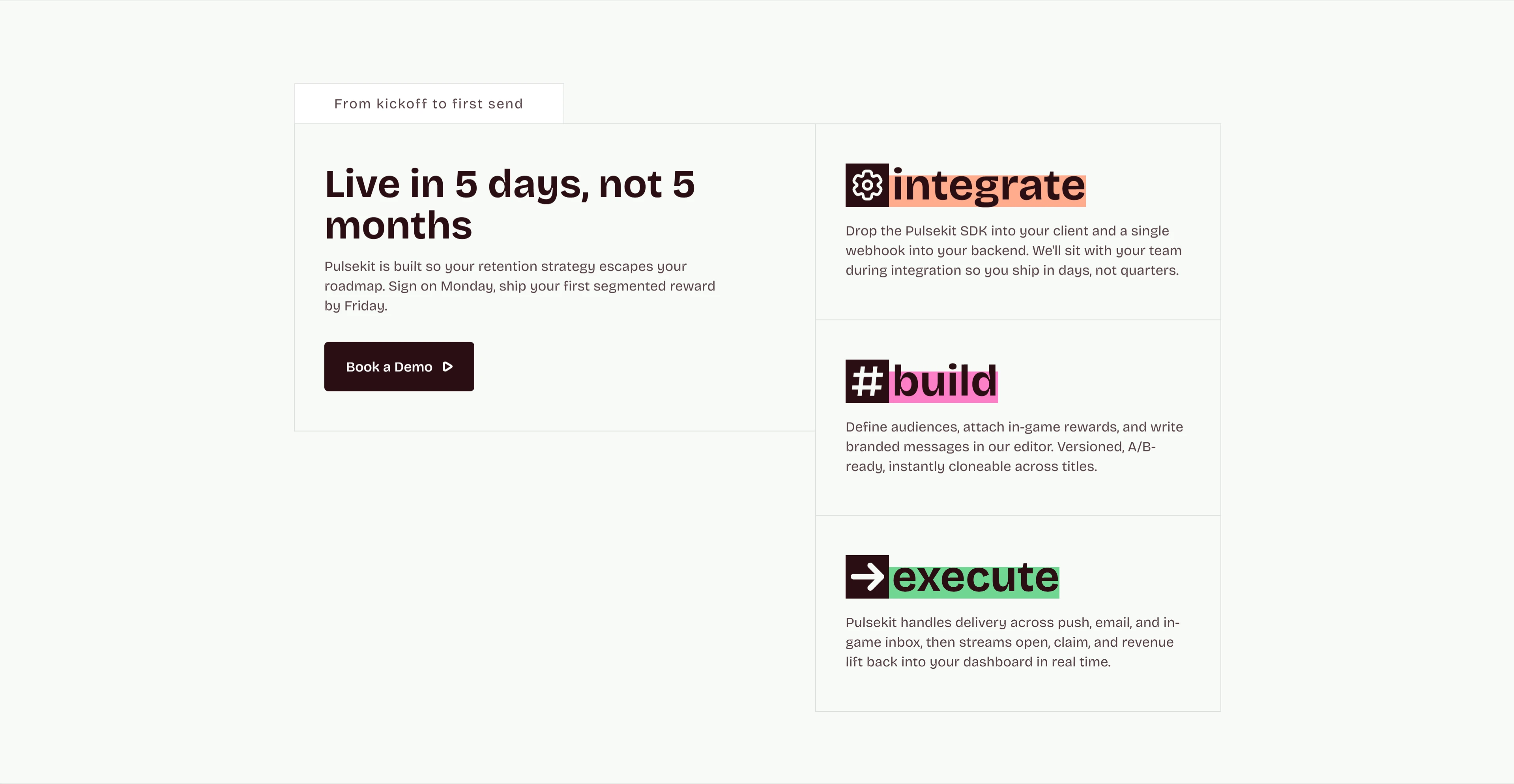
Turn onboarding speed into its own section: "Live in 5 days, not 5 months" is backed by a three-step integrate → build → execute breakdown, each step highlighted with its own accent color. Speed-to-value is a common SaaS claim, but breaking it into three named, concrete steps makes "5 days" feel like a real process instead of a marketing number.
Let studio-specific proof do the selling:
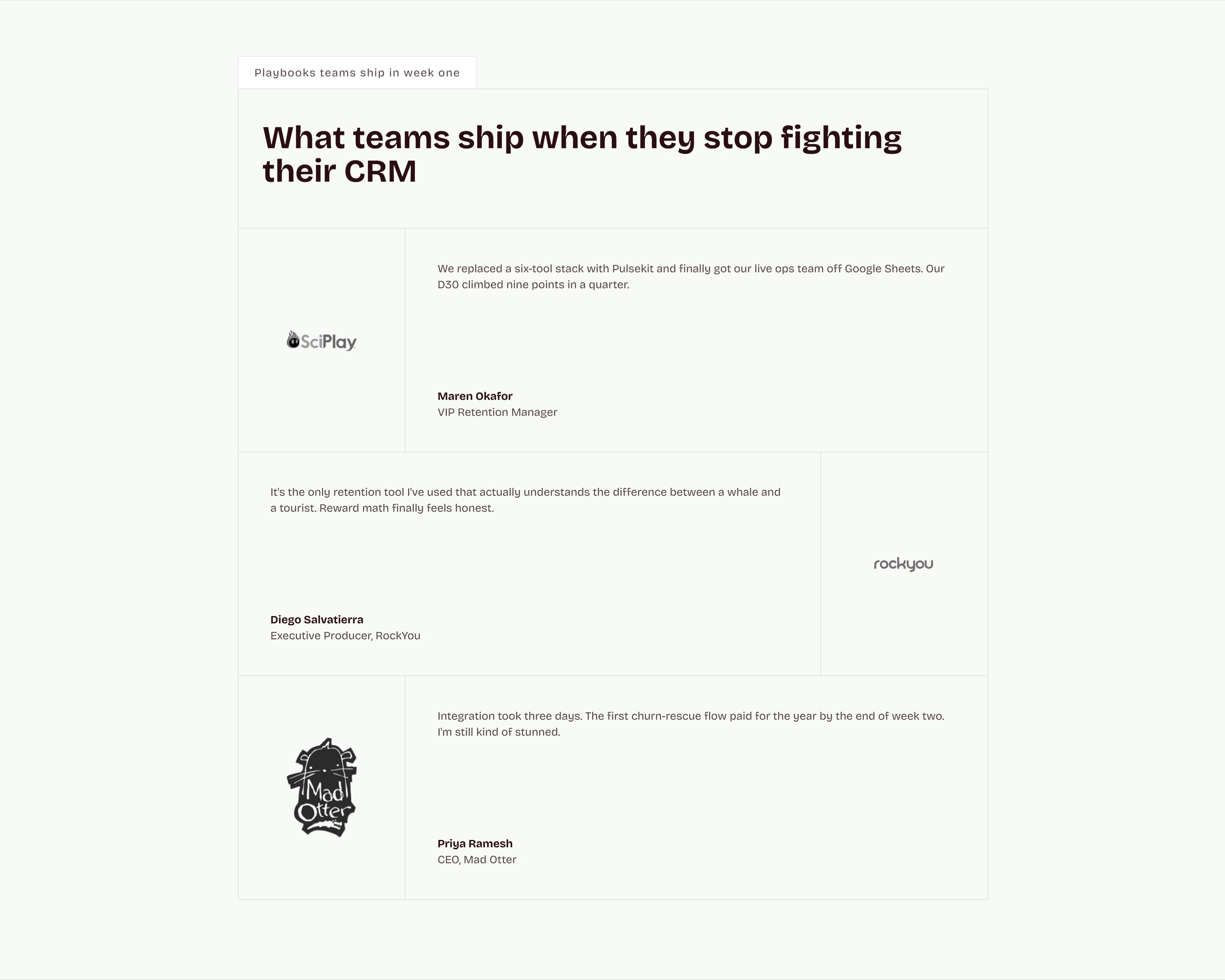
Testimonials come from named studios (SciPlay, RockYou, Mad Otter) with specific, checkable claims - "D30 climbed nine points in a quarter," "integration took three days." Gaming-specific proof from gaming-specific companies reads as far more credible to this audience than generic enterprise logos would.
Price around the metric the audience already cares about:
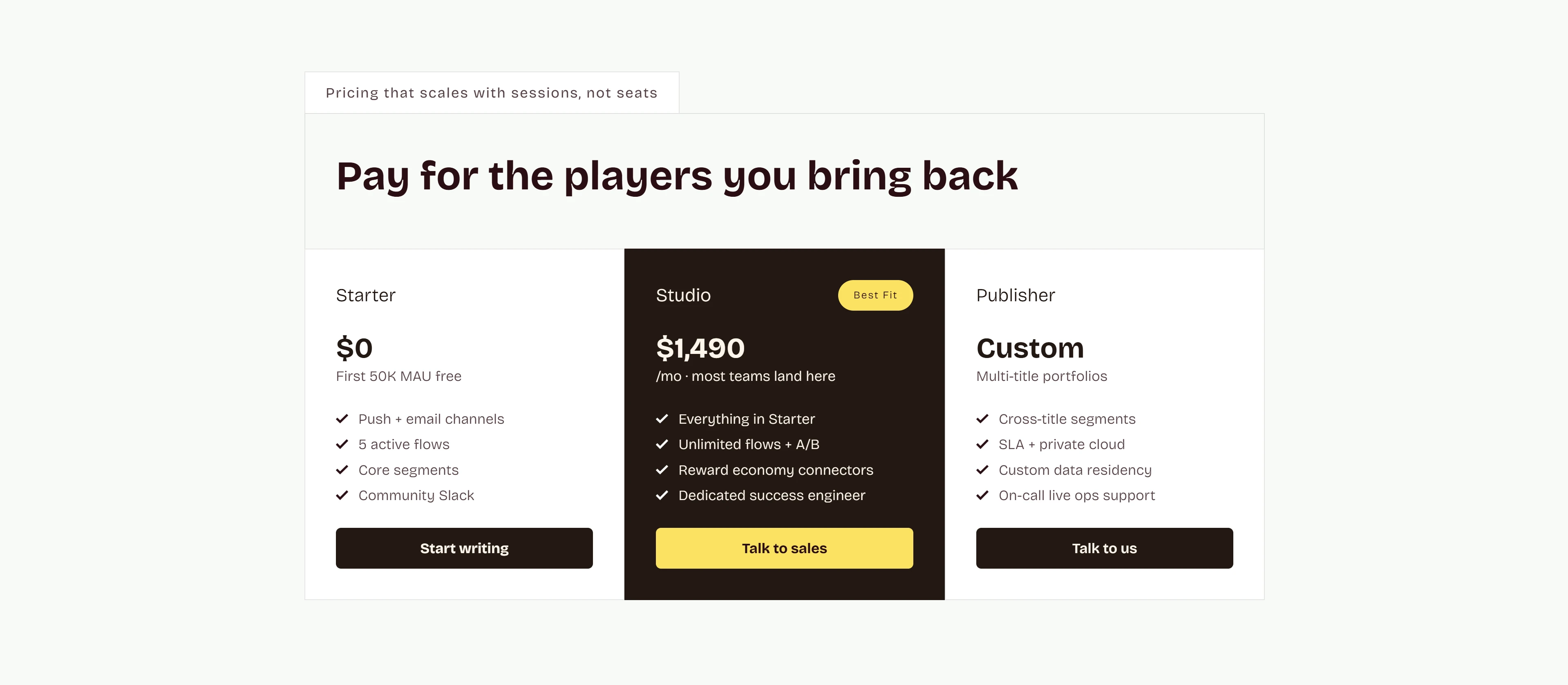
"Pay for the players you bring back" ties pricing to sessions/MAU instead of seats - a detail that matters to live-ops teams, who don't think in per-seat licensing. Three tiers (Starter, Studio, Publisher) scale from a free 50K MAU allowance up to custom multi-title deals, with the middle "Studio" tier marked "Best Fit" to guide most visitors toward the intended plan.
Like this project
Posted Aug 12, 2026
A Webflow landing page for a mobile-game CRM with color-coded sections, concrete product mockups, and live-ops usage pricing tailored to game teams.
Likes
3
Views
16