Switchboard Live Website Design
Carly Mack
"Grow your audience, no matter where they are."
The Problem
Upon my meeting with the CEO of Switchboard, we addressed the challenges that their users were experiencing with the landing page. After conducting user research, we learned that the presentation of their product was insufficient in converting visitors to subscribers. It was not clear enough what the product actually does, thus leading many users to go to their competitors.
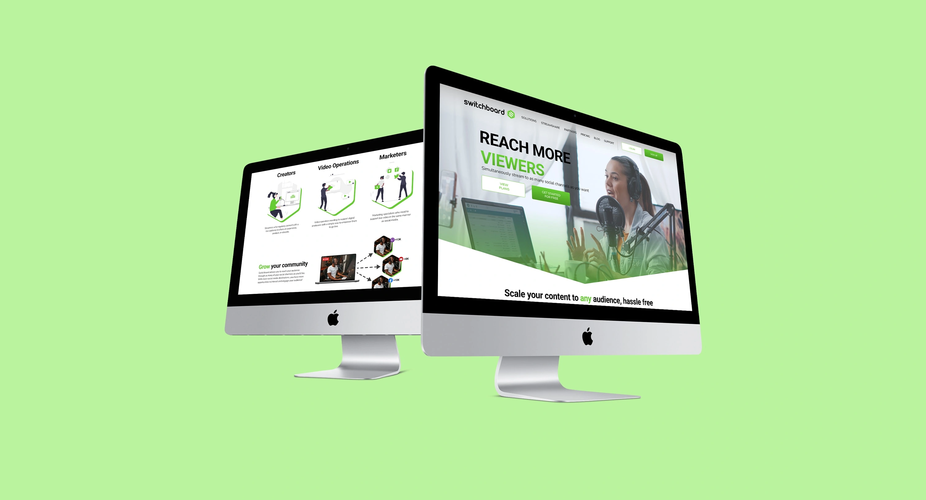
High Fidelity Prototypes
I emphasized the significance of the section order on the website in driving user conversion, as the current landing page was causing uncertainty among visitors. My focus was to promptly engage their target audience by clarifying who the product was intended for.
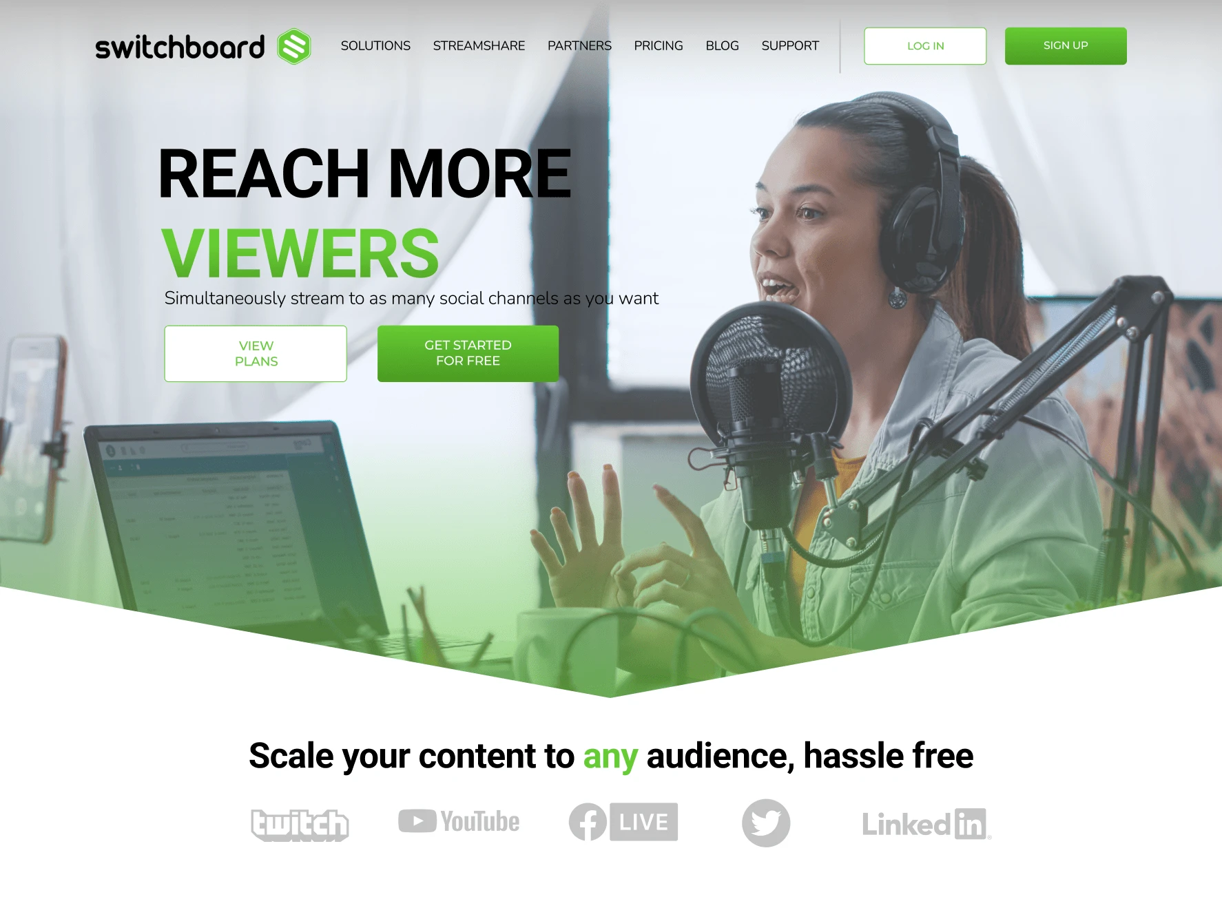
Opening view of the landing page
Solution
I emphasized the significance of the section order on the website in driving user conversion, as the current landing page was causing uncertainty among visitors. My focus was to promptly engage their target audience by clarifying who the product was intended for.
Once we captured the attention of Switchboard's audience, I highlighted the product's value proposition and demonstrated its superiority over competitors. To achieve this, I designed a straightforward graphic that illustrated the concept of multi-streaming and its relevance to businesses.
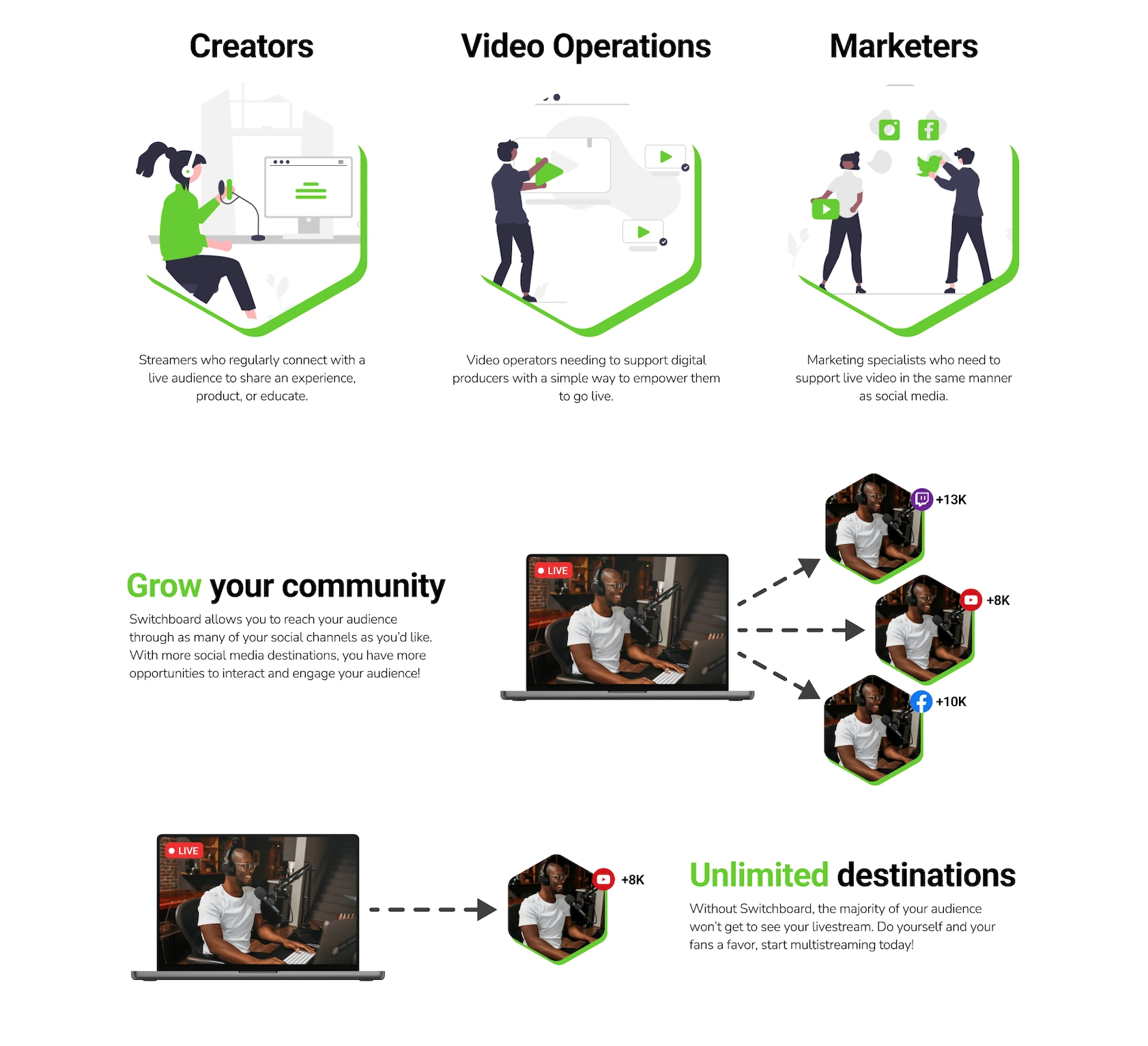
Product infographics
Call to Action
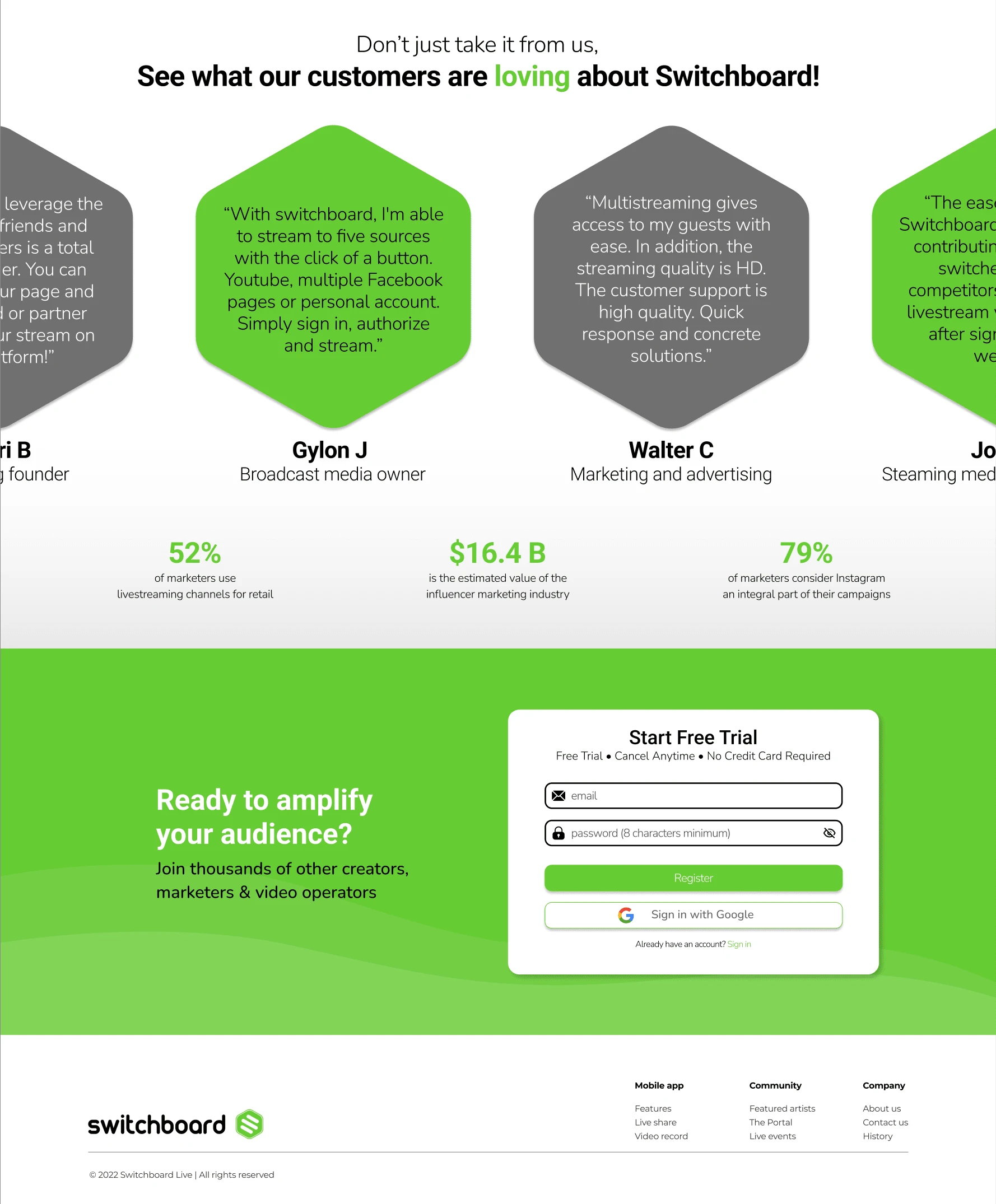
Finally, I incorporated positive feedback from authentic customers as testimonials to enhance Switchboard's credibility. In the prototype, I incorporated a slow-scrolling feature to show the multitude of great reviews.
I structured the website to enable users to sign up with ease, both at the top and bottom of the page, minimizing the need for excessive scrolling.
Like this project
Posted Nov 16, 2022
A case study on my UX design and research with Switchboard Live
Likes
0
Views
163