Launching Lemmata Out Of Stealth
Date: March – May 2024
Timeframe: 3 months
Price: $12,000
Client: Lemmata
A few months ago, I had a stealth startup called Lemmata reach out to me asking to completely refresh their MVP for their private beta. They were building a BI tool for enterprises, allowing companies to define their roadmap and initiatives as a hierarchy of nodes and translate these into complex data visualizations.
When they came to me, their web app was a simple prototype built off a Figma wireframe:
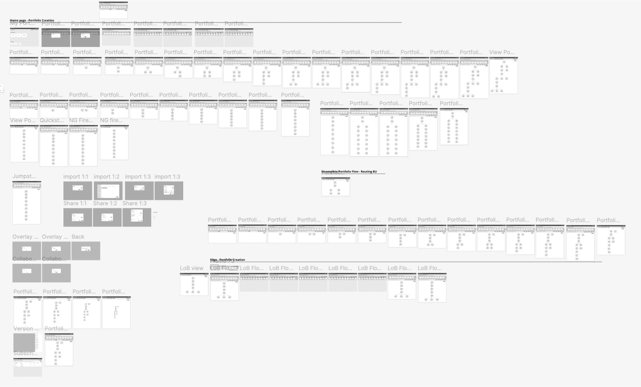
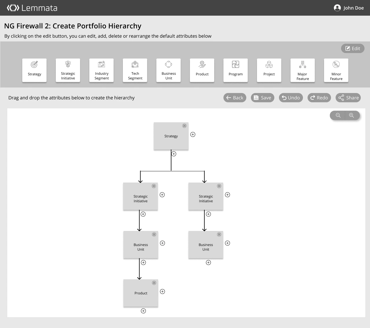
Naturally, there was a lot of work to be done.
My goal was to create an enterprise-ready SaaS application off the skeleton they provided to me.
The Brand
While the team had only approached me to tackle their application UI, I quickly found that their current logo clashed with the aesthetic I was planning to go for.
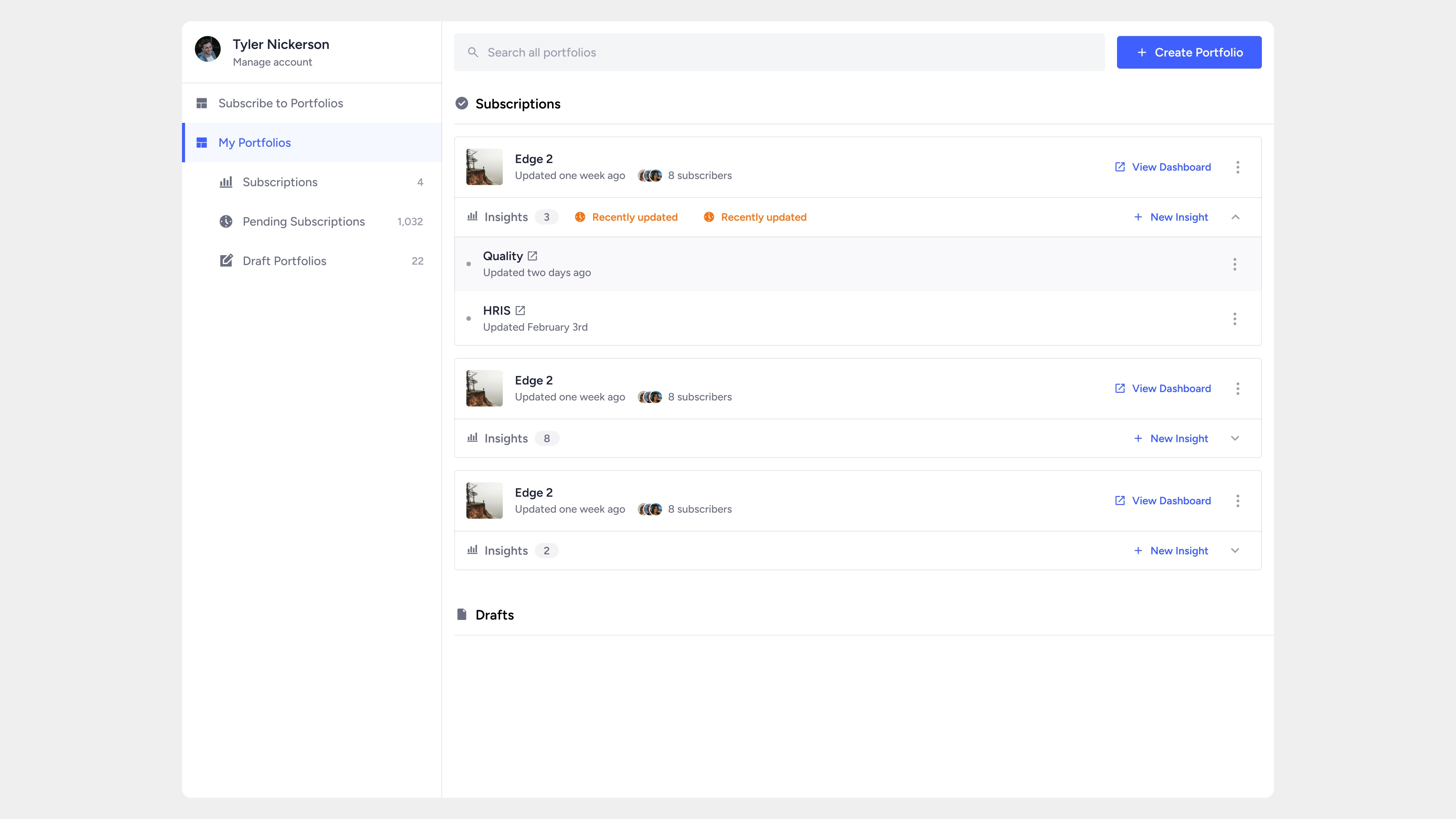
In fact, my earliest explorations omitted the logo entirely while still preserving the flat aesthetic set forth by it:
Eventually, the logo found its way into the UI:
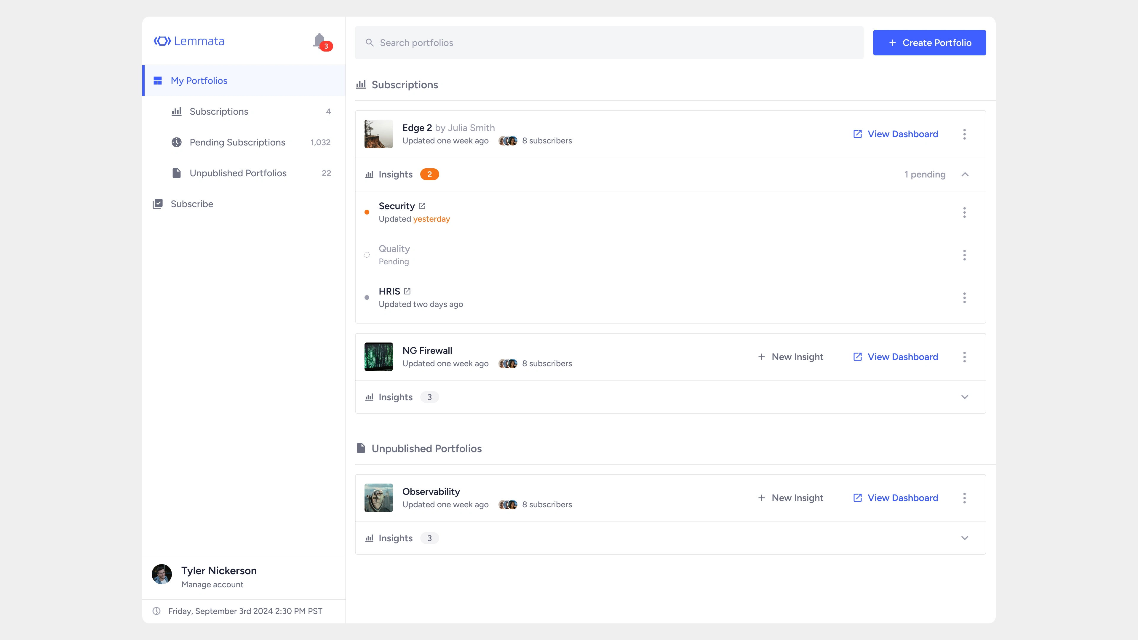
We felt the interface still needed to appear warmer, however, so I began to experiment with additional spacing and increasing the rounding of corners.
In my spare time, I threw together some quick iterations on what a revised logo might look like that could gel better with the new UI.
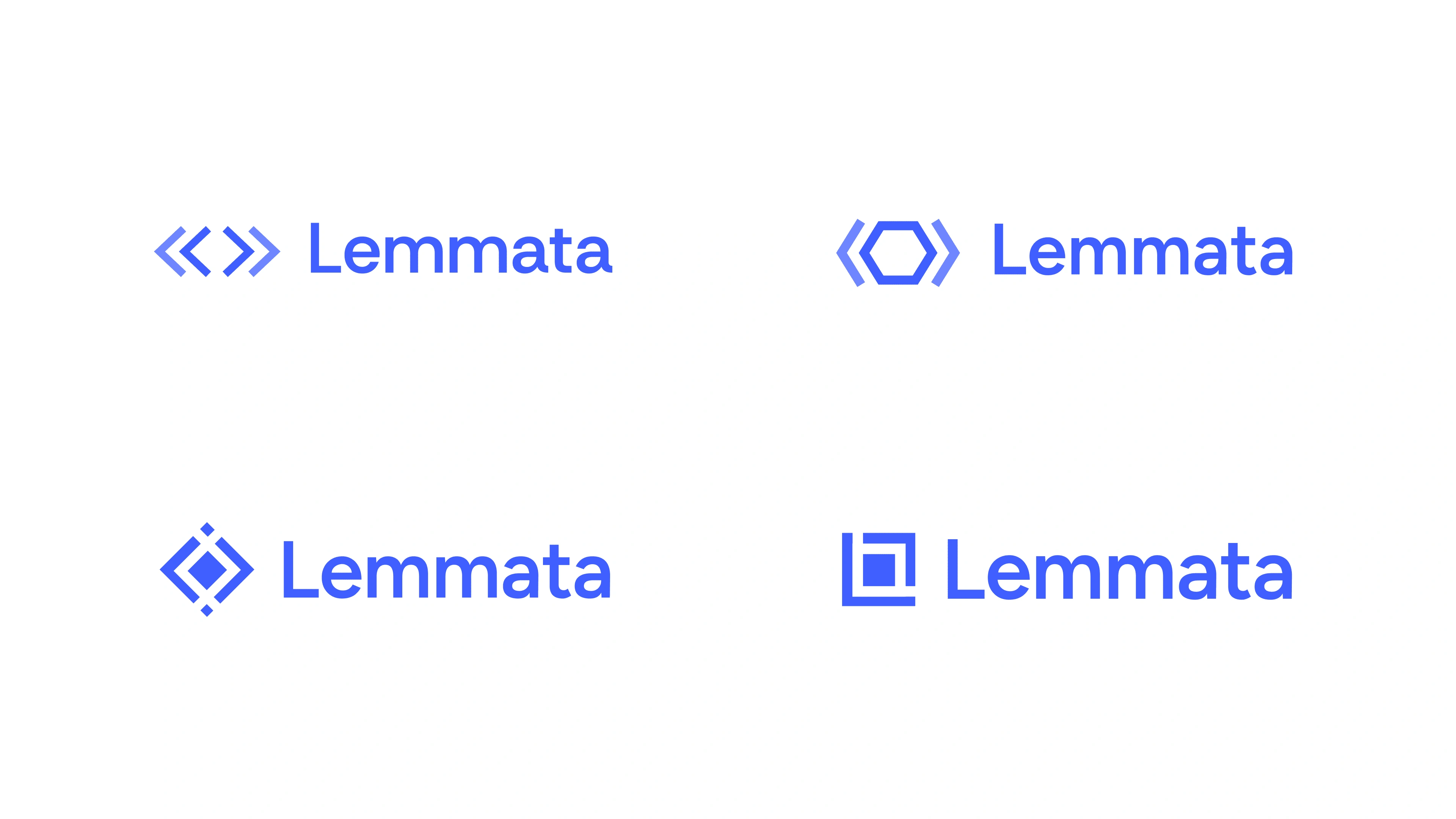
My early explorations aimed to stay true to the original logo
Eventually, I landed on a wordmark that resonated:
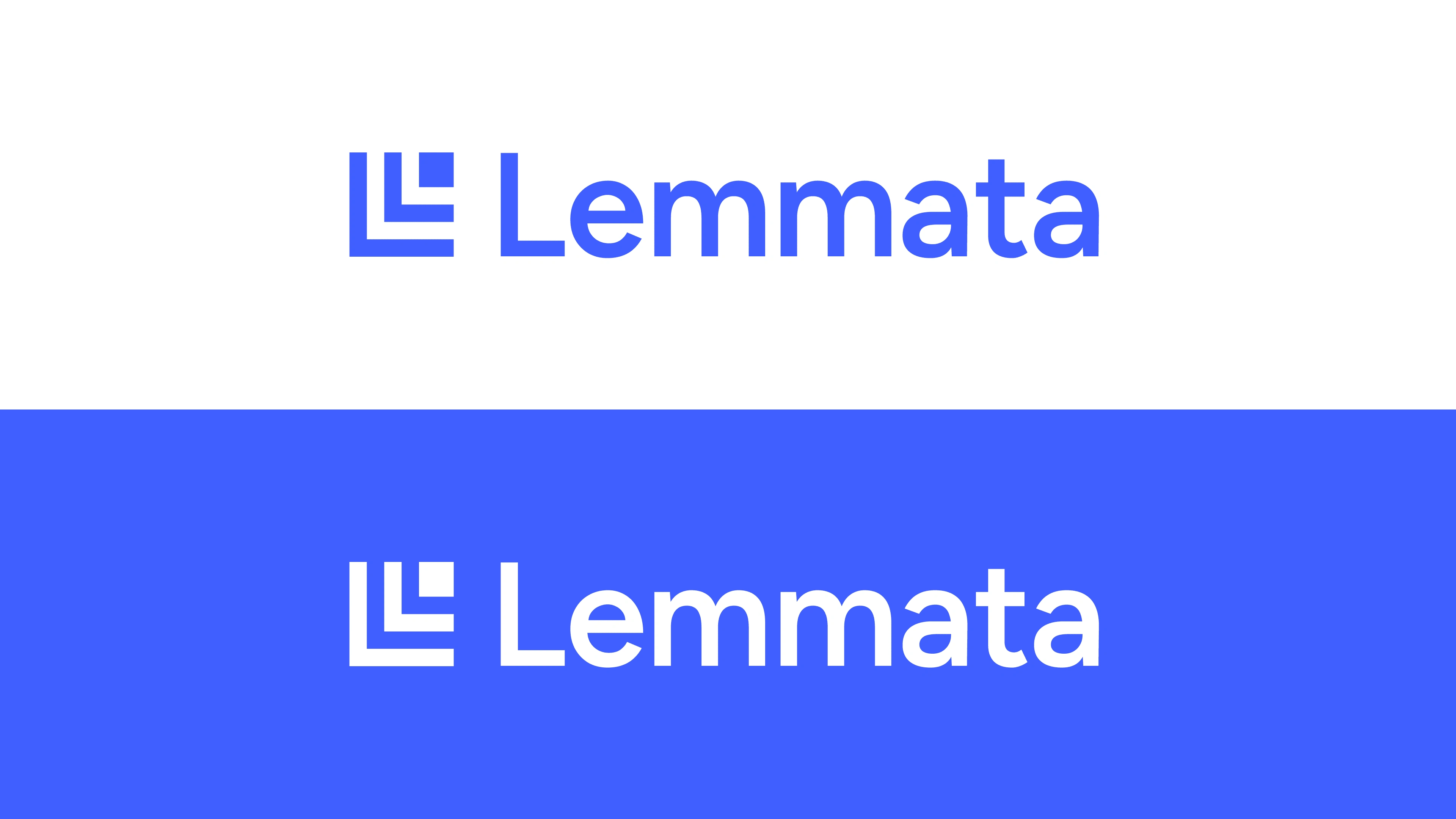
The stacked blocks convey a sense of hierarchy, while simultaneously displaying an "L" for Lemmata.
The team loved it – so we ran with it.
The Product
Product iterations were very time-consuming, as the direction seemed to change often as the early-stage founders spoke with more and more users.
While working with Lemmata, I designed their main dashboard, their entire hierarchy editing experience, their login page, as well as sharing and commenting functionality.
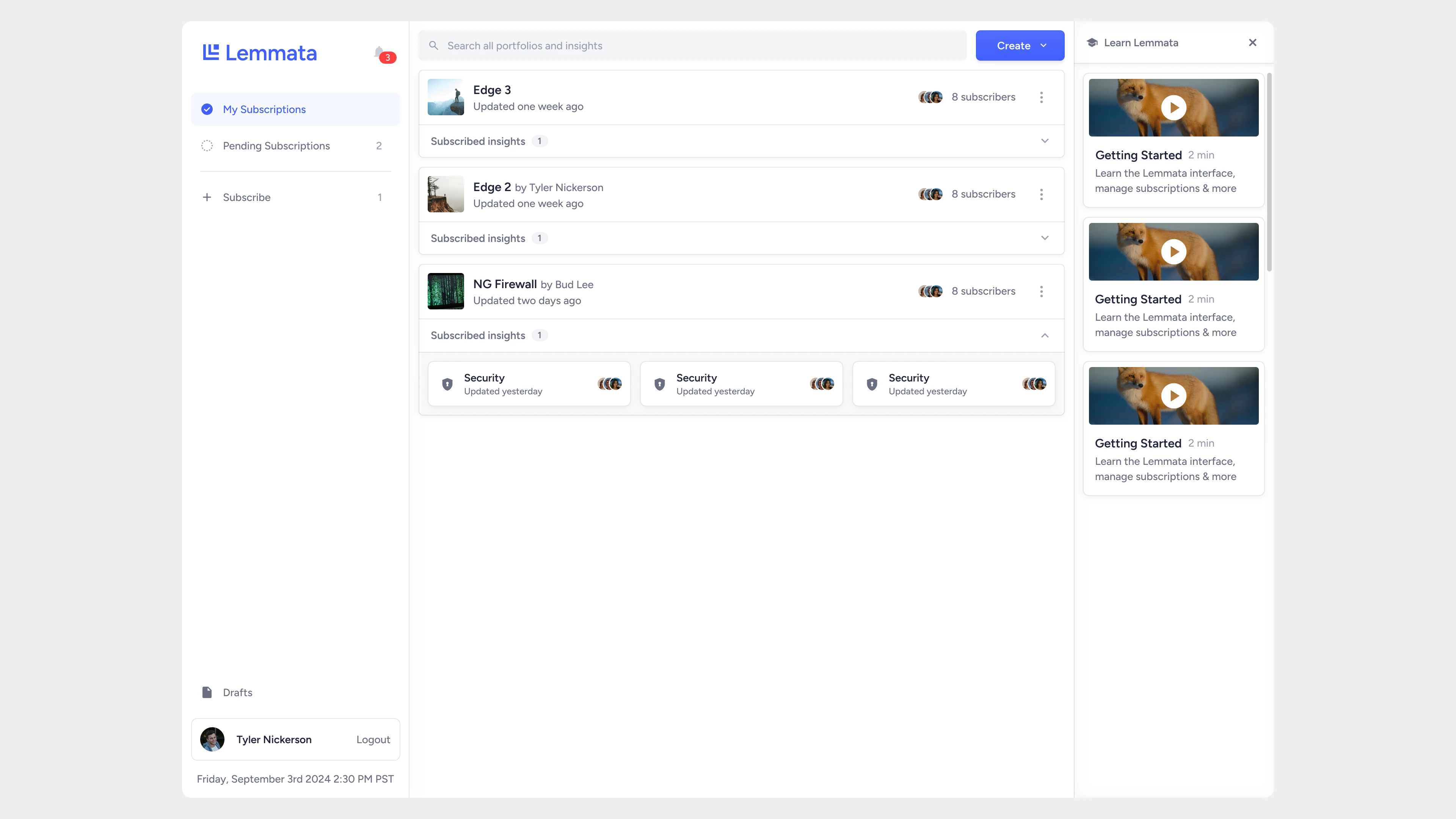
v1.1 dashboard
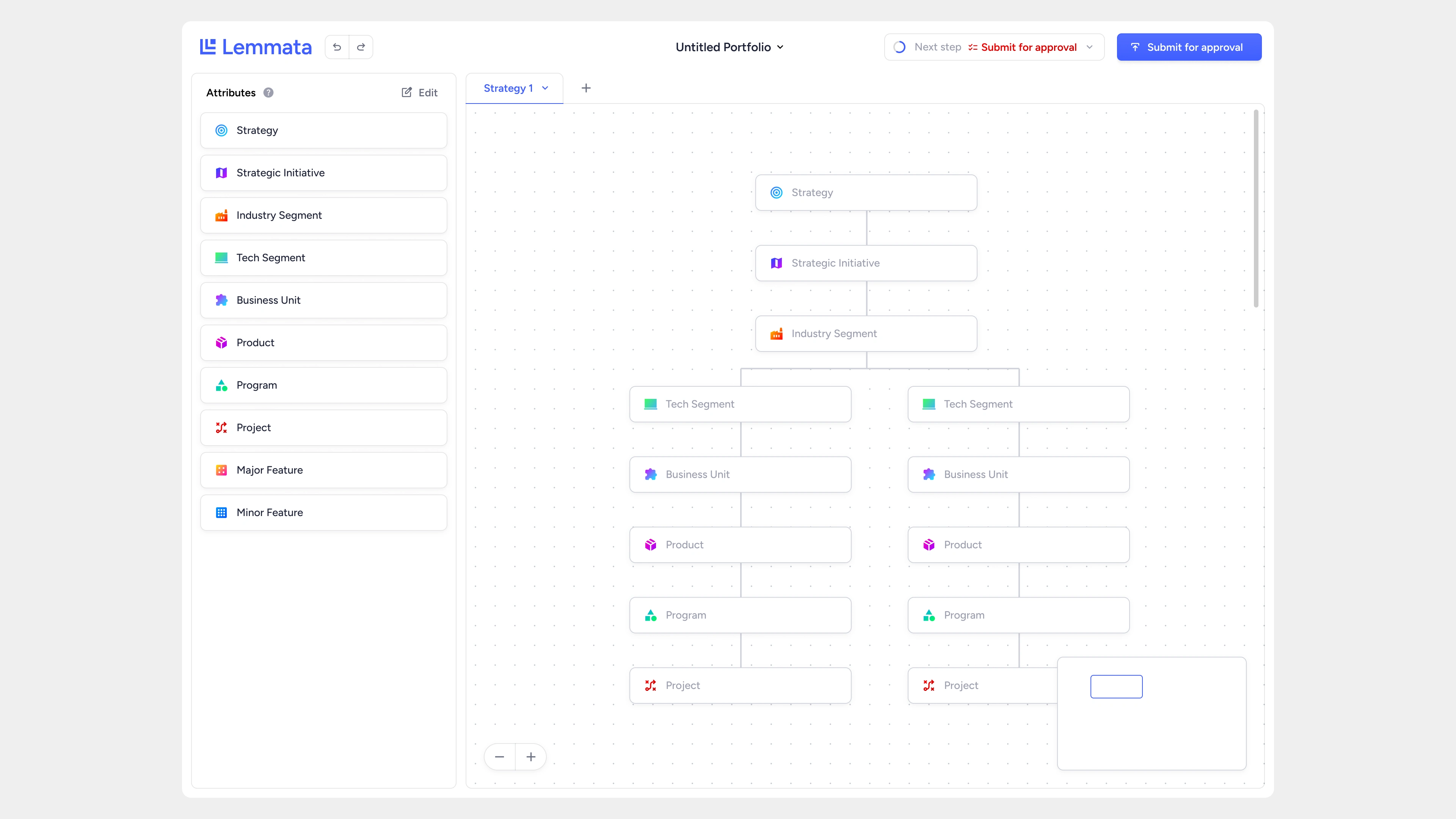
The workflow (hierarchy) editor
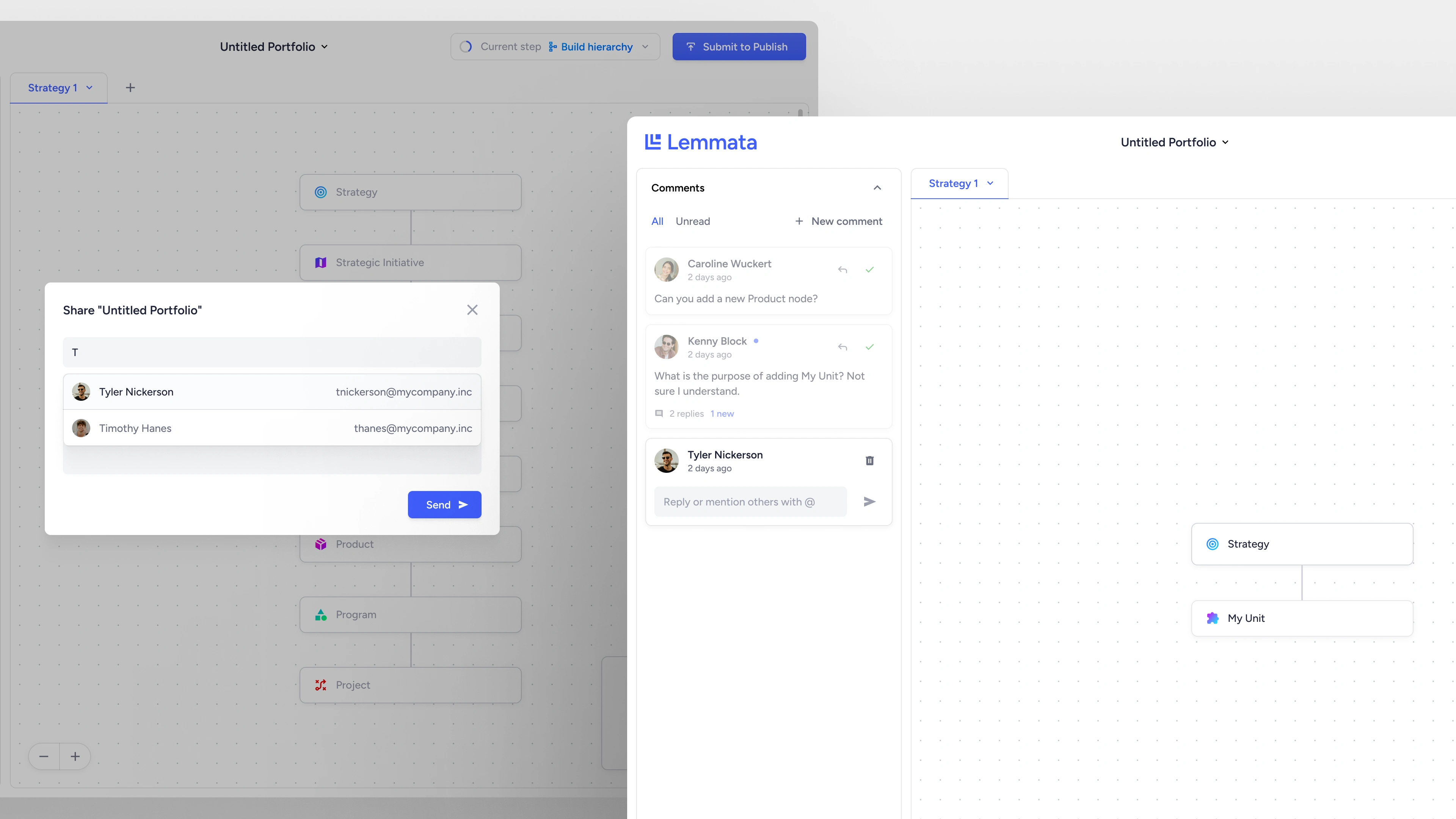
Share and comment functionality
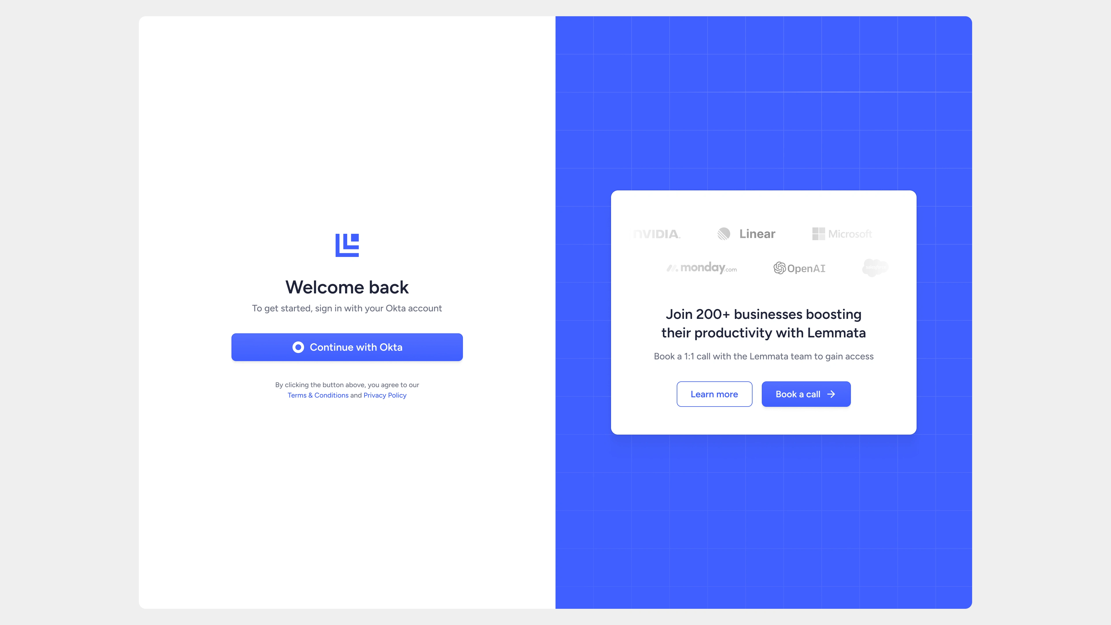
Okta login
The Website
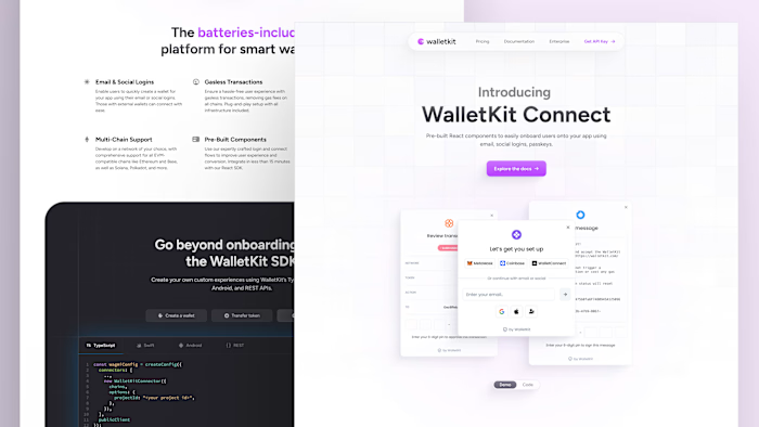
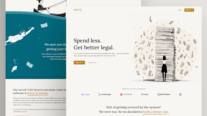
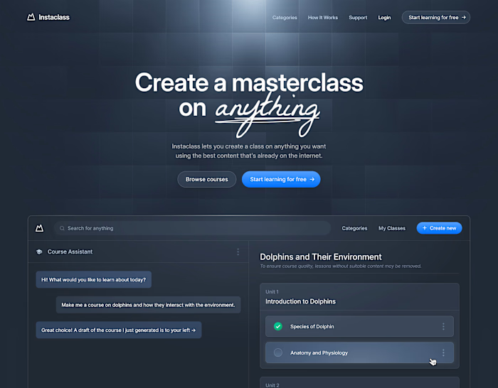
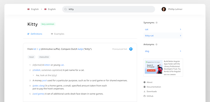
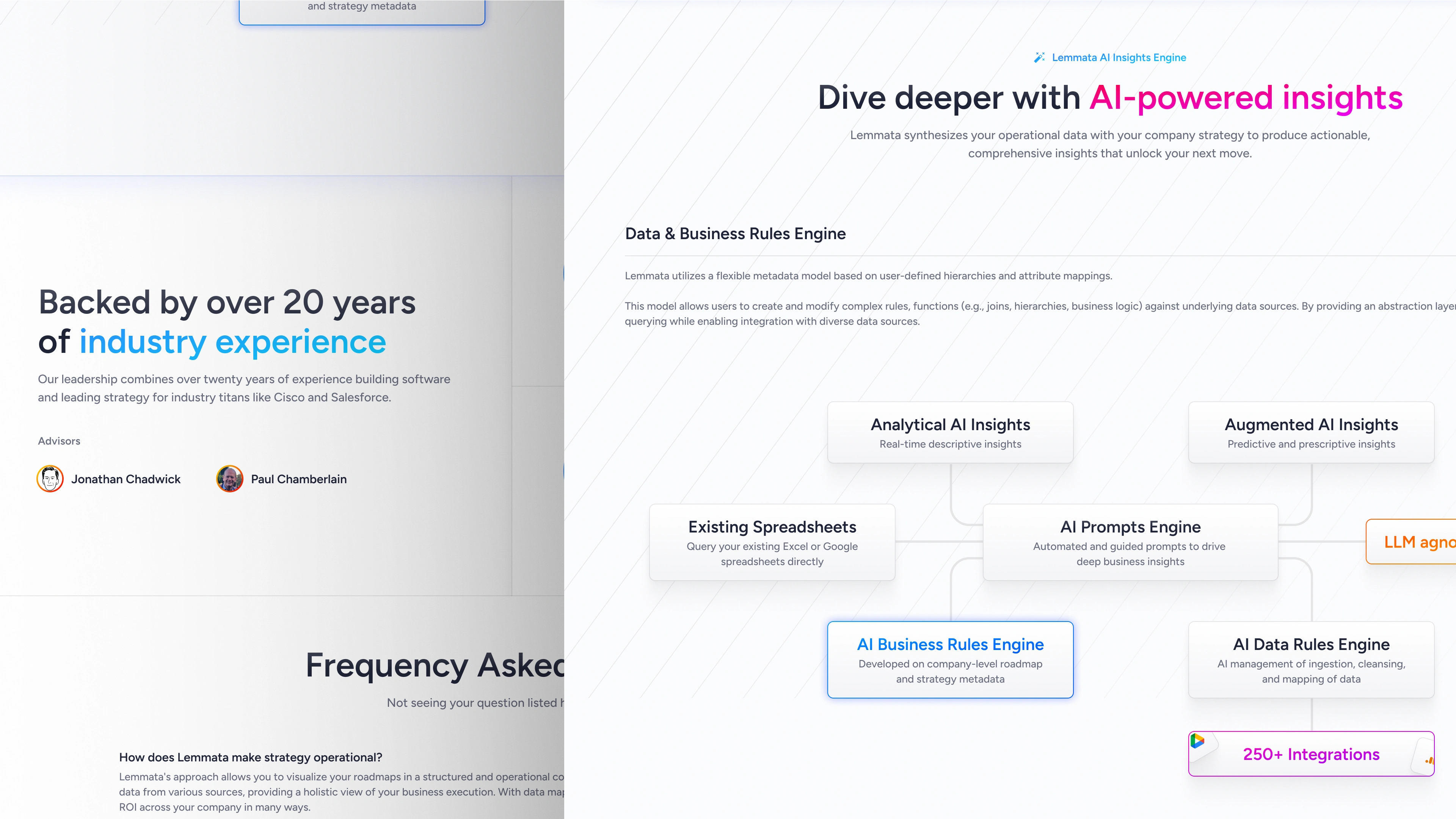
As the MVP underwent development, the Lemmata team requested a new website that could showcase their product. Through collaborating with the CEO, we devised a robust landing page highlighting their most important features.
I began by offering a handful of different directions in which we could take the site.
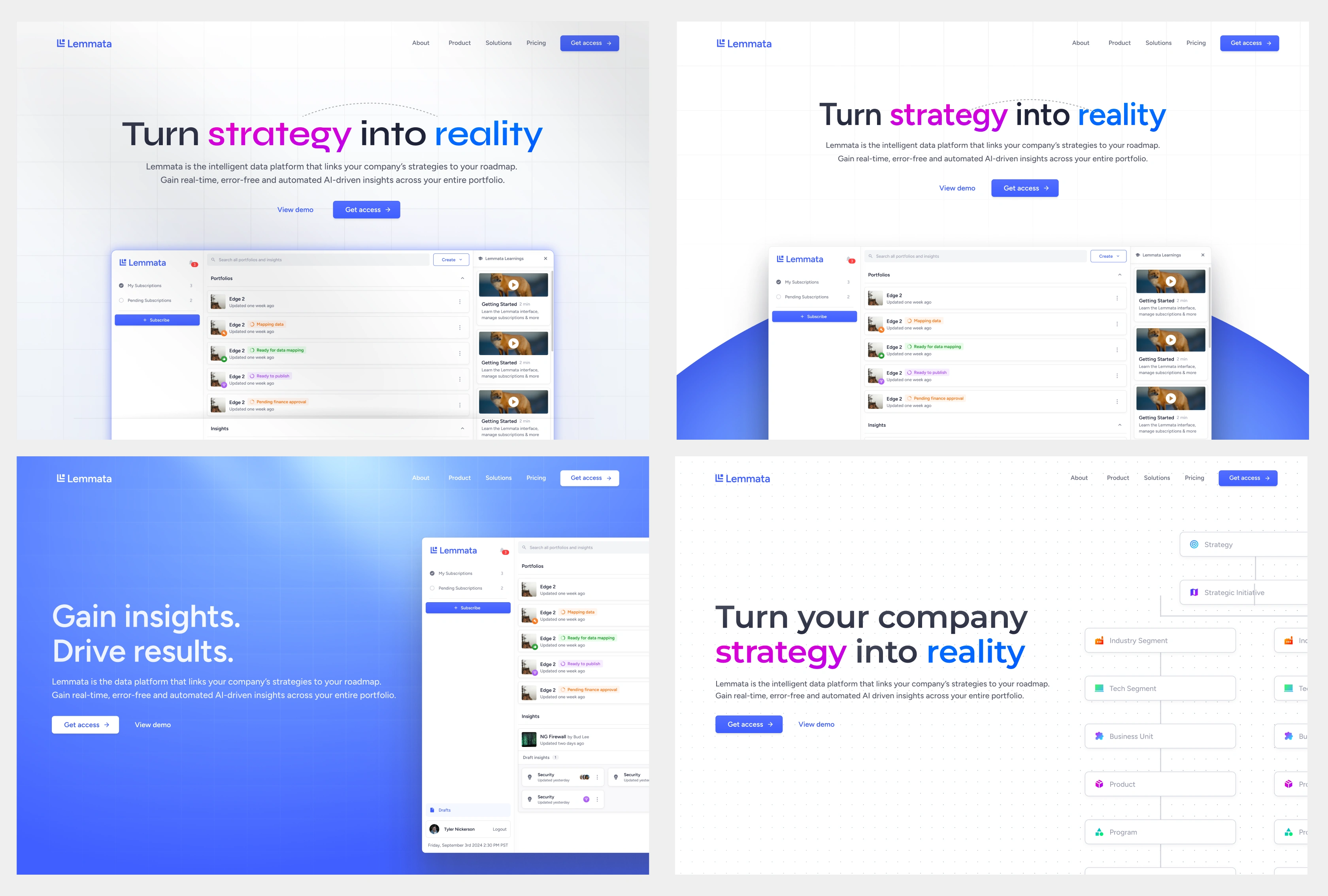
After collaborating extensively with the CEO, we settled on a direction and began work on the site.
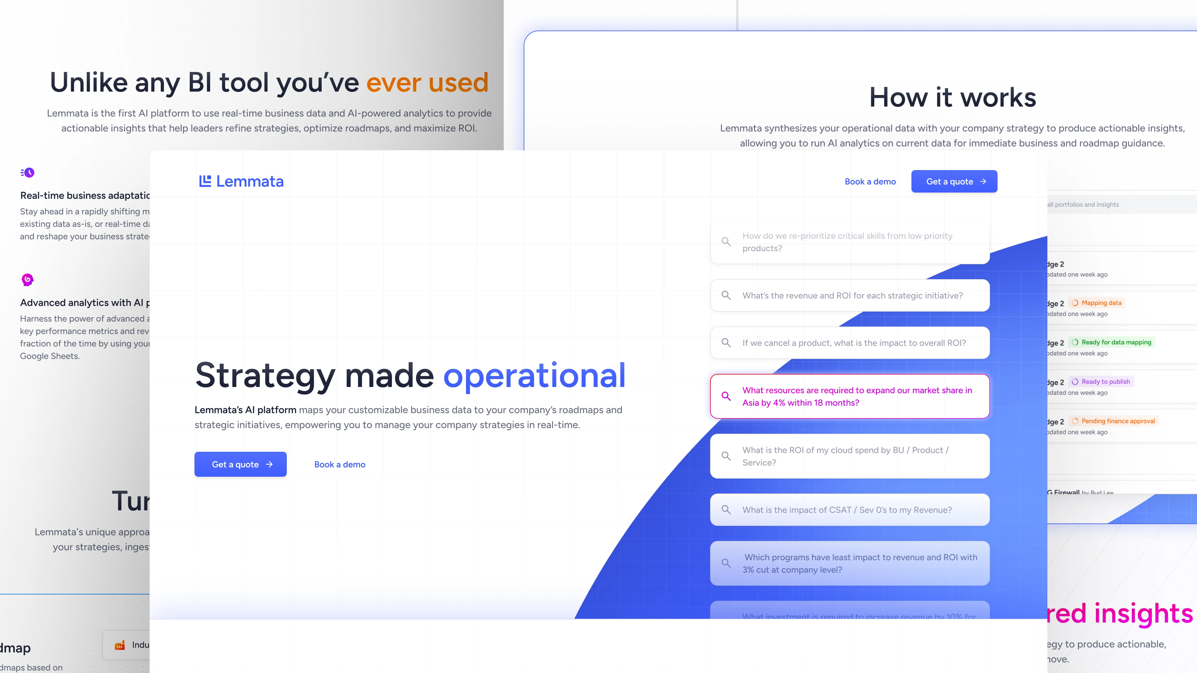
The site took 2 weeks to develop in Astro and Tailwind CSS.

Like this project
Posted Jul 23, 2024
Designing the brand, product, and website for a stealth B2B startup.
Likes
1
Views
12

