
Client said: "It looks cheap."
It wasn't cheap. It was just off-balance.
Here's what I changed:
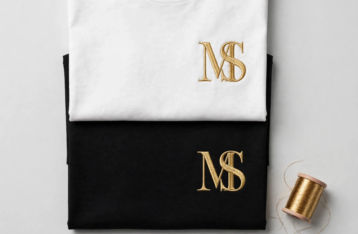
Tightened the spacing - M and S were floating apart
Matched the weight - S was thinner than M at small size
Fixed the gold - #D4AF37 on black, #B8963E on white
Same letters. Same idea. Now it looks expensive.
That's the difference between a logo and a brand.
0 likes · 0 views · Nov 6, 2026
Client said: "It looks cheap." It wasn't cheap. It was just off-balance. Here's what I changed: Tightened the spacing - M and S were floating apart Matched t...


