
Most clients think they need a new logo. What they actually need is balance.
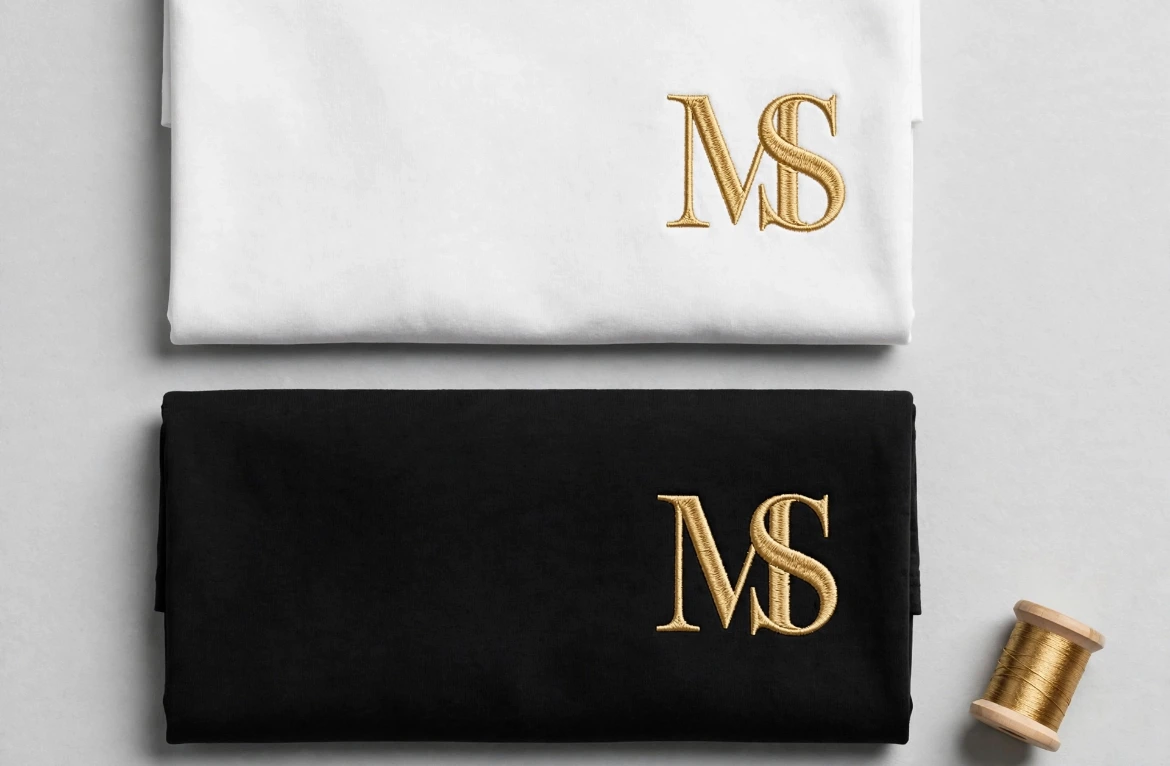
3 quick checks I use on every MS monogram:
Spacing - letters should breathe, not float apart
Weight - M and S must look like same thickness at small size
Gold - #D4AF37 on black, #B8963E on white. Wrong gold = cheap look
Fix those 3, and the same logo suddenly looks expensive.
0 likes · 0 views · Nov 5, 2026
Most clients think they need a new logo. What they actually need is balance. 3 quick checks I use on every MS monogram: Spacing - letters should breathe, not...


