


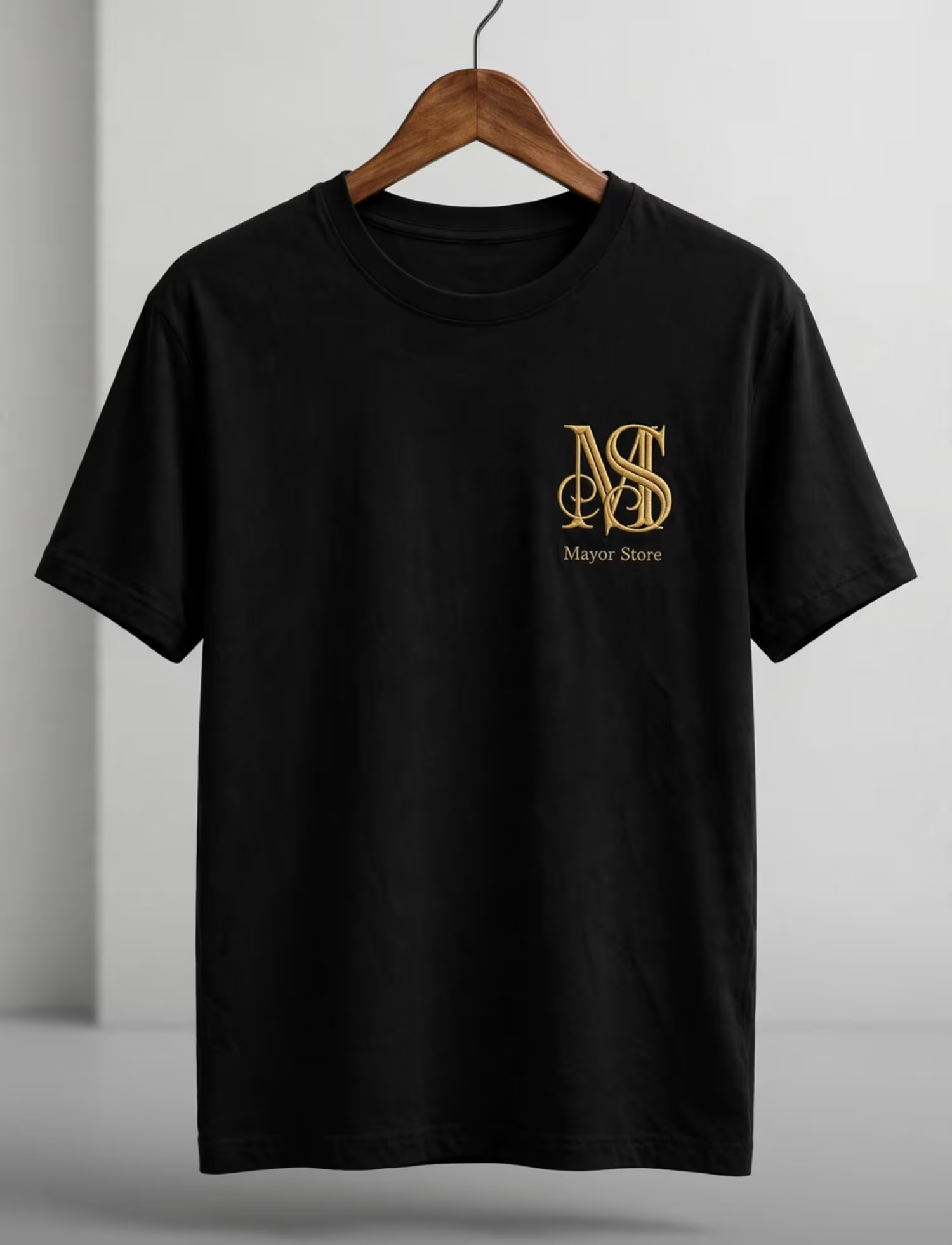

My MS monogram passes because the M and S lock together. You can't unsee the shape, even in black and white.
Try it on yours today. What did people remember?
Drop your initials 👇 I'll do the 3-second test on yours.
1
25
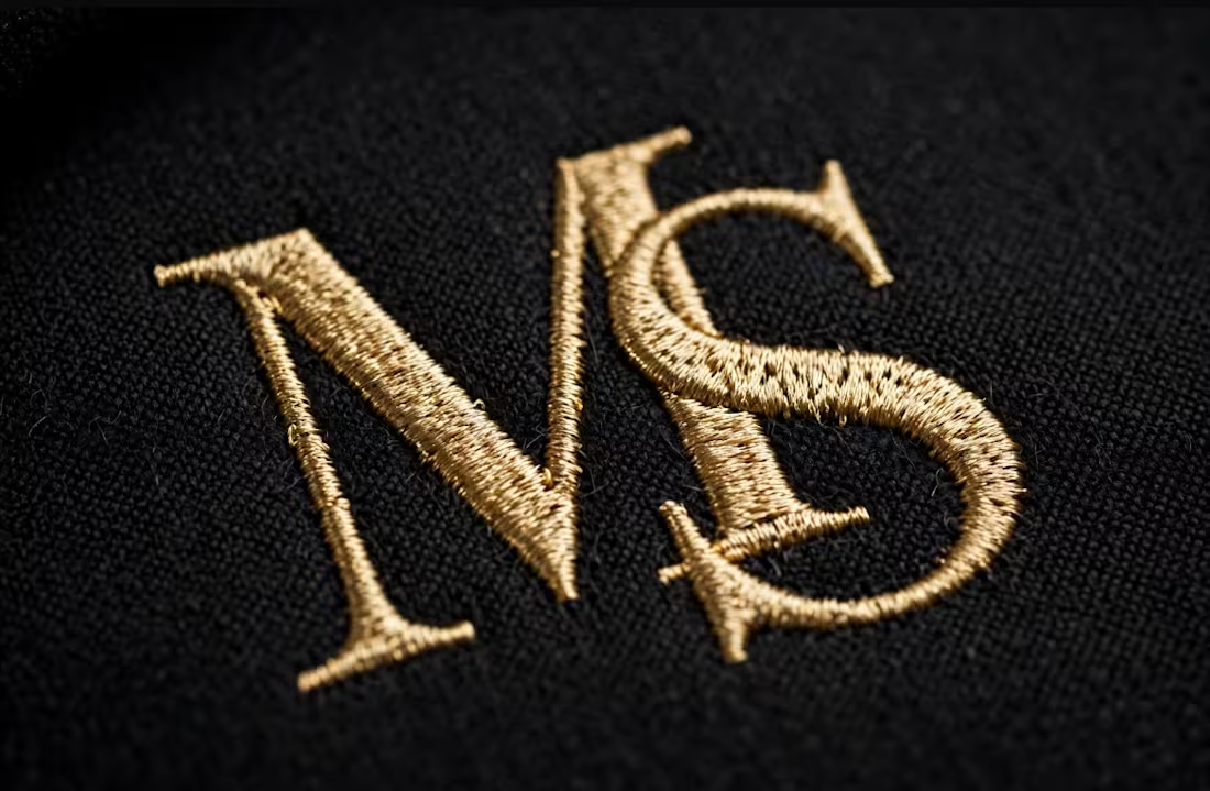
What does this logo make you feel in 3 seconds?"
If they say "expensive, clean, bold" — we nailed it.
If they say "I don't know" — the logo failed, no matter how pretty it is.
A logo is not art. It's a feeling in 3 seconds.
0
4
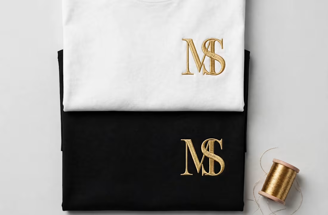
Client said: "It looks cheap."
It wasn't cheap. It was just off-balance.
Here's what I changed:
Tightened the spacing - M and S were floating apart
Matched the weight - S was thinner than M at small size
Fixed the gold - #D4AF37 on black, #B8963E on white
Same letters. Same idea. Now it looks expensive.
That's the difference between a logo and a brand.
2
1
22
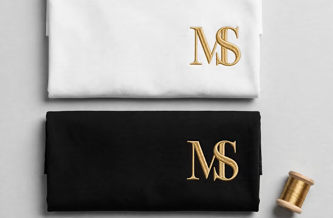
Most clients think they need a new logo. What they actually need is balance.
3 quick checks I use on every MS monogram:
Spacing - letters should breathe, not float apart
Weight - M and S must look like same thickness at small size
Gold - #D4AF37 on black, #B8963E on white. Wrong gold = cheap look
Fix those 3, and the same logo suddenly looks expensive.
0
13