Built with Jitter
Talli Website Redesign and Branding Refresh

Nina Brylevych



The context
Talli is a payment disbursement platform built for teams that handle other people's money — class action administrators, bankruptcy trustees, shareholder services firms. They run payouts to thousands of claimants at a time, where every transaction carries a compliance requirement and a legal obligation.
The product was already solid. But the website didn't reflect that — visually or in how it communicated what Talli actually does.
The goal
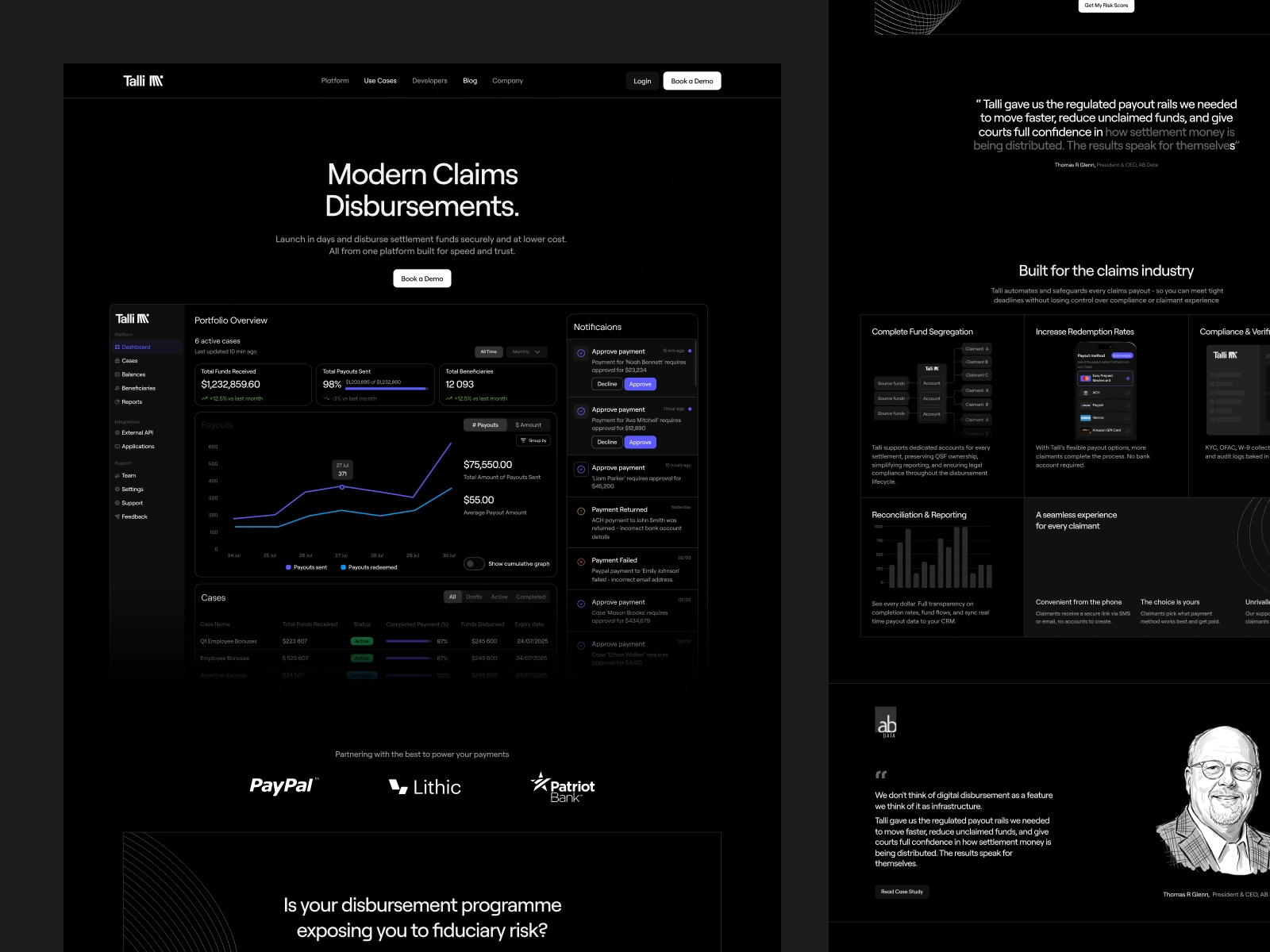
I redesigned the full website, refreshed the brand identity, and created custom illustrations for the key product sections.
The hard part with compliance-heavy platforms is that they tend to look either intimidating or dated — sometimes both. Talli's clients are professionals with real stakes: they need to trust what they're looking at before they even consider booking a demo. So the goal wasn't to make things look nice for its own sake. It was to make the site read as credible, modern infrastructure — the kind of product you hand to a client without having to explain away the design.
The updated brand is tighter and more precise: cleaner type, a clearer visual hierarchy, a color system that doesn't overstate things. The custom illustrations add warmth to sections that were previously text-heavy without making the platform feel less serious.
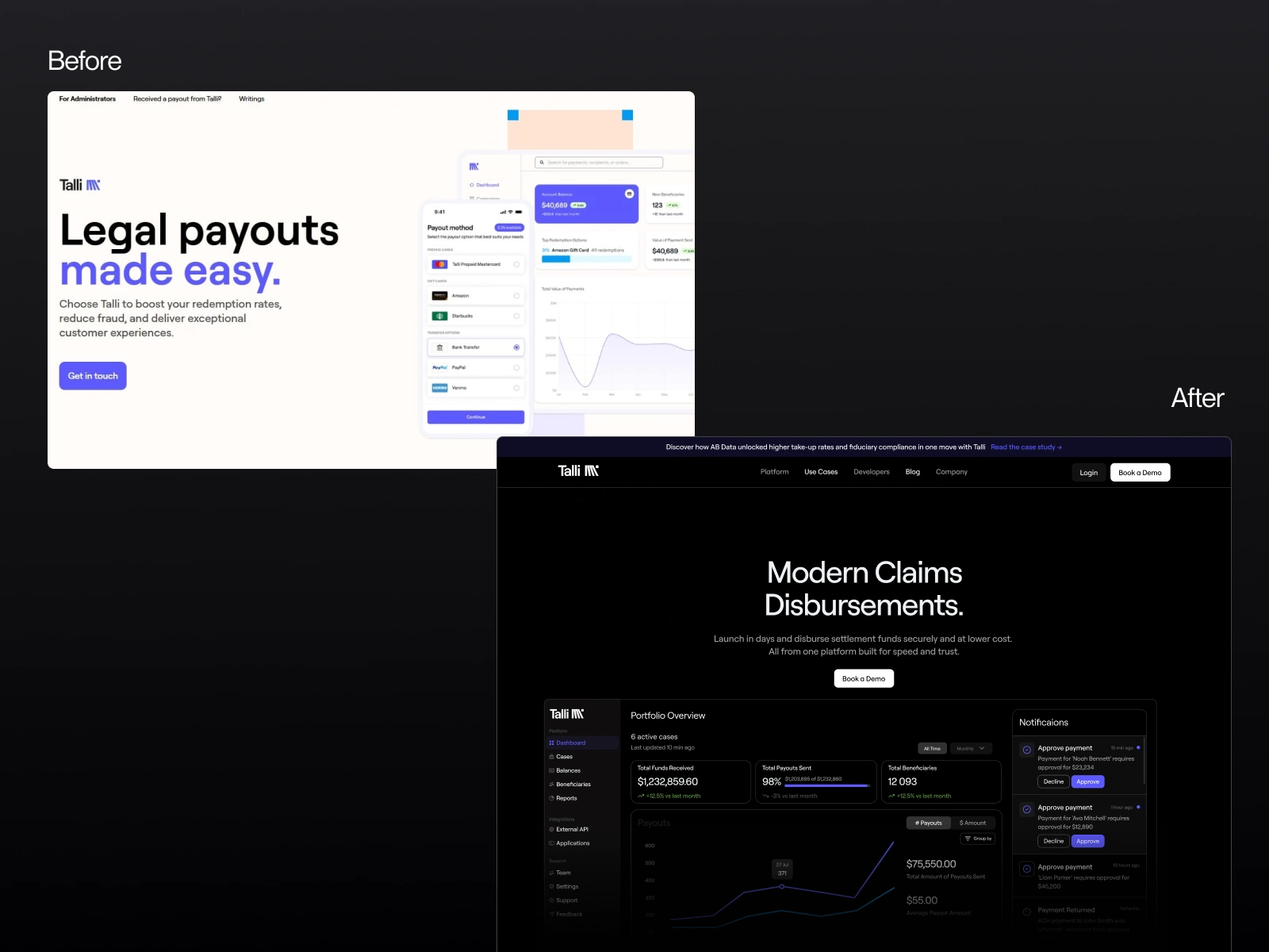
Before/After
Final Impact
The redesigned site tells Talli's story from the first section. Who it's for, what it solves, why it's different — all of that lands faster now. The brand feels like it matches the product.
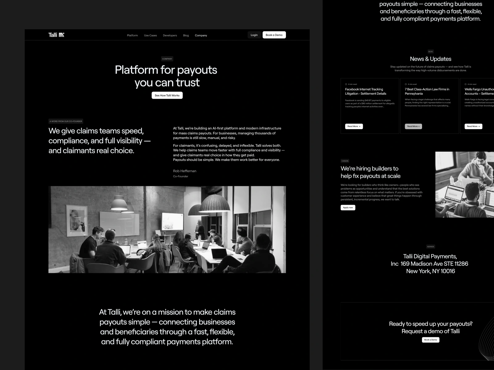
Company Page
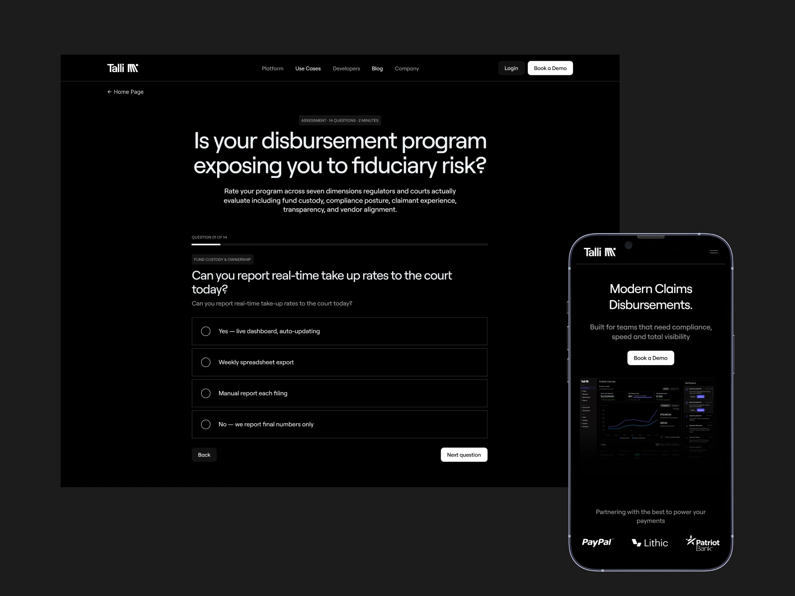
Quiz page
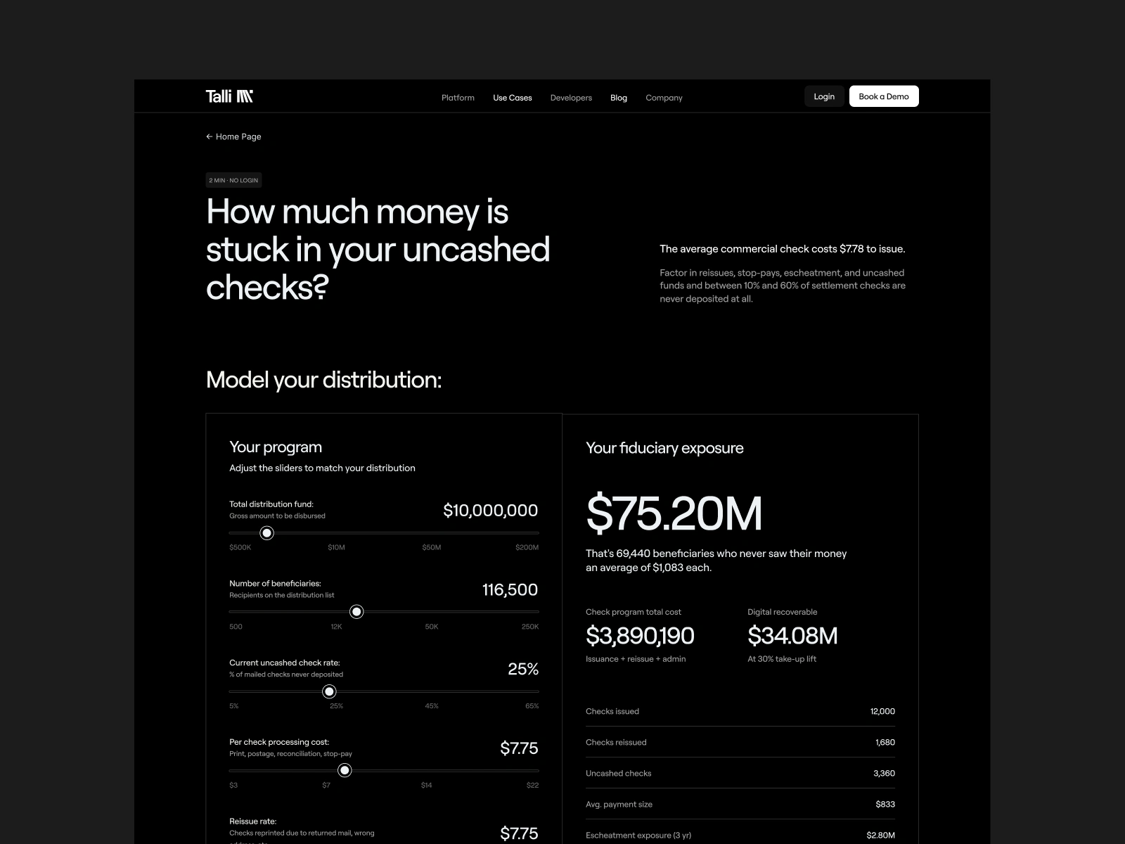
Quiz result page

Case Study Page
Like this project
Posted Jun 5, 2026
Website redesign & brand refresh for a compliance fintech. Cleaner identity, custom illustrations, and a site that earns trust before the demo.
Likes
4
Views
18
Clients
Talli