Website Redesign for a Loyalty and Rewards Platform
Portfolio project

Verified paid workView completed work
The context
CORA builds loyalty programs, points banking, and rewards marketplaces for brands in finance, travel, retail, automotive, and HR. These audiences have very different needs, and the old website had to speak to all of them at once.
The goal
The task was to redesign the site without losing brand recognition, add new pages, and tell a stronger story about the company’s advantages.
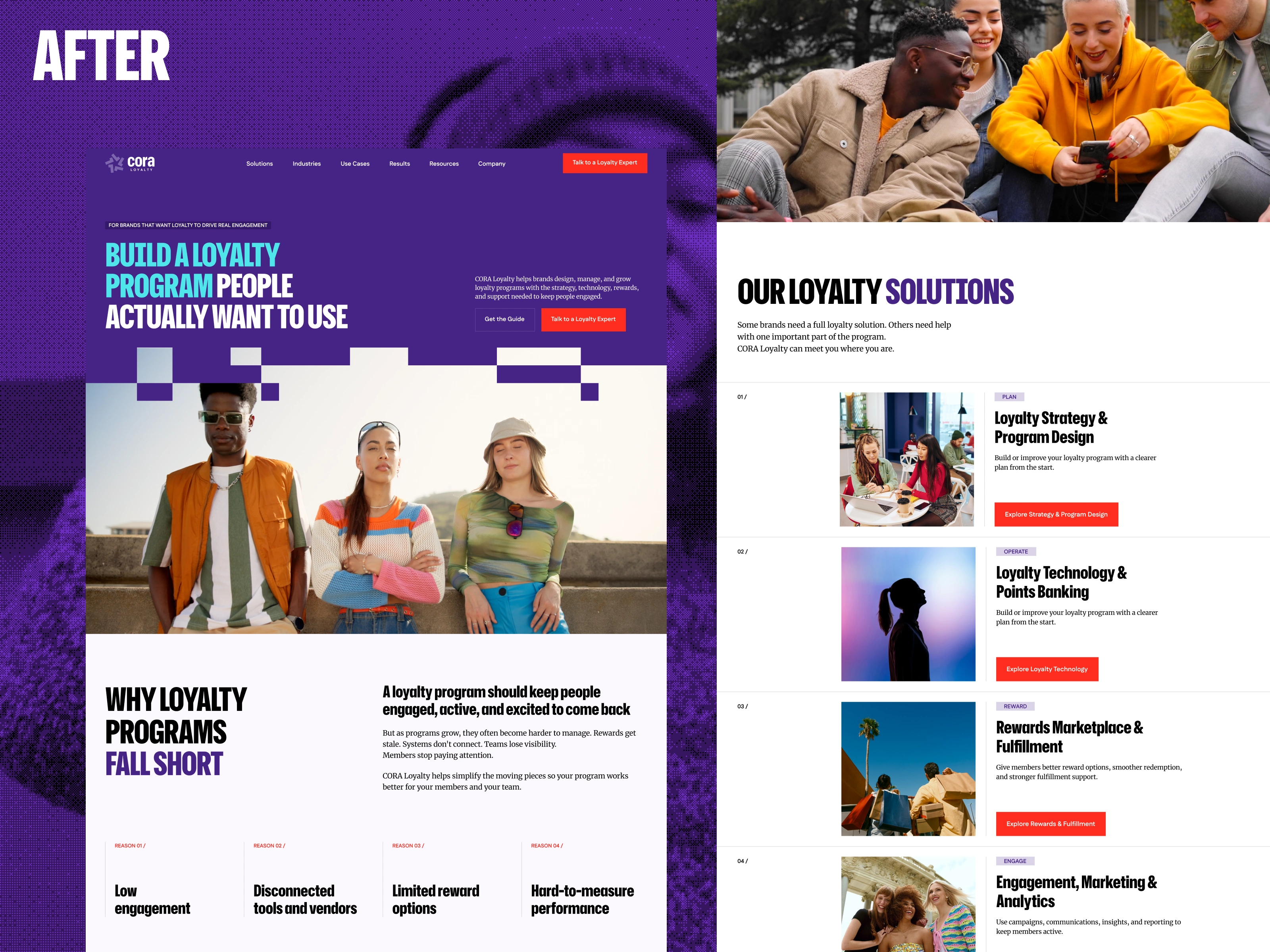
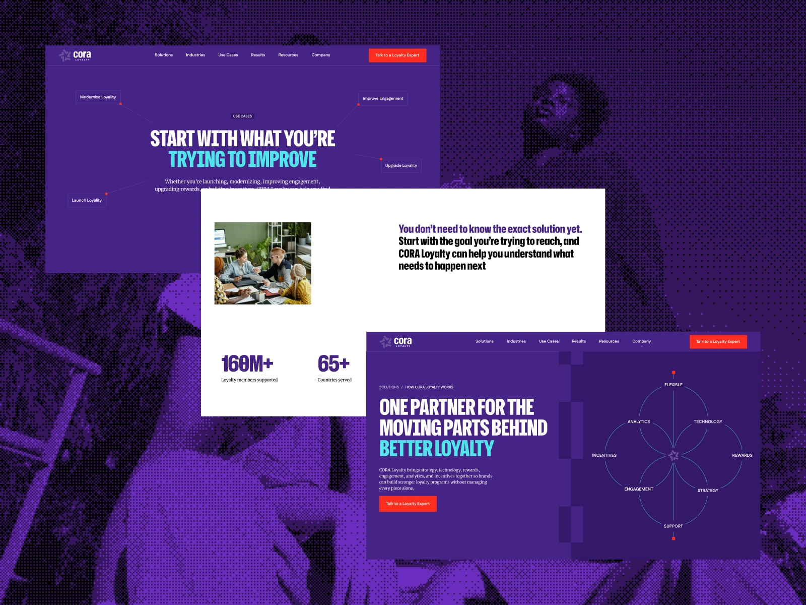
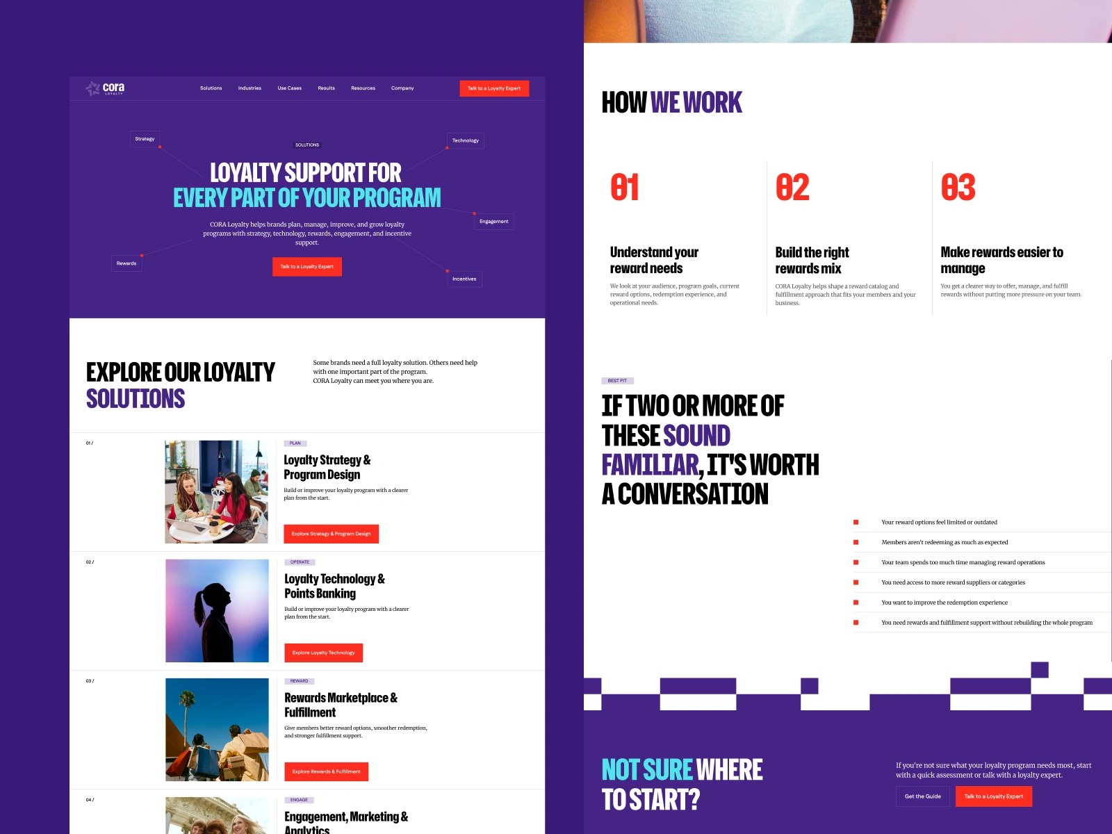
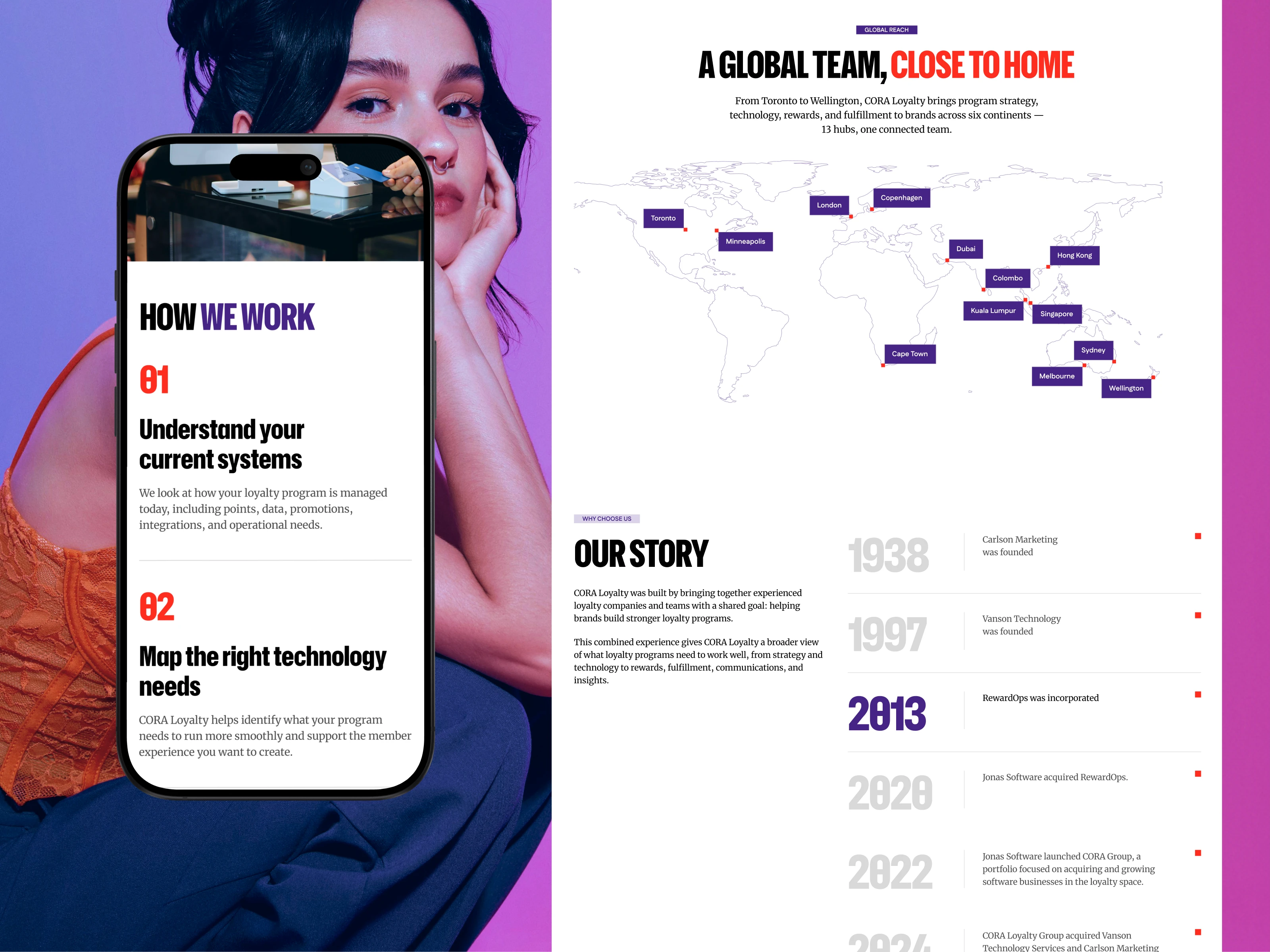
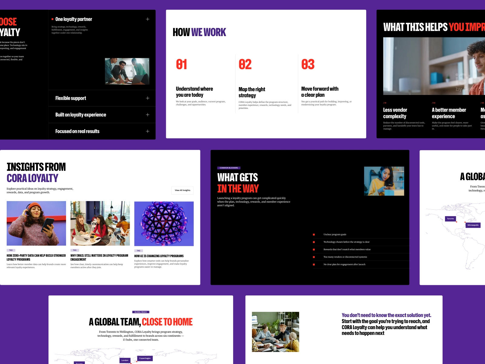
I kept the brand’s colors, fonts, and rules, and built a new UI system on top of them. I started with wireframes: I rethought the structure, mapped the UX flow, and grew the site to about 28 pages across Solutions, Industries, Use Cases, and Resources. In the UI, a clear type hierarchy puts the accents where they matter. I removed visual noise, gave the content more room to breathe, and turned repeating blocks into reusable components. Animation guides visitors down each page toward one next step: talk to a loyalty expert.
Final Impact
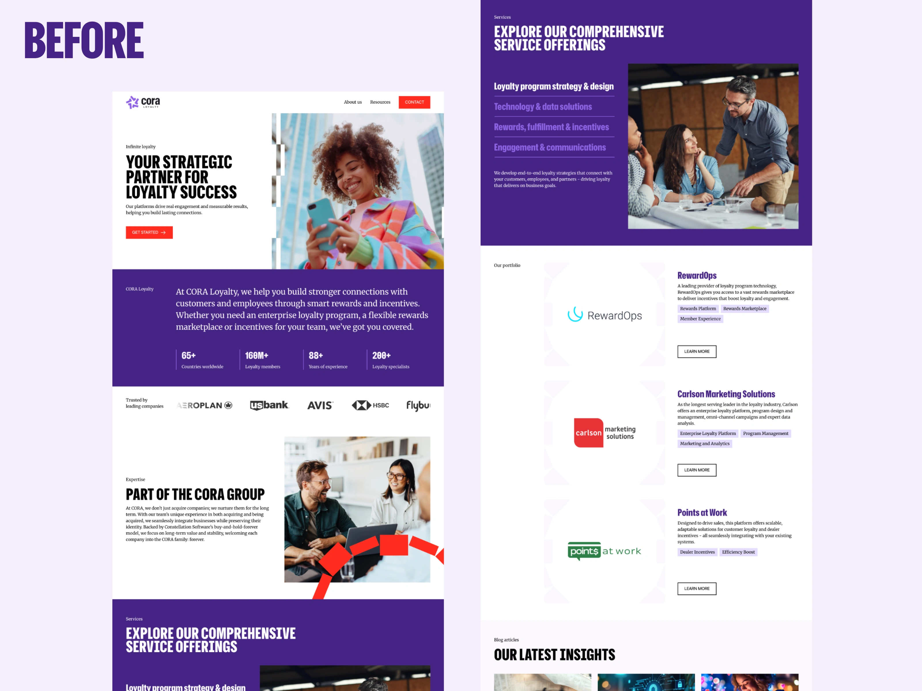
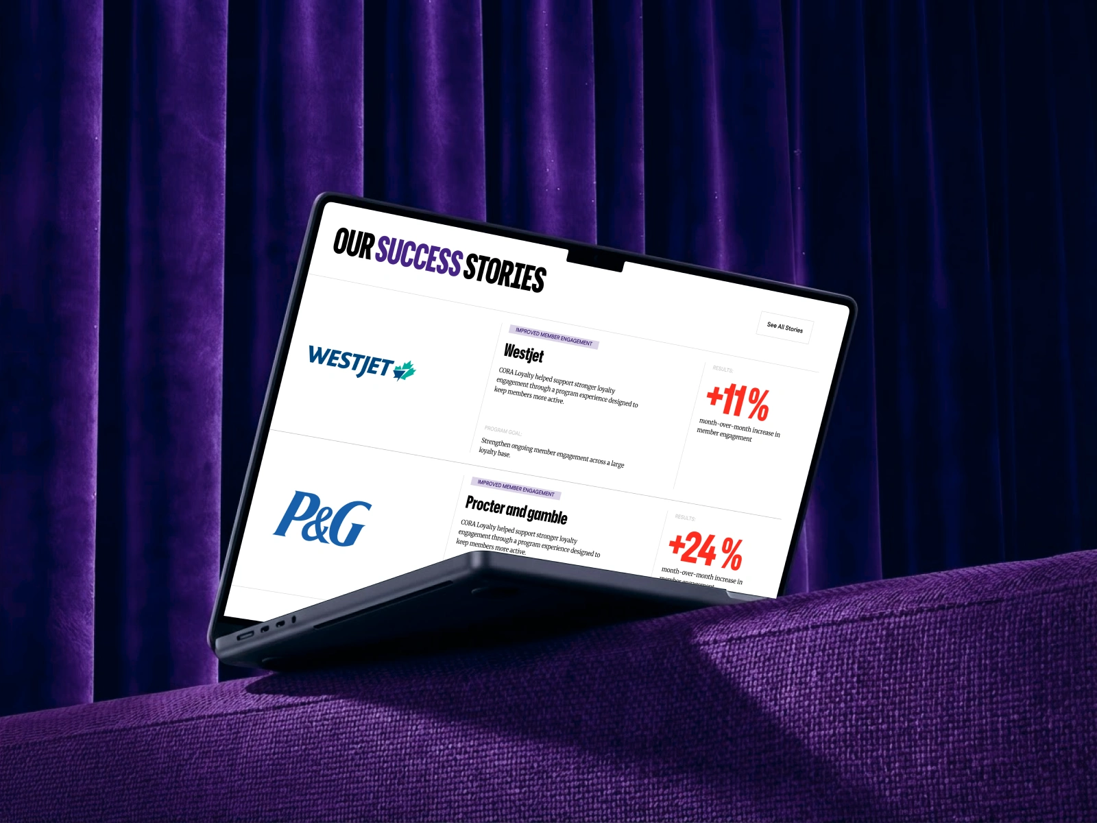
The site still looks like CORA, but it reads cleaner and says more. A visitor from a bank, a travel brand, or an HR team finds a page made for them, and the company’s strengths are clear on each one. The before and after shots below show the difference.
1 like · 2 views · Nov 10, 2026
Website redesign, wireframes, UI design, UI system and animation for a 28-page B2B loyalty platform, built in Figma on the client’s existing brand.

