Cabin Crew Transport Management Dashboard

Monodeep Samanta


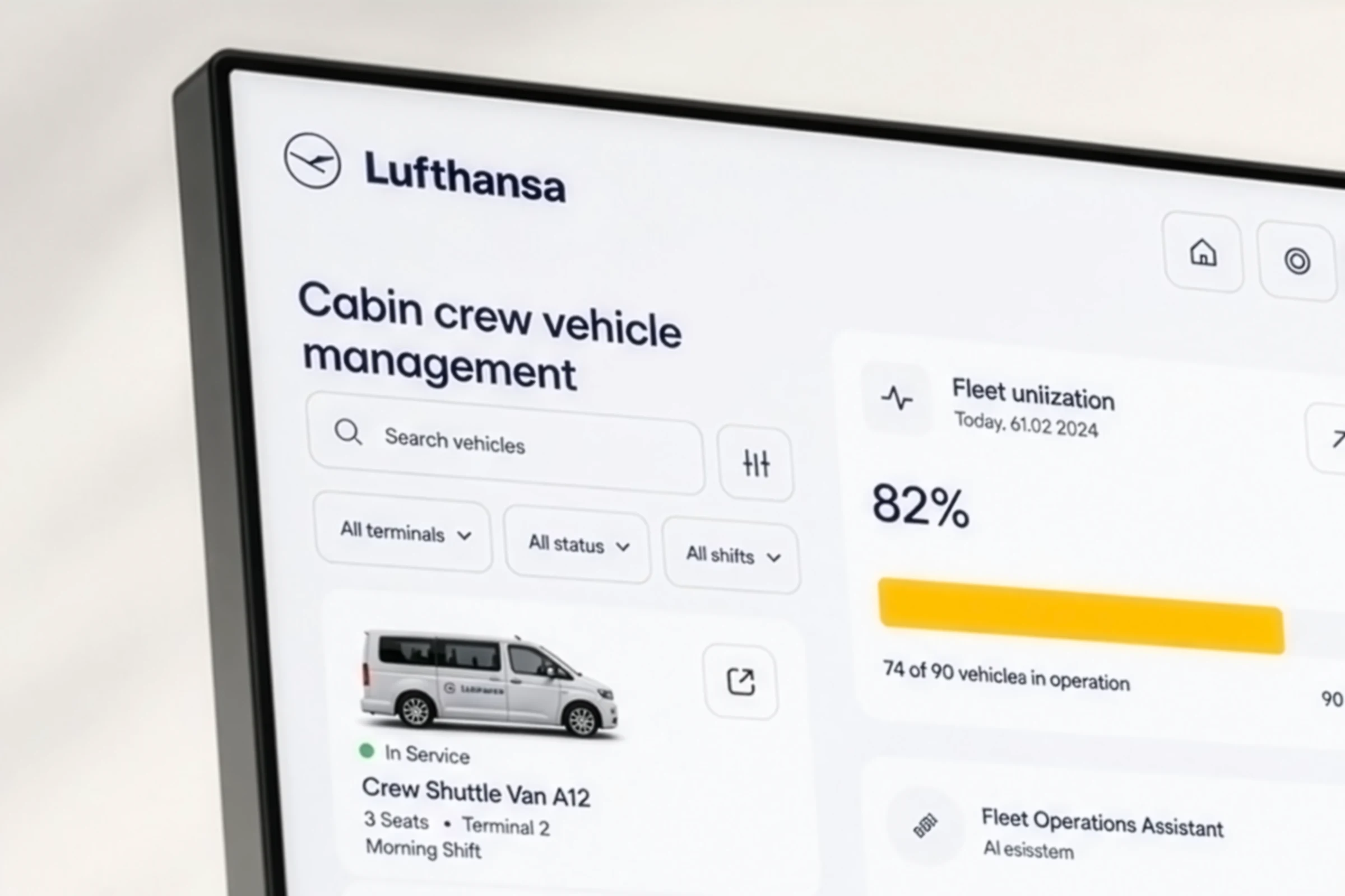
A clean operational web app concept for managing cabin crew transport across airport terminals, crew hotels, gates, and airside service routes. The interface focuses on fast decisions, live route visibility, vehicle status, punctuality, and AI-assisted allocation for airport operation teams.
Project Overview
Problem: Cabin crew vehicle coordination is time-sensitive. Dispatch teams need to know which vehicle is available, where it is, who is assigned, and whether the pickup will be on time. A cluttered dashboard makes this harder during peak airport operations.
Solution: This dashboard brings route mapping, fleet status, transfer score, vehicle availability, and live pickup data into one clean interface. The design keeps the Lufthansa-style visual language with navy, white, soft grey, and yellow highlights, making the system feel premium, focused, and operational.
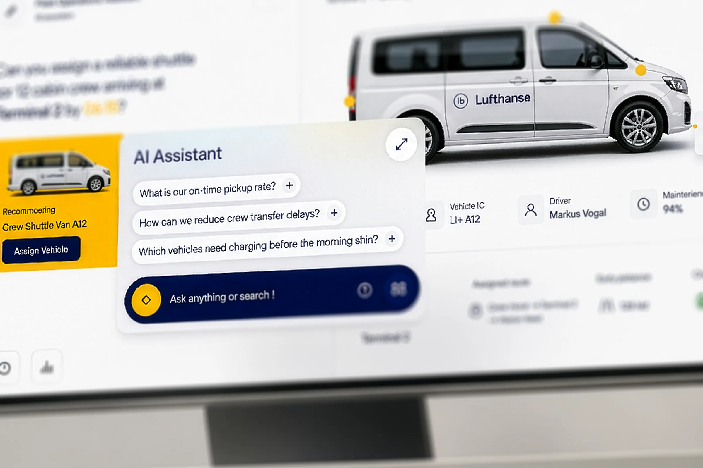
AI Assistant Panel
The AI assistant is designed to support fast operational decisions, not replace the dispatcher. It can answer questions like which shuttle is best for the next pickup, which route may face delay, or which vehicle needs charging before the morning shift. The goal is to reduce thinking time when staff are under pressure.
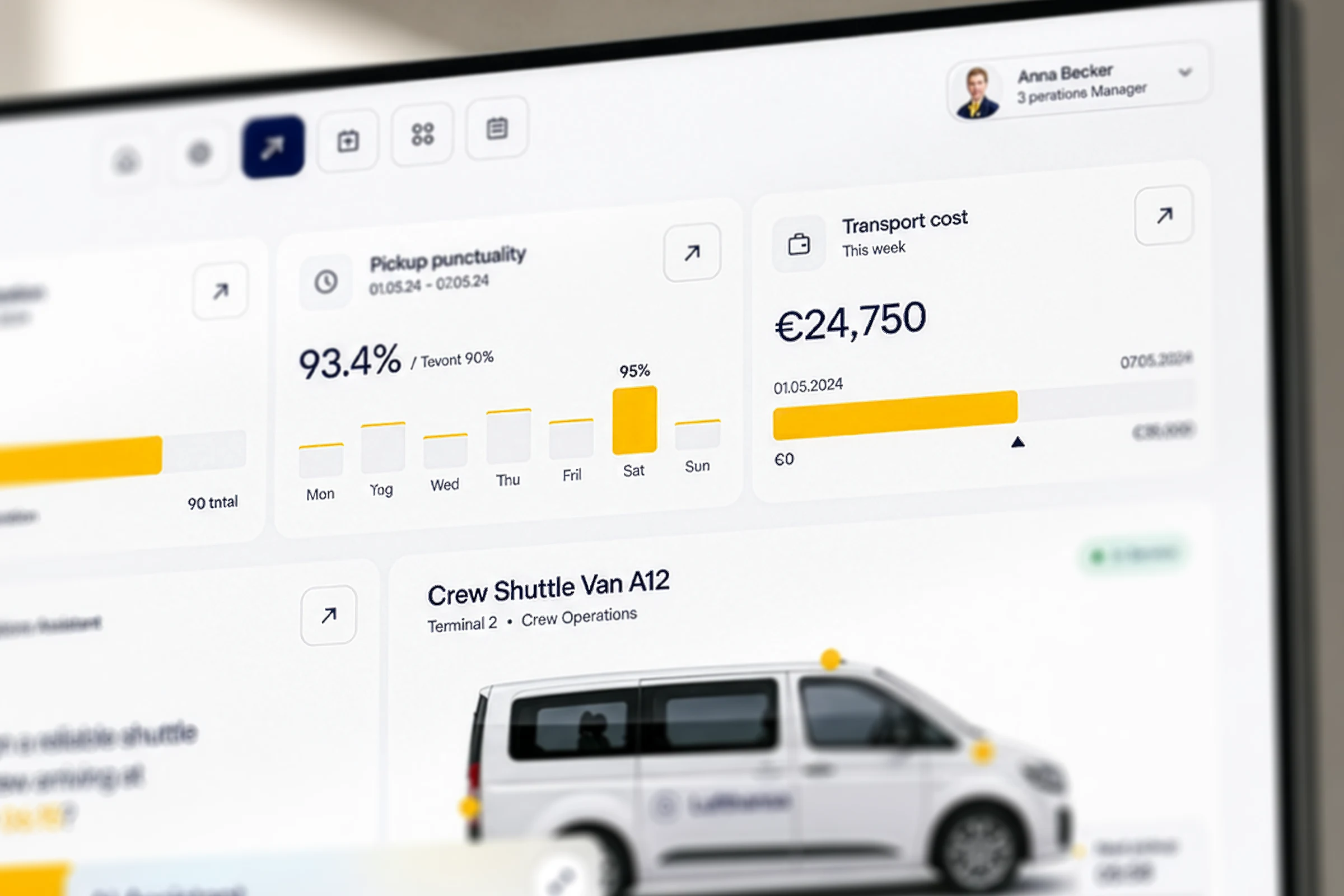
Fleet Utilisation and Cost View
This section shows the key business indicators: fleet utilisation, pickup punctuality, and transport cost. These cards are intentionally simple, because airport teams do not need decorative graphs. They need quick answers. The yellow progress bars help users instantly understand performance without reading too much data.
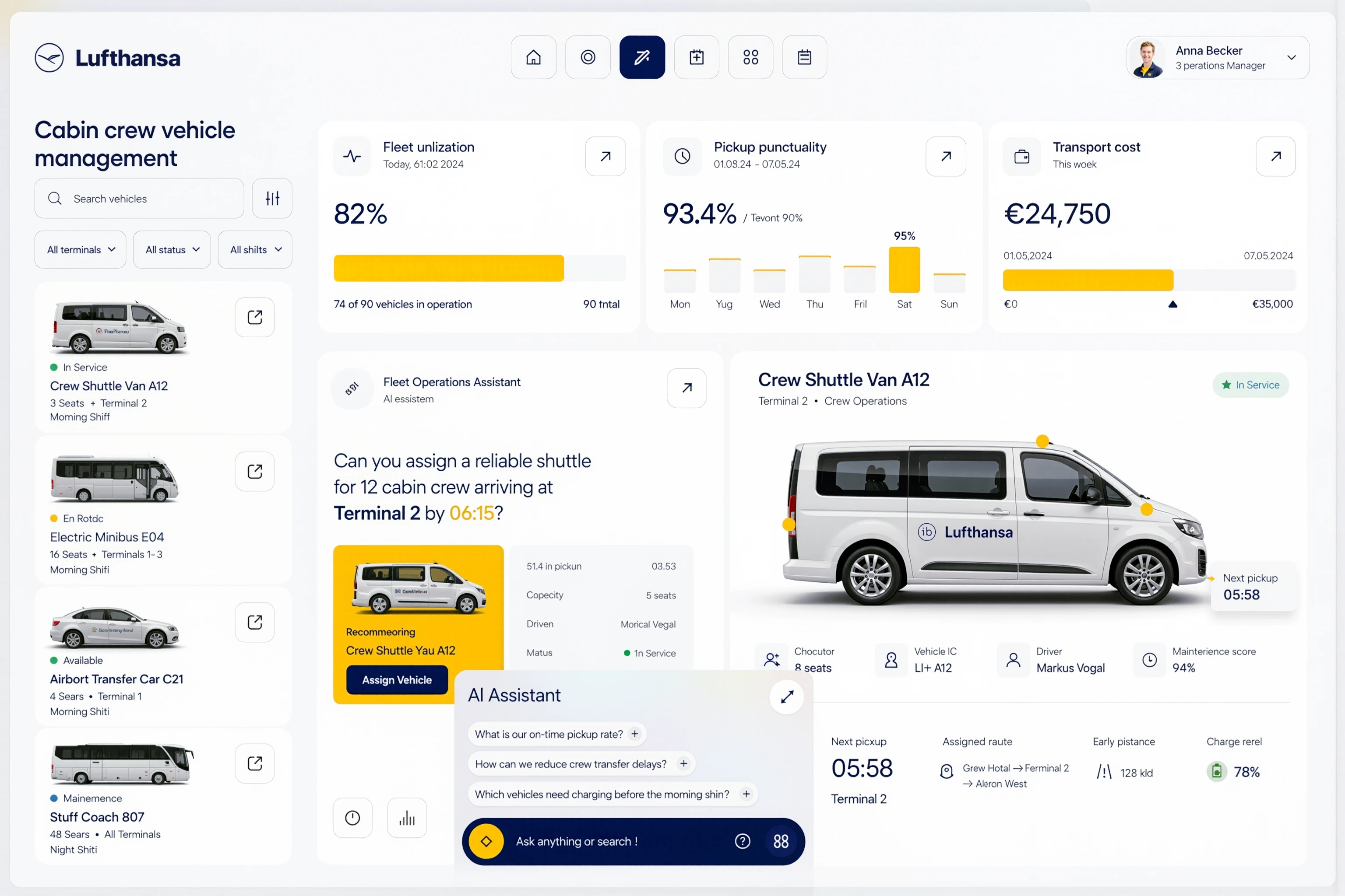
This main dashboard gives operation managers a complete overview of cabin crew transport activity. The top navigation stays clean and consistent, while the profile area keeps the user role visible. The focus is on real-time fleet movement, active routes, terminal transfers, and quick access to route details without forcing users to open too many screens.
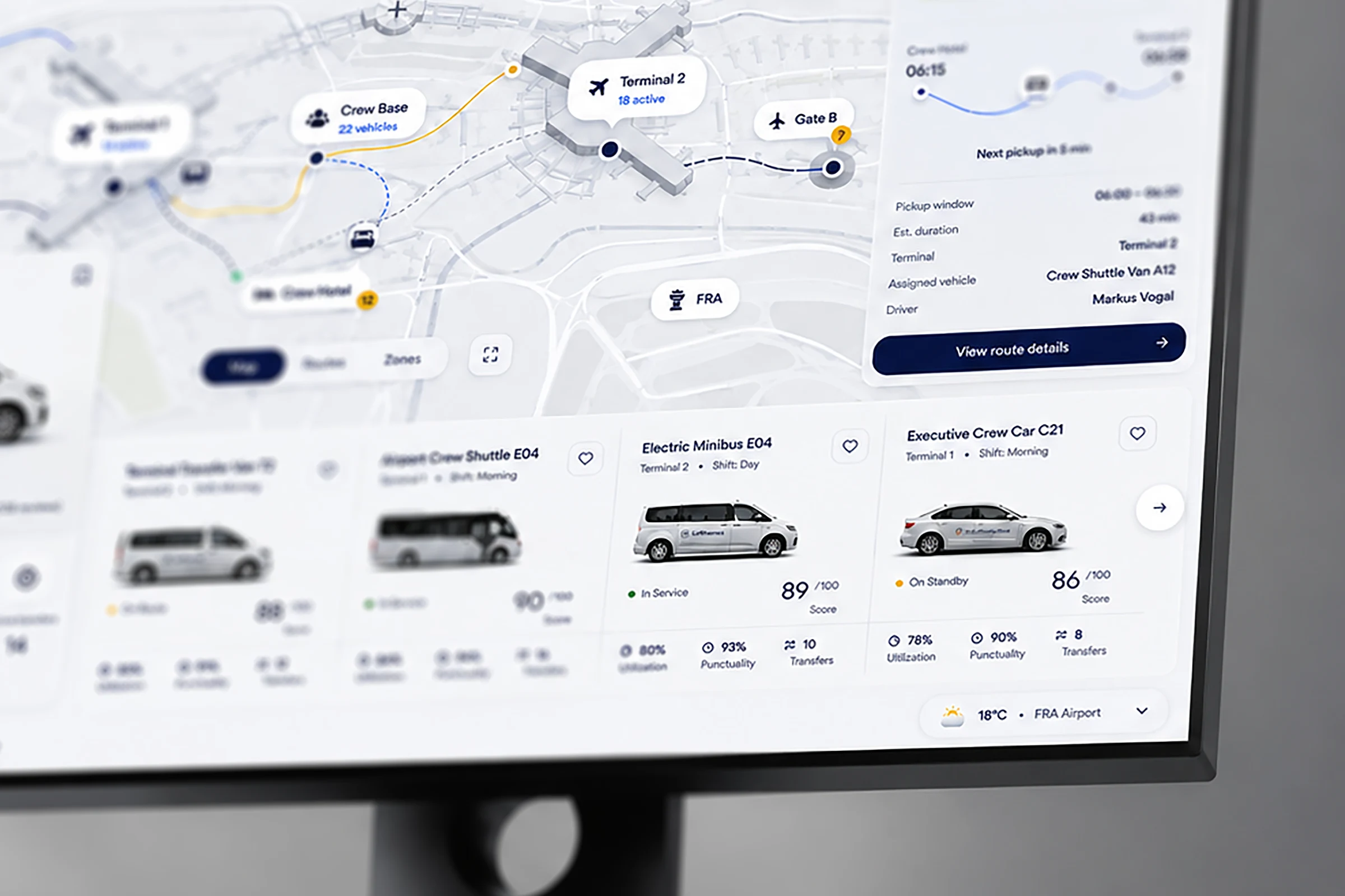
Route Map and Live Movement
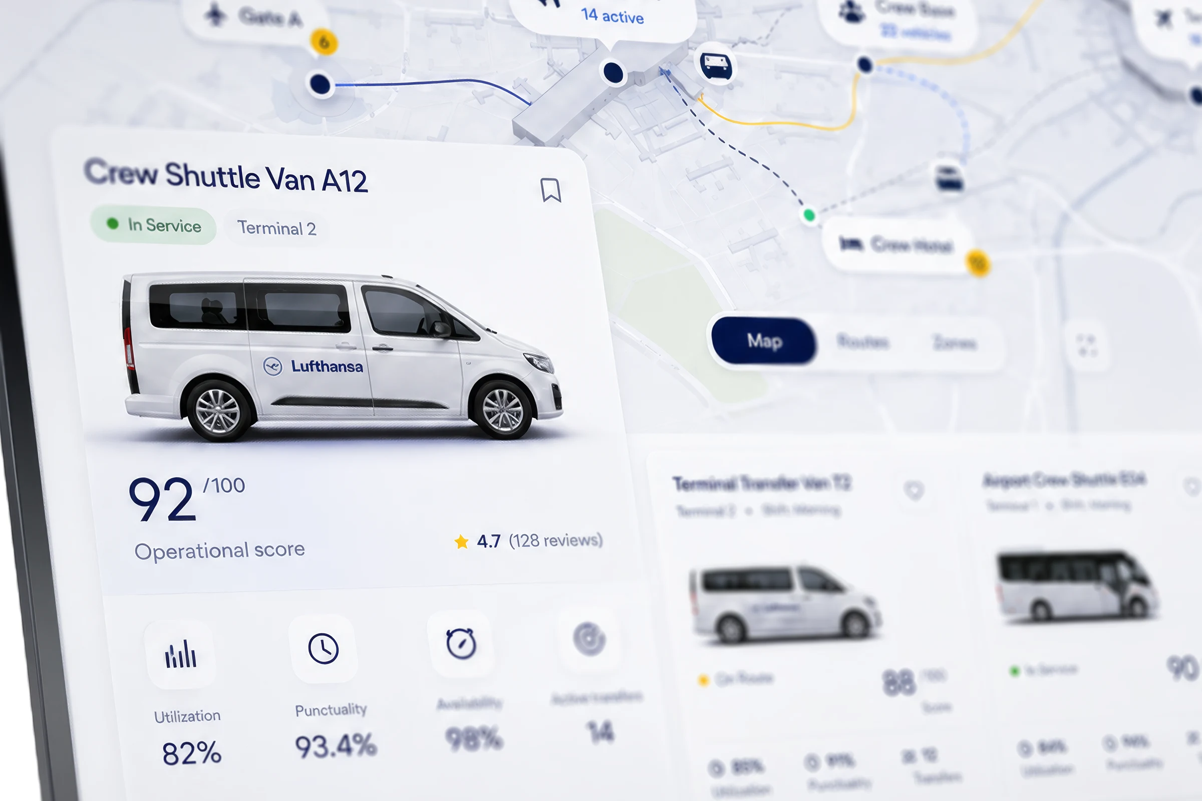
The route map connects terminals, gates, crew base, crew hotel, and active shuttle movement. The problem with normal fleet software is that route data often feels disconnected from vehicle data. Here, the map, route line, vehicle icon, and status cards work together so the user can understand what is happening in seconds.
Crew Shuttle Operational Score
The 92/100 operational score gives dispatchers a quick health check for one vehicle. Instead of showing only raw data, the card combines availability, punctuality, utilisation, active transfers, driver status, and vehicle condition. This helps managers decide whether the shuttle should stay active or be reassigned.
Airport Operations Perspective
From an operations perspective, the biggest UX challenge is not visual beauty. It is speed, clarity, and confidence. A dispatcher may have less than one minute to react. This design reduces decision friction by placing the most important information first: route, status, pickup time, vehicle score, and assignment action.
The visual direction uses Lufthansa-inspired navy, white, light grey, and yellow. The UI is minimal, but not empty. Soft shadows, rounded cards, clean icons, and strong spacing create a professional enterprise feel. The design is made for airport staff who need clarity more than visual noise.
Like this project
Posted Sep 3, 2026
Designed an aviation operations dashboard for managing cabin crew transport, fleet utilisation, vehicle status,real-time logistics with AI-assisted workflows.