
WEEK TWO OF ContraQuest
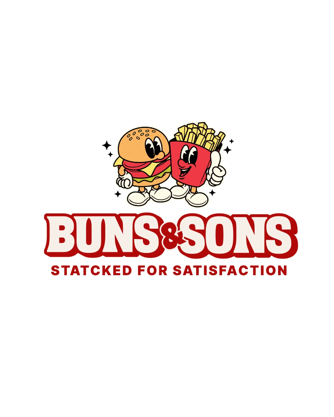
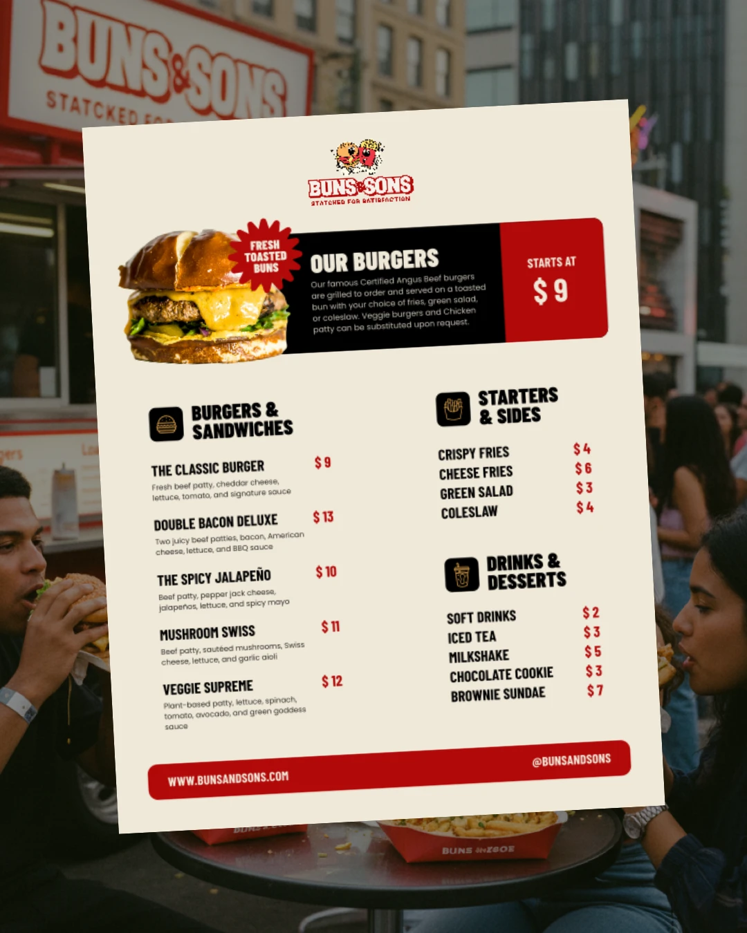
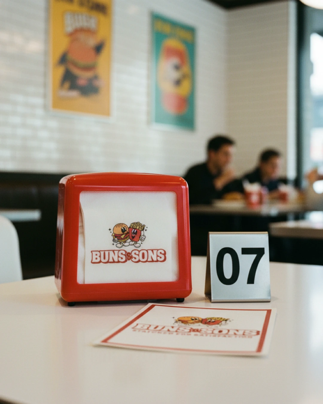
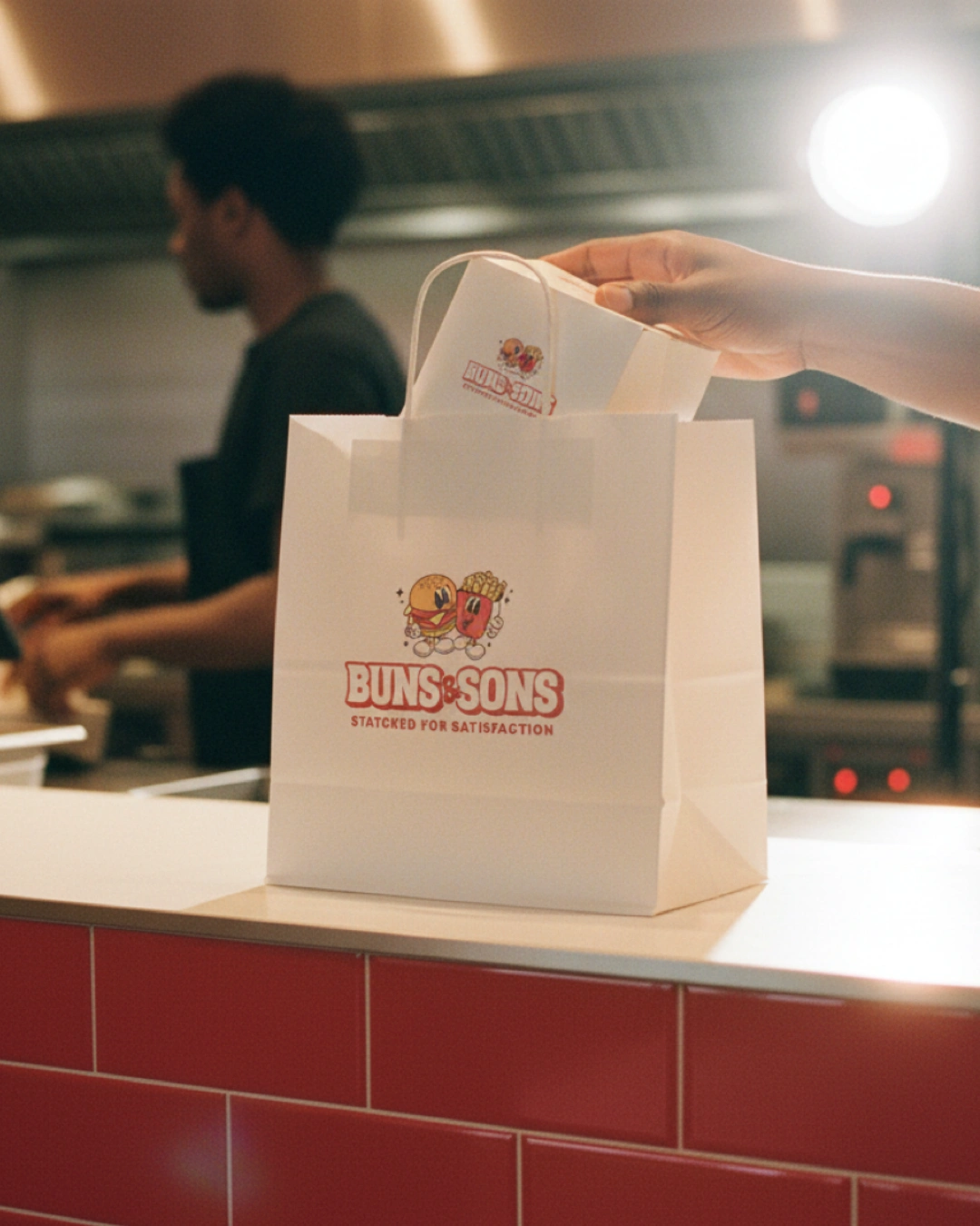
One project I’m really proud of is Buns & Sons. I handled the brand identity from strategy to visuals, making sure everything felt retro, bold, playful, nostalgic, and clever.
What I learned: → When every touchpoint speaks the same language, trust comes naturally. And it’s often the smallest details that turn a brand into an experience.
Tools used: Illustrator · Photoshop
How it shaped me: This one pushed me to think beyond the expected — blending strategy with play, and structure with personality. It strengthened my approach to brand design, and reminded me that memorable brands are to be different on purpose.
What I want more of in 2026: → Helping brands break out of the box while staying crystal clear. Designing bold, cohesive identities built for long-term impact — not fleeting trends.
0 likes · 7 views · Jan 19, 2026
WEEK TWO OF ContraQuest One project I’m really proud of is Buns & Sons. I handled the brand identity from strategy to visuals, making sure everything felt re...

