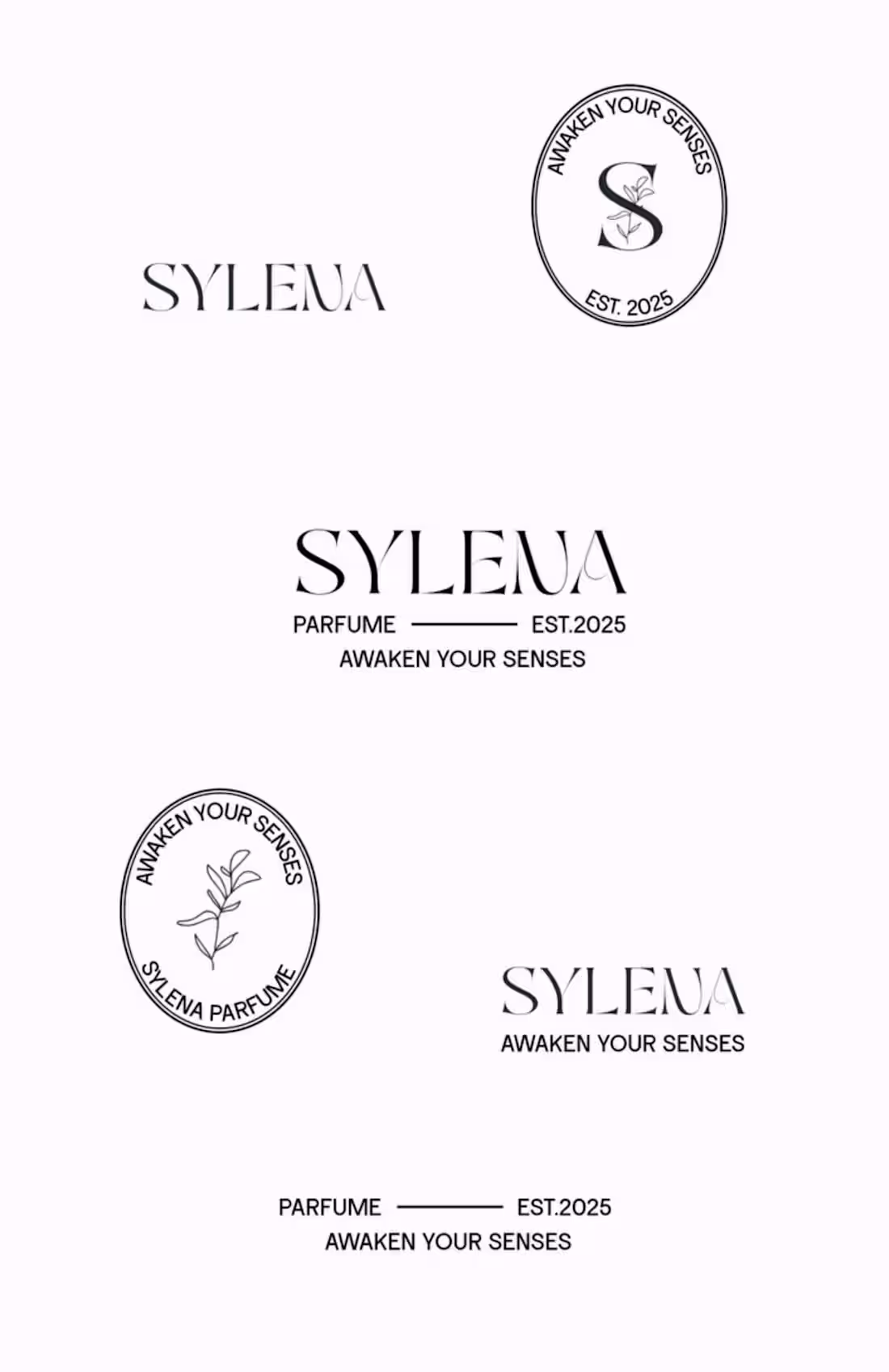
Sylena is a timeless, romantic and artistic perfume brand. Made in France. The brand creates fragrances that evoke emotions, memories, and a sense of intimate luxury.
2
66
WEEK TWO OF ContraQuest
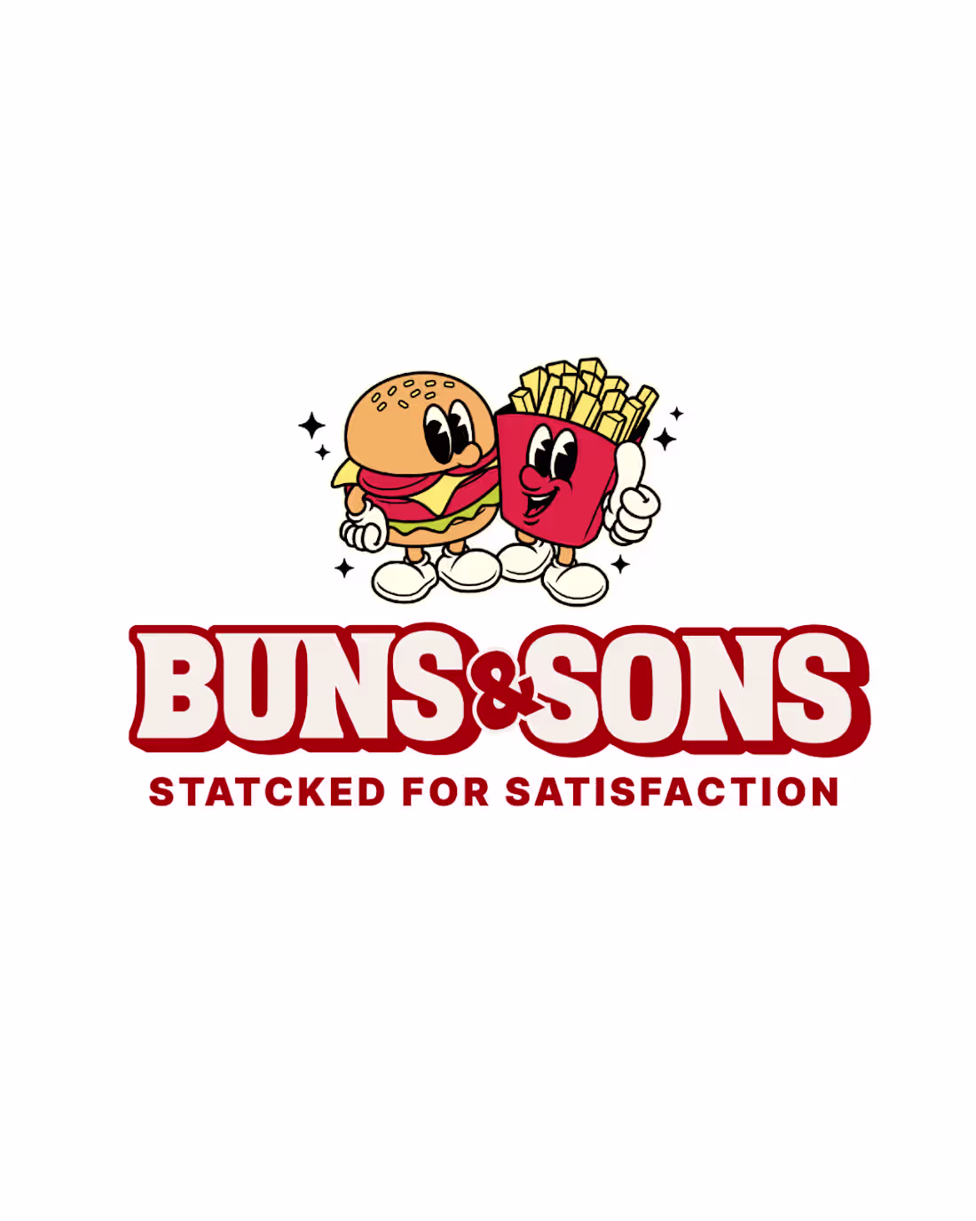
One project I’m really proud of is Buns & Sons. I handled the brand identity from strategy to visuals, making sure everything felt retro, bold, playful, nostalgic, and clever.
What I learned: → When every touchpoint speaks the same language, trust comes naturally. And it’s often the smallest details that turn a brand into an experience.
Tools used: Illustrator · Photoshop
How it shaped me: This one pushed me to think beyond the expected — blending strategy with play, and structure with personality. It strengthened my approach to brand design, and reminded me that memorable brands are to be different on purpose.
What I want more of in 2026: → Helping brands break out of the box while staying crystal clear. Designing bold, cohesive identities built for long-term impact — not fleeting trends.
2
24
181
My submission for the MagicPath Challenge ✨
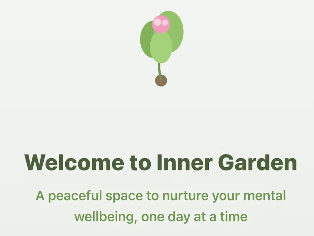
I created a mental health and chronic illness app where you are about to write down how you feel, what you’re going through, and even contact with someone if you need someone to talk to. It’s minimal (and natural) built for clarity and calmness. 👀
Homepage: https://designs.magicpath.ai/v1/safely-village-7695
Mood/Journeling: https://designs.magicpath.ai/v1/nice-house-7086
Journaling Page: https://designs.magicpath.ai/v1/gracefully-evening-7766
3
24
274
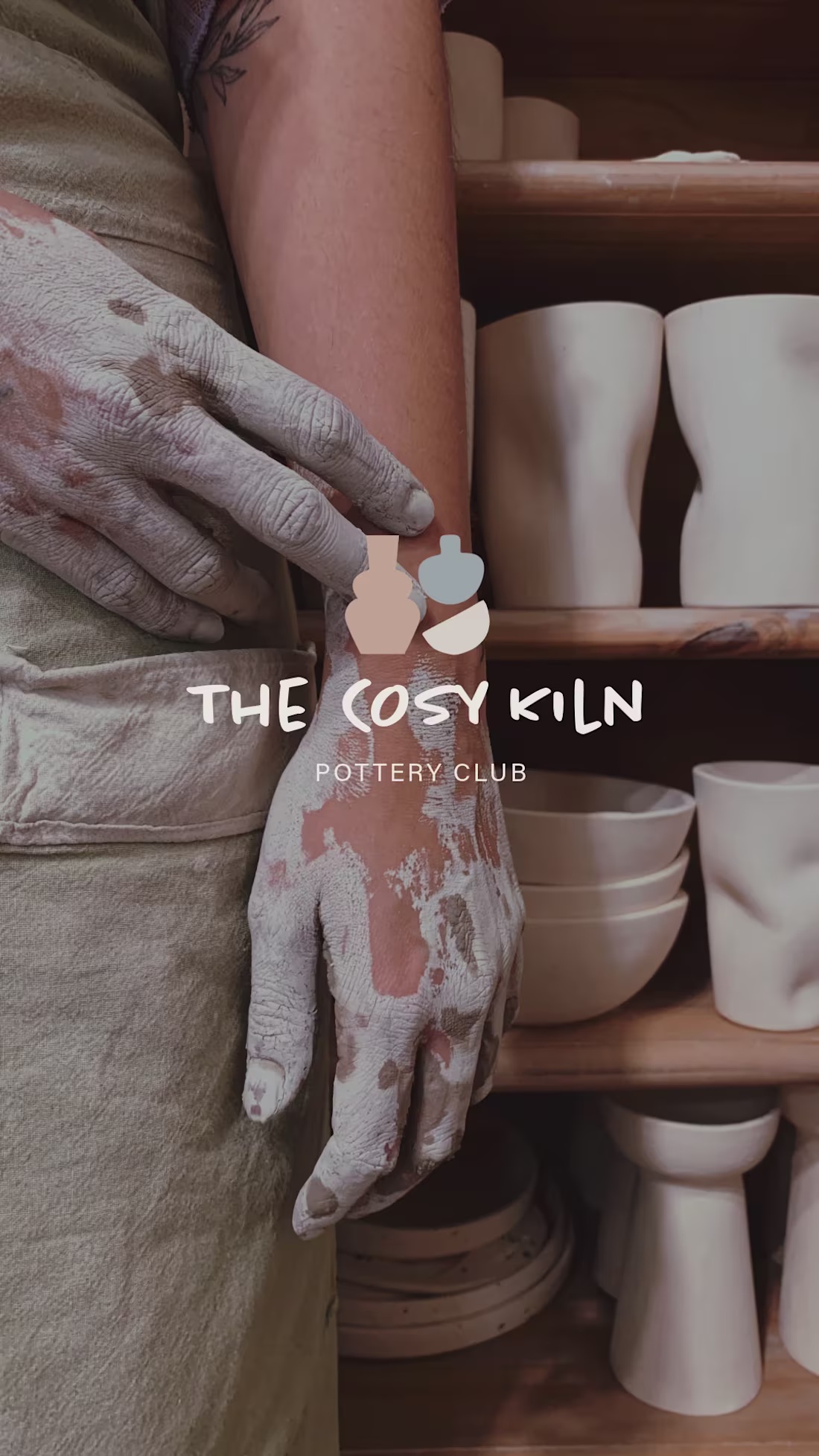
The Cosy Kiln: Pottery Club Logo & Visual Identity
0
16
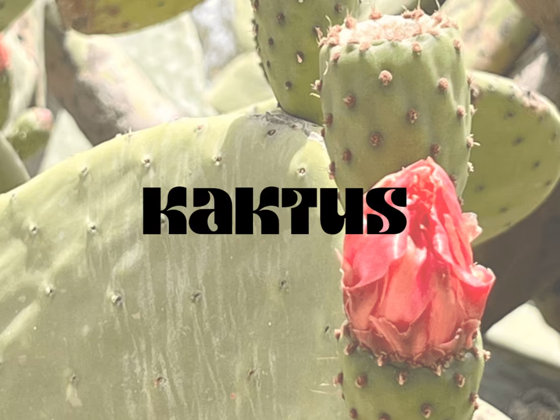
Kaktus, A Cactus Soda
0
5
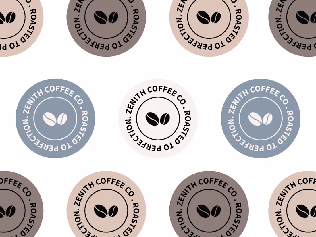
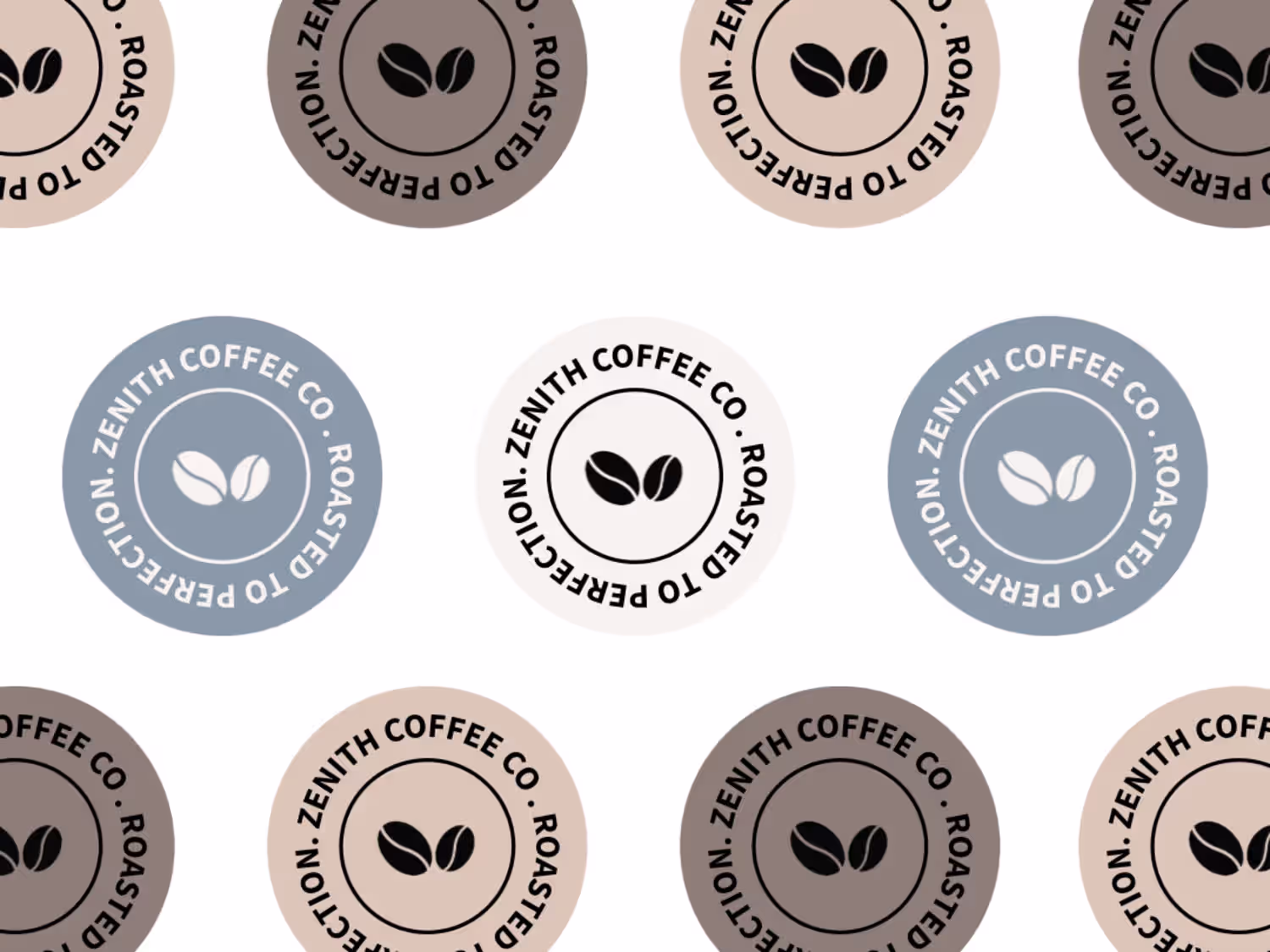
Zenith Coffee Co. Brand Identity
0
3
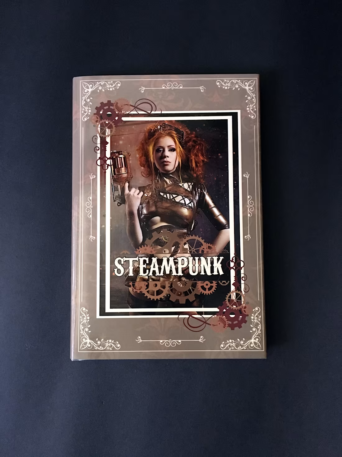
The Mechanical Beauty of Steampunk :: Behance
0
7
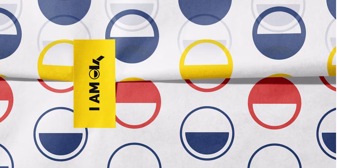
I Am Okay - For Mental Health
0
3
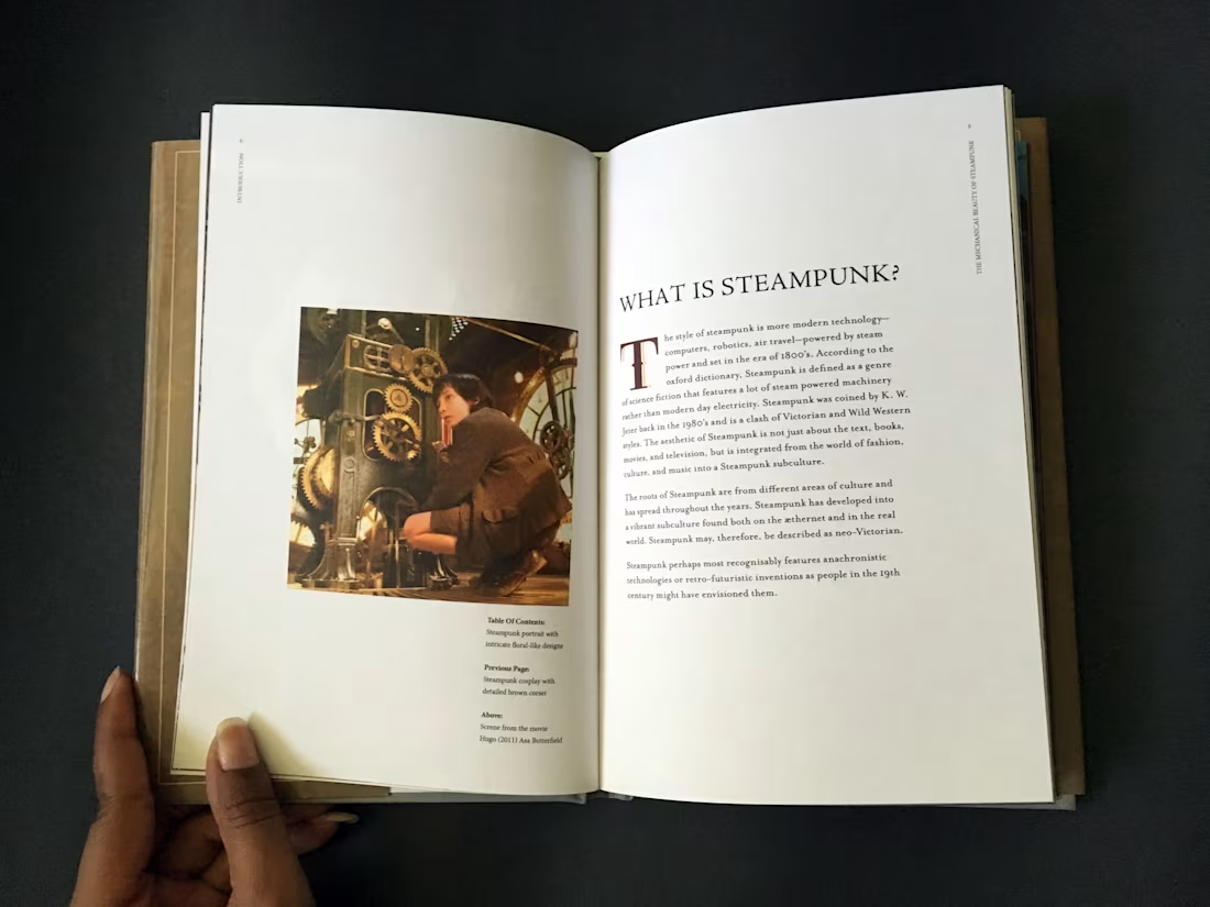
The Mechanical Beauty of Steampunk
0
9
Our Autistic Journey
0
4
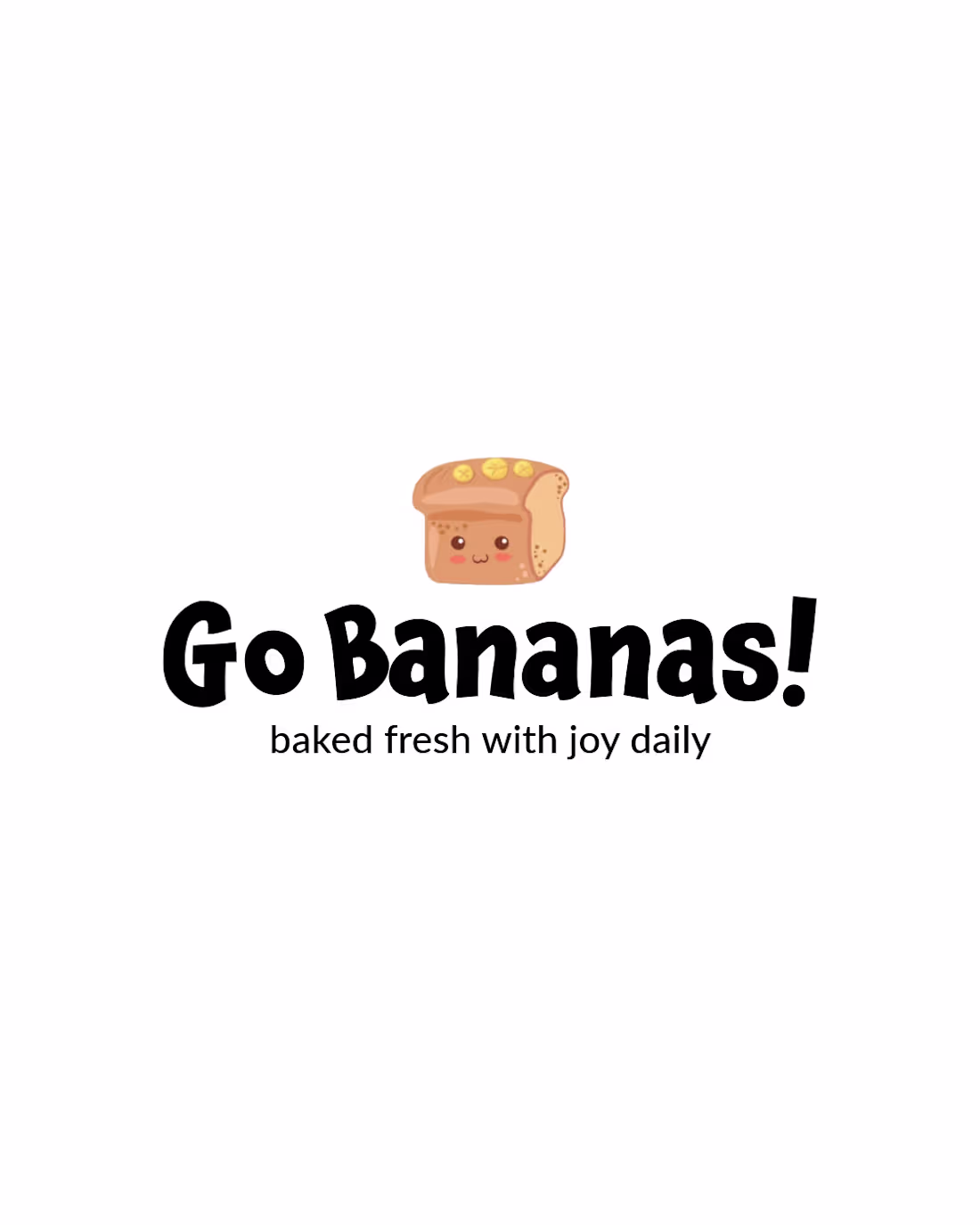
Go Bananas! Visual Identity Design
0
5
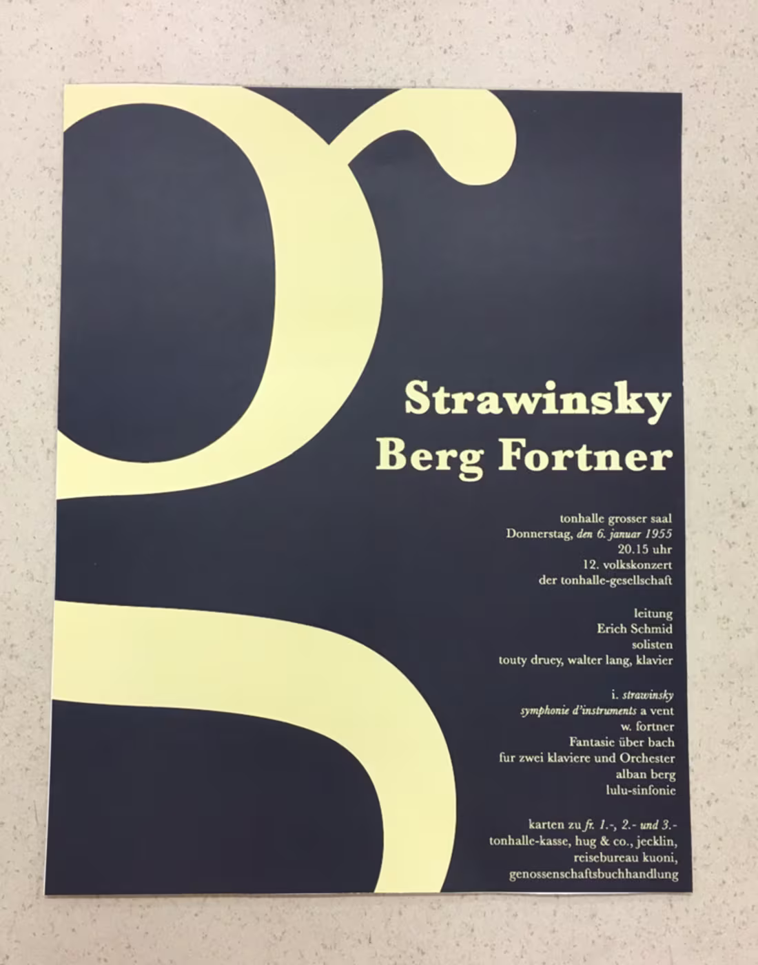
Poster Series: Saul Bass, Baskerville, & Lissitzky
0
4