Logo, Packaging & Website | Donnita
Jean Bite
✨ About Donnita
Donnita is a new brand on the market with an emphasis on eco-conscious ingredients and innovative formulas. Donnita ensures that clothes stay fresh, soft, and protected for longer while using eco-friendly formulas that are soft to the skin.
Donnita's vision is to bring fresh new products to the market and they wanted me to design fresh bold design that would stand out from it's competitors.
Process
First I briefed a client and did a visual competitor analysis of what products exist on the market and how to visualy distinguish Donnita from it's brand competitors. During that process we also determined the target group which was mostly female. I kept that in mind while desining the product.
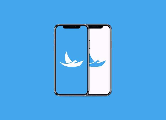
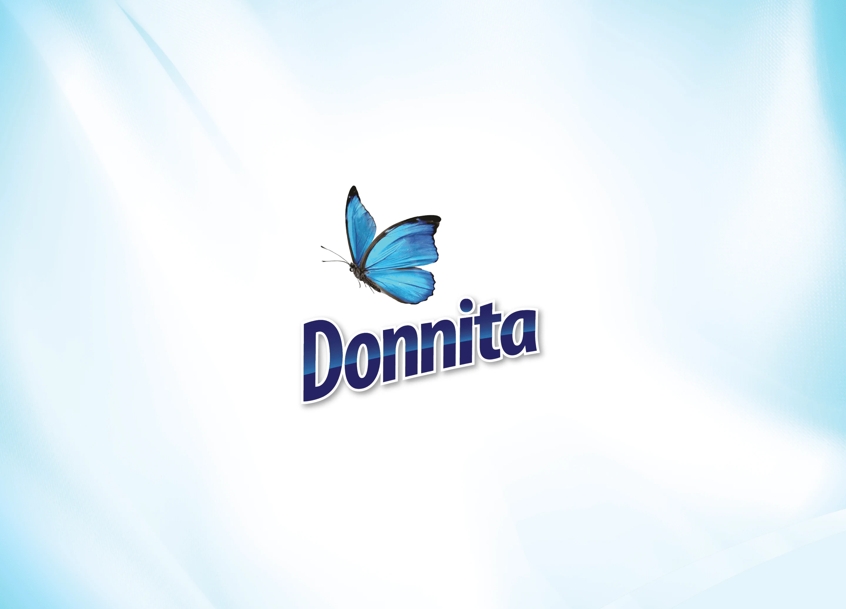
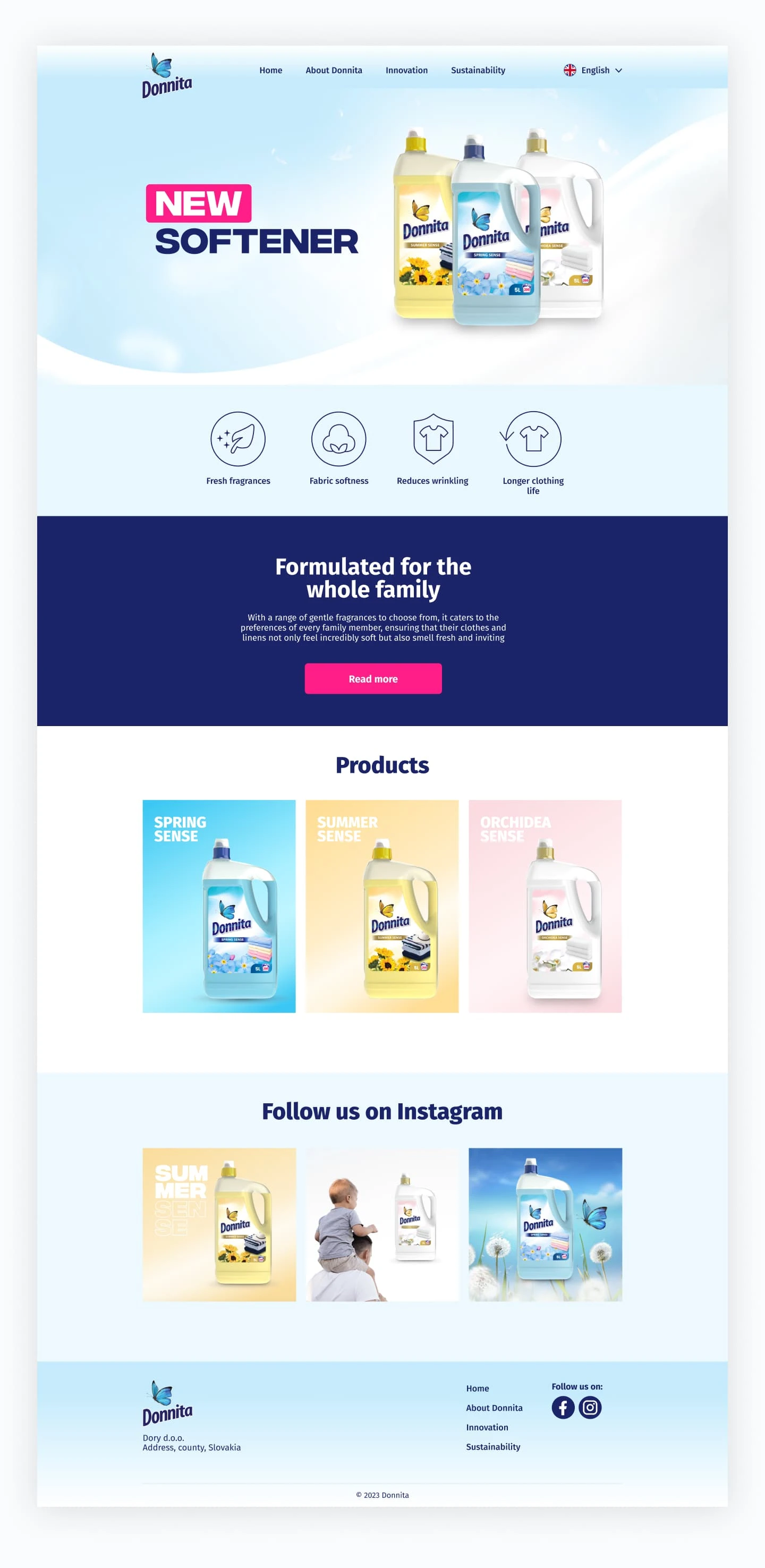
Logo
The logo is designed to represent a brand that values freshness, transformation, and elegance. Being a commercial product that sits on the shelves I used butterfly and effects on the text to distinguish it from it's competitors. The bold and slightly italicized font gives a modern, professional, and confident look while the butterfly represents freshness and lightness. The blue tones are calming, fresh, and often associated with trust and cleanliness.
Packaging
Donnita comes in three different scents, each individual package has its own color so the family of products are easily distinguishable.
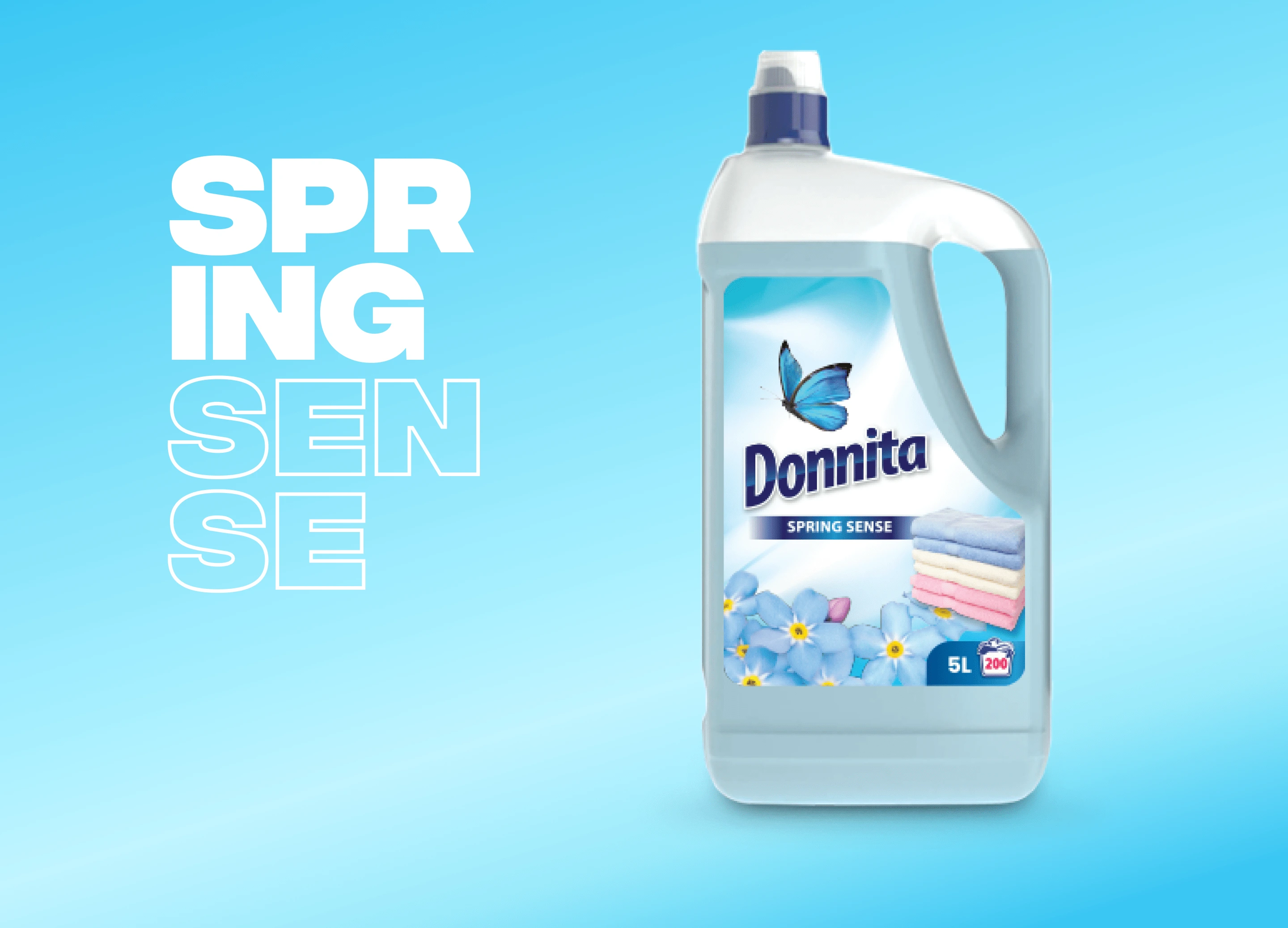
Spring sense is the original product in brand's colors - ligh blue conveying to softness and gentleness of the spring.
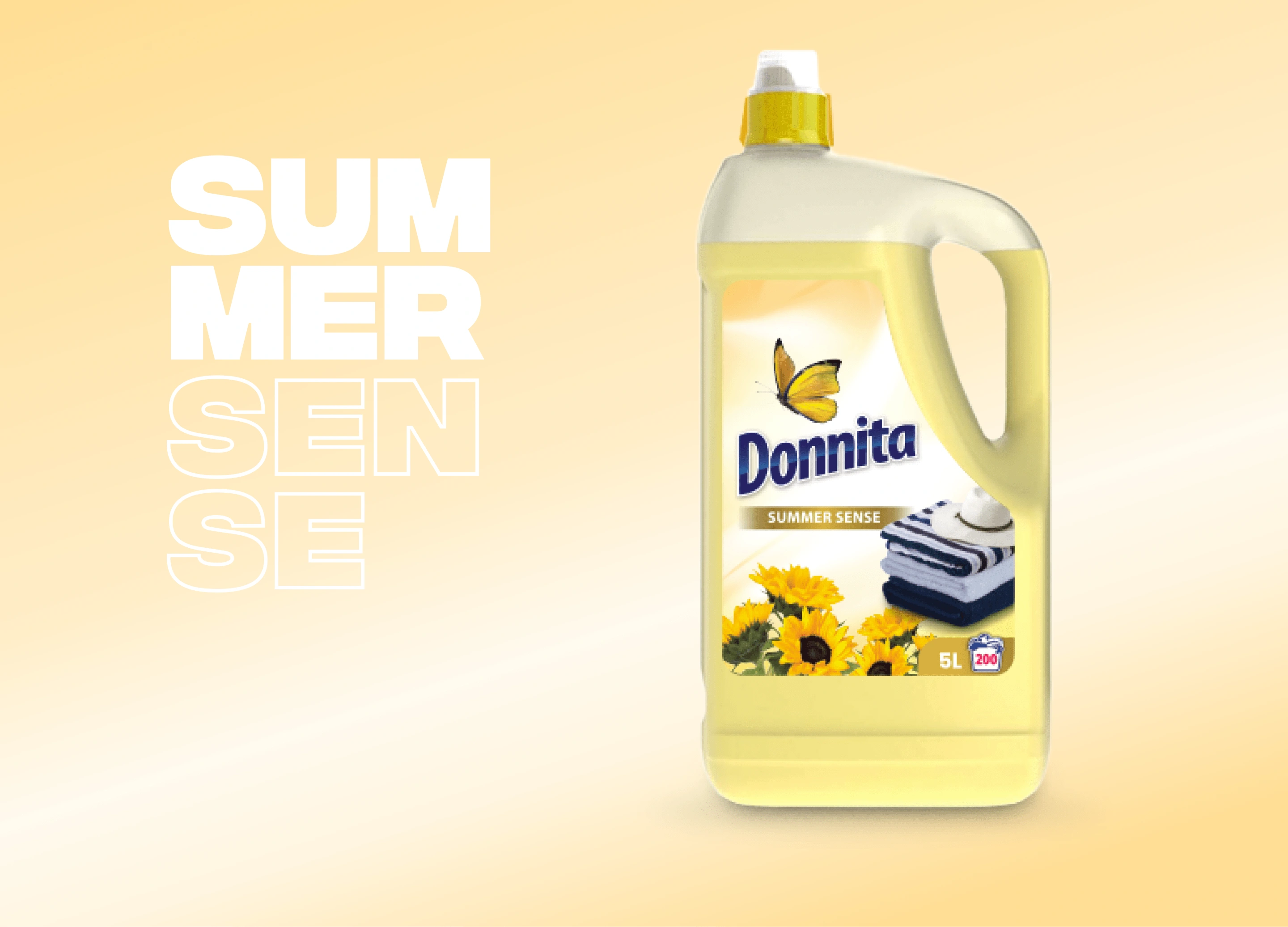
I captured the essence of summer by using yellow and gold, infusing the design with a radiant and energetic warmth. The colors evoke the brilliance of sunshine.
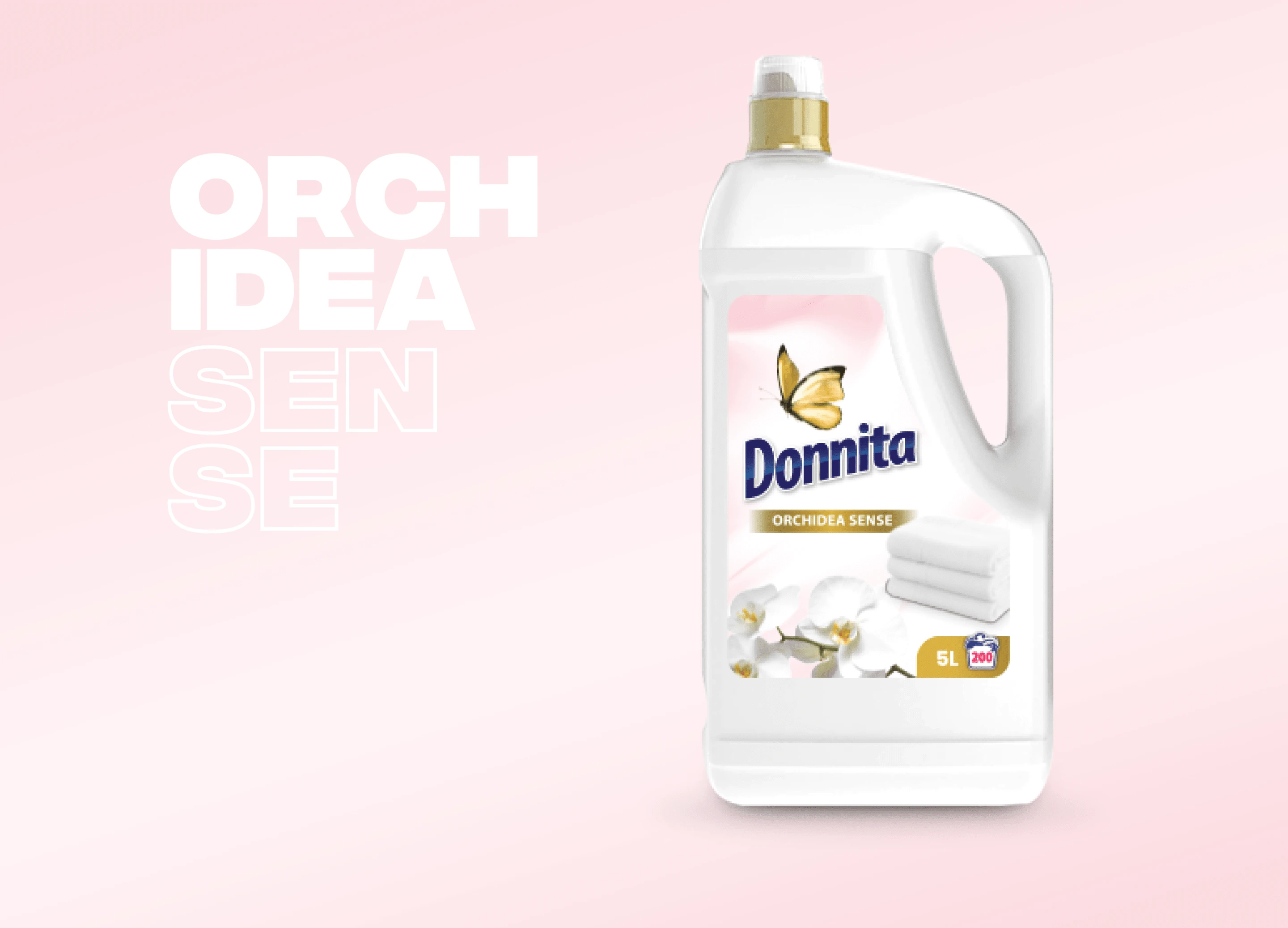
In Ordcidea sense I used a combination of light pink, white and gold to convey cleanliness and light scent.
Website
I designed the website in Figma and after some tweaks, and with final approval of the client I developed it in Webflow in 5 different languages.
Like this project
Posted Nov 6, 2024
Creating a brand and website from 0 to 100. I designed logo & brand identity, web design and development with Webflow, social media graphics.
Likes
1
Views
9