Hotel Booking App – Hotel Details UI
Francis Momoh
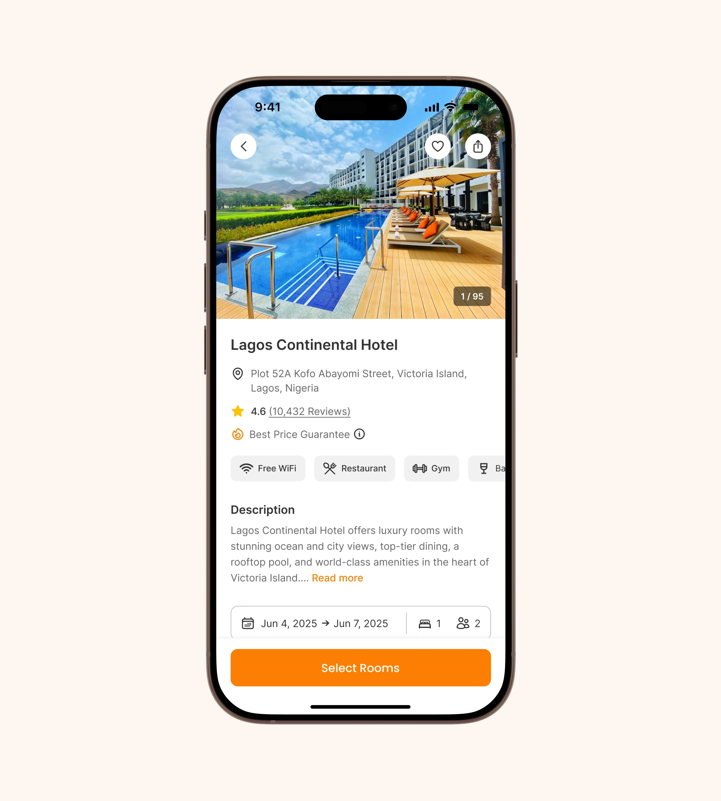
Hotel Booking App – Hotel Details UI
Overview
This project showcases the Hotel Details screen of a hotel booking application. The goal was to create a clean, modern, and user-friendly interface that allows users to quickly access hotel information, read reviews, and book rooms seamlessly.
The Problem
When booking hotels online, many users face information overload due to cluttered layouts, poor hierarchy, and inconsistent UI patterns. This often results in confusion, hesitation, and even drop-offs before completing a booking.
The Solution
I designed a Hotel Details UI that:
- Provides clear, structured information such as hotel name, location, rating, and amenities.
- Uses a visually engaging hero image to showcase the hotel and give users confidence in their choice.
- Highlights key details (reviews, facilities, description) with a well-defined hierarchy.
- Ensures a seamless booking experience with an easy-to-access date and guest selector.
- Features a prominent CTA button ("Select Rooms") to guide users naturally to the next step.
Design Approach
- Mobile-first design: Prioritized usability on smaller screens with clear spacing and touch-friendly elements.
- Visual hierarchy: Organized content so that the most important information (image, name, rating, CTA) is seen first.
- Simplicity: Reduced clutter by grouping details and using icons for quick scanning.
- Consistency: Maintained a familiar and intuitive flow to build user trust.
- Accessibility: Ensured high-contrast buttons and legible typography for diverse users.
Tools Used
Figma
Result
The final design delivers a streamlined and intuitive booking experience that minimizes user friction and supports decision-making. By presenting information in a clear and structured way, users can quickly evaluate the hotel and proceed with confidence.
Like this project
Posted May 12, 2026