Redesigning the Quikly Dashboard for Business
Ericson Luciano
Redesigning the Quikly Dashboard for Business
Background
Last week, a client reached out to me with a clear goal — to transform their existing Quikly Dashboard into a more professional and scalable business platform. The current version felt more like an MVP: functional, but lacking structure, visual hierarchy, and a strong design system foundation.
The Challenge
The client wanted a dashboard that could grow with their business — one that not only looked modern and professional but also improved data visibility, navigation flow, and user confidence when managing key business operations. The old design suffered from cluttered layouts, inconsistent components, and limited responsiveness.
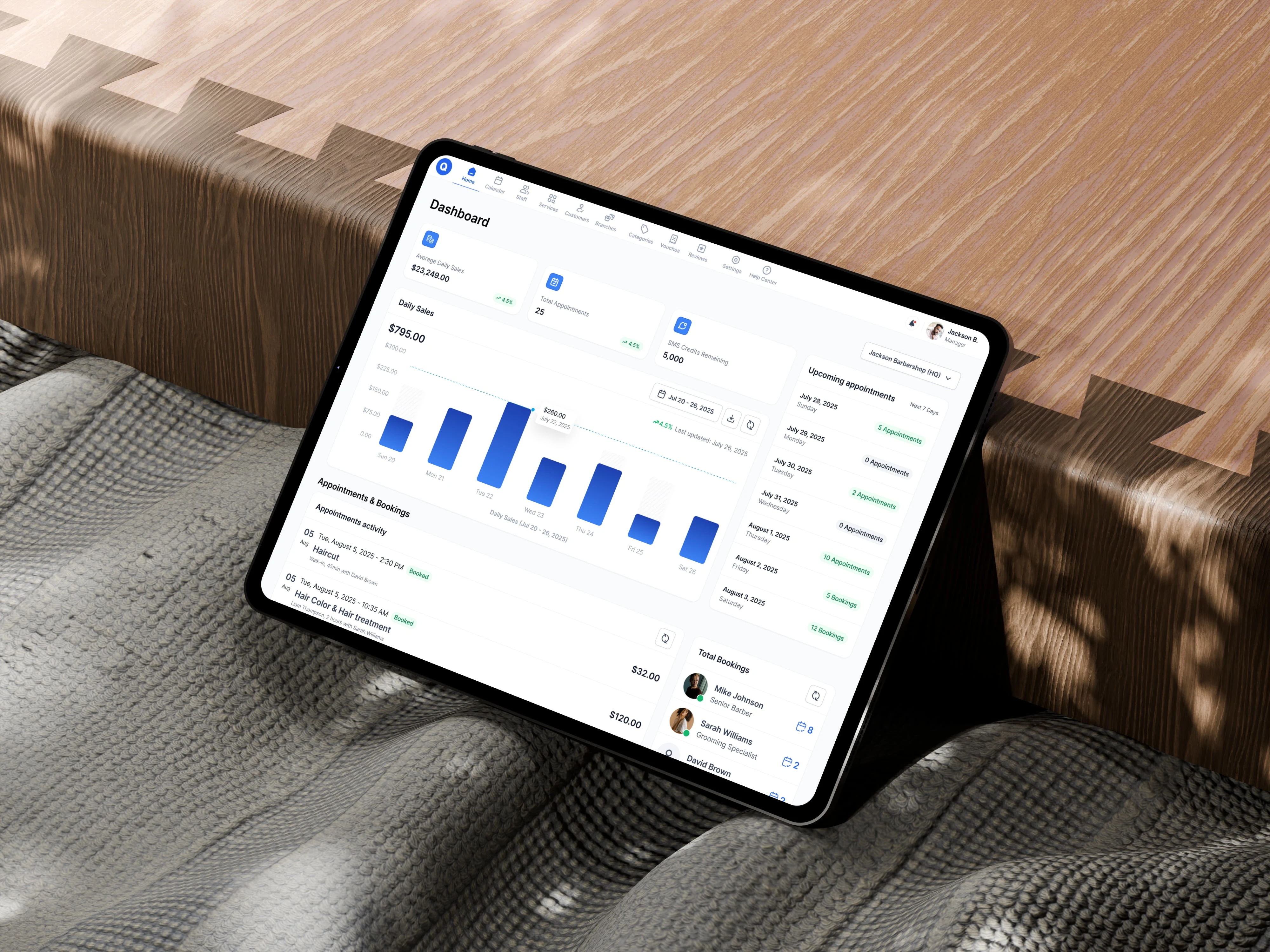
The current dashboard design
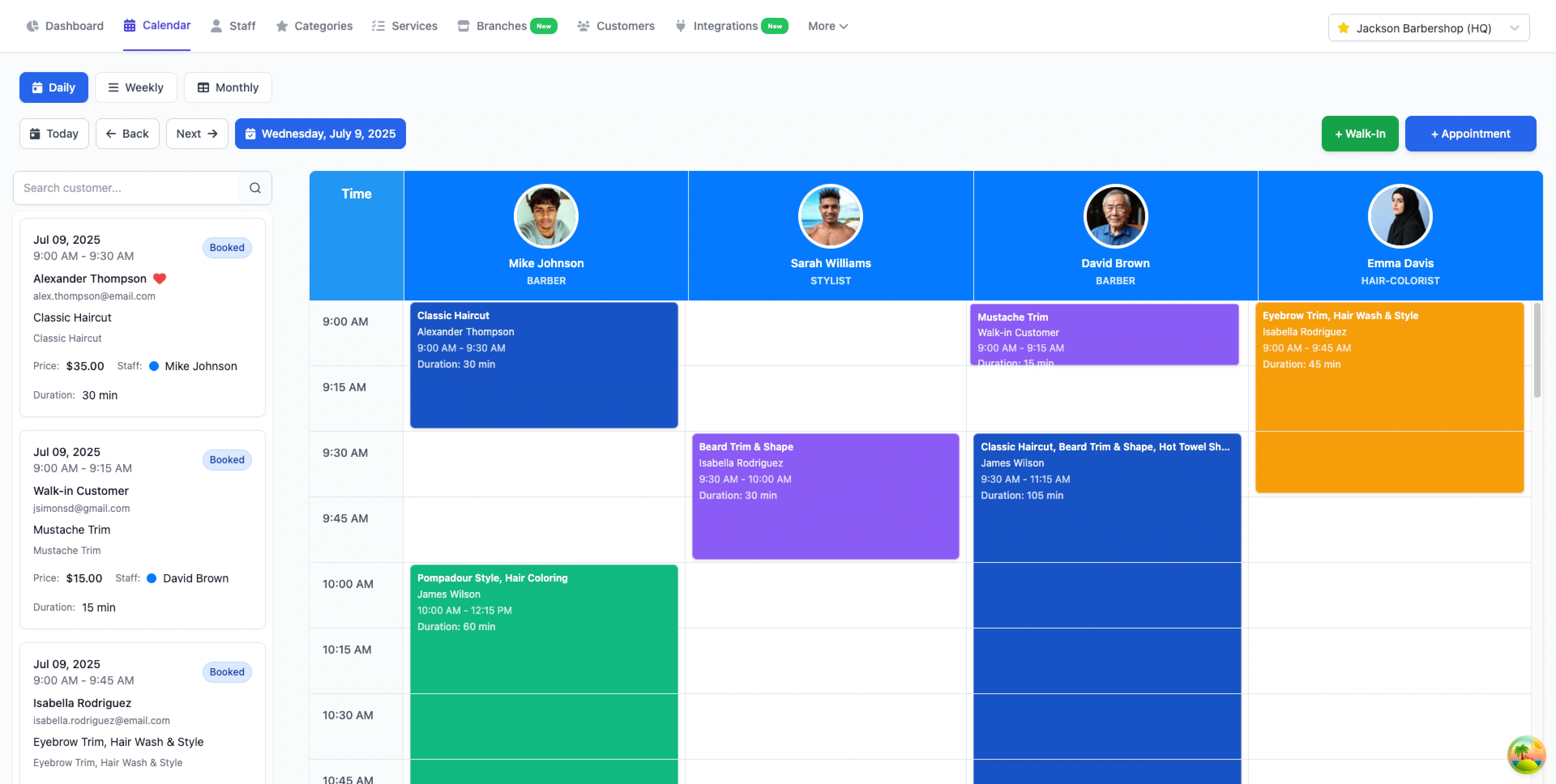
The calendar
My Approach
I began with a quick audit of the existing interface and user flows. By identifying common pain points and mapping business goals, I was able to define three key priorities:
Simplify navigation – introduce a clean sidebar and logical hierarchy for quick access.
Improve readability – use better typography, spacing, and contrast for data-heavy screens.
Unify the visual language – apply a consistent design system with clear color tokens, buttons, and chart styles.
The Outcome
The redesigned Quikly Dashboard for Business now feels cohesive, data-driven, and future-ready. It features:
A refreshed UI built for clarity and scalability
Streamlined navigation for business owners and teams
Consistent visual components that align with brand tone
Improved data visualization for faster decision-making
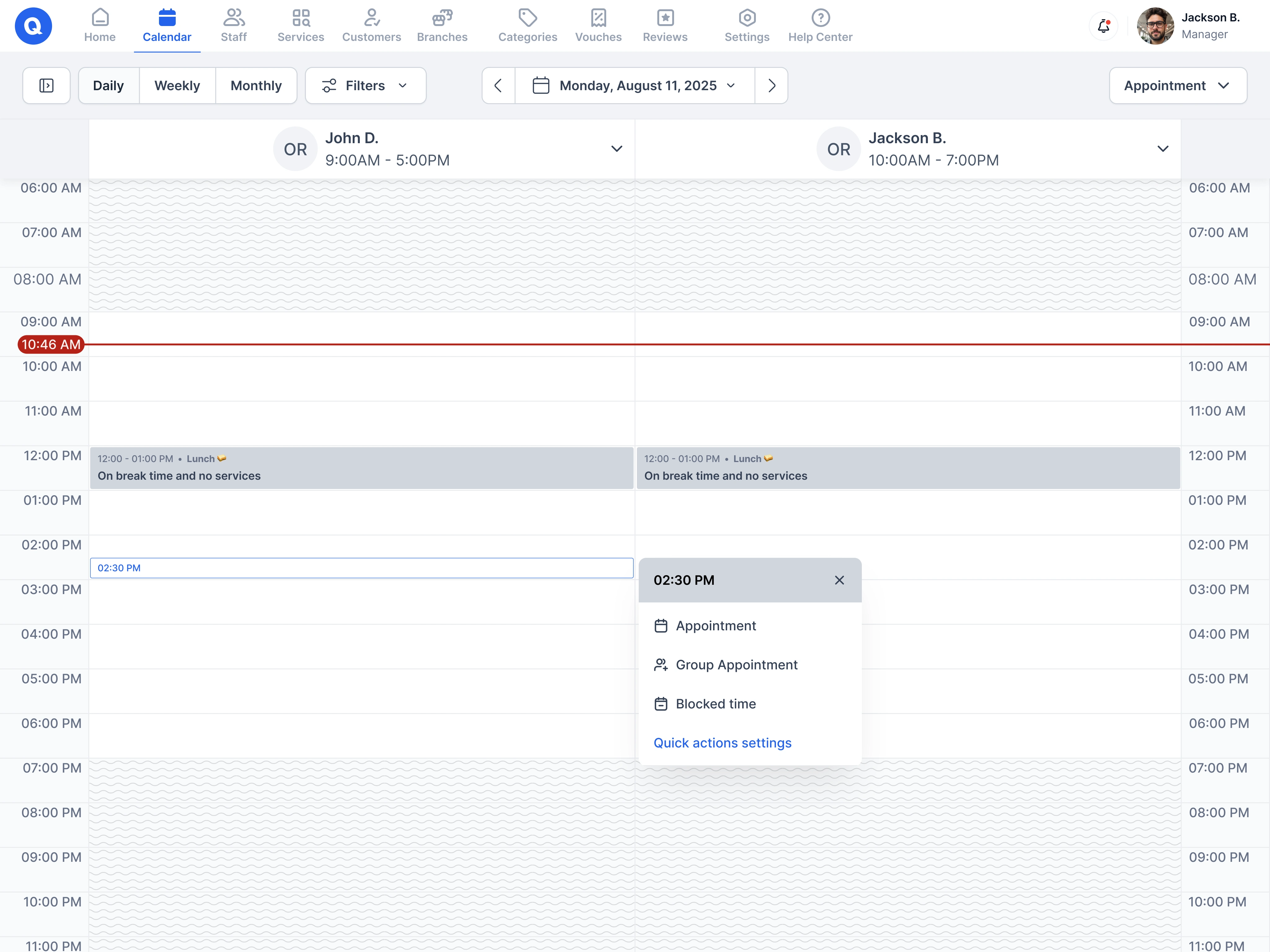
Calendar - Add to calendar and popup
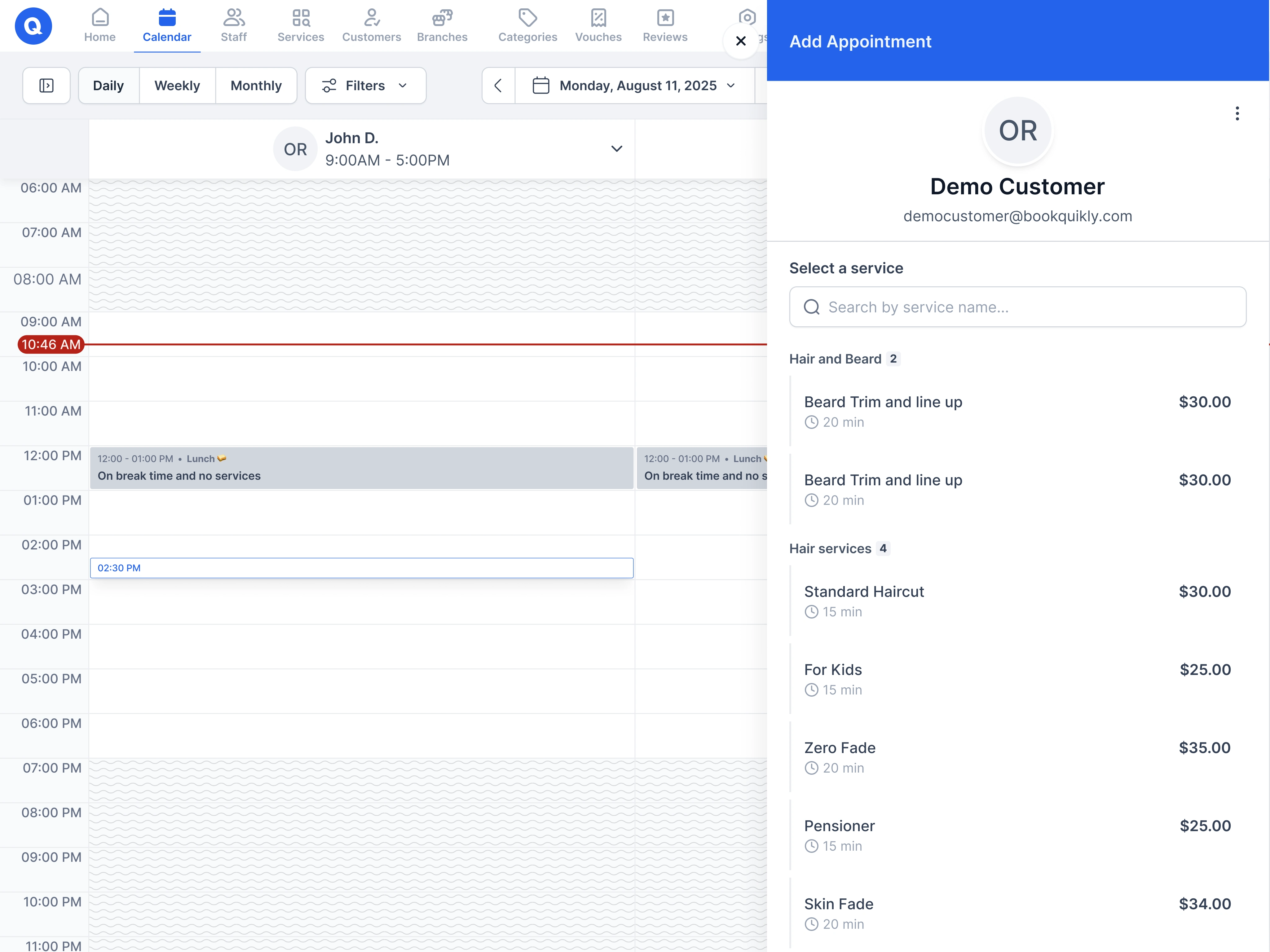
Calendar - Adding the appointment with services available
Reflection
This redesign not only elevated the brand’s professional presence but also set a strong foundation for future feature expansions. The client’s feedback was overwhelmingly positive — calling it a “game-changer for our business users”.
Like this project
Posted Oct 15, 2025
Redesigned Quikly Dashboard for improved scalability and user experience.
Likes
0
Views
6
Timeline
Aug 1, 2025 - Aug 31, 2025
Clients
Quikly